These Instagram ads examples share one thing in common. That is a repeatable structure. Each format below stops the scroll with one idea. It earns attention before asking for anything and matches the exact stage the buyer is in. This guide breaks down 20 Instagram ad formats, from the problem frame to the bold text offer. It also covers five mistakes that quietly waste ad spend.
Most guides show you ads from big brands with huge budgets and fame. You can admire these ads, but you can't copy them. Their success comes from things you don't have. What you can use is the pattern behind them. The real persuasion trick hidden under the polish.
This article gives you that. Instead of ads to admire, you get formats to build from. Each one comes with the reason it works and who it works best for. These formats behind strong social media graphic design make strong ads.
You'll also see where money gets wasted through simple mistakes. Plus clear answers to the most common questions about size, format, and performance.
Keep reading to see how it all fits together.
Top 20 Instagram Ads Examples
Instagram ads only when they solve a persuasion problem clearly. This list covers the top 20 Instagram ads examples, from problem-led hooks to social proof stacks. You'll also see what each looks like, why it works, and which categories fit best.
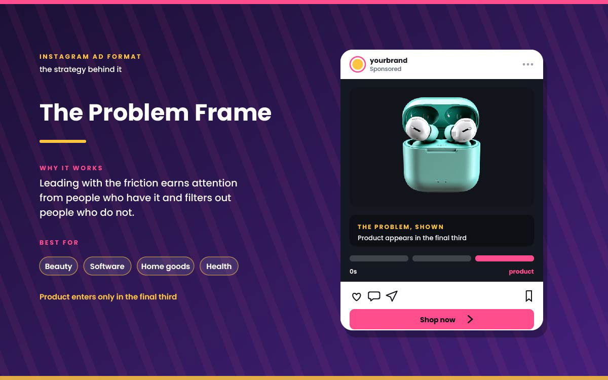
1. Problem frame
Starts by showing the problem the product solves, not describing it. The product shows up only near the end.
Why it works: Leading with the problem grabs people who have it. It also filters out people who don't. This means better conversions later.
Best for: Beauty, software, home goods, health.
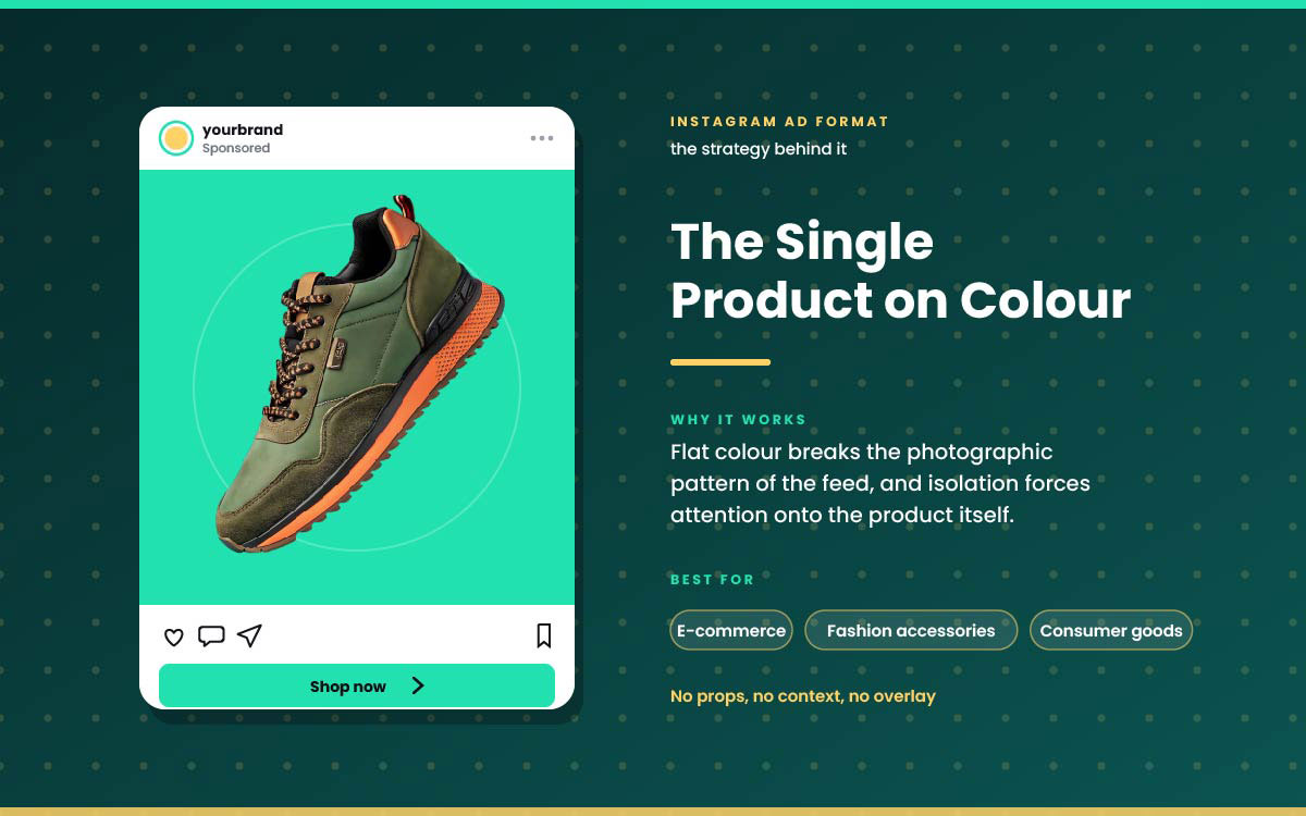
2. Single product on colour
One product shot on a plain bright color background. No props, no lifestyle scene, no text.
Why it works: The flat color stands out in an Instagram feed. Isolating the product makes people focus on it.
Best for: E-commerce, fashion accessories, consumer goods
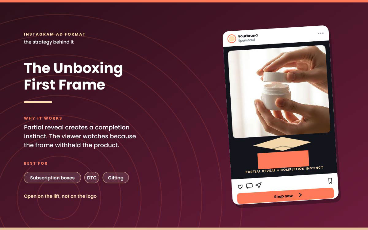
3. Unboxing first frame
The first frame shows the unboxing moment. Hands lifting packaging. Product half revealed.
Why it works: A partial reveal makes people want closure. Viewers keep watching to see the full product.
Best for: Subscription boxes, DTC products, gifts.
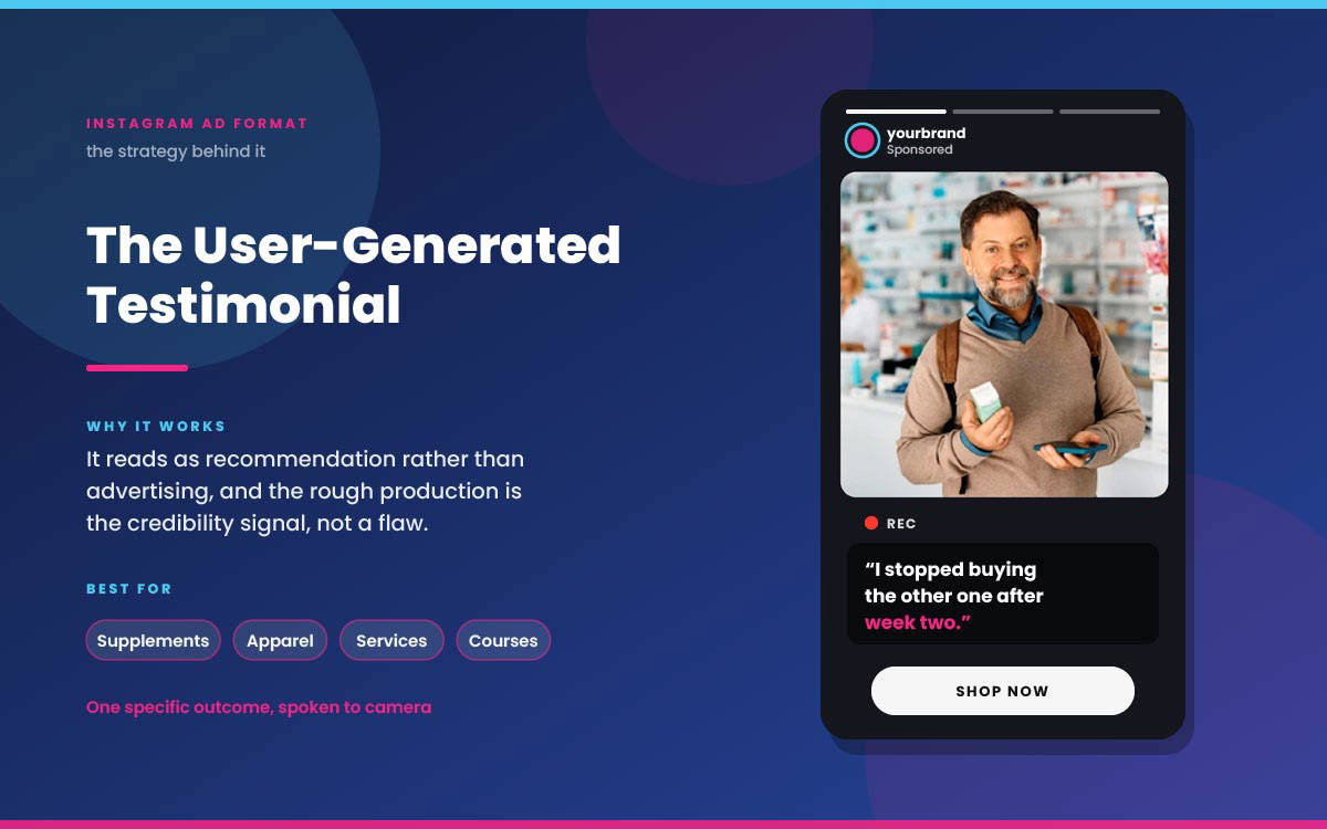
4. User-generated testimonial
Genuine customer footage, raw and unedited. The customer talks straight to camera about a real result.
Why it works: It feels like a recommendation, not an ad. The rough production actually builds trust.
Best for: Supplements, clothing, services, courses.
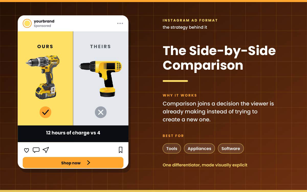
5. Side-by-side comparison
A split frame. The product on one side, the obvious alternative on the other. One key difference stands out visually.
Why it works: It taps into a choice the viewer is already making. It doesn't try to create a new one.
Best for: Tools, appliances, software, competitive categories.
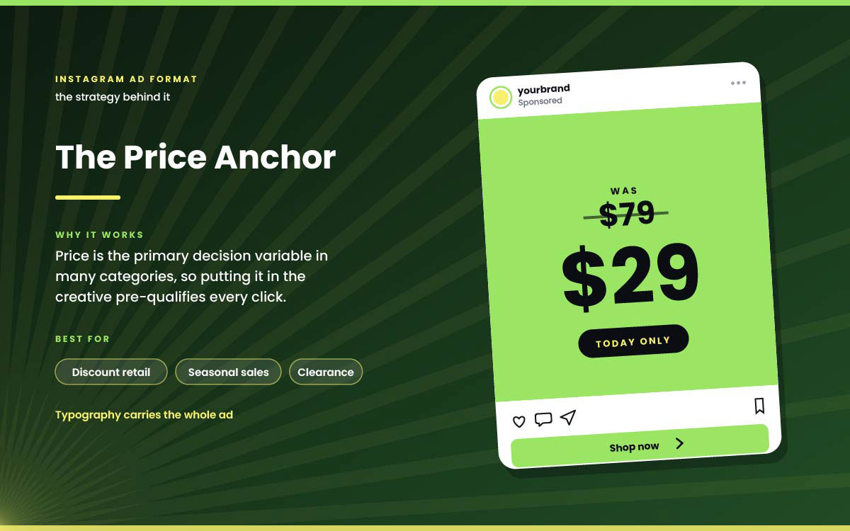
6. Price anchor
A high price shown, next to a crossed-out original price.
Why it works: Price often drives the decision. Showing it upfront filters clicks before they happen.
Best for: Discount retail, seasonal sales, clearance.
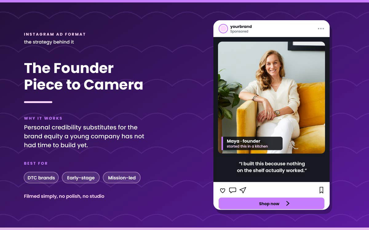
7. Founder piece to camera
The founder talks to camera about why the product exists. Simple filming, no polish.
Why it works: Founder-led content works well for young brands. It swaps personal credibility for brand equity they don't have yet.
Best for: DTC brands, early-stage companies, mission-led products.
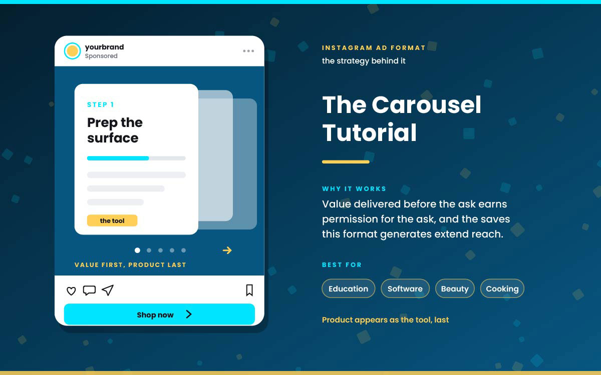
8. Carousel tutorial
Several slides teaching something truly useful. The product shows up as the tool in the last slides.
Why it works: Giving value first earns the right to ask. This format also gets more saves, which means more reach. A good organic carousel works the same way. That's why studying social media post design ideas helps with paid creative too.
Best for: Education, software, beauty, cooking.
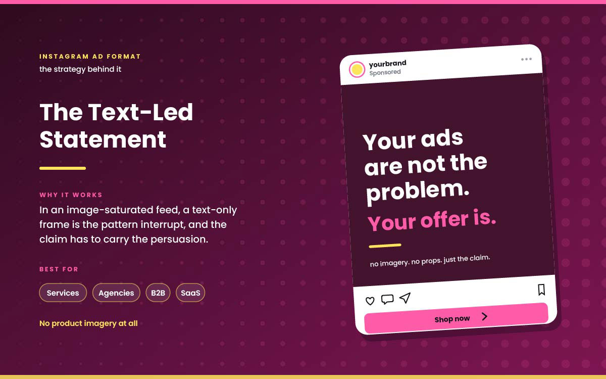
9. Text-led statement
No product photos. Just one bold or specific claim in large text on a plain background.
Why it works: In a feed full of images, plain text stands out. The claim alone has to do the convincing.
Best for: Services, agencies, B2B, subscription platforms.
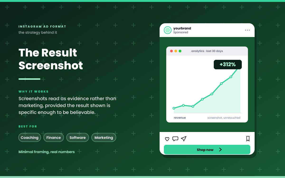
10. Result screenshot
A screenshot of a real result. An analytics graph, a message, a receipt. Shown with little framing.
Why it works: Screenshots feel like proof, not ads. As long as the result is specific enough to believe.
Best for: Coaching, finance, software, marketing services.
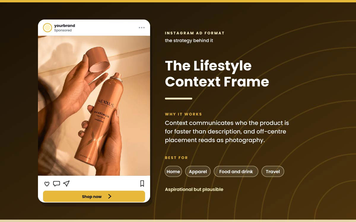
11. Lifestyle context frame
The product used in real life, in a setting people want but can believe. The product isn't centred.
Why it works: The setting shows who it's for faster than words. Placing it off centre makes it look like a photo, not an ad.
Best for: Home, apparel, food and beverage, travel.
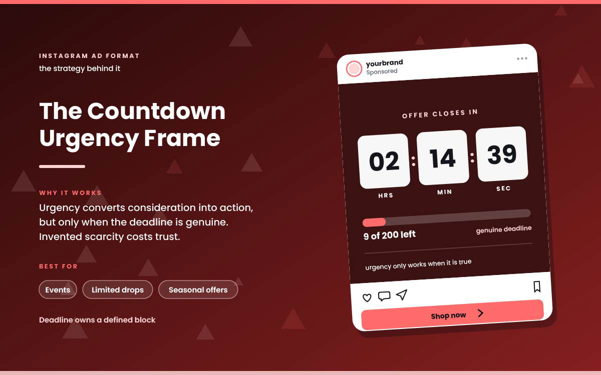
12. Countdown urgency frame
A clear deadline or stock counter in the design.
Why it works: Urgency pushes people to act. But the deadline must be real. Fake scarcity breaks trust once people notice.
Best for: Events, limited drops, seasonal offers.
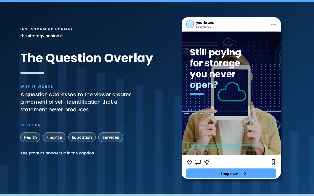
13. Question overlay
A question to the viewer over a related image. The caption provides the answer.
Why it works: A question makes viewers see themselves in it. A statement doesn't.
Best for: Health, finance, education, services.
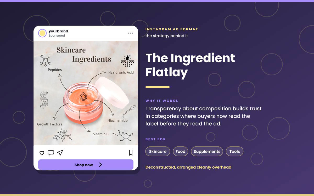
14. Ingredient or component flatlay
The product taken apart. Pieces arranged neatly from above.
Why it works: Buyers care more about ingredients now. Showing what's inside builds trust.
Best for: Skincare, food, supplements, tools.
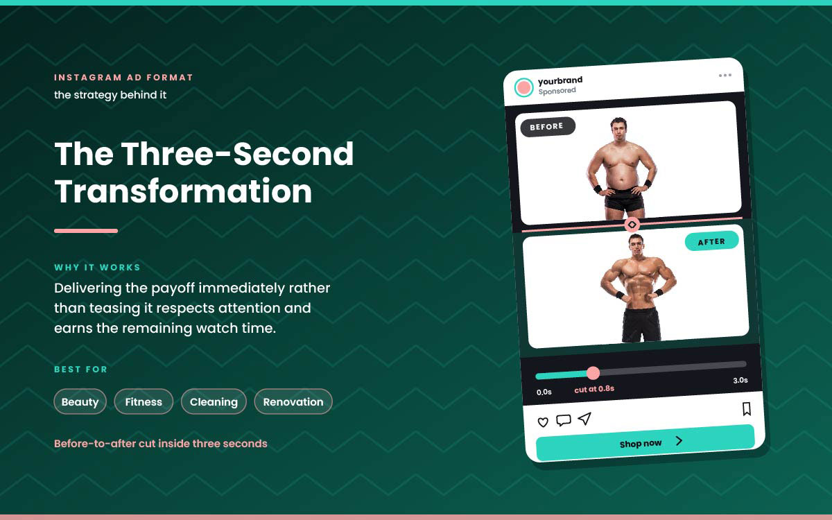
15. Three-second transformation
A quick before and after cut in the first three seconds.
Why it works: Showing the result right away respects the viewer's time. This earns more watch time. Good payoff timing is a key part of social media ad design.
Best for: Beauty, fitness, cleaning, renovation.
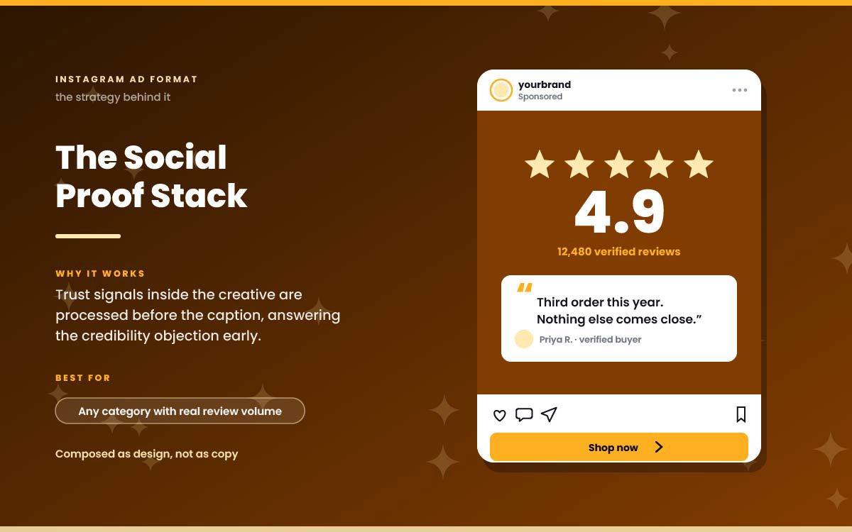
16. Social proof stack
Review count, star rating, and a customer quote shown as part of the Instagram ad design.
Why it works: People see trust signals in the visual first. This answers doubts before they even come up.
Best for: Any category with real reviews.
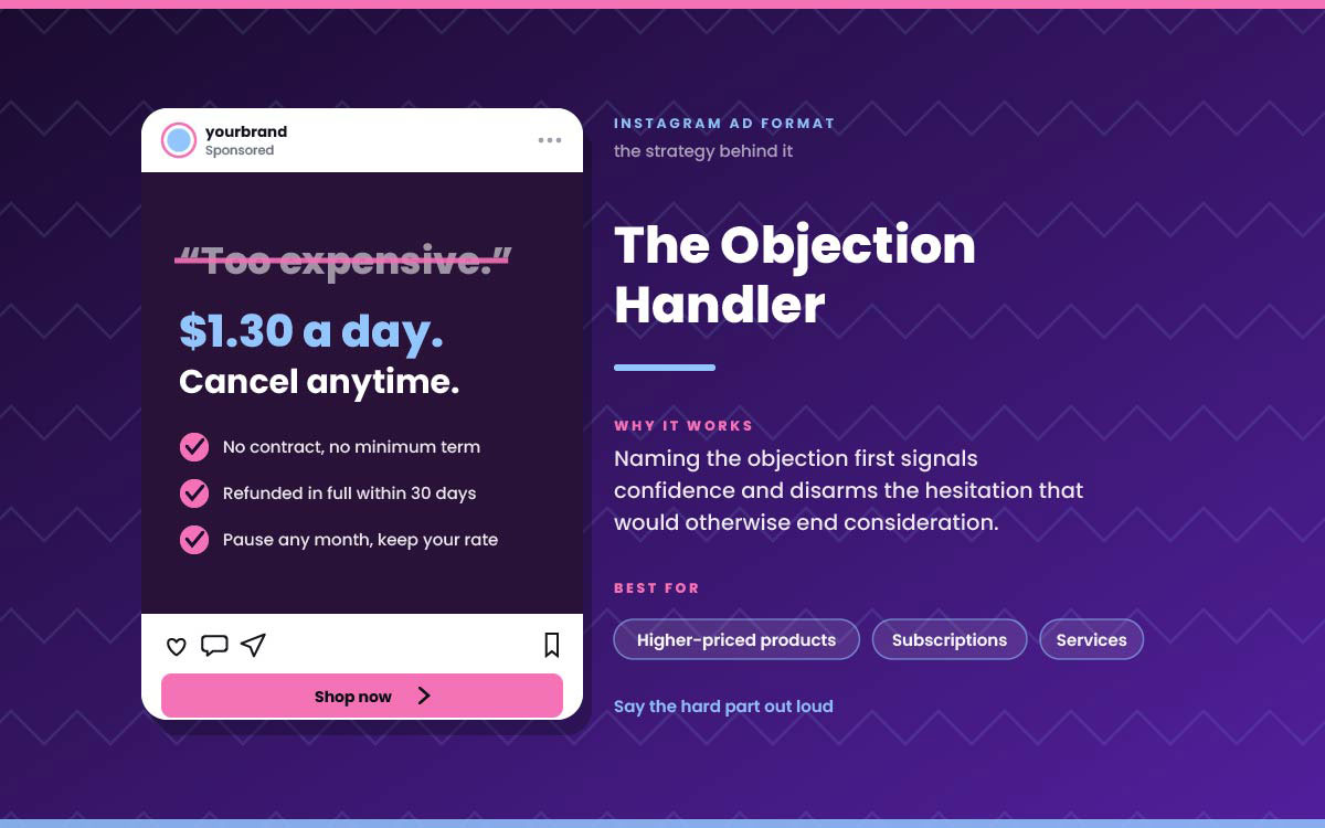
17. Objection handler
The ad names the top reason people don't buy. Then it answers that reason.
Why it works: Naming the problem first shows confidence. It removes doubt before it can stop a sale.
Best for: Pricier products, subscriptions, services.
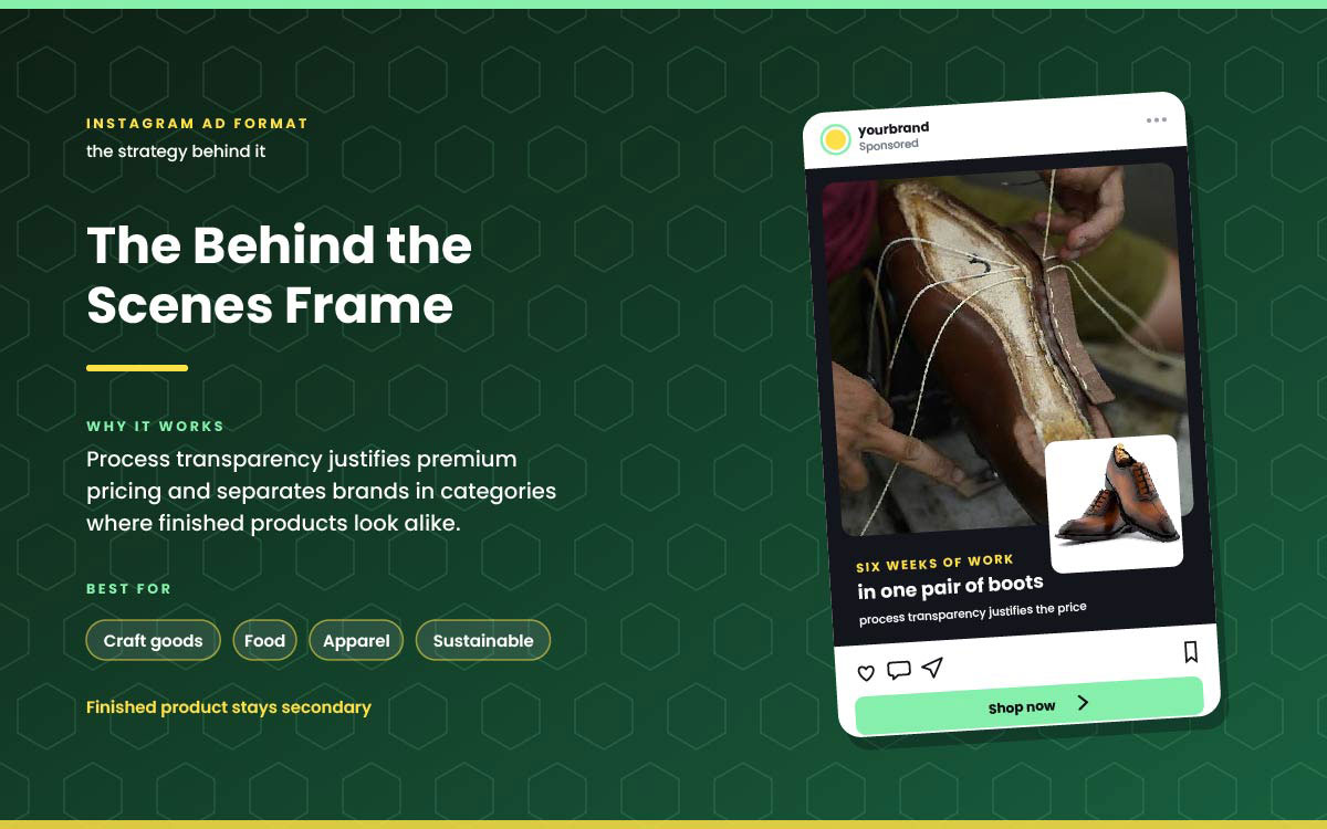
18. Behind the scenes frame
Real footage of how things are made or sourced. The finished product isn't the main focus.
Why it works: Showing the process justifies higher prices. It also sets you apart when finished products all look alike.
Best for: Craft goods, food, apparel, sustainable brands.
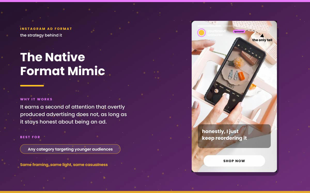
19. Native format mimic
Ads styled like real, everyday posts. Same framing, lighting, and casual look.
Why it works: It grabs attention that obvious ads don't. But it must still be clear it's an ad.
Best for: Any category targeting younger audiences.
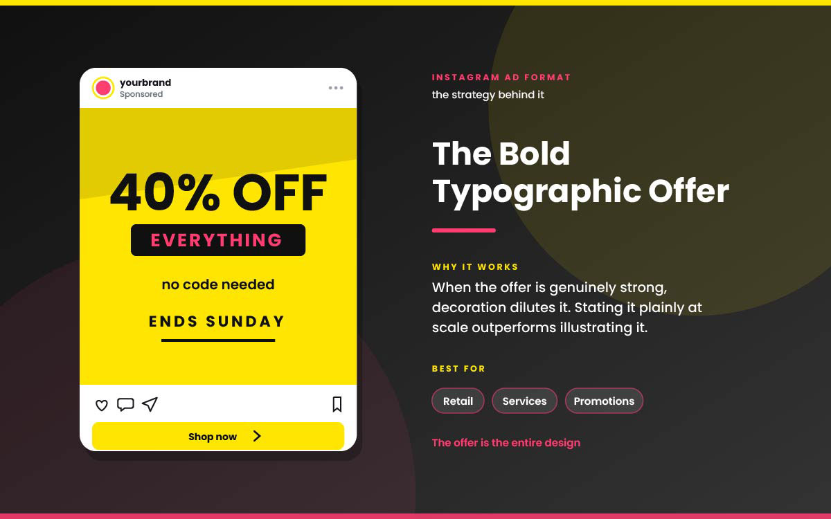
20. Bold typographic offer
The offer is the whole design. Bold text on brand colour, no images.
Why it works: A strong offer needs no decoration. Saying it plainly beats illustrating it.
Best for: Retail, services, promotions.
5 Mistakes that waste Instagram ad spend
Most Instagram ad creative ideas waste money due to five mistakes. Those mistakes are using one ad for every audience stage, letting auto crop ruin placements, building slowly to the idea, ignoring viewers who watch with sound off, and picking winners by gut feeling rather than analyzing data.
Mistake 1. Running one format to every audience stage
What happens: The same ad gets used for cold leads, warm leads, and retargeting. Making variants takes too much time.
The truth: Each stage needs a different pitch. One ad can't introduce a brand and close a sale. Trying to do both means it fails at both.
The fix: Make at least two creative sets per campaign. One grabs attention. One converts interest. Match each to the right audience.
Mistake 2. Letting meta auto-crop across placements
What happens: You upload one square (1:1) image. The platform auto-crops it for Stories, Reels, and Explore.
The truth: Auto-crop often cuts off headlines and CTAs in vertical spots. Many people see a broken image.
The fix: Make separate versions at 1080x1080, 1080x1350, and 1080x1920. Adjust the layout for each size.
Mistake 3. Building toward the idea instead of opening with it
What happens: The ad sets up context for a few seconds before making its point.
The truth: You have about three seconds. Ads that build up to their idea lose most viewers first.
The fix: Start with your strongest moment. Put the reveal, result, or claim right at the beginning.
Mistake 4. Designing for sound on
What happens: Video ads rely on voiceover or music to get the message across.
The truth: Most people watch Instagram videos on mute. Without captions, your ad says nothing to them.
The fix: Add burned-in captions to every video ad. Don't rely on platform auto captions. They're inconsistent and often turned off.
Mistake 5. Judging creativity on internal preference
What happens: The team picks ad variants in a meeting based on personal taste.
The truth: Personal taste barely predicts real performance. The team isn't the audience. They know the product too well to react as a stranger would.
The fix: Test variants on real traffic, changing one thing at a time. Let cost per result decide.
Instagram ads example FAQs
Instagram ads examples come down to two things: what to make and what it costs. These five FAQs cover both. They explain correct ad sizes, what makes ads effective, which formats work best by audience stage, ideal video length, and if organic style ads beat polished ones
Have more questions to ask? Reach us anytime to clear your confusion.
Instagram feed ads should be 1080 x 1080 pixels (square) or 1080 x 1350 pixels (portrait). Portrait fills more feed space. Stories and Reels ads should be 1080 x 1920 pixels. Keep key content inside the center 1080 x 1420-pixel safe zone.
A good Instagram ad shows an idea in three seconds. It matches the viewer's buying stage and works without sound, using captions. It also uses a custom version for each placement instead of automatic cropping.
No single format wins for everyone. It depends on the audience. Cold audiences respond to problem frames, carousel tutorials, and native style ads. Warm audiences like comparisons and objection handlers. Retargeting works best with price anchors, urgency, and social proof.
Instagram feed videos can run up to 60 minutes. Reels can run up to 90 seconds. But length matters less than the first three seconds. Most strong video ads share their main idea right away, then use the rest of the time to hold attention.
Yes. Ads that look like organic posts often grab more attention, especially with younger viewers. People tend to scroll past obvious ads. This works best when the caption is honest about being an ad, while the visuals still match organic style.
Endnote
These Instagram ad examples aren't meant for copying exactly. They show that a few structural patterns, used well, beat expensive production every time.
Knowing the structure is only half the job. The hard part is building creative fast enough to test properly, in every size needed, before the budget runs out.
That's the real bottleneck. Not knowing which format to use, but making it fast enough and in enough sizes to test well. Graphic Design Eye LLC’s unlimited design subscription solves this problem. Instead of briefing a freelancer for each variant and waiting days for revisions, you can get a design team producing your Instagram ad sets in every placement size. From square feed posts to full bleed Reels. Each of our social media design is matched to the buying stage it needs to reach, with unlimited revisions until it converts.
Start with one format from this guide. Build it properly. Let the data decide if it earns a second version.
The best ad you will ever run has not been made yet, so go build it!
Graphic Design Eye LLC is a full-service creative agency built for brands that demand more than design — they demand vision. From strategic branding to complete visual identity, we partner with startups, agencies, and growing businesses as a dedicated creative force. With flexible subscription and project-based models. Let's start with us today!