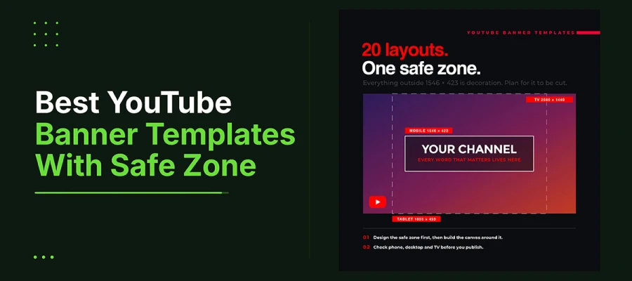
The best YouTube banner templates all follow one strict rule. The 1546-by-423-pixel safe zone must survive every device's crop. This guide covers that safe zone. It also covers the full 2560 by 1440 canvas. You get twenty layout structures for different channel types. Every template is free to build. It includes a step-by-step process and FAQs.
Most banner problems start the same way. A design looks perfect on a desktop screen. Then it opens on a phone. The channel name gets sliced in half. This gap between designer and viewer is not about taste. It is about missing specs. It is avoidable if the safe zone comes first.
Great social media post design starts with limits. This idea applies here in a very literal way. The platform already decides what readers see. The only question is whether the design respects that.
This article covers twenty layout structures based on that rule. It also gives a framework for choosing between them. This depends on your logo's strength, your audience's habits, and whether you need one banner or a full system.
By the end, you will have a clear five-step process. No more guessing, then checking your phone too late. Let’s dive into it!
Top 20 YouTube banner templates
When the layout fits the channel's content, it makes the best YouTube banner templates. It must also fit the 1546 x 423 safe zone. This zone survives every crop.
The following twenty layout structures demonstrate how the best YouTube banner templates function across various niches. This selection explores everything from safe wordmark centering to complex, type-specific arrangements. Each entry explains the logic behind the frame. So, keep exploring.
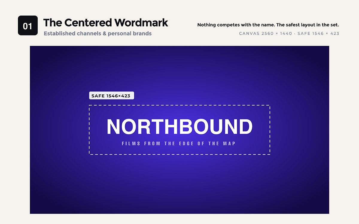
01. Centered wordmark
Channel wordmark centred in the safe zone. Make it as big as possible while staying clear. Tagline in a light font right below. The outer canvas has a soft gradient or texture. It can crop off without hurting the design.
Best for: Established channels, personal brands, or anything with a strong logo already.
Nothing competes with the name. This is the safest layout in the set.
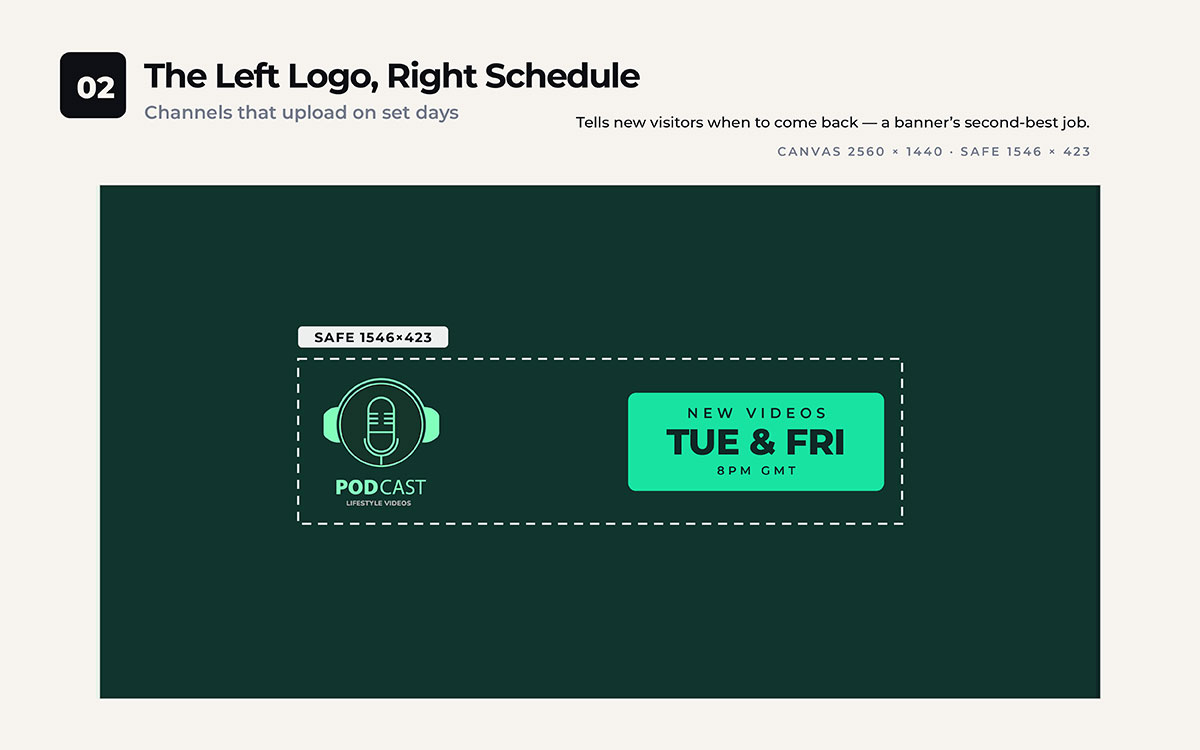
02. Left logo, right schedule
Logo or channel name sits on the left side. Upload days, like NEW VIDEOS TUESDAYS AND FRIDAYS, sit on the right in a bold block.
Best for: Channels that upload on set days.
This tells new visitors when to return. That is the second most useful job a banner can do.
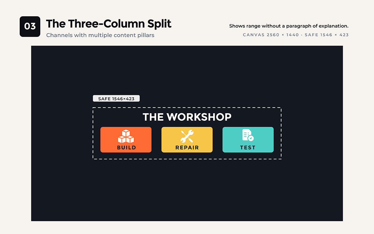
03. Three-column split
The safe zone splits into three equal columns. Each has an icon and a one-word label. The channel name sits above them.
Best for: Channels with multiple topics or content pillars.
Shows range without long explanations.
04. Portrait anchor
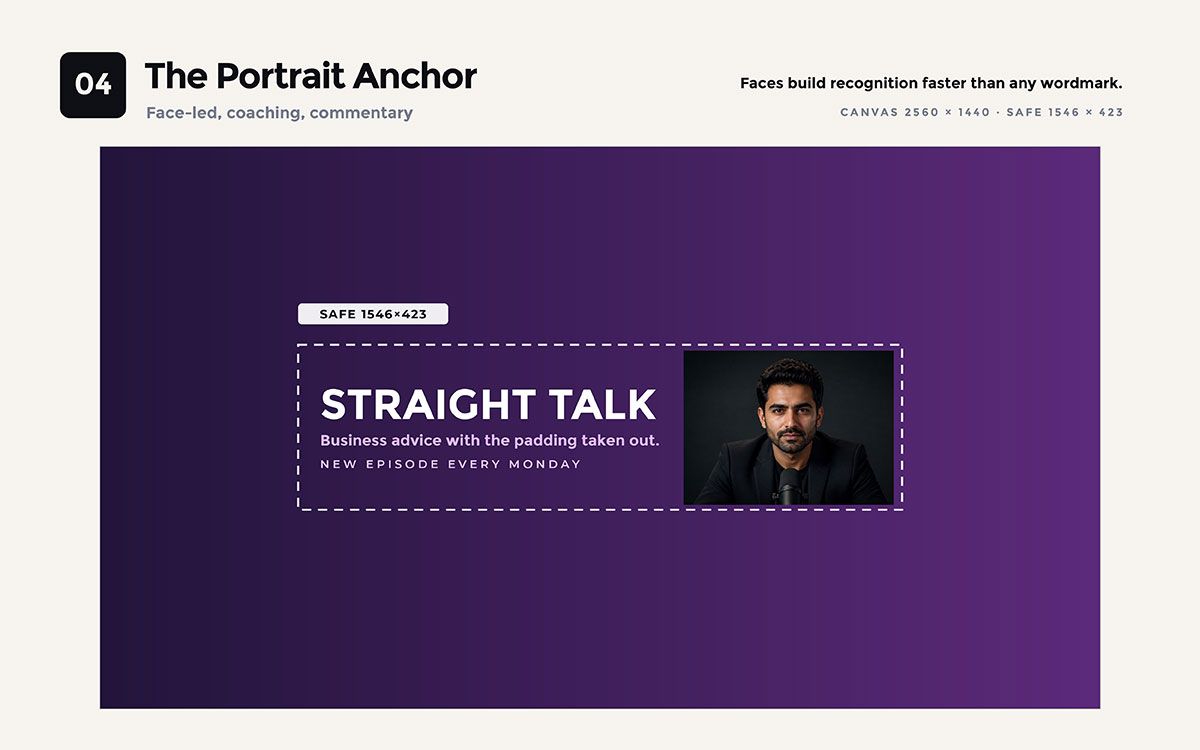
A cut-out portrait sits on the right side. Channel name and value line sit on the left, centred with the figure.
Best for: Face-led channels, coaching, commentary, personality content.
A cut-out portrait only looks clean on a flat or gradient background if the edges are truly clean. This makes the template as much about background removal as layout. Hair and shoulders show a rough mask right away.
Faces build recognition faster than any wordmark.
05. Value proposition statement
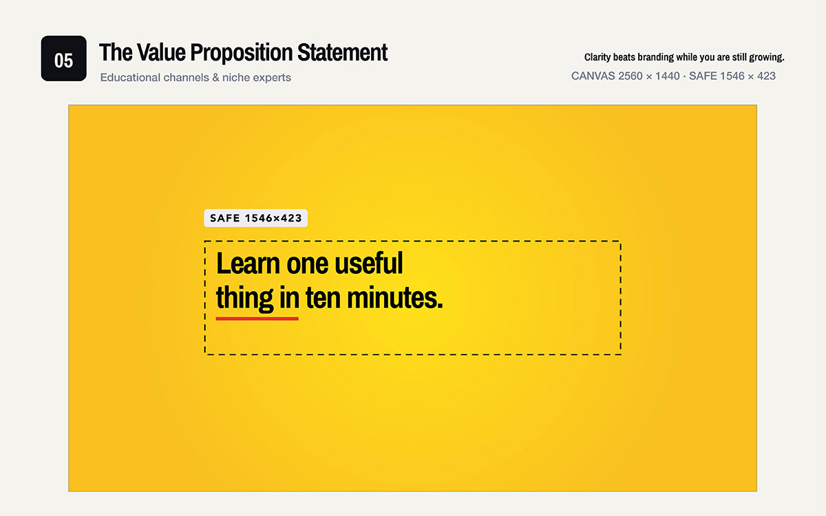
No logo at all. One sentence explaining what the channel offers fills the safe zone. It uses a bold display font across two lines.
Best for: Educational channels, tutorials, niche experts.
Clarity matters more than branding when you're still growing an audience.
06. Icon row beneath
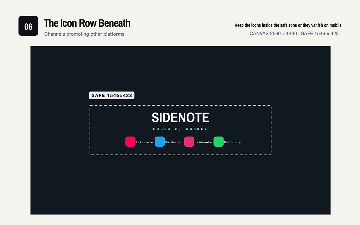
Channel name sits centered at the top. Platform icons with handles line up along the bottom edge.
Best for: Channels promoting other platforms.
Keep icons inside the safe zone. Otherwise they disappear on mobile.
07. Diagonal energy bar
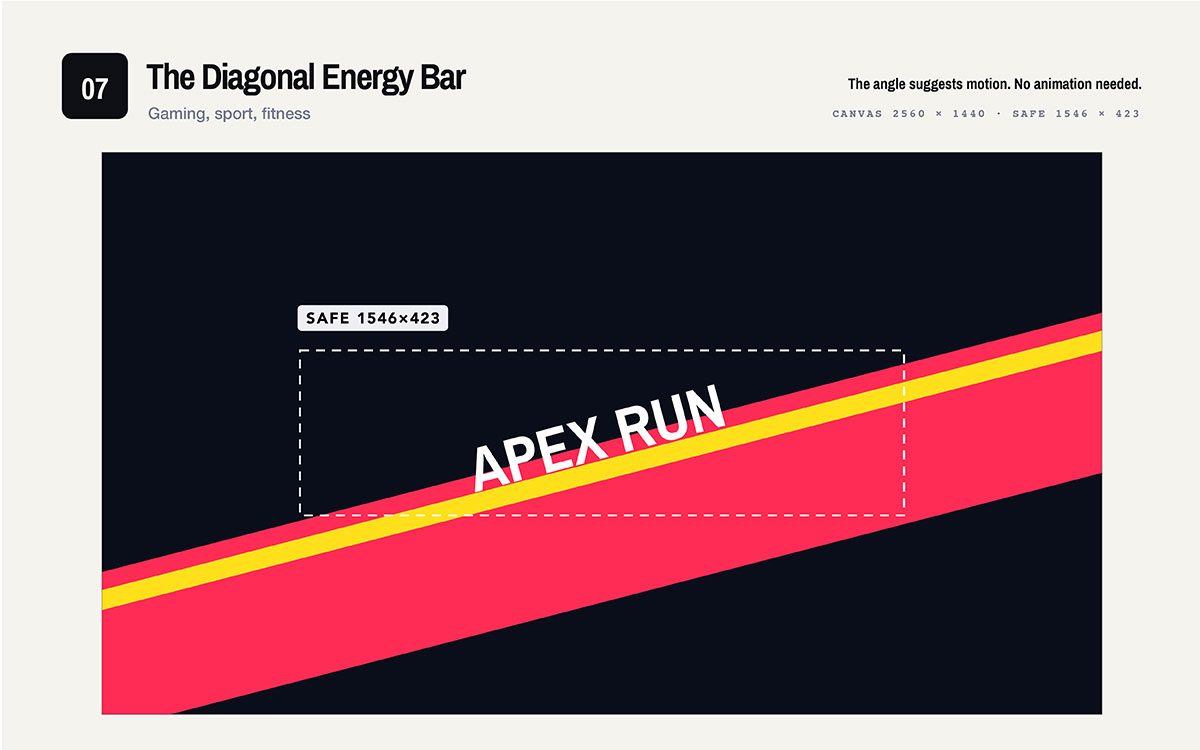
A bold band cuts across the canvas at about 15 degrees. The channel name sits on the band, inside the safe zone. The background has texture or gradient.
Best for: Gaming, sports, fitness, high-energy content.
The angle suggests motion. No animation needed.
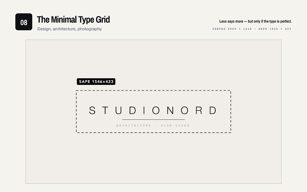
08. Minimal type grid
Channel name in light, wide letter spacing. Centred in the safe zone. Lots of space around it. One thin line under the name.
Best for: Design, architecture, photography, premium brands.
Less says more. It only works if the type looks perfect.
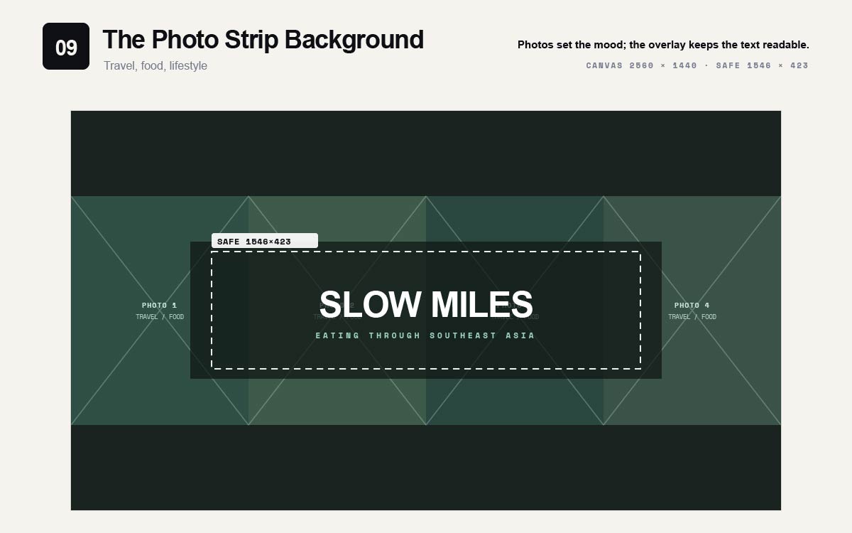
09. Photo strip background
Three to four photos stretch edge to edge in a row. A soft overlay covers the safe zone. The channel name sits on top.
Best for: Travel, food, lifestyle, or visual topics.
Photos set the mood while the overlay keeps text readable.
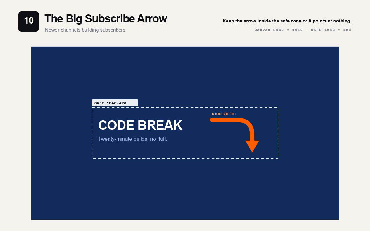
10. Big subscribe arrow
Channel name sits in the left safe zone. A bold arrow points down and right, toward the subscribe button on desktop. It stays fully inside the safe zone.
Best for: Channels focused on growth, newer channels building subscribers.
Keep the arrow inside the safe zone. Otherwise it points at nothing on mobile.
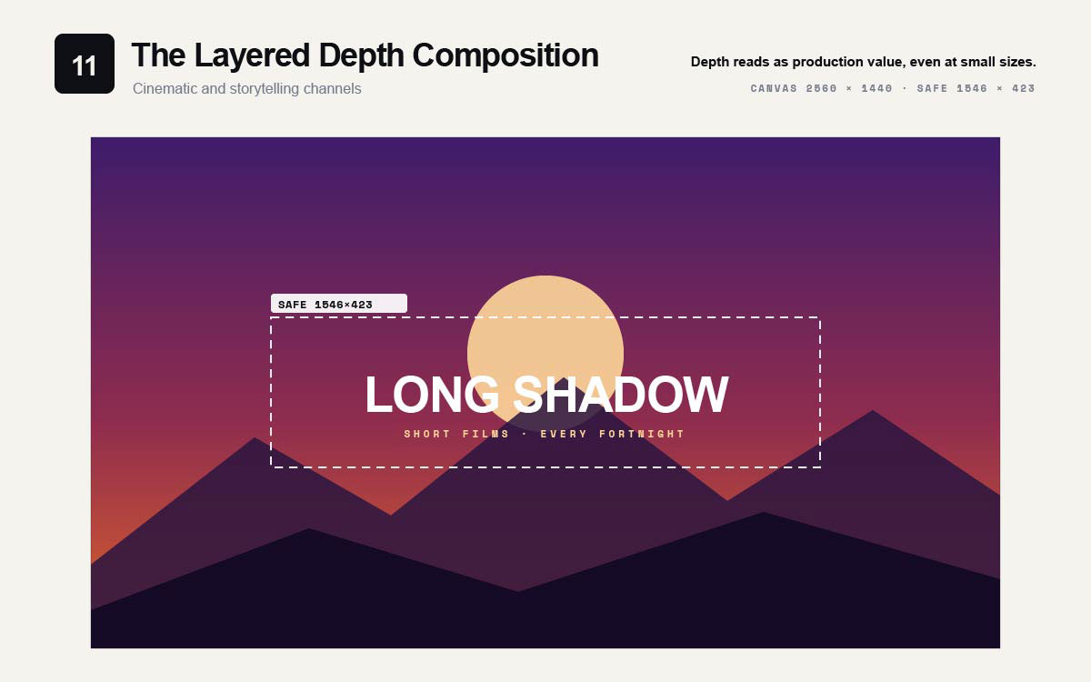
11. The layered depth composition
Three layers make it look deep. A background gradient. A middle silhouette. Text up front. Text sits sharp on top, inside the safe zone.
Best for: Cinematic channels, films, storytelling, production content.
This banner style promises high production value. The channel must match that promise. It works best when the video editing looks just as polished. A fancy banner over rough footage feels wrong right away.
Depth makes things look high quality, even when small.
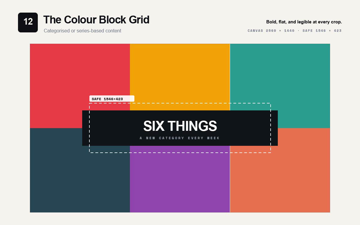
12. Colour block grid
The canvas splits into four or six solid colour blocks. The channel name sits in a knockout panel across the centre, inside the safe zone.
Best for: Channels with categorized content or series-based programming.
Bold, flat, and easy to read at every crop.
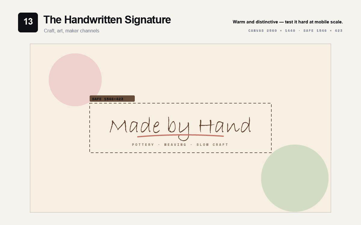
13. Handwritten signature
A script or handwritten channel name centred in the safe zone. Small structured sans text below for practical details.
Best for: Craft, art, personal vlogs, maker channels.
Warm and unique, but harder to read. Test carefully at mobile scale.
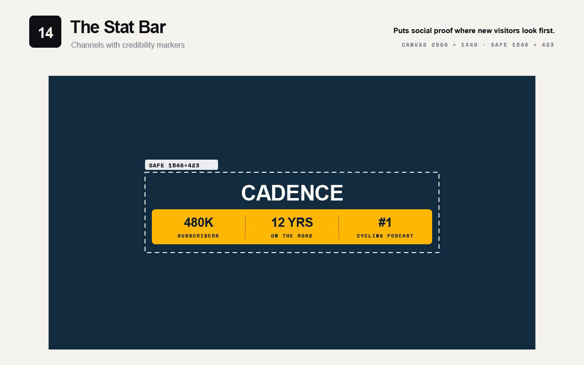
14. Stat bar
Channel name centred over a bar with two or three stats in the lower safe zone.
Best for: Channels with credibility markers like subscriber milestones, awards, or credentials.
Puts social proof where new visitors see it first.
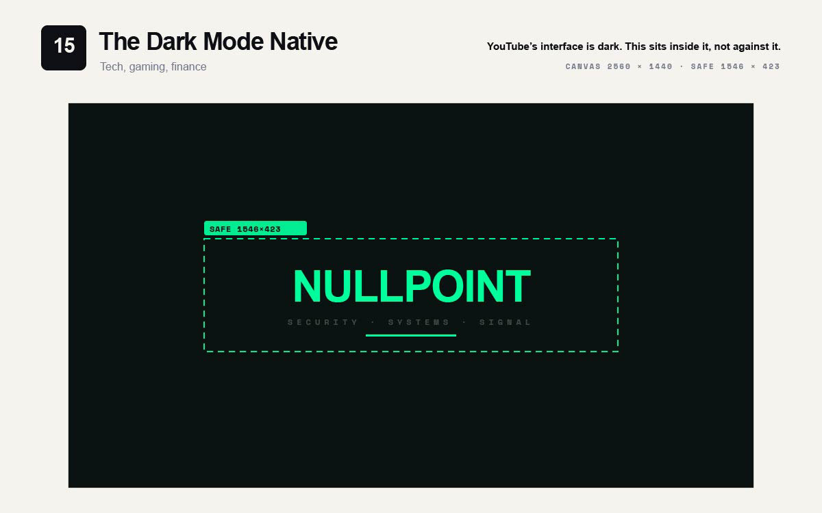
15. Dark mode native
A near-black or deep charcoal background. One bright accent colour on the channel name. No white anywhere.
Best for: Tech, gaming, finance. Any channel whose audience uses dark mode.
YouTube's interface is mostly dark. This banner fits right in.
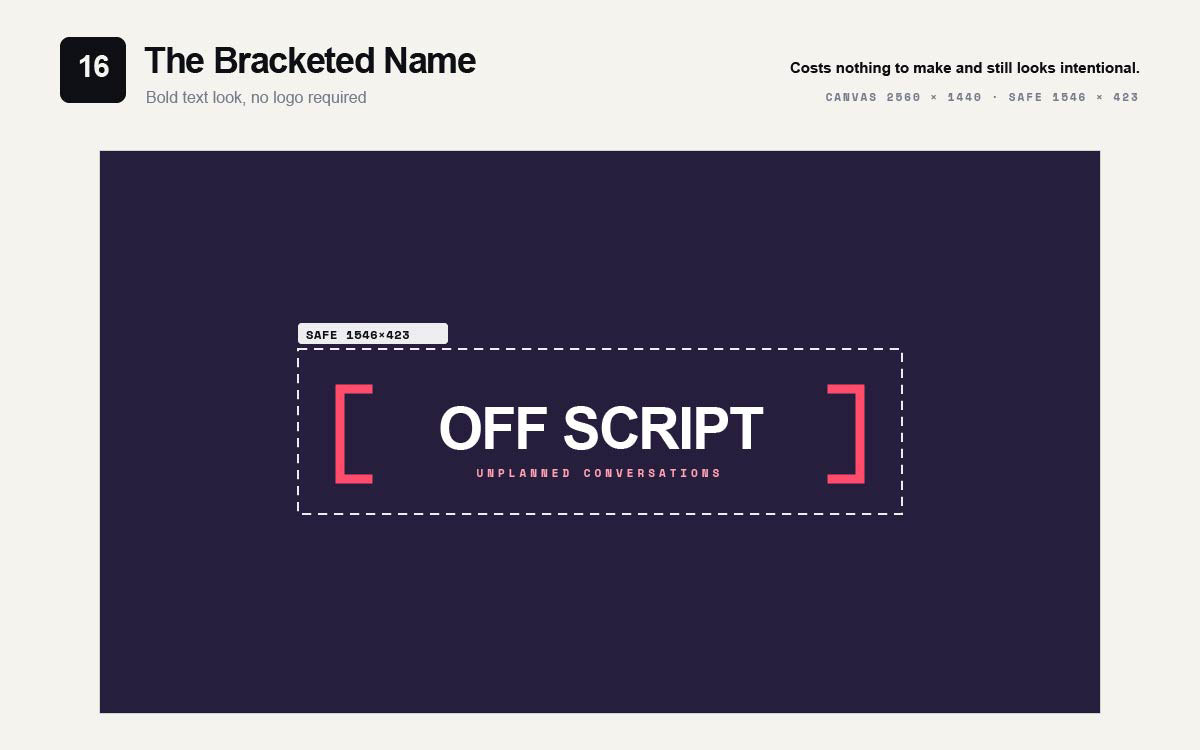
16. Bracketed name
Channel name sits in the center. Bold brackets, slashes, or lines frame it on both sides.
Best for: Channels wanting a bold text look, no logo needed.
Costs nothing to make. Still looks intentional.
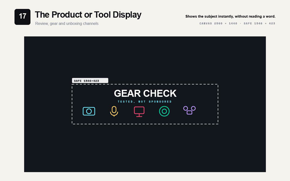
17. Product or tool display
Product silhouettes or tool icons line the lower safe zone. The channel name sits above them.
Best for: Review channels, gear-focused content, unboxing and testing.
Generic stock symbols hurt this layout fast. The whole point is instant subject recognition. Custom marks made through icon design read more clearly at safe zone scale. They can be reused across thumbnails and end cards.
Shows the subject instantly, without reading a word.
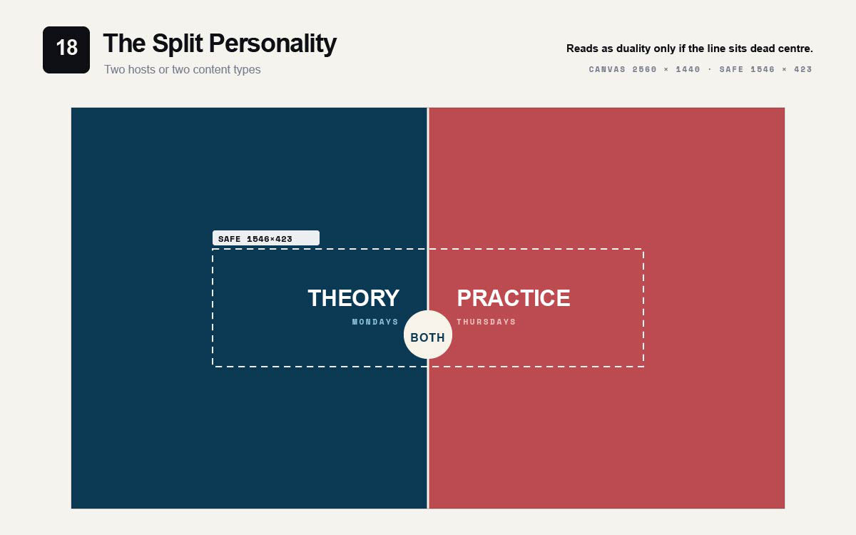
18. Split personality
A line splits the safe zone in half. Each side looks different. Two colours, two topics, or two hosts. The channel name sits on the line.
Best for: Channels with two content types or two hosts.
Shows duality well, but only if the line sits exactly in the centre.
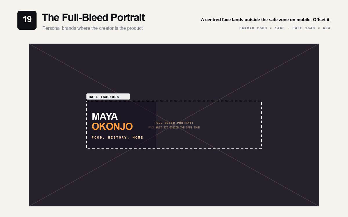
19. Full-bleed portrait
A big portrait fills most of the canvas. The subject's face sits inside the safe zone. The channel name sits in a corner of the safe zone.
Best for: Personal brands where the creator is the product.
Place the face with care. A centred portrait puts the face outside the safe zone on mobile.
20. Modular system
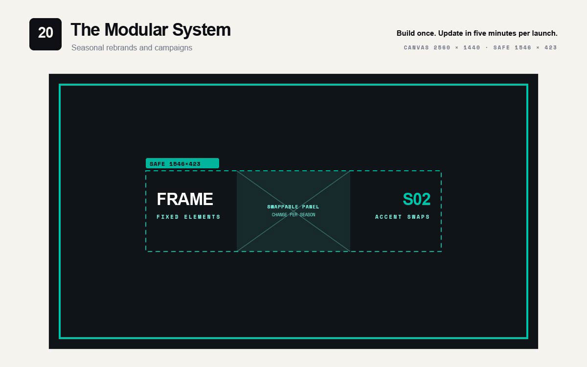
A fixed frame holds a swappable center panel. The frame, logo, and text stay the same. Only the image and accent color change.
Best for: Channels with seasonal rebrands or recurring campaigns.
Build once. Update in five minutes for each launch.
How to choose the right YouTube banner layout
Twenty best YouTube banner templates are more choice than any single channel needs. The right one is usually settled by four questions rather than by taste. Answer them in order and the field narrows to two or three candidates.
Beyond that point the difference between the remaining options is small enough that either will serve, and the time is better spent on execution than deliberation.
Does the channel have a logo worth leading with?
This is the first fork. It is not about pride. A logo earns the hero spot only if people already know it, or if it stands out enough to learn. A known channel should lead with its name. Recognition is its strength. A channel with few subscribers should lead with what it offers. Strangers don't care about the name. They care what the channel covers.
What does a new visitor most need to know?
A visitor to your channel page has one question. The banner has about a second to answer it.
For an educational channel, they ask what they will learn. The value statement answers that.
For a channel with random uploads, they ask if new content is coming. The schedule layout answers that.
For a multi-topic channel, they ask what topics you cover. The three-column split answers that.
Find the question your audience is asking. Then pick the layout that answers it.
How does the audience actually browse?
Audience habits narrow things down too. This is easy to miss.
Tech, gaming, and finance viewers mostly use dark mode. A dark banner fits right into the interface. It does not fight a white block.
Many viewers find channels through mobile search. They only see the safe zone. They never see the wide outer canvas. So a cinematic backdrop wastes effort. Most viewers will not see it.
Face-led layouts build fast familiarity. This matters for commentary and coaching. It matters less for tutorials. There, the screen is the real subject.
Do you need a banner or a system?
A channel that never changes needs one solid banner. A channel with seasonal campaigns, new series, or collaborations needs a flexible design. The frame stays the same. Only a panel and accent colour change.
Planning this system early takes extra thought once. But it saves a full redesign every quarter.
Planning it late means rebuilding an identity viewers already knew. That mistake costs more.
The table below collapses those four questions into a starting point by channel type. Treat the suggestions as a shortlist rather than a prescription.
Channel Type
What Usually Matters Most
Start With These Layouts
Established brand or network
Recognition of the existing mark
Centered Wordmark, Logo Lockup consistency, Bracketed Name
New or growing channel
Explaining the niche fast
Value Proposition Statement, Big Subscribe Arrow, Stat Bar
Educational or tutorial
What the viewer will learn
Value Proposition Statement, Three-Column Split, Minimal Type Grid
Build the best YouTube banner templates by designing inside the 1546 x 423 safe zone first, then expanding the canvas to 2560 x 1440 around it. Check for profile picture overlap in the lower left, then verify the design on phone, computer, and TV before publishing.
For channels making these along with thumbnails and end cards regularly, it helps to know what social media design costs. This helps you decide: build the system once, or rebuild it every season.
Step 1. Design inside 1546 x 423 first
Open a canvas at this exact size. Put everything here: channel name, tagline, schedule, icons. If it does not work in this space, it will not work at all.
Step 2. Expand the canvas to 2560 x 1440
Grow the canvas around your design. Do not scale the design up. Keep it centred, starting about 507 pixels from the left and 508 from the top.
Step 3. Fill the outer region with croppable content only
Use photos, gradients, or patterns here. Do not put text or key details in this space. Most viewers will never see it.
Step 4. Check the profile picture overlap
The round profile picture covers the lower left area on desktop. Make sure it does not block the channel name or other key elements.
Step 5. Verify on three devices
View the channel on a phone, a computer, and a TV if you can. The phone view matters most. It shows only the safe zone.
YouTube banner template FAQs
Questions about the best YouTube banner templates mostly come down to one gap. You design on a 2560 x 1440 canvas. But people only see the 1546 x 423 safe zone. These FAQs cover exact sizes, safe zone placement, mobile cropping fixes, content tips, and how often to change your banner.
A YouTube banner size should be 2560 x 1440 pixels, in a 16 by 9 ratio. The smallest size allowed is 2048 x 1152 pixels. Files can be up to 6 MB. Upload full size for sharp 4K screens. Use RGB colour, JPG or PNG.
The YouTube banner safe zone is a 1546 x 423 pixel box. It sits in the middle of the 2560 x 1440 canvas. It starts 507 pixels from the left and 508 from the top. This is the only part shown everywhere. Keep text, logos, and calls to action inside it.
Your banner gets cut off on mobile because YouTube crops it. On phones, only the middle 1546 x 423 pixels show. Anything outside that box gets removed. Keep important elements inside the safe zone. Use the outer canvas just for background.
A YouTube banner should show your channel name or logo. Add a short tagline about your content. You can also add an upload schedule. That is usually all that fits well inside the safe zone. Extra handles or graphics make it look cluttered.
To make a YouTube banner that works on all devices, design on a 1546 x 423 canvas with all key elements. Then expand it to 2560 x 1440, keeping everything centred. Fill the outer space with background images that can crop safely. Check your channel on phone, desktop, and TV.
Yes, but always check the safe zone yourself. Many YouTube channel art templates put text outside the centre box. That text disappears on mobile. Add a centred 1546 x 423 guide box. Make sure every readable element fits inside before you export.
Indirectly. The banner alone will not make someone subscribe. But it is the first thing visitors see. In about one second, it shows if your channel fits what they want. If it does not, they leave and keep searching.
Update your banner when your content, schedule, or focus really changes. Do not update it on a fixed schedule. Changing it too often hurts recognition, since recognition needs repetition. For seasonal campaigns, use a layout where only the middle panel and colour change.
Endnote
The best YouTube banner templates prove themselves when someone checks the channel on their phone. The name should stay whole, not cut off by a hidden crop. The safe zone rule works for all twenty layouts. But knowing the rule is not the same as actually following it every time.
That consistency is where channels usually slip. A banner, thumbnails, end cards, and profile picture all need to survive the same crop. They should also look like one matching set. Graphic Design Eye's unlimited design subscription gives your channel a dedicated designer to build your banner to the exact safe zone spec. Our experts match it with your thumbnails and end cards. They adjust everything fast when your schedule or season changes. Your channel identity stays consistent instead of drifting apart.
If the channel has no clear identity, that's a separate problem worth naming. Look for branding design agencies that give you a full reusable system. It should cover banners, thumbnails, and end cards together.
A channel worth watching should look like one before the first video even loads.
Graphic Design Eye LLC is a full-service creative agency built for brands that demand more than design — they demand vision. From strategic branding to complete visual identity, we partner with startups, agencies, and growing businesses as a dedicated creative force. With flexible subscription and project-based models. Let's start with us today!