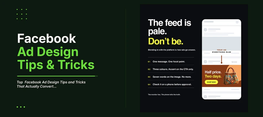
Facebook ad design tips and tricks address a few decisions that determine whether a campaign converts or quietly drains budget. Design for mobile first. Use bold contrast to stand out from the pale feed. Stick to one message per ad. Use only two or three colors. Make separate versions for each ad placement. Don't let the platform crop your ad for you.
The targeting was right. The audience was solid. The offer was good. The budget was enough. Still, the cost per result made the whole channel look bad.
Somewhere in the report, there's a reason. It's rarely the audience. Facebook's targeting has gotten very good. The algorithm finds the right people better than manual targeting ever did. But it can't make a boring image stand out. When two advertisers reach the same person with the same offer and bid, the one with better creative wins the scroll. The other pays for an ad nobody really saw.
The following discuss the Facebook ad design best practices that separate those two results. Plus the exact specs for each placement. The common mistakes that quietly raise cost per result. And answers to last-minute launch questions. None of this needs a bigger budget. Most of it just needs a different choice. So, keep reading.
15 Facebook ad design tips and tricks
Facebook ad design tips and tricks follow fifteen key rules. Design for mobile screens. Use contrast to stand out in the feed. Keep colors limited. Show human faces first. Match your design to the funnel stage. Let’s have a detailed look at these practical strategies for how to design Facebook ads that deliver results.
Tip 1: Design for the thumb, not the monitor
Most people use Facebook on their phones, not computers. So an ad you design on a big screen will actually show up as small as a playing card.
Data from Statista, based on DataReportal and We Are Social, shows about 98 percent of Facebook users are on mobile. Around 82 percent use only their phones. That second number matters most. Those users will never see a desktop version of your ad. Even if the numbers change slightly, this design rule stays the same.
So always check how your design looks at real mobile size. Headlines that look fine on a big screen can become unreadable on a phone feed. Small details in photos vanish. A logo that looks fine at 4 percent of the canvas turns into a blurry smudge.
APPLY IT
Export the ad. Open it on your phone. Hold it at normal reading distance. If you cannot read the headline in two seconds without squinting, the type is too small. The design is too busy.
The monitor lies. The phone tells the truth.
Tip 2: Break the feed pattern with deliberate contrast
Facebook's interface is white, light grey, and blue. An ad in soft neutrals or corporate blues blends into the platform and the posts around it.
Pattern interruption is what stops the scroll. Bright colours against the pale Facebook background, odd angles, strong contrast between subject and background, and bold text all create a break the eye catches before the viewer even decides to look. This is also why most social media post design ideas work. But paid ads need to work harder, since people trust them less at first.
APPLY IT
Put your ad mockup inside a real Facebook feed screenshot before you approve it. If it blends in with other posts, boost the saturation and contrast until it stands out.
An ad can look nice on its own. But if it blends into the feed, it fails its one real job.
Tip 3: Use one message, one focal point, one action
Most Facebook ad design tips and tricks fail through unplanned ads. They try to pack three benefits, two offers, and a brand story into one square image.
A viewer decides to engage or scroll in about two seconds. That's enough time for one idea to land. Three ideas land as no idea. The eye doesn't know where to start. The brain gets mixed signals it can't sort out in time.
APPLY IT
Write one sentence the ad must say before opening any design tool. Anything that doesn't support that sentence gets cut, moved to the primary text, or saved for another ad.
If you can't say your ad's message in one sentence, viewers won't get it in two seconds.
Tip 4: Limit the palette to two or three colours
Ads with two or three colours usually work better than ads with more. A small colour set creates clear visual order and guides attention on purpose.
Three colours let you set a main background, a supporting brand colour, and one bold accent just for the call to action. Six colours make everything compete, so the CTA can't stand out.
APPLY IT
Use the 60/30/10 rule. 60 percent main colour, 30 percent secondary, 10 percent accent. Use the accent only on the one thing you want clicked. Don't use it anywhere else in the ad.
Restraint isn't a limit. It makes the click target clear.
Tip 5: Lead with a human face where the product allows
Human faces grab more attention than anything else in an image. This is a well-proven fact in visual perception. It works the same way on Facebook as everywhere else.
The face should look straight at the viewer. This builds connection. Or it should look toward the product or CTA. This guides the viewer's eyes there too. Faces looking away pull attention from your message.
APPLY IT
If a face fits the product, use a real one, not obvious stock photos. Pick someone who looks like your target audience. Point their eyes toward the CTA.
Eyes look at faces first. So point the face toward what you want noticed next.
Tip 6: Keep text overlay minimal and weighted for legibility
Meta dropped the strict 20 percent text rule. But the core idea still holds: image-led ads with light text usually perform better than text-heavy ones.
Keep image text short, like a headline. Save details for the primary text field above the ad. Facebook can read that text aloud. Screen readers cannot read text baked into images. Images with heavy text also look worse in feeds.
APPLY IT
Keep text on the image to about seven words. Make the headline bold and big enough to read at 40 percent size. Put everything else in the text and description fields.
The image makes people stop. The words make them click. Don't ask the image to do both.
Tip 7: Design every ad in all required placements simultaneously
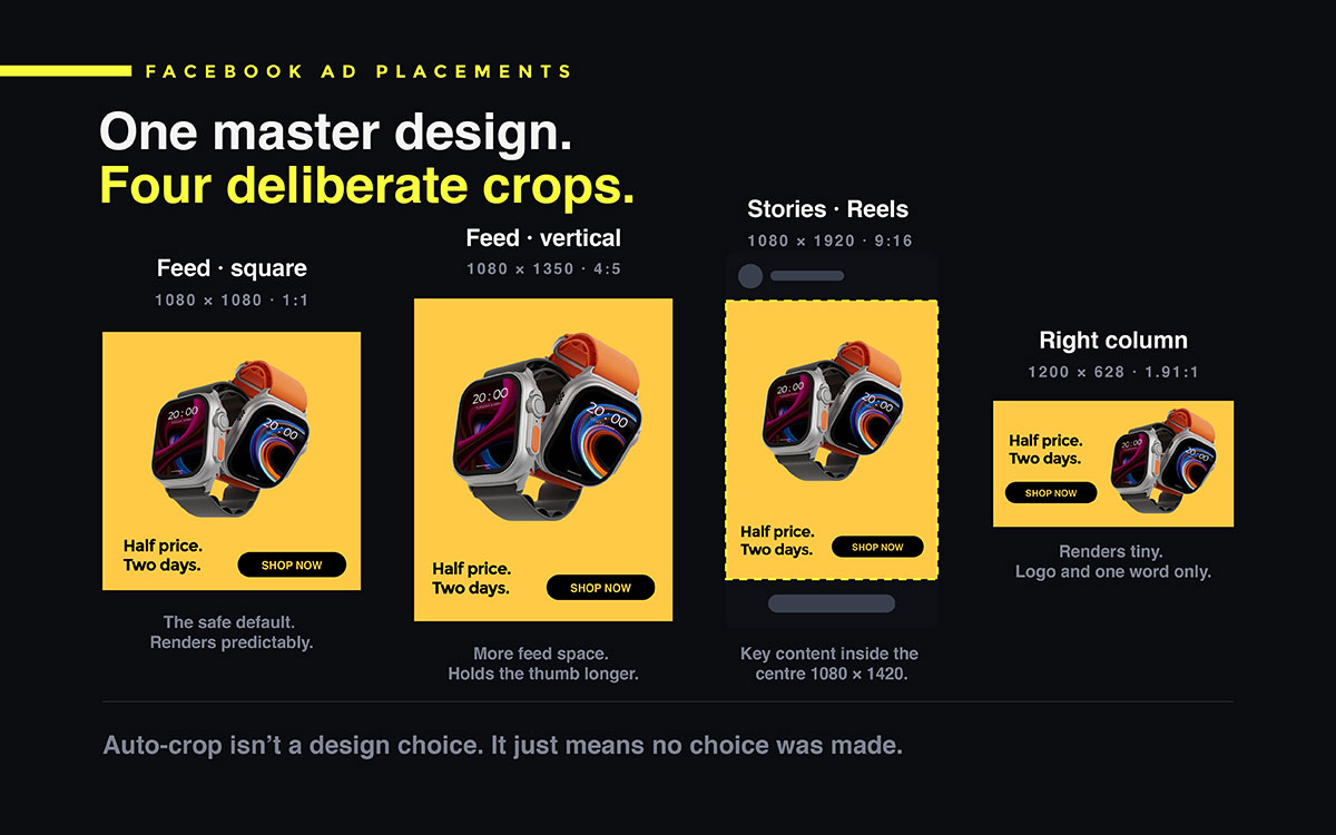
One ad appears on Facebook feed, Instagram feed, Stories, Reels, and the right column. Each spot crops the ad differently. It should be avoided if you want to follow Facebook ad design tips and tricks accurately.
If you make a square image and let Facebook auto-crop it for Stories, headlines get cut off. Focal points end up off centre. The Stories format crops square images hard. It often removes the CTA completely. When ordering social media design, list every placement you need in the brief. Don't just give the main ratio. Making extra versions early is cheap. Finding one missing after launch costs more.
APPLY IT
Build one master design. Then export different Facebook ad sizes from it: 1080 x 1080 for feed posts, 1080 x 1350 for the taller feed spot, and 1080 x 1920 for Stories and Reels. Keep all key content inside the center 1080 x 1420 safe zone.
Auto-crop isn't a real design choice. It just means no choice was made.
Tip 8: Make the value proposition visible without reading the copy
Assume viewers won't read the main text. Most won't. The creative alone must show what's offered and why it matters.
This needs no words. A before and after photo shows change. A product in use shows function. A price shown visually shows the offer. The image should carry meaning on its own.
APPLY IT
Show the ad to someone who doesn't know the campaign. Hide the copy. Ask what is being offered. If they can't answer, the creative isn't communicating. It's just decoration.
The design must work by itself. Words are just a bonus.
Tip 9: Test creative variations systematically, one variable at a time
Creative choices affect performance more than audience choices. But most advertisers test audiences a lot. They barely test creativity
Good creative testing changes one thing at a time. Same layout, different background colour. Same image, different headline. Same message, but photo versus illustration. Change three things at once, and you get a winner. But you learn nothing useful from it.
APPLY IT
Make three versions of each campaign. Change only one thing in each. Test them on the same audience. See which change works best. Use that change as your new starting point next time.
A test that changes everything teaches nothing. A test that changes one thing builds up into a real advantage.
Tip 10: Match creative to funnel stage
Cold audiences and retargeting audiences need different ads. Using the same ad for both wastes their strength.
Cold traffic has never heard of the brand. The ad needs to show what the product is and why it matters. Retargeting audiences already know this. They respond better to offers, urgency, social proof, and product details. These details mean nothing to a cold viewer.
APPLY IT
Build at least two creative sets per campaign. One is a discovery set. It leads with the problem or the change it brings. The other is a conversion set. It leads with the offer, the guarantee, or the number of reviews.
Ads can't introduce a brand and close a sale at once. Stop expecting that.
Tip 11: Use motion where the placement rewards it
Video and animated content grabs attention in a feed better than still images. Stories and Reels are made for motion.
Motion does not need a big budget. A product photo with a small animated touch, a text reveal, or a simple three-frame sequence beats a still image in most placements. It also costs much less than full video production.
This kind of simple motion design is usually the cheapest way to boost performance for an account that has only used static creative.
APPLY IT
Add movement to one version in every test set. Make the first frame work alone, since many viewers scroll past before seeing more.
The first frame must earn the second one. Treat it like the whole ad.
Tip 12: Design the thumb-stop frame deliberately for video
People often judge video ads by the first frame. It shows as a still image before playback and after you scroll past it.
If the first frame is a logo, a black screen, or a slow opening shot, it wastes the ad's best moment. The first frame should be the most eye-catching moment rather than the story's actual start.
APPLY IT
Pick the best frame in the video. Move it to the start or set it as the thumbnail. Never open on a logo or a fade from black.
No one watches a video's second second if the first second fails to earn it.
Tip 13: Include social proof as a visual element
Reviews, star ratings, customer photos, and press logos work better in the creative itself, not just the copy.
A five-star rating with a review count is a quick trust signal. People understand it without reading. It answers the viewer's doubts before they even form.
APPLY IT
Add a small social proof element to at least one variant per campaign. Use a star rating with review count, a customer count, or a known press or partner logo.
Trust is part of design. Give it space in your layout.
Tip 14: Design for sound-off viewing by default
Most people watch social videos on mute. So an ad that relies on sound tells most viewers nothing.
Captions aren't just an accessibility add-on for Facebook video ads. They carry the actual message. A video ad without captions is like a silent film with no title cards.
APPLY IT
Add captions directly into every video ad instead of relying on platform auto captions. These are inconsistent and sometimes turned off. Use the brand font for captions. Keep the size easy to read on mobile.
Captions carry the message. Sound is just extra.
Tip 15: Refresh creative before fatigue sets in
Facebook ad creative tips won’t work if you show the same ad to the same people again and again. Clicks drop. Cost per result goes up. This is called creative fatigue.
You can spot it before it gets costly. Frequency climbs past about 3. Click-through rate falls each week, even with steady spend. Cost per result rises, even with no changes to targeting or bids.
Rotation plan. Treat creative like an ongoing production line, not a one-time project. Keep this in mind: what social media design costs against the cost of running a tired ad for two more weeks.
APPLY IT
Check frequency and click-through rate every week. Design and approve the next creative variant before the current one fatigues. This way, you swap on schedule, not during a performance emergency.
Design your next ad while the current one still works.
Facebook ad placement specification table
Facebook ad design tips and tricks require ad placements in different dimensions and design treatment. Feed, Stories, Reels, Right Column, Carousel, video, and Instant Experience formats range from square 1080 by 1080 pixels to full vertical 1080 by 1920 pixels. The table below lists exact sizes, aspect ratios, and placement-specific design notes for each.
Placement
Recommended Size
Aspect Ratio
Design Note
Facebook Feed (square)
1080 x 1080 px
1:1
The safest default. Renders predictably across devices and placements.
Facebook Feed (vertical)
1080 x 1350 px
4:5
Occupies more vertical feed space than square, which holds the thumb longer.
Facebook Stories
1080 x 1920 px
9:16
Keep all content inside the central 1080 x 1420 safe zone.
Facebook Reels
1080 x 1920 px
9:16
The right edge is reserved for interface controls. Keep the CTA clear of it.
Right Column
1200 x 628 px
1.91:1
Renders very small. Logo and one word only, or it will not read at all.
Carousel card
1080 x 1080 px
1:1
Design cards to read in sequence, not in isolation from one another.
Video (feed)
1080 x 1080 px
1:1 or 4:5
Design the first frame as a standalone image, since many viewers see only that.
Video (Stories / Reels)
1080 x 1920 px
9:16
Burn-in captions and assume the sound is off for most of the audience.
Instant Experience
1080 x 1920 px
9:16
Full screen after the click. Design it as a landing page, not as an ad.
THE 9:16 SAFE ZONE RULE
Facebook Stories, Facebook Reels, Instagram Stories, and Instagram Reels all use a 1080 x 1920 pixel canvas. The platform adds its own interface on top. Keep key content, like the headline, product, logo, and call to action, inside the center 1080 x 1420 area. Content in the top or bottom 250 pixels may get covered by the profile header, caption, or CTA button.
5 Facebook ad design mistakes that raise your cost per result
Five design mistakes quietly raise Facebook ad costs. Designing at full resolution without checking how it looks in the feed. Using dull corporate colors. Cramming multiple offers into one ad. Letting the platform autocrop for every placement. Running the same ad until it stops working. Each mistake can be fixed before launch.
Mistake 1: Designing at full resolution and never checking at feed scale
The ad looks balanced on a large monitor. On a phone, the headline is unreadable. The product looks like a smudge.
The truth: Facebook ads get seen at a fraction of their design size. If you never check it at real size, you never really checked it.
The fix: Export the ad. View it on a real phone before approval. Make this step required, not optional.
Mistake 2: Using muted, corporate colour palettes
The ad uses soft greys and blues like the brand website. It blends into the Facebook feed completely.
The truth: Blending in is not the goal. The feed is your competition. Matching its colors makes you invisible.
The fix: Boost saturation and contrast for paid social. A good brand identity system plans for this. It sets a bold paid social palette next to the core colors. That way, you never have to choose. Brand consistency sets the colors. Placement sets the intensity.
Mistake 3: Cramming multiple offers into one creative
One square image crams in three products, two discount codes, and a seasonal message, all at once. The campaign tries to do too much.
The truth: You only get two seconds of attention. That supports one idea. Too many offers cause confusion and a scroll past.
The fix: One offer per ad. Make separate ads for separate offers. Let the campaign carry the complexity, not the ad.
Mistake 4: Letting the platform auto-crop for every placement
You upload one 1:1 image. Facebook auto-crops it for Stories, Reels, and the right column.
The truth: Auto-crop often cuts off headlines and CTAs on vertical placements. So many impressions show a broken asset.
The fix: Export separate versions for each placement. It takes minutes and saves your ad spend.
Mistake 5: Running the same creative until performance collapses
The ad does well at first. It runs unchanged for three months. Then cost per result doubles.
The truth: Creative fatigue is easy to predict and measure. Waiting too long means paying more for weeks.
The fix: Check frequency and click-through rate weekly. Rotate creative on a schedule, not during a crisis.
Facebook ad design FAQs
These questions come up once you understand all the Facebook ad design tips and tricks. The budget is approved. Now someone must make a real production decision before launch. Each answer gives a clear instruction first. Then it explains the reasoning.
A good Facebook ad shows one message, one visual focus, and one call to action. It uses two or three colours that stand out against Facebook's pale background. Text on the image should be about seven words. Design for mobile first, since most people use Facebook on their phones. It should stop a scroll within two seconds.
Feed ads should be 1080 x 1080 pixels for square, or 1080 x 1350 pixels for vertical. Stories and Reels ads should be 1080 x 1920 pixels, with key content inside the 1080 x 1420 safe zone. Right column ads use 1200 x 628 pixels and appear very small.
Keep image text to about seven words or fewer. Put detailed explanations in the primary text field above the ad. That text is selectable and accessible, not baked into the image. Ads with little text usually get more engagement and cost less per result than text-heavy ones.
Refresh your ad creative before people get tired of it. This usually means when frequency goes above about 3, or when click-through rate drops week after week at steady spend. Check both numbers weekly. Have your next version ready and approved so you can switch on schedule, not after costs rise.
Yes. Human faces grab more attention than most visuals and boost engagement when they fit the product. The face should look straight at the viewer to build connection, or toward the call to action to guide the eye. If the face looks away from the message, it pulls attention from what matters.
No. Meta dropped this as a strict rule, so ads are no longer rejected or limited for having more text. But the idea behind it still holds. Image-led ads with short headlines tend to beat text-heavy ones, since dense text is hard to read on a phone.
Neither always wins. Test both in every campaign. Video usually grabs attention better in feed and fits naturally in Stories and Reels. Static images are quicker and cheaper to make different versions of. A small animated touch on a still image often gives much of video's benefit for far less cost.
Run at least three versions per campaign, each changing only one thing from the original, shown to the same audience. Fewer than three won't teach you much. Changing many things at once gives a winner but no clear lesson, which is why creative testing often fails to improve results over time.
Endnote
These Facebook ad design tips and tricks are a set of decisions made on purpose instead of by default. That distinction is the entire gap between creative that earns the scroll stop and creative that quietly burns spend. But knowing the rules is not enough. You need to build the actual versions, in the right sizes, before launch.
Sometimes the problem goes deeper than one campaign. Usually the brand identity itself gives paid social nothing bold to work with. That is a separate issue. It deserves its own project.
Top branding design agencies know this. They build a palette that works on a feed, not just a letterhead.
If your team is ready to stop trusting auto crop, Graphic Design Eye LLC's unlimited design subscription gives you a full placement set from one master design: feed, vertical feed, Stories, Reels, carousel, and right column. Each one is exported to spec and checked for safe zones. So every impression shows real design, not a cropped guess.
Take your next campaign brief and compare a proper placement set to last month's results. The best advertisers do not have the biggest budgets. They just stopped letting the platform crop their best ideas by default.
Somewhere, a competitor is still trusting the auto crop. That gap is yours to take.
Graphic Design Eye LLC is a full-service creative agency built for brands that demand more than design — they demand vision. From strategic branding to complete visual identity, we partner with startups, agencies, and growing businesses as a dedicated creative force. With flexible subscription and project-based models. Let's start with us today!