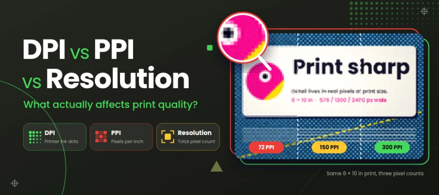
Looking for a way to clear up the DPI vs PPI vs resolution confusion? Resolution is your image's total pixel count, PPI is how tightly those pixels sit on paper, and DPI is how many ink dots your printer lays down. A file labeled 300 DPI can still print blurry when it lacks enough pixels for the print size. Check your pixel dimensions at the final print size before anything else.
Suppose you design a beautiful flyer and save it at "300 DPI," just like the printer asked. Off it goes, and you feel proud. Then the prints come back blurry, with soft text and jagged logo edges.
So, what went wrong?
Printers ask for one term, clients use another, and even design software mixes up the labels. DPI, PPI, and resolution get tossed around as if they mean the same thing, so designers, print-on-demand sellers, and small business owners end up guessing which setting to fix.
In reality, each term has its own job. PPI tells you how tightly your image's pixels are packed on paper. DPI tells you how many ink dots your printer lays down. And resolution is your image's total pixel count, like 3000 × 2400 px.
Don’t worry, you don’t have to sort it all out by yourself.
In this guide, we'll explain what DPI, PPI, and resolution mean and what affects print quality, so by the end you will know how each term works and know how to prepare a file that prints sharp.
Ready to see the pixels up close? Keep reading!
DPI vs PPI vs resolution
DPI, PPI, and resolution each belong to a different stage of printing. Resolution lives in your file, PPI ties it to a print size, and DPI lives in the printer. Epson's Expression Photo line prints up to 5760 × 1440 optimized DPI, yet printing companies still ask for 300 PPI images.
This DPI vs PPI vs resolution comparison shows who controls what, so you know which setting to fix.
Come on in!
Factor
DPI
PPI
Resolution
Stands for
Dots per inch
Pixels per inch
Pixel dimensions (W×H)
Applies to
Printers, scanners, output devices
A digital image mapped to a physical size
The digital file itself
Unit
Ink/toner dots
Image pixels
Total pixels / megapixels
Who controls it
Printer hardware and print mode
Designer (Image Size settings)
Camera, scan, export or artboard size
Changes detail?
Affects dot smoothness and tone
Only if resampling adds or removes pixels
Yes, sets maximum detail
Typical values
300–5760 DPI (printer)
72–300+ PPI
e.g., 2400 × 3000 px
Common mistake
❌ Using it to describe image files
❌ Changing it without resampling and expecting sharper prints
❌ Upscaling small images and expecting new detail
DPI, PPI, and resolution: 72 vs 150 vs 300 PPI at the same print size
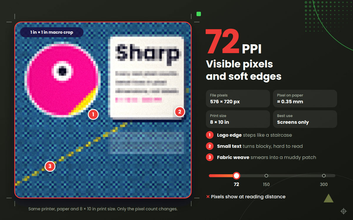
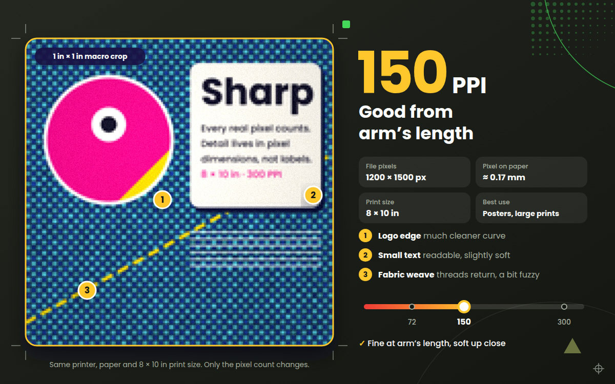
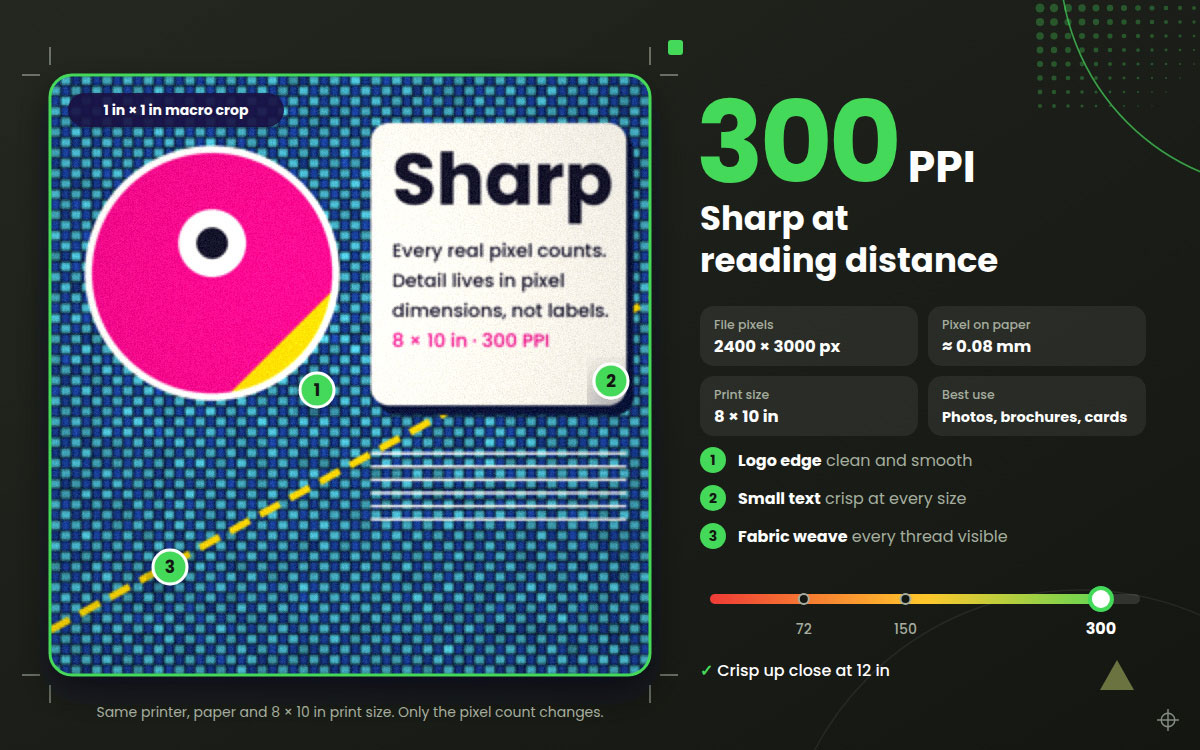
At the same 8 × 10-inch print size, PPI determines how large each pixel appears on paper. Pixels at 72 PPI measure about 0.35 mm and show up at reading distance. At 150 PPI, they shrink to 0.17 mm, and at 300 PPI to roughly 0.08 mm, finer than the eye can separate at 12 inches. This DPI vs PPI vs resolution crop test shows how pixel size shapes print sharpness, so you can choose the right PPI.
Test setup
To keep it fair, we changed only one thing: the pixel count. Everything else stayed the same.
Source photo: One image packed with fine detail: fabric texture, small text, and a crisp logo edge.
Print size: Fixed at 8 × 10 inches, using the same printer, print mode, and paper.
Capture: Each print was photographed with a macro lens under the same light. Then we cropped the same 1-inch area side by side.
Here's a quick summary of what each crop showed:
Panel
Pixel size
Effective PPI
Result
Best use
Crop 1
576×720 px
72
❌ Visible pixels, blocky text
Screens only
Crop 2
1200×1500 px
150
✅ Good from arm's length
Posters, large prints
Crop 3
2400×3000 px
300
✅ Crisp up close
Photos, brochures, business cards
Crop 4
576×720 px relabeled/upscaled
"300"
❌ No real detail added (AI: mixed)
Emergency fixes only
Crop 5
2400×3000 px
300
Varies by paper and print mode
Test before large runs
Now let's read in detail.
Crop 1: 72 PPI – Visible pixels and soft edges
Well! This is where things fall apart. Diagonal lines look like tiny staircases. Small text turns blocky and hard to read. The fabric texture is almost gone, just a smooth, muddy patch.
At 72 PPI, you can see each pixel at normal reading distance. So 72 PPI files are for screens only.
Crop 2: 150 PPI – Good from arm's length
Big jump! The text is readable, and the logo edge looks much cleaner. Hold the print at arm's length, and most people won't spot a problem.
But up close, you'll notice a slight softness. So 150 PPI suits posters and large prints viewed from a few feet away. A brochure someone holds? Not quite enough.
Crop 3: 300 PPI – Sharp at reading distance
Now we're talking! Text looks crisp, the fabric weave shows every thread, and the logo edge is clean and smooth.
This is why 300 PPI is the standard for photos, business cards, and brochures. When Apple introduced the Retina display, Steve Jobs said the human eye stops picking out individual pixels at about 300 pixels per inch at 10 to 12 inches. For most handheld prints, you won't see much gain beyond 300 PPI because your eyes can't pick up the extra detail.
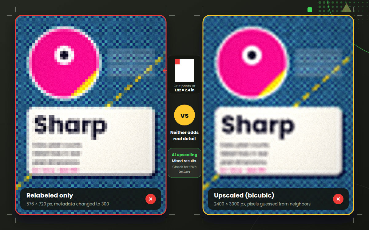
Crop 4 (Bonus): 72 PPI file relabeled or upscaled to 300 PPI
Here's the trap many people fall into. You take a 72 PPI file, type "300" into the resolution box, and hit save. So, is the problem solved?
Nope!
If you only change the number without resampling, the pixels stay the same. The file just prints smaller. Standard interpolation fills in new pixels by guessing from their neighbors. It looks smoother, but no real detail comes back.
AI upscaling tools can do better. They can sharpen edges and rebuild some texture. Be careful though, since they sometimes invent texture that was never there. Always check the output closely before printing.
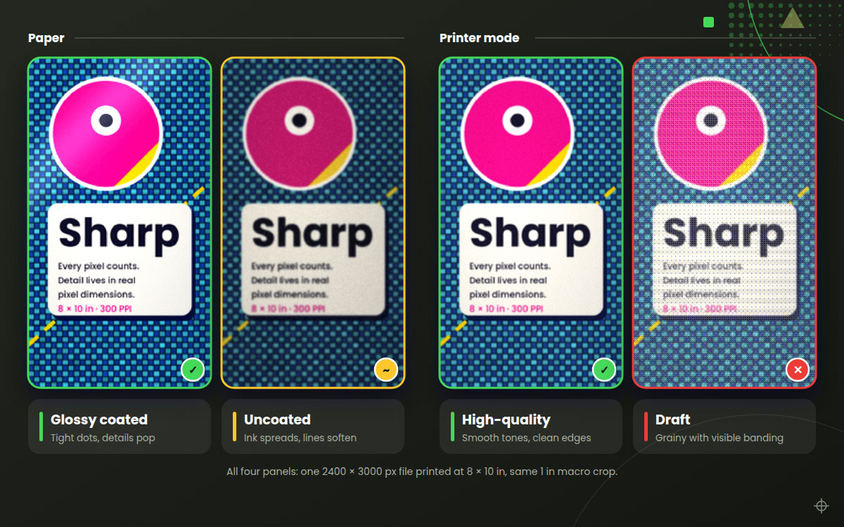
Crop 5 (Bonus): Same 300 PPI file on different paper or printer mode
Same file. The same 300 PPI. Different results!
On glossy-coated paper, the dots stay tight, and details pop. Uncoated paper lets ink spread a little, so fine lines go softer. Switch the printer to draft mode, and the result gets grainier too.
This proves one point. Your file is only part of the story. Printer DPI and paper choice also affect the final look.
What actually affects print quality?
Eight things affect print quality. They are pixel dimensions at print size, viewing distance, printer type, paper, file format, color mode, sharpening, and artwork type. Pixel dimensions matter most, followed by viewing distance, because both decide how much detail a viewer can see. Some factors change how sharp a print looks, while others change how its colors appear.
This guide to what affects print quality explains each factor, so you can spot which one is holding your prints back.
1. Pixel dimensions and effective PPI
Our crop test showed it clearly. Using the exact same printer and paper, simply increasing the pixel count transformed the results from blurry to razor sharp.
"Effective PPI" is your image's pixel width divided by the final print width. If a 2400-pixel-wide image prints at 8 inches wide, your effective PPI is 300. Stretch it to 16 inches, and it drops to 150. Always check this number at the size you'll actually print.
2. Viewing distance
Nobody reads a billboard from 12 inches away, right? The farther away people stand, the fewer pixels you need. Here's a handy rule of thumb, based on the roughly 1-arcminute limit of normal human vision:
Required PPI ≈ 3438 ÷ viewing distance (in inches)
At 12 inches, that's about 286 PPI. At 10 feet (120 inches), it's only about 29 PPI! That's why giant banners look perfectly fine at surprisingly low resolutions.
3. Printer type and DPI
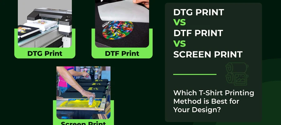
Every printer lays down dots in its own way. Inkjet printers spray tiny droplets. Laser printers fuse toner. Offset presses use halftone screens. And for apparel, DTG and DTF printers each handle ink differently on fabric.
A higher printer DPI helps create smoother tones and gradients. But it can't add detail your file doesn't have. Curious how each method works on fabric? Check out our guide on t-shirt printing methods.
4. Paper or substrate
Paper plays a bigger role than most people think. Coated, glossy paper holds ink dots tightly, so fine details stay sharp. Uncoated paper and fabric soak up ink, causing dots to spread. Printers call this "dot gain."
So if you're printing on uncoated stock or textiles, keep very fine lines and tiny text a little bolder than you would on glossy paper. Your future self will thank you!
5. File format and compression
A heavily compressed JPEG can ruin a perfectly sized image. Compression adds blocky artifacts and color banding, especially around text and sharp edges.
For print, stick with a print-ready PDF, a TIFF, or a maximum-quality JPEG. And try not to open and resave the same JPEG repeatedly. Each save squeezes out a bit more quality.
6. Color mode and profiles
Your screen shows colors in RGB, but most printers use CMYK. When your file gets converted, bright colors like vivid blues, greens, and oranges can look dull on paper.
To avoid this, ask your printer for their color profile and preview your design in CMYK before you send it. That way, nothing will surprise you.
7. Upscaling and sharpening
Output sharpening is a small step with a big payoff. Printed images look a bit softer than they do on screen, so a light sharpening pass helps bring back crispness.
Don't enlarge too much. Stretching a small image far past its native size makes its problems bigger. If the image is too small, find a larger source.
8. Vector vs raster artwork
Vectors are a secret weapon. Raster images are made of pixels, so they have a size limit. Vector artwork uses paths built from math, so it stays sharp at any size, from a business card to a billboard.
That's why logos and type should stay in vector format whenever possible. If your logo only exists as pixels, converting it to vector is a smart move.
How to calculate print size from image resolution
To calculate print size from image resolution, divide your pixel dimensions by the PPI you need. The answer is your print size in inches. That's it! No guessing, no trial prints, no wasted paper.
This one bit of math tells you, before you ever hit "Print," whether your photo can handle a postcard, a poster or a big banner. It works the other way too. Multiply your print size by the PPI to find how many pixels you need to shoot, scan, or export. Grab these two formulas and keep the cheat sheet below handy.
This section shows you how to calculate print size from image resolution, so you can confirm any image will print sharp at your chosen size:
Print size (in) = pixel dimension ÷ PPI
Pixels needed = print size (in) × PPI
Example 1: You have a 3600 × 2400 px image. Divide by 300, and you get a sharp 12 × 8 inch print.
Example 2: You want an 11 × 14 inch print at 300 PPI. Multiply, and you need 3300 × 4200 px.
Metric Tip: 1 inch = 2.54 cm. So an A4 page (21 × 29.7 cm) at 300 PPI needs 2480 × 3508 px.
Here's a quick cheat sheet for popular print sizes:
Print size
Pixels at 300 PPI
Pixels at 150 PPI
4 × 6 in
1200 × 1800 px
600 × 900 px
5 × 7 in
1500 × 2100 px
750 × 1050 px
8 × 10 in
2400 × 3000 px
1200 × 1500 px
11 × 14 in
3300 × 4200 px
1650 × 2100 px
A4 (8.27 × 11.69 in)
2480 × 3508 px
1240 × 1754 px
18 × 24 in
5400 × 7200 px
2700 × 3600 px
24 × 36 in
7200 × 10800 px
3600 × 5400 px
Selling products online too? Our guide to product image size requirements covers the screen side of the story.
DPI, PPI and resolution FAQs
These DPI, PPI, and resolution FAQs answer the doubts we hear most from designers and print-on-demand sellers. Each answer starts short and direct, so you find what you need fast. Got a quick question before sending your file to print? Start here. If you can’t find the answer below, contact us with any questions or tasks.
No. PPI is the number of pixels in a digital image. DPI is the number of ink dots a printer puts on paper. People often use them interchangeably, and when a print shop asks for "300 DPI," they usually mean 300 PPI at the final print size.
No. Changing the DPI or PPI number without resizing only changes the print size. It adds no detail. Quality depends on the real pixel size of your image. For a sharper print, you need more real pixels. A bigger number in the settings box won't help.
For prints viewed up close, yes. Photos, business cards, and brochures look best at 300 PPI. Large posters and banners viewed from a distance can look sharp at 100 to 150 PPI or even lower. Always think about how far away people will stand.
Rarely. At 72 PPI, individual pixels are visible at normal reading distance, so text and edges look jagged. It may only work for very large prints, such as banners, that people view from a distance. For everything else, aim much higher.
You need 2400 × 3000 pixels for a sharp 300 PPI print. The smallest size that still works is 1200 × 1500 pixels at 150 PPI. It looks fine at arm's length but a bit soft up close.
You can upscale it, but classic interpolation adds no real detail. It only smooths pixels. AI upscalers can improve the look, though results vary and may invent texture. Reshooting, rescanning, or vectorizing the artwork is always more reliable.
Prepare your artwork at 300 PPI at the actual print size, or supply vector files. This works well for DTG, DTF, and screen printing. Want the full process? Learn how to print t-shirts professionally.
Endnote
Finally, you've made it to the end of this guide!
Pixels, print sizes, and printer settings should feel a lot friendlier now.
When it comes to DPI vs PPI vs resolution, the whole story fits in a few lines. Resolution is the detail your file holds, PPI is how that detail spreads across the paper, and DPI is how the printer lays down ink. Divide your pixel dimensions by the PPI you need to find your print size, and check those pixels at the final size before anything else. Do that, and blurry prints stay off your desk.
Still stuck with a low-resolution logo, a blurry product photo, or a flyer that needs to be print-ready? Graphic Design Eye LLC can help. Our team handles print-ready design, image resizing, raster-to-vector conversion, and photo retouching, so your files look sharp on every surface. Contact us to get a free quote today.
Thanks for reading, and take care. Your crisp prints are just one file away.
Graphic Design Eye LLC is a full-service creative agency built for brands that demand more than design — they demand vision. From strategic branding to complete visual identity, we partner with startups, agencies, and growing businesses as a dedicated creative force. With flexible subscription and project-based models. Let's start with us today!