The top catalog design trends for 2026 are pulling print and digital closer together. Print is becoming more tactile, sustainable, measurable, and story-led. Digital catalogs are becoming more personalized, shoppable, AI-assisted, and structured for answer engines.
There is a moment when a well-designed catalog stops feeling like a sales tool.
A reader opens it just to browse. Then a product catches the eye. The layout makes sense. The images pull them in. One page leads to another.
Soon, browsing becomes interesting.
That is what good catalog design can do. It does not simply show products. It makes people want to keep looking.
For years, that attention was treated as sentiment rather than strategy. Print was difficult to measure, so budgets moved elsewhere. Now, the numbers tell a different story. A 2025 Harris Poll found that 68% of consumers find catalog shopping more relaxing than scrolling online.
The catalog is also no longer ending at the last page. A QR code can take a reader straight to a product page. Personalized content can change what different customers see. Product data can travel beyond the printed edition and help digital systems understand what is being sold. Nearly half of Gen Z consumers in the same survey said they scan QR codes or visit websites directly from catalogs.
So the interesting question is no longer whether catalogs belong in print or digital. It is what each format can do best, and how the two can work together.
In this article, we collect the top 10 trendy catalog design in 2026 so you can choose the ones that fit your brand and use them to make your next catalog easier to browse, easier to understand, and easier to buy from.
Let’s look at what is changing!
Top 10 catalog design trends
Choosing the right catalog design trends means knowing which changes will improve the next edition and which will only make it look current. Some trends can help readers find products faster, understand them better, or move from a printed page to a purchase. Others may look impressive but add little once the catalog reaches a customer's hands.
The list below ranks all ten by their practical impact on the finished catalog. Each trend gets a clear verdict, adopt or watch, so it is easier to decide where the budget belongs. Check the table first if the next edition is already in planning.
Let’s see which trends earn a place in the next edition.
#
Trend
What it changes
Applies to
Verdict
1
Storytelling-first catalogs
Structure moves from category order to narrative order
Layout and retouching time falls, art direction stays human
Both
Adopt
7
Sustainability as visible design
Stock, page count and run size become brand signals
Print
Adopt
8
Warm, tactile, imperfect visuals
Sterile minimalism gives way to texture and analogue cues
Both
Watch
9
Accessibility as a design standard
Contrast, type size and reading order become baseline
Both
Adopt
10
Catalog data built for answer engines
Product content is structured so AI systems can read it
Digital
Adopt
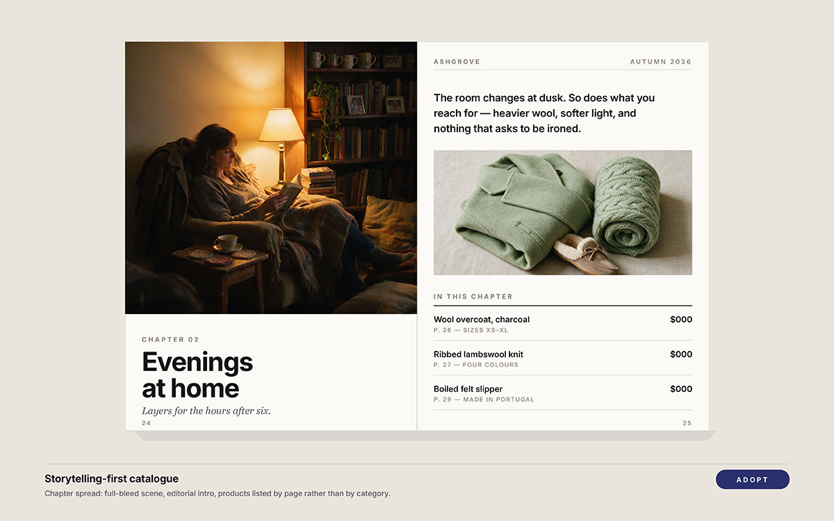
1. Storytelling-first catalogs that read like magazines
A catalog organised around chapters, seasons, or buying situations instead of product categories alone. Editorial spreads, product groupings, and visual transitions create a sequence that gives each section a reason to exist.
Product categories make sense when someone already knows what they want. They are less useful when the reader is still deciding what they want. That is where a storytelling-led catalog earns its place. Instead of showing 40 products and asking the reader to choose, it creates a context first, then introduces the products that belong there.
What to do about it: Start with the situations or stories the products can support. Build the page sequence around those ideas, then decide where each product earns its place. Let the strongest products carry important moments in the story rather than simply giving every SKU the same visual weight.
The risk: Too much editorial content can turn a catalog into a lookbook. Keep product names, specifications, prices, and ordering details easy to find.
Verdict: Adopt. A catalog should not only show what is available. It should help readers see why they might want it.
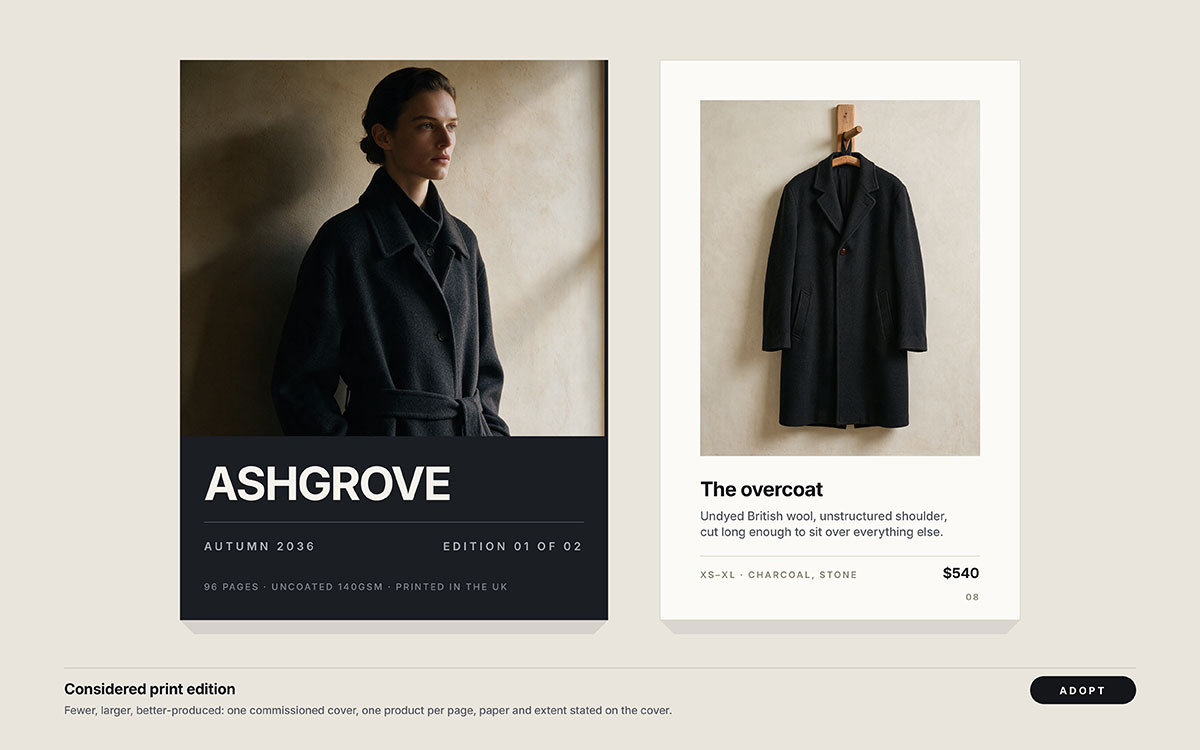
2. Print as the deliberately low-noise channel
Fewer, larger, better-produced print editions replacing frequent low-cost mailings. The catalog becomes a considered physical object rather than another promotion arriving in the mailbox.
The average inbox is crowded. Feeds move even faster. Print has a different advantage because it asks the reader to stop rather than scroll. The ANA Response Rate Report put average direct-mail response at roughly 4.4% in 2025, with house lists performing higher. If you are still weighing catalog vs. brochure, this is where the decision becomes practical: what deserves the physical format, and how often?
What to do about it: Mail less often, produce each edition better, narrow the list to qualified customers, and track responses with matchback reporting.
The risk: Premium paper cannot rescue a weak mailing list. Sending an expensive catalog to cold, unsegmented prospects simply makes the mistake more expensive.
Verdict: Adopt, but only when measurement is ready before the first press run.
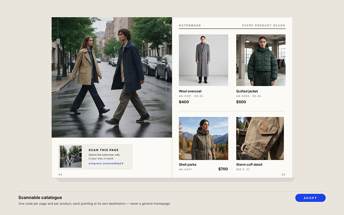
3. Hybrid print-to-digital bridges on every page
QR codes, personalised URLs, near-field tags, and short vanity links placed at product, category, or campaign level. Each one gives the printed page a trackable digital destination.
A catalog can sit on a table for weeks, but that does not mean its impact has to remain invisible. Page-level tracking shows which products and spreads actually send readers online. That puts print into the same reporting conversation as paid media instead of leaving its performance to guesswork.
What to do about it: Give every code a unique destination and track it by page, product, or campaign. A reader scanning one product spread should not disappear into a generic homepage.
The risk: A tiny code, a crowded placement, or a mismatched landing page can break the journey before it starts.
Verdict: Adopt. If the catalog cannot show what its pages are driving, every other print investment becomes harder to defend.
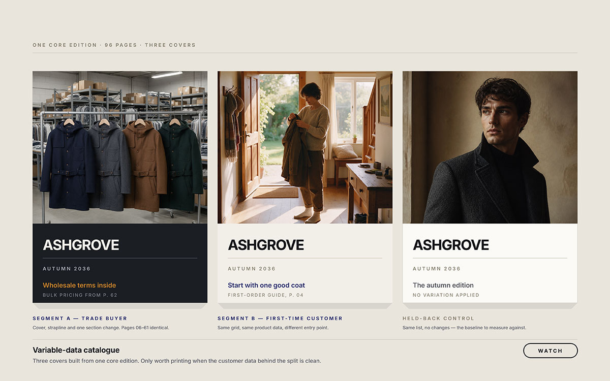
4. Personalised and variable-data catalogs
Catalogs where the cover, product selection, offers, or sections change for different customer segments. Each edition is built from the same core design but tailored to who receives it.
The same catalog does not need to speak to every customer in exactly the same way. A trade buyer may care about different products than a first-time customer. Variable data printing now makes those differences practical across a single print run, without creating an entirely separate catalog for every segment.
What to do about it: Start with two or three clear segments. Change the cover and one key section while keeping the core catalog consistent. Then measure whether the tailored version actually improves response. Keep product data clean before it reaches the page, because catalog personalization depends on reliable product data.
The risk: Personalization makes bad data more visible. A generic catalog may feel impersonal. A personalized catalog showing the wrong products feels careless.
Verdict: Watch unless customer data is already clean and segmented. If it is, test personalization on a small run first.
5. Shoppable digital editions and interactive flipbooks
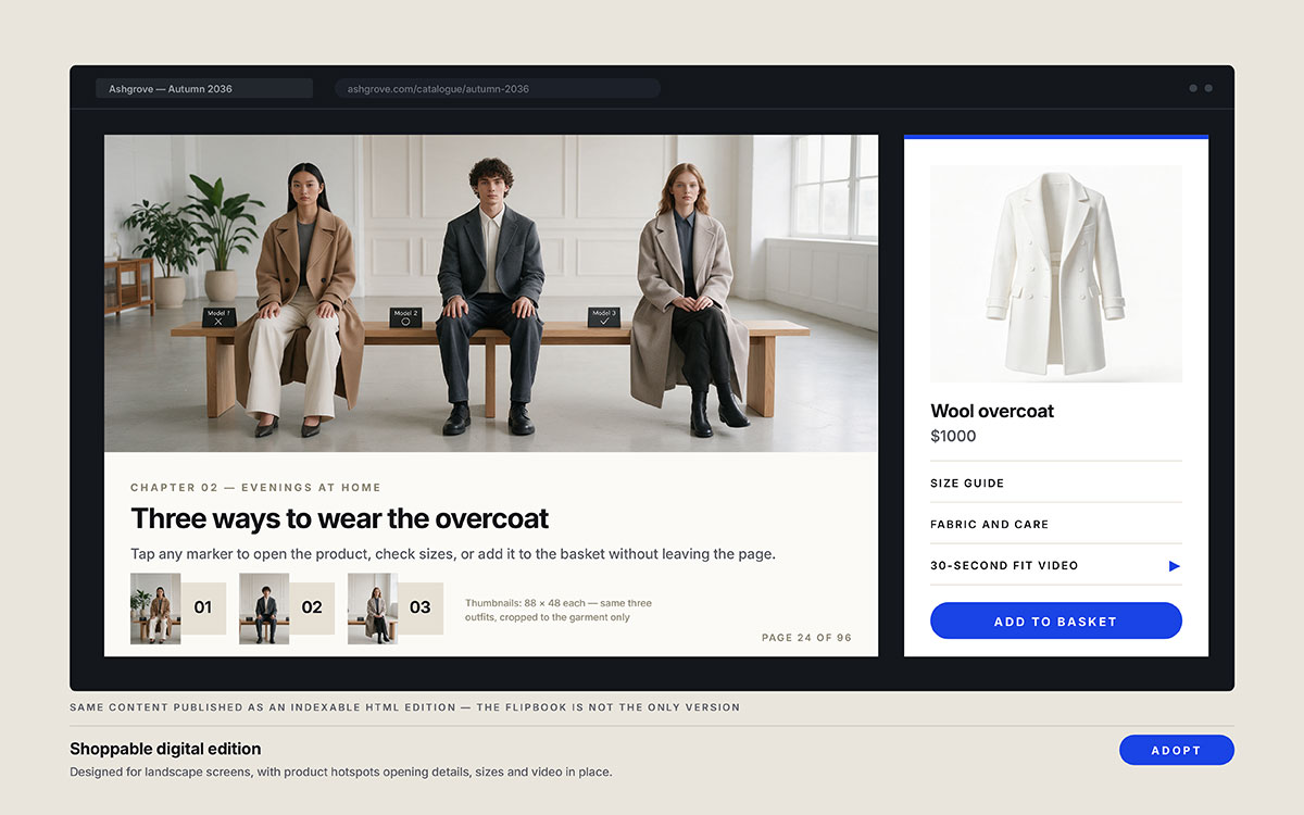
Digital catalogs where products can open size guides, play videos, or add items to a cart directly from the page. A flipbook simply recreates the page-turning experience inside a browser.
A reader can spend ten minutes exploring a catalog and still be one click away from buying. Shoppable elements close that gap. A product hotspot can turn interest into action without sending the reader hunting through a separate site. It also shows which pages and products attract the most attention.
What to do about it: Design for landscape screens instead of uploading the print PDF unchanged. Connect every product to its matching product page, and keep an indexable HTML version available for search.
The risk: A flipbook can look impressive while leaving search engines with almost nothing to read. Engagement without discoverability is a poor trade.
Verdict: Adopt, but treat an indexable HTML fallback as essential rather than optional.
6. AI-assisted production with human art direction
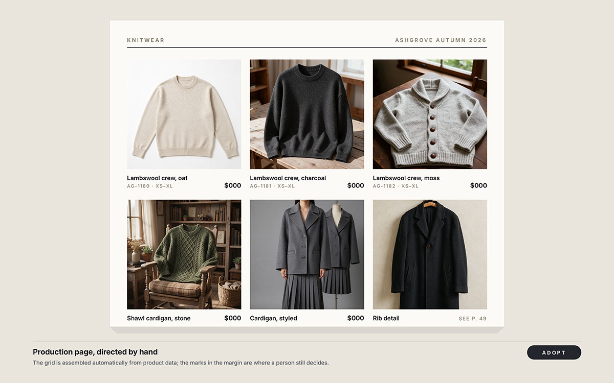
AI handling repetitive catalog work such as background removal, retouching, resizing, copy variations, and first-pass page assembly from product data.
Catalog production is often limited by volume, not ideas. Automating repetitive passes gives the creative team more time for photography, layout, and art direction, where a catalog actually develops its identity.
What to do about it: Automate the mechanical steps. Keep humans responsible for art direction, colour approval, image selection, and final proofing. Document the automated steps so quality problems can be traced and corrected.
The risk: Let AI make the creative decisions, and pages can start looking interchangeable. The real cost is not a strange image. It is a catalog that looks exactly like everyone else's.
Verdict: Adopt for production. Keep art direction human.
These operational catalog design trends are easy to miss because readers never see the work behind them. They simply notice when a catalog arrives late, looks inconsistent, or feels strangely familiar. That makes production efficiency valuable, but only when it leaves enough human judgment in the finished pages.
7. Sustainability as a visible design choice
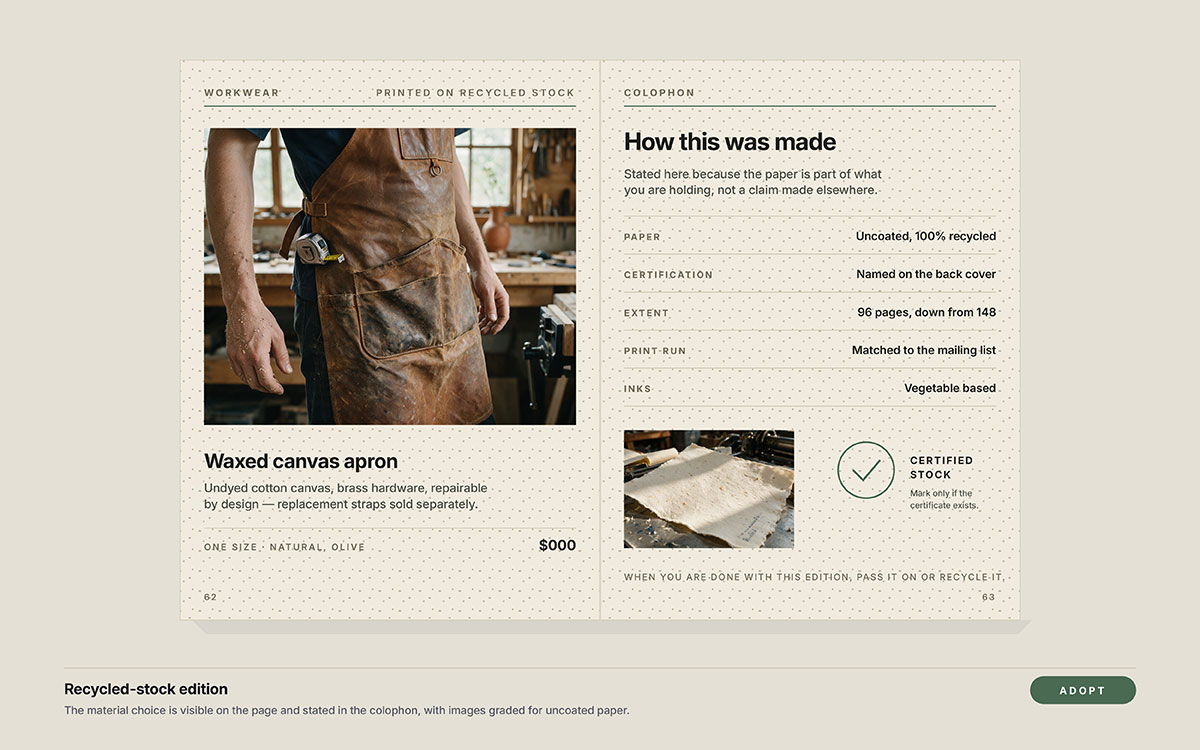
Certified, recycled, or uncoated paper stocks, shorter print runs, lower page counts, and clear disclosure of the materials used. Sustainability is moving from a production decision to a visible part of catalog design.
Readers form an impression of a catalog before reading a single line. The weight of the paper, the texture of the stock, and the finish of the page communicate something immediately about the brand behind it. At the same time, print-on-demand and shorter runs have made it easier to produce only what is needed, reducing the cost of excess inventory and unsold copies.
What to do about it: Choose certified or recycled stocks, print closer to demand, and state the paper type and certification in the colophon. If sustainability matters to the brand, make the choice visible rather than leaving it implied.
The risk: Unsupported environmental claims. If the materials are not certified, the design and copy should not suggest otherwise.
Verdict: Adopt. A catalog tells its story through paper as much as through print.
8. Warm, tactile and deliberately imperfect visual language
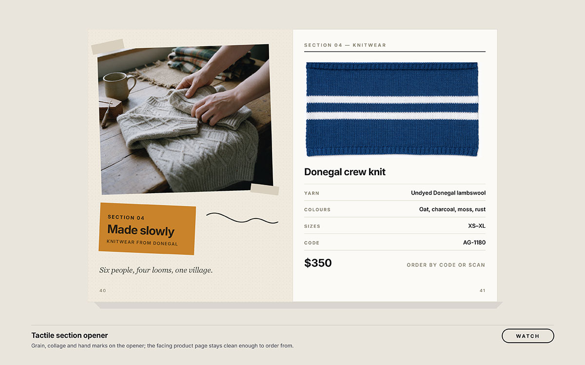
Analogue textures, film grain, hand-set type, collage, visible paper stock, and slightly desaturated palettes replacing the flat, sterile minimalism that has dominated product design.
When polished, synthetic imagery is everywhere, small signs of human craft start to matter more. A rough edge, a visible texture, or an imperfect detail can make a catalog feel made rather than generated. That shift is also appearing across the wider creative industry, including Adobe's 2026 Creative Trends Forecast.
What to do about it: Use texture in editorial spreads, dividers, and section openers. Keep product photography and information areas clean. The contrast is what makes the tactile elements feel intentional rather than messy.
The risk: Push the treatment too far, and the products become harder to see, compare, and understand. The catalog starts expressing a mood instead of selling what is inside it.
Verdict: Watch. Use the trend where it adds character, not everywhere simply because it is fashionable.
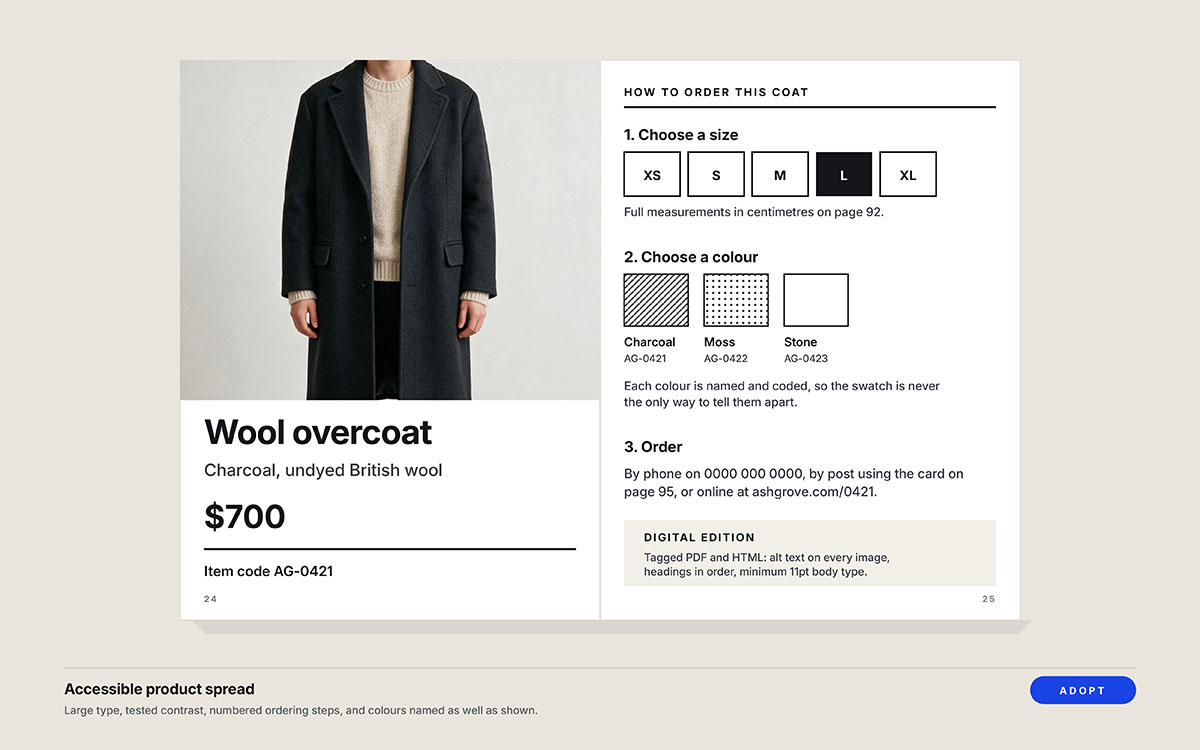
9. Accessibility treated as a design standard
Readable type sizes, tested colour contrast, clear hierarchy, and layouts that do not rely on colour alone. Digital editions also need alt text and a logical reading order.
A catalog should not become difficult to use simply because someone reads it differently. Larger type helps someone with low vision, but it also makes a product page faster to scan. Clear contrast helps readers with visual impairments, while making prices and product details easier for everyone to spot.
What to do about it: Set minimum type sizes before layout begins. Test contrast against the brand palette, and make sure digital PDFs have alt text and a logical reading order.
The risk: Treat accessibility as a final check, and basic layout decisions may already be locked in. Fixing them then can mean rebuilding pages instead of correcting a setting.
Verdict: Adopt. Accessibility is moving from a preference to a basic standard of good catalog design.
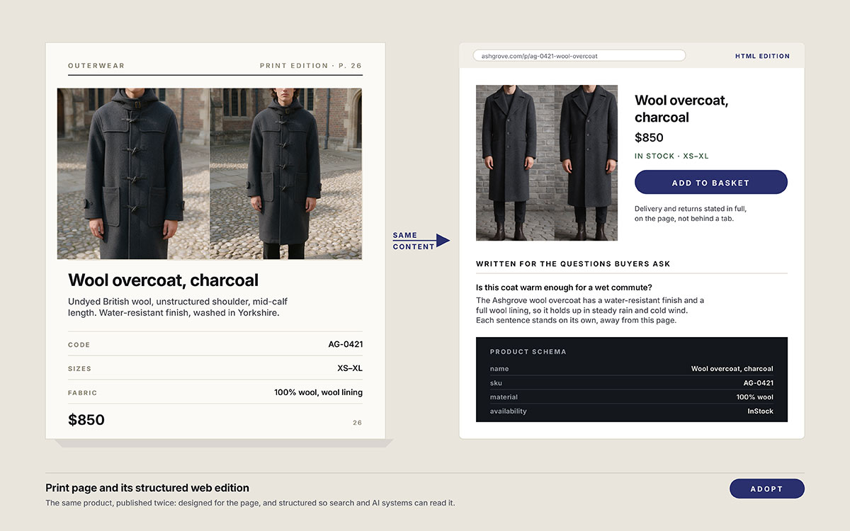
10. Catalog content structured for answer engines
Catalog content built so answer engines can understand the products, not just display them. That means structured product data, crawlable HTML pages alongside the PDF, and descriptions written around the questions buyers actually ask.
Product discovery is no longer happening only through search results or a printed page. Buyers can now ask an AI system which product fits a certain need and expect a useful answer. A beautifully designed PDF may show the product perfectly, but it gives that system far less structured information to work with.
What to do about it: Publish an HTML edition alongside the flipbook. Add Product schema to product pages, and write specifications in complete, self-contained sentences that still make sense outside the original page.
The risk: Treat the digital catalog as something to look at rather than something machines can understand. Without a crawlable, structured version, competitors with better product data can become easier to discover.
Verdict: Adopt. For eCommerce catalogs, product information needs to work for readers and the systems helping them find what to buy.
How to tell if a catalog design trend actually worked
A catalog design trend worked when it changed something that mattered, not simply when the new edition looked better. More scans, longer browsing, higher product-page visits, stronger response, or more orders can show that a design decision earned its place.
The numbers worth watching depend on the trend. A QR code should drive measurable visits. A new product layout should make products easier to find and act on. A storytelling approach should keep readers moving through the edition. The checks below show what to measure, when to measure it, and what result should make you keep the change.
Let's see what the numbers say.
Trend group
Signal to watch
Where to read it
Storytelling and print quality
Retention and repeat orders from mailed segments
Matchback reporting against the mailing list
Print-to-digital bridges
Scans and sessions per spread, not per catalog
Unique codes and campaign parameters
Personalisation
Lift of the varied segment against a held-back control
Order data split by version
Shoppable digital editions
Hotspot clicks, add-to-cart rate, pages per session
Platform analytics plus site analytics
Answer-engine structure
Impressions on product queries and AI answer citations
Search Console and manual answer-surface checks
Catalog design trend FAQs
Catalog design trends raise practical questions long before the first page is designed. Which trends are worth the budget? Which ones are already becoming standard? And which ones can safely wait?
These six questions cover the points that tend to slow planning down. Each answer gives the practical answer first, then the context needed to make the decision without guessing. Let's clear up the questions that matter.
There is no single proven “biggest” trend, but storytelling-led structure is one of the strongest. It gives catalogs a reason to be browsed rather than treated as product lists. Pairing that structure with measurable print-to-digital links makes the trend more useful, because brands can test whether stronger storytelling actually changes response.
Yes, but the evidence points to a more deliberate role rather than a return to old mailing volumes. In 2025, 68% of surveyed U.S. consumers said catalog shopping felt more relaxing than scrolling online, while 70% saw catalogs as a good starting point for holiday shopping.
Neither should automatically come first. Build the product data, photography, and copy as shared content, then adapt the composition to each format. Print needs spreads and physical pacing; digital needs responsive layouts, links, and searchable product pages. Publishing the print PDF unchanged can limit the digital experience and discoverability.
AI is increasingly useful for repetitive catalog production tasks such as image cleanup, resizing, content variations, and other production assistance. The creative decisions still need human direction. Art direction, image selection, colour decisions, and final approval determine whether the catalog feels distinctive. The goal is faster production without surrendering the brand’s visual judgment.
A crawlable HTML version gives search systems substantially more accessible content than a purely visual experience. Product structured data can also help Google understand individual product pages and make them eligible for richer search features. For AI answers, clear, complete product information gives systems useful content to interpret and cite.
There is no universal redesign cycle. Refresh products, offers, and content whenever the business requires it, but avoid rebuilding the visual system simply to appear current. A larger redesign makes sense when the existing structure no longer supports readability, accessibility, digital use, or the brand’s current needs. Measure before replacing what still works.
Endnote
That brings us to the end of this guide!
We covered ten catalog design trends shaping 2026, but the real question is what they will help the catalog do. Quad found that 68% of consumers find browsing catalogs more relaxing than scrolling online, while 69% say catalogs can spark ideas they would not find online. That is attention worth treating carefully.
The smartest catalogs will not chase every new idea. They will use the trends that make products easier to discover, understand, remember, and buy. Print and digital can work together without either one pretending to be the other.
That is the thinking behind our catalog design work. If your next trendy catalog needs a clearer story, stronger product flow, or a better connection between print and digital versions, get in touch with Graphic Design Eye LLC and let’s talk about what it should do better.
Because somewhere, someone will open that catalog and stop at one page. They may mark it, share it, or come back weeks later when they are ready to buy.
Now go make something worth keeping! That has always been the only trend that lasts! 🙂
Graphic Design Eye LLC is a full-service creative agency built for brands that demand more than design — they demand vision. From strategic branding to complete visual identity, we partner with startups, agencies, and growing businesses as a dedicated creative force. With flexible subscription and project-based models. Let's start with us today!