Learning how to design a product catalog starts with defining its purpose and organizing product information. Then, you build the layout, product pages, typography, photography, and buying paths. Print and digital catalogs also require different technical preparations for a smooth final delivery.
A single book can outlive the entire campaign that carried it. Think of a catalog still sitting on a buyer’s desk months after the emails announcing it were archived and the ads around it were scrolled past.
Almost everything we publish disappears. We spend, we launch, we watch the impressions climb, and by the following week, there is nothing left to hold. A catalog is different because it stays in the drawer, in the trade show bag, or in the hand.
And whatever you built into those pages stays there with it. Every hesitation becomes the reader’s hesitation, while every unanswered question becomes a reason to close the book.
Catalogs are rarely won by inspiration. They are won by sequence, and sequence can be learned.
This post walks you through 10 steps that turn a rough idea into a strong catalog, one that ships as a clean print-ready file or a digital that guides buyers straight to checkout.
Let's dive in and keep exploring!
How to design a product catalog
To design a product catalog, plan your page flow first, shoot clean and consistent product photos, build a repeating grid so every page feels related, pair one readable body font with a strong heading font, write short descriptions that answer real buyer questions, and export print-ready files with proper bleed, CMYK color, and 300 DPI images.
Here you get through how to design a product catalog step by step, from planning your page flow and shooting product images to choosing grids, fonts, colors, and print specs that hold up in a customer's hands.
Get started now.
Step 1: Define the catalog’s commercial job before you open a design file
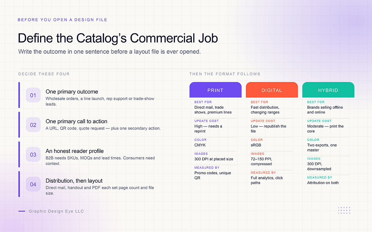
The first step in designing a product catalog is deciding what the finished catalog must help the business achieve. Write that goal in one sentence before opening a layout file. A catalog can look polished and still fail if it does not give the reader a clear reason to act.
Name one primary outcome: This could be wholesale orders, a seasonal line launch, sales-rep support, trade show leads, or reactivating lapsed buyers.
Define one primary call to action: This might be visiting a URL, scanning a QR code, requesting a quote, or placing a wholesale order, with one secondary action for readers who need more information.
Profile the reader honestly: A B2B buyer needs SKUs, minimum order quantities, lead times, and logistics. A consumer may need lifestyle context, scale cues, and a direct path to purchase.
Decide distribution before layout: A direct-mail catalog, trade show handout, and PDF download have different requirements for page count, paper, file size, and distribution.
Format should follow these decisions, not precede them. Print, digital, and hybrid catalogs also differ in their update costs, file requirements, interactivity, and measurement options, so the comparison below shows what each format requires.
Print, digital and hybrid catalogs compared
Print, digital, and hybrid catalogs serve different distribution needs. The best format depends on where the catalog will appear, how often its content will change, and how its performance will be measured. The table below compares those differences across the factors that affect production and use.
Factor
Print catalog
Digital catalog
Hybrid
Update cost
High, requires a reprint
Low, republish the file
Moderate, print the evergreen core only
Color mode
CMYK
sRGB
Two exports from one master file
Image resolution
300 DPI at final placed size
72 to 150 PPI, compressed
Master assets at 300 DPI, downsampled for digital
Interactivity
QR codes and short URLs
Buy buttons, search, linked contents
QR codes bridging print to product pages
Measurement
Promo codes, unique QR destinations
Full analytics and click paths
Attribution across both surfaces
Best for
Direct mail, trade shows, sales-rep visits, premium lines
Fast distribution, frequently changing ranges, global buyers
Brands selling across offline and online channels
Step 2: Build a clean product data sheet before any layout begins
Every hour spent on data before layout saves several during revisions. That is not a slogan. Missing specifications are the single most common reason a catalog slips its deadline, because a designer cannot finish a page that is waiting on a dimension, a price tier or a photograph nobody has taken yet.
Create a single source of truth in a spreadsheet or product information system, then lock it before layout starts.
Set an image naming convention tied to the SKU, for example, GDE-1042_front_navy.jpg, so automated placement and data merge work without manual matching.
Flag hero products, discontinued lines and items awaiting photography in a status column, so the layout stage never stalls on an unanswered question.
Treat that sheet as a permanent asset rather than a one-off document and it pays for itself across every future edition. That habit is the heart of disciplined product catalog management. The schema below covers the fields a layout needs, from the first spread to the last.
Product data sheet schema
These are the fields a layout cannot proceed without, which makes them a minimum column set rather than an ideal one. Lock them before design begins. And watch the status column closely, because it is the one quietly protecting your schedule.
Once the product information is ready, it is time to decide how the catalog will take shape. Its size affects more than how it looks. It also affects readability, mailing costs, paper use, and binding. The right format should give products enough room without making the catalog bulky.
Common choices include 8.5 × 11 in, 6 × 9 in, 5.5 × 8.5 in, and 8.5 × 8.5 in square. From there, the page count helps determine how the catalog should be bound and printed.
Saddle stitching works well for shorter catalogs. The total page count usually needs to be a multiple of four, including the cover. For example, 28 interior pages plus a four-page cover make a 32-page catalog.
Perfect binding is a better fit for longer catalogs. It normally uses page counts in multiples of two and typically starts around 24 interior pages plus a four-page cover.
Creep becomes more noticeable as a saddle-stitched catalog gets thicker. The folded pages can shift toward the outside edge. Keep important text and logos at least 0.25 in from the trim edge.
Paper stock should fit the way the catalog will be used. Image-heavy pages work well with 80 to 100 lb gloss or silk text. Lighter 60 to 80 lb text works for pages that may need writing. For trade shows, 100 to 120 lb cover stock offers more durability.
These choices are easier to manage when they are made before the layout begins. A late change to the format or binding can affect the page count, margins, paper, and design. So, use the guide below to narrow down the best option, then confirm the final details with the printer.
Format and binding decision guide
The guide below helps match the catalog’s page count with a suitable format, binding, and paper choice. Check the final specifications with the printer before production.
Page count
Recommended binding
Page count rule
Notes
8 to 32 pages
Saddle stitch
Multiple of 4 including cover
Lowest cost, lies reasonably flat, ideal for seasonal lines
32 to 64 pages
Saddle stitch
Multiple of 4 including cover
Allow for creep, keep content 0.25 in from trim
64 to 200 pages
Perfect binding
Increments of 2, minimum 24 interior pages
Printed spine, more durable, does not lie flat
Any count, reference use
Wire-O or coil
Flexible
Opens fully flat for sales reps presenting live
Step 4: Structure the catalog architecture
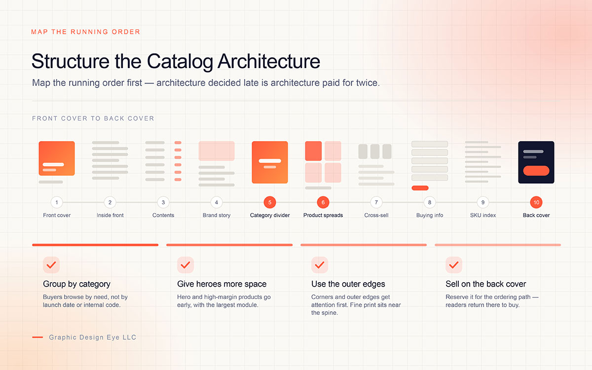
Map the running order before you design a single spread: front cover, inside front cover, contents, brand story, category dividers, product spreads, accessories and cross-sell, buying information, SKU index, back cover. Architecture decided late is architecture paid for twice. Once in design, and once again in regret.
Group Products by Category: Group products by category instead of launch date or internal product code. Buyers usually browse based on what they need, so related products should stay together.
Give Key Products More Space: Place hero and high-margin products early in the catalog. Give the best seller the largest space on its spread. Use smaller areas for specifications, alternate views, and accessories.
Position Products Where Eyes Land First: Place high-value products near the outer edges and corners of a page. These areas often attract attention first. Keep fine print and secondary descriptions closer to the spine.
Use the Back Cover for Ordering: Reserve the back cover for the ordering path. It is a surface readers may return to when they are ready to buy. Make the next step clear and easy to find.
A running order only holds when the recurring components behind it are settled too. Agree on the most important elements of a catalog design before the first spread is built, because renaming or restyling them later means revisiting every page that uses them.
Step 5: Design the grid and the product card
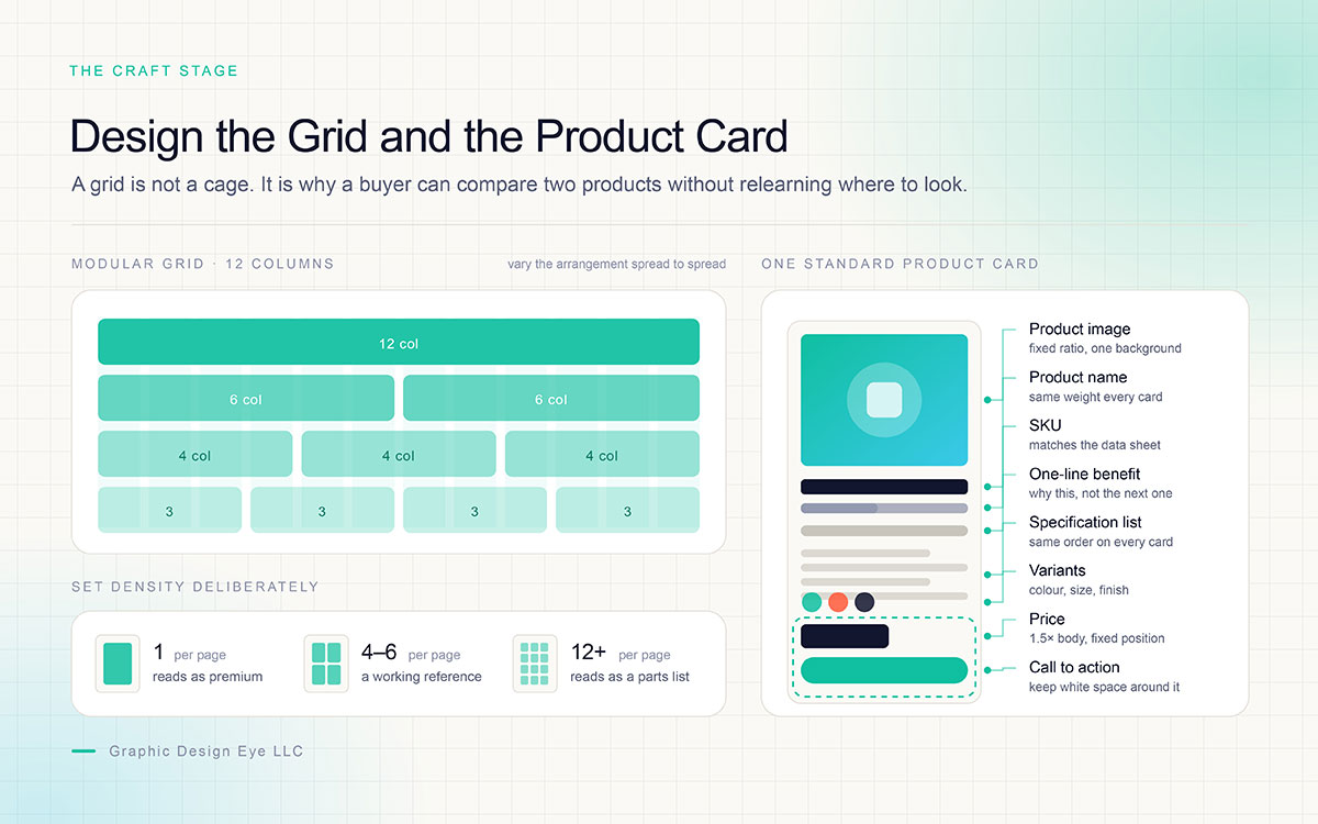
This is the step where how to design a product catalog stops being a planning question and becomes a craft one. Is a grid a cage? It is the opposite. It is the reason a reader can compare two products on different pages without relearning where to look, and that small mercy is what keeps them turning.
Use a Modular Grid: Build on a modular grid, typically 12 columns, so blocks can be combined into halves, thirds and quarters without breaking alignment.
Vary the Module Arrangement: Vary the module arrangement across spreads rather than repeating an identical column layout on every page, which flattens attention and makes a catalog feel like a spreadsheet.
Standardize the Product Card: Standardize the product card with fixed zones: image, product name, SKU, one-line benefit, specification list, variants, price and call to action.
Set Density Deliberately: Set density deliberately. One product per page reads as premium, four to six per page reads as a working reference tool, and twelve or more reads as a parts list.
Keep White Space Around Key Elements: Keep white space around price and call-to-action zones, since these are the elements a buyer keeps coming back to.
Consistent zones let a buyer scan by position rather than read every block. And scanning, not reading, is what buyers actually do.
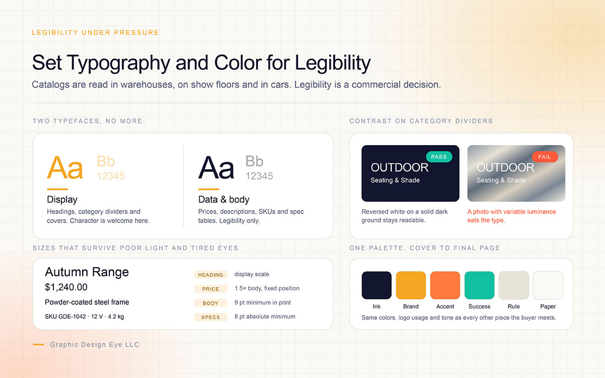
Step 6: Set typography and color for legibility under pressure
Catalog typography is read in warehouses, on trade show floors and in cars between appointments. It has to survive poor light, tired eyes and divided attention. So legibility here is a commercial decision, never a stylistic one.
Limit the Typefaces: Limit the catalog to two typefaces: one with character for headings and category dividers, one highly legible for prices, descriptions and SKUs.
Set a Minimum Text Size: Do not drop body copy below 9 pt in print. Specification tables and footnotes should stay at 8 pt at absolute minimum, with generous leading.
Make Prices Easy to Compare: Size prices at roughly 1.5 times body copy and give them a fixed position on every card, so a buyer can compare without hunting.
Check Contrast on Category Dividers: Watch contrast on colored category dividers. Reversed white type needs a solid dark ground, not a photograph with variable luminance.
Brand colors, logo usage, image style and tone of voice should carry from cover to final page, and carry consistently with every other piece of collateral the buyer meets. That coherence is a large part of why catalog design matters for ecommerce, where the printed page and the product listing are judged as one experience.
Step 7: Prepare product photography and imagery to a single standard
Photography is where most catalogs quietly lose credibility. Mismatched lighting across a single category reads as carelessness even when every individual frame is competent, which is why high-quality product images deserve to be treated as a system rather than a collection.
Keep Product Photography Consistent: Shoot every product to a shared standard: same background, same lighting direction, same shadow treatment, same camera height, and the same relationship between product and frame.
Use Print-Ready Images: Images must be 300 DPI at final placed size for print. Enlarging a web image or exporting from a screenshot is the most common cause of pixelated printed pages.
Show Multiple Angles When Needed: Provide multiple angles wherever fit, finish or mechanism matters, and add a scale cue for anything a buyer cannot judge by eye.
Match Images Across Channels: Match catalog imagery to the images used on the website and marketplace listings, so a buyer moving between channels never doubts they are looking at the same item.
Retouching needs a written standard as well: which marks are removed, which texture is preserved, how shadows are built, and what color tolerance is acceptable against the physical sample. Holding that standard across hundreds of SKUs is ordinarily handled through a dedicated product photo editing workflow, because consistency at volume is a process problem rather than a talent problem.
Step 8: Write product copy that answers buying questions
The copy is the only part of a catalog that speaks. Lead every product entry with a benefit line, then follow it with the specifications a purchase decision depends on: dimensions, materials, weight, capacity, tolerances, compatibility and certifications. Say the useful thing first, and prove it immediately after.
Include Required Specifications: Technical categories carry a hard requirement. If a dimension, temperature range or compliance standard is missing, the product cannot be specified and will not be ordered.
Group Product Variations: Group color and size variations into a single table rather than listing each variant as a separate entry. This reduces both page count and visual clutter.
Keep Descriptions Within Limits: Keep description lengths within the fixed character limits set in the data sheet, so cards do not collapse or overflow during layout.
Write in the Brand Voice: Write in the brand voice rather than in catalog shorthand. A reader who feels spoken to stays on the page longer.
Step 9: Place calls to action and ordering paths on every spread
Assume the catalog will be opened at a random page, because it usually is. Every spread needs a visible route to purchase: a short URL, a QR code, a phone number or an order reference. A persuaded reader with nowhere to go is not a missed opportunity. It is a lost sale the design itself created.
Make QR Codes Easy to Scan: Print QR codes at a minimum of roughly 0.8 to 1 in with a clear quiet zone, and test the printed proof rather than the on-screen file.
Track QR Code Responses: Give each category or campaign a unique QR destination or UTM-tagged URL, so response can be attributed to a spread rather than to the catalog as a whole.
Include Buying Information: Include buying information as its own section: ordering process, minimum order quantities, lead times, shipping, returns and size or fit guides.
Make Digital Catalogs Interactive: For digital editions, make every product block clickable, keep text selectable rather than flattened into images, and link the contents page to its sections.
Step 10: Prepare files for print and digital release
Prepress is the least glamorous step and the one most likely to undo everything before it. Files left in RGB print duller than the screen promised, and once the press is running that shift cannot be recovered. So slow down here. This is the step that repays it.
Convert to CMYK: Convert the document to CMYK before final export, using a coated profile appropriate to the press.
Add Bleed and Safe Margins: Apply 0.125 in bleed on all sides for any element touching the page edge, and keep essential content at least 0.125 in inside the trim line.
Allow Extra Space Near the Spine: Allow a wider inner margin of roughly 0.375 to 0.5 in near the spine so type does not disappear into the fold.
Export Single Pages: Export single pages in reading order, not spreads, with fonts embedded or outlined.
Prepare the Digital Edition Separately: Produce the digital edition separately: sRGB color, compressed images, a linked table of contents, and a file size that opens on mobile without stalling.
Order a Physical Proof: Order a physical proof before the full run. Color, paper feel and QR scanning all behave differently on paper than on a calibrated screen.
Production specifications at a glance
Every figure here belongs to the export stage rather than the proof stage, because prepress mistakes are inexpensive to prevent and painfully expensive to discover on a pallet of finished stock. Run both columns before releasing files, since the print master and the digital edition fail in quite different ways.
Specification
Print requirement
Digital requirement
Color mode
CMYK, coated profile appropriate to the press
sRGB
Image resolution
300 DPI at final placed size
72 to 150 PPI, compressed
Bleed
0.125 in on all sides
Not applicable
Safety margin
0.125 to 0.25 in inside the trim line
Not applicable
Spine / gutter margin
0.375 to 0.5 in near the fold
Not applicable
Page count
Multiple of 4 for saddle stitch
Any
File format
Print-ready PDF, single pages in reading order
Optimised PDF or HTML flipbook
Fonts
Embedded or outlined
Embedded or web-hosted
Proofing
Physical proof before the full run
Cross-device preview including mobile
Tolerances vary by press, so confirm every figure above with your chosen printer before release. Studios running this stage regularly, whether in-house or through a catalog design service, tend to keep a standing prepress checklist for exactly this reason. The cost of a proof is always smaller than the cost of a reprint.
7 Product catalog design mistakes to avoid
These seven mistakes cause many of the problems found during catalog proofing. Most happen well before anyone notices them at the proof stage. Each one has a simple fix when caught early. Left until later, the same fix can cost much more.
Designing Before Data Is Complete: Designing before the product data is complete, which turns every review round into a data hunt.
Using Saddle Stitching for Long Catalogs: Saddle stitching a catalog beyond about 64 pages, which causes pages to work loose after a few uses.
Skipping Bleed on Full-Bleed Pages: Building full-bleed pages without bleed, which produces a thin white line along the trimmed edge.
Using Light Cover Stock: Using a light cover stock on anything handled at trade shows, which scuffs within a single event.
Mixing Photography Styles: Mixing photographic backgrounds and lighting styles across categories, which reads as unprofessional even when each individual image is good.
Printing Reusable Prices in the Catalog: Printing prices into the body of a catalog that will be reused across a year of price changes, rather than using a separate price list insert.
Omitting the Ordering Path: Omitting an ordering path, so a persuaded reader is left with nowhere to go.
Design product catalog FAQs
These FAQs answer common questions about product catalog design and printing. Some questions come up late, when the page count or print quote is being finalized. Each answer below is simple and practical. If your question is not covered here, feel free to contact us.
Most sit between 16 and 48 pages, which is enough to present a range without overwhelming a reader. Saddle-stitched catalogs must land on a multiple of four including the four cover pages, so a 28-page interior becomes a 32-page book. Beyond roughly 64 pages, move to perfect binding.
8.5 x 11 in is the most common trim size and the safest default for mixed print and digital use. 6 x 9 in and 5.5 x 8.5 in reduce postage on direct mail campaigns, while square formats such as 8.5 x 8.5 in read as premium and suit lifestyle or design-led ranges.
Adobe InDesign remains the standard for print, particularly because data merge handles large SKU counts without manual placement. Affinity Publisher is a capable alternative with a one-time license, and flipbook platforms are usually the simplest route for the digital edition once the print master is finished.
Six to twelve weeks is typical, covering the brief, data collection, photography, layout and review rounds, with print production added on top. Digital printing usually delivers within 5 to 15 business days, while offset runs commonly need 4 to 6 weeks.
Yes, consumer catalogs should usually include prices because buyers need them to make decisions. B2B and wholesale catalogs can use a separate price list instead. This makes price updates easier and avoids reprinting the full catalog when prices, tier rates, or minimum order quantities change.
A catalog presents a product range with the details buyers need to order. A brochure usually focuses on one offer, service, or story and aims to persuade the reader. This difference affects the page count, product information, layout, and amount of specification detail needed.
Endnote
So, here we are at the end!
Designing a product catalog is easier when the decisions come in the right order. The sequence makes sense now, does it not? Define its purpose, organize the product data, choose the format, plan the page structure, and then build the layouts. Once those decisions are settled, the design has a clear job to do.
Think about the finished catalog from the buyer’s side. Can they find the product they need? Can they understand its features, price, and options? Can they compare products without getting lost on the page? Can they find the information needed to place an order? Good catalog design makes those answers easy to find.
If this is your first catalog, start with Step 1 and Step 2. Define what the catalog needs to achieve, then organize the product information before moving into the layout. The decisions made here will shape every page that follows.
Already have the product list ready for page design? Share them with our team, and Graphic Design Eye can handle the catalog cover, page layouts, product image editing, and supporting content so the finished catalog presents every product clearly and gives buyers the information they need to act.
That's a wrap for today. If you have questions about your own catalog, send us a message!
Graphic Design Eye LLC is a full-service creative agency built for brands that demand more than design — they demand vision. From strategic branding to complete visual identity, we partner with startups, agencies, and growing businesses as a dedicated creative force. With flexible subscription and project-based models. Let's start with us today!