Learning how to create a catalog in InDesign seems hard at first glance. But it is really just about placing pages and showing content clearly. With a few steps, you can make a polished catalog fast. Images, text, and ideas all fit cleanly in your layout.
Well, InDesign lets you control every detail of your catalog pages. You can move text boxes and place images exactly where wanted. The tool keeps your design even and consistent from the start. Print or digital, your catalog can look clean and balanced.
This guide makes your smooth journey of creating a catalog in InDesign simple and fun. Step by step, it will show you how to plan pages, place content, and style your text. Even if you are a beginner, you can follow along and create a catalog with ease.
By the end, your blank page becomes a strong catalog. It will show your work clearly and look professional and neat.
So, are you ready to start your first catalog design now? Keep reading!
What is Adobe InDesign and why use it for catalogs?
Adobe InDesign is a pro tool for making print and digital layouts. It is great for catalogs because it gives full control over text, images, tables, and graphics. You can make catalogs that look neat, clear, and easy to read. InDesign works well for multi-page docs and high-res images, and keeps text styles the same across pages. You can also export catalogs as print-ready PDFs or as interactive digital files.
Using InDesign helps your catalog look clean and sharp. It makes reading easy, whether in print or online. This tool gives you the power to mix art and control so your products or ideas stand out.
Key benefits of using InDesign for catalogs:
Professional Page Layouts: Place text, images, and graphics exactly where you want.
Consistency Across Pages: Keep headings, body text, and colors the same through the catalog.
High-Quality Printing: Use high-res images and color profiles for crisp prints.
Digital Ready: Make PDFs, eBooks, or online catalogs with links and media.
Manage Large Projects: Work with hundreds of pages without slowdowns.
Templates and Libraries: Start fast with ready-made templates and reusable parts.
Precise Typography Control: Set fonts, spacing, and alignment for clear, neat text.
Works with Adobe Suite: Pair with Photoshop and Illustrator for better images and graphics.
If you want a catalog that looks clean, pro, and reader-friendly, Adobe InDesign is the right choice. It gives full control over design and output so your products or ideas shine in print or digital formats.
How to create a catalog in InDesign
How to create a catalog in InDesign might feel overwhelming at first. But what if you could turn that complexity into a smooth, creative flow? Every stunning catalog you’ve admired started with a blank page and a vision. The challenge isn’t just placing images and text; it’s about crafting an experience that captures attention, builds trust, and tells a compelling story about your brand or products.
Think of InDesign as a simple toolbox for your pages. At first, the menus, panels, and tools may feel confusing. But once you know the basics, it becomes very easy to use.
Follow the eight steps below properly, and watch your blank page come alive. Each step builds your catalog with care, shape, and style. By the finish line, every page will feel neat, sharp, and clear.
Let’s break it down step by step!
1. Plan your catalog before opening InDesign
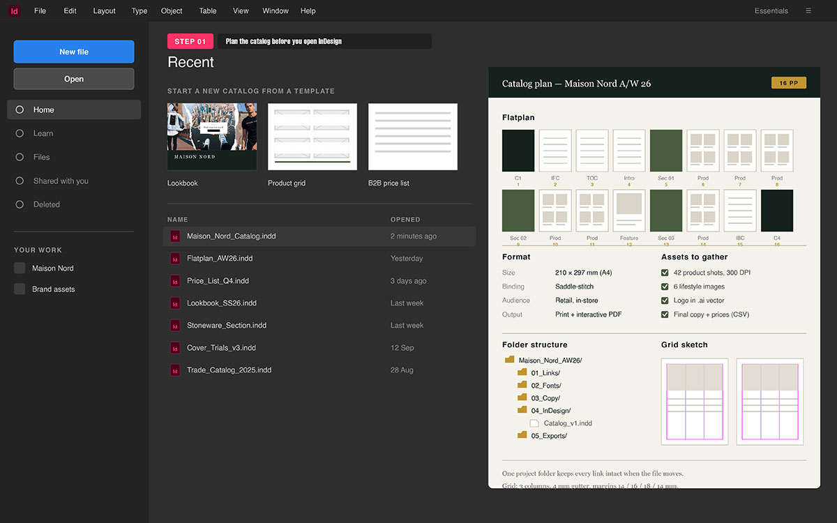
Before you open InDesign, build the full plan first. This step sets the full flow and core idea of the catalog. Think of it like a clear map for your full work. Once this is clear, your design work feels smooth and fast.
If you skip this step, you will fix things again later. That will slow your full work and break your flow.
At this stage, you are not doing design work yet. You are setting what the catalog will hold and show. You also plan how each part will move and link. You decide how all files and items will be used.
Define the catalog’s purpose and audience
Start by fixing the main goal of the catalog first. This choice will guide how your pages will look later.
A retail catalog needs bold looks and quick scan flow
A B2B catalog needs clear facts and clean text blocks
A lookbook needs story flow and big strong image use.
Action tips
Pick one main goal like sell, show, or give info
Think how the user will read it from start to end
Decide if text will stay short or go deep with detail
Note if users will scan fast or read in slow way.
This step will guide your grid, space, and page flow later.
Determine page count and format
Now you set the full size and shape of the document. This step affects page math like space and column use. It also shapes how images will scale and fit well.
A4, US Letter, or square size will change page feel
Each size will change how your content flows on pages
Page count also helps you plan page order from start.
Action tips
Pick a size based on print use or screen use
Count pages based on real content, not rough guess
Think in spreads using both left and right pages
Check bind type if page count gets high later.
This step helps you set the file right from start.
Gather assets before you start
This step helps you avoid slow work in later stages. You need all files ready before you start layout work. This keeps your work smooth and free from breaks.
You collect all items like product photos, logos, and text. This makes the layout work fast and clear inside InDesign.
Check all images for the same light and same style.
Now InDesign becomes a place tool, not a fix tool.
Sketch a rough layout grid
Now you think how each part will sit on pages. This is not a full design, just a basic page plan. It works like a guide for all next design steps.
Grids help keep all items in line and clean. This makes your pages look neat and easy to read.
Action tips
Pick how many columns each page will use.
Mark areas for images, text, and outer space.
Plan flow from title to image to small text.
Keep space the same to hold a clean page rhythm.
This grid will guide your page setup inside InDesign.
Create a folder structure
This step keeps your files safe and easy to find. InDesign links files, so clean order is very key. Bad file order can break links and stop export.
You need a clear place for each type of file. This helps you work fast and avoid file loss.
Action tips
Make folders for Images, Fonts, Files, and Exports.
Keep file names short, clean, and easy to read.
Store all files in one main project folder.
Use file names like v1, v2, and final stage.
This keeps your work clean, safe, and easy to manage.
2. Set up a new InDesign document
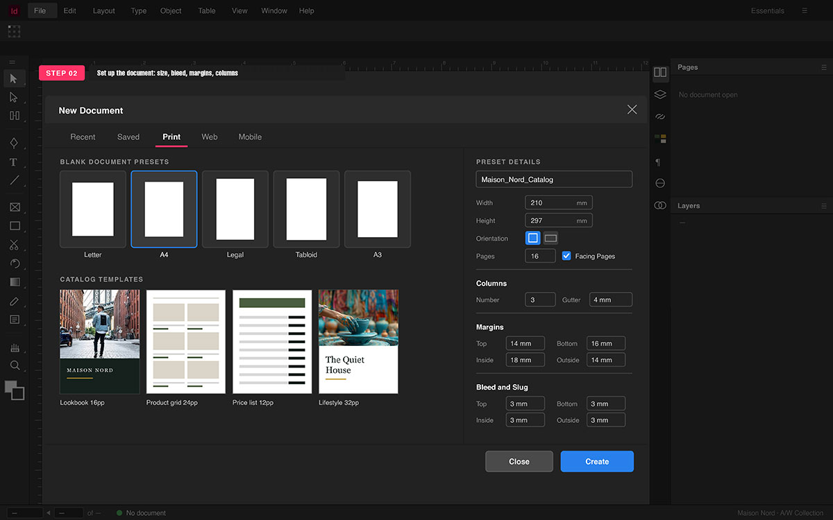
Now your plan is clear, so you build the file here. This step turns your plan into a real file in InDesign. Think of this as the base that holds all your pages. Each setting here will guide how your layout will act. Page size, bleed, and margins control your page flow.
If this setup is right, your work stays smooth and fast. If not, you may face errors and fix work later. So here, you build a strong base for all pages.
Intent: Print or digital PDF
Pick the final use before you start the file setup.
Print files need CMYK mode and bleed space set.
Digital files use RGB mode and need no bleed.
This choice will change how your colors will look later.
It also affects how your file will export at the end.
Page size
Set page size to match your chosen final format.
Use A4, US Letter, or square size as needed.
Do not change size later after you start layout work.
That can break image scale and page alignment badly.
Keep size fixed from start for clean and stable work.
Facing pages
Turn this on if your file reads like a book. This lets you design left and right pages as one spread. It helps keep flow smooth across all page pairs. And turn it off for single page files like flyers.
Bleed
Set bleed to 0.125 inch or 3 mm on all sides. This lets images go past the edge to avoid white lines. It helps keep print edges clean after trim cut. Always use bleed for print files to stay safe.
Slug
Use slug space to add notes or print marks outside. This area stays out of the final cut page size. You can add file notes or print info in this space. It is not a must, but helps in print work.
Margins and columns
Set margins to control space near page edge areas. Add columns to guide text and image placement well. Use the same gap size to keep all columns clean and even. This grid will guide all your layout work later.
Pro Tip
Set color mode to CMYK at the very start.
Do not change color mode later in the file.
Late change can shift colors and break print look.
Start right to keep colors true and safe.
3. Create and apply master pages
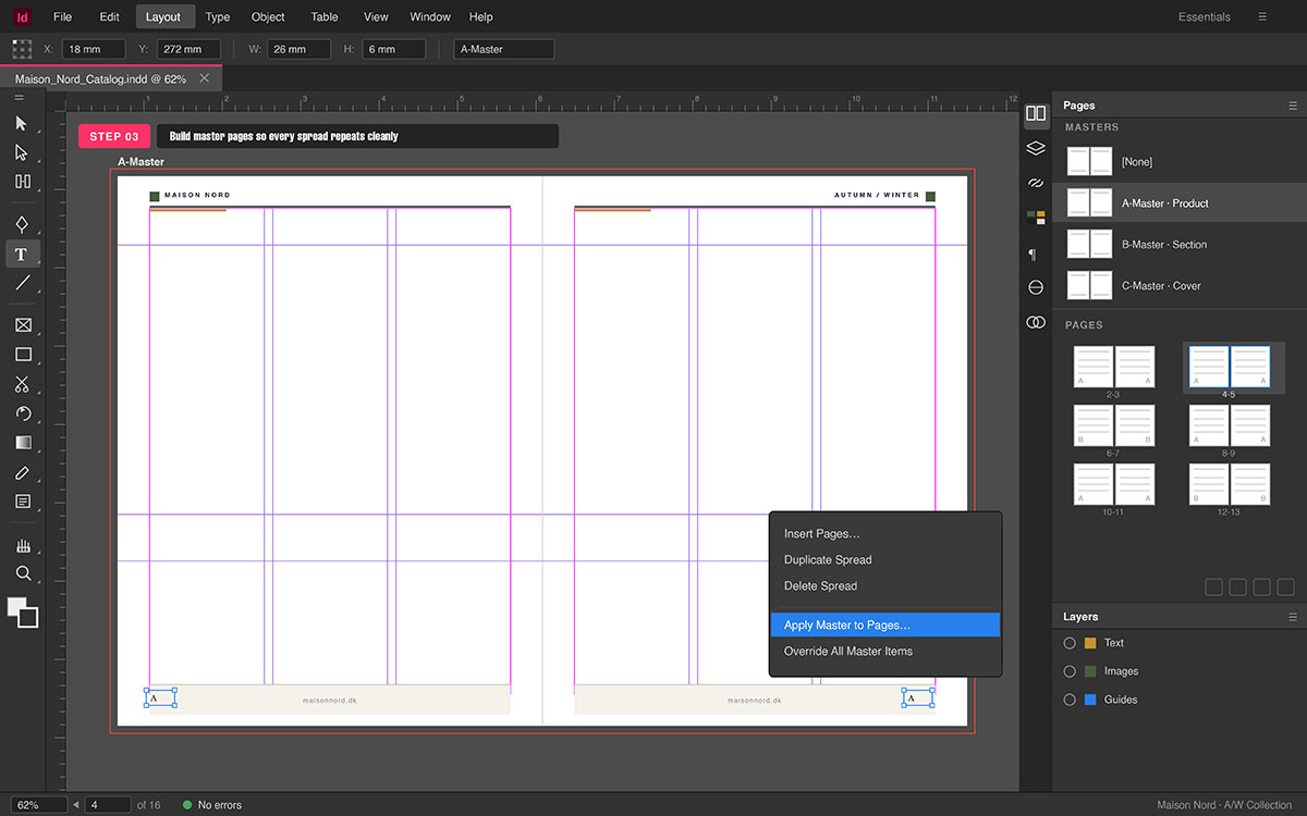
Master pages act like templates for your catalog pages. Anything on a master like logo, header, or grid shows on all pages. This ensures spacing and layout stay consistent everywhere.
Changes on a master update all attached pages at once. They save a huge time for catalogs with many pages.
Think of masters as blueprints for different page types. One master can hold product pages, another chapter openers.
How to create a master page
Follow the below steps and easily create master page:
Open the Pages panel (Window → Pages).
Click New Master or duplicate one you already have.
Give it a clear name like “Product Page” or “Back Cover.”
Place only repeated items: headers, footers, backgrounds, and guides.
Do not place unique images or text here; use content pages instead.
This sets the frame for your layout and overall catalog flow.
Add automatic page numbers
Page numbers repeat on every page, and masters handle this.
Go to Type → Insert Special Character → Markers → Current Page Number.
Place numbers on footers or headers according to your grid.
InDesign updates numbers automatically as you change pages.
This saves time and keeps your pagination neat and clean.
Add repeating elements
Decide what stays the same across all pages:
Logos, brand name, or tagline
Header bars, footers, or divider lines
Background colors or gradient blocks
Grid guides for text and images
Use the master grid to align everything precisely. This keeps visual hierarchy consistent on every page.
Apply master pages to document pages
Now, it’s time to applying master pages to document pages:
Drag your master from the Pages panel onto a page or spread.
Or right-click page(s) and choose Apply Master to Pages.
All repeated items appear in the right position instantly.
You can apply different masters to different sections easily. For example, one master for product pages, another for promos.
Override master elements when needed
Sometimes a page needs unique design changes.
Hold Cmd/Ctrl + Shift and click the master element to unlock it.
Now you can adjust it without changing other pages.
This works for special content like full-page images or callouts.
Pro tips for master pages
Use multiple masters for different sections to stay organized.
Keep all elements aligned to grids for neat pages.
Name masters clearly so team members know each section.
Avoid placing unique images or text on master pages.
Masters should control repeated layout only, not special content.
4. Build a consistent typography system
Typography is more than just picking fonts for your catalog. It gives your catalog a clear voice and guides the reader. A strong system keeps text readable and visually well-ordered. It also reflects your brand’s personality across all pages. Here, you create a repeatable system for all text elements.
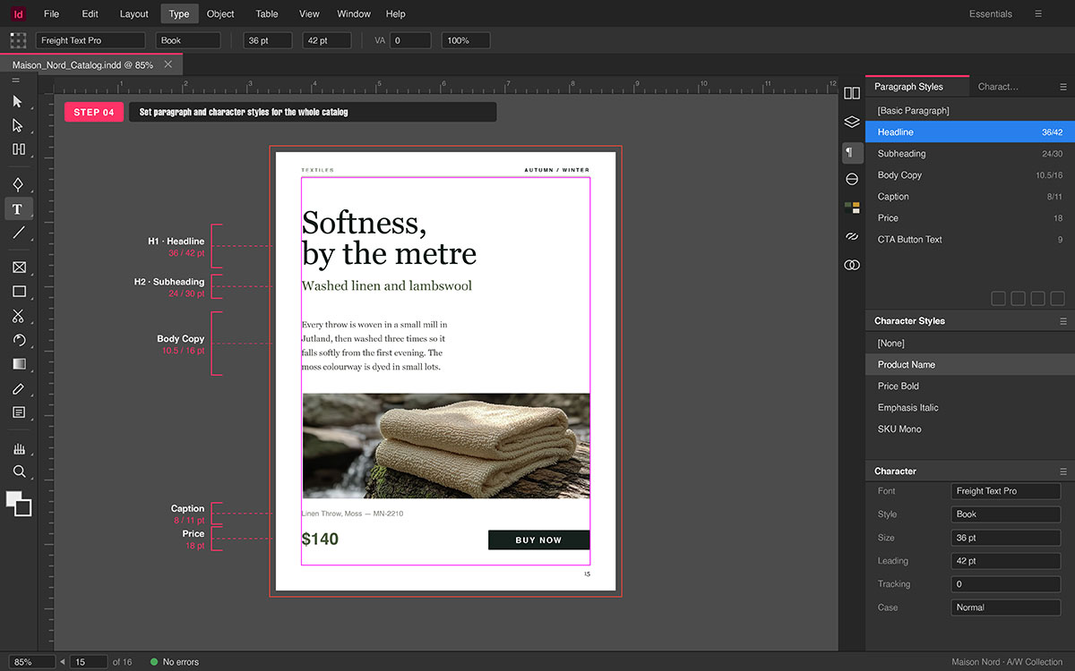
Create paragraph styles
Paragraph styles are key to consistent text formatting. They define font, size, color, spacing, and alignment for blocks. Essential styles to create:
Headline: main title to grab attention on pages
Subheading: secondary titles for page structure
Body Copy: main descriptive or product text
Caption: small text or image descriptions
Price: clear numbers that stand out visually
CTA Button Text: phrases like “Buy Now”
Using paragraph styles lets you update all text at once. No need to change each text box manually across pages.
Create character styles
Character styles handle special formatting inside paragraphs. For example, bold product names or highlight prices easily. You can italicize notes or add emphasis to specific words. Apply them without changing the rest of the paragraph.
Combine with paragraph styles for flexible, consistent design. This gives control over words while keeping overall uniformity.
Sans-serif fonts like Proxima Nova or Helvetica Neue work well. They are clean and easy to read for body text.
Display fonts work best for headings or special elements.
Use no more than two or three typefaces for cohesion.
Always put readability first, especially for long catalogs.
Set a type scale
A type scale keeps hierarchy consistent across all pages. Assign clear sizes for each text level:
H1: 36 pt
H2: 24 pt
Body: 10–11 pt
Caption: 8–9 pt
This creates rhythm and guides readers’ eyes naturally. It keeps your layout clean and visually organized.
Why use styles?
The main benefit of paragraph and character styles is global control.
Update a style once, and all text changes automatically.
It ensures uniformity across every page of your catalog.
It also speeds up workflow and avoids text inconsistencies.
Using styles makes your catalog look professional and polished
5. Place images and build product page layouts
Images are the heart of your catalog’s visual story. They show product quality and guide the reader’s focus. Correct placement keeps pages balanced and easy to read. Here, you build a repeatable layout for all product pages.
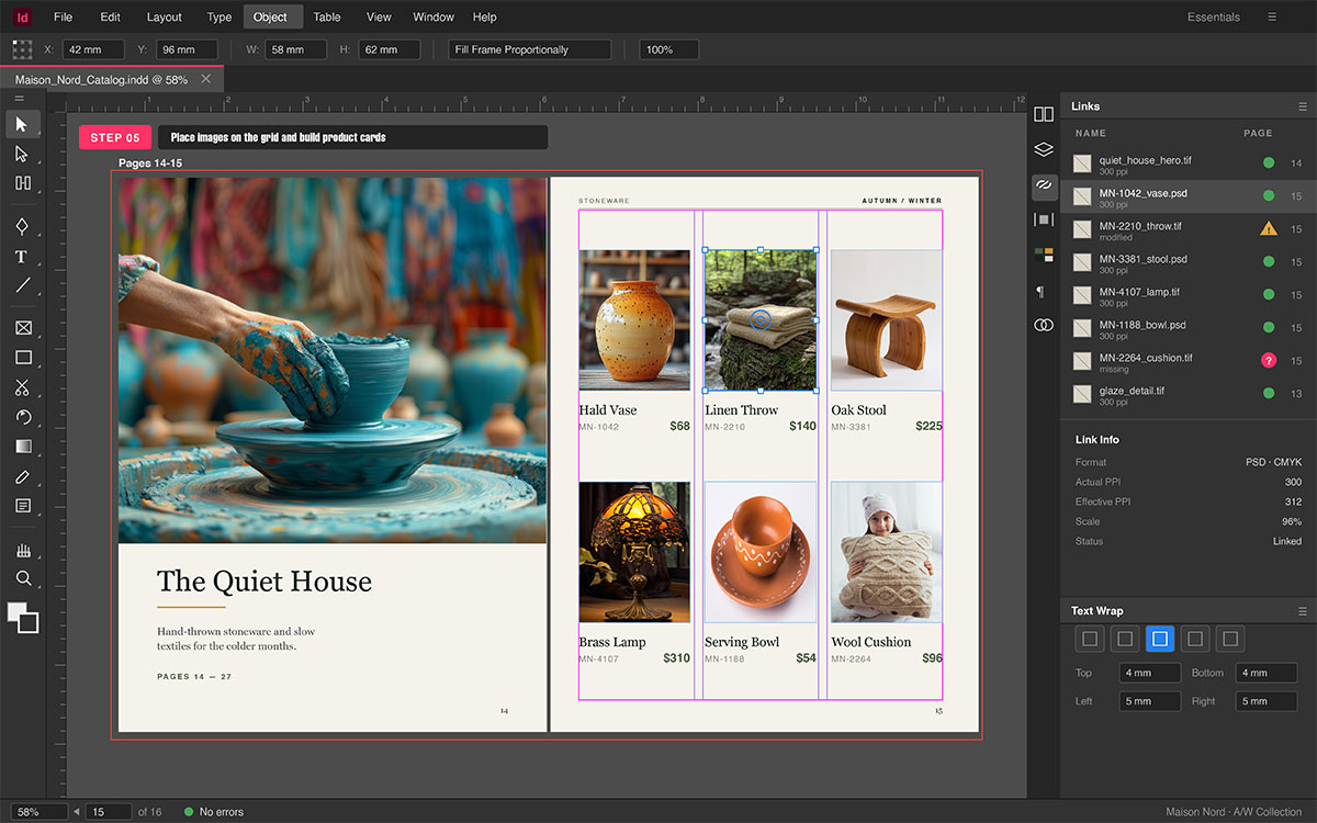
Place images correctly
Placing images is both a technical and visual choice.
Always link images instead of embedding to keep files light.
Use File → Place (Cmd/Ctrl + D) to import images.
Position them within your grid for consistent alignment.
Avoid stretching or scaling that reduces image quality.
Use the links panel
The Links panel manages all images in your catalog.
It shows missing, modified, or offline files instantly.
Relink images quickly when updates occur in your folders.
Keeping links organized avoids export and preflight issues.
Check links regularly to maintain visual consistency.
Image resolution requirements
Resolution affects clarity and professional look of images.
Print catalogs need at least 300 DPI for crisp results.
Digital-only catalogs can use 72–150 PPI to save space.
Keep all images at consistent resolution for visual balance.
Pre-check all images to prevent last-minute quality problems.
Create a product page grid
A grid keeps all elements aligned and visually neat.
It sets positions for images, titles, text, and prices.
Use View → Guides to create margins, rows, and columns.
Maintain consistent spacing to make pages easy to scan.
Plan grids so multiple pages follow the same layout rules.
Text wrap around images
Text wrap makes copy flow naturally around visuals.
Open Window → Text Wrap to control text flow.
Set offsets to give breathing space around each image.
Use text wrap selectively to keep visual hierarchy clear.
Combine with your grid to keep alignment uniform across pages.
Group repeating elements
Grouping makes reusable product cards for faster workflow.
Group image + title + price + description as one unit.
Duplicate cards across pages to maintain design consistency.
Adjust one card before copying to apply changes globally.
Use groups to align multiple cards easily within the grid.
This method keeps product pages consistent, clean, and professional.
6. Use data merge for large product catalogs
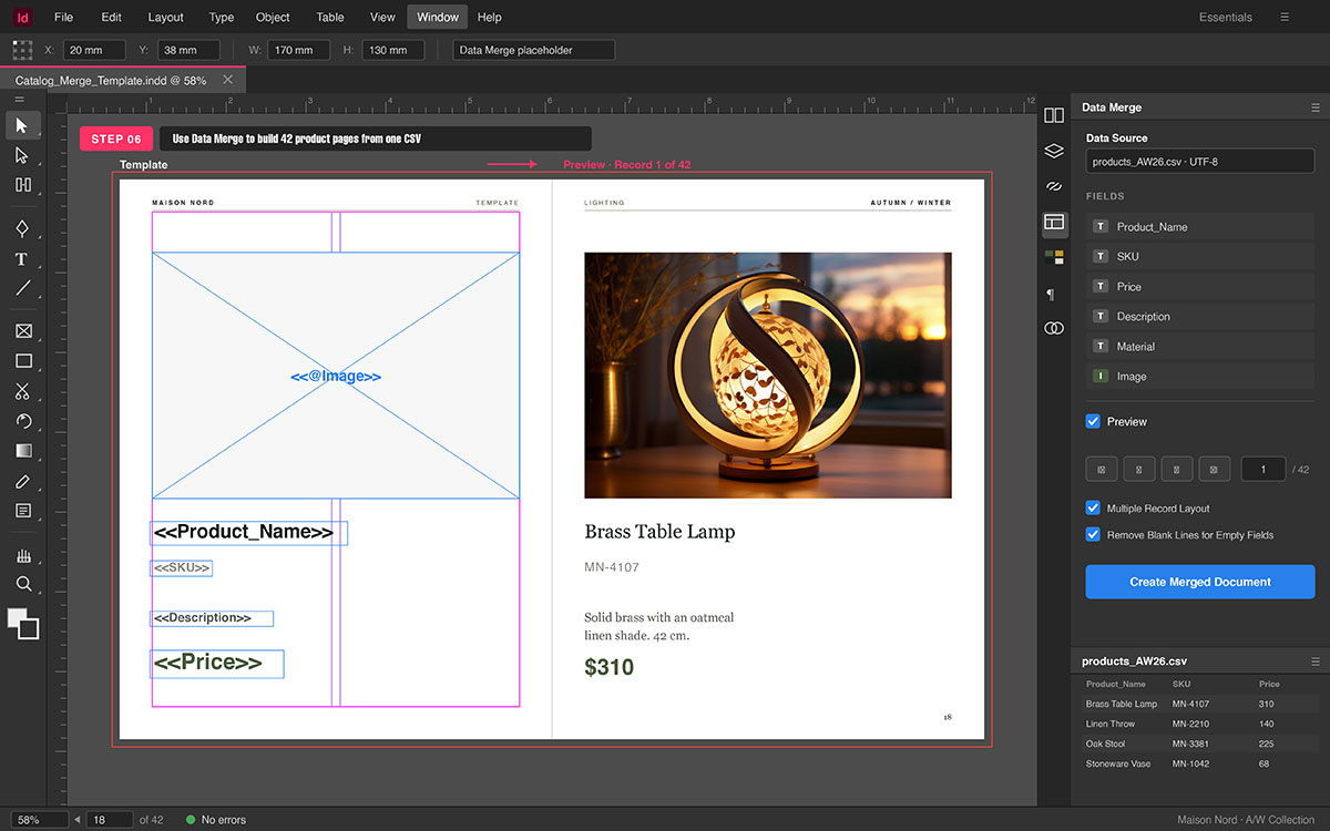
When your catalog has many products, placing each manually is slow. InDesign’s Data Merge helps automate this process efficiently. It pulls data from spreadsheets straight into your catalog layout. Using placeholders in a template, you can create pages quickly. This keeps layout consistent and saves hours of repetitive work.
When to use data merge
Data Merge works best for catalogs that:
Have 20 or more products with the same layout
Need uniform formatting for every product entry
Require quick updates if text or images change
Think of it as a bridge from raw data to polished design. You design once and populate automatically with real content.
Prepare your data source
Start by creating a clean, structured data file. A tidy file makes the merge process fast and error-free.
Use a CSV or TXT file with columns like Name, SKU, Price, Description, Image Path
Keep headers simple; avoid spaces or special characters
Use UTF-8 encoding to prevent text errors
Make image paths absolute, pointing directly to your asset folder
A clean data source ensures smooth, efficient merging later.
Create the merge template
The template is the layout placeholder for all products. Every field image, name, price gets a placeholder.
Design one master product page with grids and guides
Add text fields for each data column
Place image frames and mark them for Data Merge
Keep layout flexible for different text lengths or image sizes
This ensures every merged page looks polished and uniform.
Load the data source
Link your template to the spreadsheet so InDesign can pull data.
Open Data Merge panel (Window → Utilities → Data Merge)
Click Select Data Source and pick your CSV or TXT file
Confirm all fields appear in the panel
Adjust placement if needed to keep alignment
Proper linking ensures each product fills its space correctly.
Preview and merge
Always preview records before generating the full document.
Use the Preview checkbox in the Data Merge panel
Scroll through sample records to check text, images, and prices
Once satisfied, click Create Merged Document
Previewing helps prevent misalignment or layout errors across pages.
Common pitfalls
Even automated merges can fail if data has issues:
Image paths must be absolute, not relative
CSV must use UTF-8 encoding to avoid corrupted text
Column headers should avoid special characters like &, %, #
Ensure all images exist in linked folders before merging
Being careful avoids errors and ensures smooth catalog generation.
By mastering Data Merge, you can scale catalogs fast without breaking layout.
It turns repetitive work into a few streamlined steps. This lets you focus on design details and creative finishing touches.
7. Add color, visual hierarchy, and design polish
Once your catalog has structure, it needs life and polish. Colors, hierarchy, and design guide readers’ eyes clearly. Every choice helps readability and gives a clean look. This step makes the catalog feel professional and finished.
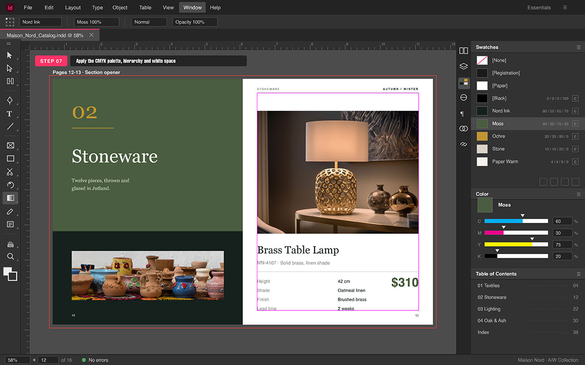
Set up a CMYK color palette
A fixed color palette keeps your brand clear and strong.
Swatches make colors the same across all catalog pages.
Open Window → Color → Swatches to make your palette.
Define primary, secondary, and accent colors for use.
Give each swatch a clear name to match brand rules.
Apply colors to text, shapes, and backgrounds consistently.
Apply color to section dividers
Color organizes content and separates sections visually.
Use headers with distinct colors for each product type.
Highlight section blocks or category headers for quick cues.
Check contrast to keep text readable and clear.
Avoid bright or clashing colors; keep the palette balanced.
Use white space intentionally
White space makes pages feel open and premium to see.
Margins and gutters keep images and text from touching edges.
Add padding inside text frames so the copy has breathing room.
Space between products helps clarity and easy scanning.
Avoid clutter; empty space improves the product’s perceived value.
Add a table of contents
A TOC guides readers and shows catalog planning is solid.
Go to Layout → Table of Contents to create it quickly.
Pull headings automatically from your paragraph styles.
Include page numbers for readers to navigate with ease.
Adjust spacing and style to match your typographic system.
Create a cover page and back cover
The cover is the first look; the back is the last one.
Use bold visuals, catalog title, and tagline for impact.
Add contact info or a QR code for easy customer access.
Keep cover colors consistent with the brand palette used.
Use hierarchy so the title stands out at a single glance.
Use object styles
Object styles make frames and shapes uniform across pages.
Create styles for images, captions, and callout shapes.
Apply the same style on every page to stay consistent.
Change a style once to update all frames automatically.
By applying color, hierarchy, and polish carefully, your catalog becomes readable. Every page feels planned, clear, and visually pleasing to the reader. It reflects your brand while showing your products’ true quality.
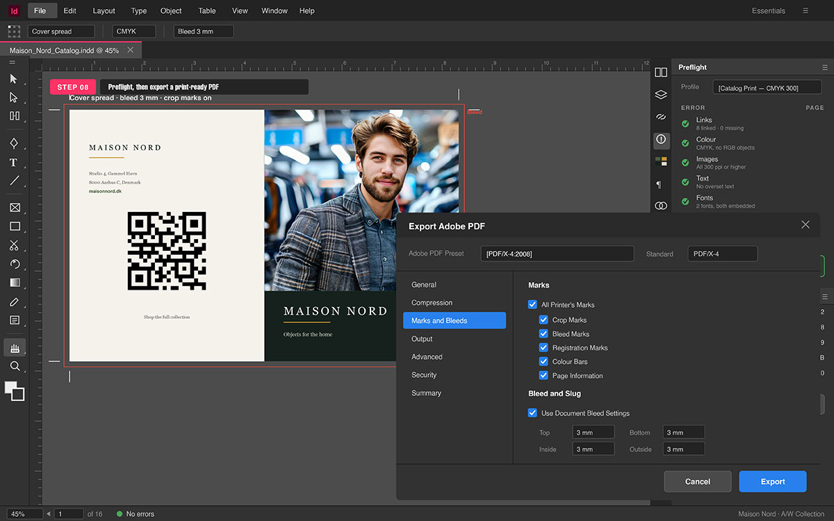
8. Preflight and export your catalog for print or digital
Before sending your catalog, check every part carefully first. Preflight and export make sure all files are ready. This step stops mistakes and keeps quality high and clean. It ensures your catalog looks perfect on print or screen.
Preflight checklist
Preflight acts like a safety net for your catalog. It finds issues that could break print or digital output.
Open Window → Output → Preflight to start the panel.
Check for missing fonts and embed or replace them.
Make sure all linked images exist and are up to date.
Look for overset text that does not fit its frame.
Ensure all images are 300 DPI or higher for print.
Confirm CMYK color mode is active to avoid color shift.
Check bleed and slug settings match printer instructions.
Preflight helps your catalog print cleanly and stay professional.
Export as PDF for print
Exporting as PDF keeps layout, fonts, and colors correct.
Go to File → Export → Adobe PDF (Print) to start.
Use PDF/X-1a or PDF/X-4 for print standards.
Include bleed and crop marks to guide the printer.
Confirm image resolution, fonts, and colors are correct.
This creates a print-ready file and reduces costly errors.
Export as interactive PDF
Interactive PDFs make digital catalogs easy to use.
Add links to products, websites, or purchase pages.
Include buttons and bookmarks for simple navigation.
Enable interactive options during export for full function.
This format is great for digital lookbooks or brochures online.
Export as EPUB
EPUB works well for apps, tablets, or mobile readers.
Go to File → Export → EPUB to start the process.
Supports text flow, clickable links, and interactive images.
Makes your catalog adapt to different screen sizes easily.
Packaging collects all files for safe sharing with others.
Go to File → Package to gather all content.
Include fonts, linked images, and InDesign files together.
Add a report of all fonts and links for reference.
This step ensures nothing is lost when sending to print or design.
By preflighting and exporting carefully, your catalog is ready. It is clean, professional, and works for print or digital use. This last step makes your design translate perfectly to production.
7 Tips for avoiding InDesign catalog mistakes
Making a catalog in Adobe InDesign can be tricky. Even small mistakes can make it look cheap or cause print problems. Avoiding errors helps your catalog stay neat, clear, and ready to print. Paying close attention to colors, images, and text saves time, money, and stress.
Quick-scan list of common mistakes and solutions:
Using RGB color mode for print: Always set your document to CMYK for print. RGB is meant for screens and may cause color shifts when printed.
Embedding images instead of linking: Link images to keep your file size small and make updates easier. Embedded images can slow performance and bloat files.
Skipping master pages: Use master pages for headers, footers, and page numbers to maintain consistent layouts across your catalog.
Using too many fonts: Stick to 2–3 typefaces for a clean, professional look. Too many fonts can confuse readers and clutter the design.
No bleed on full-bleed images: Add at least 0.125” bleed so images extend past the page edge. This prevents white lines after trimming.
Ignoring overset text: Check for the red “+” icon and adjust text frames or font size. Overset text means content is hidden and won’t print.
Not packaging the file before sending to a printer: Use InDesign’s “Package” feature to collect fonts, images, and settings. This prevents missing files and printing errors.
Creating catalogs in InDesign FAQs
You may still have some small questions. That is fine. This part will help you. Each answer is clear, short, and easy to use in real work.
Time will change based on size. A small 16-page catalog can take 1 to 3 days. This is true if the page count is low and each page has few items. A big catalog, like 100 pages, can take 2 to 3 weeks. This is more work, as there are more pics, more text, and more parts to set. You can save time if you plan first. Get all pics, names, and prices ready. When all is set at the start, the work goes much fast and smoothly.
Yes, it can. It has a tool to fill data fast. You can link a CSV file with your data. Once you set it up, it will add item name, pic, and price on its own. You do not need to type each one by hand. This helps a lot when you have many items. It also cuts small errors and keeps all pages the same in look.
Use PDF for print. It is the best and most safe type. For old print use, go with PDF/X-1a. For new print use, PDF/X-4 is good. Make sure to add crop marks and bleed. This keeps the edge safe so no text or pic gets cut. A good file will print clean. No blur, no miss font, no shift in page.
Yes, for big work. It gives you full control. It works well for long files, many pages, and a clean text set. You can keep all parts in line with ease. Canva is good for quick and small work. But for a full catalog, it may not give the same pro look.
Yes, you can. A template can save time and help you start fast. You can change text, font, color, and pics as you like. The base set is already done for you. This is good if you are new or if you want a clean look with less work from the start.
Endnote
Finally, I hope to understand the process of how to create a catalog in InDesign. Will be pretty easy if you keep in mind certain elements like setting up the document correctly, sticking with a single type of font or font family, placing images properly, and knowing how to export your file. Once you have these aspects covered, you can make a professional, print-ready or digital catalog which is not only visually balanced but also user-friendly.
At the point of exporting, your catalog will exceed being just a number of pages - it will be conveying a story, leading your readers, and presenting your brand at its best.
To help you through the whole experience, get our free preflight checklist which will help you catch errors before sending your catalog for printing.
Graphic Design Eye LLC is a full-service creative agency built for brands that demand more than design — they demand vision. From strategic branding to complete visual identity, we partner with startups, agencies, and growing businesses as a dedicated creative force. With flexible subscription and project-based models. Let's start with us today!