Wonder how to design a charity annual report that gets donors to give again and more? Designing a charity annual report comes down to eight principles: lead with human impact, build a unified visual identity, design for scanning readers, visualise your data, use authentic photography, and more. Most reports fail before they're even opened.
Your organisation spent twelve months doing work that changes lives. Then someone exports a spreadsheet, drops a few photos into a Word template, and the whole story collapses into a document almost nobody reads.
Most charity annual reports are designed last, budgeted last, and treated as a compliance checkbox. The cost is invisible but real. Donors don't announce their disappointment. They just give less next year, redirect major gifts to organisations whose materials look more credible, and quietly move on.
According to the Charity Communications report (2023), 67% of major donors review an annual report before making a significant gift. It's one of the most important brand touchpoints you have.
This guide covers eight proven design principles, the most common charity mistakes, a practical breakdown of best practice, and answers to frequent questions about the annual report design process.
Knowing how to design a charity annual report means turning dry compliance data into a story about real people. Lead with the impact on beneficiaries, keep visuals consistent, and use infographics to make data feel meaningful. Done well, it builds donor trust, boosts credibility, and keeps supporters engaged long term.
These eight principles shape every annual report we produce for nonprofit clients.
Principle 1: Lead with Impact, Not Administration
The first page of your annual report is your most valuable space. Most charities waste it on a contents page, a foreword, or a trustee list. Those things belong inside, not on page one.
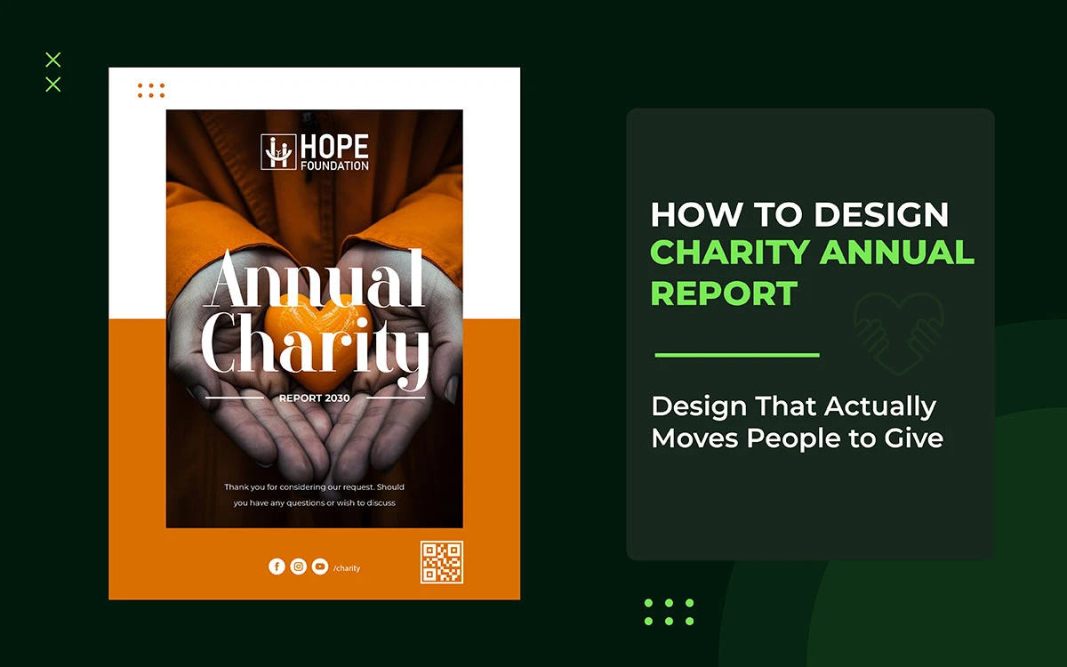
Your cover and first spread should lead with real human impact: one powerful photo, a beneficiary story in a single sentence, and one striking statistic. Readers need to feel something before they start thinking. Data goes inside. People go on the cover.
Put one authentic beneficiary image front and centre, paired with a standout stat and a bold title. Compare that to a cover showing an administrator at a desk. The first builds an emotional connection before the reader turns a single page.
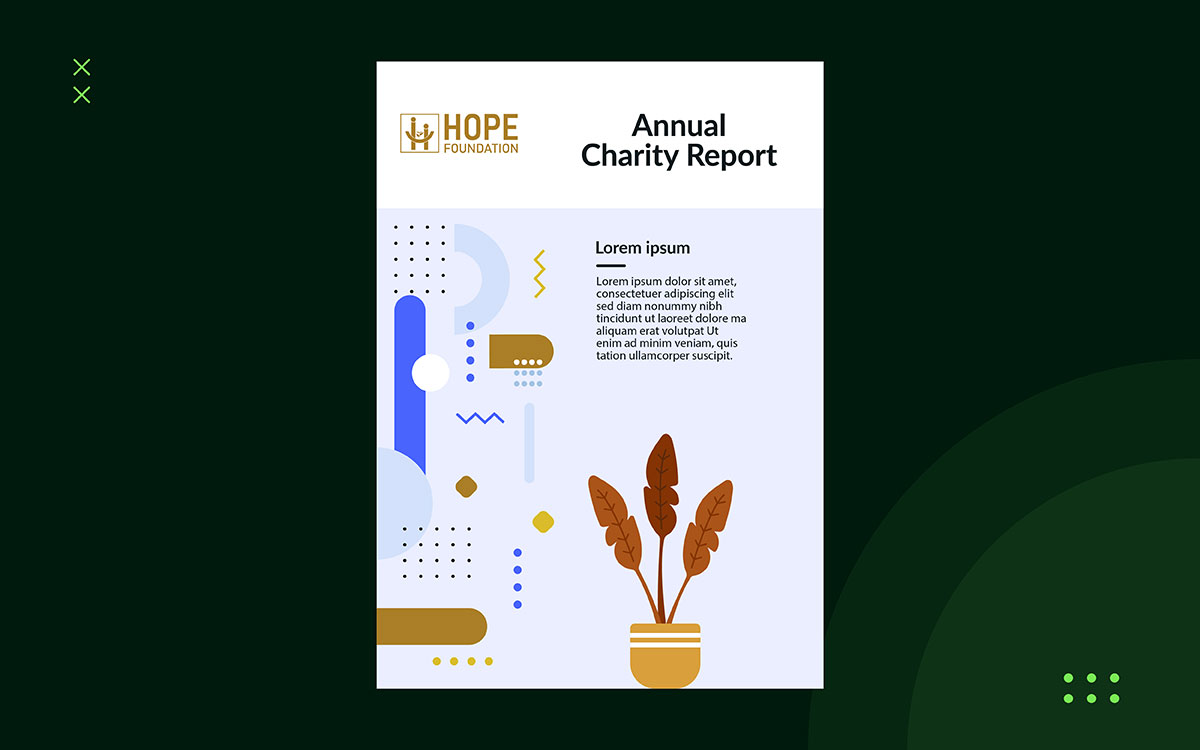
Principle 2: Build a Visual Identity System Before You Open a Template
A charity's annual report is one of its most important brand documents. The fonts, colours, icons, and photos must match your organisation's nonprofit branding guidelines. Don't just use whatever a template gives you by default.
Oxfam GB, Doctors Without Borders, and The Wellcome Trust all produce annual reports you'd recognize instantly. Their reports don't look generic; they look like the organizations behind them. That's intentional, and it comes from having a strong, consistent visual identity. If you haven't built that foundation yet, do that first before touching the report.
Principle 3: Design for How People Actually Read
Readers don't read annual reports from start to finish. They scan. They skip. They get distracted. They come back. Your design needs to work for all of these habits without making things harder for the reader who actually wants to dig deep.
Give readers multiple entry points. Use strong pull quotes on section pages. Add chapter summaries for skimmers. Create visual anchors that guide the eye from one key message to the next. Someone spending two minutes with your report should leave knowing one story, one number, and what your organisation stands for.
Navigation should be visual, not just text-based. Clear section headers, colour-coded chapters, and consistent page layouts help readers find what matters to them fast, without having to wade through dense paragraphs to get there.
Principle 4: Turn Data Into Something a Donor Can Feel
Numbers need context to land. A table showing 82% of donated funds reached direct delivery matters, but as a spreadsheet row, it gets ignored. Turn it into a good infographic, and it hits instantly, feels meaningful, and sticks with a donor weeks later when someone asks why they keep giving.
Infographics, waffle charts, illustrated timelines, and proportional diagrams do not just make data easier to read. They make it harder to ignore. If you need help turning impact metrics into visuals that grab attention, our infographic design for charities service transforms complex data into clear graphics that donors remember, trust, and share.
Principle 5: Use Photography That Earns Trust
Stock photography has no place while learning how to design a charity annual report. It's not just about looks, it's about trust. A photo of some random smiling family tells donors nothing about your work, your people, or what you achieved. It just says you couldn't afford real photos. Donors notice.
Real photos of your beneficiaries, staff, and volunteers are worth the investment. Hire a professional photographer, get proper consent, and think carefully about how people are shown. How you photograph beneficiaries is both a moral and a reputation issue. Dignified images signal values that donors respect and trust.
Principle 6: Make Typography Do the Work Your Words Cannot
Typography goes unnoticed when it works well and feels wrong when it doesn't. A clear hierarchy of headings, subheadings, body text, captions, and pull quotes guides readers through a document naturally, without them having to think about it.
Font choice also communicates something about your organisation. A children's hospice needs warmth. A global policy think-tank needs authority and precision. A community food bank needs accessibility and welcome. These call for different typefaces. If your organisation treats typography as an afterthought and just uses whatever font came with the template, the document will feel generic and careless. In a sector where trust matters, that's a costly impression to leave.
Principle 7: Accessibility Is a Values Statement, Not a Legal Checkbox
A digital annual report that screen readers can't read excludes people your charity exists to help. In a sector built on inclusion, that's a contradiction that donors and trustees are no longer willing to ignore. Meeting WCAG 2.1 AA contrast standards isn't a compliance box to tick; it's the minimum expression of your stated values.
In practice: alt-text on every image, a logical document structure for screen readers, descriptive hyperlinks, and large-print or easy-read versions available on request. Accessible PDF design for nonprofits requires expertise in PDF tagging, reading order, and assistive technology that goes well beyond standard graphic design. If your current supplier can't demonstrate that experience, find out before you commission the next report.
Principle 8: Production Planning and Print Specifications
A good report that comes out of the printer with dull colours, blurry images, or text swallowed by the spine fails at the last step. Good print quality requires: CMYK colour profiling, 300dpi minimum resolution, bleed and crop marks on every page, and exporting as PDF/X-1a.
The choice between digital, print, or both should come from your audience and budget, not guesswork. Many organisations waste money printing reports that most stakeholders would rather get as an interactive PDF. At the same time, some donors, especially major donors and trust funders, respond better to a quality printed copy. Usually, the right answer is both, planned together from the start.
Why Most Charity Annual Reports Fail
As you learn how to design a charity annual report, you must know why it sometimes fails. Most charity annual reports fail for four reasons: last-minute production, generic templates built for compliance, fear of investing in professional design, and limited in-house skills.
All of these are avoidable with good planning and a specialist design partner
1) The Last-Minute Trap
Annual report design is usually an afterthought. Programme teams pull together outcome data in April, then hand the report to a volunteer, a junior admin, or whoever last touched Canva. It ships in June with a phone photo on the cover and a spreadsheet pasted in as the financial summary.
That tells every donor, trustee, and regulator the same thing: the organisation doesn't think its own story is worth telling well. In a sector where donor trust takes years to build and seconds to lose, that matters.
2) The Template Illusion
Many charities use free templates from sector websites or design platforms. Most were built for corporate compliance, not donor engagement, so they meet legal requirements without inspiring anyone to give.
A report built on one will satisfy the Charity Commission while failing to win back a lapsed donor, give a trustee confidence to increase their award, or make anyone care about the work.
3) The False Economy
Some organisations avoid investing in professional design, worried it looks like a misuse of charitable funds. That concern is understandable, but the conclusion is financially wrong.
The Nonprofit Marketing Guide found that organisations with strong visual communications raise 32% more from mid-level donors. Professional annual report design funds the mission rather than working against it.
4) The Internal Capacity Gap
Even when charities want to do better, most don't have the in-house skills to make it happen. Word and Canva work fine for social posts, event flyers, and internal documents, but they weren't built for multi-page, print-ready publications. Page layout, typography, colour management, and master pages are beyond what those tools can do. For a document at this level, organisations need software and workflows built specifically for the job.
Charity Annual Report Design Mistakes vs Best Practice
The table below covers the most important design decisions in a charity's annual report and the standard each one requires. Use it to review your current report or plan your next one.
Common Design Mistake
Best Practice Alternative
Cover features the CEO in a formal suit
Cover leads with a beneficiary story and an authentic, emotion-led photograph
Financial data presented in raw Excel tables
Key metrics transformed into custom infographics, waffle charts, and illustrated timelines
Body copy in 9pt Times New Roman
Accessible 11pt body copy in a humanist sans-serif typeface with generous line spacing
Free stock imagery used throughout
Ethical on-site photography with full consent documentation and dignified framing
No consistent brand language across pages
Unified colour palette, typography system, and icon set aligned to brand guidelines
PDF exported directly from Word or Google Docs
Print-ready PDF/X-1a exported from InDesign or Affinity Publisher with CMYK colour profiles
No digital accessibility provision
WCAG 2.1 AA compliant: alt-text, screen-reader structure, high-contrast text throughout
Charity Annual Report Design FAQs
The following questions are among the most frequently asked by organisations about how to design a charity annual report. Each answer is structured to provide clear, actionable guidance.
Most mid-sized charities need 20 to 40 pages; smaller ones need 12 to 16. Page count matters less than whether each page earns its place. A well-designed 16-page report will outperform a 60-page document full of data tables.
Adobe InDesign and Affinity Publisher are the professional standards. Both offer precise typography, master pages, color management, and press-ready export that multi-page publications need. Canva and Word aren't suited for print quality or major donor distribution.
Between $2,500 and $15,000 professionally, depending on page count, data visualization complexity, and whether print-ready files are included. Graphic Design Eye LLC offers nonprofit pricing with a 30% discount for registered charities.
A message from the Chair or CEO, program outcomes with impact data, clear financial statements, beneficiary stories with consent, donor and partner recognition, and a look ahead at strategy. Write each section with a specific reader in mind, such as a grant funder or a first-time supporter.
Five things define the standard: consistent visual identity, authentic photography that shows beneficiaries with dignity, data visuals that make the impact clear, typography that guides readers naturally, and press-ready production files. A specialist nonprofit design agency delivers all five.
At least three months before publication. A skilled agency builds the visual framework and page layout at the same time as the final audit, so design and data work happen together, not one after the other. Starting in May for a June publication is the most common reason annual reports turn out weak.
Yes. A digital-first report, built as an interactive PDF or a dedicated web page, offers navigation, embedded media, and accessibility features that print cannot match. The key is designing for the screen from the start rather than repurposing a print layout. Explore our portfolio to see both approaches.
Endnote
Now you know how to design a charity annual report worth reading. Just lead with human impact, build a consistent visual identity, and treat your annual report as the important document it is. Don't let it be designed by whoever last used Canva.
The best annual report fits your mission and speaks to the donors you're asking to believe in it. But who do you trust to tell that story? Graphic Design Eye LLC offers professional annual report design for nonprofits, with a 30% discount and a flexible subscription model. We create publication-quality reports that communicate your mission, impact, and finances while staying within your budget.
A project-based package gives you a clear scope and defined deliverables so you can see the quality before committing to anything bigger. No surprises, no pressure.
Your annual report is already speaking to your donors. Make sure it says what you intend.
Graphic Design Eye LLC is a full-service creative agency built for brands that demand more than design — they demand vision. From strategic branding to complete visual identity, we partner with startups, agencies, and growing businesses as a dedicated creative force. With flexible subscription and project-based models. Let's start with us today!