The HKB Tech case study is a good example. The company is a leader in artificial intelligence, cybersecurity, climate technology, and digital transformation. Its technical expertise is clear. But its brand looked scattered. Audiences had to work hard to understand who HKB Tech was and what it stood for.
This gap between technical skills and communication is common in technology. Many companies focus on product development, innovation, and technical differences. Branding often comes second. The thinking is that strong technology will sell itself.
Research shows this is not true. People form opinions about a company’s competence, reliability, and professionalism based on visual cues first. If the visuals are inconsistent, even the best technology can be overlooked.
This case study demonstrates how HKB Tech resolved its brand problem through strategic graphic design. It turned a fragmented look into a clear, consistent identity.
The lessons from this process provide a framework for other tech companies to align their visual identity with their market position and business goals.
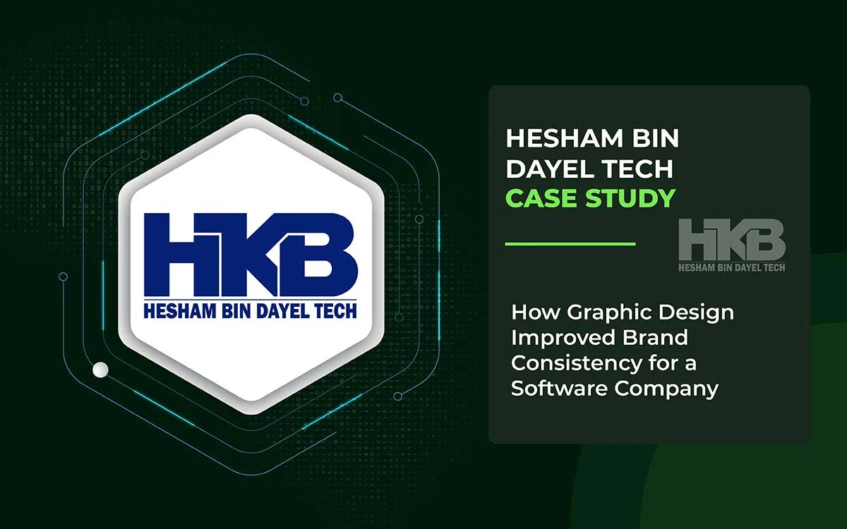
HKB Tech Case Study
This HKB Tech case study shows practical steps to improve brand consistency. It demonstrates that careful design choices in typography, color, layout, and icons matter. These decisions helped HKB Tech establish a consistent, clear visual identity. By studying HKB Tech’s journey, you can learn to align your brand visuals. Aligned visuals make your brand look more professional and easier to remember.
About the HKB Tech
HKB Tech is a Saudi Arabian technology group working in AI, Smart Cities, FinTech, and emerging technologies. The company faced a big branding problem: it was technically strong but lacked a clear, cohesive visual identity. Its fragmented appearance undermined perceptions of its authority and expertise.
This case shows that careful design planning can fix brand fragmentation. It can also boost perceived authority and create visual systems that grow with the company.
These results offer valuable lessons for software companies, tech firms, and B2B businesses that struggle to maintain brand consistency across services, audiences, and channels.
The HKB Tech Problem
HKB Tech’s challenge was not about technology or market position. The company had strong skills, trustworthy leadership, and a clear strategy.
The real problem was the gap between how the company saw itself and how others saw it. This gap came from inconsistent visuals.
In branding terms, this is a classic case of doing well internally but not communicating clearly. Inside, the company operated as a single team. Outside, people saw a scattered brand that was hard to understand and trust.
Problem 1: Complexity Without a Unified Visual Language
HKB Tech worked across multiple domains: AI, cybersecurity, smart cities, health technology, climate solutions, and financial technology. Each sector had distinct technical requirements, regulations, and audiences.
This wide reach was intentional, but it caused some problems:
- Sector-Specific Communication Silos: Each field used its own communication approach, with unique visuals and presentation styles. None referred to a central brand system.
- Fragmented Brand Experience: Someone seeing HKB Tech in AI might not recognize it as a climate technology brand. This made the brand feel inconsistent.
- Cognitive Overload for Audiences: Without a consistent look and feel, people had to work harder to understand the brand, rather than focusing on its offerings. It slowed trust and decision-making.
From a branding view, HKB Tech needed a branded house strategy. Instead, it operated as a house of brands, with disconnected sub-brands. This created a mismatch with its strategic goals.
Problem 2: Authority Present But Not Perceived
HKB Tech had real authority:
- Six decades of business history with the Bin Dayel Group
- Leaders recognized as experts in AI and digital transformation
- Alignment with Saudi Arabia’s national technology strategy
But authority is felt before it is understood. People judge credibility first by what they see. Visual cues matter more than credentials or technical details at first glance.
HKB Tech’s inconsistent visuals worked against the authority it had earned. This gap in perception weakened its competitive position.
Problem 3: Balancing Global Ambition and Local Identity
HKB Tech had two main goals. They sought to compete internationally while maintaining trust and credibility within their local region. Achieving this balance needed a clear brand expression. The brand had to demonstrate global quality while respecting the local context.
Without consistent design rules, the brand faced risks:
- It could feel too generic and fail to connect with local stakeholders who value their heritage.
- It could feel too local, making it hard to compete with global technology firms.
This is a common challenge for tech companies in emerging markets. Yet, few address it with a clear design strategy.
Problem 4: Innovation Without Visual Hierarchy
In fast-moving tech industries, every product can claim to be innovative. But if everything looks equally new, nothing really stands out.
HKB Tech didn’t lack innovation. The problem was that there was no visual hierarchy to guide understanding:
- Which capabilities were core and which were complementary?
- Which technologies led the story, and which supported it?
- How did different offerings connect within the portfolio?
Without a clear structure, all the innovations appeared jumbled. Instead of telling a strategic story, it felt like an undifferentiated catalog.
Problem 5: Internal Growth Creating External Noise
As HKB Tech expanded across sectors and projects, internal activity outpaced clear communication outside the company. This caused several issues:
- The marketing materials appeared disconnected rather than coordinated.
- Presentations varied significantly in tone, structure, and visuals.
- Digital channels lacked a consistent look or recognizable patterns.
For a company that promises precision and smart systems, these visual inconsistencies raised small but important questions about credibility.
The Core Problem in One Line
HKB Tech was strong in technology but weak in visual unity. This made the brand appear inconsistent and less authoritative, and it caused confusion in communication with stakeholders.
The company didn’t need just a prettier look. It needed a design framework that could organize complexity, show authority, and grow with the company.
The HKB Tech Solution
The solution for HKB Tech was not intended to improve appearance. It was about making everything cohere.
Graphic Design Eye saw HKB Tech's challenge not just as a design task but as a problem of brand structure. The goal was not only to make attractive designs. It was to develop a visual system that could handle complexity, demonstrate hierarchy, and remain consistent across all touchpoints.
This approach is very different from typical graphic design projects. Instead of creating separate assets, such as a logo, company profile, and brochure, the focus was on establishing design rules and reusable structures. Internal teams could then use these rules consistently.
From a strategic perspective, this method prioritizes impact over quantity. It aims to identify a few key inputs that yield the greatest results.
Solution 1: Turning Complexity into a Structured Visual System
HKB Tech operates across many advanced domains. That complexity could not be simplified away. The solution was to organize it.
Graphic Design Eye developed a central visual logic that enabled different technologies to coexist within a single recognizable structure. Each sector retained its identity, but all spoke the same visual language.
From a theoretical standpoint, this reduced cognitive friction. Audiences no longer had to relearn the brand every time they encountered a new service.
Solution 2: Designing for Perceived Authority Before Explanation
People judge a brand visually before they hear anything about it. Audiences quickly form opinions about a company’s competence based on design cues, often without realizing it.
The solution focused on clear markers of authority that show credibility right away:
- Visual Hierarchy and Information Structure: Content was organized to guide the viewer’s attention. Well-structured information shows clear thinking. For HKB Tech, this meant that presentations, proposals, and marketing materials followed a logical flow rather than overwhelming the audience with too much information.
- White Space and Visual Breathing Room: Negative space was used carefully to signal confidence and sophistication. Brands that lack confidence often crowd every inch of their design. Confident brands let content breathe, knowing that clarity is more persuasive than clutter.
- Consistent Alignment and Precision: All visual elements were carefully aligned and spaced. Misaligned or inconsistent layouts can make a company look sloppy, which is risky for businesses offering precise technologies.
These design choices acted as nonverbal signals of authority. HKB Tech’s credibility became apparent immediately, without requiring additional explanation.
Solution 3: Creating a Bridge Between Local Roots and Global Vision
Handling the tension between regional identity and global competitiveness needed a careful design approach. It avoided choosing only one side.
Instead of picking either a "regional" or "international" style, the solution created a smart visual language that worked in context:
- Showed Universal Professionalism: Used design choices that reflected global standards. It established credibility, which is essential when competing with multinational technology companies.
- Included Subtle Local Hints: Added design touches that recognized the regional context. It did so without employing overt cultural stereotypes. This way, the brand felt right locally while staying credible globally.
- Focused on Clarity, Not Decoration: Skipped flashy cultural symbols. The design emphasized clear and confident visuals, letting HKB Tech’s work speak for itself.
This strategy turned a potential challenge into an advantage. HKB Tech now operates effectively both locally and internationally.
Solution 4: Establishing Visual Hierarchy for Innovation Storytelling
Innovation loses its impact when everything seeks attention simultaneously. The solution was to prioritize strategically. It helped audiences see HKB Tech's offerings as a coherent narrative, not just a disorganized catalog.
This included:
- Defining Core vs. Supporting Offerings: Highlighting core capabilities and distinguishing them from ancillary services. It facilitated the audience's understanding of the overall portfolio.
- Creating a Step-by-Step Flow: Using templates and layouts to guide people through information in order. This built understanding gradually rather than presenting everything at once.
- Using Visual Cues for Importance: Applying size, color, and placement to show what matters most. The design itself told the story.
This structured approach turned HKB Tech's innovation story from confusing to compelling.
Solution 5: Aligning Internal Growth with External Consistency
Most importantly, the solution focused on scalability and repeatability. As HKB Tech grew, the brand system had to accommodate new products, markets, and modes of communication. It needed to do this without constant redesign.
The setup included:
- Documented Design Principles: Clear guidelines that internal teams could follow when creating new materials. It maintained design consistency without requiring external review for each asset.
- Template Systems: Reusable layouts for presentations, proposals, data sheets, and social media graphics. They maintained brand consistency while providing teams with flexibility to adjust content.
- Decision Rules Instead of Strict Templates: Teams used design principles to make choices, rather than following rigid templates. It ensured consistency while providing flexibility for future needs.
- Training and Knowledge Transfer: Internal stakeholders learned not only how the brand appeared but also why design choices supported the company’s goals.
This setup transformed the design from a bottleneck requiring external assistance into an internal skill. It allowed the brand to grow smoothly as the company expanded.
The Resulting Shift
The solution did not change HKB Tech’s identity. Instead, it showed how that identity moved across different contexts, audiences, and communication channels.
The new brand system showed:
- Technological sophistication through precise visuals
- Institutional authority through confident design
- Complex portfolio made clear with visual hierarchy
- Scalable infrastructure to support future growth
Most importantly, the solution treated the design as a strategic tool rather than merely decorative. This change completely reshaped how HKB Tech approached brand communication.
HKB Tech Project Investment: USD 1,000
On the surface, USD 1,000 might seem small for a technology company with operations in AI, Smart Cities, FinTech, and DeepTech. However, the power of this investment lay not in its amount but in the specific position within the brand system in which it was used.
This project approached brand consistency not as a problem of appearance, but as a problem of structure.
The Core Logic Behind the Investment
Brand inconsistency is not about blaming the design team. It arises when:
- Several teams communicate independently without coordinating their messages
- Different technologies are offered under the same brand without clear differentiation
- The vision of the leaders changes faster than the visual identity
HKB Tech faced a situation in which the brand stood for cutting-edge innovation, but its visual language did not function as a unified, regulated system.
Consequently, the USD 1,000 investment was intended to correct the system rather than to effect a superficial redesign.
How the Budget Was Strategically Allocated
Rather than churning out a large number of creative assets, the budget was focused on design infrastructure that would have a high impact:
- Harmonizing a visual hierarchy across all materials
- Defining and standardizing typography, color usage, and layout logic
- Developing repeatable design rules for current and future sectors
From a branding theory perspective, this is a leverage-based approach: small inputs that influence many future outputs.
Why Brand Consistency Delivers Disproportionate Value
In software and technology branding, consistency builds trust. When visual elements are in harmony:
- Complicated products are perceived as simpler
- Sophisticated technologies are seen as more trustworthy
- Decision-makers view the organization as mature
This investment directly reduced the cognitive load for users and stakeholders. A consistent design system makes the brand easier to understand, allowing audiences to focus on capabilities rather than interpretation.
Investment as Risk Reduction
From a strategic perspective, this USD 1,000 was spent as risk mitigation. An inconsistent brand can result in:
- Misinterpretation in different markets
- Loss of authority in conversations with enterprises
- Friction in discussions with partners and investors
By promoting consistency early, HKB Tech decreased the long-term costs of rebranding, redesigning, and repositioning as the company grows.
The Compounding Effect of the Investment
The real value of this investment lies in its compound impact. Once a consistent visual system is established:
- Every future design becomes faster and more accurate
- External agencies align more easily
- Internal teams communicate with fewer corrections
This transforms design from a recurring cost into a scalable operational asset.
Logical Summary
USD 1,000 was not spent to improve HKB Tech's appearance. It was invested in to improve the brand's performance. By focusing on consistency, not just creativity, Graphic Design Eye helped HKB Tech:
- Present a unified identity across advanced technologies
- Strengthen perceived authority without increasing complexity
- Build a visual foundation capable of supporting long-term growth
In brand strategy terms, this was a low-cost, high-impact effort. It was perfectly suited to a software company operating at scale.
What Other Software Company Can Learn
HKB Tech’s case shows that many software companies overlook this: brand consistency is not a decoration. It is infrastructure.
Here are the key lessons that other software- and technology-driven companies can learn from this case.
Lesson 1: Brand Consistency Is Infrastructure, Not Decoration
HKB Tech demonstrated an important lesson: brand consistency is not merely about appearance. It’s part of how a company works. Many tech companies spend too little on systematizing their brand. They view design as an add-on, not as a core part of operations.
But brand consistency is like IT systems or other operational tools. When it works, you hardly notice it. When it’s missing, it causes big problems. Companies that understand this treat brand infrastructure as a priority.
Actionable Step: Don’t judge brand consistency by its appearance. Measure it by operational results: how long content takes to produce, how well stakeholders understand it, and how strong your position is against competitors.
Lesson 2: Visual Coherence Comes Before Technological Credibility
In tech markets, people judge a company’s skill in many ways, through specs, thought leadership, case studies, and how professional it looks. Studies indicate that people first notice visual cues. These visuals then shape their understanding of other information.
If visuals are inconsistent, people may doubt the company’s maturity, even if its tech is strong. On the other hand, consistent visuals make the company seem more competent overall.
Practical Tip: Visual consistency isn’t just branding. It enhances credibility and increases trust in your technical abilities.
Lesson 3: Complexity Needs Structure, Not Simplification
Technology companies that operate across multiple areas often feel pressure to “simplify” their brand message. HKB Tech shows a different way: manage complexity, don’t erase it.
Rather than cutting services or narrowing its market, HKB Tech maintained its diverse offerings. They developed visual systems that facilitated audience understanding of their range. The key was clear structure, not forced simplicity.
Actionable Tip: When your brand feels complex, ask whether the problem is real complexity (which needs simplification) or organizational complexity (which needs structure). Most tech companies face organizational complexity. They gain more from clear systems than from reducing complexity.
Lesson 4: Small Strategic Investments Beat Big Tactical Spending
A $1,000 investment illustrates an important idea: small, focused investments that improve the system deliver better results than large expenditures that only treat symptoms.
Many technology companies allocate substantial resources to marketing, creative projects, or platform-specific campaigns. But they often ignore the basic brand foundation. It creates significant activity but doesn’t address the underlying problems with the brand.
Practical Tip: Before launching new marketing or creative campaigns, check your brand foundation first. Make sure everything is consistent and well-structured before scaling up communications.
Lesson 5: Design Systems Scale, Individual Designs Do Not
HKB Tech succeeded because it focused on reusable systems instead of one-off creative pieces. This shows a key truth: to grow, you need systems.
Single designs, no matter how good, have to be redone every time. A design system, once established, can be used in many contexts with minimal additional effort. For growing tech companies, this difference is very important.
Actionable Step: Look at design work through the lens of reuse and scalability, not just creativity. Focus on frameworks that enable teams to maintain consistency independently.
Lesson 6: Local-Global Positioning Needs Visual Intelligence
For technology companies operating in both regional and international markets, visual positioning requires careful consideration. It cannot be just “regional” or “international.” It must show understanding and skill in different settings.
HKB Tech did this by using a design that looked professional everywhere, yet still fit each local context. They avoided looking too generic or relying on stereotypes.
Actionable Step:
If your company faces the same challenge, create visuals that focus on clarity and confidence. Don’t rely on obvious cultural symbols. Let your work show regional credibility while keeping global standards.
Endnote
Brand consistency did not happen overnight. It was a careful and gradual process. Decisions were made thoughtfully. Clear guidelines were set. The team understood how the brand wanted to be seen.
For HKB Tech, graphic design made the brand easier to understand. Visual elements began to feel connected. Colors appeared intentional. Layouts looked familiar and coherent. The brand stopped telling many stories across platforms. It began to tell a clear and unified story.
If your tech company struggles with a messy visual identity, mixed messages, slow brand growth, or a gap between your skills and how credible you look, a strong brand system can help.
Graphic Design Eye works with tech companies to create clear and consistent design systems. We maintain your brand's professional and trustworthy image without compromising growth or oversimplifying complex ideas.
Contact Graphic Design Eye to see how a smart design system can turn your brand from scattered into unified. This provides your company with a strong foundation for lasting success in technology.
When design is consistent, your brand appears reliable and trustworthy.