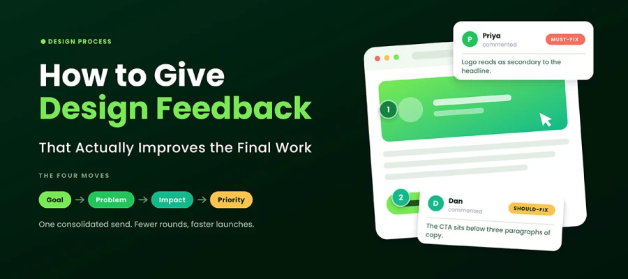
How to give design feedback comes down to four simple steps. Restate the goal, describe the problem, explain how the problem affects the goal, and label each comment as must-fix, should-fix, or preference. Send all your feedback at once, in context, and in one clear voice. That reduces the number of revision rounds, keeps designers engaged, and keeps the work focused on the goal.
Round three lands in your inbox. You open it, and somehow the work feels further from the goal than it did in round one. The colors changed, the layout shifted, and the headline shrank. Yet none of it feels closer to what you actually needed.
Does this sound familiar?
You have reached the final section, so there is no need to worry. Let us be honest for a moment. In most cases, the problem is not the designer. It is the input. Designers work with what they are given, and vague feedback often leads to vague results. Learning how to give graphic design feedback is one of the cheapest fixes available to you because it is something you can fully control.
In this guide, we will dive into a structured four-step method for providing graphic design feedback on your active projects. Also explores three specialized critique models, includes written examples for your upcoming reviews, and provides a final checklist to verify your notes before delivery.
Keep reading, as the solution to your revision fatigue is only a short scroll away!
How to give design feedback
To know properly how to give design feedback, state the goal the design must hit, describe the specific problem you see, explain how that problem hurts the goal, and let the designer propose the fix. Rank every comment as must-fix, should-fix, or preference so priorities are never guessed.
These four steps work for a logo, a landing page, a pitch deck, or a single Instagram tile. They work whether you're a founder with no design vocabulary or a design lead who could redraw the thing yourself. Get started now.
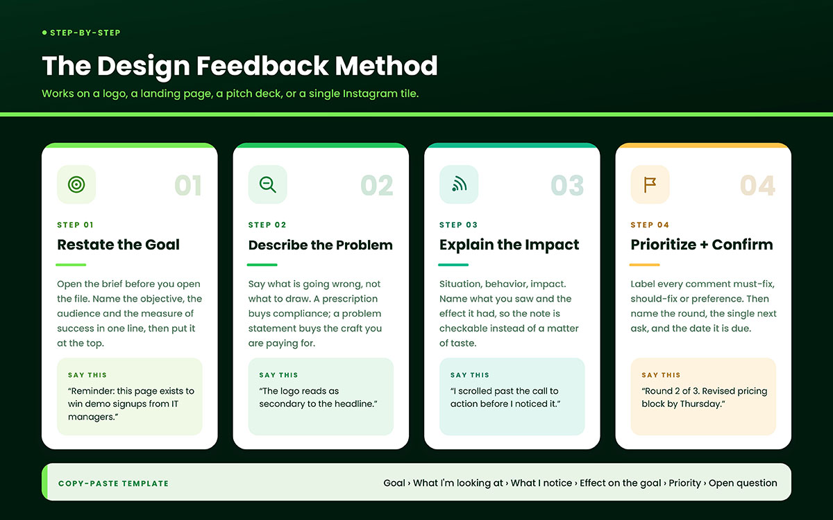
Step 1: Restate the goal before you react
Open the brief before you open the file. Name the objective, the audience, and the measure of success in one sentence. Put that sentence at the top of your feedback.
One line is enough: this landing page exists to get demo signups from IT managers.
That small act changes the question you're asking. Rather than asking whether you like it, ask whether it does the job. Those are different questions, and they produce different notes.
It also protects the designer from your Monday mood. A stated goal becomes a shared standard, and shared standards are what a working graphic design process runs on from first sketch to final delivery.
Step 2: Describe the problem, not the solution
A prescription tells the designer what to do. A problem statement tells them what's going wrong. Make the logo bigger is a prescription. The logo reads as secondary to the headline, and brand recall is the goal here; that is a problem statement.
The difference matters more than it sounds. When you prescribe, you get compliance. The designer executes the instruction, stops diagnosing, and hands the outcome back to you. At that point, you've made yourself the art director on a project you paid someone else to art direct.
There's one honest exception. Hard constraints aren't opinions and shouldn't be up for debate. Brand colors, legal disclaimers, accessible contrast ratios, and platform specs are requirements. State them as requirements. If the brand book locks a palette, say so plainly and point to the color combinations already approved, rather than inviting alternatives you'll only reject later.
Step 3: Explain the impact
Observations without consequences are just opinions with better manners. The fix borrows a structure from leadership coaching: Situation, Behavior, Impact, or SBI, a model developed by the Center for Creative Leadership. Adapted for creative work, it becomes what you looked at, what you saw, and what effect it had on you as a reader or viewer.
It reads like this: on the pricing section, the call to action sits below three paragraphs of body copy, so I scrolled past it before I noticed it.
Notice what that sentence does. It's checkable. The designer can open the same section, see the same copy stack, and reproduce your experience without arguing about taste. Impact turns a preference into evidence, and evidence is what a designer can actually solve for.
Step 4: Prioritize and confirm next steps
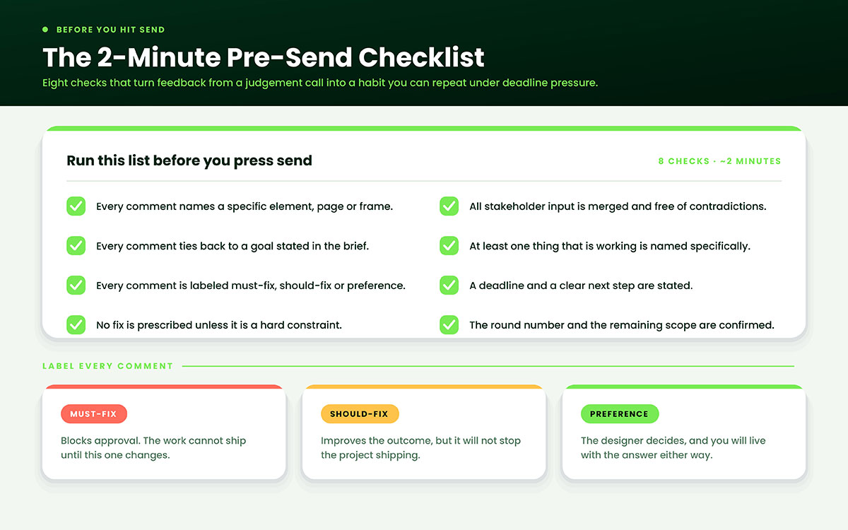
Label every comment. Must fix means it blocks approval. Should fix means it improves the outcome but won't stop the project. Preference means the designer decides, and you'll live with the answer either way.
Then name the round. Saying this is round two of three and that the layout is now locked tells the designer which doors are closed and prevents a fixed scope from quietly drifting open. If you're not sure how many rounds you have, check how the review cycle is structured before writing a single note.
Close with a clear ask and a date. Please send the revised pricing section by Thursday closes the loop. Let me know your thoughts; leave it open for a week.
Copy-paste feedback template
Goal: [objective from the brief]
What I am looking at: [page, frame, artboard, or asset name]
What I notice: [observable detail, no adjectives]
Effect on the goal: [what happens as a result]
Priority: [Must-fix / Should-fix / Preference]
Open question for you: [invite the designer's expertise]
Three critique frameworks worth borrowing
SBI isn't the only structure available. Two others are worth knowing, because the right frame depends on whether you're writing notes alone or talking in a room.
Framework
How It Works
Best For
Watch Out For
SBI (Center for Creative Leadership)
Name the situation, then the observable detail, then the impact it had on you
Written, asynchronous notes on a specific file or frame
Reads clinically if every single comment uses it
I Like, I Wish, What If (Stanford d.school)
Open with what works, raise concerns as wishes, offer possibilities as questions
Live group critique and early-stage concepts
Wishes can become prescriptions in a friendly costume
Rose, Thorn, Bud
Tag each observation a strength, a problem, or an unrealized opportunity
Sorting a long, contradictory list of stakeholder notes
Says nothing about priority, so pair it with must-fix labels
Pick one and stick with it for the length of a project. When every reviewer uses the same shape, the designer stops decoding personalities and starts reading content. Just remember a framework organizes your thinking; it doesn't replace it.
Design feedback examples (Weak vs. strong)
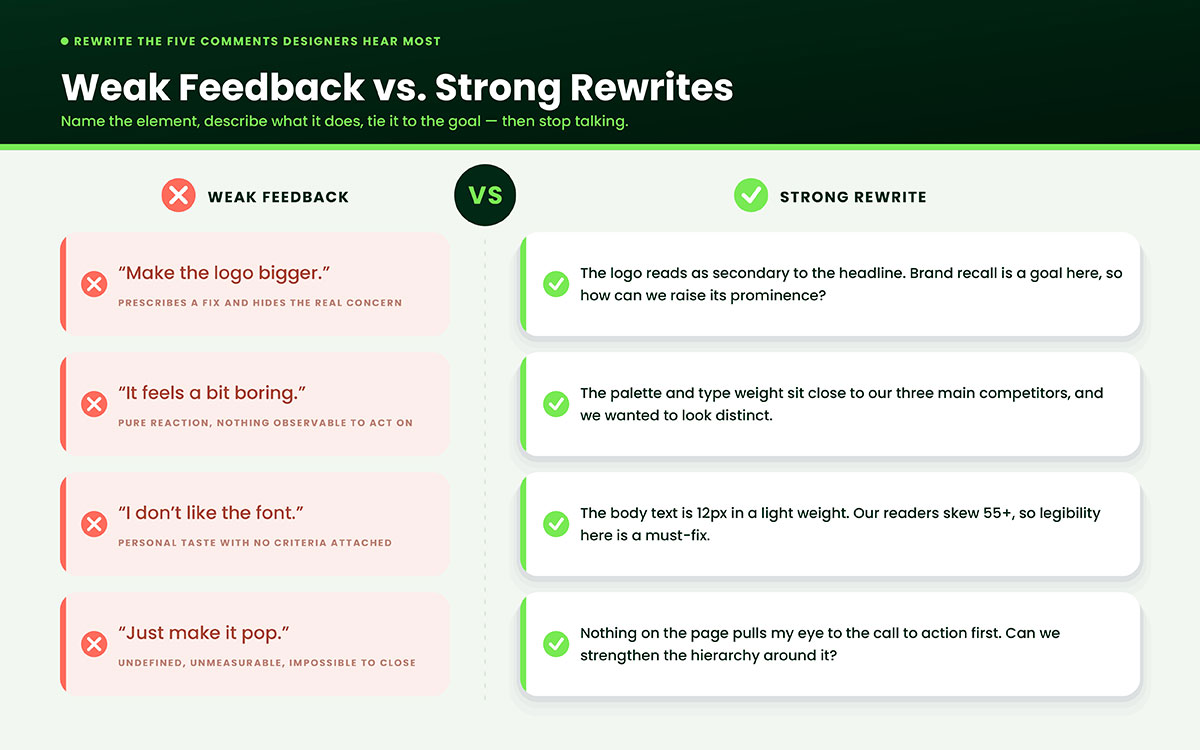
Weak feedback names a feeling or hands over an instruction. Strong feedback names an element, describes what it does, and ties it to a goal. The table below summarizes the five comments designers hear most often, along with the reasons each original fails.
Weak Feedback
Why It Fails
Strong Rewrite
Make the logo bigger
Prescribes a fix and hides the real concern
The logo reads as secondary to the headline. Brand recall is a goal here, so how can we raise its prominence?
It feels a bit boring
Pure reaction, nothing observable to act on
The palette and type weight sit close to our three main competitors. We wanted to look distinct. What could differentiate us?
Can we see it in blue?
Requests an output without stating a problem
Green tested poorly with this audience in our last campaign. Is there a palette that still fits the brand guide?
I do not like the font
Personal taste with no criteria attached
The body text is set at 12px in a light weight. Our readers skew 55+, so legibility here is a must-fix.
Just make it pop
Undefined, unmeasurable, and impossible to close
Nothing on the page pulls my eye to the call to action first. Can we strengthen the visual hierarchy around it?
Read the right-hand column again and notice what's missing. Not one rewrite tells the designer what to draw. Each hands over a problem, a reason, and a boundary, then stops talking. That silence is deliberate. It's the space where the designer does the work you hired them for.
8 Design feedback mistakes to avoid
Most design feedback mistakes are not rude. It is just vague, late, or scattered across four different chat threads. And the designer pays for it in wasted rounds.
These eight habits quietly turn a two-week project into a six-week one. Here's where to start fixing them.
Redesigning it yourself in the comments: Marking up coordinates and font sizes buys compliance, not craft. Describe the problem and let the designer bring three ways to solve it.
Sending feedback in dribs and drabs: Notes trickling in over two days create partial revisions that contradict each other. Hold everything and send one pass.
Speaking for a user group you haven't researched: People won't like that is an assertion wearing a research costume. Say the leadership team prefers, or bring the data.
Comparing the work to an unrelated brand: Make it feel like Apple ignores a different budget, audience, and category. Compare against your own brief and the brand identity the design is built to carry.
Withholding praise entirely: If you never name what works, the designer has no idea what to protect and may rebuild the one part you liked. Name one strength specifically.
Approving something you've only seen on a desktop monitor: Check it where it will live, on the device your audience actually uses, before signing off.
Treating revision rounds as unlimited: Undefined scope breeds resentment on both sides. Agree the number of rounds in writing before work starts, then track which one you're in.
Delivering criticism publicly that belonged in a direct message: Critique the work in the open, address a performance concern privately, and never mix the two.
Pre-send design feedback checklist
Run this list before you hit send. It takes about two minutes and turns giving design feedback from a judgment call into a habit you can repeat under deadline pressure.
Every comment names a specific element, page, or frame.
Every comment ties back to a goal stated in the brief.
Every comment is labeled must-fix, should-fix, or preference.
No comment prescribes a solution unless it is a hard constraint.
All stakeholder input is merged and free of contradictions.
At least one thing that is working is named specifically.
A deadline and a clear next step are stated.
The round number and the remaining scope are confirmed.
About giving design feedback FAQs
Now you know how to give design feedback, including the four steps, the rewrites, and the checklist. These are the questions that come up during a project when the file is open, and the next round is due. We have answered them directly. Skim through and find the one that fits your situation, then use it in your next set of notes. If something is still missing, simply reach out to us. We're here to help 24/7.
Name the goal the design should meet. Describe one clear problem you see. Explain how it hurts that goal. Let the designer suggest the fix. Then label it must fix, should fix, or preference. That gives the designer a target and a priority. That's all they need.
It's specific, objective, goal-oriented, and actionable. It points to something, describes what it does, and links it to the brief. A reaction just shares how you felt. It gives nothing to check. Both can be honest. Only one is useful.
Critique the work, not the person. Swap adjectives for observations. Say "the copy is unreadable at this size" instead of "this is sloppy." Ask questions instead of giving verdicts. Note what's working before what isn't. Good structure keeps the tone from coming across as an insult.
Don't say "make it pop." It can't be measured. Say what should catch the eye first instead. Don't say "I'll know it when I see it." That's your job, not theirs. Share three references instead. Don't say "can you just quickly," it hides real work. And never say your nephew could do this.
Two to three rounds is standard for project-based work. Put the number in the agreement, don't assume it. Extra rounds usually cost more. Subscription and flat-rate package models differ, often with unlimited revisions within a set brief. Confirm which model you're buying.
Test it in four ways. Check whether it is clear at small sizes, works in a single color, stands out in its category, and matches the brand traits outlined in the brief. Focus on these points rather than on whether you like the shape. A logo is a tool first and a picture second.
A critique is a structured examination of the work against stated goals, usually conducted as a session with an agenda. Feedback is any response, reaction, preference, or direction included. Every critique is feedback. Most feedback isn't a critique. Knowing which one you're giving sets expectations for both sides.
Set one deadline for input. Collect all responses into one document. Remove duplicates. Resolve direct conflicts with the outcome owner before the designer sees anything. Send one prioritized list from one named owner. This applies to every type of graphic design project, from packaging to presentations.
Endnote
Now! We’ve arrived at the final section, and there is no reason for concern!
Here is how to give design feedback in one line. Restate the goal, describe the problem, explain the impact, and rank what matters. Each comment takes about two extra minutes.
The payoff is clear. Fewer rounds mean faster launches. Faster launches mean lower costs. And when a designer is trusted to solve problems instead of simply following instructions, they stay more invested in your brand. That value never shows up on a budget sheet.
Print the checklist and keep it beside you for your next three reviews. By the fourth, you probably will not need it. Writing feedback this way will start to feel natural and become the easiest way to talk about work you are paying for.
Still stuck on a review that has gone sideways? Contact us, and we will walk you through it.
Graphic Design Eye LLC is a full-service creative agency built for brands that demand more than design — they demand vision. From strategic branding to complete visual identity, we partner with startups, agencies, and growing businesses as a dedicated creative force. With flexible subscription and project-based models. Let's start with us today!