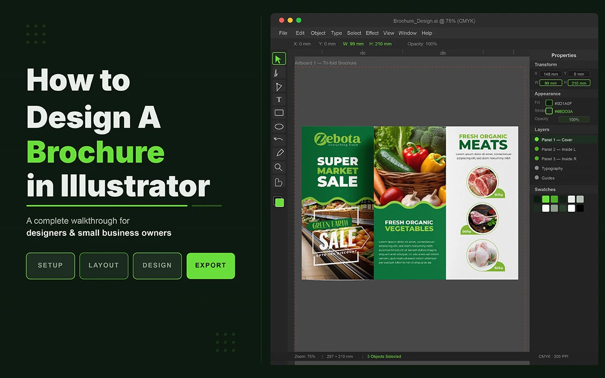
Wonder how to design a brochure in Illustrator? It comes down to five fundamentals: correct document size (8.5×11" or A4), CMYK colour mode, bleed settings (3mm / 0.125"), fold guides, and a clear layout grid. Follow this guide, and you can produce a polished, print-ready brochure in under 30 minutes, even as a beginner.
There is something thrilling and daunting about opening a blank Illustrator canvas. The cursor blinks. The artboard stares back at you. And somewhere in the background, a deadline quietly tightens its grip.
Most people respond the way you might expect. They type a headline, paste a few images, pick a colour that feels right, and hope for the best. The result is a brochure design that looks cluttered, unbalanced, and hard to read, the kind that ends up in the bin before it is ever truly read.
But professional designers know that designing a brochure in Adobe Illustrator is not about raw talent; it is about method. A great brochure is not born from inspiration alone. It is built methodically and purposefully, with the right tools in the right order. If you follow the right steps, you can go from an empty document to a print-ready brochure in under 30 minutes.
This guide is your roadmap to getting professional results without the professional price tag.
So, let us begin!
How to Design a Brochure in Illustrator
The truth is, you don't need to be a seasoned designer to create something beautiful. You just need the right approach, the right tools, and a little guidance to get started.
Here, we'll take you through everything you need to know about how to design a brochure in Illustrator, from setting up your document and building your layout to choosing fonts, adding images, and exporting a print-ready file.
Let's get started now!
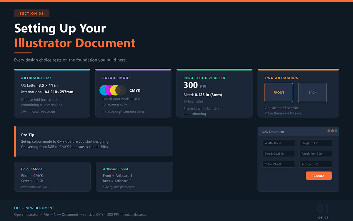
1. Setting Up Your Illustrator Document the Right Way
The first thing anyone learning how to design a brochure in Illustrator must understand is this: every design choice you make later rests on the foundation you build here.
Set this up incorrectly, and no amount of beautiful typography or stunning imagery will save you from a brochure that prints with muddy colours, blurry photos, or white borders where there should be none.
Open Illustrator and navigate to File → New Document. From this single dialogue box, you are making decisions that will affect every single page of your brochure. Do not rush it.
Artboard Size
For a standard tri-fold brochure, set your artboard to 8.5 × 11 inches (US Letter) or A4 (210 × 297 mm) for international use. These dimensions are not arbitrary. They reflect the physical reality of how brochures are printed, folded, and displayed.
Before you commit to a size, it is worth understanding that different types of brochures affect your layout. So, choose your fold format before committing to artboard dimensions.
Colour Mode: CMYK vs RGB
If your brochure is going to be printed, and most brochures are, you must set your colour mode to CMYK. This is the language of professional printing: Cyan, Magenta, Yellow, and Black. RGB, by contrast, is the language of screens.
Designing in RGB and printing in CMYK is one of the most common reasons designers are blindsided by colours that look nothing like what they expected.
Resolution and Bleed
Set your resolution to 300 PPI for print clarity. Anything lower and your images risk appearing pixelated or soft on paper, a problem that is invisible on screen but devastating in print.
Additionally, add a 0.125-inch (3 mm) bleed on all sides. Bleed ensures that your background colours and edge-to-edge images extend beyond the cut line, eliminating the risk of an unwanted white border appearing after trimming.
Front and Back: The Case for Two Artboards
A brochure has two sides, and your Illustrator document should reflect that. Set up two artboards, one for the front, one for the back, placed side by side.
This simple act of visual separation makes it far easier to design each surface coherently, check for panel alignment, and hand off a file that any print shop can understand.
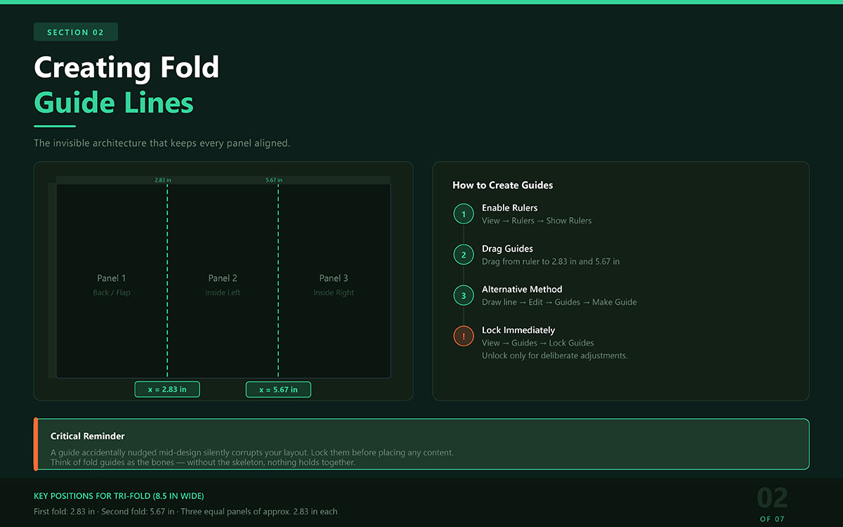
2. Creating Fold Guide Lines That Keep Everything in Place
Fold guides are the invisible architecture of your brochure. You will never see them in the final product, but without them, text drifts dangerously close to fold points, images get cropped in the wrong places, and panels look uneven when held in hand.
For a standard tri-fold on an 8.5-inch wide artboard, place guides at:
2.83 inches — first fold point
5.67 inches — second fold point
This divides the artboard into three equal panels. To create your guides:
Go to View → Rulers → Show Rulers to enable the ruler
Drag guides from the ruler onto your artboard at the correct positions
Alternatively, draw a line and convert it via Edit → Guides → Make Guide
Think of fold guides as the bones of your design. Everything you build on top of them, typography, imagery, colour, becomes the flesh. Without the skeleton, nothing holds together.
Extra Tip: A guide you accidentally nudge mid-design silently corrupts your layout. Lock them before you start placing content. Unlock only when you need to make deliberate adjustments.
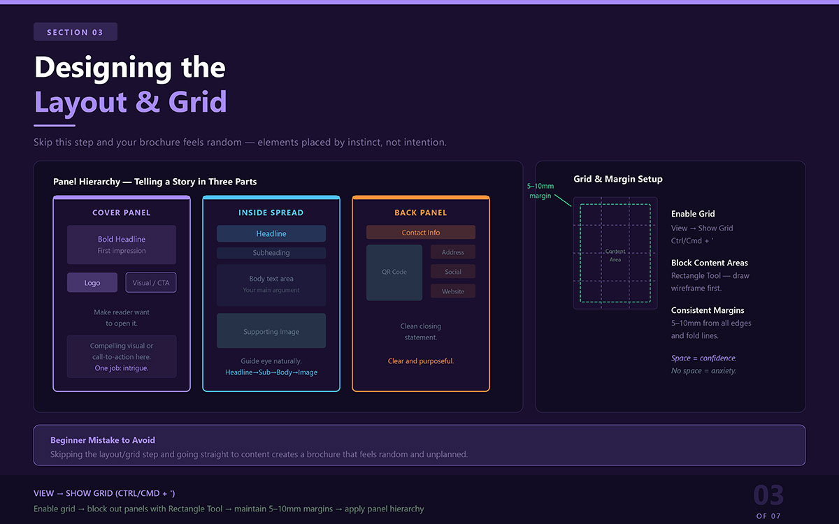
3. Designing the Layout and Grid
With your guides locked and your document ready, the next step is to give your brochure its visual structure. This is where many beginners make their first significant mistake: they skip this step entirely and jump straight to adding content. The result is a brochure that feels random, elements placed by instinct rather than intention.
Enable the grid by navigating to View → Show Grid (Ctrl/Cmd + '). The grid gives you a reference system that makes alignment effortless. Next, use the Rectangle Tool to block out rough areas for content within each panel. Think of this as a wireframe, a rough plan that lets you see your spatial distribution before you commit to any actual content.
Maintain consistent margins of 5–10 mm from the edges and fold lines inside each panel. This breathing room is what separates a professional brochure from an amateur one. Content pressed against the edge feels anxious. Content given space feels confident.
Panel Hierarchy: Telling a Story in Three Parts
Every panel in your brochure serves a different function. Design with that purpose in mind:
Cover panel: Your first impression. A bold headline, your logo, and a compelling visual or call-to-action. This panel must do one thing above all else: make the reader want to open it.
Inside spread: Your main argument. Organise content with a headline → subheading → body text → supporting image flow. Guide the eye naturally from one point to the next.
Back panel: Your closing statement. Contact information, a QR code, your address, and social handles. Clean, clear, and purposeful.
4. Adding and Styling Text That People Actually Read
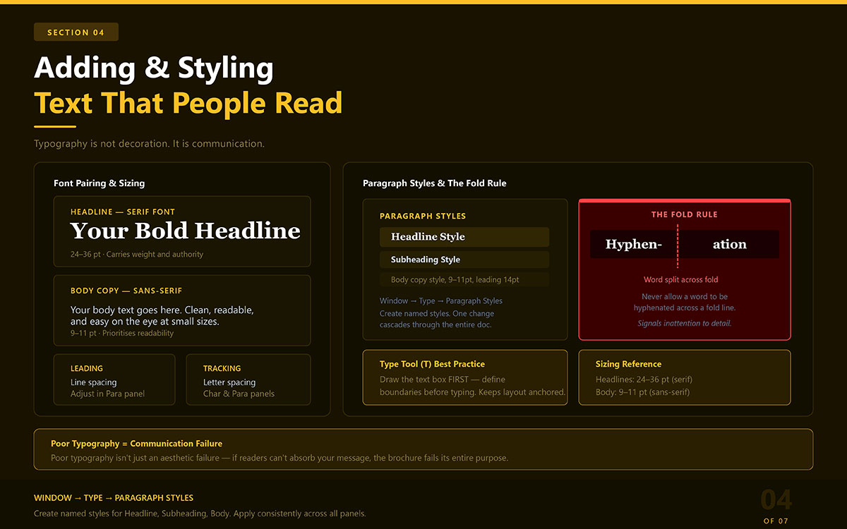
Typography is not decoration. It is communication. The way your text is set, its size, spacing, weight, and arrangement, determines whether readers absorb your message or abandon it. In brochure design, poor typography is not just an aesthetic failure. It is a communication failure.
Use the Type Tool (T) to draw text boxes within each panel. Do not simply click and type; draw the box first, defining the boundaries of where your text will live. This keeps everything anchored to your layout rather than floating freely.
Font Pairing and Sizing
Pair a serif font for your headlines with a clean sans-serif for body text. Serif fonts carry weight and authority; sans-serif fonts prioritise readability at smaller sizes. Keep headlines between 24–36 pt, and maintain body text at 9–11 pt. These are not arbitrary rules; they reflect decades of print design experience.
Spacing, Leading, and the Fold Rule
Use the character and paragraph panels to adjust tracking (letter spacing) and leading (line spacing). Small adjustments here have an outsized impact on readability. And one rule above all others: never allow a word to be hyphenated across a fold line. A word split by a fold is not just awkward to read; it signals to the reader that the designer was not paying attention.
Paragraph Styles: The Secret to Consistency
Navigate to Window → Type → Paragraph Styles and create named styles for each text level: headline, subheading, body copy. Apply these styles consistently across every panel. When your brochure grows or needs edits, a single style change will cascade through the entire document.
5. Working with Colours and Branding
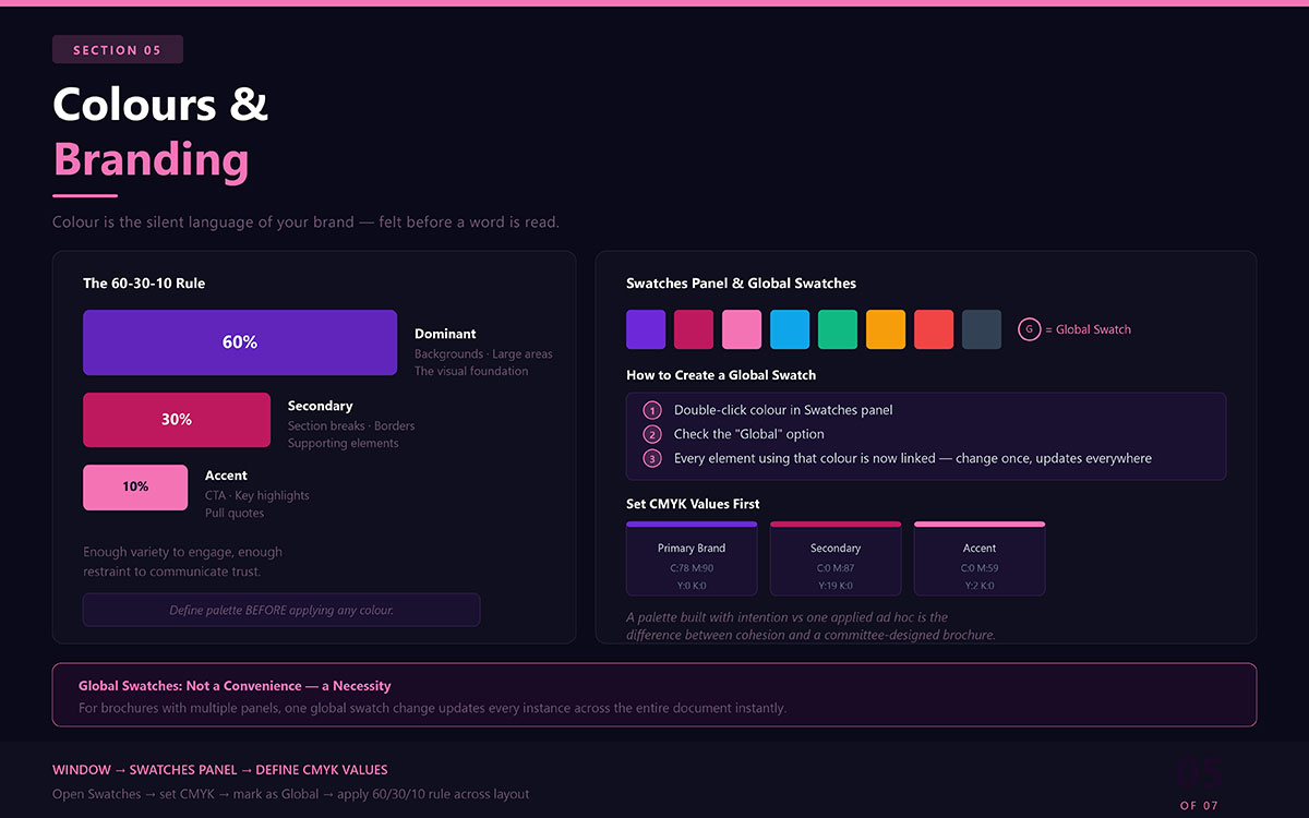
Colour is the silent language of your brand. Before your reader processes a single word, they have already felt something, warmth or coolness, energy or calm, trust or doubt, based on the colours you have chosen. That is the power of colour. And in a brochure, that power must be used with precision.
Begin by opening the Swatches panel and defining your colour palette before applying any colour anywhere. Establish your CMYK colour values for each brand colour first. The difference between a palette built with intention and one applied ad hoc is the difference between a cohesive brand presence and a brochure that looks like it was designed by committee.
The 60-30-10 Rule
Apply this proven principle to every brochure layout:
60% — Dominant colour (backgrounds, large areas, the visual foundation)
This ratio creates visual interest without chaos, enough variety to engage, and enough restraint to communicate trust.
Global Swatches: One Change, Everywhere
Double-click any colour in your Swatches panel and check the 'Global' option. A global swatch means that every element using that colour is linked to one source. Change the swatch once, and every instance updates automatically across the entire document. For brochures with multiple panels and complex layouts, this feature is not a convenience — it is a necessity.
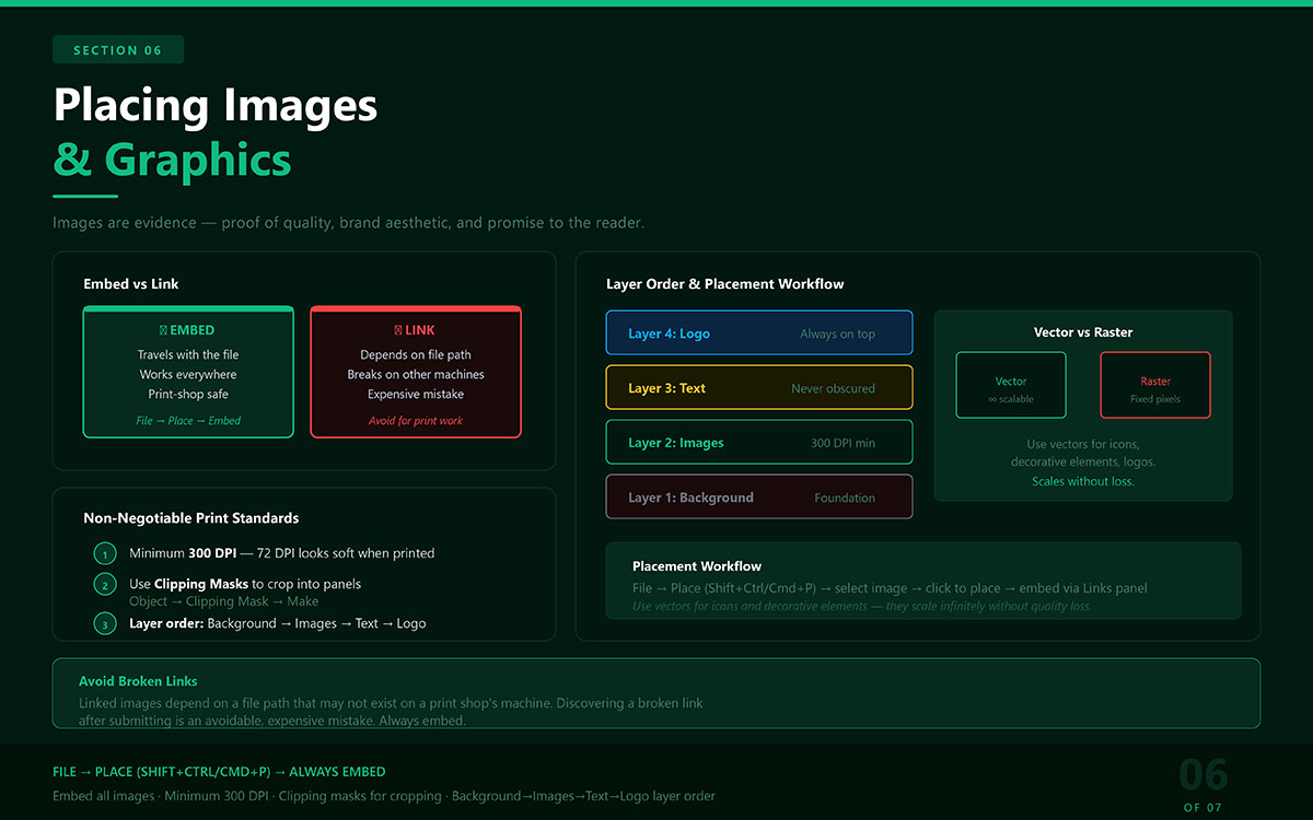
6. Placing Images and Graphics With Intention
A great photograph placed poorly is worse than no photograph at all. Images in a brochure are not decoration; they are evidence. They are proof of your quality, your brand aesthetic, your promise to the reader. Place them carelessly, and that promise is broken before a word is read.
Use File → Place (Shift+Ctrl/Cmd+P) to add images. For print work, always embed your images; do not link them.
Embedded images travel with your file wherever it goes
Linked images depend on a file path that may not exist on a print shop's machine
Discovering a broken link after submitting your file to print is an avoidable, expensive mistake.
Resolution, Clipping Masks, and Layer Order
Three non-negotiable standards for print images:
Minimum 300 DPI — an image that looks crisp on screen at 72 DPI will print soft and blurry
Use Clipping Masks (Object → Clipping Mask → Make) to crop images into panels without altering the source file
Maintain intentional layer order: Background → Images → Text → Logo. Your most important elements must never be obscured
Where possible, use vector graphics for icons and decorative elements. Vectors scale infinitely without losing quality, a characteristic that matters enormously in professional print production.
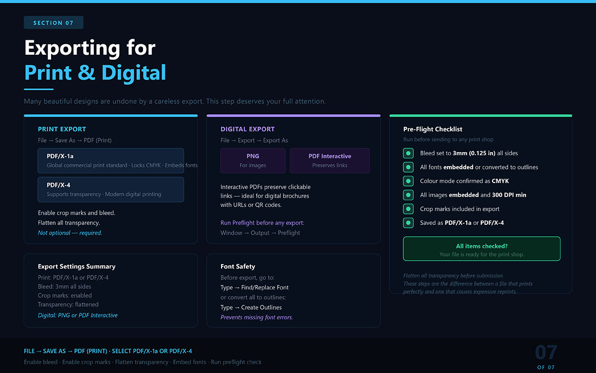
7. Exporting Your Brochure for Print and Digital
You have invested real time and care into this brochure. The export step is where that investment is either protected or squandered. Many beautiful designs have been undone by a careless export, missing fonts, incorrect colour profiles, or a bleed setting left unchecked. This step deserves your full attention.
Exporting for Print
Go to File → Save As → PDF (Print). Select the PDF/X-1a or PDF/X-4 preset.
PDF/X-1a: The global standard for commercial printing — locks in CMYK and embeds all fonts
PDF/X-4: Supports transparency and is accepted by most modern digital printing workflows
In the export dialogue, enable crop marks and bleed. Flatten all transparency before submission. These steps are not optional; they are the difference between a file that prints perfectly and one that causes expensive reprints.
Exporting for Digital
For email campaigns, websites, or digital presentations:
Go to File → Export → Export As and choose PNG (for images) or PDF (Interactive)
Interactive PDFs preserve clickable links — ideal for digital brochures with URLs or QR codes
Run a preflight check via Window → Output → Preflight before any export
Pre-Flight Checklist Before Sending to a Print Shop
Run through this checklist before submitting any brochure file:
✔ Bleed set to 3 mm (0.125 in) on all sides ✔ All fonts embedded or converted to outlines ✔ Colour mode confirmed as CMYK ✔ All images embedded and minimum 300 DPI ✔ Crop marks included in export ✔ Saved as PDF/X-1a or PDF/X-4
Brochure Design Mistakes in Illustrator And How to Fix Them
Understanding the right process only gets you halfway there. Knowing the wrong turns to avoid completes the journey. These are the mistakes that most commonly undermine brochure designs, along with the corrections professionals rely on.
1) Choosing the Wrong Fold Without a Plan
Tri-fold, bi-fold, Z-fold, gate fold; each format tells a different story. Choosing one at random, without mapping your headline, key imagery, and call-to-action to specific panels, means designing blind.
Fix: Sketch your content hierarchy on paper before opening Illustrator. Know which panel the reader sees first, second, and last. Then choose the fold that supports that sequence.
2. Skipping Fold Marks and Guide Layers
Fold guides are not optional. Without them, text and images drift dangerously close to fold points, where they risk being trimmed, obscured, or visually fractured across the fold.
Fix: Set fold guides before placing any content. Lock them immediately. A photograph or headline split by a physical fold is not a design choice. It’s a mistake that announces itself to every reader.
3. Not Reviewing the Full Spread Before Export
Designing one panel at a time without stepping back leads to disconnected results. Colours that feel harmonious in isolation may clash when adjacent panels are viewed together.
Fix: Regularly zoom out to review the full spread, front and back, inside and outside, before finalising any section. Visual coherence only becomes visible at scale.
4. Ignoring the Balance Between Text and Images
Every panel has finite space. Too much text overwhelms. Too many images confuse. Neither serves the reader's need for a clear, well-delivered message.
Fix: Give each panel a single primary purpose: one key message and one supporting visual. Let white space work. Restraint is what makes brochures feel professional rather than crowded.
5. Failing to Save Incrementally
Adobe Illustrator crashes. Software freezes. Power cuts happen. Losing two hours of careful work because autosave was trusted exclusively is a lesson no designer needs to learn twice.
Fix: Save manually and often (Ctrl / Cmd + S). Use version-named files, v1, v2, final, and final-approved, to maintain a recoverable history of your work.
Brochure in Illustrator FAQs
These questions reflect the most common queries people have when learning how to design a brochure in Illustrator. Each answer is written to address the query directly.
Illustrator offers a 7-day free trial with full access to all features, including print tools. Free alternatives like Canva or Inkscape exist, but they lack professional print precision. For commercial brochure work that requires CMYK accuracy and bleed control, an Adobe subscription is a worthwhile long-term investment.
Standard brochure size is 8.5 × 11 in (US Letter) or A4. For tri-folds, divide the width into three equal panels. Bi-folds use half the sheet per panel. Add 3 mm bleed on all sides and keep safe margins inside each panel to protect key content.
Illustrator is better for single or double-page brochures that rely on heavy illustration, custom shapes, and complex graphics. InDesign is the stronger choice for multi-page brochures, long body copy, and consistent typography at scale. Your decision should come down to content complexity, page count, and how much text the layout carries.
When creating a new document, enter 3 mm (0.125 in) in all four bleed fields. This extends background colours and images past the cut line, preventing white borders after trimming. Keep all critical text and logos within the safe zone to avoid cropping during production.
Export your brochure as PDF/X-1a or PDF/X-4 with crop marks, embedded fonts, CMYK colour mode, and 3mm bleed. Most professional print shops require one of these formats. PDF/X-4 supports transparency layers, while PDF/X-1a is better suited to older print workflows and is the safer universal choice.
Endnote
Knowing how to design a brochure in Illustrator is one thing. Executing it with precision, consistency, and print-ready confidence is another. The method outlined here gives you everything you need to approach that blank canvas with clarity.
If you want to keep building on what you've learned here, exploring our guides on marketing brochure strategy and creative layout tips will take your thinking to the next level.
And when you're ready to move from learning to producing, Graphic Design Eye LLC can take your brief and turn it into a polished, print-ready brochure that represents your brand exactly as it deserves to be seen. From the first brochure design idea to the last print, each part will tell your story.
The process is clear. Whether you design it yourself or hand it to people who do this every day, what matters most is that your brochure lands in someone's hands and earns their attention.
The blank canvas is waiting. Now you know exactly how to approach it!
Graphic Design Eye LLC is a full-service creative agency built for brands that demand more than design — they demand vision. From strategic branding to complete visual identity, we partner with startups, agencies, and growing businesses as a dedicated creative force. With flexible subscription and project-based models. Let's start with us today!