Learning the right steps of how to create a PowerPoint presentation. Pick the right layout, add clear visuals, and keep text short and simple. Your slides become neat and attractive. Do it right, and your crowd will stay focused. They will see and remember what you show.
A presentation full of words and pictures is nothing without a strong story and an engaged audience. It will help you tell your story, lead your audience, and keep everything in harmony. Not to mention, good slides will save you a great deal of time and help you make your points more effectively.
Even the best speakers admit that slides that are not well-ordered and designed can make it difficult to follow the main points. That is why they invest some time in layout designing, text alignment, and de-cluttering visuals. Well-ordered slides attract attention, make content easily readable, and give your presentation a professional look.
In this article, you’ll find everything you need to know, a step-by-step process, so you can build presentations that inform, impress, and actually be remembered.
Let's dive right into it!
How to create a PowerPoint presentation
How to create a PowerPoint presentation that actually grabs attention isn’t as easy as it looks. Most slides end up cluttered, boring, or quickly forgotten. If you’ve ever struggled with where to start, what to include, or how to make your slides look professional, you’re not alone. Many beginners open PowerPoint with a great idea but get stuck turning it into a clear, engaging presentation.
The good news? You don’t need to be a designer or expert to create slides that impress and communicate your message effectively. With the right approach, structure, and a few smart design tips, you can make simple ideas into powerful visuals.
Let’s break down the exact steps to help you create a PowerPoint presentation.
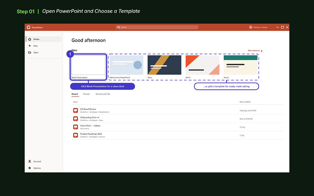
1. Open PowerPoint and Choose a Template
First, open Microsoft PowerPoint, the tool to make your slide show. When PowerPoint starts, the start screen will show on your PC. This is where a new slide file begins. From here, you can make slides, add text, place pictures, and build your presentation step by step.
At this stage, you do not need to add slides or text. The main goal is to make sure the program runs well and the home screen is visible. Once the start screen is ready, move to the next step.
Quick start actions:
Open Microsoft PowerPoint from your PC
Wait for the start screen to show
Make sure the program is fully loaded
Check that you are on the home screen
Once ready, pick how your presentation will start.
Click “Blank Presentation” or Choose a Template
Now, pick how your slide show will look. You can choose a Blank Presentation or a ready template. A template has set colors, fonts, and slide forms. A blank slide gives a clean page to set your own style.
Some users pick blank slides to build each part by hand. Some pick templates to get a neat look fast. Both ways work. Choose what fits your work. If you are unsure which route suits your topic, a quick read of proven presentation design tips makes the decision clearer before you commit to a structure.
Starting options:
Click Blank Presentation for a clean page
Browse built-in templates
Preview layouts before picking
Choose a theme that fits your slide show
After picking, PowerPoint opens the first slide. This slide is the base where your presentation takes shape.
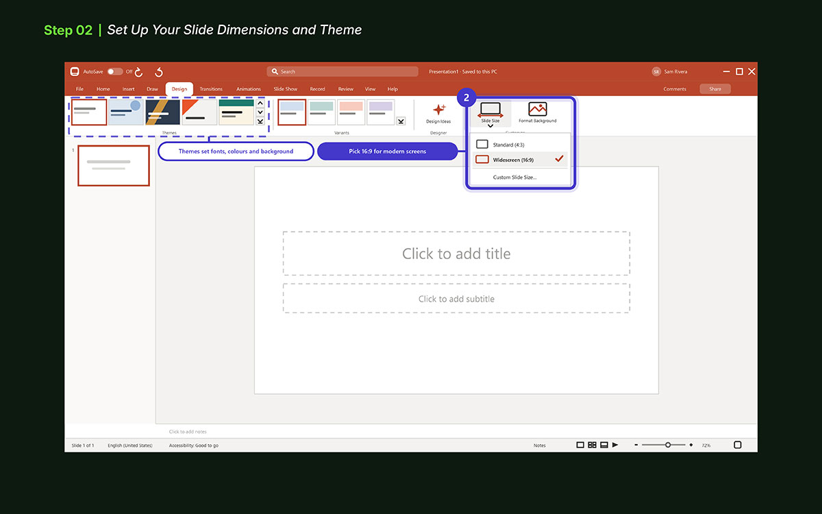
2. Set Up Your Slide Dimensions and Theme
After you pick a template or start blank, set slides right. Size and theme make your slides look neat. They also help your crowd follow your talk.
Set the slide size:
Go to Design → Slide Size
Pick Standard (4:3) for old screens or projectors
Pick Widescreen (16:9) for modern screens, laptops, and online shows.
The right size at the start saves pain. Changing it later may move or stretch items.
Pick and apply a theme:
A Theme sets fonts, colors, and back for all slides. It makes your slides look the same.
Use Slide Master for full control. Change fonts, add logos, set brand colors. Every slide then matches your style.
Keep it consistent: The crowd notices sudden font or color changes. Clean style keeps them on your talk. If your palette is still undecided, working out how to choose brand colors first keeps every slide anchored to one identity instead of drifting slide by slide.
Extra tips:
Stick to brand colors for a neat look
Use 1–2 fonts only; too many fonts look messy
Keep back plain. Busy back hides text
Check screens and devices in advance
Make sure slides fit and look good
Set size and theme early. It saves time. Slides stay neat, matched, and ready. This builds a strong base before you add words or pics.
3. Add and Organize Your Slides
Now that slide size and theme are set, add slides. This is the skeleton of your talk. Slides hold your ideas. Clear structure keeps your crowd on track.
Adding new slides:
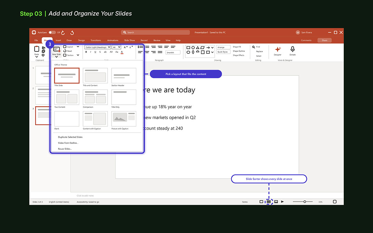
Go to Home → New Slide
Pick a layout: Title, Title and Content, Two Content, Comparison, or Blank. Use one that fits your content.
Add slides as you go. Do not put it all on one slide. Each slide should hold one main idea.
Organizing slides:
Use Slide Sorter (View → Slide Sorter) to see all slides at once. Move slides fast.
Group slides by sections: intro, main points, visuals, conclusion
Keep the story clear. Start with a hook. Show points. End with a strong close.
Tips for clarity:
Use 3–5 bullets per slide. Too much text is overwhelming.
Use visuals: pics, charts, or icons explain points fast.
Keep headings short. The crowd should see the topic at a glance.
Number slides if the deck is long.
Preview flow: check slides in order. Make transitions smooth.
Add and sort slides with care. This makes the deck neat, clear, and engaging. Each slide guides your crowd from start to end.
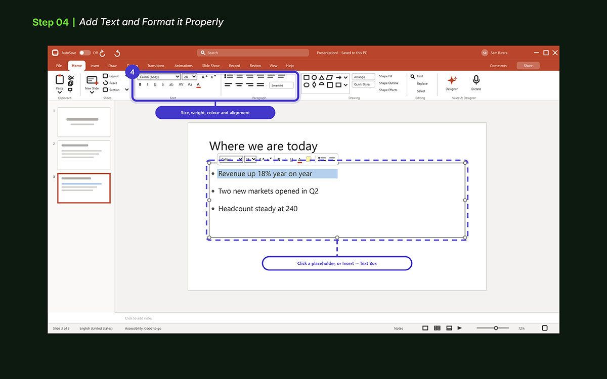
4. Add Text and Format it Properly
With slides ready, add your words. Text tells your crowd what your talk is about. Too much text or messy style can confuse or bore. Keep text clear, neat, and easy to read.
How to add text:
Click a text box or go Insert → Text Box.
Use short, clear phrases. One idea per slide.
Use bullets to break info. Makes content easy to scan.
Formatting text:
Pick easy fonts. Arial, Calibri, or Helvetica work best.
Keep font size readable. Titles 32–44 pt. Body 18–32 pt.
Use bold or color to show key points. Do not use too many colors.
Align text the same way. Left-align is easiest.
Use no more than 3 font sizes. Keep looking neat.
Tips for pro slides:
Use 3–5 bullets per slide
Give space. Do not cram text
Use theme colors to match design
Check contrast: dark text on light background or light text on dark background
Add spacing between lines and bullets. Makes slides airy and clear.
Good text keeps slides neat and clear. The crowd sees and gets your points fast. Slides look clean, and your talk is strong.
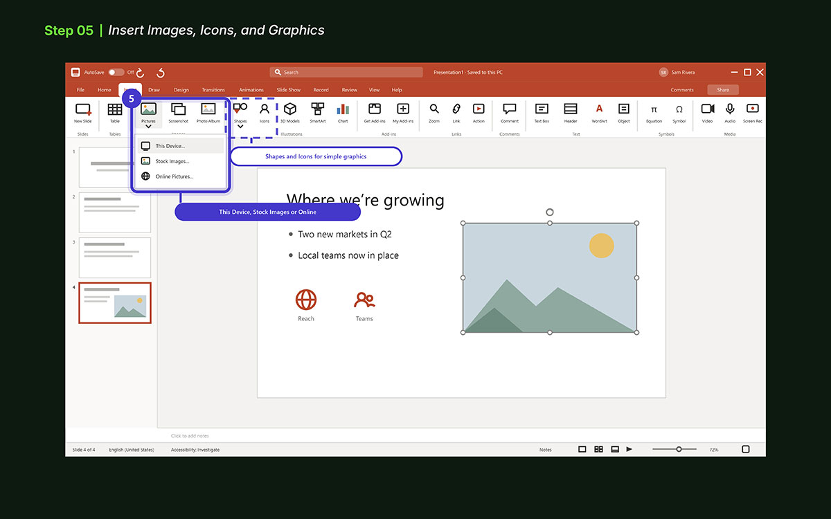
5. Insert Images, Icons, and Graphics
Now it’s time to give your slide some life. Images make slides more fun and easy to read. Use photos, icons, or drawings to show points. Pictures help explain ideas faster than text alone.
Image tips:
Go to Insert → Pictures.
Pick from This Device, Stock Images, or Online Pictures.
Resize and move the image to fit well.
Make sure images do not cover text.
Keep images in a spot that looks good with text.
Importantly, small graphics like icons, shapes, or illustrations make slides more fun and easy to read. They show key points, guide the eye, and break up long text.
Use them well. Don’t crowd the slide.
Tips for graphics:
Go to Insert → Icons / Shapes.
Pick icons that fit your topic.
Use shapes to mark points or add info.
Keep all graphics the same style and color.
Place graphics so they do not cover text or pics.
Repetition of style is what makes a layout feel deliberate rather than assembled, a principle that runs through most graphic design tips and tricks worth following. Once graphics are in, your slides look clear and neat.
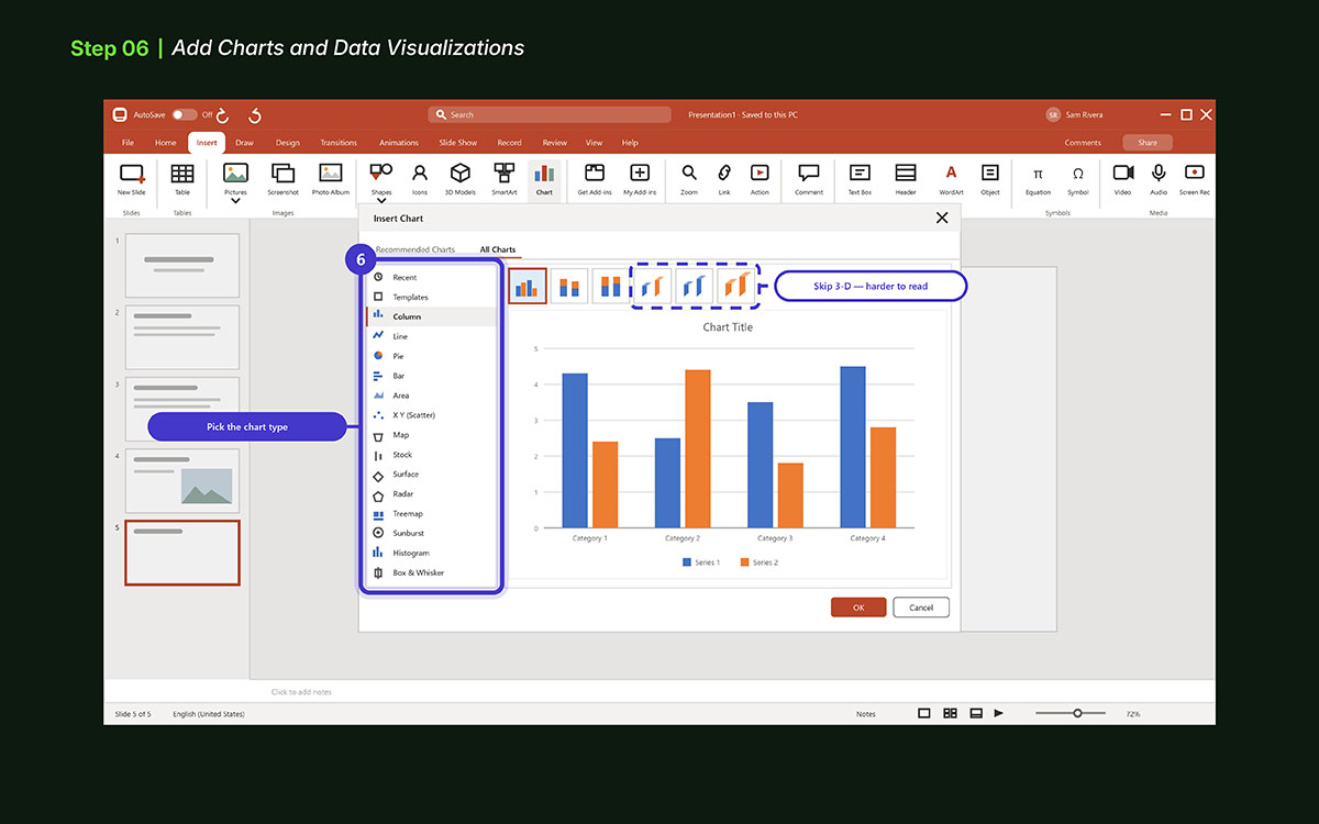
6. Add Charts and Data Visualizations
Charts make numbers easy to read. They help your crowd see key points fast. Skip long tables or stats. Visuals tell the story at a glance.
How to add charts: Go to Insert → Chart. Pick a chart type:
Column or Bar for comparing items.
Line to show trends over time.
Pie to show parts of a whole.
Area or Scatter for deeper comparisons.
A spreadsheet pops up. Enter your data. Chart updates on its own.
Tips for good charts:
Keep charts simple. Do not add too much data.
Use the same colors. Stick to the theme or brand.
Label axes, points, and legends clearly.
Highlight key numbers with bold, color, or callouts.
Skip 3D effects. They make charts hard to read.
Extra tips:
Add short captions or callouts to show the main point.
Use icons, diagrams, or infographics to help explain numbers. When a data set is too dense for a standard chart, infographic design condenses several figures into one readable image the crowd can absorb in seconds.
Check charts on different screens. Make sure it is clear.
Good charts turn numbers into a story. They keep slides clear, show key points, and make your talk look pro.
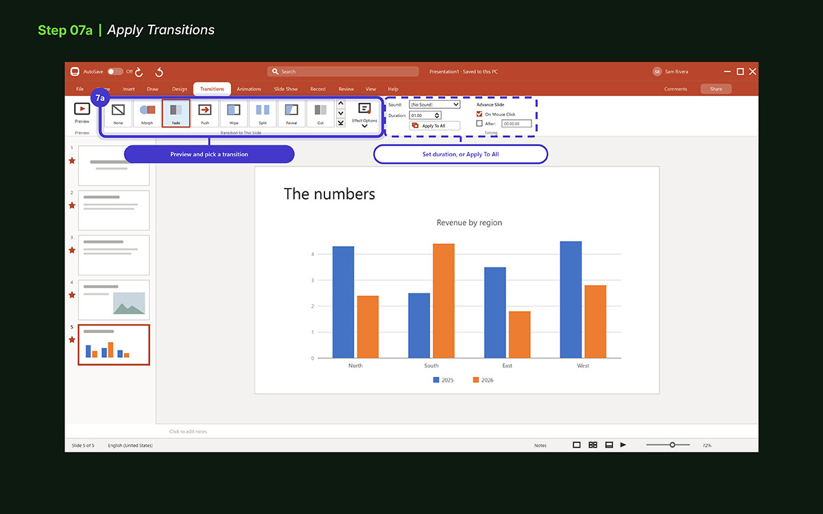
7. Apply Transitions and Animations
Transitions show how one slide moves to the next. They make slides look smooth and pro. Simple transitions help slides flow and keep viewers focused. Avoid too many transitions, or slides may look messy.
Transition tips:
Go to the Transitions tab
Preview and pick a transition for each slide
Set duration to control slide speed
Adjust effect options for smooth motion
Apply to all slides for same style, or single slides for variety
Check slides in slideshow mode to see smooth movement
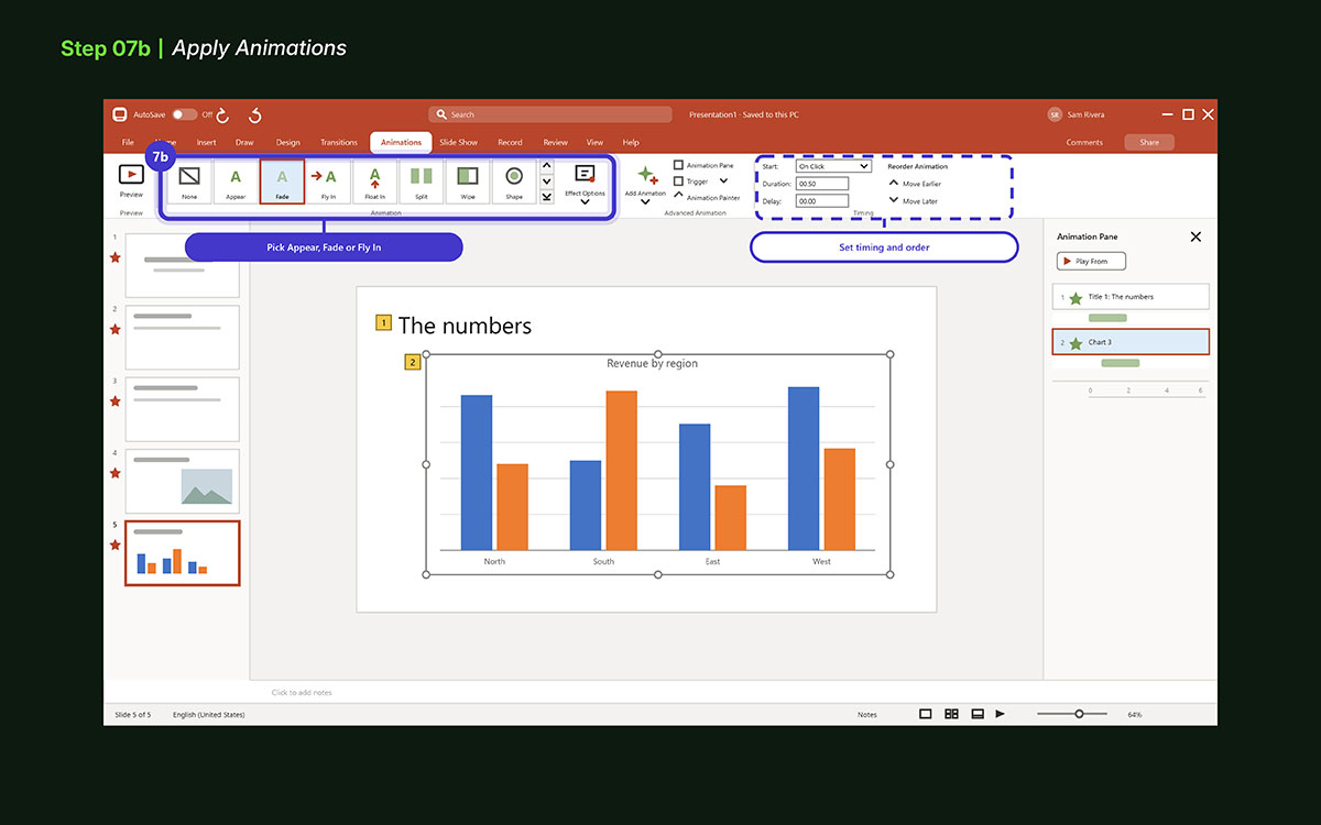
Once transitions are done, you can add animations to text or objects to highlight parts of slides.
Animations help draw eyes to key parts, like a title, bullet, or pic. Use them with care. Too many can make slides messy. Good animations guide viewers and make slides more fun to watch.
Animation tips:
Go to the Animations tab
Select the text or object to animate
Pick an effect like Appear, Fade, or Fly In
Set timing and order so objects move smooth
Keep animations short and simple
Test slides to make sure animations are clear and neat
Movement earns its place only when it carries meaning, which is the same restraint that governs good motion design in any format. After adding animations, your slides are now organized, clear, and ready. They are neat, easy to read, and look pro. You can now review or practice your show.
8. Add Speaker Notes
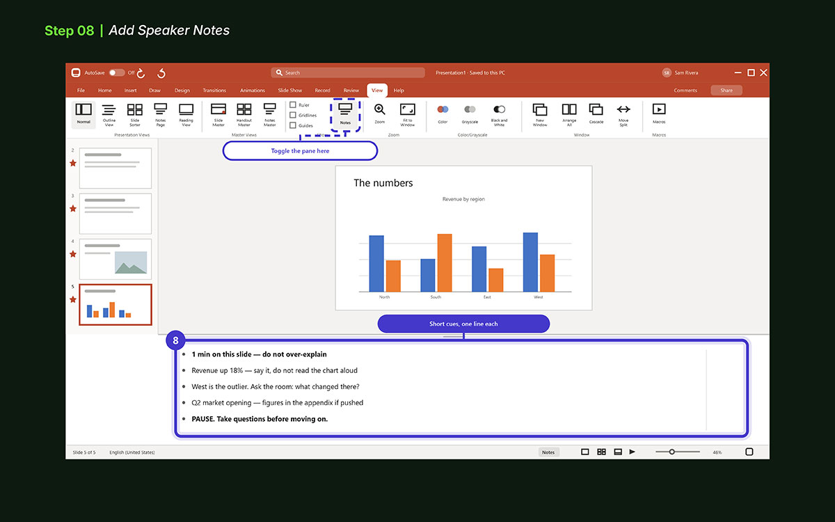
This one is an important step of how to create a PowerPoint Presentation. Slides show your crowd the main content. Notes are your secret guide. They help you remember key points. They give extra info. They keep your talk smooth. Think of them as a personal script. Only you can see them.
How to add notes:
Click the Notes pane below the slide.
Type points, reminders, or extra info you need.
You can add tips like questions to ask the crowd, stats to mention, or examples to explain ideas.
Use short bullets or phrases instead of full sentences. This helps you speak naturally.
Tips for using notes well:
Keep notes brief and clear. Use one line per point.
Bold or highlight key points. This helps you find them fast.
Use notes for cues, not full speech. Let your words flow naturally.
If you present online, open Presenter View. Your crowd sees slides only. You see notes.
Extra ideas:
Add timing cues to stay on track. For example, “1 min per slide.”
Include links or references to open extra info fast.
Add reminders for gestures or audience interaction. For example, “ask a question here.”
Practice with notes before presenting. This builds confidence and cuts mistakes.
Check notes on different screens. Make sure text is readable.
9. Review and Proofread
Before you finish, check your slides. Small mistakes like typos, misaligned items, or uneven style make slides look messy. A careful final look keeps your crowd on your message, not errors.
How to review slides:
Go through slides one by one. Check text, pics, charts, and layout.
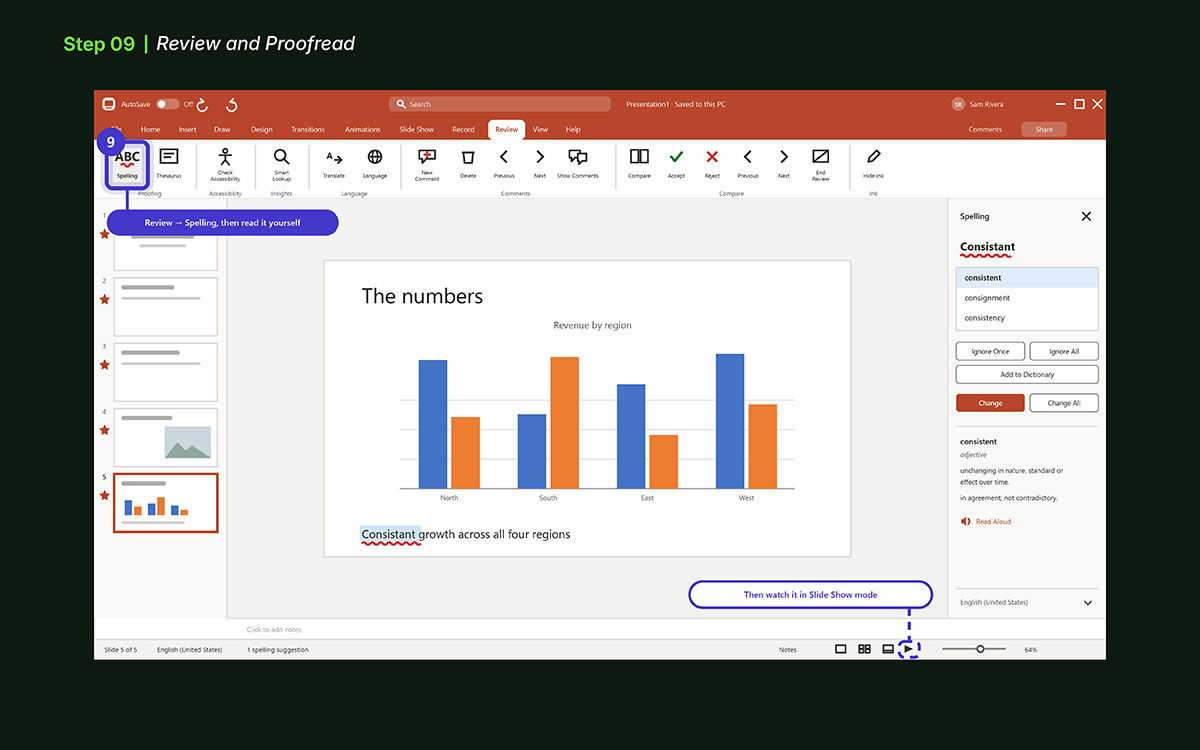
Check spelling and grammar. Use PowerPoint spell check (Review → Spelling). Also read manually.
Check consistency: fonts, colors, sizes, and bullet style should match all slides.
Make sure charts, tables, and images are clear. Label them well. Make them easy to read.
Tips for a polished look:
Review in Slide Show mode. See slides as your crowd will.
Ask a friend or coworker to proofread. Fresh eyes find missed errors.
Check transitions and animations. Make sure they are smooth and not distracting.
Test all links, videos, and files. Make sure they work.
Extra tip: Take a short break before the last check. 10–15 min helps spot errors you missed.
Reviewing and proofreading makes your slides neat and clear. It boosts your confidence. Your crowd focuses on your message, not mistakes.
10. Save and Export Your Presentation
After finishing slides, text, visuals, and notes, save your work. This keeps your presentation safe. It makes sharing easy.
How to save:
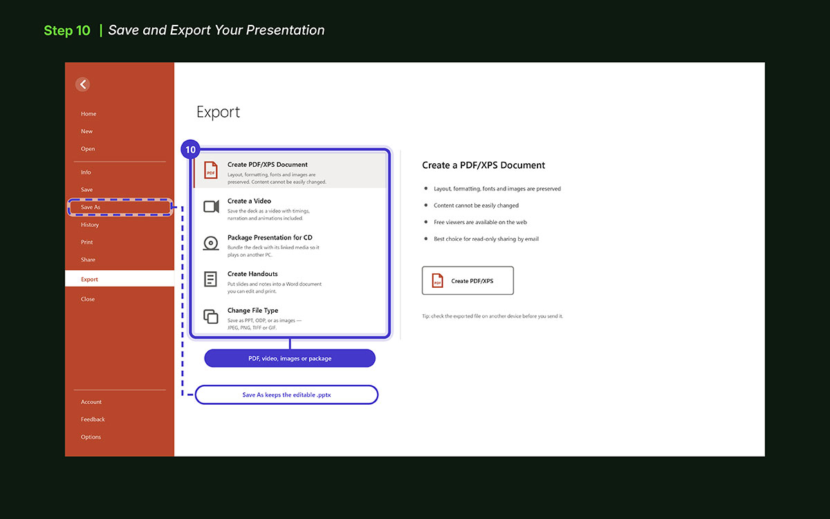
Click File → Save As.
Pick a spot on your PC or cloud.
Use PowerPoint (.pptx) to keep slides, animations, and notes.
Save often to avoid lost work.
How to export:
PDF: File → Export → Create PDF. Good for read-only sharing.
Video: File → Export → Create a Video. Use for online shows or auto slides.
Images: File → Export → Change File Type → JPEG or PNG. Use for slides as images.
Package for CD/USB: File → Export → Package Presentation. Keeps files and media. Good for another PC.
Tips:
Name files clearly, add date or version.
Check exported files on another device. Make sure charts, media, and format work.
Keep a backup in the cloud or external drive.
Saving and exporting rights keeps slides safe, clear, and pro. It protects your work and makes sharing simple.
Top PowerPoint mistakes beginners make
Many new users quickly make the same mistakes while following the steps of how to create a PowerPoint presentation.
Slides get full of text
Font size gets too small to see
Colors do not match well
Too many moves and fade effects pull the eye away
So it helps to know these common Microsoft PowerPoint slip ups early. When you see what goes wrong most of the time, it gets much easier to make slides that look clean, are easy to read, and help your crowd get the point fast.
Too much text: New users put whole paragraphs on slides. People cannot read and listen at once. Use short bullet points.
Tiny fonts: Small fonts make reading hard. The crowd loses focus. Use clear fonts. Titles big, body medium, space lines well.
Bad colors: Bright or low-contrast colors look messy. Use simple colors. Dark on light or light on dark works best.
Default templates: Default templates look plain. Change colors, fonts, layout, and add small touches.
Too many effects: Flashy moves can distract. Use simple transitions. Only animate key points.
Too many images: Too many pics or charts crowd slides. One idea per slide. Give visuals space.
Bad alignment: Messy text or uneven space looks weak. Line up text, pics, and charts. Use grids or guides.
Reading slides: Reading word for word is stiff. Slides should guide your talk. Show key points and speak naturally. Use stories or notes. Your voice leads.
Not rehearsing: Skipping practice makes talks rough. Run through slides first. You feel sure and smooth.
Low-quality images: Bad pics or clipart make slides look weak. Use clear, sharp images only.
Inconsistent style: Keep fonts, colors, and style the same. Consistency makes slides look pro.
Distracting backgrounds: Too busy or loud backgrounds take attention away. Keep backgrounds simple.
No backups: Always save backups and use the right file type. You do not want to lose work.
7 Quick tips for PowerPoint presentation design
Simple design rules make slides pro. They keep your crowd focused. Small choices like space, color, font make a big difference. Current presentation design trends lean the same way, with restraint and white space outranking decoration on almost every deck that lands well.
Quick-Scan Design Tips:
Use the 6×6 rule: Max 6 bullets per slide. Max 6 words per bullet. Keeps content easy to read.
Color contrast: Text and back should stand out. Meets accessibility standards.
Consistent alignment: Use guides (View → Guides). Align items on all slides.
White space: Don’t crowd slides. Empty space makes slides clear.
Brand colors: Use your brand palette (Design → Customize Colors). Keep slides on-brand.
High-quality images: Use sharp, royalty-free pics from Unsplash, Pexels, or Microsoft Stock.
Font pairing: Pair one serif with one sans-serif. Or use one font family with weight changes. Keeps text neat.
Keep slides simple and consistent. Focus on readability, layout, and visuals. Clear slides leave a strong impression.
PowerPoint presentation FAQs
These FAQs clear up common questions about slides, design, collaboration, and sharing.
For a 10-minute talk, aim for 10–15 slides. Use one idea per slide, and plan one slide per minute. Longer talks can use more slides. Do not add slides just to fill time. Rather, keep it short so your crowd can follow.
Pick clean, plain templates. Use neutral backgrounds and clear fonts. Also, limit colors to a few. You can use Microsoft themes like Ion, Facet, or Slate work well. But do not use flashy templates. Because, they distract from your talk. Actually, simple and neat looks professional.
Use clear pics and icons. Avoid old clipart. Stick to three colors max. Remove busy borders or backdrops. Use charts or graphs instead of long tables. Keep font size and space the same on all slides. This guides the eye and makes slides clear.
Yes. Save the file to OneDrive or SharePoint. Click Share to invite team members. Many people can edit at once. Use comments or version check to track changes. Real-time edits keep work smooth.
PDF keeps slides the same. Perfect for sharing or posting online.
Steer clear of these to make your PowerPoint better:
Do not put too much text on one slide. Keep it short.
Do not mix fonts or colors.
Low-quality pics blur.
Do not use too many moves or effects, they distract.
Make key points stand out with bold, size, or color.
Endnote
You’ve reached the end of this guide on how to create a PowerPoint presentation. One thing is clear: a strong slide show is not made by adding more slides. It is made by choosing what to show, what to cut, and how to guide your crowd’s eye.
The top rule: one slide, one idea. Not a wall of text. Not ten points crammed on one screen. Just one clear thought that moves your message forward. Follow this, and your crowd stays engaged from start to end.
Many beginners think the software does the work. It does not. PowerPoint, Keynote, and Google Slides give tools, but the thinking is yours. Each slide should answer two questions: What must this show? What can I remove?
To improve your PowerPoint skills, practice creating slides with a single clear idea on each. Cut anything that does not support your main point. Importantly, test your slides by asking yourself if someone can understand it in three seconds. And of-course, always review and revise your deck before each presentation to make sure it flows smoothly.
If you want pro help, Graphic Design Eye works with brands, teams, and creators. Graphic Design Eye provides a presentation design service for slide flow, visual order, and deck clarity. From full design to quick polish, we turn rough drafts into slides that hold attention and boost your message.
Ready to build better slides? Reach out to Graphic Design Eye for tips, feedback, and pro slide design.
Graphic Design Eye LLC is a full-service creative agency built for brands that demand more than design — they demand vision. From strategic branding to complete visual identity, we partner with startups, agencies, and growing businesses as a dedicated creative force. With flexible subscription and project-based models. Let's start with us today!