Well, have you ever held a product and felt a click inside? That small spark when you think, “This feels right”? That’s packaging talking. Packaging is more than a wrap or a box. It’s the first word your product says. Before touch, before text.
Most people skip the hard part. They pick a box, add a logo, and call it done. But it is not that simple. Every choice counts. Each shape, hue, and word sends a sign. If it’s off, even a bit, people feel it.
So, where do you start? How do you make your product look real, safe, and liked? How do you make a box that guards your product and tells your brand’s tale?
In this guide, you’ll see packaging as more than a shell. You’ll learn why the type of box sets the stage. Why color and logos are signs, not décor. How text, pics, and layout lead the eye. And how small things like edges, alignment, and print files can make or break the work.
Let’s turn that blank space into packaging that talks, connects, and wins!
How to design product packaging
How to design product packaging that is truly creative on the shelf is both an art and a science. Great product packaging is far more than a protective shell. It is a powerful marketing tool, a storytelling medium, and a tactile experience all rolled into one. Studies consistently show that consumers make purchasing decisions based heavily on packaging design, with many admitting they've tried a new product simply because the packaging caught their eye. On the flip side, poor packaging can undermine even the best product, causing it to be overlooked, misunderstood, or undervalued.
Below, we'll walk you through a proven, step-by-step approach to designing product packaging that not only looks stunning but also serves its functional purpose and aligns your brand identity.
Let’s check out what’s ahead!
1. Define your goals, budget & target audience
Before you touch a box or pick a color, stop and think. Ask three key questions. Why are you making this packaging? Who will buy it? How much can you spend? If you skip this step, you may waste time, spend too much, or make a pack that does not fit your buyers. This step sets the base for all design work.
Set your packaging goals
Decide what your pack should do. Common goals include:
- Make the product stand out on a shelf
- Give a strong unboxing feel for online buyers
- Show that your brand cares about the environment
- Give a premium or high-end look
Plan how you will track success. Will it be more sales, fewer returns, or better reviews? Make sure goals match your brand. Packaging should feel part of the brand story.
Know your target audience
Next, get clear on who will buy your product. Look at:
- Age, gender, income, and lifestyle
- Where they will see or buy it: store, online, subscription box, or boutique
- What appeals to them: simple design, bold color, nostalgia, or eco-friendly ideas
Understanding your audience guides every choice, from shape and graphics to color and finish.
Set a realistic budget
Your budget decides what materials, print types, and pack shapes you can use. Include all costs:
- Structural design and graphic design
- Tooling or dieline creation
- Printing and prototype tests
Check manufacturer minimum order amounts. They can change the total cost.
This step is not a formality. It is the foundation. When done well, every later choice will make sense and support your product and brand.
2. Research competitors & market trends
Now, it is really necessary for you to visualize the battlefield clearly. In fact this step is not only looking at other packaging but also figuring out the main idea, expectations, and possible opportunities of your competitors. Properly done research would guide you not to get lost but make you create a design that is purposefully different.
Competitive audit
First, get 5-10 competitor packages in your category. For example, one can:
- Take photos in stores
- Save images from websites
- Or collect real packaging if possible
Now look at them closely. Not quickly really observed. Check things like:
- What colors are used again and again?
- What kind of fonts do they prefer?
- Do they use photos, illustrations, or simple graphics?
- What materials do they use, plastic paper matte, glossy?
- Are the shapes mostly standard or different?
And here is the most important part:
- Look for patterns then look for what is missing
The missing piece is your chance. In fact, if each one of the brands turns to green for the concept of organic, you do not always have to follow the same route. Design of clean white with subtle accent colors can attract more attention.
Pro Tip: Don’t just ask “What looks good?” Ask: “What would I notice in 3 seconds on a crowded shelf?”
Current packaging trends
Trends are a reflection of what people are currently liking. However, don't just follow them blindly; simply get a sense of what they are. A quick scan of the current packaging design trends will show you which directions are gaining ground and which ones are already fading.
Here are some of the most popular ones:
- Eco-friendly packaging: Decrease of plastic in packaging, more recyclable or biodegradable content.
- Minimal design: More empty spaces. Cleaner layout, less stuff.
- Interactive packaging: QR code, scan feature, or small digital interaction.
- Personalisation: Special editions, custom names, or unique packaging packages.
How to Use Trends Smartly: This is the very spot where the majority of people fail. They copy the trends verbatim and as a result, everything starts to look similar. Rather:
- Only choose what fits your brand
- Combine trends with your own style
- Make sure your design remains simple and clear
Quick Tip: In case your packaging still appears good after trends have changed, you did it right.
3. Choose the right packaging structure & materials
Now that you are aware of your target market. Great. The next thing is to figure out how your product will be physically packaged. This step is not only about aesthetics. It's also about safety, price, and in-store experience.
Common packaging types
First, pick a product packaging structure that still suits it. Here are the main types:
- Boxes: Foldable cartons (lighter), rigid boxes (high-end look), corrugated boxes (for transportation)
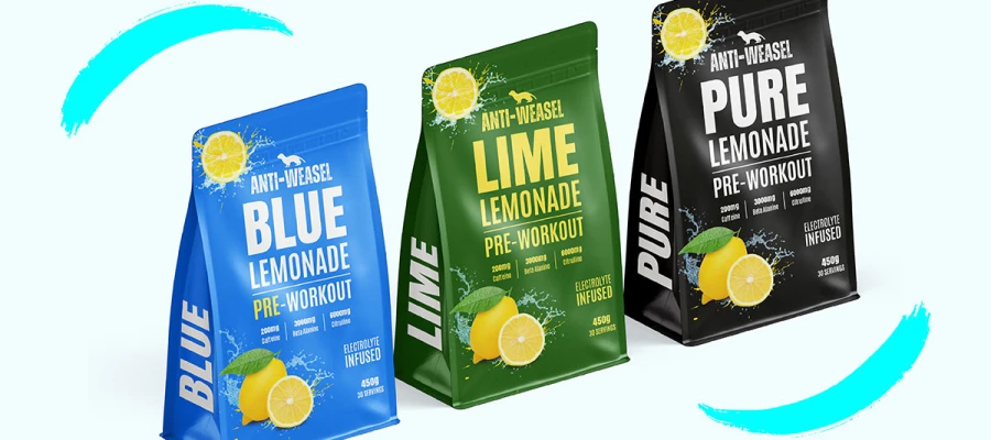
- Bags and Pouches: Stand up pouch, pillow bag, ziplocked pack, generally meant for snack items, powders as well as flexible products.
- Bottles and Jars: Glass (high-end), PET/HDPE plastic (lightweight), aluminium (robust and up-to-date).
- Labels and Sleeves: Stick-on labels, shrink sleeves or wraparound labels, used when the container itself is plain and the label design carries the whole brand message.
- Tubes and Blister: Packs Often used for cosmetics, creams and pharmaceuticals.
Quick Tip: Don't allow the appearance alone to influence your decision. Ask yourself: "Would this be logical for my product?"
Material selection criteria
First, choose the material. That choice will determine your safety, costs, and brand perception. Here are some questions to help you choose:
- Product Protection: Is your product easily breakable? Will it require moisture or heat protection, or could it be sensitive to light?
- Sustainability Goals: Would you like to go for green packaging? Some possibilities include using packaging made of recycled materials, FSC-certified paper, or compostable packing.
Brand Look & Feel:
- Kraft paper: natural eco handmade
- Gloss finish: modern, premium
- Matte finish: soft minimal elegant
Your material is the first physical proof of your branding design, so the finish should echo the same personality your logo and colour system already carry.
Shipping Considerations: More weight means packaging means higher delivery costs. The size of the package also impacts the dimensional weight pricing in e-commerce.
Quick Tip: Great packaging turns out to be a good protector of the product design comes later.
Creating the dieline
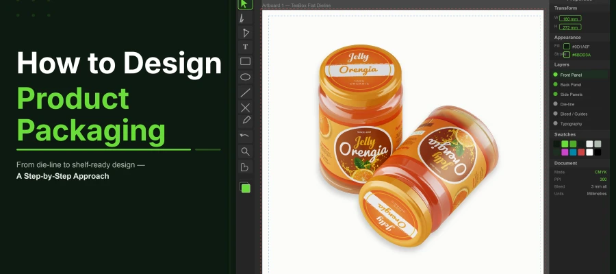
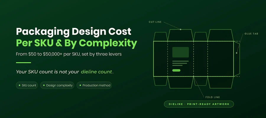
The next step is a bit technical but very crucial. A dieline is the unfolded, one-dimensional representation of the packaging. It indicates:
- Die cutting lines
- Folding lines
- Bleed areas
You may think of it as a set of instructions for your packaging. Here are the steps:
1) Obtain the dieline from your manufacturer or supplier
2) Always put your design over the template
3) Work in Adobe Illustrator for precision
4) Have dieline lines (cuts/folds) kept on a different layer from your design
Quick Tip: Do not shift dieline lines without the manufacturer's consent even minor alterations can disrupt the whole structure.
4. Design the visual elements
This step is where your pack starts to look real. Now, you shape how it feels to the eye. Text, color, image, and layout all work as one. Each part must have a clear role. Nothing should feel random. When you do this well, the buyer can see, read, and trust your pack in one quick look. The goal is simple. Make it easy to read. Make it nice to see. Make it clear what to buy.
Typography
Text is not just for info. It also shows style and tone. Good type makes your pack easy to read and gives your brand a clear voice.
- Use 1–2 typefaces. One for title or product name. One for body text.
- Keep text clear at small sizes, mainly for ingredients, disclaimer, and nutrition facts.
- Set a clear order of text: product name → type or variant → main claim → other details.
- Follow minimum size rules. For FDA goods, this is often 6 pt.
- Use bold for key words. Use italics or small caps for less key parts.
Pro Tip: Print a test or use a real mockup. Check if the text is easy to read in real light and real size.
Colour psychology
Color speaks fast. It shows mood, use, and brand feel in one second. The right color can pull the eye and help the buyer choose fast.
- Green feels fresh, clean, and eco safe.
- Blue feels calm, safe, and true.
- Red feels bold, fast, and full of energy.
- Keep brand color same on all SKUs so your range looks like one set.
- Use color code for type, size, or taste so the buyer can pick with ease.
- Check the contrast ratio for a clear view. WCAG AA asks for at least 4.5:1.
Pro Tip: Use swatches in Illustrator or InDesign so your color stays the same in each print run.
Imagery & graphics
Images tell your story fast. A good image can say more than a full line of text. It builds trust and shows use at a glance.
- Use high-res photos. At least 300 DPI for print.
- Keep light, color, and back clean so the product looks true.
- Use vector icons or art. They print clean and stay sharp.
- For food or life goods, show a serving shot so the buyer can see how it looks in real use.
- Do not let images hide text. Keep space so all words stay clear.
Pro Tip: Use masks or frames so each image fits well in the pack size and bleed area.
Layout & hierarchy
Layout shows how the eye will move. It tells what to see first, next, and last. A clean layout makes the pack feel calm and easy.
- Start with the Primary Display Panel (PDP). This is the front that the buyer sees first.
- Use back and side panels for more info like list, use guide, and legal text.
- Keep a 3–5 mm safe zone from cut and fold lines so no key text gets cut.
- Use a grid and guide to line up all parts and keep balance.
Pro Tip: Test the full pack. Fold it or use a 3D mockup. Check space, flow, and how it looks from all sides.
5. Include all legal & regulatory requirements
This step makes your pack safe to sell. It is not just about text. It is about clear, true, and must-have facts. When you add the right info, you avoid risk. You do not face reprint, delay, or ban.
At the same time, you win trust. The buyer can see what they get, how to use it, and if it is safe. So, this step does two jobs. It keeps your brand safe, and it helps your buyer feel sure.
Universal requirements
Each pack must show some key facts. These are used in most shops and most lands. They help the buyer know the item fast, and they help the shop scan and sell with ease.
- Product name: State the name in a clear way so the buyer knows the item at first look.
- Net weight or volume: Show the exact size, such as g, ml, or L, so the buyer can judge value.
- Country of origin: Tell where the item is made, as this can shape trust and is often a must by law.
- Manufacturer name and address: Give full brand or maker details so the buyer can reach you if need be.
- Barcode (UPC/EAN): Get this from GS1. It helps scan, stock, and sell in stores with speed and ease.
- Recycling symbols: Add signs like the Mobius loop or HDPE code so the buyer knows how to bin or reuse the pack.
These are the base of a safe pack. If one part is lost, you may face hold-ups in ship, sale, or stock.
Category-specific requirements
Some goods need more data. This is based on use, risk, and law. Here, the pack must give more care and more facts.
Food & Beverage
The buyer must know what they eat and if it is safe, and the panel still has to sit inside the layout without breaking it, which is where strong food packaging design ideas earn their place.
- Nutrition Facts panel with key values
- Full ingredient list in the right order
- Allergen declarations for risk items
- Best-before or expiry date in the set form
Cosmetics & Personal Care
These go on skin, so clear and safe use info is key.
- Full INCI ingredient list with set names
- PAO (Period After Opening) sign to show use life after open
- Safety warnings or use guide where it is a must
Pharmaceuticals
This group has strict laws. Each word must be right and clear.
- Drug Facts panel with full data
- Dosage and use guide
- NDC number or like ID code
- Approval marks such as FDA or MHRA if it is a must
Children’s Products
For kids, safe use is the top goal. The pack must warn and guide.
- ASTM or CE marks for safe use proof
- Age-warning labels such as 3+
- Choking hazard signs where there is risk
In the end, this step is not hard, but it needs care. Each word on the pack has a role. When all parts are right, your pack is clear, safe, and ready to sell with no fear.
6. Prototype, test & iterate
This step turns your idea into a real pack. Now you do not just look at a screen. You hold it. You test it. You see how it works in real life. This is where small flaws show up. If you fix them now, you save cost, time, and stress later. The goal is simple. Make sure your pack looks good, feels right, and works well before full print.
Prototyping methods
Each type of test sample has a clear use. Use more than one so you can check both look and use.
- Digital mockups: Use Photoshop or Illustrator smart objects to build a real-like view. This is fast and low cost. Good for early check and client review.
- Physical prototypes: Order 5–10 samples from your printer or maker. This lets you feel the stock, test folds, and see print in real form. You can spot issues that a screen will miss.
- 3D renders: Tools like Adobe Dimension or Blender can show a life-like 3D view. This helps for online shop images or team review, and for packs with hard dielines.
Pro Tip: Use both screen and real samples. One shows how it looks. The other shows how it works.
Testing checklist
Your sample must pass key tests. It must look right and work well in real use.
- Structural integrity: Check if the box stays in shape with the product in it. Test stack, ship, and store. Look at edges and folds, as they fail most.
- Print fidelity: Check Pantone or CMYK color match. View the print in day light, tube light, and LED. Make sure color stays true in all light.
- Shelf readability: Stand 1–1.5 m away. See if the name, logo, and key claim are easy to read. If not, fix size, color, or text order.
- Consumer testing: Show the pack to 5–10 people from your target group. Do not guide them. Just watch. Note what they feel, what they say, and what they think the product is.
- Drop testing & ISTA simulation: For ship packs, test real drop and shake. See if the pack can guard the product and stay in shape after hits and load.
Iteration
This is where you improve the pack step by step. Do not rush. Small fixes can make a big gain.
- Collect all feedback from test, use, and view.
- Change dielines, stock, color, or art as needed.
- Make a new sample and test again. Repeat till all parts feel right.
Pro Tip: Save each version. This helps you track what got better and makes new SKUs easy to build later.
7. Prepare files & go to production
This is the big moment where your design finally becomes real. Getting your files right helps the manufacturer succeed. It also saves you from expensive mistakes or delays. Proper prep protects your brand quality. It ensures your packaging looks great on the shelf and feels right during the unboxing.
Print-ready file specifications
Every file must meet professional standards to print well.
- Colour Mode: Stick to CMYK for offset or flexo printing. If you need a perfect match, define your Pantone swatches clearly. Avoid RGB for any print work.
- Resolution: Keep photos and graphics at 300 dpi minimum. For tiny text or fine patterns, 600 dpi is better for a crisp look.
- Bleed and Safe Zones: Set a 3mm bleed on all sides. Position logos and text at least 5mm from trim edges. This simple step prevents accidental cropping.
- File Format: PDF/X-4 is the best choice here. Remember to embed all fonts and flatten transparency. Clean up your file by removing unused swatches or hidden layers.
Pro Tip: Check your Links panel in Illustrator or InDesign for missing images. Nothing slows down a printer like a broken link.
Working with a printer or manufacturer
Clear communication ensures the final product actually matches your vision.
- Proofing: Always ask for a press or digital proof. Use it to double-check colours, text, and image placement before the mass production run starts.
- Colour and Substrate Agreement: Confirm your colour tolerances and paper type. Look at finishes like matte, gloss, or soft-touch. Review coatings like UV or lamination. Even tiny changes can hit the final quality hard.
- Logistics: Lock in your lead times and minimum order quantities (MOQs). Track your shipping schedules and quality inspections. Document every spec to keep everyone on the same page.
Pro Tip: Run a production checklist. Track file names, colour specs, paper, and coatings. Include die lines and proof approvals. It gives you total confidence before you sign off on the full run.
Once this step is done, your files are production-ready. You’ve reduced the risks and protected your brand consistency. Now, your product is ready for a successful launch.
8 Common packaging design mistakes to avoid
Now you know how to design product packaging! But small mistakes in packaging design can hurt your brand. Using the wrong colors or ignoring folds can look bad. These common packaging design mistakes confuse your customers. Avoid these traps to help your product stand out. Good design meets rules and helps the user.
List of Common Mistakes and Solutions:
- Designing in RGB: Always work in CMYK for print. RGB colors look different on paper. They may shift in ways you do not want.
- Ignoring the dieline: Plan for folds and cuts. This stops your art from looking crooked.
- Too much info on the primary display panel: Keep the main panel clean. Focus on the product name. This helps it pop on the shelf.
- Skipping legal review: Check all labels and claims. This stops legal issues or product recalls.
- Not testing with real users: Get feedback from your audience. This helps you find confusing parts early.
- Choosing materials for looks only: Pick materials that protect the item. They must be durable for a long shelf life.
- Hard to open designs: Make the unboxing easy. This leads to better reviews and happy users.
- Ignoring sustainability: Use eco-friendly materials. This is vital for younger buyers.
Avoiding these packaging design mistakes makes your brand look professional. Most of them are caught inside a structured packaging design service workflow, where dielines, colour proofs, and legal copy are reviewed before anything reaches the press. It ensures the pack works well and follows the law. Smart choices now save you money later.
Design product packaging FAQs
If you create product packaging, you may wonder about the cost of tools and most importantly how they work well. These packaging design FAQs will bring you the most relevant information helping you plan packaging design with maximum ease.
The price may vary significantly. Freelance work can be $300-$2,000 for a simple design. Agency work can be $5,000-$30,000 or more. The price depends on how many SKUs you want, whether you need structural design (dielines folds materials), and if you require brand art, photos or drawings.
Mostly:
- Adobe Illustrator - for vector graphics and dielines.
- Adobe Photoshop - for photos, mockups and image adjustments.
- Adobe InDesign - for multi-page packs or label text.
Other structure tools:
- Esko Studio and ArtiosCAD - for folds, die-cuts and 3D mockups.
A dieline is a flat 2D template that shows exactly where to cut, fold and score. It is the specification for the package. Proper dielines prevent misprints, incorrect folds, or off-center graphics.
A standard project can take 1 to 3 days. Time depends on:
- Project type: Simple designs take less time, complex lines take more.
- Revisions: Each round of edits adds time.
- Approvals: Some packs need law checks or brand checks.
- Production tests: Prints and mockups can take days or weeks.
Simple packs with few SKUs may finish in about a month. Large projects with many products and tests can take three months or more.
Good packaging does many things at once. Key points include:
- Legibility: Names and key info should be clear from far.
- Shelf impact: Packs should stand out and attract the right buyer.
- Brand story: Packaging should show the brand values and story.
- Compliance: Labels should follow all legal rules.
- Protection: Packaging should keep the product safe during shipping, moving, and storing.
Endnote
You are now at the end of this guide on how to design product packaging. By now, you can see how each step builds the final look. The box shape, front label, color pick, and text place all work as one. When done right, the box is clear at first glance. People see what the product is and why it matters.
Most products do not fail from poor make. They fail when the box does not show the value fast. A buyer walks past in a few steps. If the design is messy, dull, or easy to forget, the product never gets its first shot. Good box design fixes this. It guides the eye, shows the main point, and builds trust in a few short moments.
That is why careful design counts. Each line, space, and color should help the product speak. When the layout is even and the message is clear, the box does its work before a single word is said by a sales rep.
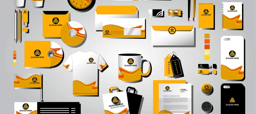
If you want to dive deeper, the same thinking applies to how graphic design shapes brand identity, since a box is only one more surface where that identity has to hold.
If you want more guides, quick tips, or help with your own box design, reach out to Graphic Design Eye LLC. We love to share ideas, answer your questions, and help turn a plain box into a design people remember.