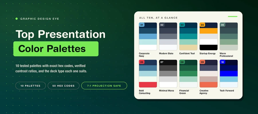
The best presentation color palettes are Corporate Navy, Modern Slate, Confident Teal, Startup Energy, Warm Professional, Bold Consulting, Minimal Mono, Financial Green, Creative Agency, and Tech Forward. Each has five hex codes and a checked contrast ratio from 2.6:1 to 18.9:1. Apply three to five colors per deck. Try to follow a 4.5:1 minimum contrast ratio under WCAG 2.1 AA. And use 7:1 for projected slides.
Most color advice stops at the file. It picks hues that look nice on a bright screen and calls it done. But a pitch deck color palette goes further. It’s projected in a dimly lit room and played over a video call that flattens subtle tones. It also gets printed in black and white and read later.
This guide suggests palettes for that whole life. Each one comes with exact hex codes and a verified contrast ratio. You will also find five small mistakes that quietly ruin a good palette in the room. If your deck also needs layout help, presentation and pitch deck design covers that too.
So, keep reading to find the one for your next deck.
10 Best presentation color palettes
The ten best presentation color palettes are detailed below. Each has five hex codes and a checked contrast ratio. Ratios range from 2.6:1 for accent text to 18.9:1 for Minimal Mono, the highest in the set.
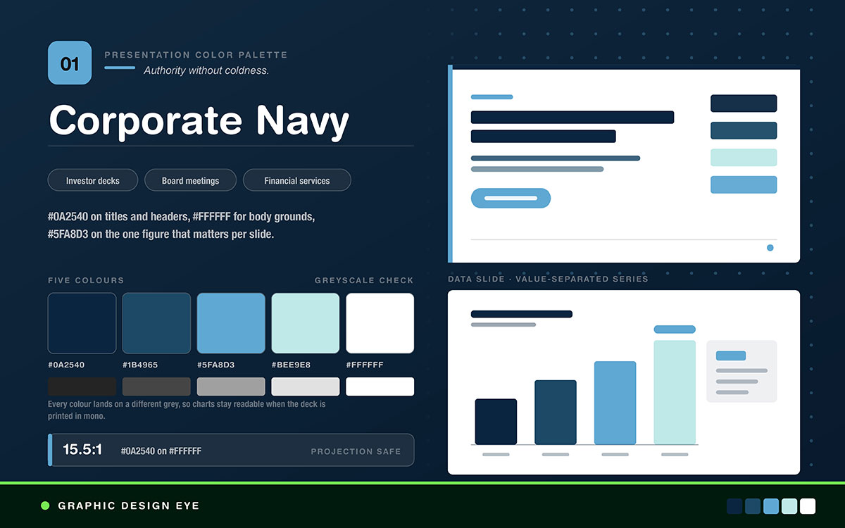
Best for: Investor decks, board presentations, financial services
Feel: Strong but not cold. Navy feels trustworthy in a way black doesn't.
How to use it: Use #0A2540 for titles and headers. Use #FFFFFF for slide backgrounds. Use #5FA8D3 for data highlights, one figure per slide. Navy on white scores 15.5:1. That beats the 7:1 needed for projection.
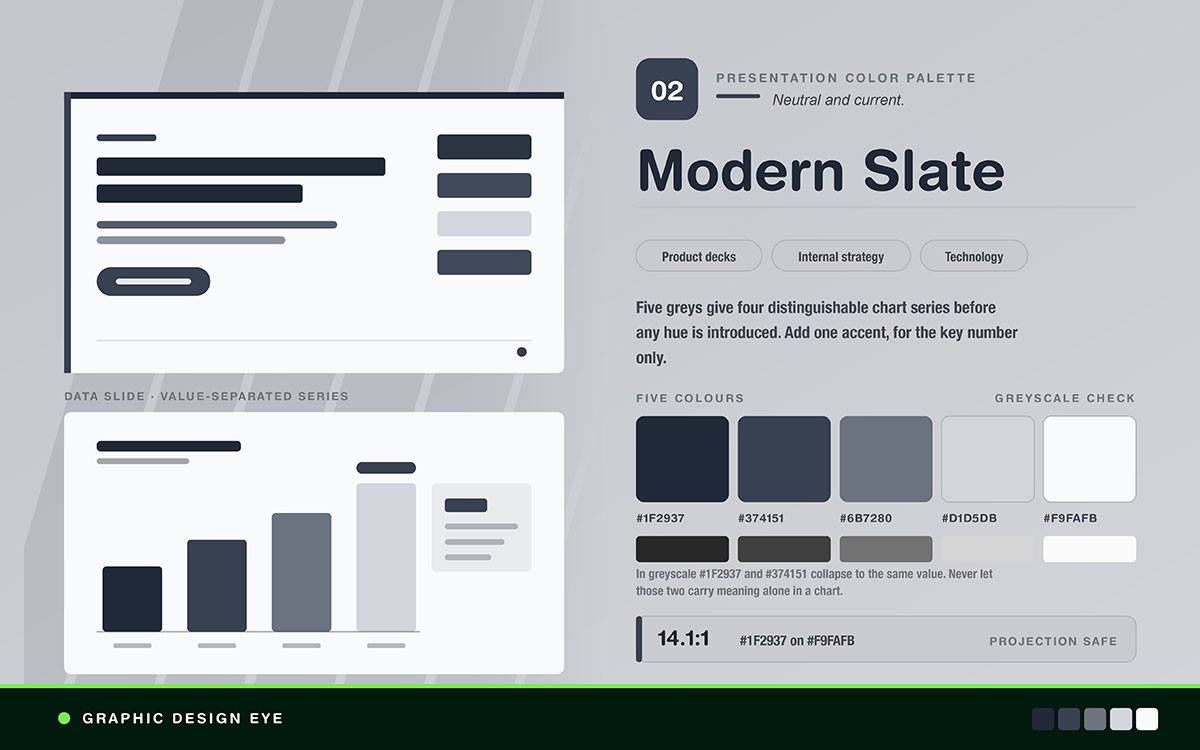
Best for: Product decks, internal strategy, tech companies
Feel: Neutral and modern. Color does not distract. Content carries the argument.
How to use it: A true greyscale system needs one accent color for emphasis. Pick one brand color. Use it only on the key number on each slide. The five greys give four chart series before adding any color.
A greyscale system also avoids off-brand decks, since there is no palette to misuse. Teams making decks often keep this discipline through a locked template, not instructions. A brand identity system solves the same problem on a larger scale.
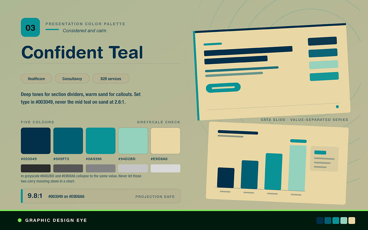
Best for: Healthcare, sustainability, consultancies, B2B services
Feel: Calm and thoughtful. The warm sand keeps it from feeling clinical.
How to use it: Use the dark tones for section dividers. Use the light sand for callout boxes. Teal works well as a chart fill. Don't use it as text on sand, since it only provides a 2.6:1 contrast ratio. Use #003049 for text instead.
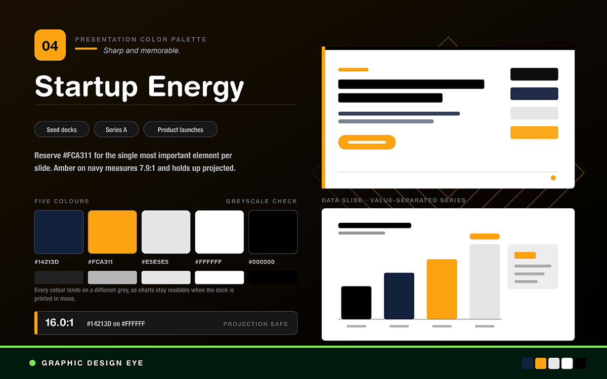
Best for: Seed and Series A pitch decks, product launches
Feel: Sharp and memorable. Amber against deep navy creates high contrast while staying calm.
How to use it: Save #FCA311 for only one key thing per slide. Using it on more than one thing weakens the emphasis. Amber on navy measures 7.9:1 and stays clear under projection.
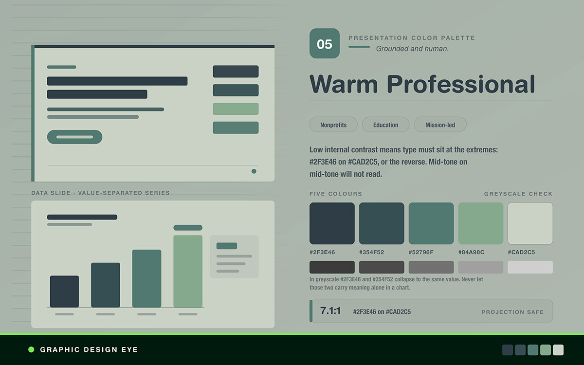
Best for: Nonprofits, education, environmental, mission-led groups
Feel: Grounded and human. Serious but not corporate.
How to use it: Colors sit close together, so text needs strong contrast. Use #2F3E46 on #CAD2C5, a 7.1:1 ratio, or flip it. Mid tone on mid tone will not work.
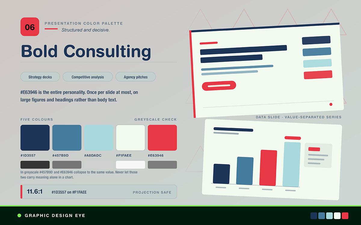
Best for: Strategy decks, competitive analysis, agency pitches
Feel: Structured and decisive. The single red accent gives it punch.
How to use it: #E63946 is the whole personality here. Use it once per slide, on a risk figure, a key insight, or the ask. At 3.9:1 on the off white, it works for big figures and headings, not body text.
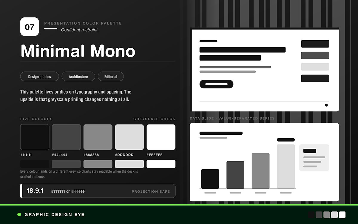
Best for: Design agencies, architecture, luxury, editorial
Feel: Confident restraint. The work doesn't need decoration to persuade.
How to use it: This palette depends on typography and spacing. Poor type sets ruin it fast. It survives every degradation, since greyscale printing changes nothing.
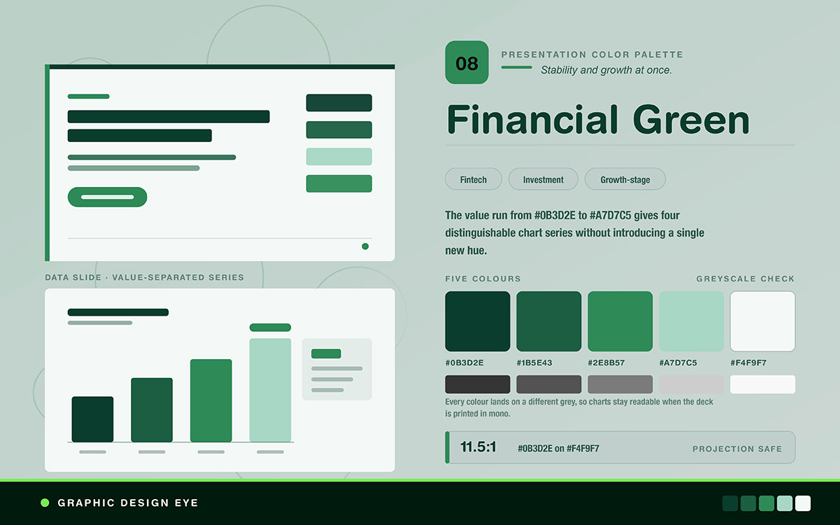
Best for: Fintech, investment, agriculture, growth stage decks
Feel: Feels stable and growing at once. Deeper than typical corporate green.
How to use it: Great for charts. The shades from #0B3D2E to #A7D7C5 give four clear data series without adding new colors. This also survives greyscale printing.
Charts show whether a palette works. A value-separated set like this makes a figure easy to read, rather than losing the audience. This is the same skill used in infographic and data visualization design, just at slide scale and under harder viewing conditions.
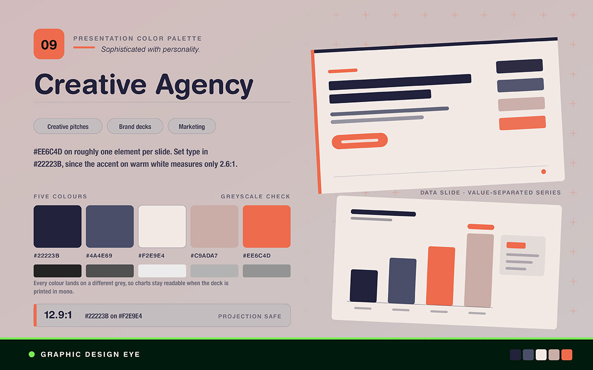
Best for: Creative pitches, brand presentations, marketing decks
Feel: Sophisticated but full of personality. Still looks professional.
How to use it: Use #EE6C4D as the accent. Add it to one element per slide. #F2E9E4 gives a warmer background than white. It also projects well. Set type in #22223B. On warm white, the accent only measures 2.6:1.
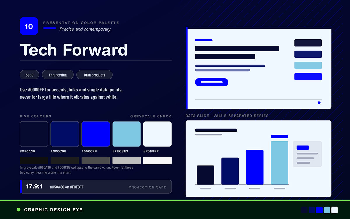
Best for: SaaS, engineering, data products, technical audiences
Feel: Precise and modern. The bright blue feels digital.
How to use it: Pure #0000FF is too strong at scale. Use it for accents, links, and single data points. Avoid large fills or backgrounds. It clashes with white and looks bad.
5 Mistakes that make a good palette fail in the room
Five mistakes can ruin the best presentation color palettes. Those are: using the accent color on everything. Pairing colors with similar lightness. Using pure white backgrounds under projection. Ignoring how the deck looks as a PDF later. Adding decorative color to slides that do not need it.
Let’s read them one by one and learn their fixes.
Mistake 1: Using the accent color on everything
The accent shows up on headers, bullets, icons, chart bars, and page numbers because it is the brand color.
The truth: An accent only stands out when it is rare. Put it on six things, and it stands out on none. The audience will not know where to look.
The fix: Use the accent once per slide. Pick the one number, idea, or word that matters most.
Mistake 2: Choosing colors with similar lightness values
Two brand colors look different in hue but share similar lightness on charts and diagrams.
The truth: Similar lightness turns into the same grey when printed. It also gets hard to tell apart when projected. Hue difference alone does not create enough contrast.
The fix: Check the palette in greyscale. Make sure every color that needs to stand out has a clearly different lightness.
Mistake 3: Using pure white backgrounds for projected decks
Slides use #FFFFFF because it's the default in every tool.
The truth: Pure white glares in a dark room. It tires your eyes over a long presentation and weakens the contrast of everything on top.
The fix: Use a slightly off-white shade, such as #F9FAFB or #F4F1DE. You won't notice it on screen, but it feels much easier on the eyes when projected.
Mistake 4: Ignoring how the deck will be shared afterward
The deck is made for a live talk, then sent later as a PDF that looks different.
The truth: Most decks get read more than they get presented. A deck built only for the room fails everyone who just sees the file.
The fix: Design for the file first. If it works on its own, it will work in person too.
Mistake 5: Adding color to slides that do not need it
Every slide gets a colored background, a header bar, and dividers to make it look designed.
The truth: Too much color becomes noise. It makes the deck feel decorated rather than thoughtful. Restraint feels confident.
The fix: Use white or off-white slides with black text. Add color only for section breaks, data, or the ask.
Presentation color palette FAQs
The questions below cover the best presentation color palettes that recur, from how many colors a deck can carry to why a palette that looked confident on screen falls apart in a boardroom. Each answer begins with the direct response, so you can make your choice and return to the slides themselves.
For any other questions, feel free to contact us for advice. We’re happy to help.
Use three to five colors. One main background color, one or two support colors for structure, and one accent for the single most important thing on each slide. Fewer than three loses hierarchy. More than five weakens the accent.
Use deep, trustworthy base tones like navy, slate, or teal. Pair them with one bold accent color. Navy and amber, slate and a brand color, or teal with warm sand all work. The exact hues matter less than saving the accent for real emphasis.
Body text needs at least a 4.5:1 contrast ratio under WCAG 2.1 AA. Aim for 7:1 on projected decks, since projectors show color poorly and room light reduces contrast. Large headings above 24 points can use a 3-to-1 ratio, but a higher ratio is safer.
Use a slightly off-white background instead of pure white, like #F9FAFB. Pure white glare in a dark room tires the eyes and weakens the contrast of your content. On screen, the difference barely shows.
For a colorblind audience, ensure each data series stands out by lightness. Add a second cue too, like a pattern, line style, or label. Try turning the slide grey. If two series look the same, the chart relies too much on color alone.
Yes, but you will likely need more shades than your brand kit offers. Most brand guides provide only two or three core colors, which isn't enough for sections, charts, and emphasis across many slides. Add tints, shades, and one neutral color instead of new unrelated ones.
Avoid pure saturated red and green as the only distinction between chart series, since the most common form of colour vision deficiency affects exactly that discrimination. Also avoid pure black backgrounds, which project as unstable grey and make white type appear to vibrate, and avoid any two colours of similar lightness carrying different meanings.
Use higher contrast than you would in person, and skip subtle color shades. Video compression loses fine color detail first, so close tints in a chart will blur together. Differences in lightness survive compression. Differences in hue alone do not.
Endnote
The best presentation color palettes only earn their place once they hold up in the room, under a projector, on a call, or printed in grey. Knowing which palette fits your deck is the easy part now.
Most teams struggle to apply it consistently. A palette that looks right on slide one can drift by slide twenty. Contrast ratios slip. Chart colors stop matching. That is when you need a team that treats the palette as a system. Graphic Design Eye LLC's design service builds your deck slide by slide. The palette gets locked into a template. Contrast gets checked for projection. Charts stay readable in greyscale and on video calls. So the consistency you planned actually holds through the whole deck.
If your next pitch, board update, or client presentation deserves better than a palette applied inconsistently across forty slides, it’s worth investing in presentation design agencies. Choose your colors with intention, and let the room remember the message.
Get the palette right once, and every deck that walks into the room after it is ready.
Graphic Design Eye LLC is a full-service creative agency built for brands that demand more than design — they demand vision. From strategic branding to complete visual identity, we partner with startups, agencies, and growing businesses as a dedicated creative force. With flexible subscription and project-based models. Let's start with us today!