This AHO case study demonstrates how improved design enhanced AHO’s brand. It examines how design enabled the organization to communicate more effectively.
Nonprofit organizations often have strong missions. But not all explain them clearly.
AHO was already making a positive change at the grassroots level. The organization worked closely with real communities.
Before the redesign, the brand lacked clear trust signals. It did not fully show credibility or the scale of its work. Donors and partners sometimes struggled to quickly understand AHO. This confusion slowed engagement and limited growth.
The case study demonstrates how investment in design enabled AHO to advance. The organization gained confidence through better branding. A clear and consistent visual identity was created. The brand became more credible and reliable.
The change went beyond logos and colors. It became a full communication system. The system showed an impact clearly. It helped earn trust from stakeholders. It also supported future growth.
We will explore the challenges AHO faced. We will explain the strategies used. We will discuss the branding kit deliverables. We will share the final outcomes.
By the end, one thing will be clear. Smart branding is essential for nonprofits. It helps create a strong and lasting impact.
Let’s binge on!
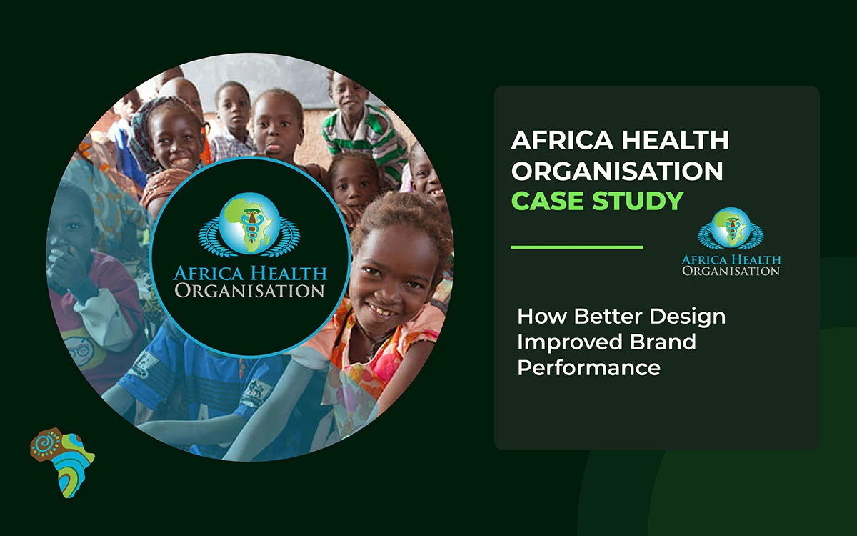
AHO Case Study
Strategic branding should not be seen as a cost. It is a long-term investment in trust and clarity. It also supports steady and sustainable growth.
Through a comprehensive professional branding kit, AHO saw real change. This case study shows clear improvement in brand performance. The organization built stronger and more genuine trust. Relationships with the target audience became deeper.
Careful design choices made a big difference. Simple and clear visuals improved understanding. The change was not only visual.
Internally, AHO felt more reliable and stable. The organization gained confidence in its identity. It became a more trustworthy presence overall.
About the AHO Nonprofit Organization
AHO is a nonprofit organization supporting underserved and vulnerable communities. Its main focus areas are education, awareness, and long-term social development.
The organization works at the grassroots level with real people. It listens closely to community needs. It responds with practical and useful programs.
AHO believes real change takes time. The organization avoids quick fixes. It focuses on steady progress instead.
This progress comes through learning and guidance. Community support plays a key role. Programs help individuals grow personally. They help families become stronger. They help communities move forward sustainably.
Through workshops, AHO shares knowledge and skills. Outreach activities build confidence and awareness. Educational programs open new opportunities.
AHO’s work is grounded in care and compassion. It is driven by a strong commitment to social impact.
The AHO Design Problem
AHO’s design problem was not the cause itself. The cause was strong and meaningful.
The real problem was communication. The brand lacked clarity, consistency, and credibility. This affected both visual and written communication.
A detailed brand audit showed several ongoing problems. These issues were built into the system. Together, they were weakening the organization's effectiveness:
Visual Identity Inconsistencies
The organization’s logo appeared in many different forms. These variations showed up across platforms, materials, and communications. As a result, stakeholders became confused. Brand recognition grew weaker over time. There were no clear rules for logo use. Team members followed their own understanding. It resulted in a fractured and inconsistent brand image.
Lack of Visual System Standards
AHO had no fixed color palette or typography system. Each team member designed materials independently. This caused big visual differences across outputs. The organization appeared unprofessional and disorganized. The problem affected all materials. This included social media content and donor presentations.
Weak Messaging Structure
AHO’s written communication showed real passion and dedication. However, it lacked a clear structure. Donors and partners found it hard to grasp the organization’s scope. Its impact and capacity were not easy to understand. Messages relied heavily on emotion. They did not include enough data, proof, or clear value statements.
Limited Brand Scalability
The existing brand assets were not well adapted to different uses. Designs created for digital platforms did not translate well to print. The materials used in donor meetings were deemed unsuitable for community events. As a result, team members often had to start from scratch. New materials had to be created for each situation.
Reduced Donor Confidence
Some potential donors felt unsure. The branding was inconsistent. The messaging was not always clear. This led them to question the organization’s competence and professionalism. As a result, funding discussions suffered. It also limited access to resources.
Missed Partnership Opportunities
Organizations looking for partners prefer groups that appear organized and capable. AHO’s scattered brand presence sent mixed signals. It suggested possible instability. Because of this, the potential creative partner hesitated. Some chose to work with competitors instead.
Operational Inefficiency
Internal teams spent too much time explaining the mission. They often had to fix misunderstandings. They also kept recreating basic materials. This wasted time and effort. It pulled resources away from program work. It also reduced the organization’s ability to grow its impact.
The Strategic Design Solution
Recognizing these challenges, AHO contacted Graphic Design Eye to develop a comprehensive solution. This collaboration focused on creating a sustainable brand system tailored to AHO’s unique needs and constraints.
Graphic Design Eye started with a clear strategy. The primary objective was to develop a strong, enduring brand system. This system needed to support AHO’s mission for many years. It also had to work across different situations and uses.
Every design choice was guided by three core principles:
- Clarity as a Competitive Advantage: Nonprofit organizations compete for attention and resources. In this environment, clarity matters. Being able to explain the mission and impact in seconds gives a strong advantage. Every design element was refined to help people understand quickly. This was done without losing depth or meaning.
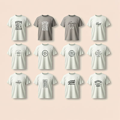
- Consistency Across All Touchpoints: People interact with organizations in many ways. These include websites, social media posts, t-shirts, brochures, printed materials, event signs, emails, and PowerPoint presentation designs. Maintaining a consistent look and message across all of them enhances recognition. It also strengthens trust and creates a unified brand experience.
- Credibility Through Professional Visual Language: Visual design strongly shapes how stakeholders judge an organization. A clean, professional design demonstrates competence and care. It signals attention to detail and respect for relationships. The design needed to feel friendly but professional. It also had to balance warmth with capability. All design decisions supported this goal.
The discovery phase followed a structured process. Stakeholder interviews were conducted first. Audience analysis helped define key groups. Donor behavior research showed decision patterns. Nonprofit competitors were also carefully reviewed.
All decisions were based on real evidence. Nothing was driven by personal opinion or guesswork.
Branding Kit Deliverables
The investment did not produce separate or disconnected assets. Instead, it created a complete and connected brand ecosystem.
- Logo Architecture: Primary and secondary logo versions were created. This ensured the logo could be used correctly in many situations. The system included horizontal, vertical, and icon-only versions. Each version was designed for a specific purpose. All versions kept the same look, feel, and brand recognition.
- Strategic Color Palette: Colors were selected to achieve the desired emotional impact. At the same time, accessibility needs were carefully considered. The palette reflected the organization’s values and followed WCAG accessibility standards for digital use. Each color had clear rules for how and where it should be used. This ensures visual consistency across all materials.
- Typography Hierarchy Framework: Fonts were selected with readability as the top priority. They worked well on digital screens and in low-quality print settings. The typography system defined clear rules for headings, body text, and accent elements. These rules enabled team members to design clean, professional materials without advanced design skills.
- Comprehensive Brand Guidelines Documentation: The brand guidelines clearly explained how to use logos, colors, and typography. They also covered spacing, placement, and contrast rules. The document included clear “do’s and don’ts” to avoid mistakes. Everything was written in simple, easy-to-understand language, so even non-designers could apply the brand correctly and confidently.
Design Strategy
Every design choice was informed by a clear strategy, not by trends or personal taste. Nothing was done just to look good.
This careful method helped the design stay useful over time. It also made sure the design worked well in practice.
This ensured the brand worked equally well on a website, a donor report, or a printed flyer in a rural community center.
- Psychological Color Strategy: Color choices were informed by research on color psychology. They were used to create feelings of trust, warmth, and reliability. These emotions help encourage donor involvement and a sense of community. Colors were not selected solely for their appearance. They were selected for their proven effect on perception and decision-making.
- Context-Appropriate Typography: Fonts were selected with readability as the primary consideration. They perform well on low-resolution screens, low-cost prints, and in poor lighting. This practical focus ensured that brand materials remained clear and effective across all settings. These settings ranged from digital campaigns to field-based materials.
- Multi-Context Logo Optimization: The logo was designed to work across many formats. It functions well on large banners and small social media images. It also supports full-color and single-color printing. This flexibility removed the need for separate redesigns. Brand consistency was maintained across all applications.
- Impact-Focused Visual Hierarchy: Layout designs were created to guide attention carefully. They direct focus toward impact data, testimonials, and program results. Decorative elements were kept secondary. This ensured the design supported communication goals. It did not compete with the message.
- Resource-Adaptive Design Systems: Brand elements were designed to perform effectively in both high- and low-budget contexts. They work well in polished marketing campaigns and in resource-limited field use. The brand remains effective on advanced websites and professionally printed reports. It also operates on simple photocopies of flyers used in community centers.
The Investment: $10,000
The $10,000 budget was carefully and purposefully planned. The goal was long-term value, not quick design fixes.
Every part of the investment focused on building a reusable system. AHO could use this system repeatedly.
The investment was mainly used for the following:
- Research and Strategic Foundation (30%): A substantial portion of the budget was allocated to early research. This included stakeholder discussions and careful planning. The goal was to solve real organizational needs, not assumed ones. This strong foundation reduced the risk of expensive redesigns. It also kept the solutions useful as the organization grew and changed.
- System-Based Design Development (45%): Rather than producing separate, unrelated assets, most resources were allocated to developing a unified brand system. The system was designed to work as a whole. Its parts supported one another across different platforms and uses. This created far more value than isolated design pieces could.
- Documentation and Knowledge Transfer (15%): Clear and easy-to-follow documentation was created. Teams were also trained to use the system confidently. This allowed the organization to work independently. As a result, long-term value increased by lowering the need for ongoing external design support.
- Practical Asset Creation (10%): The final portion of the budget was allocated to ready-to-use assets. These assets supported key functions, including fundraising, awareness efforts, and day-to-day communications.
Compared with the cumulative costs of repeated small design changes, this investment proved more effective. It created a reusable brand framework. This framework continues to deliver value over time.
AHO Brand Performance Results
Following the launch of the new brand system, AHO observed clear changes within a few months. The changes were not only visible. They were also felt by people interacting with the organization.
Brand improvements changed how people responded to AHO. Trust and understanding developed more quickly than before.
Stronger Donor Confidence
Donor meetings became more effective. Professional presentations clearly showed the organization’s competence and impact. Donors felt more confident in the organization.
This strengthened relationships and led to more effective discussions on funding. The polished visuals showed operational skill, reduced perceived risks, and helped build trust.
Faster Brand Recognition Across Channels
Using consistent colors, fonts, and visuals across all materials facilitated brand recognition. Stakeholders can quickly identify AHO materials on social media, at events, and in print.
This repeated exposure built familiarity and made marketing more efficient, reinforcing the organization’s presence.
Clearer Internal Operations
Internal teams experienced less confusion regarding branding. Clear guidelines removed doubts about logos, colors, and material design. Pre-made templates saved time on routine tasks.
Staff could focus more on program work. Workflows improved because everyone shared the same understanding rather than relying on personal estimates.
Stronger Professional Image
Partnership discussions indicated a change in others' perceptions of AHO. Prospective partners now viewed the organization as organized, professional, and capable. This improved perception facilitated collaboration and strengthened negotiating positions.
Higher Content Engagement
Branded content performed better across digital and physical channels. Social media posts got more interactions after brand standardization. Printed materials at community events led to more follow-ups.
These results show that a professional and consistent look directly improves stakeholder engagement.
What Other Organizations Can Learn
This AHO case study clearly shows an important truth about nonprofit branding. It is not about increasing expenditures. It is not about trying to look “big.”
It is about being clear, honest, and consistent. It is about clearly communicating the mission to the world. When people quickly understand an organization, trust grows faster.
Important lessons from this project include:
- A strong mission requires a robust system: passion alone is insufficient. A clear brand system keeps the mission focused and organized. It also makes communication easier as the organization grows.
- Clarity builds trust: Mixed visuals and unclear messages create doubt. Donors hesitate when things feel confusing. A clean and consistent brand builds confidence and security.
- One solid brand saves long-term costs: A complete brand system reduces repeated redesigns. It prevents constant quick fixes. It also reduces the need for outside help.
- Strategy before design saves money: Planning first avoids wasted effort. Design is more effective when it follows a strategy. Each piece of content lasts longer and works harder.
- Branding supports daily operations: Branding is more than appearance. It helps teams work faster every day. It supports better decisions and clearer communication.
- Early structure reduces future friction: Early branding investments prevent future problems. Clear systems make growth smoother. Expansion feels controlled and less stressful.
For nonprofits, branding is not an extra cost. It is a practical tool for growth and trust. It supports long-term impact and stability.
Endnote
Now that we have reached the end of the AHO case study, one thing is clear. Design is not only about making things look better. It is about improving outcomes.
For AHO, small and thoughtful design changes made a real difference. The brand spoke more clearly to its audience. It felt more confident and more focused. It also connected more deeply with the right people.
This journey shows that strategy and creativity must work together. They cannot succeed when separated. When design aligns with brand goals, performance improves naturally. Trust grows over time. Engagement feels honest and real.
The brand stops making noise and starts moving with purpose. It speaks to issues of clarity, consistency, and connection. Better design can change how people see you. It can also change how they respond to you.
Your brand is already a story. Good design helps others hear that story clearly.