This La Lucky case study explores how a focused investment in professional graphic design improved brand perception and increased credibility. The objective was simple. High-quality products and reliable service needed a visual identity that matched their value.
In e-commerce wholesale, first impressions strongly influence buying decisions. La Lucky, an Asian food importer with 28 years of industry experience, faced a growing gap between its operational strength and its visual presence. This gap risked weakening the brand’s long-established market position.
The challenge was not performance, but presentation. Inconsistent design reduced trust and diluted authority in digital channels. A strategic approach to professional graphic design resolved this issue. The outcome shows that a strong visual identity plays a direct role in building trust, reinforcing expertise, and supporting long-term success in competitive online marketplaces.
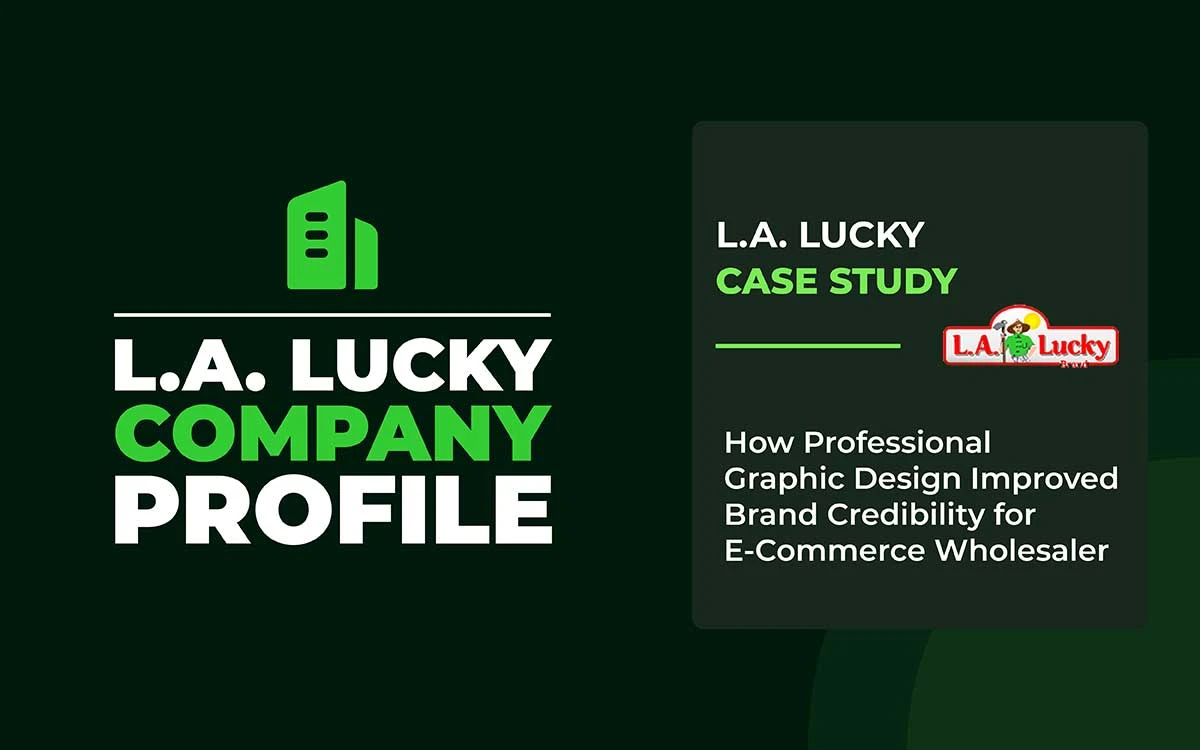
La Lucky Case Study
This La Lucky case shows how an investment in professional graphic design can significantly improve brand credibility. The updated visuals helped the brand appear more trustworthy and established.
The redesigned image presents La Lucky in a strong, confident light. The brand now looks consistent wherever customers encounter it. Customer engagement has increased, and business partners view the brand as reliable and professional. Strategic design transformed La Lucky’s visuals into a practical tool for building trust.
This La Lucky case study examines the brand in detail. It outlines the design decisions step by step. The goal is to show how clear and consistent design helps an eCommerce brand earn trust in a competitive market.
About La Lucky
La Lucky is a leading importer and distributor of Asian food products in the United States. The company has more than 28 years of experience in the food industry. It was founded in 2007 by George Nguyen.
La Lucky sources thousands of food products from multiple Asian countries. It distributes these products to retailers across all fifty U.S. states. The company is known for consistent product quality, reliable delivery, and dependable customer service.
The company offers over 8,000 products from more than 100 global brands. Several of these brands are exclusive or newly introduced to the market. La Lucky continues to expand its product range to meet customer demand. Its goal is to provide a broad selection, competitive pricing, and strong overall value.
The La Lucky Problem
La Lucky faced a challenge common to many established businesses. Its operations were strong and well-organized. However, its brand presentation did not reflect this strength.
The company’s internal systems performed well. Yet its outward-facing visuals and messaging failed to communicate that capability. As a result, potential buyers could not clearly see the reliability and professionalism behind the business.
Visual Inconsistency Across Touchpoints
The company’s extensive product range, while commercially advantageous, created visual fragmentation. Products sourced from hundreds of international brands arrived with disparate packaging, photography standards, and presentation styles. This diversity, unmediated by a consistent brand overlay, created a disjointed user experience that undermined perceived professionalism.
Product imagery varied dramatically in quality, composition, and lighting. Some items featured professional studio photography; others displayed basic snapshot documentation. This inconsistency forced potential customers to evaluate product quality alongside presentation quality, introducing unnecessary doubt into purchase decisions.
Marketing materials reflected similar challenges. Promotional graphics lacked visual hierarchy and professional polish. Typography choices appeared arbitrary rather than strategic. Color palettes shifted between campaigns, preventing brand recognition and diluting message impact.
The Credibility Gap
For prospective business customers evaluating potential suppliers, first impressions occur online. Website visits, social media engagement, and digital marketing materials form the primary basis for trust assessment. La Lucky’s digital presence, while functional, failed to project the authority and reliability that characterized their actual operations.
George Nguyen articulated the disconnect: the company’s mission centered on delivering superior variety and quality, yet digital presentation failed to substantiate these claims. Potential customers encountered visual elements suggesting amateur execution rather than professional management.
Competitive Pressure in Digital Commerce
The e-commerce wholesale sector has experienced significant consolidation and professionalization. Retailers seeking Asian food products now encounter numerous sophisticated distributors, many featuring polished digital presences that communicate competence instantly. In this environment, visual presentation serves as a qualifying criterion: suppliers who appear unprofessional are eliminated before operational capabilities are considered.
Research confirms that business buyers make rapid assessments based on visual cues. Inconsistent branding, amateur graphics, or unprofessional photography immediately trigger skepticism about business practices. Even minor visual deficiencies compound to create significant credibility deficits.
Defining the Core Problem
La Lucky’s challenge distilled to a single principle: their visual identity failed to reflect their operational reality. The products warranted trust; the service proved dependable; the experience validated excellence. Yet the brand presentation suggested otherwise, creating unnecessary friction in customer acquisition and retention.
This misalignment represented both opportunity and urgency. Opportunity, because bridging the gap required a visual transformation rather than an operational improvement. Urgency, because competitors were already leveraging professional presentations to claim market share regardless of actual capability differences.
The La Lucky Solution
La Lucky contacted Graphic Design Eye to transform their brand’s visual identity. Graphic Design Eye operated a comprehensive visual audit, strategic identity development, and coordinated implementation across all customer touchpoints to evolve the brand. The collaboration focused on achieving functional credibility enhancement through strategic design.
Establishing Unified Visual Language
The foundation of transformation required establishing consistent visual standards applicable across La Lucky’s diverse product portfolio. Graphic Design Eye developed a comprehensive style guide that specifies color palettes, typography systems, photographic standards, and principles for company profile layout. These guidelines ensured that, regardless of product origin or category, all visual elements projected a unified brand identity.
Color selection prioritized psychological associations with reliability and quality. Typography balanced professionalism with accessibility, ensuring readability across digital and print applications. Layout structures emphasized product prominence while maintaining a lean, uncluttered composition that communicated organizational competence.
Product Presentation Standardization
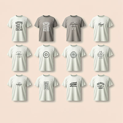
Addressing the 8,000+ product catalog required a systematic approach rather than an item-by-item redesign. Graphic Design Eye created photographic templates and editing protocols that elevated existing imagery to professional standards. Consistent lighting correction, background treatment, and compositional framing transformed disparate product shots into cohesive visual assets.
For products requiring additional visual context, supplementary graphics highlighted quality indicators: certifications, awards, sourcing authenticity, and packaging details. These elements provided reassurance without overwhelming the core product presentation, striking a balance between information and clarity.
Website and Digital Platform Enhancement
The company website received a comprehensive visual restructuring. The navigation hierarchy was simplified and strengthened through strategic use of visual weight and spacing. Product categories gained distinctive iconography that facilitated rapid scanning while maintaining aesthetic consistency. Call-to-action elements were redesigned to balance visibility with sophistication, encouraging engagement without appearing aggressive.
Homepage banners were redesigned to spotlight key differentiators: extensive selection, rapid delivery, and dedicated support. Each banner incorporated compelling imagery, concise messaging, and clear visual hierarchy. The cumulative effect transformed the homepage from an information repository to a persuasive sales environment.
Marketing Materials Refinement
Social media templates, email campaigns, and promotional materials received coordinated redesign. Each template incorporated La Lucky’s refined visual identity while allowing flexibility for specific promotions. Consistent header treatments, typography application, and color usage ensured brand recognition across platforms and campaigns.
Product packaging and presentation materials showcased items in context, helping retailers visualize how products would appear in their own operations. These materials balanced aspiration with authenticity, presenting products attractively while maintaining realistic representation.
Communicating Authority Through Design
Beyond aesthetic improvements, design choices strategically communicated La Lucky’s industry position. Visual elements incorporated subtle cues signaling experience, stability, and scale: refined color choices suggesting established business, typography selections indicating professionalism, and layout decisions reflecting organizational sophistication.
The 28-year operational history, previously buried in text, was brought to the surface through timeline graphics, milestone highlights, and visual storytelling elements. Supplier relationships and exclusive partnerships received prominent visual treatment, transforming abstract concepts into tangible competitive advantages.
Solution Summary
Through their engagement with Graphic Design Eye, La Lucky received a comprehensive solution that addressed root causes rather than symptoms. By establishing unified visual standards and systematically implementing them across all touchpoints, the collaboration eliminated the credibility gap between La Lucky’s operational excellence and market perception. The result: a professional, cohesive brand identity that accurately reflected the company’s capabilities and instilled immediate confidence in prospective customers.
La Lucky Investment: $1,500
The transformation of La Lucky’s brand identity required an investment of $1,500, a figure that warrants examination for both its modesty relative to the company’s scale and its strategic deployment for maximum impact.
Resource Allocation Strategy
For a company managing 8,000+ products and operating nationwide distribution, $1,500 represents a remarkably efficient expenditure. The investment achieved maximum leverage by strategically focusing on high-impact elements rather than a comprehensive overhaul. Priority areas included:
Core visual identity elements (logo refinement, color palette standardization, typography system) that establish the foundation for all subsequent applications.
Product photography templates and editing protocols that enable systematic quality improvement across the entire catalog.
Website visual enhancement focused on the homepage, category pages, and key conversion points where first impressions form.
Marketing template creation allows efficient production of consistent materials across multiple platforms and campaigns.
Credibility Return on Investment
The primary return on this investment manifests in enhanced credibility; difficult to quantify but undeniable in impact. A professional visual presentation accomplishes several commercial objectives simultaneously:
First, it reduces friction in customer acquisition. Retailers evaluating suppliers make rapid judgments based on visual presentation. Professional design eliminates doubt, allowing purchase decisions to proceed on the basis of product merit and commercial terms rather than concerns about supplier legitimacy.
Second, it supports premium positioning. Consistent, refined visuals signal quality consciousness, justifying competitive pricing and reinforcing value rather than discount positioning. Customers perceive professional brands as more reliable, reducing price sensitivity.
Third, it builds partnership confidence. Business customers seek stable, professional suppliers for long-term relationships. Visual presentation indicating organizational sophistication suggests operational competence, encouraging substantial initial orders and sustained partnerships.
Efficiency Through Focus
The $1,500 budget achieved substantial results through strategic prioritization. Rather than attempting a comprehensive redesign, Graphic Design Eye identified leverage points where visual improvements would generate disproportionate credibility gains. This focused approach delivered professional outcomes without requiring extensive financial commitment.
The investment established scalable frameworks. Photography templates, for instance, enable ongoing product additions to maintain visual consistency without additional design expense. Marketing templates facilitate efficient campaign creation. These enduring assets compound value over time, making the initial investment increasingly efficient.
Comparative Value Perspective
Consider alternative approaches to achieve a similar level of credibility enhancement. Extended sales cycles aimed at overcoming visual presentation deficiencies carry opportunity costs far exceeding $1,500. Lost customers who make negative snap judgments represent revenue that will never be realized. Pricing concessions compensating for credibility deficits erode margins permanently.
Against these alternatives, strategic design investment represents exceptional efficiency. For less than the cost of attending a single industry conference, La Lucky fundamentally transformed market perception—a transformation influencing every customer interaction indefinitely.
What Other E-Commerce Businesses Can Learn
La Lucky’s transformation offers actionable insights applicable across the e-commerce sectors. These lessons transcend specific industry contexts to address fundamental principles of brand credibility in digital commerce.
First Impressions Determine Opportunity
Digital commerce compressed traditional relationship-building timelines into milliseconds. Website visitors form credibility judgments within seconds of arrival. These snap assessments determine whether users engage deeply or exit immediately. A professional visual presentation creates a positive initial impression, opening the door to substantive engagement.
Businesses cannot afford to rely on eventual credibility demonstration through extended interaction. Most potential customers never progress beyond an initial impression if that impression proves negative. Investment in professional visual presentation must therefore precede rather than follow business development efforts.
Consistency Multiplies Credibility
Visual consistency across touchpoints creates compound credibility effects. Each instance of professional, on-brand presentation reinforces previous impressions. Conversely, inconsistency introduces doubt with each deviation, undermining trust cumulatively.
For businesses managing diverse product lines or operating across multiple platforms, establishing and maintaining visual consistency requires a systematic approach. Style guides, templates, and protocols ensure that expansion and growth occur within established brand parameters rather than creating fragmentation.
Strategic Focus Outperforms Unlimited Budgets
La Lucky’s $1,500 investment demonstrates that strategic focus generates superior results compared to unfocused expenditure. Identifying high-impact touchpoints and concentrating resources accordingly produces disproportionate returns. This principle proves particularly valuable for businesses operating with constrained budgets.
The key is to analyze the customer journey and identify moments when visual presentation most significantly influences credibility assessment. Prioritizing these moments for professional design maximizes conversion impact per dollar invested.
Design Functions as Conversion Infrastructure
Professional design represents more than aesthetic enhancement; it constitutes essential infrastructure for conversion. Clear visual hierarchy guides users through complex catalogs. Consistent presentation reduces cognitive load. Professional aesthetics lowers psychological barriers to purchase.
Businesses should evaluate design investments not as discretionary expenditure but as fundamental business infrastructure comparable to payment processing or inventory management. Without an effective visual presentation, other business strengths remain inaccessible to potential customers.
Visual Quality Signals Operational Quality
Customers extrapolate from visual presentation to operational capability. Professional design suggests professional management, quality control, reliable systems, and attention to detail. Conversely, amateur visuals imply amateur operations regardless of actual capability.
This psychological association makes visual presentation particularly crucial for businesses whose operational excellence proves difficult to demonstrate before purchase. Design becomes a proxy indicator, allowing customers to make informed assumptions about aspects they cannot directly observe.
Incremental Improvement Delivers Substantial Results
Complete brand overhauls rarely prove necessary. La Lucky’s transformation involved systematic elevation of existing elements rather than wholesale replacement. Refined photography protocols, consistent color application, and professional layout templates collectively created a dramatic impact without requiring complete reconstruction.
Businesses intimidated by the perceived scale of visual improvement should recognize that focused, incremental changes accumulate significant credibility enhancement. The key involves maintaining consistency in improvements, ensuring that each refinement aligns with the overall strategic direction.
Endnote
The La Lucky case study highlights a simple truth. Customers sense credibility before they decide to buy. For an e-commerce wholesaler, first impressions matter greatly. Professional graphic design played a key role in changing how La Lucky was perceived.
Before the redesign, La Lucky offered quality products. However, the brand did not appear confident or professional. The visual presentation failed to convey the business’s strength.
After updating the layouts, refining the typography, and introducing a clean visual system, the brand felt more reliable. The website became well-organized. Product images appeared clear and trustworthy. La Lucky finally looked as professional as the company behind it.
This transformation was not about adding more design elements. It was about removing doubt. Clean visuals made the site easier to navigate. Consistent branding built confidence at every step of the buying process. Shoppers felt reassured from the moment they arrived.
For e-commerce brands that struggle to build trust at first glance, Graphic Design Eye provides a graphic design solution. We design visuals that feel professional, stable, and dependable.
In online wholesale, credibility is not optional. It is the foundation of success.