First impressions matter a lot for investment firms. Conor International Investment had a strong portfolio and real expertise. But their brand visuals didn’t fully reflect the trust and authority they had earned. This case study explains how that changed.
Through a strategic brand redesign, Conor International Investment developed a custom logo that immediately communicates professionalism, credibility, and leadership.
A logo is more than just a symbol. It represents the whole brand. It tells clients and partners what a company stands for without words. For Conor International Investment, the goal was simple: the logo had to show strength, build trust, and position the firm as a dependable leader in finance.
Through careful selection of typefaces, colors, shapes, and design elements, the logo was crafted to suggest stability and precision. Every element works together to convey confidence and reliability across all platforms—websites, reports, presentations, and business cards.
The work didn’t stop at design. A strategy supported the visuals. With this identity, the firm can showcase its expertise and earn trust at first glance. This case study proves that a logo isn’t just decoration; it’s a tool for communicating authority and standing out in a competitive market.
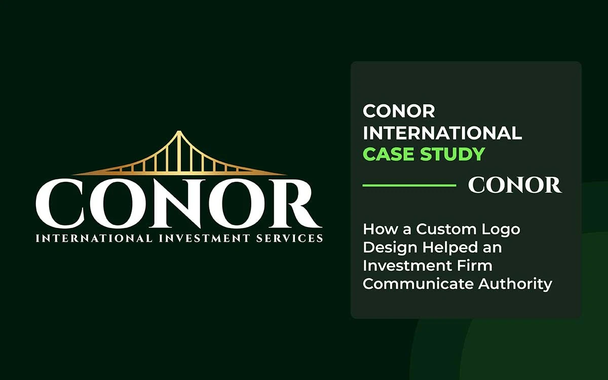
Conor International Investment Case Study
This case study examines how Conor International Investment developed a custom logo that conveys power and professionalism from the outset. The design reflects trust, reliability, and strength in the finance world.
The final result is a logo that builds clients’ confidence. It positions the company as a trusted and dependable partner. With careful design, a simple icon became a bold statement of expertise.
This case study explores the visual identity challenges Conor faced, the strategic solution implemented, and the measurable impact on brand perception and client confidence.
About the Conor International Investment
Conor International Investment is a global investment firm. Their goal is to make international investing easier and safer. The company provides a wide range of services, including property sales, rentals, management, and high-return investments. They guide clients from evaluating opportunities to starting and growing their businesses.
Conor is built on professionalism and expertise. They ensure every deal is handled on time and efficiently. Their team helps clients find real estate and investment options that fit their goals. Support is provided at every step of the way.
With strong market knowledge, strategic insight, and a global network, Conor helps clients make smart investment decisions.
The Conor International Investment Problem
Conor International Investment operates in a field where trust matters most. Trust is at the heart of everything they do.
They handle international investments, real estate, and cross-border deals that often run into millions or even billions.
Despite the high stakes and serious nature of their work, the brand had a major issue. Its visual identity failed to convey authority or inspire confidence in the company.
High-Trust Industry, Low Visual Authority
Investment and real estate firms are judged almost instantly. People form opinions before they read about the services, reach out to the company, or trust the process.
Most look at the logo first. For Conor International Investment, the issue was clear. The logo felt weak and unestablished. It lacked the weight and presence expected from a global investment firm. At a glance, it didn’t convey expertise, stability, or professionalism. In a high-risk industry, that gap can create doubt and hesitation.
Mismatch Between Services and Brand Image
Conor offers:
- Advice on investing internationally
- Buying, selling, and renting properties
- Managing properties
- Real estate investments that can make good money
All these services need the company to seem trustworthy and confident. But the brand didn’t show that.
- The logo didn’t feel global.
- It didn’t look financially strong.
- Instead of standing out as an expert, it just looked like any other company.
Because of this, the company's first impression was weak.
First-Impression Loss in Digital Spaces
Most people meet Conor online first.
- Website.
- Search results.
- Social media.
In these spots:
- The logo acts like the company's face.
- A weak logo makes people doubt.
- Doubt can make them pause or leave.
Even if the service is great, a weak logo can still hurt trust. This happens quietly, before anyone talks to the company.
Lack of Differentiation in a Crowded Market
The investment and real estate world is packed with companies. Many say the same things:
- "Trust us."
- "High returns."
- "Expert advice."
Without a clear logo:
- Conor looked just like every other company.
- There was nothing that showed it was a leader.
- The brand didn’t feel special or memorable.
- In global investment, it is risky to be unnoticed.
Emotional Confidence Was Missing
Investing money is not just about logic. It’s also about feelings. People want to feel:
- Safe
- Confidence
- Guided by experts
But the company's old look didn’t arouse these feelings.
- It didn't feel bold
- It didn't feel secure
- It didn't feel like a firm you trust with major financial decisions.
This sense of missingness affected how people saw the brand.
In investing, trust is everything. Conor International Investment had great services. They were very skilled. But their logo didn’t show strength, stability, or trust right away. Because of this, some clients hesitated.
The problem wasn’t how they worked. It wasn’t their services. It wasn’t their goals. The problem was how they looked. In investing, if a company doesn’t look trustworthy right away, people won’t trust it.
The Conor International Investment Solution
To address these critical branding challenges, Conor International Investment partnered with Graphic Design Eye, a specialized design firm with expertise in financial brand identity. The collaboration focused on creating a visual identity that would establish immediate trust and credibility. Together, they set out to develop a logo that would convey power, stability, and global reach—all without a single word.
The partnership recognized that in investment and real estate, visual identity is far more than decoration—it’s a strategic asset that builds confidence and reduces client hesitation. This principle guided every design decision throughout the collaboration.
Authority as a Visual Signal
Working with Conor, Graphic Design Eye approached the logo as a psychological tool rather than just a visual element. The design strategy was built on key branding insights:
- People decide if they trust a company in just a few seconds.
- What they see first sets the stage for trust, even before they think about it.
- Strong symbols make people feel safer when making money decisions.
The new logo was designed to show authority. It’s a visual sign that Conor is a company you can rely on.
Custom Design Over Generic Identity
The logo wasn’t made with the usual real estate or investment icons. It was designed to show exactly where Conor stands in the market.
- International investment focus
- Real estate know-how
- Help through every step of investing
Why custom logo design matters:
- Ordinary logos are easily overlooked
- Leaders need to stand out
- A unique look shows confidence and strength
This custom design helped Conor stand out in a crowded investment world.
Structure, Balance, and Stability
The design team employed strategic visual elements specifically chosen to evoke trust and authority:
- They used symmetry to show balance and control.
- They chose strong, solid shapes to signal stability.
- They kept the layout neat to suggest professionalism and order.
From a design point of view, structured forms send a clear message:
- They show reliability.
- They hint at long-term thinking.
- They signal a strong organization.
These qualities are key in branding for investments.
Typography as a Trust Mechanism
Typography can significantly shape how people perceive authority. The logo’s design was made carefully to:
- Show confidence without being pushy
- Look established without chasing trends
- Be easy to read on screens and paper
Branding experts say that steady, clear typography:
- Shows that you are serious
- Suggests you know what you’re doing
- Makes it easier for people to understand
Because of this, Conor came across as calm, in control, and trustworthy. These are exactly the traits investors like.
Minimalism to Signal Confidence
The logo stayed simple on purpose. This was not by accident. From a branding point of view:
- Simple brands seem more confident.
- Too much detail can feel messy or unsure.
- Strong authority is usually calm, not flashy.
The clean look made Conor feel like a guide for tricky investment choices. It showed the company keeps things clear and not confusing.
Global Readiness and Versatility
Since Conor works in international investment, the logo was made to:
- Fit well in different cultures
- Look simple but strong
- Work easily on websites, apps, documents, and signs
This helps the logo back Conor’s global goals. It also keeps things looking professional everywhere.
Alignment Between Brand Promise and Visual Identity
Conor’s message is simple: Step into global investing without fear. The new logo finally shows that clearly.
- You can feel the authority right away.
- The company looks ready to handle big investments.
- The new look matches the serious work it does.
This makes people less doubtful. Trust starts from the very first moment.
Through their partnership with Graphic Design Eye, Conor International Investment achieved a comprehensive brand transformation. The collaboration produced a meticulously crafted logo that repositioned the firm as strong, reliable, and trustworthy in the competitive investment landscape.
This wasn’t merely a cosmetic update—the strategic design work fundamentally shifted market perception. In the investment industry, where trust is the foundation of every client relationship, visual credibility became a powerful business asset.
Conor International Investment: $7,000
No big investment company can afford to ignore a strong, memorable look. It’s like showing up to an important meeting in a sharp suit.
Conor International Investment got this. They teamed up with Graphic Design Eye and spent $7,000 on a custom logo. The aim was simple: look trustworthy, professional, and in charge at first glance.
Seven thousand dollars. That seems like a lot. But think about it this way: would you trust a multi-million-dollar investment firm if its logo looked like something made in MS Paint? Probably not. And that’s exactly the point.
A One-Time Strategic Investment, Not a Cosmetic Expense
The $7,000 fee covered:
- The logo is completely custom. It’s made to work well in the world of finance and real estate.
- The fonts and colors are chosen to convey a sense of trustworthiness and class.
- There are many versions, each tested and backed by research on what people respond to.
In simple terms, the logo isn’t just something that looks good. It’s a tool that shows, “We are professionals. You can trust us.”
High Perceived Value = High Credibility
In finance, much of the game happens in people’s minds. A strong logo:
- Shows skill and trust quickly.
- When people see it, they hesitate less at first.
- It also helps the company stick in their memory, even when there’s a lot of competition.
Put it this way. You would not risk your entire life savings over a poorly designed business card. Why should a logo be any different?
ROI Beyond Numbers
The $7,000 investment doesn’t have to make money back directly (though it can). It pays off in:
- Client trust is the most important kind of value
- Confidence in big decisions, so clients feel safe from the very first click
- Brand authority, standing out in a sea of ordinary companies
Sometimes, the best results don’t show on a spreadsheet. They happen when someone clicks "Contact Us" without thinking twice.
Long-Term Impact
Unlike short-term ads or seasonal campaigns, a logo lasts forever. You see it on websites, in papers, on slides, and on social media.
A smart logo design is an investment that can strengthen a brand for many years.
You can update it if needed, but its main power and trust stay the same. Like the old saying goes: a good design is like a good investment—it keeps growing over time.
In Simple Words: Why $7,000 Was Worth It
With $7,000, Conor International Investment got a bold, clear look. It shows the company is strong. It makes people trust them. It also helps clients feel at ease, even before talking to anyone.
When you think about it, $7,000 isn’t much. Missing chances can cost a lot more. Waiting too long can also mean losing out. Being unnoticed in a tough global market can be even more expensive.
Honestly, if a logo can make people trust you before you say a word, what’s the real cost of that?
What Other Investment Company Can Learn
Conor International Investment’s story teaches an important lesson. In big, competitive industries, first impressions really matter. The way you show yourself at the start is just as important as knowing your stuff about money. A smart, well-thought-out logo isn’t just for looks. It helps people trust you.
1. Your Logo is Your First Salesperson
Before anyone reads a single word on your website, they notice your logo.
- Does it make you look confident or unsure?
- Professional or just messing around?
Lesson: Your logo speaks before you do.
In finance, people decide if they trust you in just a few seconds. Don’t leave that to luck.
2. Authority Is Not Optional, It Is a Requirement
Investing money is risky. People want to feel safe.
- A weak or plain logo can make a company seem unsure or unprofessional.
- A strong, well-designed logo makes a company look stable and skilled.
Lesson: Visual credibility is the main support for financial credibility.
3. Consistency Builds Trust
One logo alone is not enough. It has to work everywhere the company appears:
- Website
- Presentations
- Reports
- Social media
Using the same look everywhere makes the company seem organized. It also makes it look professional. And it helps people trust the company.
Lesson: Being consistent shows quiet confidence.
4. Investing in Design Pays Off
Conor spent $7,000 on a custom logo. That sounds like a lot, right? But think about the chances you might miss when you hesitate or doubt yourself.
A strong logo helps clients choose you. It can turn someone who’s unsure into someone who’s completely confident. It also makes your brand stand out from the rest.
Lesson: Good design isn’t just for looks. It’s a smart move that pays off.
5. Design Shapes Perception Faster Than Words
People often say that first impressions are the most important in international investing.
- Clients can decide if they trust you in just a few seconds. This can happen before they even look at your work or check your team.
- A smart logo can make people see you the way you really are. Your skills should match how you look.
Lesson: Good design is the fastest way to show you’re trustworthy.
6. Small Details Create Big Impact
Typography, shapes, space between things, and colors might seem small, but they:
- Show that something is steady
- Make it feel professional
- Tell people it can be trusted
Lesson: Every little detail matters. People decide if they trust you in a blink.
Final Takeaway: A smart logo is more than just a brand. It’s a tool. Other investment companies could learn from Conor International Investment. A good logo builds trust. It also makes a strong first impression. And it works like a quiet salesperson that never takes a break. Conor International Investment didn’t change its services. They kept the same team and skills. But just by changing how people saw them, they completely turned things around. And that’s what really mattered.
Endnote
The Conor International Investment case study highlights an important point. In big industries like finance, a logo really matters. It’s often the first thing people notice about a brand.
Through its collaboration with Graphic Design Eye, Conor International Investment achieved a distinctive logo that authentically represents the firm’s values. Every line, curve, and color in the design conveys balance, stability, and growth.
The logo was more than just a picture. It became a quiet promise. The company knows complicated things. It pays attention to details. And it delivers results.
This first visual "handshake" helped Conor International connect with people right away. Investors felt sure about the company. Partners felt like they were on the same page. The brand stood out as trustworthy in a crowded market.
The logo was more than the company’s look. It shaped expectations, guided how people saw the brand, and became a standard for professionalism everywhere.
Through strategic design collaboration, Conor International Investment created more than a symbol—they developed a powerful brand asset. The logo continues to open doors, build client trust, and reinforce the firm’s position as a credible leader in global investment.