Did you know that color can influence purchasing decisions by up to 85%? In business and branding, your brand acts as a canvas to tell your story. Just like an artist uses color to create a mood or tell a story, your brand's colors can do the same.
Choosing the right color scheme isn't just about aesthetics; it's a strategic decision. It can significantly impact how your target audience perceives your brand. Perfect color combinations can create a powerful first impression, grab attention, and even subconsciously influence customers purchasing decisions.
Color has a great impact on human perception and emotion. As a brand builder seeking the perfect logo color combination, you can't afford to overlook this potent tool. When you look at successful global brands, you'll notice that they have carefully chosen colors for their branding.
Mastercard's red-yellow radiates unmistakable energy, while Taco Bell's purple-green conveys youthful playfulness. Each shade reinforces the brand's personality. In this way, the right color palette can not only attract attention and create visual appeal but also communicate the values and personality of your brand.
If you're having trouble picking the right colors for your brand, don't worry! We've created an ultimate guide to help you through the process. Whether you're a new business or rebranding, this guide will give you useful advice and tips on how to choose brand colors. Learn more!
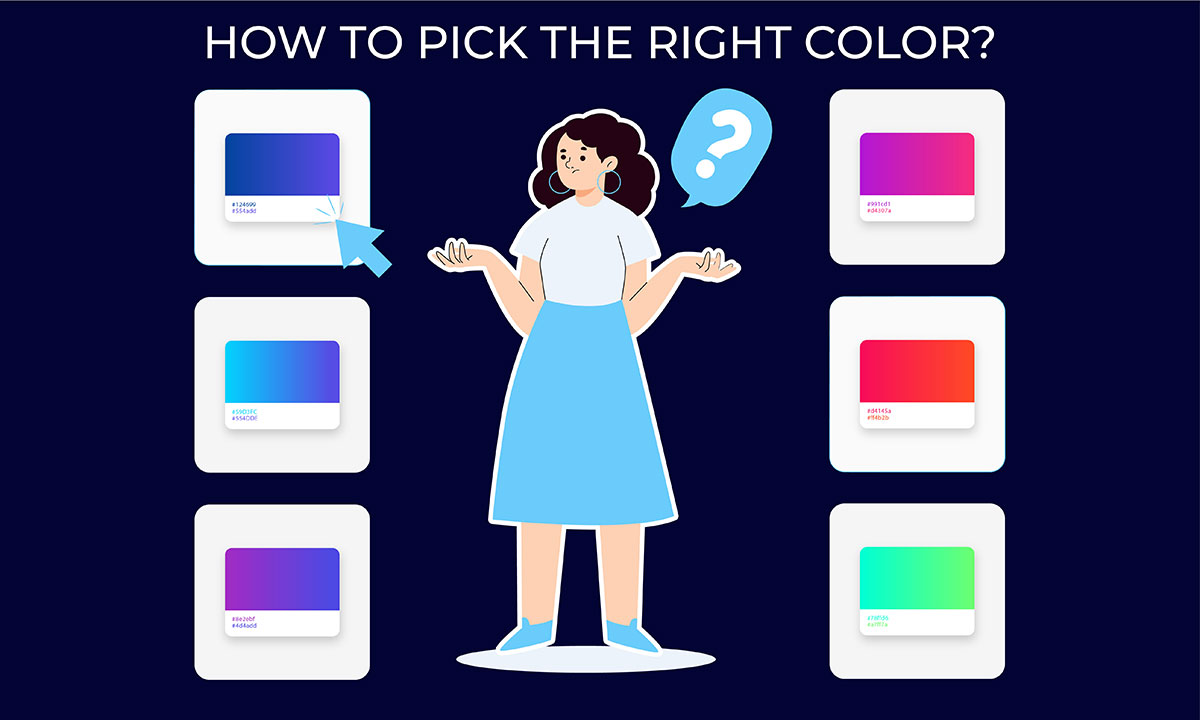
How to choose brand colors?
Choosing your brand's colors is a thoughtful and strategic process. It requires a deep understanding of your target audience, your brand's personality and values, and the emotions you want to evoke. Considering the intricacies, business owners seek the expertise of professional designers or branding experts before choosing their brand colors. They apply color psychology and explain how certain colors can evoke specific emotions and behaviors in consumers.
Therefore, it is recommended to consult with professionals to decide the perfect color for your brand. A professional branding design service can help you navigate through the process and ensure that your brand color communicates your message and values effectively. This guide will provide you with a step-by-step process on how to choose brand colors.
Step 1: Define Your Brand Personality
Before diving into color selection, it's crucial to clearly define your brand's personality, voice, and core values. Understanding your brand's unique personality and values is the foundation for choosing the right colors that align with your desired image. Ask yourself:
What are the key traits you want to convey—professionalism, youthfulness, luxury, sustainability, or something entirely else?
How do you want your target audience to perceive your brand?
What emotions do you want to evoke in your customers?
Consider the core traits you want to convey – professionalism, youthful energy, luxury, or eco-friendliness. Think about how you want your target audience to perceive your brand and the emotions you want to evoke.
Step 2: Consider Industry Standards
Looking at industry standards and competitor branding can provide you with valuable insights into color palettes that have already proven to be successful. Research typical color trends and norms within your specific industry or sector. Certain colors may carry established expectations and associations for your customer base.
While conforming fully isn't mandatory, you must balance industry relevance with differentiation. This will help you make informed decisions and ensure that your brand colors are both appropriate for your industry and distinct from those of your competitors.
Step 3: Research Competitors
Conduct a thorough audit of the color palettes used by your key competitors. Look for opportunities to visually distinguish your brand through strategic color choices. Don't simply mimic the competition, but study how they leverage color to inform your approach. Identifying an available, unique color space could be your differentiating advantage.
Step 4: Decide on Primary, Secondary, and Neutral Colors
There are tons of colors, shades, and hues to choose from when selecting brand colors. To avoid overwhelm and make things easier, it's helpful to categorize your colors into primary, secondary, and neutral options.
Primary Color: This is the signature color that forms the foundation of your brand identity. It should be bold, memorable, and reflective of your brand's personality. Think of Coca-Cola's iconic red or IBM's deep blue.
Secondary Colors: These colors complement your primary color and add depth and variety to your branding. Use 1-2 secondary colors that harmonize well with your primary choice.
Neutral Colors: Black, white, gray, or brown help balance brighter brand colors. They provide clean backgrounds and allow pops of color to truly shine. Neutrals can also convey simplicity and sophistication when used strategically.
When deciding on brand colors consider the following -
Overall Color Harmony & Balance
Versatility across print/digital mediums
Accessibility for color blindness or visual impairments
Cultural associations of specific colors in key markets
Step 5: Experiment with Palettes
When you have done all the necessary research and have a clear understanding of your brand's personality, it's time to experiment with different color palettes. Play around with various combinations of colors that align with your brand's desired personality traits. Create versatile palettes with 3-5 complementary colors that can work across various contexts. Don't be afraid to be bold, but also create options aligned with your brand personality.
Ultimately, the goal is to find a color palette that not only represents your brand effectively but also resonates with your target audience. Get feedback from colleagues and potential customers to gauge their perceptions.
How to Create a Cohesive Brand Experience?
Now that you've identified your perfect brand colors, it's time to ensure they work together seamlessly to create a unified and recognizable brand identity. Consistency is key here! Imagine a brand whose logo is bold red and blue, but its website features a bland grey and green color scheme. Confusing, right? Here's how to maintain color consistency across all your branding touchpoints:
Logo as the Foundation
Your logo is often the first visual element associated with your brand. Use your chosen colors prominently within the logo design. Consider your logo first when choosing the brand color. This will help to concept a better logo design idea and identify the most suitable logo color for you.
Website as Your Digital Storefront
Extend your color palette to your website's user interface. Apply primary, secondary, and tertiary colors to background elements, buttons, text, and graphics to create a visually cohesive experience.
Marketing Materials with Matching Hues
Whether it's brochures, social media posts, or email marketing campaigns, ensure your brand colors are consistently used across all marketing materials. This reinforces brand recognition and builds trust with your audience.
Packaging design
For physical products, your packaging is a prime opportunity to showcase your brand's colors. The way you design your product packaging should reflect your brand identity and utilize your chosen color palette effectively. Think about companies like Tiffany & Co., whose iconic turquoise boxes instantly signal their brand identity.
Maintaining Consistency with Brand Guidelines
Develop a brand style guide that outlines your core colors, their hex codes (for digital use), and specific usage guidelines for different applications (e.g., minimum contrast ratios for accessibility). This ensures everyone involved in creating brand materials uses the colors correctly, maintaining consistency across the board.
By implementing these strategies, you'll create a cohesive brand experience that strengthens your brand identity and leaves a lasting impression on your target audience. Remember, color is a powerful branding tool. Use it strategically to make your brand stand out and resonate with your customers!
Endnote
The colors you select for your brand are more than just a splashy visual - they're the very essence of your brand's personality made manifest. From creating first impressions to building lasting emotional connections, nailing your unique color palette is crucial to designing a memorable brand identity.
Throughout this comprehensive guide, we've equipped you with a comprehensive walkthrough for choosing colors that authentically capture your brand's core traits. By following these steps and learning from successful brands, you can create a powerful and memorable brand identity. Remember, the right colors can be a game-changer, helping you elevate your brand and achieve long-term success!
Graphic Design Eye LLC is a full-service creative agency built for brands that demand more than design — they demand vision. From strategic branding to complete visual identity, we partner with startups, agencies, and growing businesses as a dedicated creative force. With flexible subscription and project-based models. Let's start with us today!