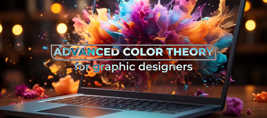
All graphic designers need to understand color psychology and advanced color theory to choose the apt color that resonates with the brand identity and values. The choice is more than choosing a color palate and using it. It is all about exploring color relationships and understanding how they can evoke the right emotions in prospects and thereby convert them into potential customers.
It is no surprise that many arts and design schools teach advanced color theory as a subject. For instance, Australia’s International School of Color and design (ISCD) and the International Association of Color Consultants/designers teach their students color psychology, and color theory along with its effective use in branding and image development for a business. So, let's explore advanced color theory that helps every graphic designer professionally present color design solutions.
Basics of Color Theory
Color theory is nothing but understanding of how all the colors interact with each other and can be created from the primary colors such as red, blue, and yellow. To strategize appealing color schemes, a designer should know the various components of color theory. Before getting to know them, know that the color theory was conceptualized by Sir Isaac Newton in the 18th century when he came up with the world’s first circular diagram of color.
Well, the circular diagram of color is now commonly known as the color wheel, which many of us would have studied in school. Even if you are unaware of it, let us have a recap. 3 major color types in a color wheel are primary colors which are Red, Yellow, and Blue, then there are secondary colors which include orange, green, and violet which are created by mixing and merging the primary colors. Then there are tertiary colors which can be created by mixing and merging primary and secondary colors, such as Azure and Rose.
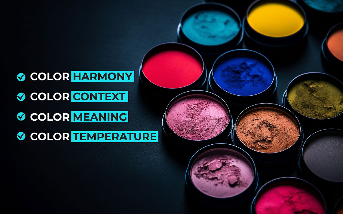
Exploring Color Theory Components
When a designer starts exploring colors, they get to learn that there are various angles from which it needs to be looked at. Some of these are:
Color Harmony
Whether a designer is a social media post design or even doing a minute task such as choosing a typography for a social media campaign, he or she must keep in mind the color harmony to engage the audience and give them something so pleasing to their eyes. Yes, it's a constant effort to play with colors to grab the eyeballs.
For instance, when a designer is choosing colors for a sunset, the probability is that he or she may choose deep orange, shades of purples, whites, and black. This is because people can relate more to these colors for sunset but then again one can always experiment against color harmony, to create hyper-realistic designs. It depends on the brand’s nature, targeted audience, and a lot of other business factors. Traditionally designers try to bring harmony or order to the colors they choose to bring about a balance in visual experience.
Color Context
This is all about understanding how colors can be used in a specific environment. More than graphic designers this comes in handy to interior designers. For Instance, bright bold colors like fiery red might make the room feel small, even if it is of a specific size. When it comes to marketing, red can make the campaign look urgent, passionate, and exciting. Haven’t you wondered why designs for a SALE campaign always come in RED or Red and black combinations? This is intentional.
Designer getting color context wrong paves the way to many negative after-effects. One is the aesthetic problem, for instance, using too many bright all at once may suit the interests of very few but it might be visually jarring to many. Another negative effect, an error in color context can cause is for those with color blindness. For instance, if a designer is using 2 simple colors red and green to help the viewers distinguish between 2 concepts, those with red-green color blindness will get confused immensely. Here, the designers should have used a color-blind-friendly palette.
Color Meaning
If you have ever traveled to China or Hong Kong, you would wonder why there is an obsession with the color Red. In Chinese culture, Red is an auspicious color that brings joy and good fortune. They also believe that wearing the color red or carrying something can attract wealth. They have a meaning for the color red. Similarly in a marketing context, too, colors are associated with certain emotions that will in turn help the marketer create specific impressions in their target audience.
A graphic designer should have a thorough knowledge of color meanings to play with the emotional chord of business’s customers. Have you noticed B2B businesses use standard palettes for their marketing assets? It will mandatorily have classic blue, gray, white, or black shades. This is because these colors are associated with professionalism and credibility.
Color Temperature
If there is a parameter to describe various light temperatures that appear visually, it's only the kelvin color temperature scale. The colors measured on a Kelvin scale typically range from 2700-5000 degrees. But what does color temperature have to do with designing and marketing? Well, having a deeper understanding of color temperatures can improve the aesthetics of a product or a space. For example, a marketer can choose a warm color with a temperature say 2700K for ads that call for urgency or alertness. However, the cool colors that have a temperature of 5000K can be used to promote alertness and productivity. Now you must be wondering why cooler colors have high Kelvin scale temperatures in comparison with warmer colors. Yes, that's how it's measured.
Understanding color temperature will help graphic designers in creating accurate, consistent shades of color appearances in all mediums. This matters because different devices such as a mobile, laptop, website, etc, display colors differently. Not just that color temperature can influence the mood of a design, which means a lot for analyzing the effectiveness of a design. Let us take a classic example, according to the reliable website ‘Color Meaning’ there are 134 shades of red. However, all the red do not have warm Kelvin scale temperatures. Interestingly there are cool bluish reds and warm yellowish reds. A designer can choose which red to be used to set the right mood of a design.
Color Mixing And Blending Techniques
Most graphic designers use tools like Photoshop for color mixing and blending. If you are in the graphic design sector you would already be aware of various color blending techniques. But if not read further, you will get to know in depth about it.
1. Gradient Creation
A smooth transition from one color to the another named gradient creation is often applied by most graphic designers to gain visual interest, add depth to design elements, indicate a transition, and for a lot many branding reasons. Platforms like Photoshop give gradient tools where one can make different types of transitions such as linear, radial, angle, diamond, etc.
2. Layer Blending
This involves the process of combining multiple layers in a design to achieve complex but dynamic visual effects, a technique widely used by graphic designers and photographers. This method enriches visual narratives or rather visual storytelling, enhances texture and depth by the use of the right color combinations, and helps in achieving precise color relationships, aligning with advanced color theory concepts.
Editing and designing tools like Adobe Photoshop provide a variety of blending modes such as multiply, overlay, and screen that manipulate the color, its shades, and luminance values of underlying layers to produce diverse striking results. These modes are crucial for graphic designers who aim to control color interactions meticulously and create visually cohesive designs.
3. Filters and Adjustments
Filters and adjustments are essential graphic design tools, used to edit images or layers within a digital composition. They allow designers to apply complex effects and transformations that adjust color balance, contrast, sharpness, and more. This capability is pivotal in applying advanced color theory, where precise color adjustments are necessary to evoke the right mood and visual impact. Software like Adobe Photoshop provides an extensive range of filters and adjustment options, including hue/saturation, brightness/contrast, and color balance, enabling designers to achieve the desired effect while maintaining color harmony.
4. Layer Masks
Layer masks in graphic design software like Adobe Photoshop are a fundamental tool for achieving non-destructive editing in design projects. They allow designers to hide or reveal parts of a layer without permanently altering the original image. This technique is invaluable when implementing advanced color theory, as it provides the flexibility to experiment with color layers and effects without compromising the integrity of the original elements. Layer masks support sophisticated visual techniques such as gradient masks or complex composites, which are essential for creating depth and dimension while meticulously managing color interactions in a design.
To sum up, mastering advanced color theory is essential for every graphic designer aiming to enhance their work's effectiveness and emotional impact. By delving into the psychological and cultural implications of colors, designers can create more compelling and communicative visuals. Understanding concepts like color harmony, color context, and the ways colors influence each other and viewer perception can transform a simple design into a memorable experience.
Endnote
In a nutshell, this guide taught you some advanced color theory for graphic design. It went beyond the basics and explained how color could influence emotion and be construed in different cultures. You learned how to use color combinations, not necessarily knowing how colors feel temperature-wise and how they make the viewer perceive your designs.
These ideas will help make your graphic design even better. You will be able to come up with designs that will appeal to the audiences you are targeting and thereby achieve the goals you have in mind for the designs. Remember, color is a designer's superpower. Use color correctly, and you'll be good to go to the next level of your graphic design projects!
Anyway, do you want to take your designs to the next level and truly connect with your audience? The color theory has to be your main mastery!
At Graphic Design Eye, we understand the power of color and its impact on emotions and perception. Let our professional graphic designer add color to your evoking and inspiring design. Contact us for a free consultation today!
Designing is an art to me and proper instruction can make you the expert one. Hi, I'm Michael the graphic design expert. Depending on my experience and research I've written out about how to become a graphic designer. Hope this will help you to know new things.