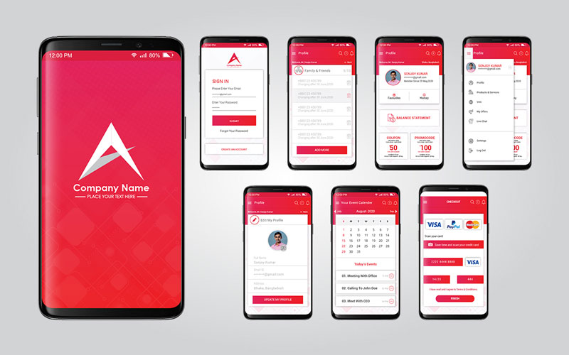
What is Responsive Web Design?
In our daily lives, we go through online, websites, applications, software, etc. for so many purposes. The internet has become a part of our daily life and websites are at the root of all online appearances. Whatever we want to do online, we need a website to create an online presence. whether you are creating a personal portfolio or you are about to build an eCommerce store, you should have a website to go on the right track. We all know that the rapid growth of the Internet, websites, and other online activities are not done overnight. The way we are getting everything easily with the smartphone in our hands is the consequence of the huge development of modern technology. The significance of modern technology cannot be overstated because we are moving towards it. Meanwhile, responsive design is a significant evolution of computer science. It helps make our online experience so dynamic and non-stop because we are realizing it now. If you're familiar with the term responsive web design, then you may already be interested to know what responsive web design is, what the uses of responsive design are, and also how it works. So, let’s jump straight into the in-depth discussion below to clear up about responsive web design.
How Does Responsive Design Work?

Web design and development is a headache for website owners. It sounds simple but it is never like that though. Web design and development encompasses everything including planning, analysis, design, development, testing, and maintenance to make a complete website. Responsive design is a distinguished part of website development. It deals with the graphical user interface design of websites and makes the interface responsive across all device platforms. In detail, people now use different types of devices such as mobile, tablets, web browsers, etc. for surfing the internet. These devices come with different screen specifications and widths such as 320, 480, 760, 960, 1200, and 1600 pixels are the most common. The screen width is an important factor for websites because it determines how the website will be displayed on the user’s device screen. Since there are different screen widths and resolutions for different devices, it makes sense that the website should have separate formations to support each screen. Can you imagine a website’s particular design structure, one for iPhone, one for tablet, one for web? It sounds ridiculous. However, responsive design saves us from such multiplex issues as we create a responsive design for our website that works well overall for the devices. Responsive websites are compatible with all screen resolutions. No matter the device type, responsive design ensures the smooth loading and adjustment of the website on the user’s device screen.
What Makes A Website Responsive?

The responsive design process took place when the website was under construction. Before responsive design, there was another graphical user interface design function called adaptive design. You can say responsive design is the updated and efficient version of adaptive design. There are huge differences between adaptive and responsive design. To understand how responsive design works, you need to come up with some important terms related to it. They are,
Viewports
"The viewport is the user's visible area of a web page. The viewport varies with the device and will be smaller on a mobile phone than on a computer screen." When you're reading this article on your device screen, everything that you can see goes to the viewport. But this article is so long and your screen can’t display the whole article at a time. That’s why there is the scrolling option that helps to fit the entire article on your device screen and lets you scroll up and down to move. Viewport refers to your current view, the part of the article you aren’t seeing right now is not considered as the viewport. So, your device screen determines the viewport size. Whether you are on a big monitor or smartphone, your browser is full screen, or not, the viewport automatically adjusts the content on your screen.
Fluid Grids
Fluid grids determine web page layout and provide corresponding visual results to display web pages on the user’s screen. Web Pages consist of several elements and you have to fix the position for each of the elements on the layout and viewport. Fluid grids is a grid-based layout system for web pages that uses a 24-column CSS (Cascading Style Sheets) grid system and generator to make your webpage adaptive and responsive in all screen sizes. Unlike fixed pixel widths layout where we’ve to manually resize every element’s size, a fluid grid layout works through a specific number of columns where elements are assigned and adjusted proportionally with the screen size.
Media Queries
Media queries are a CSS3 feature that uses the @media rule to adapt specific conditions to render certain results on the user’s screen. So, media queries only work if the condition you apply matches the device screen and browser. Media queries are used for,
-
Width and height of the viewport
-
Width and height of the device
-
Orientation (is the tablet/phone in landscape or portrait mode?)
-
Resolution
Media queries consist of media types that must be defined in the head of an HTML tag. There are a variety of media types used such as ‘all’, ‘print’, ‘screen’, and ‘speech’. These attributes are used to describe the general category of a device.
Fluid Visuals
We’ve to use images to make website content easy to digest and to hold readers’ and visitors’ attention. Image requires optimization and resizing images to be perfect in size so that they can perform well in the final destination. Visual elements like images aren’t naturally fluid-like text. It needs to load to be apparent to users and also needs to adjust on the user’s device screen. If images are in large files and of low quality, it will cause to bad loading issue that hinders the responsiveness of the website. Therefore, modern web design tactics include CSS commands and technical adjustments to make images responsive to ensure faster loading on the user’s screen.
Responsive Navigation
Most websites have navigation menus to allow visitors to get what they want from the homepage quickly. The navigation menu holds all the main service pages that you want to show and interact with users. If you have a navigation menu on your website, you’ve to give separate attention to making it responsive. To make the navigation responsive, you can convert it into a drop-down menu and also can create a hidden menu that becomes visible only through a swipe or click. Also, there are popular techniques followed in responsive navigation design. They are,
They are different ways to design your website navigation based on how the users will find it comfortable to them.
Fluid Typography
Typography is indispensable for websites. We’ve to use a large volume of typography on every website page. Typography should also come in a responsive form so that it can match any screen width and optimize automatically. “In a fluid layout, browser width and typographic measure are linked: the wider the viewport, the more characters per line.” Fluid typography uses fixed values such as the ‘em’ unit to define font sizes in media queries. It helps typography to change its size according to the current viewport of the device. As a result, no matter how bigger the content is and what the device is, fluid typography will make your web content flow well overall with screen widths. So, viewports, fluid grids, fluid visuals, and media queries are the basic elements in responsive web design. They are responsible to make a responsive website that works well over all types of device screens.
Why is Responsive Design So Important?

Responsive design has become a common concern for all soft programs including websites and applications. It works in the background to create the most comfortable graphical user interface and user experience. Responsive design has become more important due to the rapid growth of mobile phone users. Online activists and website owners are now highly intent to build mobile responsive websites because more than half of the internet users are mobile phone users. If the website lacks a responsive design, it won’t be able to interact with mobile phone users. As a result, the owner has no success with it. Besides, there are so many reasons that prove the importance of website responsiveness. We’re showing here some of the reasons to perceive why responsive web design matters a lot.
Make Website Accessible Across All Devices
Once there were websites that worked only on computer devices. At that time, mobile phones weren't as available as they are now. Today, more than 50% of online traffic comes from mobile devices. People are now more likely to use handheld devices such as smartphones, tablets, iPad, MacBooks, and so on. Here comes the importance of responsive web design. At present, you can’t build websites only for computer devices. You’ve to think about a large number of users who come from handheld devices and make your website in that way so that it can easily be accessible to mobile browsers also. Responsive web design ensures that your website can access not only all the mobile devices but all the types of devices available right now. The following practices of using viewport, fluid grid, media query, and fluid image make websites a dynamic layout that automatically fits all the device screens. It is made possible by modern web design and development assets such as CSS, JavaScript, and others.
Enhance Website Performance
Your online success depends on the website’s performance, and how visitors and users interact with it. Website performance relies on so many things but mainly the design and backend development. The responsive design comes in the web design phase that creates a responsive graphical user interface. The fluid grid layout system of responsive web design allocates a particular place for every web page element and the viewport helps to activate them according to the device screen resolution.
Besides, responsive design influences website loading, navigation, and visual consistency. It makes the website mobile responsive, displays website contents faster, and provides a great user experience for the users. Responsive websites show good results in SEO. As search engine optimization is highly important for websites, you can keep the practice ongoing and develop a responsive website.
Comfortable User Experience
User experience is all for online approaches. Bad loading issues for page-to-page navigation and images of the website cause users to turn over. Whatever type of website strategy you’re implementing, if your website isn’t perfect in all aspects, you can’t engage visitors on it. User engagement is the topmost priority for website owners. The higher the engagement will be, the more increasing chances for conversions, prospects, and revenue. Since all depend on your website structure, the design, and the user experience it provides, you must intend to make your website responsive for the users. It is logically proven that a responsive website generates more and more than a non-responsive website. The responsive design encourages visitors to keep connected and also builds a good relationship between users and the author.
How to Build A Responsive Website?
So, it is clear that you should have a responsive website if you want to do better online. Whether you’re an enthusiast blogger or online eCommerce retailer, responsive design is highly important for you. Therefore, you should concentrate on building a responsive website at the beginning of your website journey. If you’re about to create a WordPress website, you should choose a responsive theme and then customize it to fit your needs. However, if you’ve already chosen a static theme, no problem, you can make it responsive by customizing the backend code, setting fluid elements' widths and heights, resizing images, optimizing fonts, etc. If you have the skill and knowledge, you can get it handy and make your WordPress website responsive to yourself. But if you don’t have that, you have to enlist professionals to assist in this regard.
Endnote
Finally, people think that responsive design is all about mobile-friendliness. However, that’s a chunk of a huge idea. You’ve to consider a lot of things when it comes to the question of building a responsive website for your purpose. You can find responsive web design agencies or professional web developers to build or make your existing website responsive in all aspects.


 Services | All Kinds of Content Creation Services Company


Your email address will not be published. Required fields are marked*