Yes, the game has changed. People don’t just buy products anymore. They buy stories, feelings, and brands that speak their language. And your logo? It’s the first thing they see. That’s why creative logo design ideas open doors to stand out, no doubt about that.
From bold simplicity to old-school vibes, today’s top logo looks are smarter than ever. They help brands build real connections that stick in people’s minds. And yes, they even end up in shopping carts.
So, no matter you’re sketching your very first design or giving your logo a much-needed facelift, these top 10 best logo design trends will take your brand from “meh” to memorable. Let's get to it!
Are you prepared to refresh your brand? Here are the 10 current logo design trends ruling in 2026.
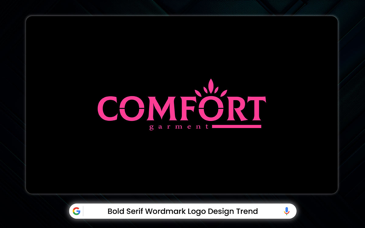
The typography game just got a whole lot louder, or should we say bolder! Gone are the days of quiet, reserved fonts. The bold serif wordmark has taken center stage in 2026. They are stepping in with thick strokes, sharp details, and a whole lot of attitude. They’re not here to blend in. They’re here to be seen.
But don’t picture the old-fashioned serifs you saw on your grandpa’s business cards. These are their edgier descendants. They’re beefed up, stylized for the digital age, and designed to stop your scroll mid-swipe.
Imagine a font with the grace of a ballroom dancer but the punch of a prizefighter. That’s the bold serif in a nutshell. It holds onto the elegance of traditional type while bringing the kind of visual weight that pops on screens and shelves alike. The Peroni Nastro Azzurro brand is already leading the charge, designing custom slab serifs that strike the perfect balance between classic charm and modern muscle.
And if you’re running a brand, this trend might just be your best friend. On fabric or packaging, those thick lines and defined curves show up beautifully, creating a premium look without trying hard.
Bold serif wordmark logo design conveys authority, tradition, and confidence. Their strong, structured lettering ensures readability while adding a timeless, sophisticated edge to branding.
Popular styles include slab serif (chunky, modern), high-contrast (elegant, dramatic), and vintage-inspired (classic, nostalgic). Heavy weight and sharp details make them striking yet refined.
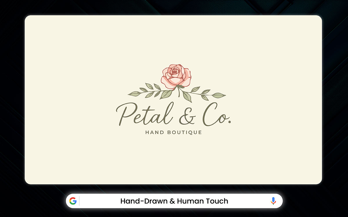
In a time when everything’s polished by pixels and perfected by AI, something raw and real is really in demand, such as hand-drawn logos. And for entrepreneurs, that’s a golden opportunity.
These sketches aren’t designed by software. Real hands make them. Uneven lines, messy little flourishes, soft textures, each mark telling its own story. Imperfection is the new charm. The kind of charm that says, “Hey, a human made this, and they cared.”
Smart business owners are leaning in. They’re swapping sterile logos for hand-lettered brand names, doodled mascots, and custom logo illustration. These logos connect with people. They speak to something we’re all craving these days: authenticity. Heart. It sparks a sense that there’s a real person behind the product.
Hand-drawn logos bring warmth and authenticity. Their natural imperfections add a human touch. It makes brands feel more approachable, creative, and memorable.
Popular styles include sketchy (loose, artistic lines), brushstroke (bold, textured), and doodle (playful, whimsical). Custom lettering and watercolor effects enhance their personal, artisanal appeal.
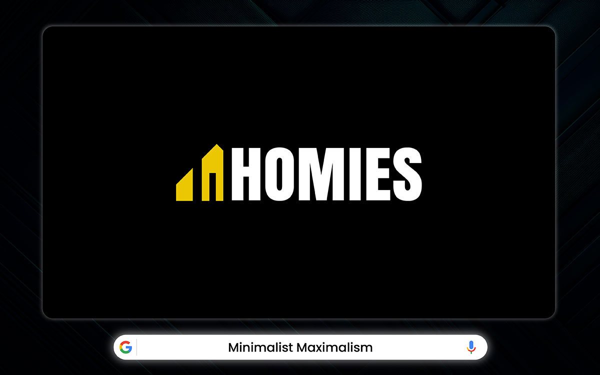
Minimalist maximalism. Sounds like a design oxymoron, right? But it’s actually one of the smartest and sleekest trends in modern branding. It’s where clean simplicity meets bold expression, and somehow, they get along beautifully.
Picture of a plain background with just one or two bold design elements. Maybe it’s a splash of neon. Maybe it’s a big font that practically shouts, but only in the classiest way. The magic is in the mix. Less clutter, more impact.
For any business, this style is a dream. It works just as well on a small chest print as it does on a bold, full-back graphic. Your logo stays crisp and readable, even when it's tiny on a business card or tucked into a profile picture. It has the power to grab attention in a feed full of scrolls.
Minimalist logo designs make brands easy to remember with simple and clear shapes. As they remove unnecessary details, they stay versatile and scalable. It makes them work well in any format and gives them a timeless look.
Popular styles include geometric designs with sharp lines, negative space with hidden meanings, and monoline with single-stroke elegance. Flat design and simple color palettes make them modern and bold.
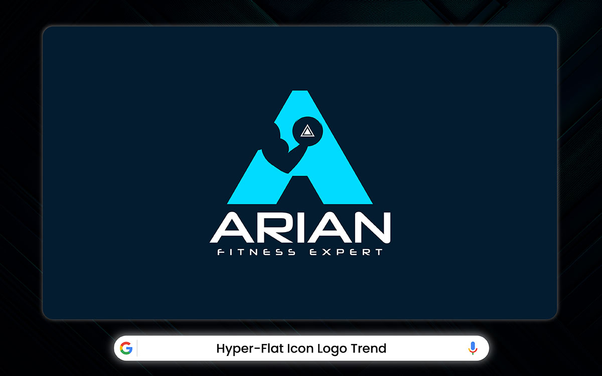
Hyper-flat icon logos are minimalism in its most daring form. Every extra detail is gone. What’s left is a logo stripped down to its purest shape; clean, sharp, and perfectly flat.
It looks hyper-simple. Thin lines. Airy type. Bold geometry. These tiny symbols carry a brand’s whole visual identity. Just one curve, one shape, and your audience knows who you are.
For entrepreneurs, this trend is a gift. Whether you're screen printing or going full direct-to-garment, these icons hold up beautifully. Big or small, they stay crisp. They don’t lose detail. They don’t get muddy. They just work.
Hyper-flat design also plays smart with negative space. It lets your logo breathe. From a tiny Instagram avatar to a giant billboard, your logo stays true.
And let’s not forget who this style speaks to, Gen Z. They love clean looks, bold visuals, and anything that photographs well. Hyper-flat icons check every box. They’re modern. They’re fresh. In a world full of noise, hyper-flat is the whisper that gets heard.
Hyper-flat logos focus on simple shapes, bright colors, and clean lines for easy recognition. Their 2D design makes them scalable, perfect for digital use, and gives them a bold, modern look.
Trending styles include monoline (single-weight strokes), isometric (dimensional flatness), and gradient-mesh (smooth color blends). Stark contrasts and abstract shapes amplify their tech-savvy, minimalist appeal.
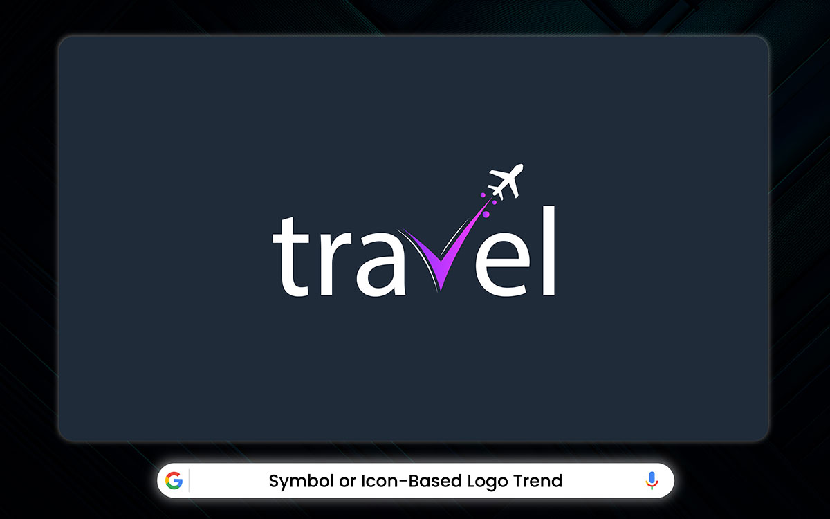
Symbol or icon-based logos are everywhere this year. They’re clean, bold, and powerful. These little visual gems speak louder than words.
Instead of relying on letters or long brand names, symbol logos do all the talking with images. One glance, and your customer remembers you. It's like a mental shortcut. No matter if it's a sleek shape, a clever symbol, or an abstract mark, these logos stick. They work across languages, cultures, and most importantly, across platforms, from your Twitter to TikTok.
Symbol-based logos pack a punch in the smallest space. As everyone is plunged into screens, that quick hit of recognition matters more than ever. These simple icons have the ability to stick in people’s minds, spark curiosity, and make your brand unforgettable, with just a glance.
Icon-based logos help people recognize your brand quickly with simple symbols. They work well in both digital and print. These logos show your brand's values clearly and have a modern look.
Current logo design trends include geometric shapes, line art, and mascot designs. Geometric designs focus on abstract precision, while line art brings minimal elegance. Mascot-style designs are all about creating charming characters. Using negative space and flexible color schemes makes designs more memorable.
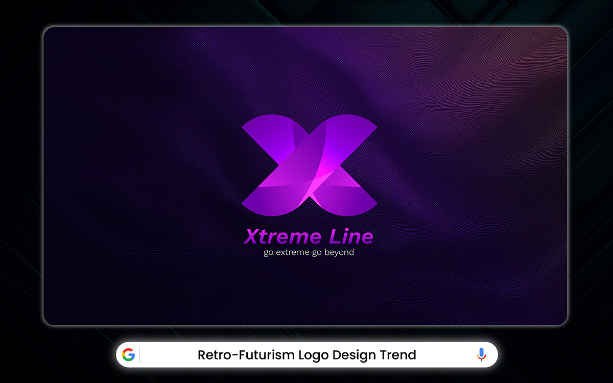
Think of shiny chrome letters floating through hazy neon skies, holograms melting into glowing gridlines. And that Y2K magic is getting a fresh update for the digital world. Welcome to the world of retro-futurism, 2026’s boldest logo trend turning brands into time machines.
Retro-futurism blends the charm of the ‘80s and ‘90s with a sleek, future-forward edge. They feel nostalgic and new. They’re like sharp shapes wrapped in liquid metal, vintage logo style of sci-fi fonts with a cyberpunk twist, and dreamy gradients that glow like digital northern lights.
For entrepreneurs, this trend is gold. It speaks to Gen Z’s love for all things retro, while also hitting the sweet spot for millennials chasing that perfect mix of cozy and cool.
Retro-futurism is a mix of the past and the future. It creates logos that feel familiar and new. Bold colors, smooth curves, and vintage tech details bring a sense of hope. It blends the best of yesterday with a hint of tomorrow.
Some popular styles include 80s synthwave, with its neon grids; atomic-era, featuring space-age shapes; and cyberpunk, known for glitch effects. Together, these elements create a futuristic and timeless vibe, full of optimism.
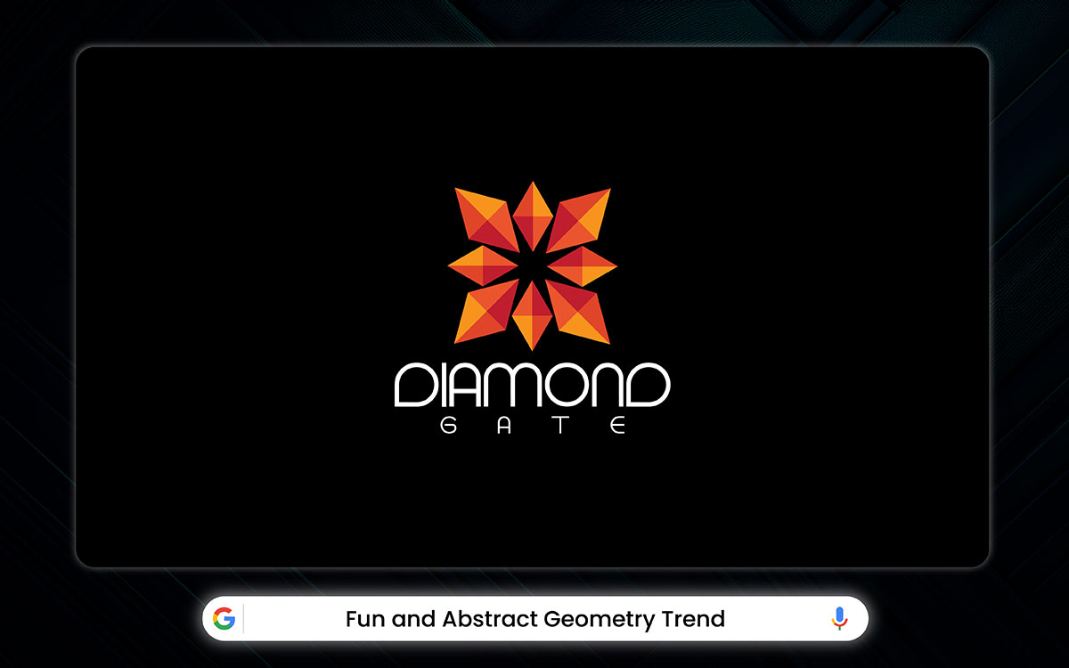
Geometry isn’t sitting up straight anymore, and we love it for that. The days of stiff, flawless shapes are over. Today’s geometric design is wild, free, and full of surprises.
Picture a circle, but with a cheeky little gap. A triangle, not so sharp, softening its edges like it just had a good yoga session. Even hexagons are getting funky, dancing to their offbeat rhythm.
What really makes things pop is the combination. Clean, straight lines brushing up against smooth, dreamy curves. It’s that perfect clash, bold but easy on the eyes. Throw in some unexpected color psychology in logos, and you’ll get something that nobody forgets.
For any brand, this trend is a jackpot. These abstract logo design trends shape to your will, look good at any size, and carry a whole lot of personality.
Abstract geometry uses shapes, symmetry, and negative space to create eye-catching logos. It turns complexity into simplicity. The precise math behind it brings out a sense of innovation, balance, and broad appeal.
Trending logo design styles right now are polygonal, fluid, and overlapping. Polygonal features have sharp angles and depth. Fluid has smooth, organic curves. Overlapping uses transparent layers. Monochromatic colors and optical illusions give these styles a conceptual feel.
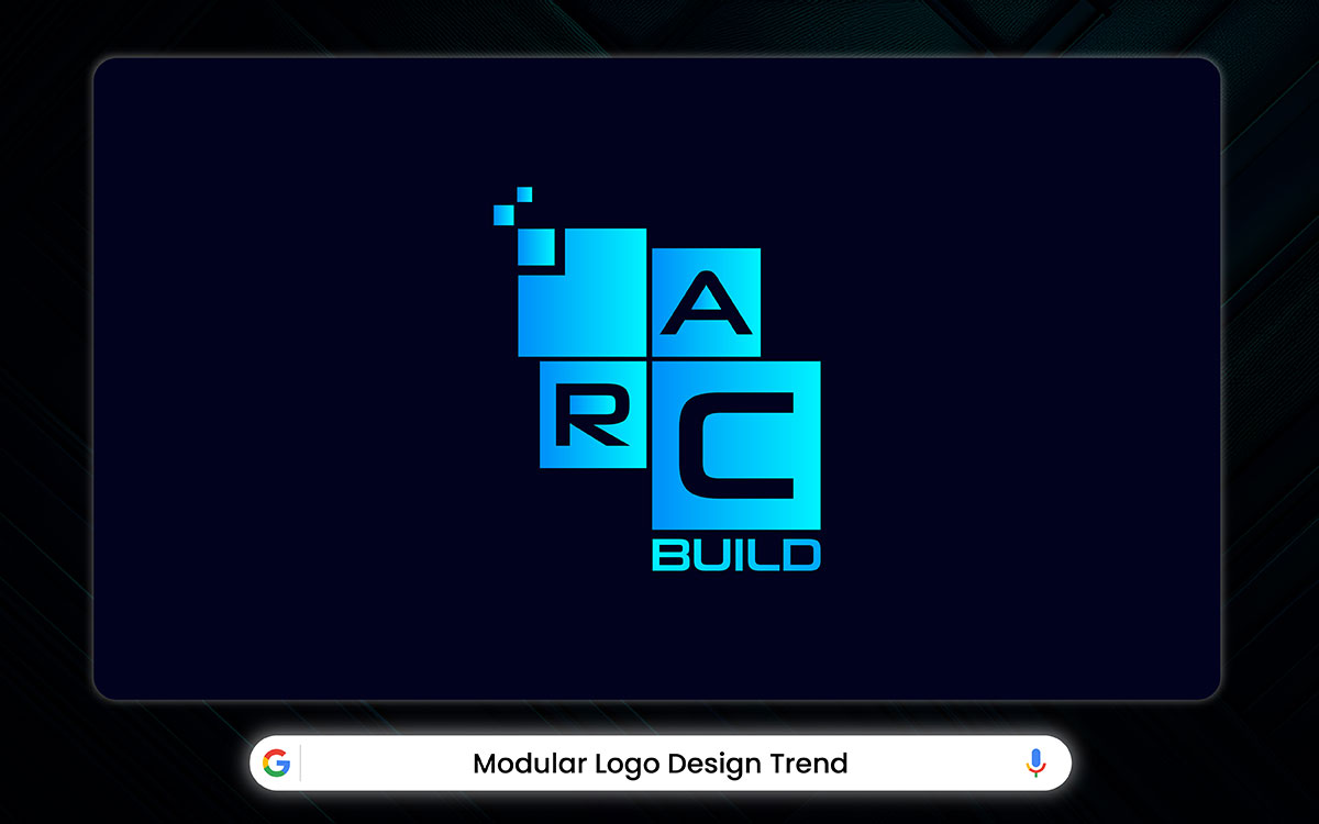
The logo design world is going through a shift. Logos aren’t what they used to be. Brands are now embracing modular logo systems. And that’s a good thing.
Back in the day, logos were one-size-fits-all. Same shape. Same look. Everywhere. Boring. But brands today live in way too many places for that. Instagram, shipping boxes, care tags, hoodies, pop-up booths, you name it. A locked-in logo just can’t keep up.
That’s where modular systems come in. Imagine your logo like a set of building blocks. You’ve got your main logo, your colors, your typeface, maybe a few killer icons. Together, they tell your brand’s story. And when you need to change things up, a smaller version for a label, a bold mark for a chest print, you can. And it still represents you.
That’s the beauty of it. You stay consistent, without being boring. You evolve, without losing recognition.
Modular logos offer flexibility by breaking the design into parts that can be rearranged. It ensures brand consistency across various uses, while giving the logo a modern, stylish look.
Current logo design trends focus on building-block systems. These are geometric units that fit together like puzzles. There’s also the use of overlay designs. Transparent layers create depth. Dynamic typography is another trend. It uses variable fonts paired with modular elements.
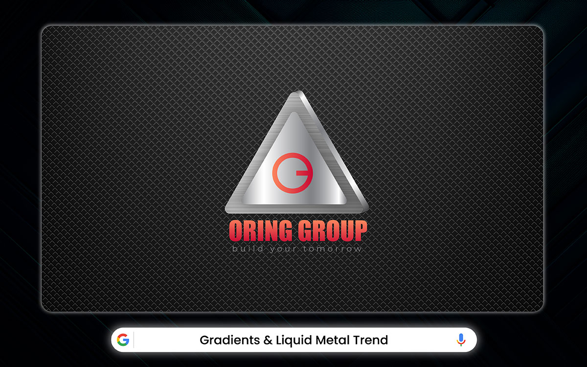
In 2026, liquid metal is flipping the script on logo branding. What used to be plain letters now shine like chrome dreams. Imagine logos that shimmer with fluid, mercury-like gradients, sliding and swirling across each letter in ways you can’t quite predict. It’s like watching metal melt right before your eyes.
These designs play with light and shadow to create a sense of depth that feels almost touchable. You’ll swear you could reach out and run your fingers over the slick, shiny surface. Behind the scenes, clever gradient tricks mimic molten metal, giving every logo a tactile vibe.
What’s fun is how this trend mixes the throwback charm of Y2K style with cutting-edge digital art. This combination creates logos that look ahead of their time and are comfortingly familiar. Those uneven lines and smooth transitions add a subtle movement, grabbing your eye the moment you glance their way.
Liquid metal logos are eye-catching with their shiny, flowing surfaces that look like molten metal. It gives off a sense of luxury, innovation, and energy. The reflective shine keep the logos stick in people's minds.
Some popular styles are mercury-inspired designs, with organic drips and swirls. There’s also polished chrome, known for its sleek mirrored finishes. Molten gloss brings a voluminous 3D look. Metallic gradients and light-reflective details add depth. Monochromatic color schemes make everything more versatile.
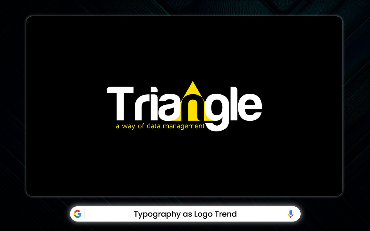
Typography has officially stepped out of the shadows and grabbed center stage in 2026. Instead of relying on icons or symbols, brands are turning their wordmarks into eye-catching works of art.
Forget your basic fonts. We’re talking about custom lettering that turns your brand name into a bold statement. Big-name brands are ditching the boring sans serifs and embracing personality-packed typefaces.
According to Looka, artistic typography is the fastest-growing trend in logo design. Ayoh Foods and Poca Cosmetics brands are leading the pack, boasting vibrant lettering that bursts with character.
For anyone in the game, this trend is a goldmine. Your brand name becomes wearable art that looks fresh whether it’s on the chest, the sleeves, or even the tags. Think of a flowing script for a boho vibe, bold geometric fonts for streetwear edge, or charming hand-lettering for artisanal collections. The right custom lettering can tell your story without saying a single word.
Typography logo designs capture a brand’s essence. The letters themselves become art. Custom typefaces make each logo unique. The way the letters are styled sets the tone. It makes the logo stand out and work well in any size or on any platform.
Logo design trends today include kinetic (animated), chiseled (3D depth), and fluid (overlapping transparency) designs. Each one balances creativity with legibility. They adapt well to both digital and print formats.
Choosing the right logo design trend is like picking the right outfit. It should fit your style, stand the test of time, and feel like you. Here’s how to pick a logo trend that works for your business:
Before jumping on the trend train, take a moment to understand your brand. What’s its personality? What values does it stand for? Who’s your audience? If you’re a fun, quirky brand, go bold and colorful. If you’re more corporate, go for something sleek and simple.
Some trends are here today, gone tomorrow. Choose wisely! Go for trends that have staying power, like clean lines or classic typography. You want your logo to still look fresh in five years.
What’s trending in your industry? Tech brands tend to favor futuristic logos, while eco-friendly brands often go for earthy, hand-drawn styles. Your logo should feel right at home in your market.
A logo needs to work everywhere, from a website to a billboard to a coffee mug. Make sure the trend you choose is versatile and scalable. A good logo shines in all formats.
Take a peek at what others in your field are doing. Find ways to stand out with a twist on popular trends, rather than copying what’s already been done.
A pro designer can help bring it all together. They’ll mix modern trends with timeless design, so your logo is both fresh and lasting.
And here we are, right at the finish line of our logo design trends journey.
Look closely. The design world shifts with bold colors, simple lines, and playful fonts. Each trend tries to catch your eye, but the best logos don’t follow blindly. They mix fresh ideas with real meaning and stand out because they feel honest.
You might wonder how to find that balance and that spark that makes your brand unforgettable. You’re not alone. It takes vision and care from someone who listens and turns your story into a mark that speaks louder than words.
That’s where we come in. At Graphic Design Eye, we don’t just make logos. We tell stories that grow with your brand and stay in people’s minds. And you may need just the creative logo design service we provide.
So, if you want to try something new, it’s time.
Contact us and let’s bring your brand to life.
Thanks for being here. Here’s to your brand’s bright future. 😊