When you shop online, what do you notice first? It's all about the images, right?
As online shopping grows, first impressions have become more important. Because of that, photo backgrounds serve more than just a decorative purpose! They are essential to catching your viewers' attention.

In fact, did you know that 67% of consumers say that product image quality is a big deal in their buying decisions? That's huge!
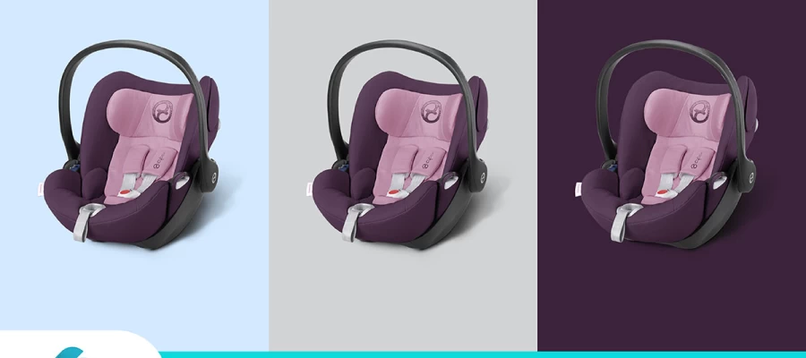
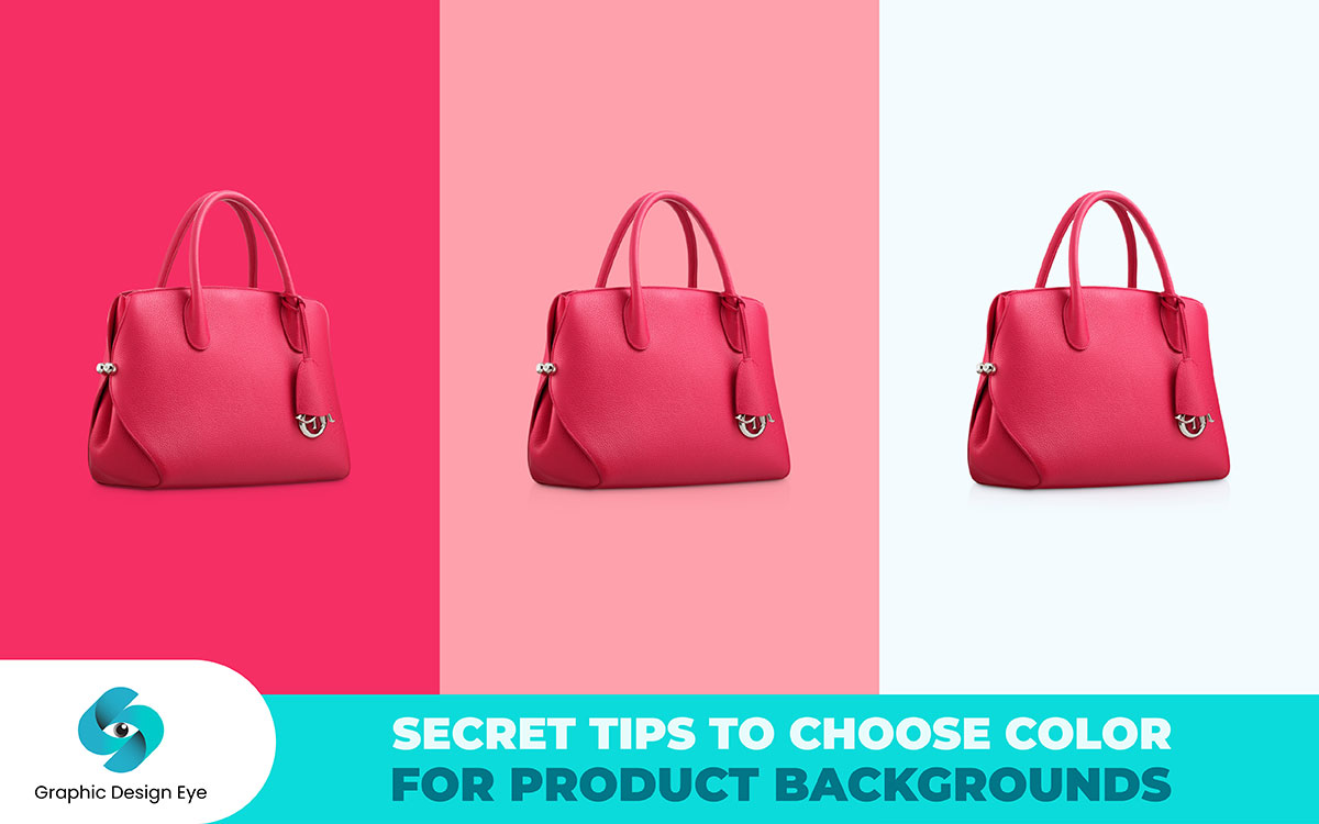
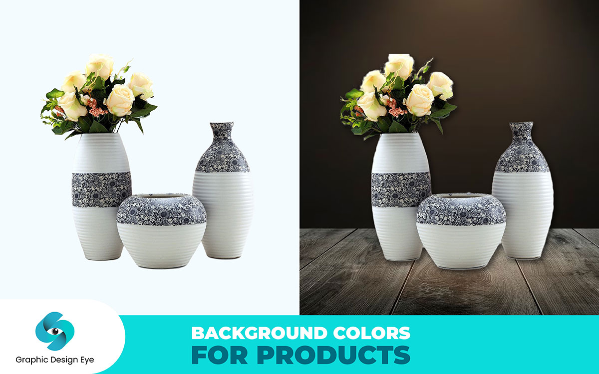
However, you can imagine an online store where every product photo is noticeable. The background color and texture are carefully selected to improve the product and fit the brand. This is the power of having a strong background. It transforms a simple shot into a powerful marketing technique. It also helps your brand connect with customers and increase sales.
Therefore, you can follow our suggestions below on, how to choose a color for product image background. Regardless of where they appear, your audience will find them engaging. We look forward to having you with us!
Content that supports understanding of different colors and their uses of background overrides this hope.
But then again, after understanding all there is to know about the right, suitable product photo background, how then do you get to choose what color to be used?
This isn’t just picking out an appealing paper and color for the product. It is more about selecting the best background that compliments the product as well as what the business entails. Now let’s discuss how it is possible to get the ideal background for your products. here are
For example, when coming up with a background color for product images, first consider the features of the particular product in question. The background is used to enhance the product rather than distract from it.
Let’s push this further. Imagine that you are taking photographs of hand made decorative wooden spoons and forks. In this natural shades of wood there’s warmth and earthiness hence the choice of stains is important.
In such a scenario something with natural colors like a light color wood table or brown fabric will do the work. This decision further supports the simple elements and characteristics of the utensils.
On the contrary, you were shooting an image of a product such as a mobile phone with a very smooth design.
A light gray background or transition to black would be used to complement the contemporary features of the product being showcased. This helps in giving the product the simple yet sophisticated feel that the product carries in its design.
In both of these depictions, the background is given a special attention so as to underline how special and distinguishable the product is resoundingly.
Actually It is obligatory to keep in mind the context of the product photographs when selecting the appropriate background colors. Here is a quick table which explains the probable backgrounds of different platforms:
| Platform | Recommended Background | Purpose and Examples |
|---|---|---|
| Amazon | Pure white background image. | Required for consistency and clarity. Maintains a professional appearance. |
| Ecommerce Store | Clean backgrounds like white or light gray. | Helps products stand out and makes comparison easy. Examples: Agood Company’s off-white backgrounds, and Kidly’s cohesive neutrals. |
| Social Media | Creative backgrounds reflecting a brand personality. | Use neutrals or bold colors to align with your brand’s aesthetic. Example: Vielö’s Instagram with a mix of tactile materials. |
| Etsy & eBay | White background recommended, but vibrant colors or lifestyle settings are also effective. | Adds visual interest and enhances product appeal. Example: Various Etsy sellers using different backgrounds. |
| Print Materials | Clean white backgrounds or contextual lifestyle shots. | Showcases products clearly in catalogs or brochures. Example: B&Q’s use of both clean and lifestyle backgrounds. |
| Advertisements | Vibrant or themed backgrounds. | Grabs attention and reinforces brand message. Ensure the background complements the product. |
| Product Packaging | Background colors matching or complementing packaging design. | Creates a cohesive look and strengthens brand identity. |
By selecting the right background for each platform, you can enhance your product images' effectiveness and maintain a strong, consistent brand presence.
The color that the background of a product photo has also matters in the mood and tone it expresses. This is how they are used for background inclusion.
Using pale greens, blues, and grays can equally generate a calm ambient. These colors are well suited for items which are meant for relaxing or promoting well being.
Example: A perspective skincare line may choose a soft blue pigmentation to this brand in an airy and clean manner. Such a mild shade also helps to emphasize the product’s pacifying attributes and gives peace.
Yellows, reds, and oranges are striking colors and can be utilized to evict awake photographs. These colors are good for fun oriented or any appealing products.
Example: For instance, a fitness company can use a saturated yellow background, interpreting it as vigor and energy. It draws the attention of the product and makes one active to it.
Shades like navy, burgundy, and charcoal represents class. These colors can be used for the sale of premium and luxury products.
Example: A designer of exclusive jewelry can match the color background with deep navy in the lesser prominent walls, for luxury effect.
Pastel colors or bright brighter hues can also make your photos playful. These colors are good for children’s products or fun brands.
Example: Brands that manufacture toys for children will translate their imaginativeness by using soft rose or brilliant turquoise in order to emotionally appeal their audience.
Use of Clean Crisp Colors in Design: White, light grey or beige could add some elevation and advancement. These colors are appropriate to products to avoid the professional conflict.
Example: A pastel grey screen should be used when designing a website for a company that specializes in unique modern devices.
The natural and manmade lights enable the photographer to be creative with the backdrop; hence the need to comprehend these two.
Example
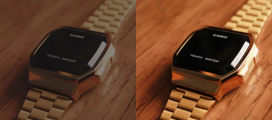
So, let’s say we want to photograph a sophisticated women’s wristwatch. You can use bright, focused lighting and a dark background to enhance the beauty and details of a watch. Because of its color, even a black background looks flat or uneven if it is not properly lit.
Hiding the watch under black without changing the background in black will rather help in improving the overall image of the watch. So in product photography here is light on what can be done:
Natural Light: Changes the color of background according to times and weather. For example, white phenomenon could appear warm at noon and cold in the morning.
Artificial Lighting: The color temperature can also be controlled to adjust the warmth and coolness of the background. Tan lights create warm yellowish light, with good lights making it appear bluish.
Lighting Position: A white background will typically appear gray under angled lighting because of shadows. When the light is correctly positioned, it is still bright as well as true to form and color.
Diffused Light: A light tent as well as the use of diffusers must be employed to diffuse the light uniformly. This minimizes shadows and provides the same color background regards the sphere.
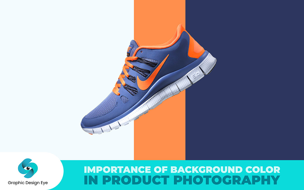
Using multiple background colors will help in discovering the best one for the product images. To make your product better in this regard, you need to play around with the colors.
For instance, the bright red background enhances a white product compared to its absence while the pastel background enhances subtle products.
You can also look beyond the use of plain colors. Try incorporating designs and textures, such as wooden textures and fabric prints.
You also need to test these backgrounds in different light conditions. A background which seems perfect in ambient lighting may appear quite different in street lights. A combination of daylight and studio lighting enables you to assess how well each color and texture holds up.
It is clearly obvious that 54% of consumers today prefer buying online and 92% of shoppers browsing items use their phone. Therefore, make sure your product images are appealing on any device. Read the following tips for image revision and formatting:
Pay attention and make sure that the images showing your products, be it a larger display or a handheld smartphone, remain presentable without distortion. Do not forget to use tools and emulators to see how your image background color and product look through various screens.
The same case applies to the cropping and resizing of images for effective viewing and application in whatever screen size available.
Take into a note what makeup the particular background color would assume when the screen is too bright or too dim. What may be termed as an ideal background on a busy screen may be very dull when that screen is quiet.
It’s important to ensure that there is sufficient tonality between the product and its background. Make sure that there are no matching colors that would further hide the product.
There are various varieties of web browsers and operating systems and each one of them has different color inequalities. Browse through different product photographs in different browsers and ascertain that the colors are as they should be without any adjustments needed. Adjust the background color accordingly so that it remains true.
Listen to users regarding the images. If they complain about the lack of details and visibility, see what can be done.
Use analytics of the website to measure how different images are performing in regard to devices. For instance, a high bounce rate or low clicks may suggest that the images are failing to show as intended.
Most importantly, color makes the best feature in photographs and more so in product photography. Every element of color tells some important story. The color of your background will either spoil or enhance a potential buyer’s perspective about the item you have displayed. It is primarily where the user is emotionally connected without physically touching them to make a choice and win them over.
Indeed, the right background color helps ‘open up’ the product by ensuring that certain aspects of the product are more prominent.
For instance: White color lacks a background and so when used to support a product,
At the same time, a black background is posh and luxurious—most suited to sophisticated products. This can also be gotten from a bright background.
As found in the Amazon rebranding study, 80% of customers will be aware of your brand due to the color. This is the reason the background education matters in the brand identity. Now, let us examine why the background is such an eternal centerpiece:
It makes a clear view of the product and adds allure to it by displaying its features. For instance, a white background creates an impression of cleanliness and simplicity while a black background captures elegance and class.
Product background colors evoke certain customer emotions for shopping. A soothing color creates a mood for calm shopping. It enables customers to make more deliberate and sharper decisions, and vibrant colors make it energetic and exciting.
Use the same background color for all your product images. The goal is to develop a uniform shopping experience and reinforce the increased brand identity.
Image background colors carry inherent psychological effects. For example, a white background would work well with any image that looks creative. Red may connote excitement and urgency—this is most appropriate for new launches or limited-time offers.
The right background color for a competitive market is not only about looks; it is a strategic move that can increase sales. Studies have proven that a coherent and brand-oriented background color will dramatically improve product sales.
As e-commerce competition increases, things like background color will make all the difference in 2024. This small differentiator could greatly increase product perception and, ultimately, merit in the marketplace.
Try to choose a color background that supports the appeal of your product, changes customer behavior, and anchors identification. Also, It’ll increase the sales you need to succeed in today's crowded market.
The background is not limited to the absence of the colors; it is also offering material, finishing, and size which influence the end result. In the event that you are wondering how to make the best of these factors for effective product images, here is what you can do:
Paper: One of the cheapest backdrop options that is smooth with non-glossy finishes is a plain paper sheet. The only limitation with this is that it gets stained rather fast and cannot be cleaned. Therefore, you will have to cut it and replace it from time to time.
Muslin and Cotton: These are very hard-wearing and can be used to create various depths in your image's background. They are also easy to deal with and portable, which means they can be used for different space arrangements.
Wood and Marble: Different textures create varied effects. For instance, wood is used for a rustic effect while marble evokes beauty. However, texturing should not distract from the focal point of the product itself.
Faux Surfaces: These let you build environment for example a bathroom or kitchen . Select such textures, which goes with the theme of your product.
Soft Light: All of the other images show that even soft light minimizes nasty shadows in order to put the product on the center of the photo. This is used especially on white backgrounds.
Hard Light: These kinds of lights give rise to hard dark shadows. This adds spice to the product by dramatizing the contour of the item pictured. This should be looking for bold scary images.
Lighting Position: The position of your lighting can affect dramatically the background lighting. A number of poor lighting makes a white background looking like grey, proper lighting can make it clean and fresh.
Straight On: This photography angle is useful when you want to emphasize the frontal view of the product.
3/4ths View: It is effective since it creates a perception of volume and displays the modal’s other sides.
Overhead: Against this view, flat photography of stiff structures or a bunch of photos can be taken.
Standard Edit: This allows for the capturing of the hues by the background but retains natural appearance.
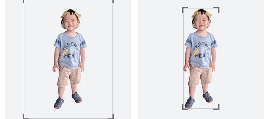
Pure White Edit: This is the opposite of the previous tone edits, as it strips the background tone to produce a bright, white background. Most of the time, this is necessary when cutting clothes to sell online.
Product Color: The background is one of the most important choices. A light background suits dark products, and vice versa. It is apparent that your business’s atmosphere is important. For countryside products, the earthy colors are likely to be appropriate. However, hot colors will do the trick for the modern and stylish items.
Do the Considerations on the Media: It is important to consider the type of photo. For example, catalogs require some consistency, but when it comes to websites, more room for creativity is offered.
Print Versus Pes Digital: In print media, there is always a need for uniformity among all the photographs taken, while in an eCommerce website, one can play around more with the color background.
Web Page Design: Look at the color of the website much care should be taken upon the website's content to its color. If the color of the site content is light then a shade of white would be required.
Expense In The Materials: Background colors of a sophisticated nature are likely to be costly. Try to align your budget with quality requirements for the best result and be careful with unnecessary expenses.
Expense In The Post-Production: Attempt to think about the most likely expenses for the work connected with the enhancement and retouching of the photo. A more intense background may require more effort and costs in the alteration work.
The type of background color one chooses for a particular product photography can either make the images more appealing or less appealing. That is why, even though it is frustrating, you have to understand that the background is polite to the product and also in line with the character of your business.
So, we have prepared a step-by-step guide on how to choose a background color in which you will find cases that will help your photography:
Use Case: Ideal for eCommerce systems and specialist catalogs with maximum detailing and concentration.
Use Case: Good for many products and settings, particularly when beautiful appearances are required.
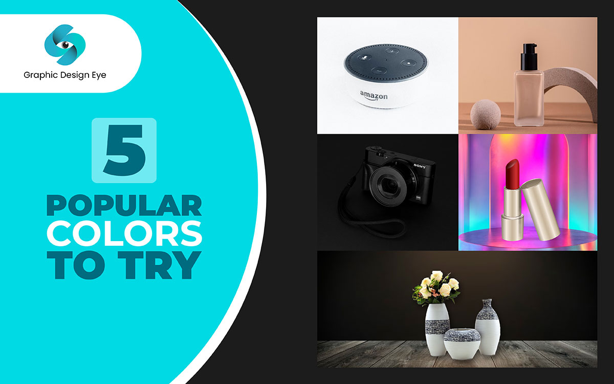
A black color can act as a curtain, delivering an opulent feel. Great for presenting high-end items such as jewelry, leather, high-end tech, etc.
They can enhance the features of products in lighter shades. They can also show more explicit details and shapes that a white background would otherwise hide.
They help place the shine of metal and reflections centrally on the imagery, making whatever has been illustrated as 'un' black more appealing.
Use Case: Most applicable for luxury products and items that demand a striking and elegant approach in the presentation.
The user will likely use bright colors and dynamic images to spice things up and attract attention to the product.
Use complementary or contrasting shades to help restore equilibrium to your set of products. This is good in accompanying the color scheme of your company's products.
The soft range contains muted pastels like powder blue or lavender, which evoke a romantic or carefree feel that works well for girly style and retro items.
Use Case: When there is a need to add a flash of color to the product or when it is essential to express some moods or brand qualities.
There are notable vessels among several other impressive product attention-modifying uses, unique coloring and using materials such as wood, stone, marble or cork as a background in product photography serves a great purpose.
Adding accent elements such as moss, leaves or terracotta also provides a healthy, earthy aspect, especially for products centered around nature. For instance, these have decorative and functional purposes such fibers may help in boosting the look of your products as well as providing a high perceived worth to your products which would be inviting to buyers.
Use Case: This strategy is very appropriate for firms that deal with seasonal nature oriented products, decorate with any product and sell, or craft and sell products where focusing the background will sell it more to those who care about nature.
Additionally, The use of contrasting or complementary colors in the background serves to bring out particular aspects of the product's image and this makes it easier to create a product focused image. This time it emerges that even the background can be done away with more successfully than applying a color which fills the space that is around the product. Even though one can hire a professional background removal service to help with the photo background color change, there are services that specifically deal with these challenges.
This work ensures that the product’s marketing presentations appear to be uniform across social media, marketing manuals and e-commerce websites whose advantages help in product marketing.
Background tends to remain the same in regard to a specific product, for instance, white for electronics, grey for fashion items, wood color for home exterior items, black for jewelry, and soft colors for beauty products and toys.
The following table presents statistics on background colors that people selected, reasons for selection and relevant examples.
| Categories | Background Colours | Rationale Behind This Choice | Example |
|---|---|---|---|
| 1. Skincare and Hair Care | White, Pastel Colors | White: Neater, cleaner, and more business-like, ideal for emphasizing quality. Pastel Colors: Elegant and gentle, aiding promotion without overshadowing the product. | Glossier uses white backgrounds for slick, minimalistic brand positioning. Fenty Beauty employs pastel backgrounds to create a sense of fineness and usability. |
| 2. Cutting Edge Fashion Apparel | Gray, Blue, and Pastel Tone Colors | Gray: Allows the colors and textures of the clothing to take center stage, maintaining focus on the brand's modern minimalist direction. | Zara uses gray backgrounds to align with their modern minimalist brand direction. |
| 3. Shoes | White, Beige, Earth Tones | White: Keeps the focus on the design or color of the shoe. Beige/Earth Tones: Enhances warmth and creates a natural look, ideal for moderate or leisure footwear. | Nike uses white backgrounds to highlight the colorful and detailed footwear. Timberland employs beige tones to showcase their rugged, outdoor-oriented boots. |
| 4. Food Products | White, Black, Natural Wood | White enhances the presentation of food, making it look more appetizing. Black adds contrast to make rich food colors pop. Natural Wood evokes a cozy, rustic atmosphere. | Starbucks uses white and natural wood backgrounds to create a warm, welcoming product presentation. Whole Foods utilizes natural wood to highlight artisanal products. |
| 5. Furniture | Neutral Tones, Wood, and Earthy Colours | Neutral Tones: Ideal for making furniture designs stand out. Wood: Adds warmth and an organic feel, suitable for country or classical furniture. Earthy Colours: Adds warmth to home decor. | West Elm uses neutral colors for a modern, uniform look. Restoration Hardware uses wood to support the classical style of their furniture. Crate & Barrel employs earthy colors to add warmth to home decor. |
| 6. Jewelry | Black, Gray, Soft Blues | Black: Adds luxury appeal and drama, ideal for high-end jewelry. Gray: Desaturates the composition, focusing attention on the design. Soft Blues: Adds sophistication and complements jewels. | Tiffany & Co. uses black backgrounds to highlight their signature blue boxes. Cartier uses gray tones in advertising to emphasize their jewelry. |
| 7. Toys and Games | Bright Colors, Pastels | Bright Colors: Evokes an active, joyful look, perfect for children. Pastels: Cheerful and light, ideal for baby products and items for young children. | LEGO uses bright, fun backgrounds to appeal to children. Fisher-Price employs pastel colors to attract the younger audience of toddlers and babies. |
| 8. Books and Stationery | White, Wood, Soft Pastel Colors | White: Focuses attention on book covers and stationery designs. Wood: Adds warmth and seriousness, ideal for educational materials. Soft Pastels: Adds brightness and lightness to products. | Penguin Random House uses white backgrounds to emphasize book covers. Moleskine uses wood backgrounds to reflect honesty and craftsmanship. Paperchase uses pastels to draw attention to vibrant stationery designs. |
You did not have any feedback on our proposal for selecting the most appropriate background colors. We trust you found it interesting and useful. Perhaps, you have picked up some new tips or learned about illustrating your product images.
Today more than ever a company has to enter a graphical marketplace to survive, which sounds reasonable with some effort. More than just embellishing, such a selection is quite crucial in understanding the subject. This is such a marketing strategy that helps you reach out to the target consumers by advertising your products.
Now, if you still need additional support with choosing the right background color for your product image, don’t wait to contact us!
We shall come back to you with some insights that would be useful product background colors for your ecommerce product branding. In the meantime, continue putting together beautiful images and improving your business products.
Let your ideas keep flowing!