Once, I was supposed to organize an event where it would be my responsibility to present our company. I had worked for hours with designs, displays of products, presentations so that we would emerge differently.
Of course, all that work didn't quite seem to fill the hole. I knew the service was solid, but I wasn't receiving the reactions I had wished for. It was at that point that I began to wonder: how could I create for myself a brochure-one that would not just stop people but make them certain and connect with them?
I came to realize that it wasn't just about making a brochure look good. If you want maximum effect, every element-every color, image, and word-needs to have a purpose. It needs to have an emotional connection, tell a story, and take your audience toward a decision. When I began thinking this way, everything changed.
Then, with that attitude, we remade our brochure, which stood out in a room full of competitors. And what was the result? We landed a deal with our dream company.
If you are wondering how you can get that kind of result, then stay tuned. I'm going to walk you through the most crucial brochure design tips that will help in driving your marketing with brochures, putting most of the impact on them. These easy design tips will help take your attention and turn it into action. Go on reading.

A catching-up brochure will work wonders for your brand. If you have the easy 12 brochure design tips, you can make it look great and strike with your target. Let's begin with discussing of the easy tips to make your unique brochure. Let's drive in!
The first and foremost thing when designing a brochure is to understand your audience. Knowing your buyers well lets you create the brochure according to their needs and pain points. When I make the design, I ask myself:
These indications will help you also to formulate unique and appealing brochures that will trigger your buyer's emotions.
When choosing the brochure size and number of pages, think about what message you want to provide the buyer. Let’s have a look at how you select the perfect size and page:
The right brochure design can make or break the marketing campaign. When you approach a client, the first impression always matters.
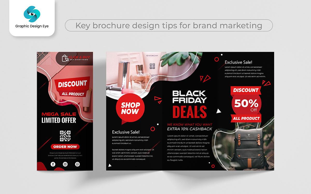
You can find a lot of brochure design templates online. But what makes your company unique? Yes, you guessed it right “a stunning color and design sense”.
Once, I experimented with modern designs that highlighted luxurious images and made the text easy to visualize.
While watching the result, I was just surprised as the blend of crisp lines and strategic white space made the brochure sophisticated.
So, if you use color thoughtfully, you can transform the marketing kit into works of art!
When I first designed the brochure, I was eager to showcase every detail of our design.
So, I crafted the brochure with intricate descriptions of every feature of our service. The result? A beautifully designed brochure became so hard to read.
Here comes the power of simplicity.
The clear and concise content of any design always stands out. Break up text into headings, subheadings, bullet points, and short paragraphs. It shows you respect buyers' time and makes it easier to grasp the message easily.
The brochure does not just fill in information with text about a company. Visuals also create a huge impact on the brochure design. Some visuals you can incorporate into your design:
Including high-quality images in brochures isn’t just aesthetic; it’s about telling the story in a compelling way.
My photos were decent but lacked the vibrancy that hampered the overall quality. Then, I shot a series of excellent images and incorporated them into the brochure design. And Boom!
The design became the best one that resonated with potential customers on a deeper level.
So, select high-resolution and relevant images for your layout to ensure the maximum impact.
My brochures once looked completely different from websites. It caused buyers to be confused about our brand.
To fix that, I matched the colors, fonts, and tone that created a seamless experience across all platforms. As a result, the client instantly recognized and trusted our brand.
Your brochure should maintain brand consistency as it will enhance your business’s professional look and make it reliable for buyers.
The paper you select can evaluate your brochure from ordinary to extraordinary. I love to experiment with different types of papers to see which looks great.
And got the best results with thick and glossy papers because these give the brochure a professional look and make a lasting impression.
So, when you are designing your brochure, don’t overlook the power of paper. The right paper can turn the brochure into an unforgettable one.
As I learned to make effective designs, my friends came to me sometimes to take brochure design tips.
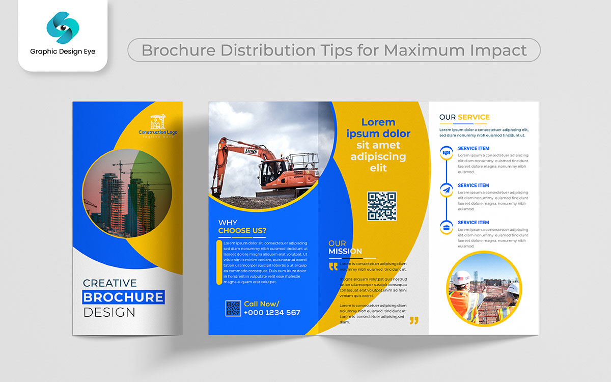
One of my friends created a stunning brochure, but I saw that clients might get lost in the content. Then I told her to do these things to make the navigation effortless:
Finally, he made a brochure that guided his buyers smoothly through the message and ensured that they would take action without frustration.
A powerful call to action CTA always makes a difference. Why did I say that?
See the two examples:
Which would you want? Option 2 is far more likely to get people than Option 1, because it puts the pressure of urgency on an action. And that is why a good call to action is so important in your brochure design-it leads them to the next activity that will bring them closer to your business.
Proofreading and testing may look like minor steps, but they are important for maintaining your brand’s professionalism.
In the process of content writing, it’s easy to overlook errors when designing your brochure. So don’t skip proofreading, as it allows you to fix grammar mistakes, typos, and factual accuracy.
Before you hit print, review every word, number, and detail to avoid missteps later on.
Suppose you have completed a brochure design that looks perfect to you. However, the brochure may have an unclear CTA and not address the pain point of your buyer.
With invaluable feedback, I realized which place needed to make adjustments. Gathering feedback and iterating helps me refine the brochure, enhance its effectiveness, and ensure that it communicates effectively. I hope now you can guess the importance of feedback.

Imagine you have just truly designed a stunning brochure, replete with beautiful images and words that compel. And you want to share it with the world. But even as you're on a high after getting it printed, you simply recognize that handing it out just isn't enough. You want it to land in the right hands. You want it to create a buzz and drive action.
It is like planting seeds on rich soil. You need to find the right spots for sowing your message in, where it could thrive. With a properly chalked-out distribution strategy, your brochure can indeed help casual readers develop into loyal customers.
Below, we will be sharing some very easy, yet effective, brochure distribution tips that will help your brochures realize their full potential and actually make a difference in the course of your marketing effort.
Suppose, you are at a trade show, surrounded by booths showcasing everyone’s product and service. As people walk through the aisles, they notice a colorful brochure. And it's yours!
They pick it up and flip through the pages. The brochure highlights what makes you unique and why your solution matters.
Later, they review everything they picked up; your brochure stands out. As the message and visuals of brochures are connected with them, it may turn into a partnership, sale, or long-term customer.
This is the power of leveraging events and trade shows- using brochures to leave a lasting impression in a sea of competition.
Collaborating with complementary businesses can be a game changer for your brochure distribution strategy.
You can work with relevant businesses to distribute your brochures at their location. For example, if you run a fitness studio, your partnership with a local gym or wellness center to distribute your brochures may help reach more clients by placing your message directly in front of an audience already interested in healthy living and fitness.
When customers see your brochure at a business they already know and trust, they’re more likely to take notice and engage with your brand.
A well-placed brochure stand or handout in a high-traffic area can make your brand visible to your customers.
Distribute your brochures at a reception desk in a cozy waiting area where clients can sit comfortably. This creates an opportunity for engagement, allowing potential clients to learn more about your company.
Direct mail campaigns are among the most common ways to distribute your brochure. It allows you to place your brand in the hands of potential prospects.
When you target the right audience, add personalized touch, and offer something valuable, direct mail becomes an effective way to bring the brand to life.
When anyone asks me which is the most effective way to distribute brochures in this digital world, social media comes to my mind at first.
Using digital distribution channels like Facebook, Twitter, and Linkedin are great ways to share brochure design with your targeted prospects.
You can also share the brochures through email marketing, placing them on your website and sending direct emails to reach a wider audience.
In conclusion, we have seen how these brochure design tips create maximum impact on marketing efforts when applied correctly. If done properly, a brochure is not just any other marketing piece, but a strong kit that states your brand's message with crystal clarity and eloquence.
From layout to typography, every brochure decision plays a role in how your audience feels when communicating with your business. You will want to strive for a brochure that demands attention, keeps the interest of prospects, or nails your message. You know you've struck the Goldilocks zone when your copy and images strike the perfect balance, which will be reflected in the response of your prospects.
Have a brochure designed in such a way that it can speak for the company directly to the target audience. Take into account the needs, preferences, and key messages that you want them to remember. These are not just tricks; these really are proven strategies that will help your marketing pop in the crowded space.
And with that, today is all done! If you'd like to discuss making your brochures hit the mark further, it would be our pleasure to receive any messages or comments, and in view of that, I'll keep working to get the best from your design.