A captivating brochure plays a ‘big game’ to take your business to the next level. A proverb goes, “A picture is worth a thousand words.” Go in-depth, the image you use in your brochure design makes an impression on your audience's mind.
Different types of imagery, like illustration, icons, or graphics, are solid tools for communication with your audience. An exceptional brochure can bring design inspirations to create aesthetic patterns and creative layouts that draw anyone’s eyes. Brochure design concepts help pick influential fonts and colors, play with mind-triggering shapes or angles, and cover cohesive color blocking with filters.
Surely, an engaging brochure can change the overall script!
This blog helps you with the top 79 exciting brochure ideas to boost your leads and support your brand identity by offering credible and informative content about your brand. Let’s get started.
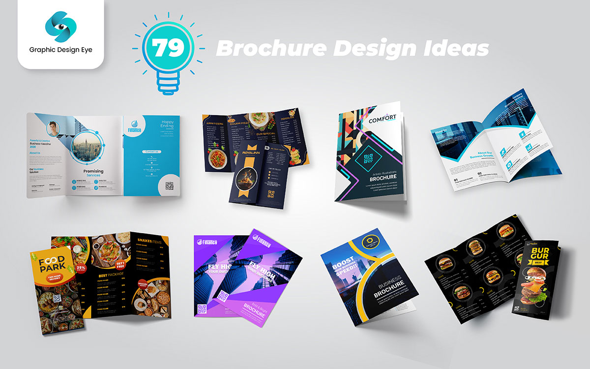
You know what’s really neat? A fold can change a brochure a lot. A clever fold grabs attention and makes people curious. Just imagine the possibilities with different folds. In this section, look at 79 brochure design ideas. Each one shows a fun way to share your message and leave a lasting impression on your audience.
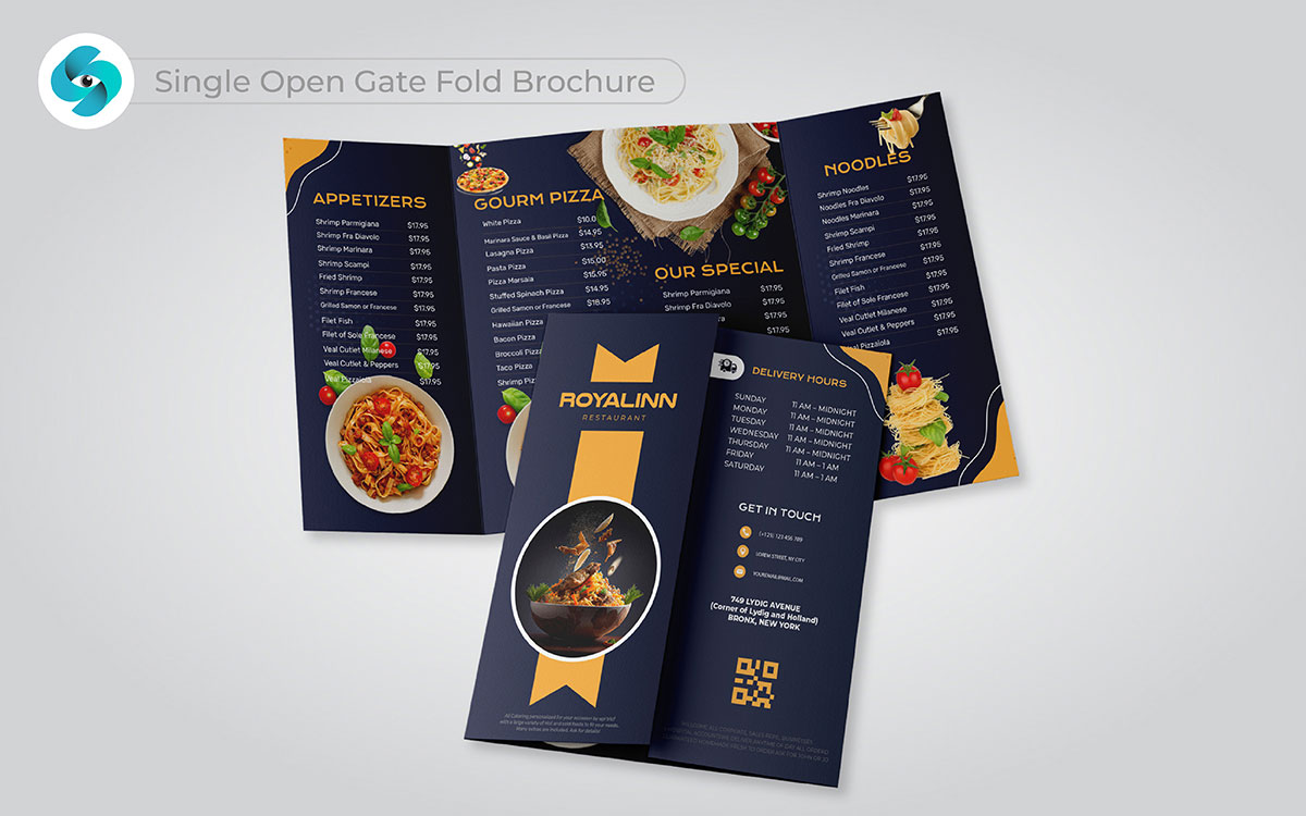
You might be wondering how one open gate fold brochure can change things. Here’s the thing: it makes a great first impression. The special design grabs people’s attention and makes them want to look closer. I remember using this style for a project, and it started real conversations.
To put it simply, it helps your message shine. It invites customers to connect with your brand in a way they won’t forget. Let’s face it, a professional brochure design is a key kit for engaging your audience and growing your business!
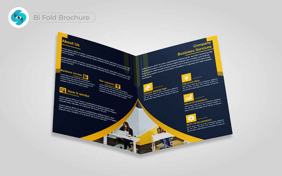
But what if your message could fit neatly in somebody's hand and yet make an impact? That's what it does: the bi-fold. With two folds, it creates four easy-to-follow panels. In other words, it is perfect to divide your information.
It's simple, yes, but also powerful. You can introduce your products or services without overwhelming the reader. Yeah, it would be perfect in order to make sure everything fits just so and is to the point.
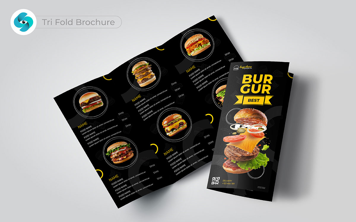
Ever feel like less is more but more is still needed? The tri-fold fits that perfectly. Three panels, compact and easy to carry, but still spacious enough to share key details. That means it gives you enough space to share your story without overloading the reader. I’ve seen this layout work wonders for events or quick product overviews. Whether it’s for a simple intro or a quick breakdown, it’s designed to stand out while staying organized. So, moving on, this layout’s got it all.
Once, a local non-profit needed a tri-fold brochure for their big fundraiser. They had ideas but needed help. Actually, I believe every good tri-fold brochure design starts with a chat, so we talked about their mission.
But here’s the thing: we wanted their brochure to stand out. We chose bright colors and bold images. The cover grabbed the customer's attention right away. It showed their brand logo and their message loud and clear.
As we worked through the brochure, we made sure each panel had a purpose. We included their story, what they do, and how people can help. Not to mention, we wanted it to feel friendly and inviting.
When we sent the first draft, the client was thrilled. Honestly, it feels like they couldn’t wait to share it. They said, “This is exactly what we needed!” Their excitement made us smile.
After a few changes based on their feedback, we had the final version. It was more than just a brochure; it was a kit to connect with people.
In reality, we often find that good design can make a big difference. It’s interesting to see how a simple brochure can spark interest and support.
In my view, each project is unique, and that said, it’s important to make those stories shine.
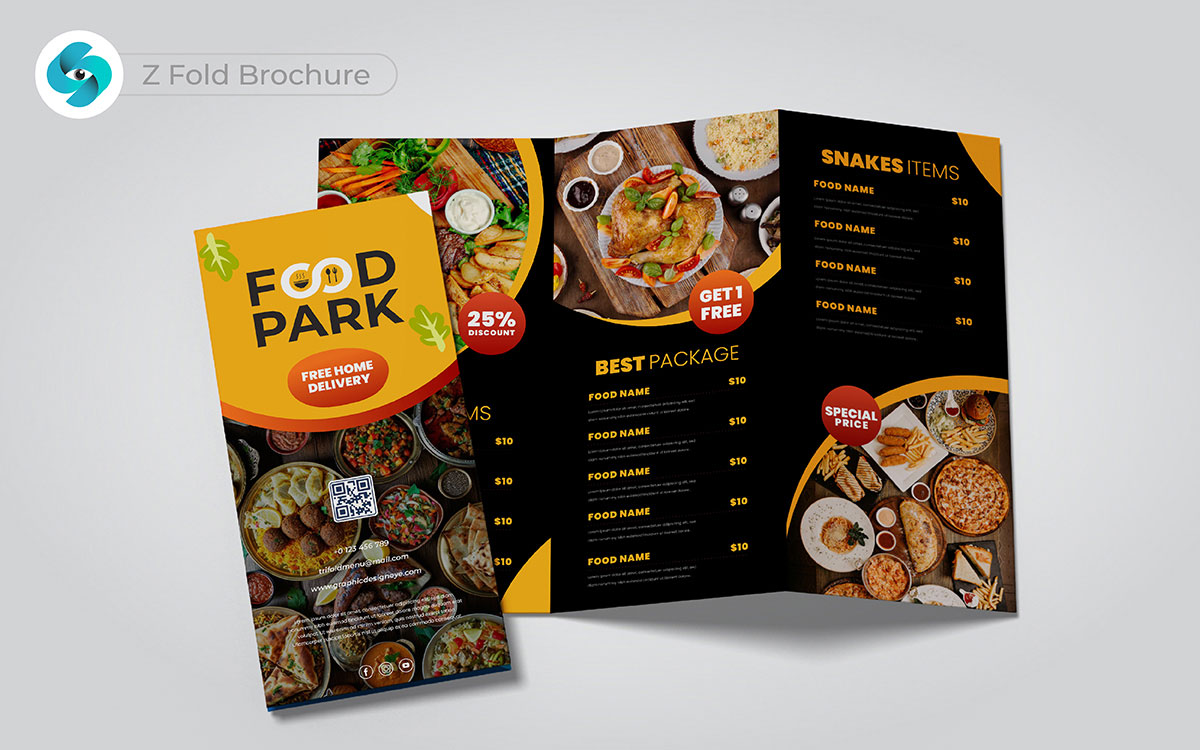
There’s something exciting about watching a story unfold, piece by piece. Oh, and by the way, the Z-fold does just that. It opens in a zig-zag pattern. You know what? This guides the reader through your message. These brochure design ideas are great for breaking down steps or explaining things clearly. I just thought of something: each fold makes it fun.
Wait, here’s another idea—it keeps everything neat too. On that note, this format blends creativity with structure. It makes sure the information flows smoothly.
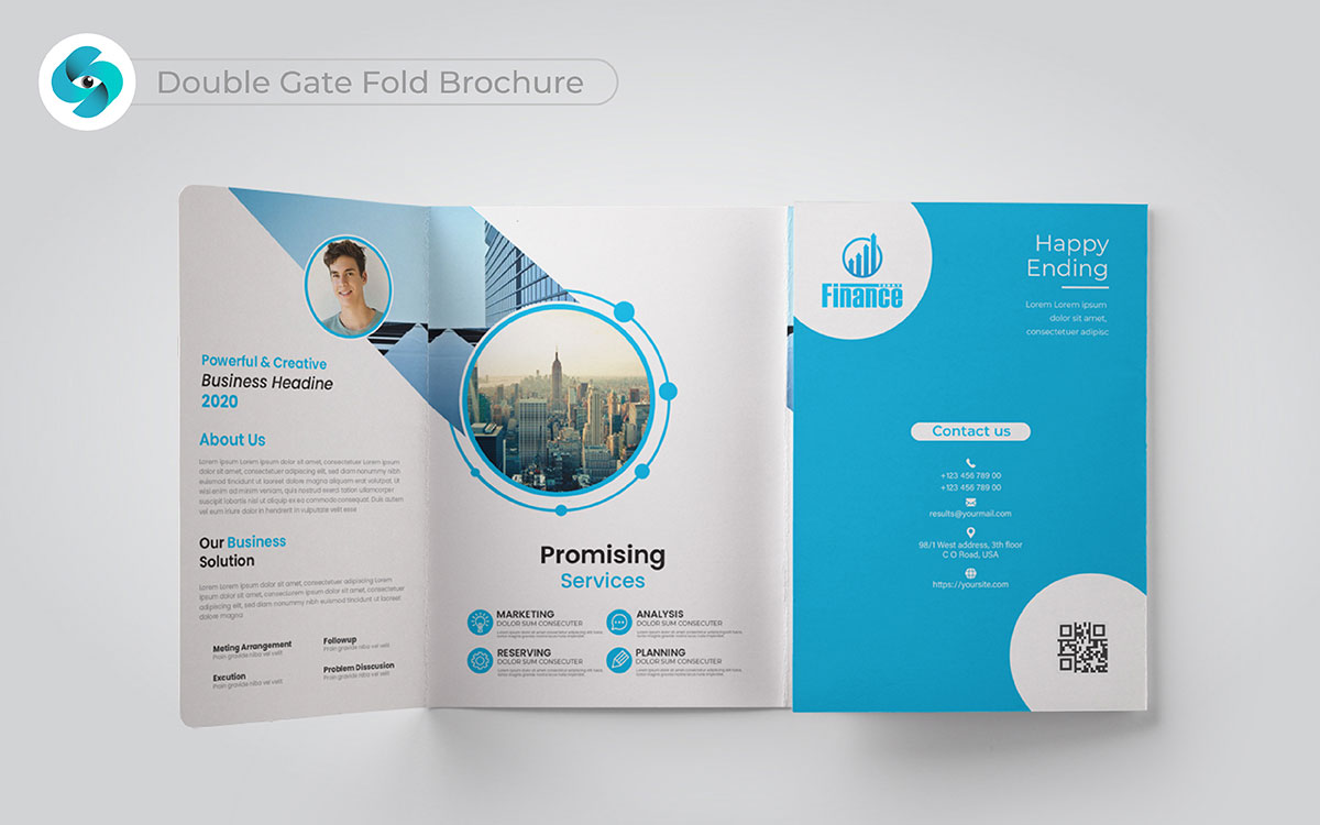
Have you ever unwrapped a gift and felt that excitement? That’s what the double gate fold brochure is all about. Two outer flaps open first, and then, well, the real story unfolds. It’s like peeling back layers of an unexpected surprise.
I’ve used this format for clients with a lot to share, and it always feels special. You’re not kidding when it comes to presenting in style and detail. All in all, it’s a powerful way to connect with your audience.
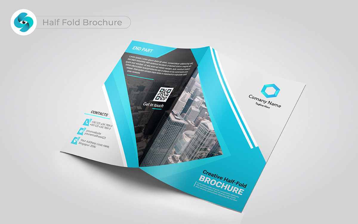
There’s beauty in simplicity. The classic half-fold brochure is clean and organized, like a breath of fresh air. Actually, it’s a perfect choice when you want to divide your content clearly. It’s not too complicated, but still allows your message to shine.
Each panel guides the reader, giving them a clear path to follow. Bottom line is, it’s ideal when you want to keep things straightforward but impactful. This layout speaks for itself.
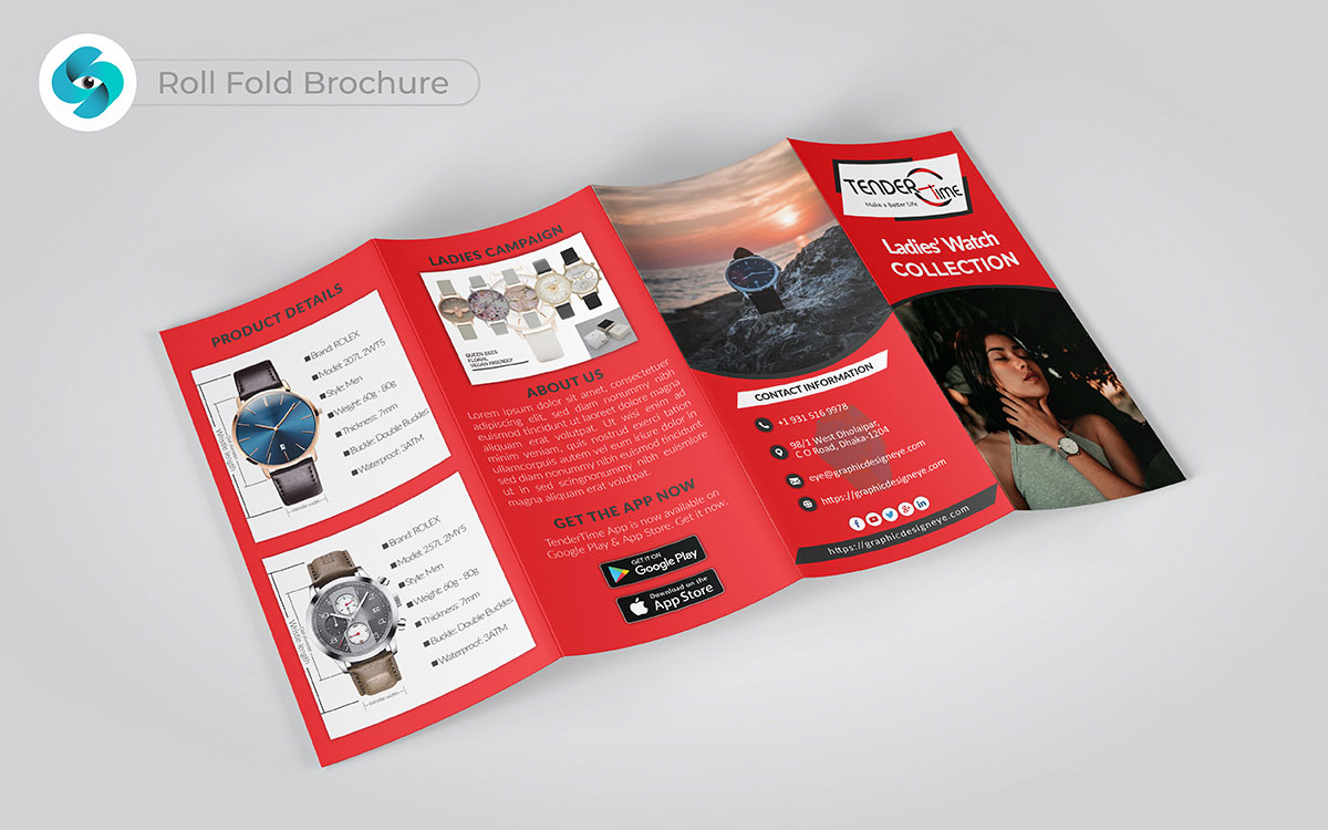
Sometimes, you want a brochure that feels like a journey. That's where the triumph of the roll-fold design comes in. As each panel unfolds, the story just keeps flowing smoothly, drawing you in deeper with everyone it gives space to share so much information without overwhelming anyone. Honestly, I believe it’s worth it.
The balance is perfect—just enough to say what matters, but never too much. The design feels effortless, letting the message breathe and leaving a gentle yet lasting impression. Yeah, exactly how it should feel.
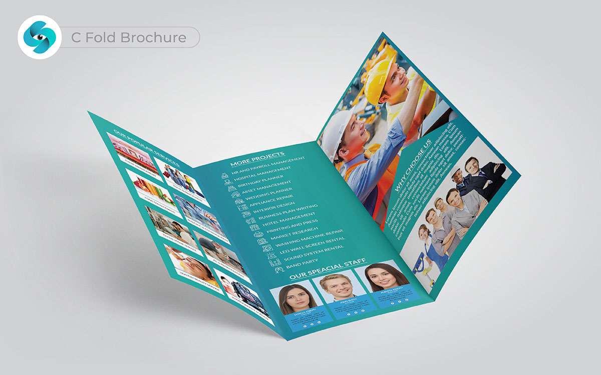
When thinking about the c-fold brochure, it brings to mind something sharp and sleek. It opens with three neat sections, each one ready to tell a part of the story in a clear, organized way. You might think it’s simple, but that’s not exactly it—there’s a polished edge to how it all fits together. The way the panels fold into each other keeps everything clean and refined. Trust me, it’s true. Personally, I find it to be a design that keeps things simple yet sophisticated. Yep, that makes sense.
By the way, let me share with you something, at our last design of c-fold brochures, the client was ecstatic. I was blown away! They needed to showcase a new product line, and this brochure was perfect. When they opened it, the owner exclaimed, “Oh, come on! This looks amazing!”
I couldn’t believe my eyes as their team gathered around, smiling and excited. “Seriously, what just happened?” I thought. Just like that, everything changed. They knew this brochure would grab attention at their upcoming event.
If you want that kind of wow factor, our C-fold brochures will deliver! You won’t be disappointed!
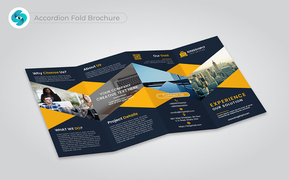
Here’s another idea that stands out—the flexible accordion-fold. It opens like an unfolding journey, leading the reader step by step. That’s not quite right with many other brochures, but this one?
It’s perfect for when you need to break down lots of information without clutter. Each panel connects in a rhythmic flow, making sure your message doesn’t feel overwhelming.
Honestly, I believe it’s a brilliant way to share a detailed story with style and creativity.
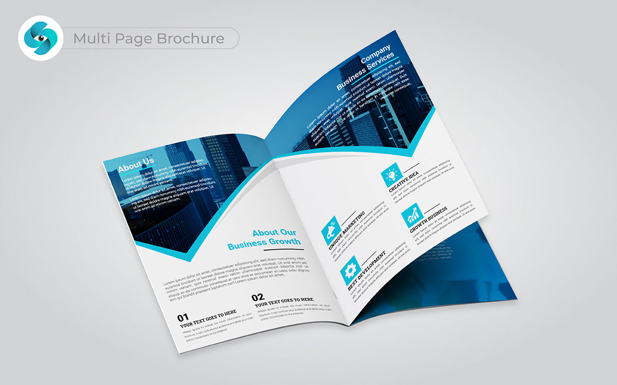
More space means more opportunities. That’s where the multi-panel brochure shines. You might think it’s too much, but actually, that’s not true—it’s all about balance. With these brochure design ideas, extra sections allow for deeper storytelling while staying organized.
Ideas can spread out, giving you plenty of room for visuals and text without feeling cluttered. What I appreciate about this design is how it combines creativity with structure.
Every panel fits together like pieces of a puzzle. Trust me, it’s worth it. It’s obvious this one leaves a lasting impression.
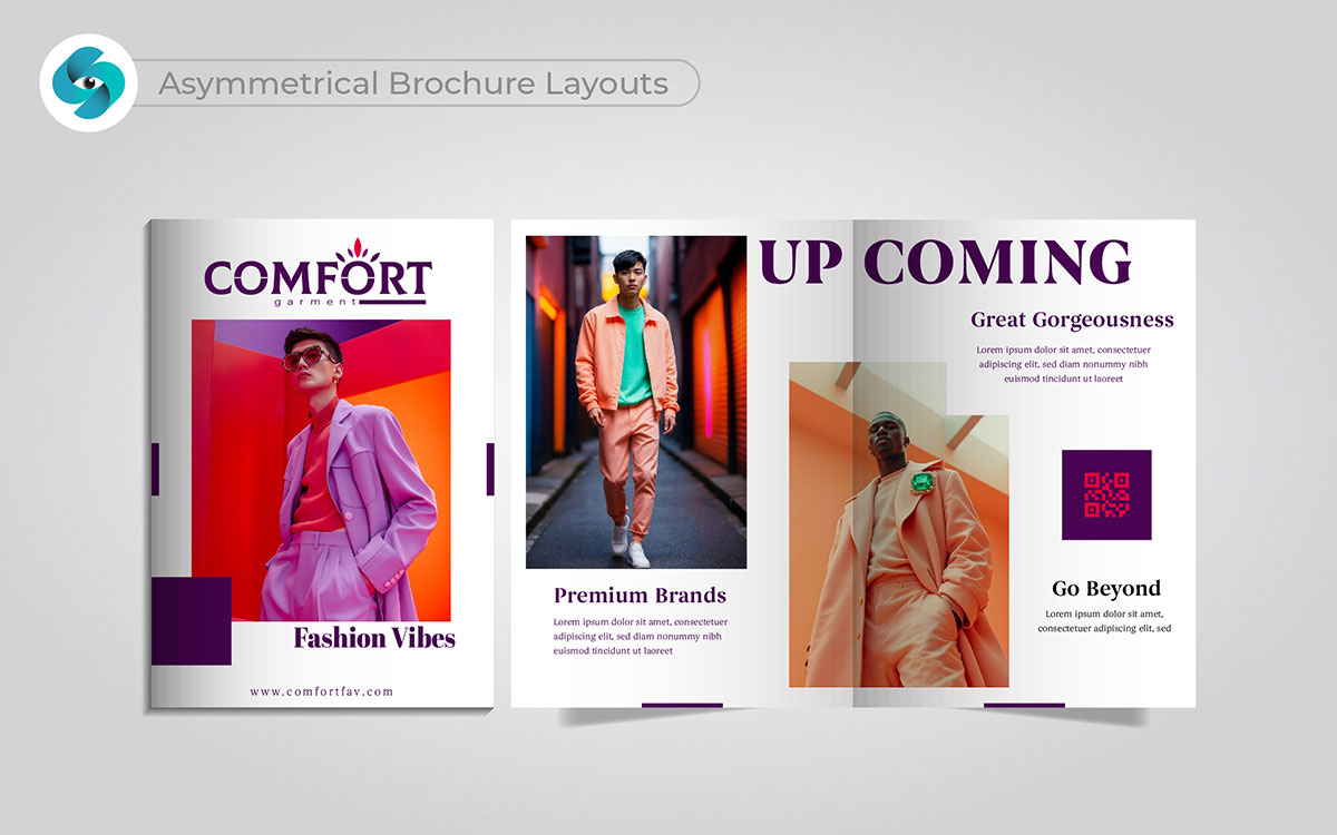
Breaking the mold creates magic. Asymmetrical brochure layout design grab attention in new ways. I see it differently; these designs feel fresh and exciting.
They make each section dance. You hit the nail on the head when you think about how they tell a story. Each fold invites the reader to discover more. It’s a risk, but one worth taking for brands wanting to stand out. This brochure style showcases creativity and innovation beautifully.
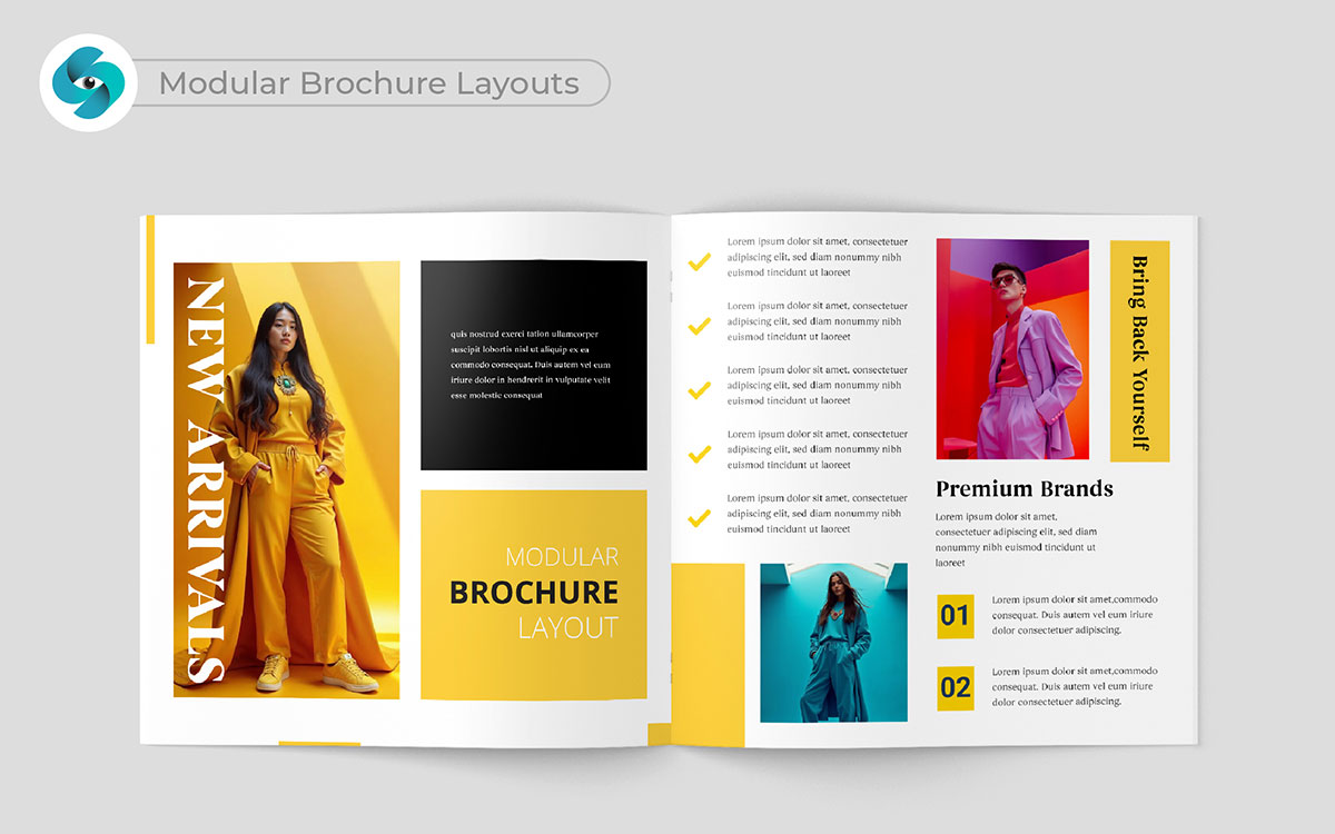
Picture a puzzle where each piece fits perfectly. Modular brochure layout designs are clear and easy to read. That resonates with me because organized sections guide the reader. I hear you, but there’s another layer to it—these brochure layout designs help highlight key points.
Each module can shine a light on different messages. It leaves room for doubt, don’t you think? This approach helps your audience focus on what matters. It’s like a roadmap guiding them step by step.
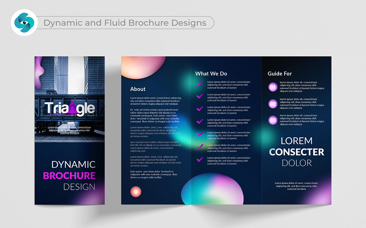
A design should feel alive and flowing. Dynamic and fluid brochures break the rules. They allow for movement and interaction. That’s profound, honestly; I love how they reflect a brand’s energy.
Pages almost come alive, inviting readers to turn them eagerly. This changes things, doesn’t it? It encourages exploration, keeping the reader engaged. It’s not just worth it—it’s necessary for creating memorable experiences that connect deeply with the audience.
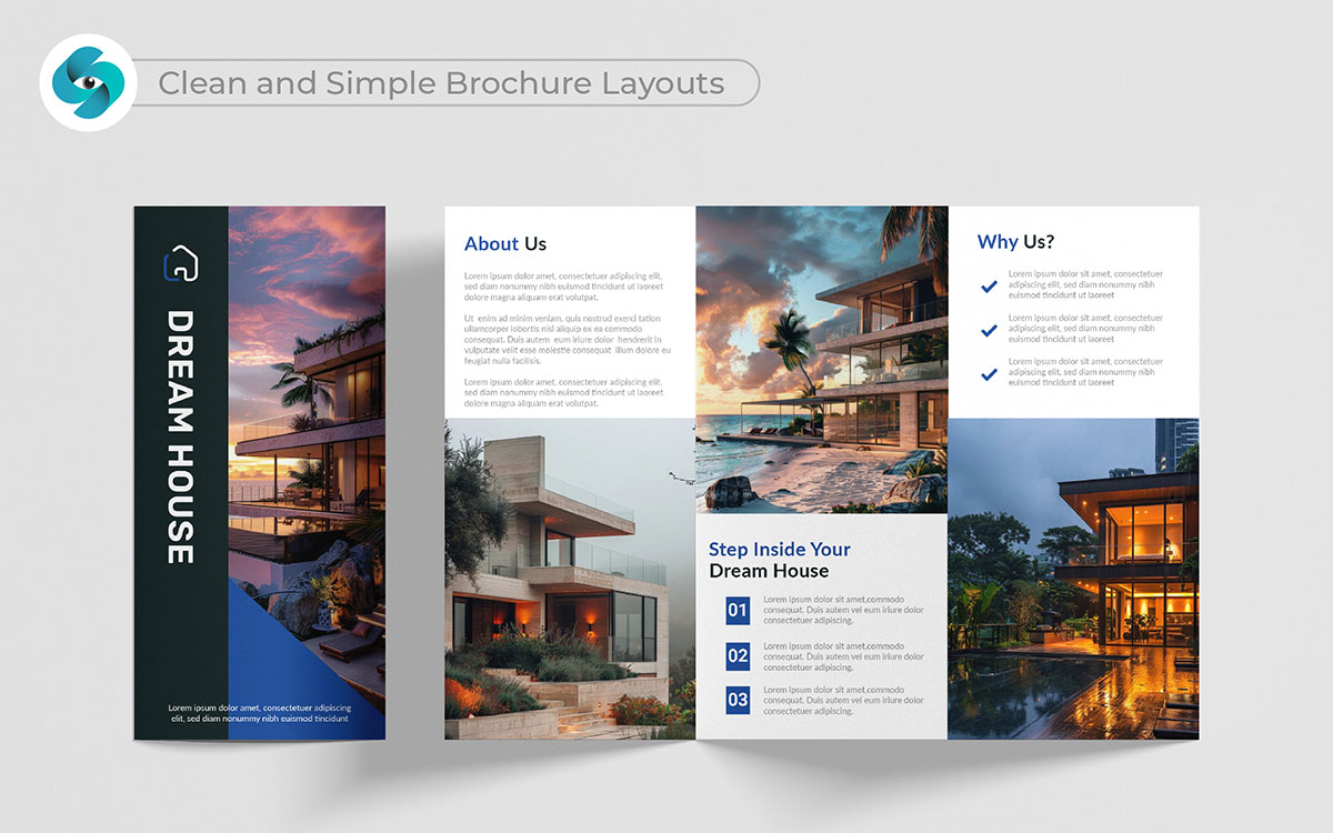
In a noisy world, simplicity stands out. The clean and simple brochure layout design is a breath of fresh air. That’s a hard truth to swallow, but clarity helps focus attention. I appreciate how they highlight essential information. I stand by that because it makes the message easy to absorb.
Each brochure element has a purpose. It’s not just worth it—it’s necessary for fostering trust and professionalism.
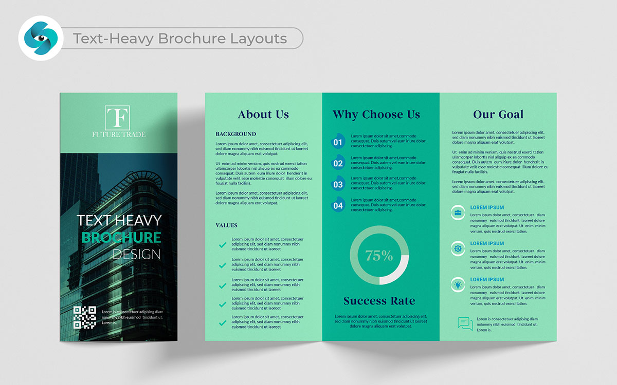
Words tell the deepest stories and text-heavy brochures embrace that. They give space for rich storytelling. I can’t say for certain, but I have my doubts about them being boring. Thoughtful design makes them engaging.
Clear headings help readers absorb the information. That opens up a whole new perspective on how we see brochures. This approach invites the audience to learn about your brand. It’s a way to share your passion in a meaningful way.
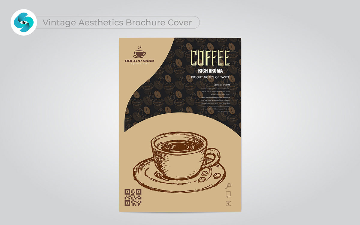
That’s a powerful point—vintage designs have a charm that never fades. But there’s more to it. They carry a warmth that feels like a piece of the past. It’s timeless.
I love how these brochure design ideas blend old and new, creating something rich with texture. It’s like holding a memory in your hands. This style isn’t just about looking beautiful; it’s about bringing history to life, making it feel real and connected to the present.
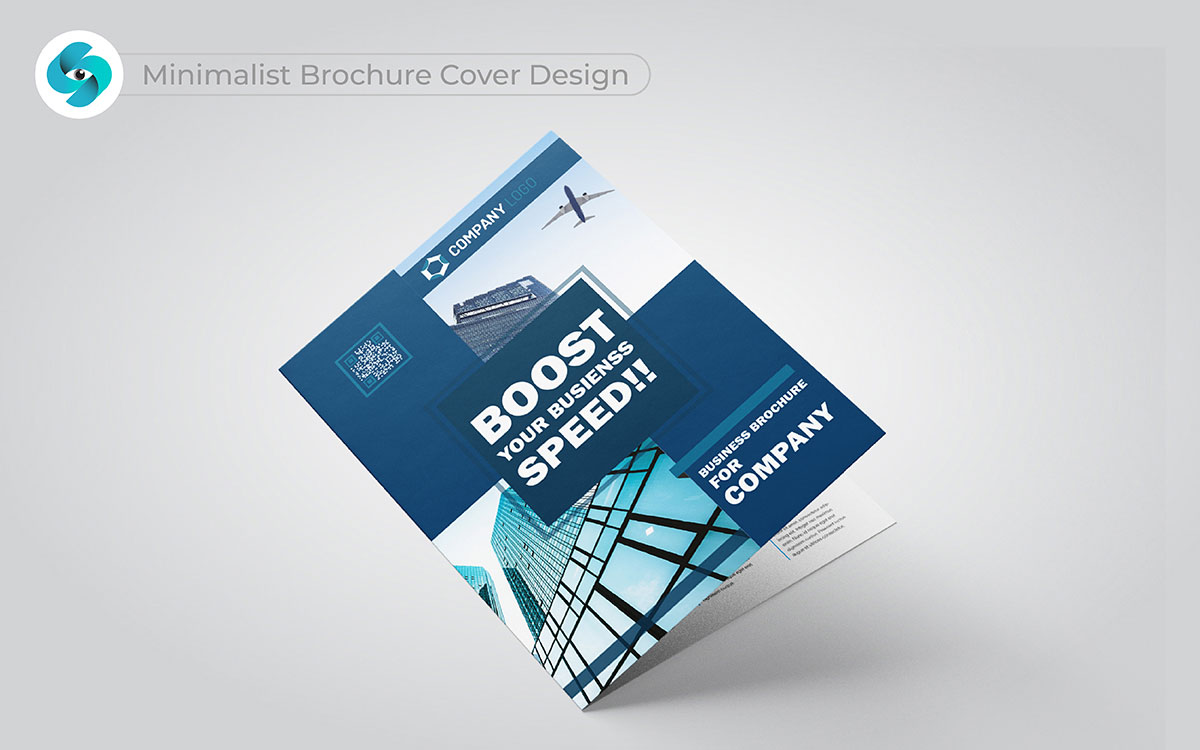
Brochure cover designs that speak to the heart—you know the calm beauty of a minimalist cover design. A brochure design that uses clean lines and space to create a peaceful feeling. I stand by that, no question. It’s about removing the extra to let the message breathe.
This idea connects with me deeply. Simplicity holds more value than you think. It’s not just about looking nice. It’s about sharing the message in the clearest way.
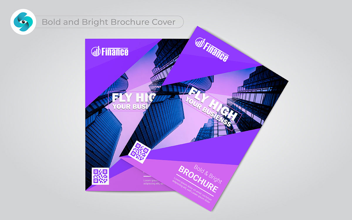
You’ve seen the power of simplicity, but there’s more to it than that. Bold colors and strong designs take things to another level. That’s vibrant & bold cover brochures. These colors spark excitement. It’s a risk, but one worth taking.
Without a doubt. I love how this style stands out. Every look feels alive. It’s not just bold. It sticks in your mind and leaves a mark.
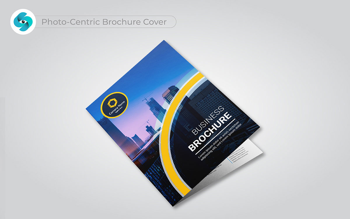
That’s one way to see it, but think about the emotion in a photo-focused cover brochure design. One image can say so much. It captures feelings right away.
I can say that with absolute conviction. It’s not just about showing something. It’s about making an emotional connection. From where I stand, photography pulls you in. It makes you part of the story. I wouldn’t trade this approach for anything.
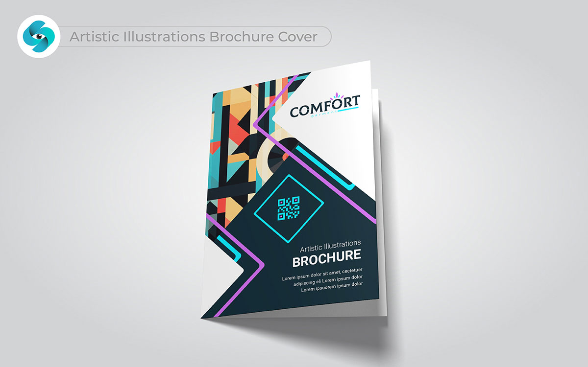
Let’s not jump to conclusions—illustrations don’t just look fun. They feel personal. I see it differently with an illustrated art cover brochure design. Every hand-drawn detail feels made just for you.
That resonates with me. It makes each brochure feel special. It’s not about being perfect. It’s about showing character. This is something I truly believe. It pulls you into a creative world. The art tells the story better than words.
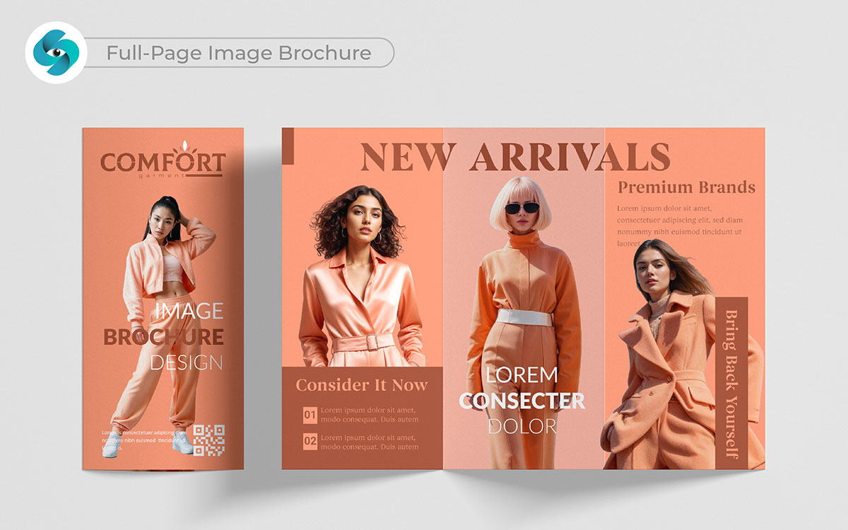
A full-page image brochure can say so much. It grabs attention in one glance. That’s a powerful point. This layout makes a strong visual impact. I can say with conviction—an image can speak without words. It pulls the reader in, creating an emotional connection.
That’s deeper than I expected. It’s not just bold—it’s unforgettable. A well-chosen image can capture the essence of your message, making it stand out in the best way.
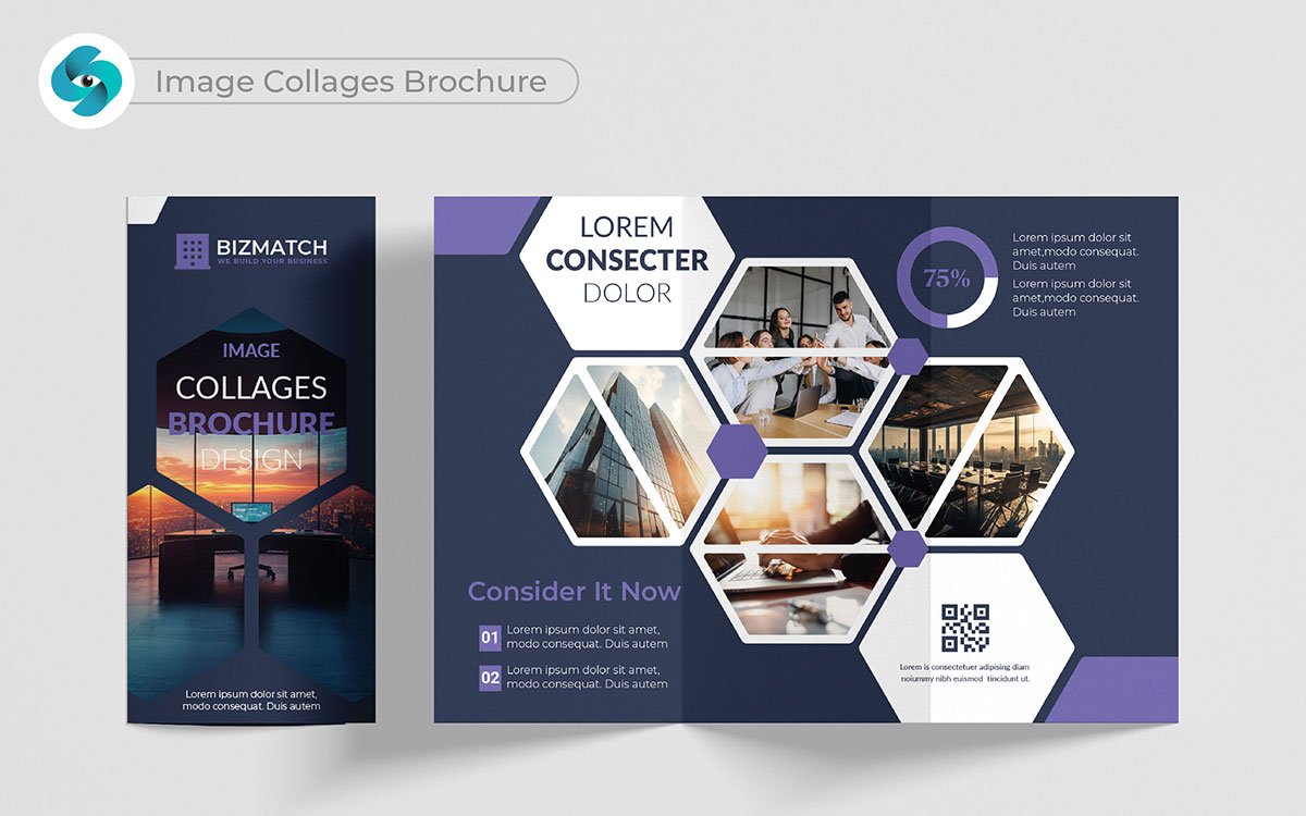
Image collages bring multiple stories together. They showcase a range of ideas in one design, opening up a whole new perspective. These brochure design ideas highlight different parts of your brand in a fun, vibrant way. I see it differently—each image adds a new layer of meaning.
They’re lively and creative, always keeping the reader curious. That’s profound, honestly. They make your brochure exciting and fresh, encouraging readers to explore more.
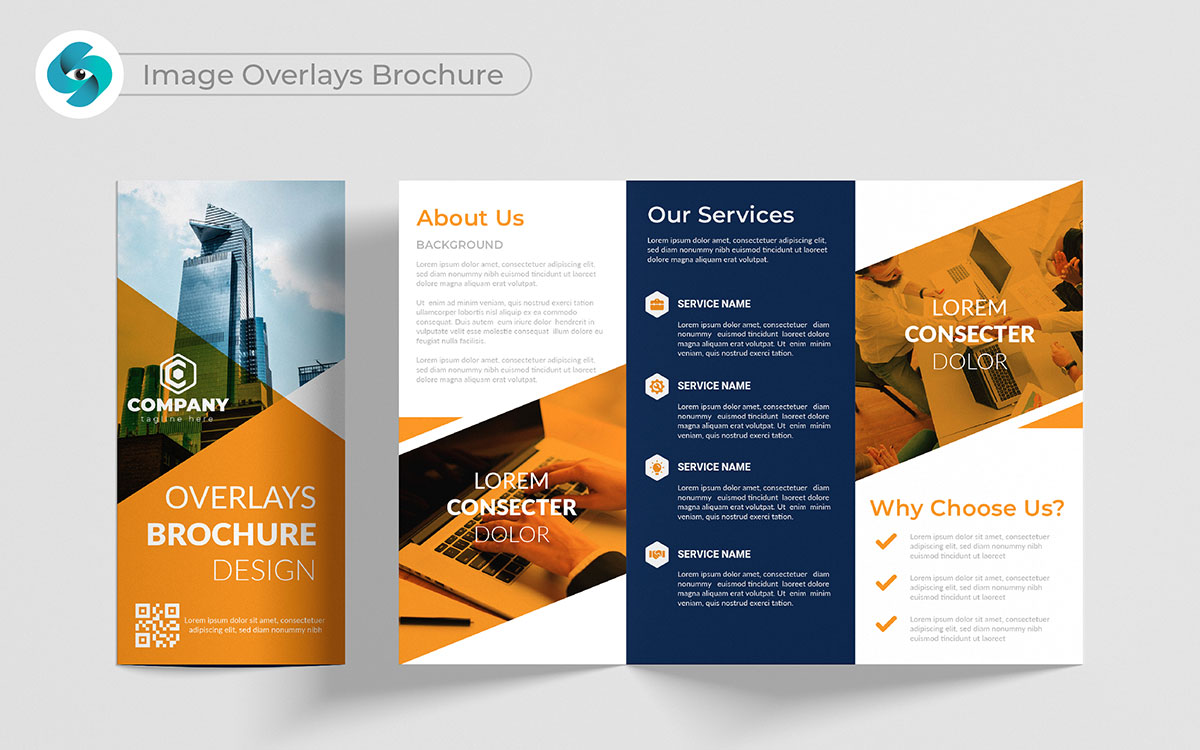
Image overlays offer something unique. They create a sense of depth, blending text with images smoothly. That resonates with me because it’s visually striking. This style catches attention quickly. I’m torn on this one, but it often works beautifully when balanced well.
Overlays let you highlight key points without clutter. That’s a bit of a stretch for some, but it adds interest. This brochure layout keeps the design fresh, making sure your brochure stays engaging from start to finish.
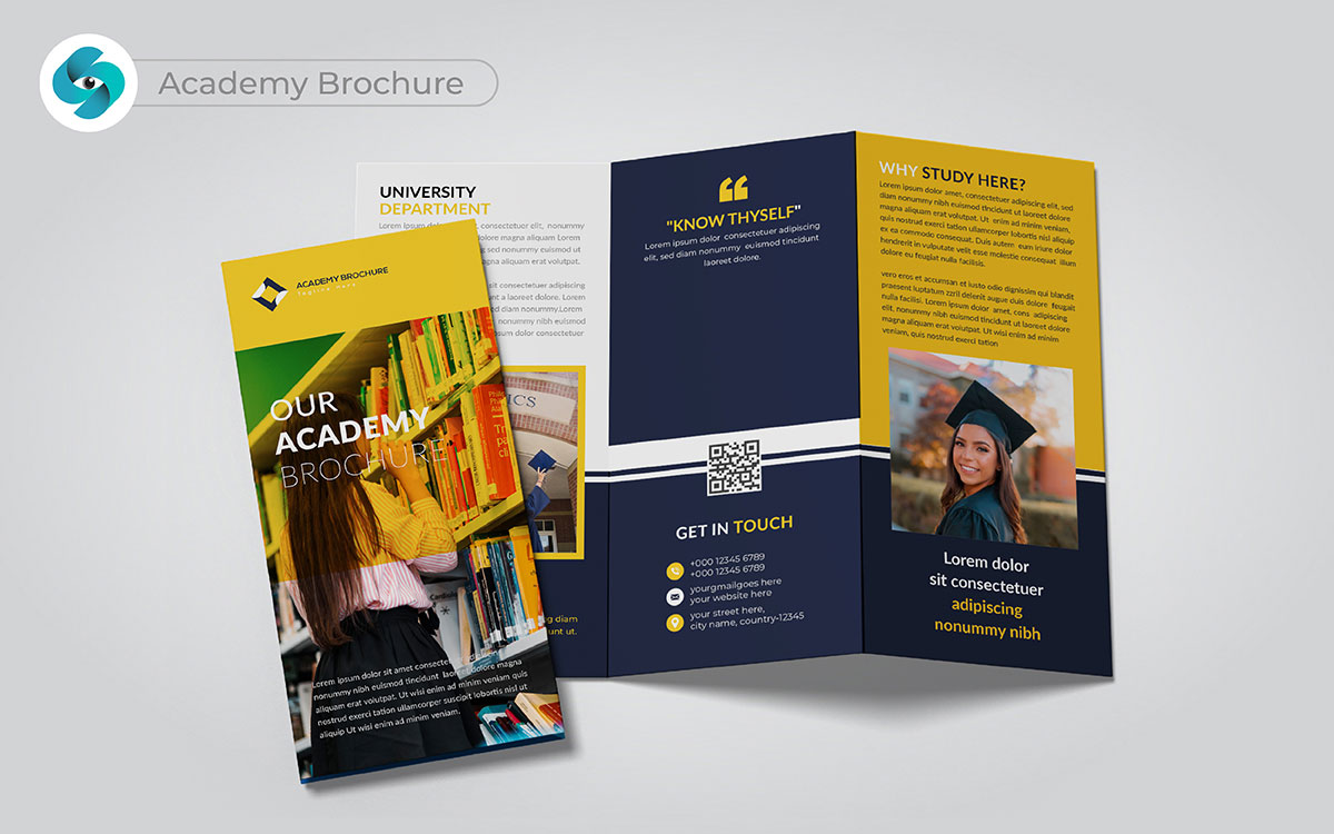
How can your academy stand out in a busy world? A tri-fold academy brochure should inspire trust, but also feel welcoming. That’s not how I see it—it’s about finding the perfect balance.
A full-page image of students can instantly draw people in. Simple sections highlight courses, admissions, and values. That’s the real deal. A clean brochure design helps parents and students easily find what matters. It’s a bit risky, but totally worth it to make your message hit home.
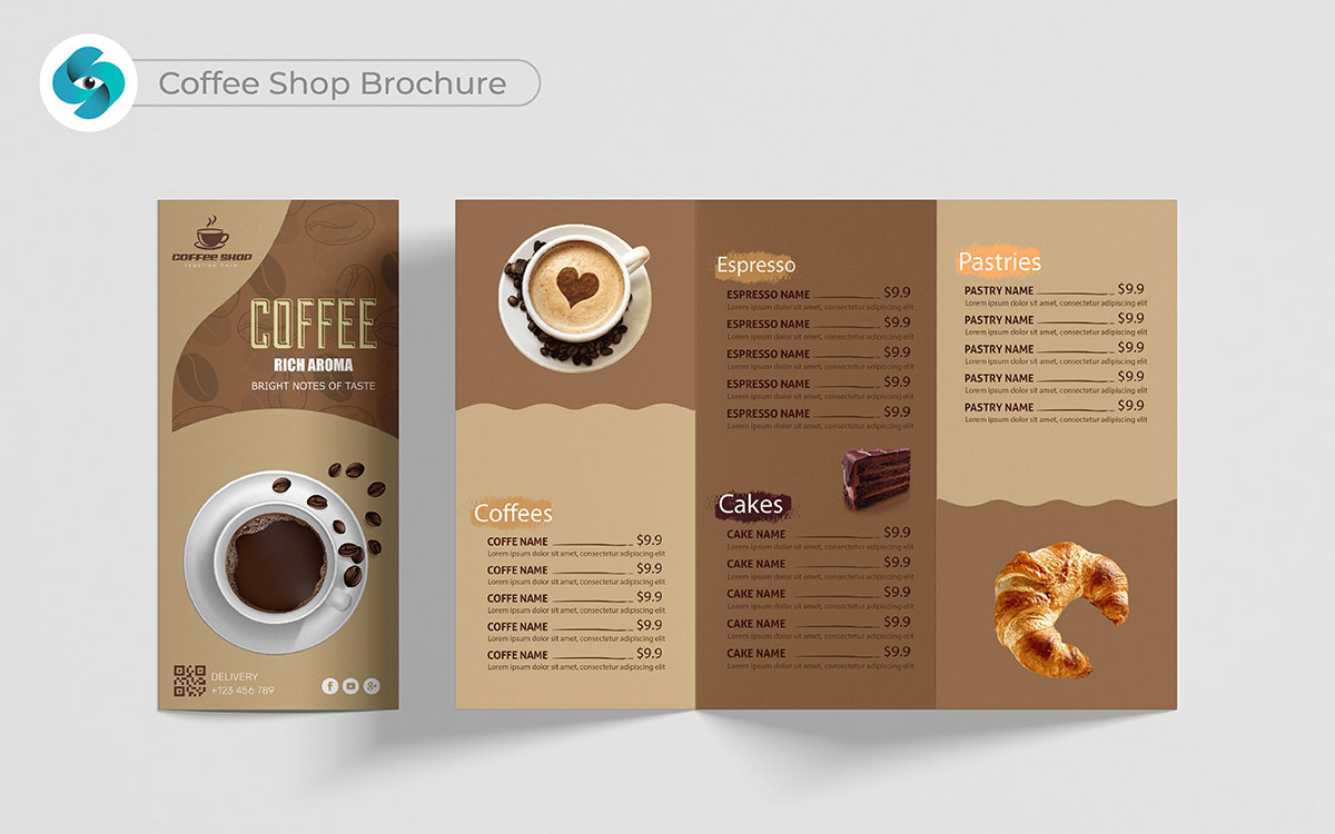
A tri-fold coffee shop brochure should feel like an invitation. It’s not just about coffee; it’s about offering comfort. I’m not sure crowding the page with text is the way to go here. Instead, focus on branding by highlighting your best brews with warm, inviting images.
Show off your menu and special offers with simple, friendly sections. That hits home; it’s about creating a craving for more than just a drink. The right layout pulls people in like the smell of fresh coffee.
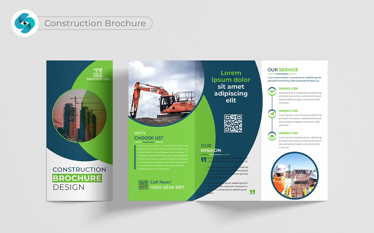
A construction brochure must reflect strength and reliability. That’s the real deal—people need to see your work to believe in it. Show off completed projects with high-quality images, placing trust right at the center. Clear sections for services and testimonials help build credibility without overloading the page.
That feels more honest. A well-structured best brochure layout ensures everything is easy to follow. This is how you put your expertise on display.
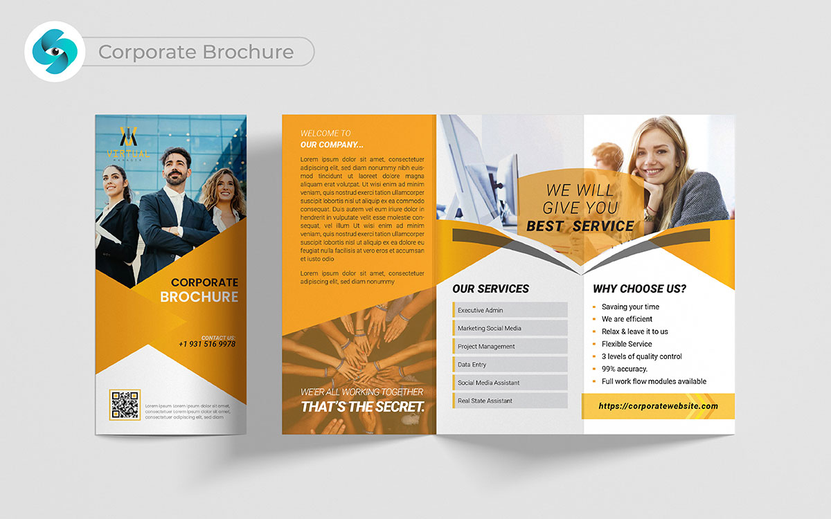
What truly defines your company? A corporate brochure should reflect professionalism, trust, and leadership. It’s not just about bold statements; it’s about proving them. A strong, impactful image on the cover instantly shows who you are.
Clean, well-organized sections lay out your services, achievements, and values. When brainstorming top trends brochure design ideas, I’m sticking with that, no doubt—a crisp design makes all the difference. It’s a bit risky to rely only on words, so let those visuals carry your message too."
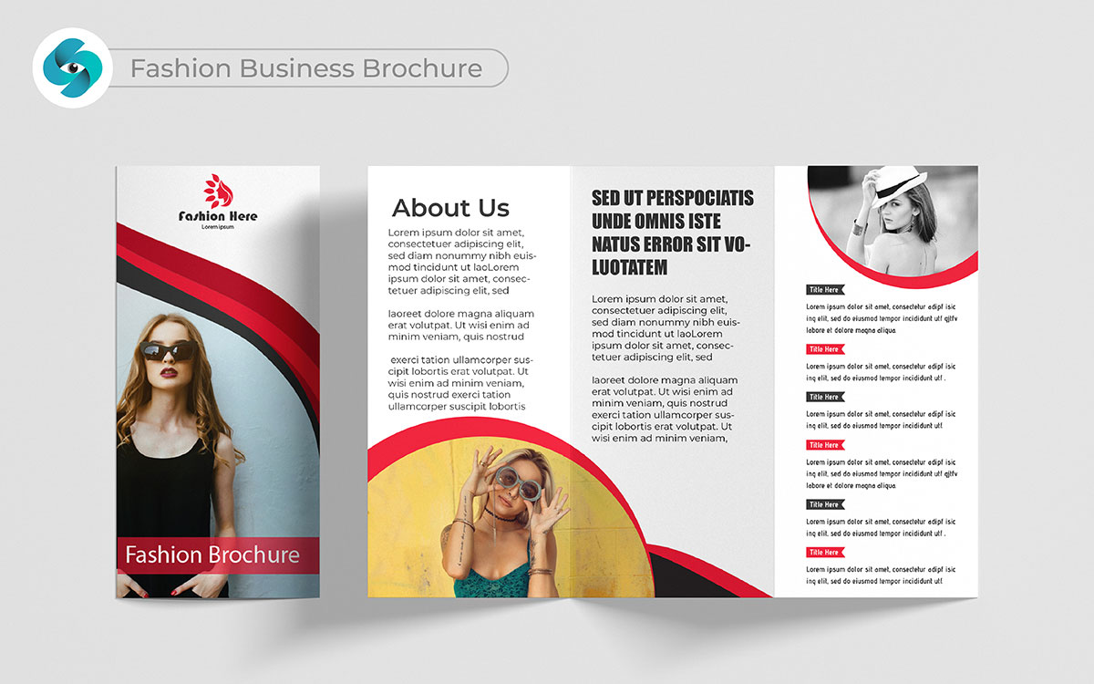
Fashion speaks without words. A fashion brochure should reflect that with bold, striking designs. It’s not just about clothes; it’s about style and identity. The layout should feel trendy, fresh, and easy to flip through.
I hear you, but there’s another layer to it—people want to see what sets your brand apart. Use large, high-quality images of your best pieces. This approach not only highlights your fashion but creates an emotional branding with the reader.
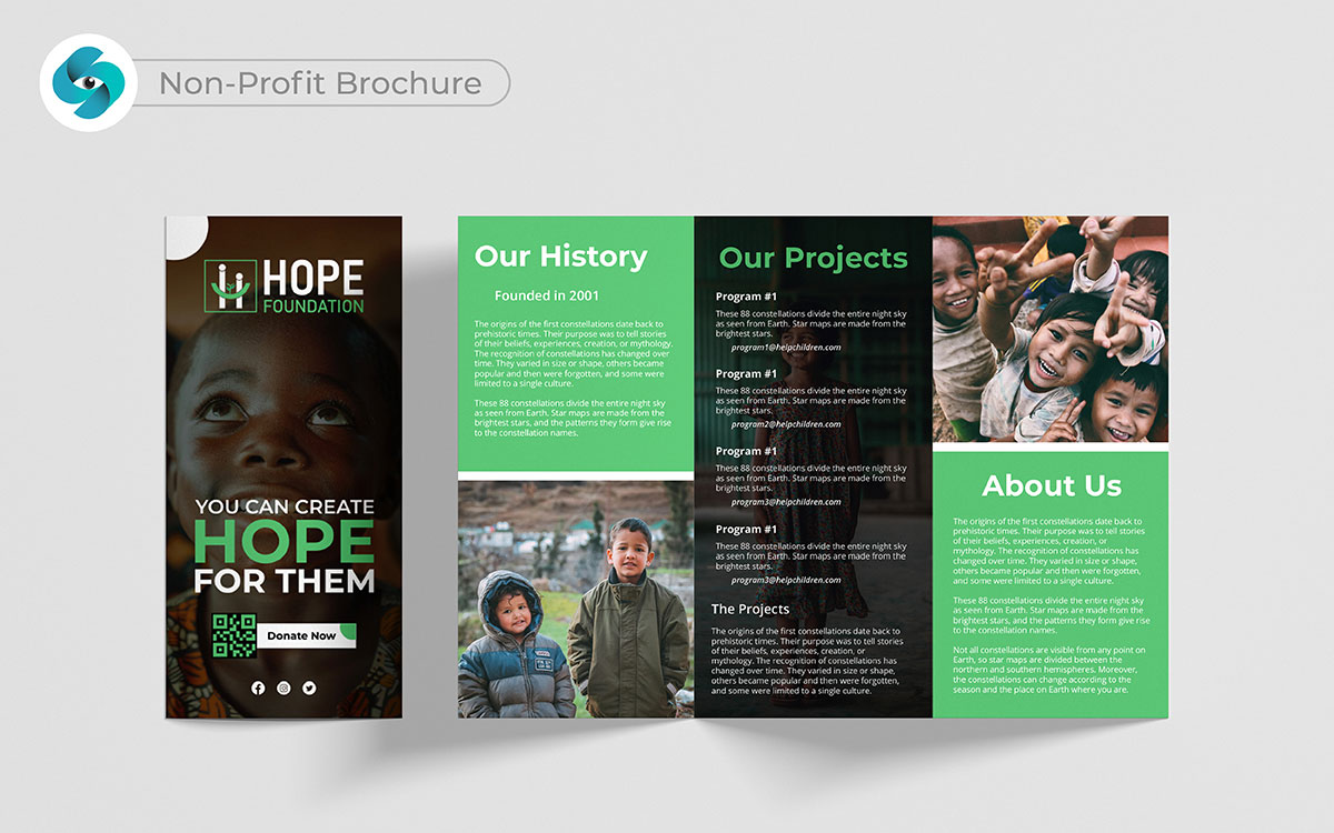
A tri-fold non-profit brochure should inspire action. It’s about connecting with hearts, not just minds. I can’t say for certain, but I have my doubts about cluttering it with too much information.
Instead, focus on your mission and impact. Stories and images of the lives you’ve changed add depth. That’s profound, honestly. Clear sections on how donations help and why your cause matters will encourage support. This is where design meets purpose.
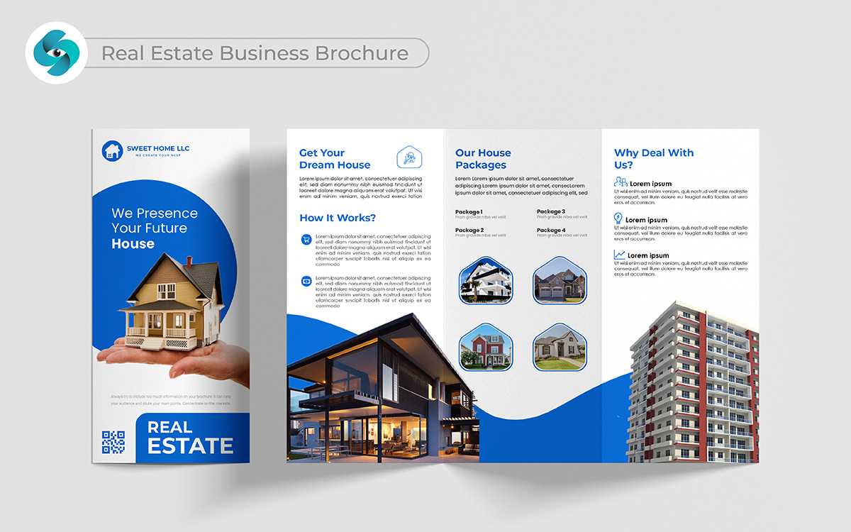
How do you make someone trust you with their biggest decision? A real estate brochure design needs to feel trustworthy and professional. I’m not sure about cramming too much info. Brochure high-quality images of properties paired with easy-to-read sections are key. You can’t ignore that. Clear descriptions of listings and testimonials give buyers confidence. That’s a fact. The design should be clean and organized, guiding readers smoothly through each property option.
Wait a minute, you'll find it interesting. When we worked on a tri-fold real estate business brochure design, we faced a choice about the property listings. You know, it’s kind of cool that we could have skipped making a special section for them; that was an optional part.
But I just had a thought: “What if we added it to make the trendy brochure even better?” It’s pretty wild that our focus on quality pushed us to do it.
We created a special area just for the listings with high-quality images and easy-to-read descriptions. It’s neat to see that this made the top brochure look more organized and inviting.
When we showed it to the client, they were thrilled! You might find it fun to know they appreciated our effort to go above and beyond. I can totally see how our choice made a real difference.
You could say it’s all about providing the best quality. In the end, we didn’t just make a trendy brochure; we created something that helped them stand out. How cool is it that our hard work paid off?
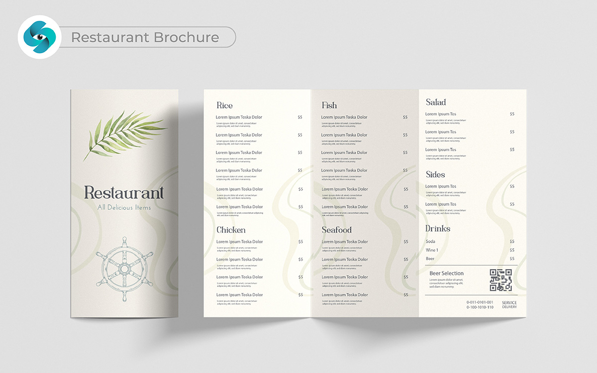
A restaurant brochure should stir up an appetite. Words alone can’t do that—show your best dishes with large, high-quality images. That hits hard—food is a visual experience first. Include simple sections for your menu, specials, and what makes your restaurant unique.
The trendy restaurant brochure design should feel welcoming and make readers want to visit. I’m torn between focusing on atmosphere or restaurant menu, but both need to shine equally. This is where great design makes them hungry for more.
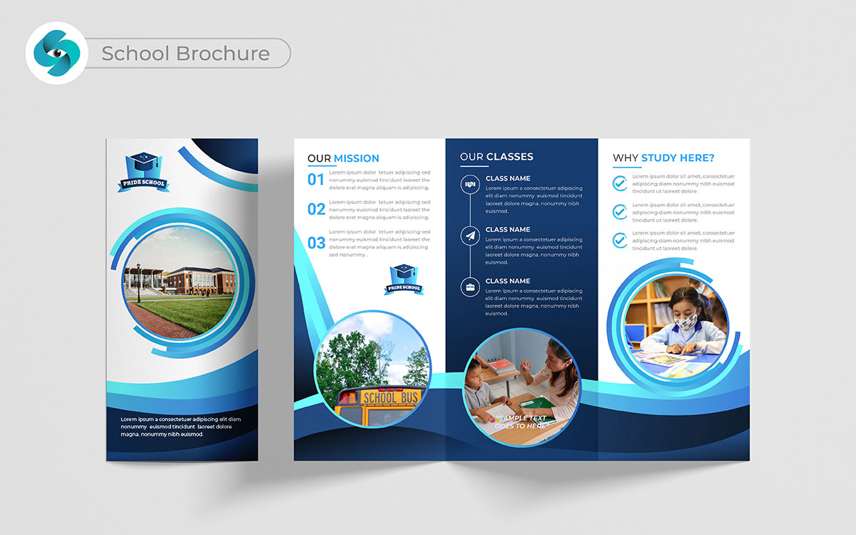
Choosing a school is a big decision. A school brochure should guide parents and students through that process with ease. Wow, that’s deep—education is about more than just programs. Use images of students learning and teachers engaging to make it feel personal.
The school brochure layout should be simple, breaking down academic highlights, extracurriculars, and your school’s values. Something feels off about going too fancy. Keep it warm and approachable to build trust.
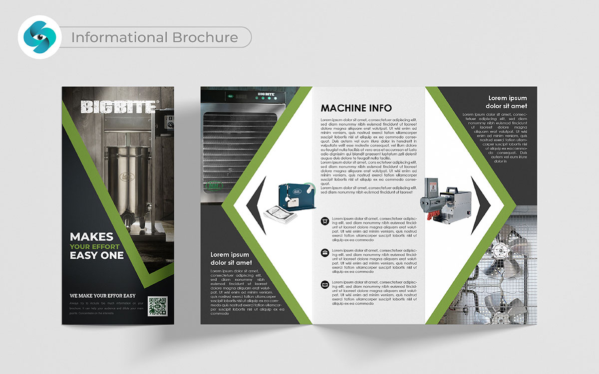
You might think an informational brochure is just about sharing facts, but that’s not really how it goes. It’s more about drawing people in. It sets the stage for your business by clearly explaining what you offer. Customers want to feel like they know you, and this brochure gives them that chance.
I strongly believe in this best design concept. A clear, easy-to-read design helps people see your value quickly. They don’t have to dig for information—it’s all there, laid out perfectly. This makes them trust you more, which leads to more customers. That totally shifts the perspective, right?
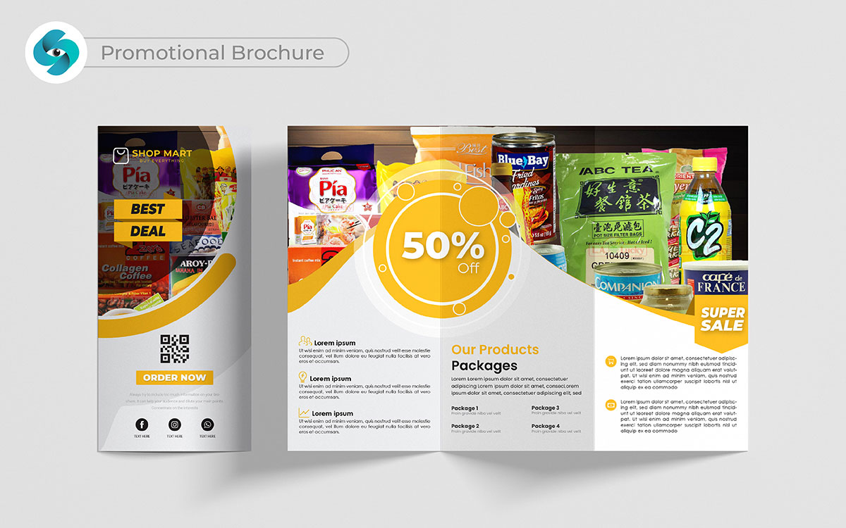
What if your next customer is just a page away? A promotional brochure design can transform how you connect with potential customers. It’s not just about showcasing products; it’s about telling a story and adding something unique in your sales strategy.
Each page should breathe life into your brand, pulling readers in with engaging visuals and compelling text. I believe this is where you can shine. By highlighting offers, testimonials, and the benefits of your services, you create a connection. It’s a way to spark interest and encourage action, guiding people to your door.
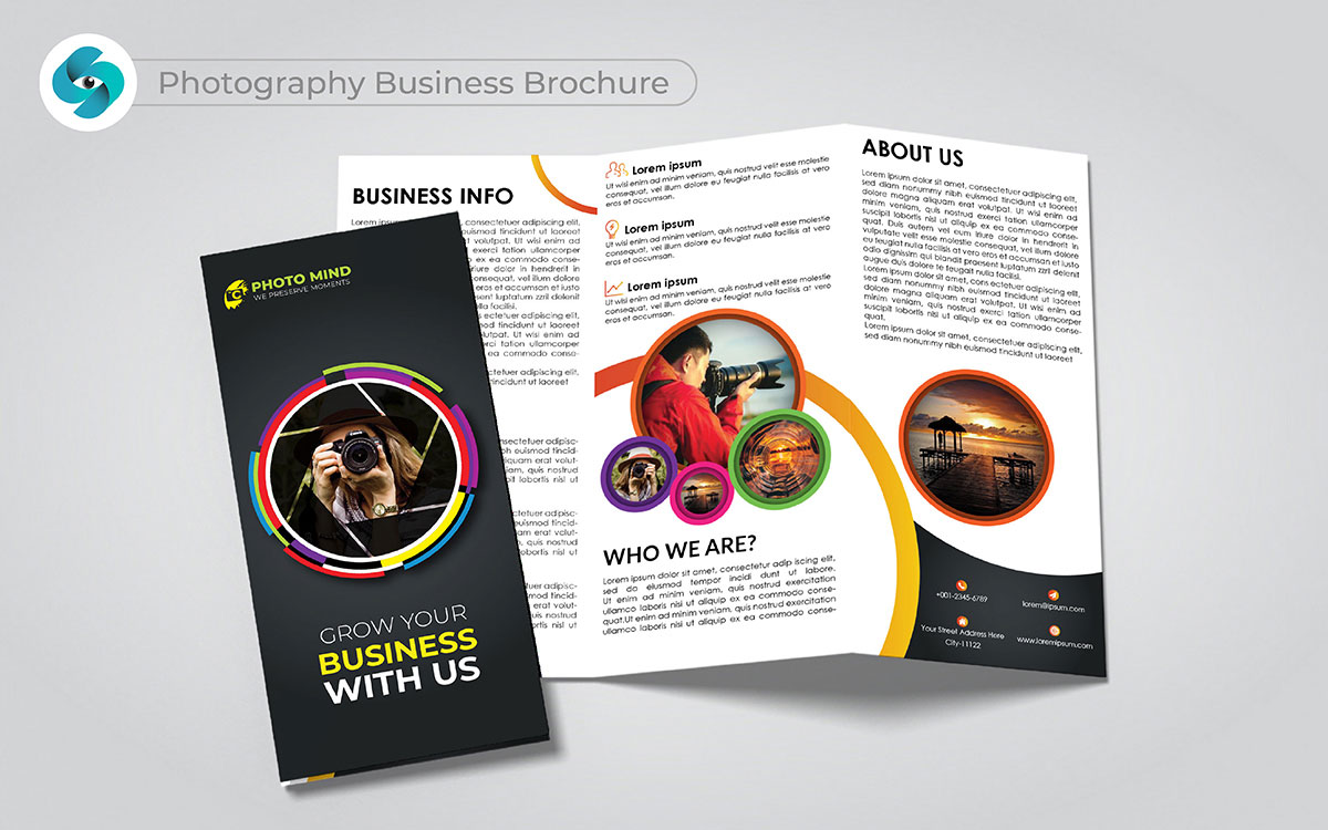
I don’t see it that way at all when people say a photography brochure is just about showing pictures. That’s way too simple. It’s about showing your unique style and how you capture memories. When people flip through a brochure full of your best work, they can imagine you capturing their special moments.
That really strikes a chord with me. It builds an emotional connection. A top brochure that tells your story and showcases your portfolio lets potential clients trust you with their events. You can’t brush that aside.
People want to work with someone they feel connected to, and that’s what this brochure design helps you achieve. You’ll start seeing more inquiries come in, no doubt about it.
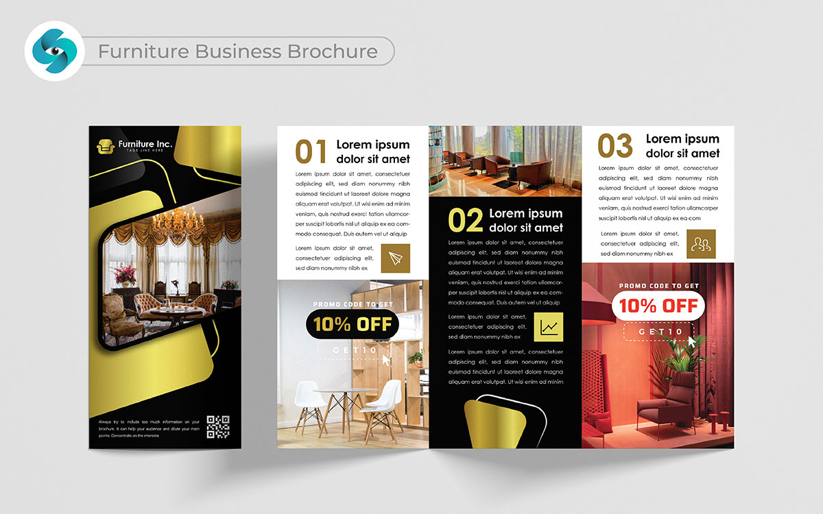
A furniture brochure doesn’t just show pieces; it creates a vision of how your products fit into someone’s life. When you share the story behind the materials or designs, it builds trust. People feel like they’re buying more than just furniture—they’re investing in something meaningful.
That’s definitely something to think about. This emotional branding turns browsers into buyers.
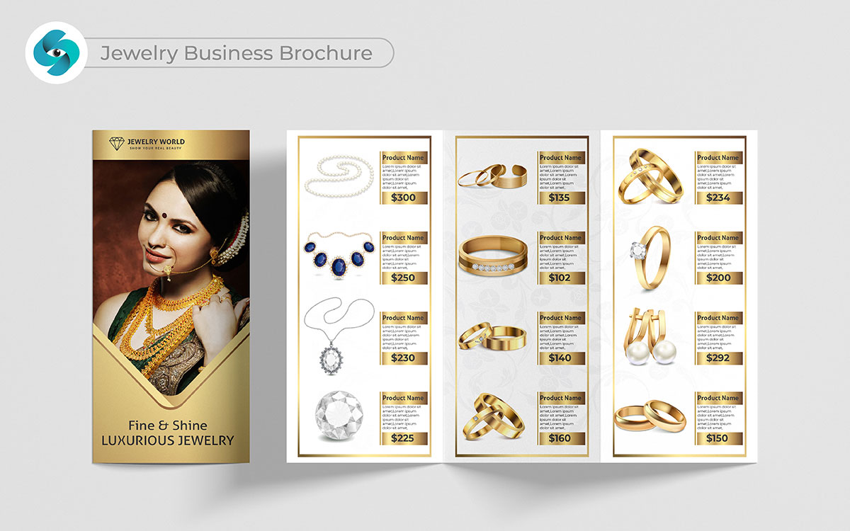
You might think a jewelry brochure is all about glitter and shine. But that’s not how I see it, honestly. It’s about making people feel something when they look at your pieces. That’s a hard pill to swallow for some, but I believe it’s true. The top brochure design highlights the craftsmanship, the personal touch, and the story behind each design.
You make a valid point when you show how each piece connects to emotions or special occasions. This helps people feel like they’re buying more than jewelry—they’re buying a story or a memory.
That’s food for thought, for sure. It makes them want to choose your brand when they’re looking for something meaningful.
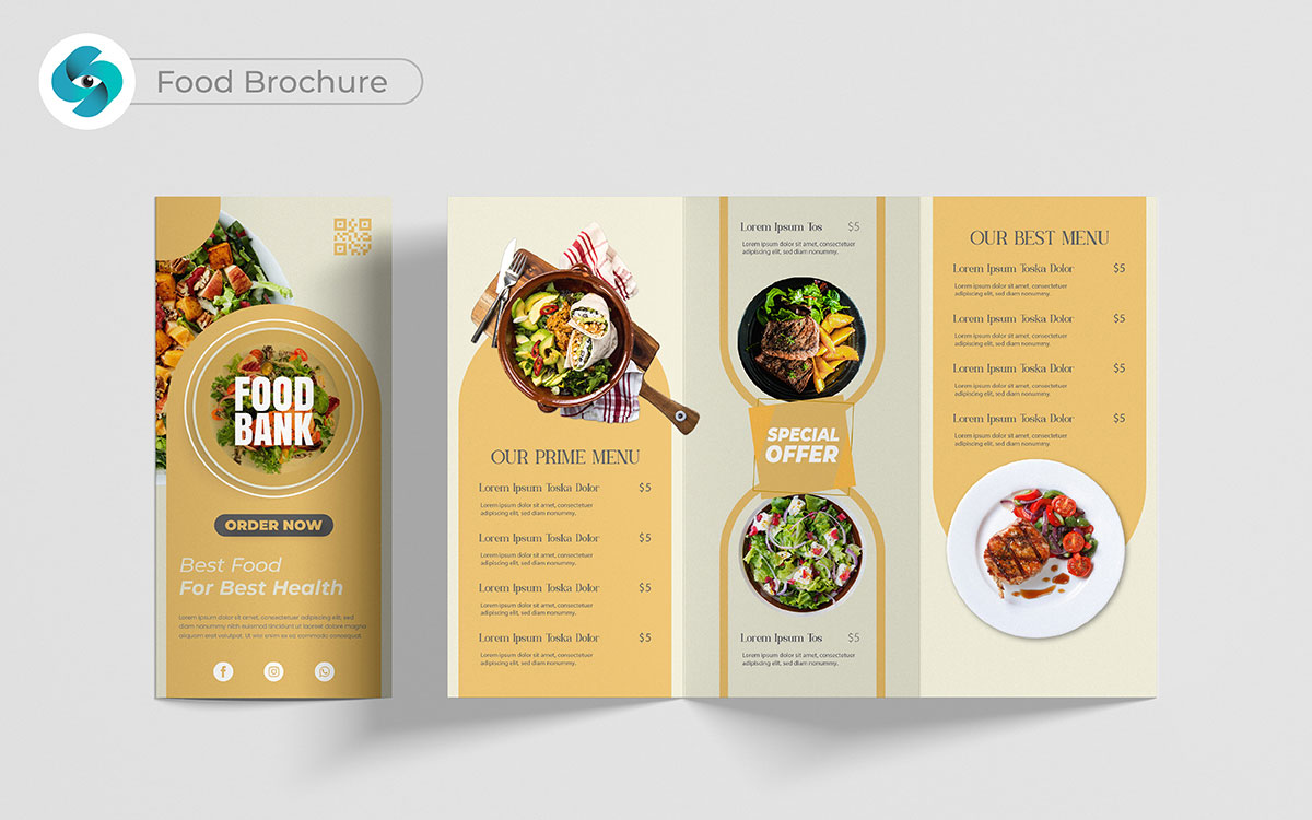
Here is one of the most interesting food brochure design ideas! A food brochure needs to make people hungry—simple as that. That totally shifts the perspective, right? It’s not just about listing dishes or ingredients. You need to show mouth-watering images and describe flavors in a way that makes people want to try it now.
You can’t deny that one. When you show how your food is made with love and fresh ingredients, it helps people feel good about choosing you. It builds trust and makes them feel excited to come in and taste for themselves. I’d go for that any day of the week! That emotional pull leads to more orders, both in offline and online.
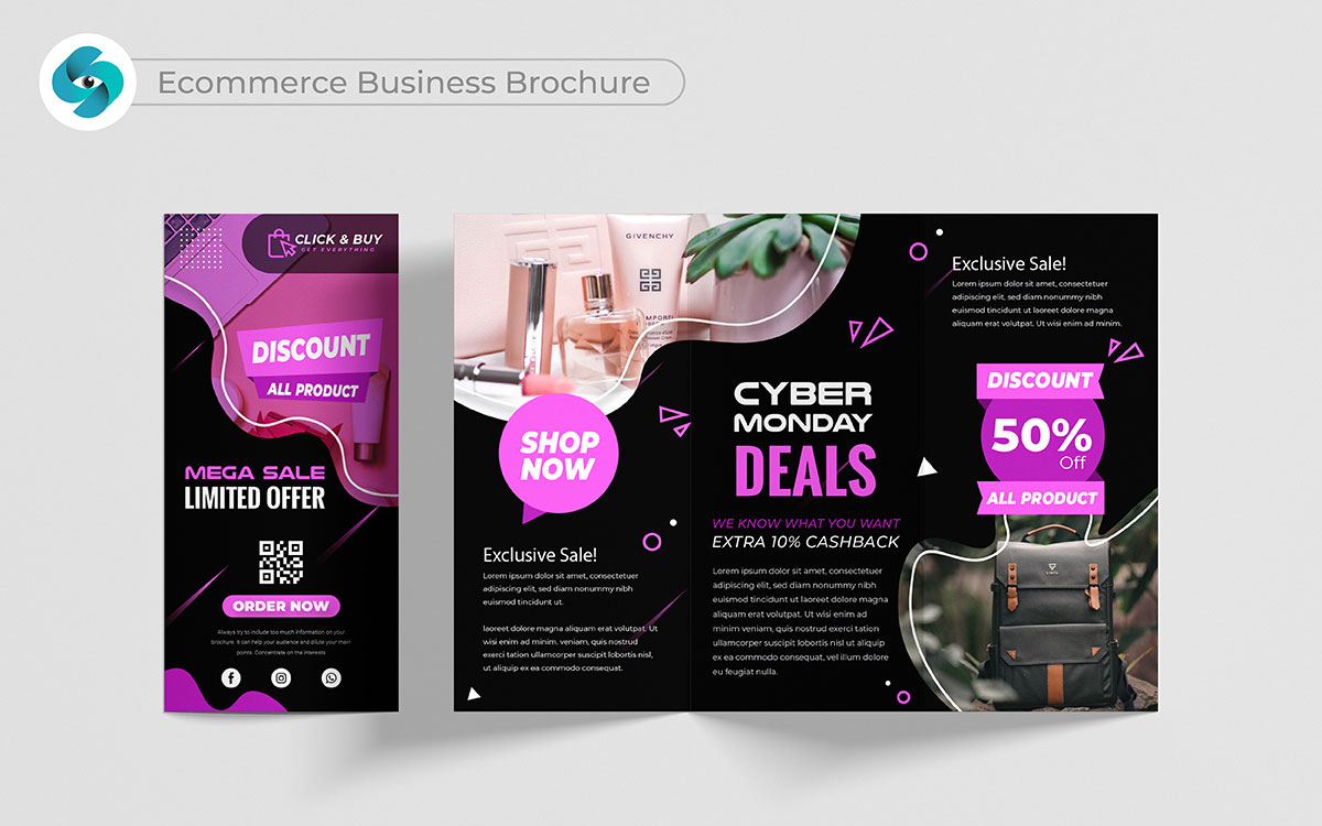
You might think a brochure for an ecommerce business wouldn’t be that important. That’s a good thought, but let’s explore more. An ecommerce brochure builds trust by showcasing your products and giving clear steps on how to shop.
That totally shifts the perspective, right? It helps potential customers feel confident about making purchases online. Include clear images, prices, and simple instructions. This makes it easier for people to buy.
I’m with you 100% on that. A top trendy designed ecommerce brochure helps break down the barriers that make online shopping feel cold or confusing. It turns hesitant visitors into buyers.
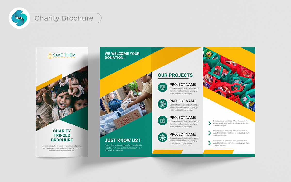
Let’s be real for a second—getting people to donate is hard. That’s not the full story, though. A charity brochure design can do more than just ask for money. It can show real stories of impact, and that emotional pull gets people to care.
You could look at it that way, but here’s the thing: when people feel connected to your cause, they’re more likely to support you long-term. That’s where it gets interesting because loyal supporters bring in more donors.
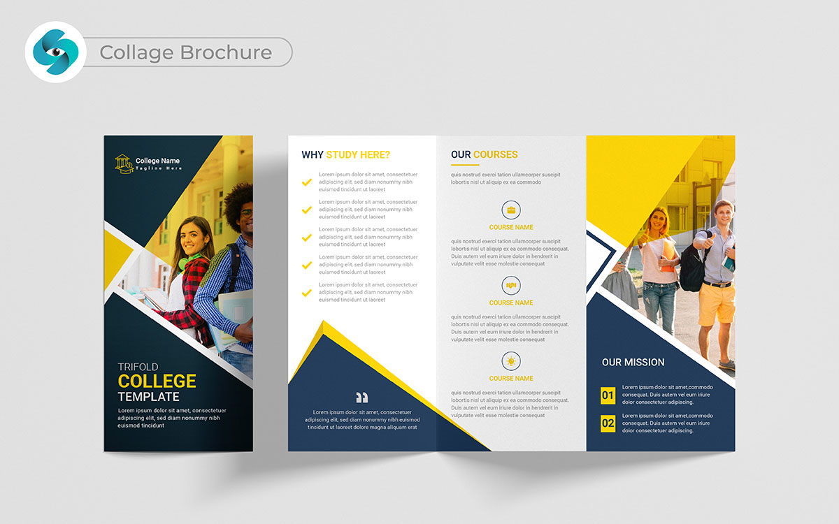
I see where you’re coming from, but a collage brochure isn’t just about blending pictures. Honestly, it’s not that simple. It’s about showing different parts of your business in one top trendy brochure design.
Let me break it down. When people can see a range of what you offer, they get excited. They start thinking about how you fit into their lives.
That’s just scratching the surface. Here’s where it gets good—a creative layout makes you stand out. And when you stand out, clients remember you. That’s how you keep them coming back.
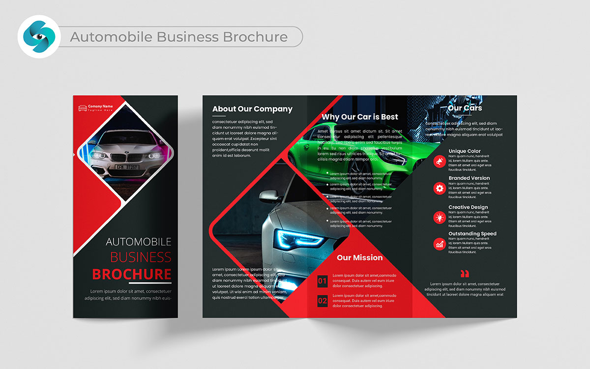
Well, here’s the thing… Most of us think that an automobile brochure is just a list of cars. It’s actually a part of the equation. You’re showing potential buyers how your cars can fit into their lives.
Whether it's safety, luxury, or adventure, you’re telling a story. But here’s the kicker: when people see themselves in those experiences, they feel ready to make a purchase. That’s just scratching the surface of how you build trust, and trust leads to loyal customers.
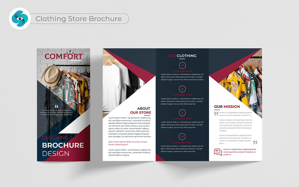
Wait, hear me out. A clothing store brochure design isn’t just about showing your latest collection. I wouldn’t be so sure that’s enough. It’s about style and lifestyle. Let me flip the script for a second—when you show people how your clothes fit into their world, whether it’s casual, business, or trendy, you create emotional branding. And here’s where it gets good: they don’t just buy clothes; they buy a feeling. That emotional hook turns casual shoppers into repeat buyers.
You know, that reminds me of a project we did for a clothing brand. They needed a trendy brochure to show their style.
It’s amazing how often we forget that a brochure can tell a story. We decided to show real people in their clothes. Just picture this: a woman at a cafe and a guy at a concert.
I realized that connecting fashion with everyday life makes a strong bond. The client loved our ideas! We filled each page with bright pictures and fun stories.
Believe it or not, the brochure was a big hit! The client was thrilled. They saw how we made their clothes feel special.
You might be surprised to hear that this brought in many new customers. It’s funny—by sharing stories, we helped the brand connect with people.
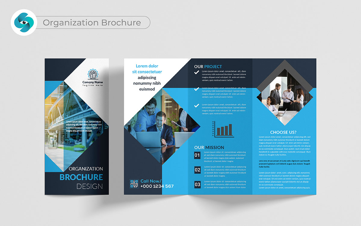
You’ve got a point, but here’s the thing—a great organization brochure goes beyond just explaining what you do. That’s where things get tricky. It has to show the real benefits of working with you.
Let me throw this out there: stories, visuals, and real-life examples make all the difference. They show people why you matter. Yeah, but here’s another angle. When people see how organized and effective you are, they’re more likely to get on board.
That’s where the customer growth comes from. And that’s what leads to lasting partnerships.
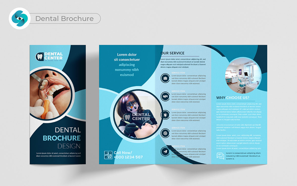
How does a great smile change lives? A dental brochure design must showcase more than just services. Let me stop you right there. Patients are looking for trust when it comes to their smiles. I have seen firsthand how a brochure filled with real patient testimonials and before-and-after pictures creates that trust.
Here’s where it gets real: when potential patients feel reassured, they are more likely to schedule an appointment. That builds loyalty, and loyal patients return time after time.
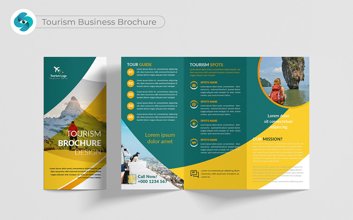
Travel opens doors to new adventures. A custom tourism brochure can transport potential customers before they even arrive at your destination. I have worked with businesses where we showcased the local culture, must-see spots, and hidden gems, and here’s the fun bit: it excited people to visit.
But that’s not the whole deal. When you create a vivid picture, you give them a reason to choose you over others. That’s where you win more bookings.
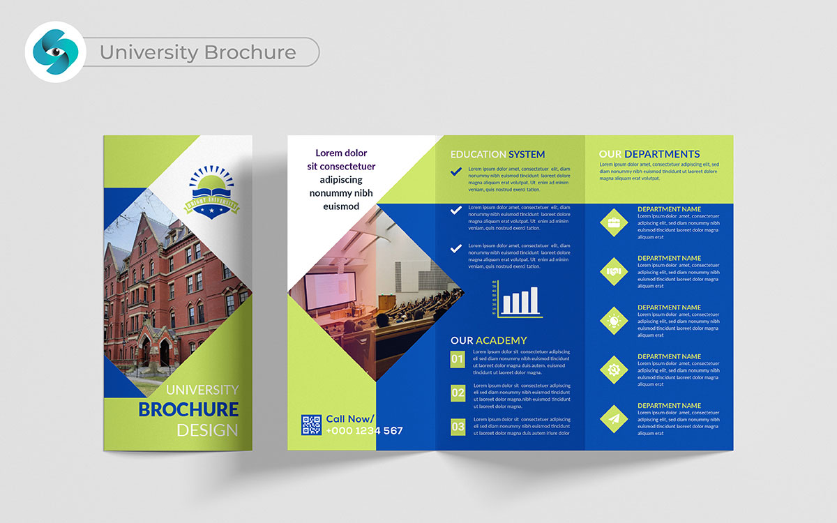
What makes a university stand out in a sea of choices? A university brochure must convey more than just a list of programs. I have been involved in creating trendy brochure designs that highlight student success stories, vibrant campus life, and career opportunities.
Here’s something you might have missed: students want to feel connected to a community. When a best brochure connects on an emotional level, it encourages students to apply. That’s how universities attract more applicants and cultivate a thriving student body.
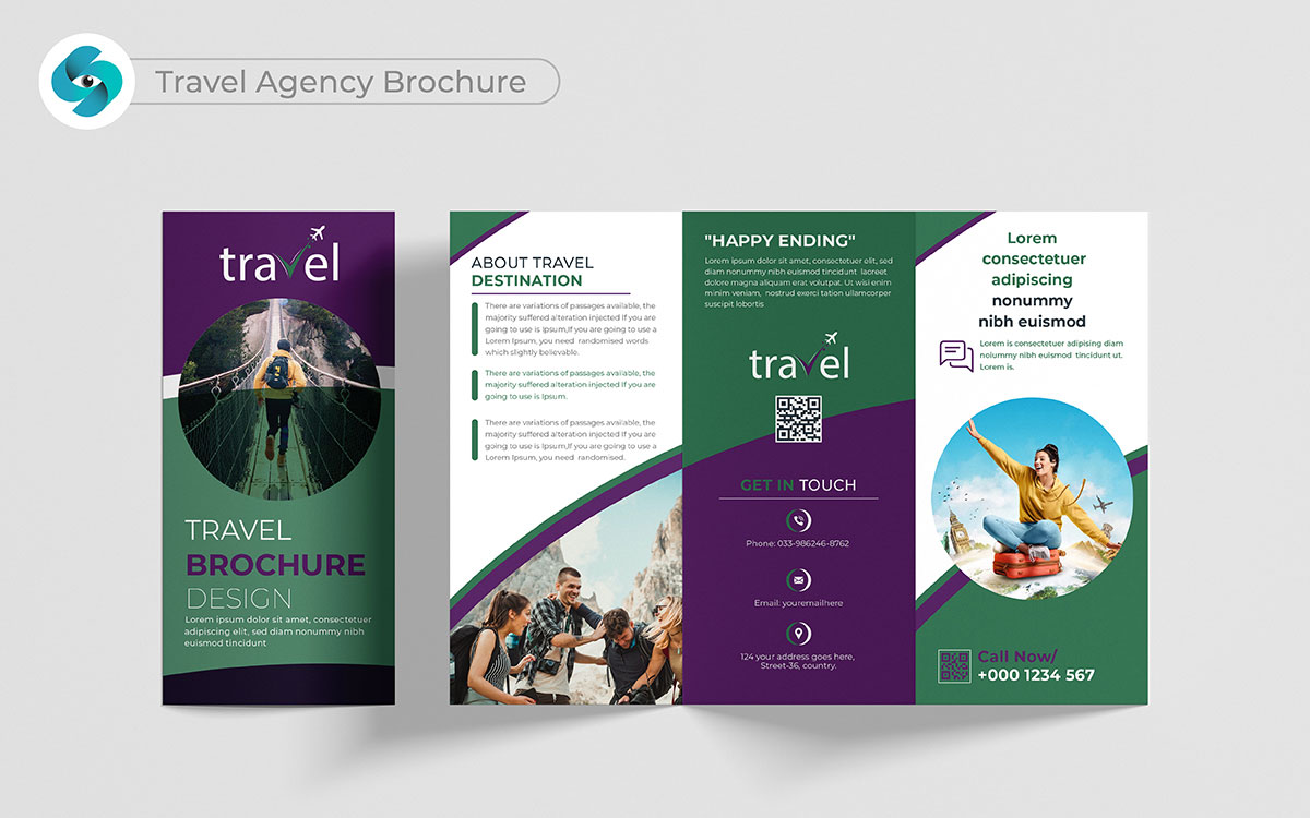
Travel dreams come alive with vibrant experiences. A travel agency brochure design must inspire wanderlust and curiosity. When people see pages filled with stunning destinations and exciting activities, they feel the adventure calling. It’s about more than just trips; it’s about creating connections. By showcasing personalized itineraries and unique local experiences, you invite customers to imagine their journey.
That’s where the magic happens: when travelers see themselves enjoying those adventures, they become eager to book. Building that excitement turns dreams into reality and creates loyal customers who return for more.
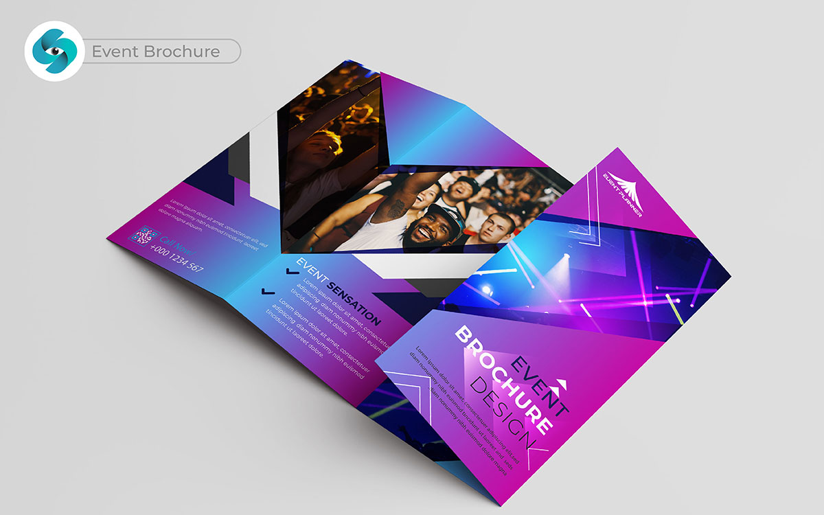
What makes an event unforgettable? An event brochure must do more than just share dates and locations. That’s only the tip of the iceberg. By highlighting the energy, key speakers, and engaging entertainment, the brochure can create buzz.
Here’s the catch: potential attendees need to feel they will miss out if they don’t participate. When the excitement is palpable, the brochure draws people in. They register, they attend, and soon your event becomes a must-visit, attracting even more customers for future events.
You know what’s interesting? We were hired to design an event brochure for a charity gala. We had only one week to finish it! It’s funny how that works—tight deadlines can spark creativity.
Just so you know, the pressure was on. I really believe that challenges help us do our best. We got all the details and started working right away.
Then, the client called with a surprise. They wanted to change the theme from a “garden party” to a “masquerade.” I have to mention, we were a bit shocked! But instead of panicking, we saw it as a chance to be creative.
You might find it useful to know that pressure can bring out great ideas. We worked late at night, designing beautiful masks and bright colors.
When we showed the final brochure, the client was very happy! It’s pretty clear that our hard work paid off. At the gala, guests loved the trendy brochure and it helped set the mood.
Let’s face the facts: tight deadlines can lead to amazing results. I can’t help but wonder how these moments make us love design even more!
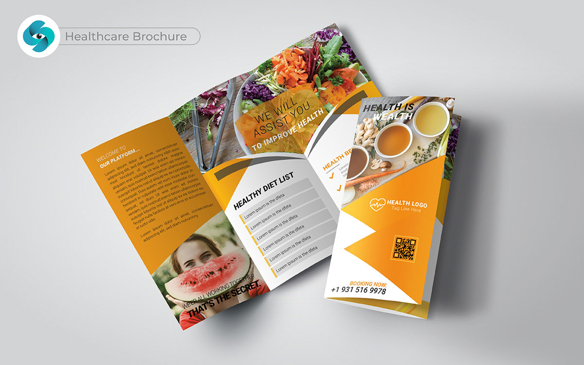
Good health is very important. A healthcare brochure must build trust and show care. Here’s a thought for you: when patients see clear information about treatments, they feel better. Imagine this for a second: testimonials and success stories can really help.
A creative brochure design attracts more patients. When people feel connected to your services, they are more likely to choose you. This is where creative healthcare brochure design ideas come into play; they can highlight your unique offerings and create a lasting impression. I remember how a simple brochure design helped a friend pick the right clinic. It made her feel good about her choice.
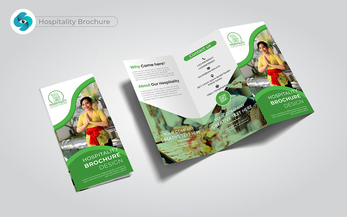
What makes a stay truly special? Comfort and service make a big difference. A hospitality brochure should show what makes you unique. Let me paint a different picture: stunning pictures of cozy rooms and tasty meals create a warm feel.
Think about it this way: when potential guests see what you offer, they can picture themselves enjoying their stay. Here’s the kicker: a strong brochure invites bookings and brings customers back. I’ve seen how a beautifully made brochure can lead to more reservations.
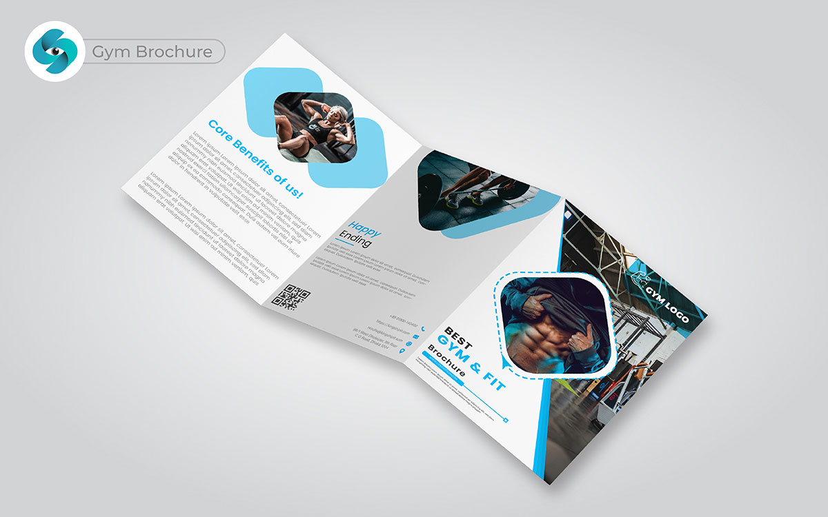
Fitness can change lives. A gym brochure design must inspire and motivate. Here’s a fun fact for you: bright pictures of workouts and happy members attract people.
You know what’s wild? When potential clients see others achieving their goals, they feel encouraged to join. Highlighting special offers for beginners can create excitement. So, picture this: a top trendy brochure connects with people and helps bring in new members.
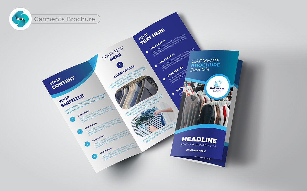
What if you could show your unique style? Style matters a lot. A garments brochure must highlight the latest trends and classic pieces. Here’s where it gets spicy: eye-catching pictures of clothes and accessories attract customers. So, picture this: when they see how the items fit into their lives, they start to imagine wearing them.
Highlighting special promotions creates an urgency to shop. I found a favorite clothing brand through a brochure that caught my eye. It shows how effective these materials can be.
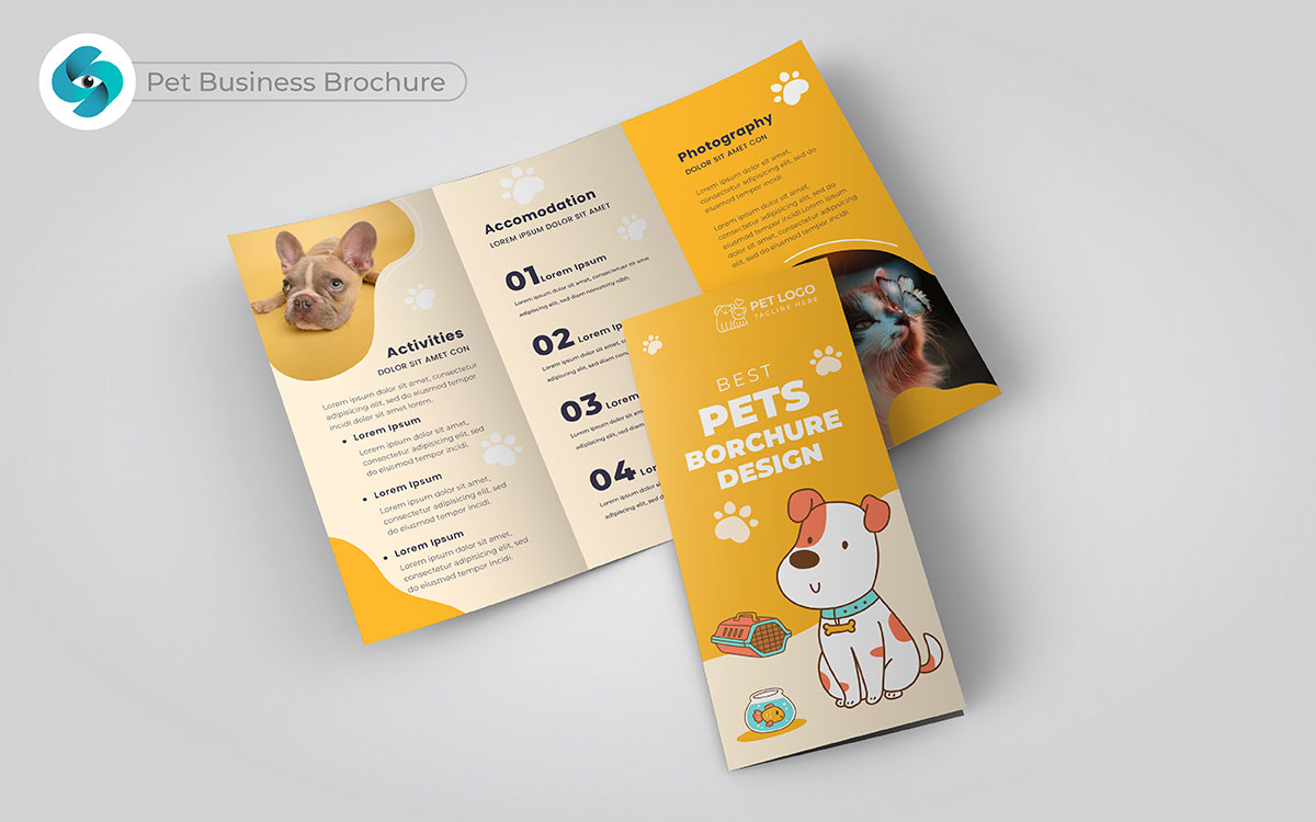
Pets bring joy to our lives. A pet business brochure design must show love and care for animals. Here’s a little twist for you: happy pets with your products create a strong bond. Imagine this for a second: when pet owners see how your items improve their pets' lives, they feel excited.
Helpful brochure design tips build trust. Here’s the deal, though: a great pet brochure design attracts more customers and creates lasting bonds with pet lovers.
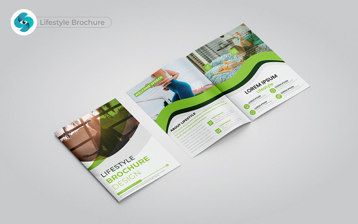
What if life could be even better? A lifestyle brochure design must inspire and motivate. You might want to rethink that: it should reflect what your audience cares about. Let’s unpack that a bit more: using bright pictures and personal stories creates a connection.
When people see how your products improve their lives, they feel encouraged to explore. I often feel drawn to brands that tell a story through their brochures, making me want to learn more.
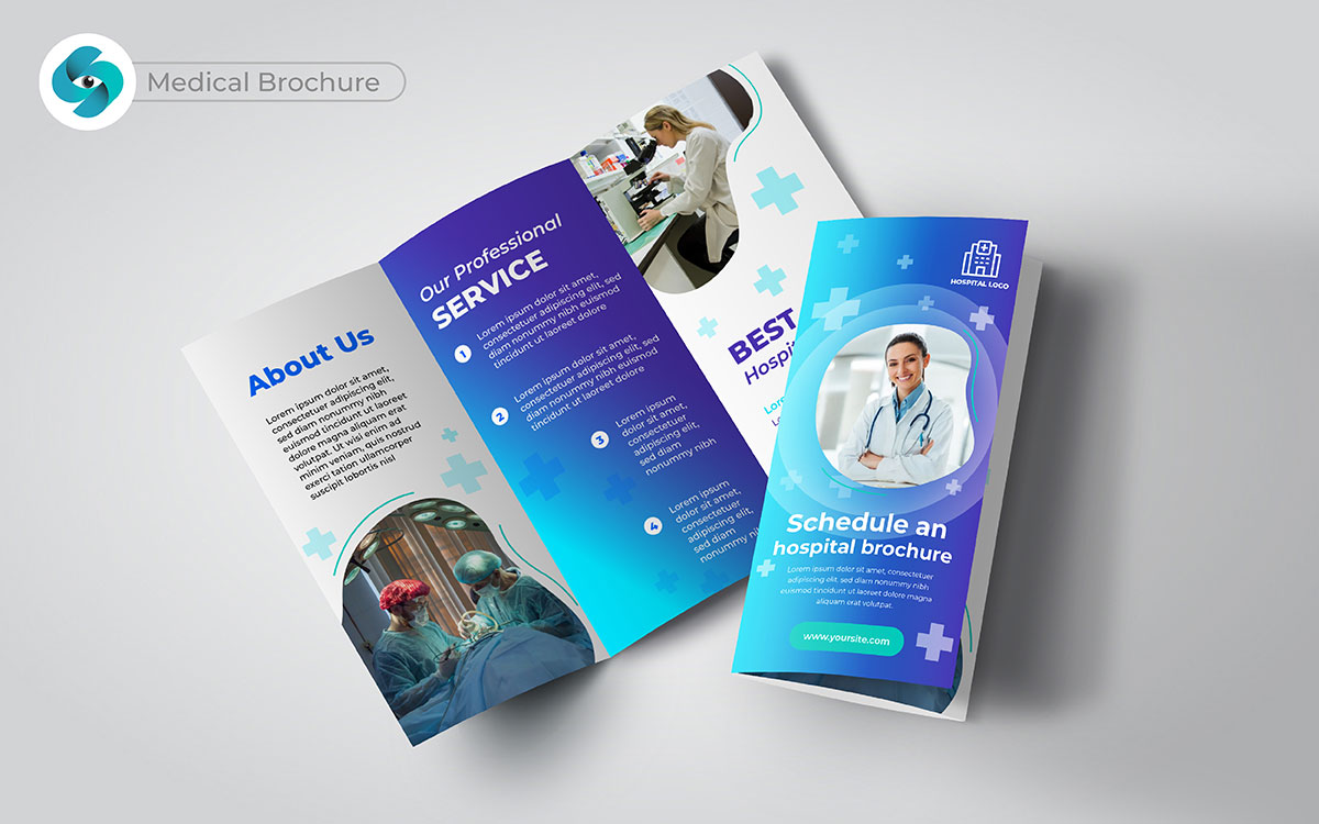
Health is important. A medical brochure must give clear information and build trust. So, let’s break this down a bit: when patients read about your services, they feel reassured.
Just for kicks, what if I told you that highlighting success stories can help them feel confident in choosing your practice? A trendy brochure design encourages patients to reach out, leading to more appointments and loyal patients.
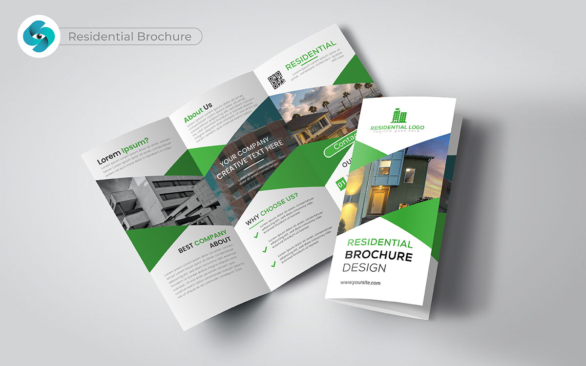
Have you ever walked into a home and felt at ease? Home is where the heart is. A residential brochure design must capture the feel of a property. Here’s where it gets interesting: beautiful pictures, detailed descriptions, and unique features help potential buyers imagine their future home.
Let’s shake things up a bit: highlighting the neighborhood and local amenities adds value. An appealing brochure attracts more interested buyers, leading to visits and offers.
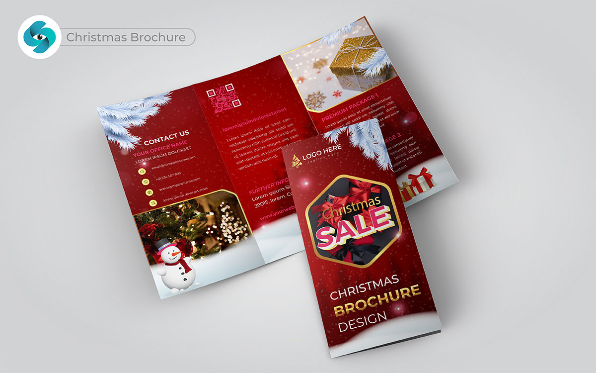
What makes the holiday season special for you? A good Christmas brochure design can bring joy and excitement. You’re going to love this twist: unique gift ideas and fun holiday events draw customers in. They’ll be blown away! When they see festive decorations and happy images, they will feel the holiday spirit.
I can’t help but wonder how a brochure can help people make great memories. You can’t ignore this: connecting with your audience is key to boosting sales during this special time.
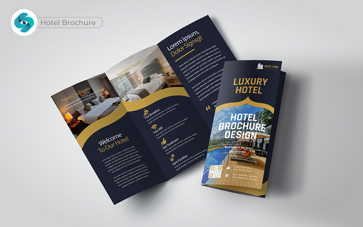
Comfort and relaxation make all the difference. So, imagine this scenario: a hotel brochure shows cozy rooms, beautiful views, and fun local attractions. Here’s the scoop you’ve been waiting for: highlighting unique amenities can set your hotel apart. You’re about to see it in a whole new light: when guests feel excited about their experiences, they are more likely to book their stay. Let’s spice things up a bit by including special deals or price packages to boost interest and reservations.
You will be amazed to know! We once got a message to design a hotel brochure. The client wanted something special. You know what’s funny? They felt their old trend brochure didn’t show off their nice hotel.
I mean, it makes sense that first impressions matter. We knew we had to make it charming and easy to read.
In a way, it’s like telling a story. We used beautiful images and simple text. Let’s be honest here; we wanted guests to feel welcome right away.
After a few drafts, we showed the client our design. I can’t help but think they were nervous at first. But when they saw the final product, their eyes lit up!
Honestly, who doesn’t want a brochure that shines? They were very happy with the result. So, what’s the deal? We listen, create, and deliver. The hotel loved it, and we felt proud!
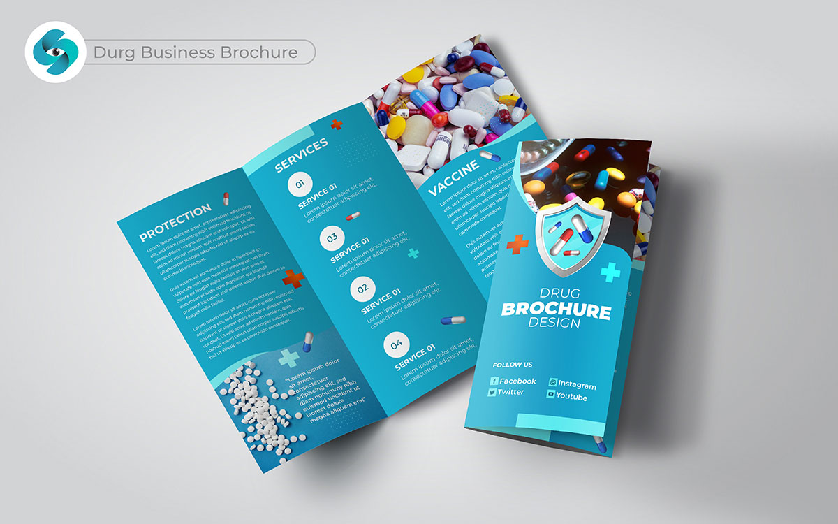
Ever thought about how medicine can change lives? Medicine plays a big role in our health. Here’s a little nugget of wisdom: a drug business brochure should explain your products and their benefits clearly. Let’s dive into the unexpected: adding testimonials from healthcare professionals can build trust with potential clients.
You won’t want to miss this part: when customers see how your products can help them, they feel confident about purchasing. This might blow your mind when you realize that creative brochures can lead to a big increase in sales.
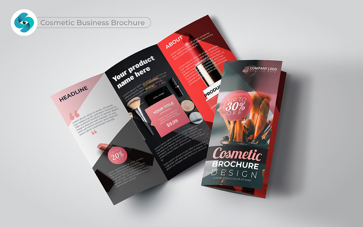
Beauty comes in many forms. Let’s flip the script for a minute: a cosmetic brochure design should show how your products enhance natural beauty. You’re in for a treat with this one: stunning visuals and clear product descriptions grab attention.
Here’s a plot twist for you: by including makeup tips or tutorials, you can engage your audience more. I bet you didn’t see this coming! When customers see how your products can transform their looks, they are eager to try them.
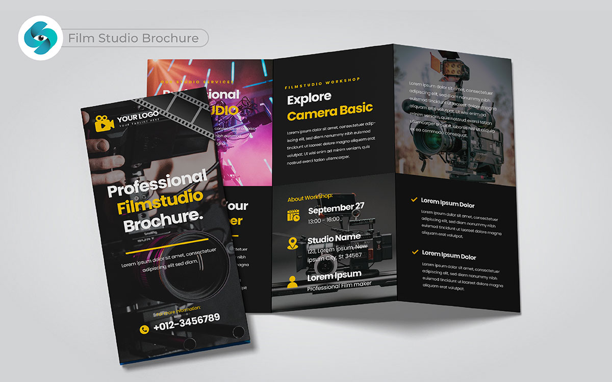
What if I told you your next big project is just a brochure away? A film studio brochure design must show creativity and excitement. Let’s spice things up a bit: show amazing pictures from past projects. Just picture it for a moment: when clients see high-quality images, they can imagine their ideas coming to life. Now, here’s the juicy part: sharing behind-the-scenes stories makes the brand feel friendly.
This builds trust and invites filmmakers to work with you. You won’t believe what happens next: a trendy brochure can lead to new clients and fun projects. Here’s a little nugget of wisdom: the top class brochure can change everything for your studio marketing.
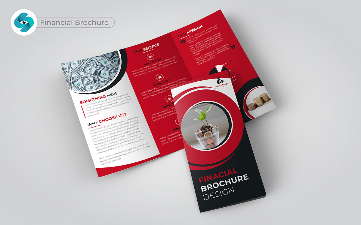
Ever thought about it like this? A financial brochure design can attract more clients. Here’s the scoop you’ve been waiting for: clear and simple information builds trust. Let me hit you with a fun fact: infographics make complex data easy to see. This might blow your mind! When potential clients see the value of your services in a visual way, they are more likely to call you.
Here’s something to tickle your brain: adding testimonials can turn doubt into trust. I bet you didn’t see this coming: a good financial brochure can lead to more calls and a stronger client base. Buckle up; this is a ride toward success for your business.
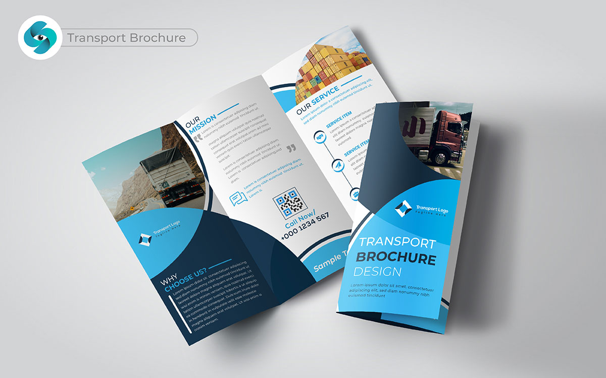
I often wonder how many businesses miss the power of a transport brochure design. You’ll want to hear this part: it’s not just about routes and schedules. It’s about showing safety and reliability. Just picture this: potential clients see images of your clean, nice vehicles. They’ll be blown away by your care for quality.
He just dropped a truth bomb by adding happy customer testimonials. This builds trust and invites new inquiries. When your transport brochure shows on-time deliveries and happy customers, they’ll wish they knew this sooner.
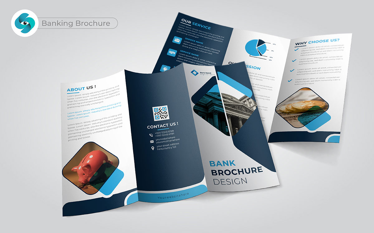
What makes a bank stand out? Trust and reliability are very important. A banking brochure design must show the benefits you offer. You’re going to love this twist: highlighting special promotions or low-interest rates grabs attention.
They say this changes everything! When customers see how you can save them money, they become interested. I can feel the excitement building when they find new services like mobile banking or personalized advice. That’s how a creative brochure brings in more clients for your bank.
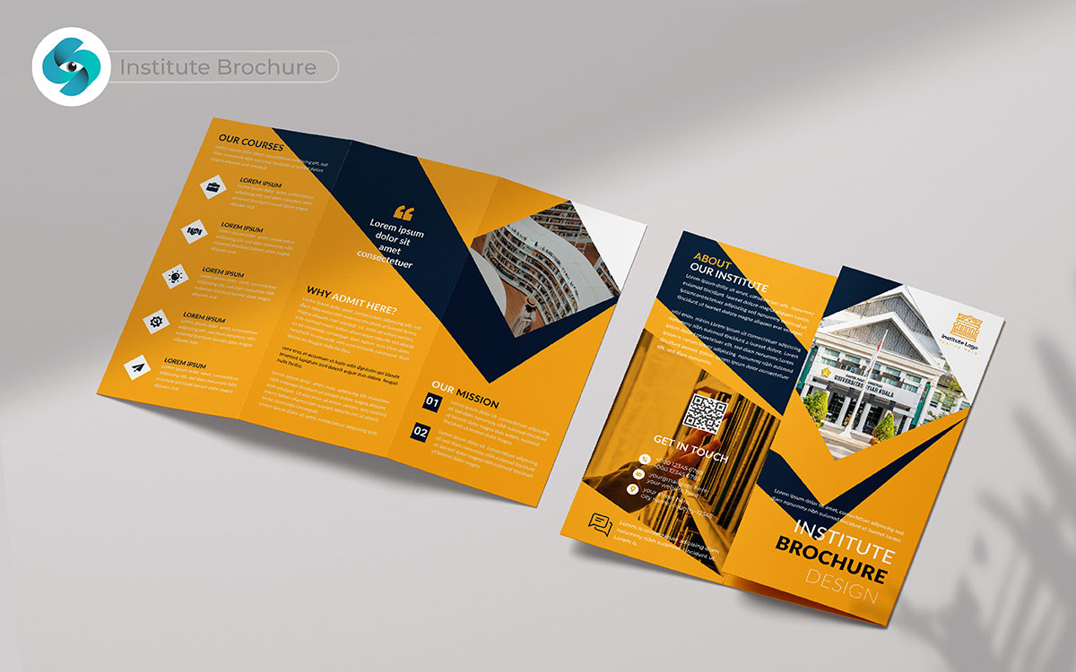
I can feel the excitement building for a great institute brochure. You’re going to love this twist: it’s more than just course lists. It’s about sharing the vision that makes your school special. Here’s something to think about: adding alumni testimonials helps future students connect.
They show real success stories. I have to admit, that’s interesting! When students see where they could end up, they’re more likely to enroll. A top class institute brochure design can guide them on their journey.
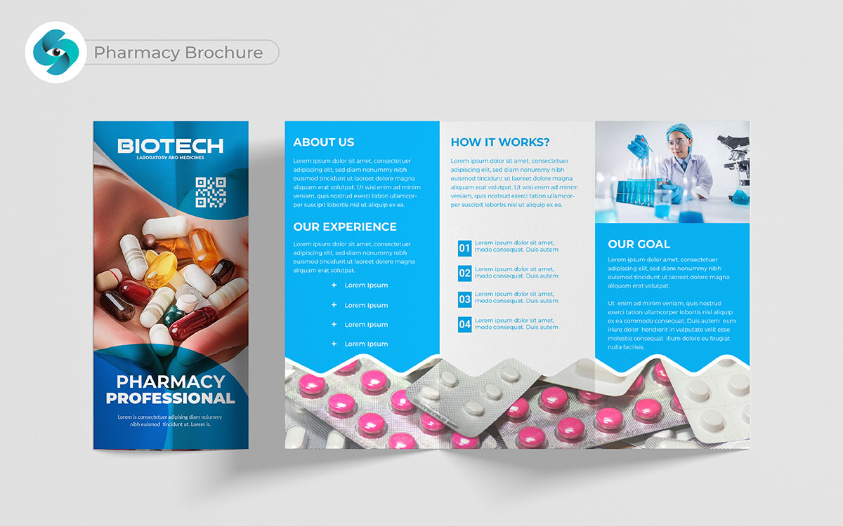
What do you want in a pharmacy? Convenience and care are key. A pharmacy brochure should highlight helpful services. You might find this surprising: info on health screenings and shots shows you care about their health. You’ll want to hear this part: when people see all the products and services, they feel confident in picking your pharmacy.
I can’t help but wonder how a trendy brochure builds trust and makes people feel comfortable. That’s how a great pharmacy brochure can attract more customers and keep them coming back.
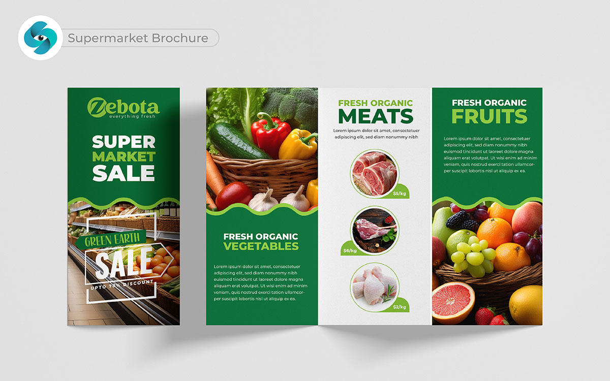
Do you think just listing products is enough? Actually, it’s really about connecting those products with people’s lives. When a supermarket brochure design highlights weekly deals, seasonal discounts, or fresh arrivals, it speaks to how much people want to save money. Just imagine someone flipping through your brochure and seeing their favorite fruits are half off.
They’ll probably make a special trip just for that. To be honest, adding recipes or meal ideas can make a grocery list feel like a full experience. By exploring creative brochure design ideas, you can enhance this experience even more, making the brochure not just informative but also inspiring. You won’t believe how many customers start visiting regularly when they feel like they’re getting more than just products.
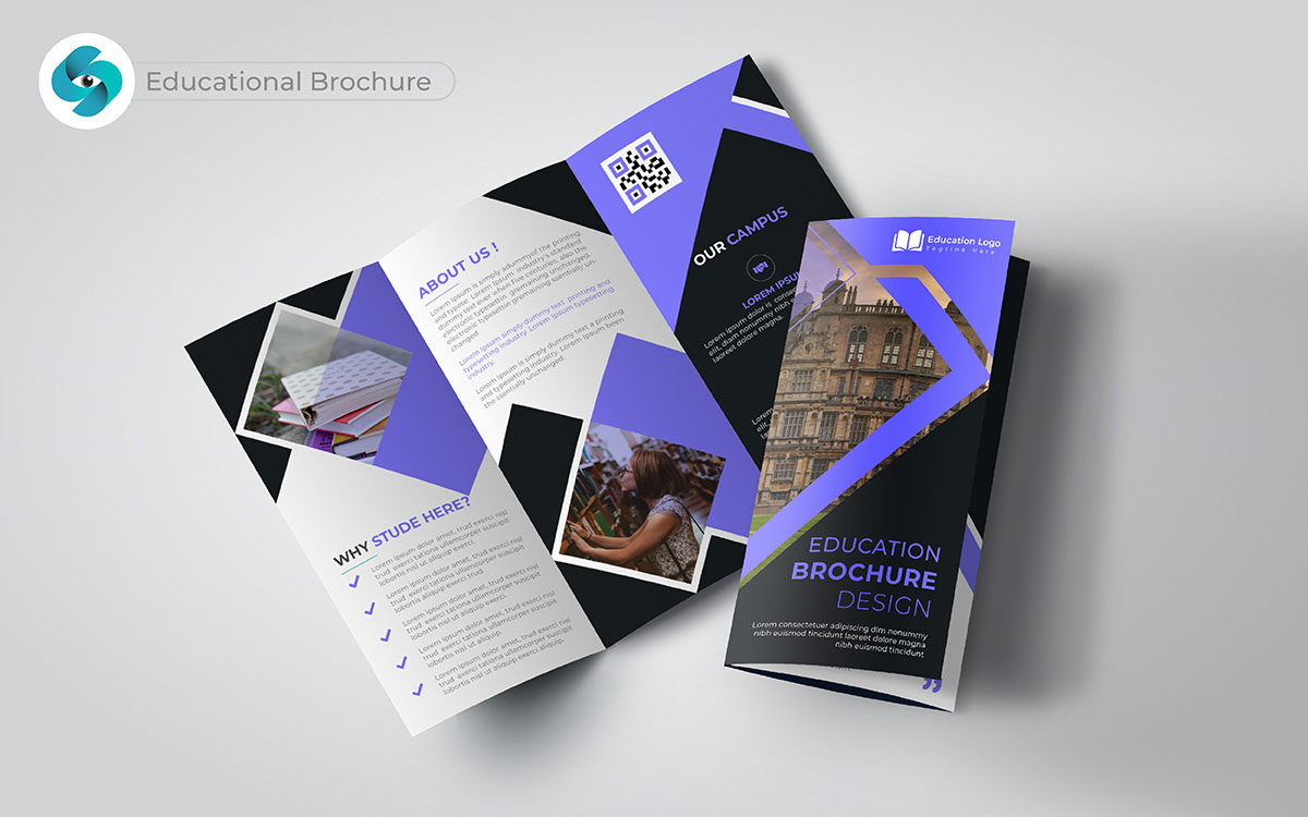
Now, how do you make parents or students believe your program is the best choice? I’ve seen that showing real-life success stories or testimonials builds trust fast. When people see how others have benefited, they’re more likely to sign up.
Guess what? A trendy educational brochure clearly lays out your curriculum and extracurricular activities. And trust me, this makes it easier for parents to decide. I remember a parent once telling me that a brochure with real photos of students made them feel like their child would fit in perfectly. It builds a sense of belonging, making them excited to join.
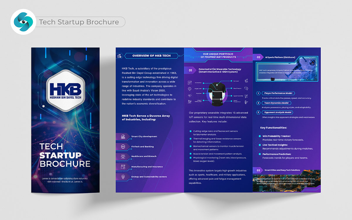
In the tech world, there’s always the question: “How will this product make my life better?” Actually, a brochure that clearly shows the problem your tech solves can do wonders.
You know what? People love innovation, but they need to understand how it works. I’ve noticed that using diagrams, user stories, and simple words to explain technical features gets customers excited. Showing the future potential of your product is important, too.
I mean, when they see how your tech will grow, it gives them confidence to invest early. They say this changes everything because a best teach brochure can make even a complex tech product feel simple.
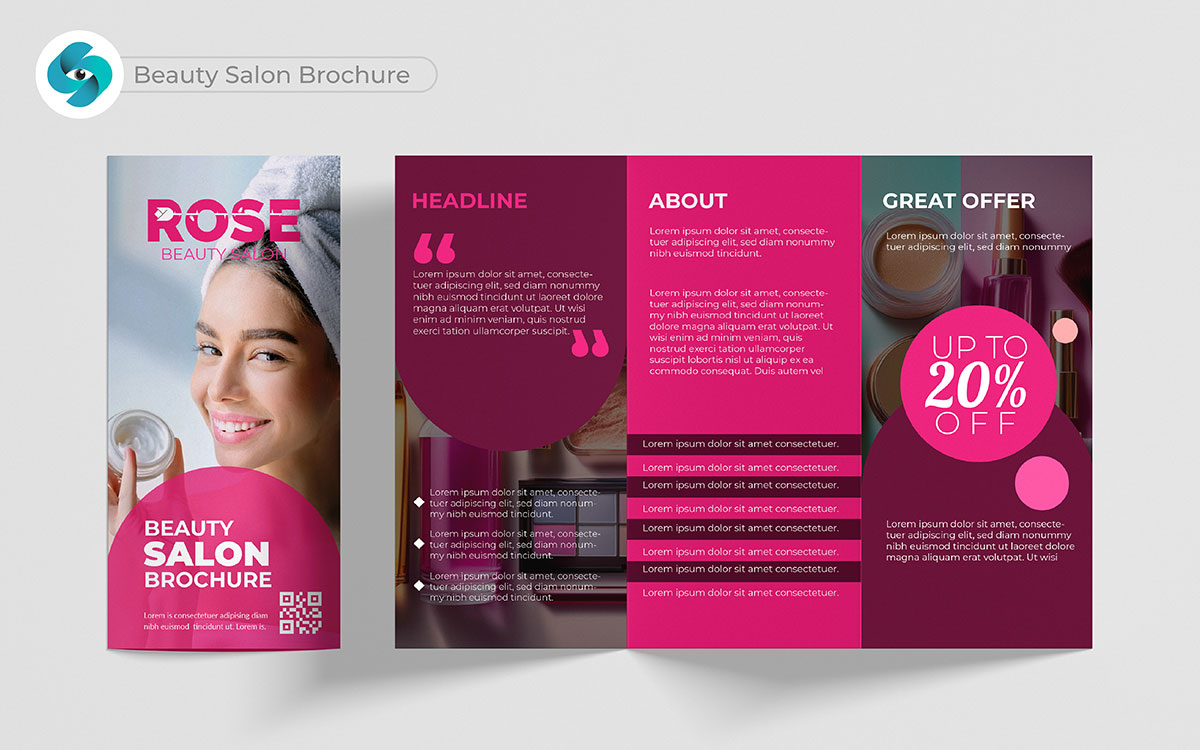
Here’s something you’ll love—beauty is as much about emotions as it is about services. A beauty salon brochure with before-and-after photos helps clients picture themselves with a perfect haircut for glowing skin. To be honest, when I got my salon brochure right, appointments just started rolling in. Seriously, showing customer transformations and listing detailed services builds trust. Imagine a potential client seeing the exact steps of your skin treatments—they’ll feel like they know what to expect and can trust the process.
And honestly, offering a first-visit discount in the brochure creates a “why not try it” feeling. They’ll be excited as they imagine their own transformation.
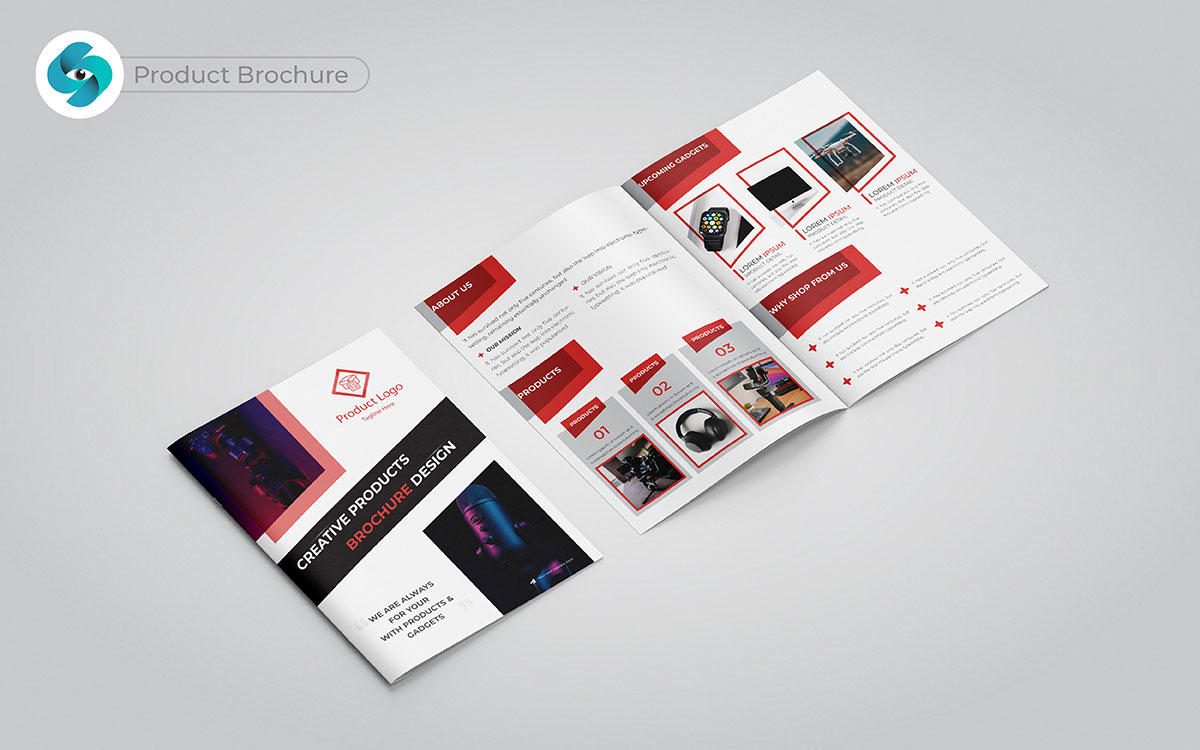
Let me tell you, a product brochure is more than just a catalog; it’s your chance to sell a lifestyle. People want to know how a product will make their life better, not just what it does. I’ve noticed that when a brochure explains how a product solves specific problems or makes life easier, it really pulls people in.
Imagine this: You highlight a feature no one else has, and suddenly, your product stands out. You won’t believe how something as simple as a clear call-to-action—like “Buy now” or “See it in action”—can lead people straight to buying. That’s not just a brochure; it’s a powerful kit for sales.
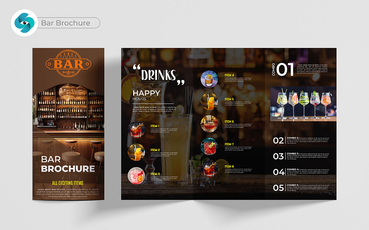
How do you turn a bar into a place people want to visit? Well, it’s more than just about selling drinks. A great bar brochure doesn’t just list the menu; it creates a feeling of the vibe and atmosphere. You see what I mean? When someone reads about your special cocktails, live music, or themed nights, they can almost feel the energy before even arriving.
And guess what? Sharing the stories behind your signature drinks or the history of your bar adds personality. People don’t just want a drink; they want a story to tell. I wonder how many customers come just for that “cool factor” after seeing your brochure.
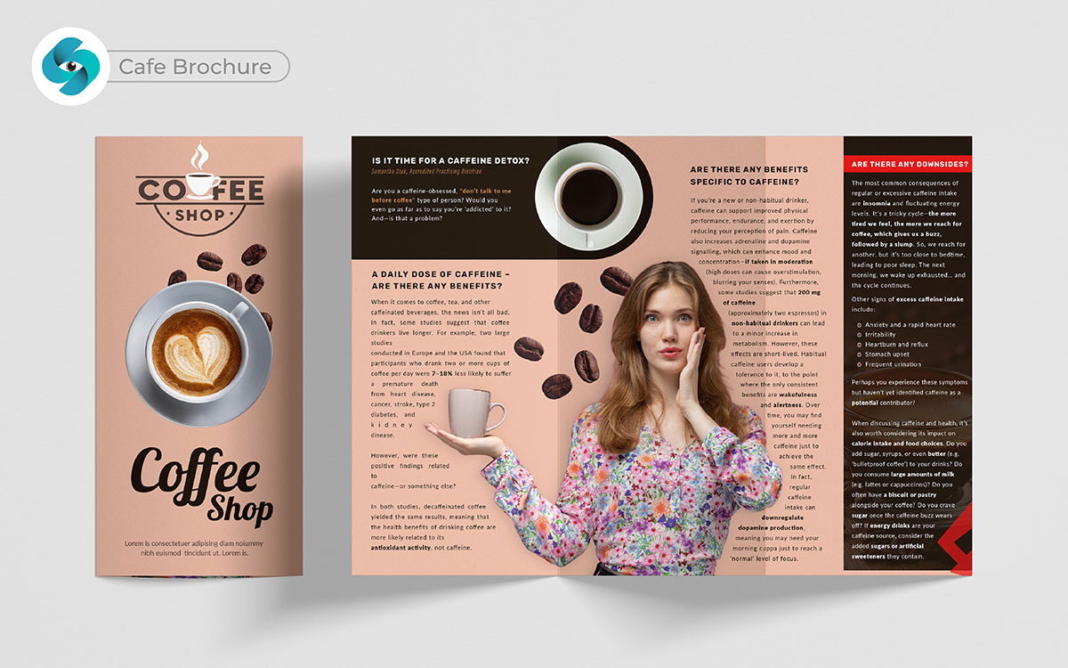
A cafe brochure design can make a big difference. Cafes are not just about coffee. They’re about the whole experience. Showing your menu is important, but showcasing your cozy spaces or signature drinks can make a connection. I can’t count how many times I’ve walked into a cafe just because I saw a beautiful picture of their pastries in a brochure.
Customers picture themselves enjoying the space before they’ve even stepped inside. When you add a “10% off your first visit” or a loyalty program, it gives people a reason to visit. Once they do, they often become regulars.
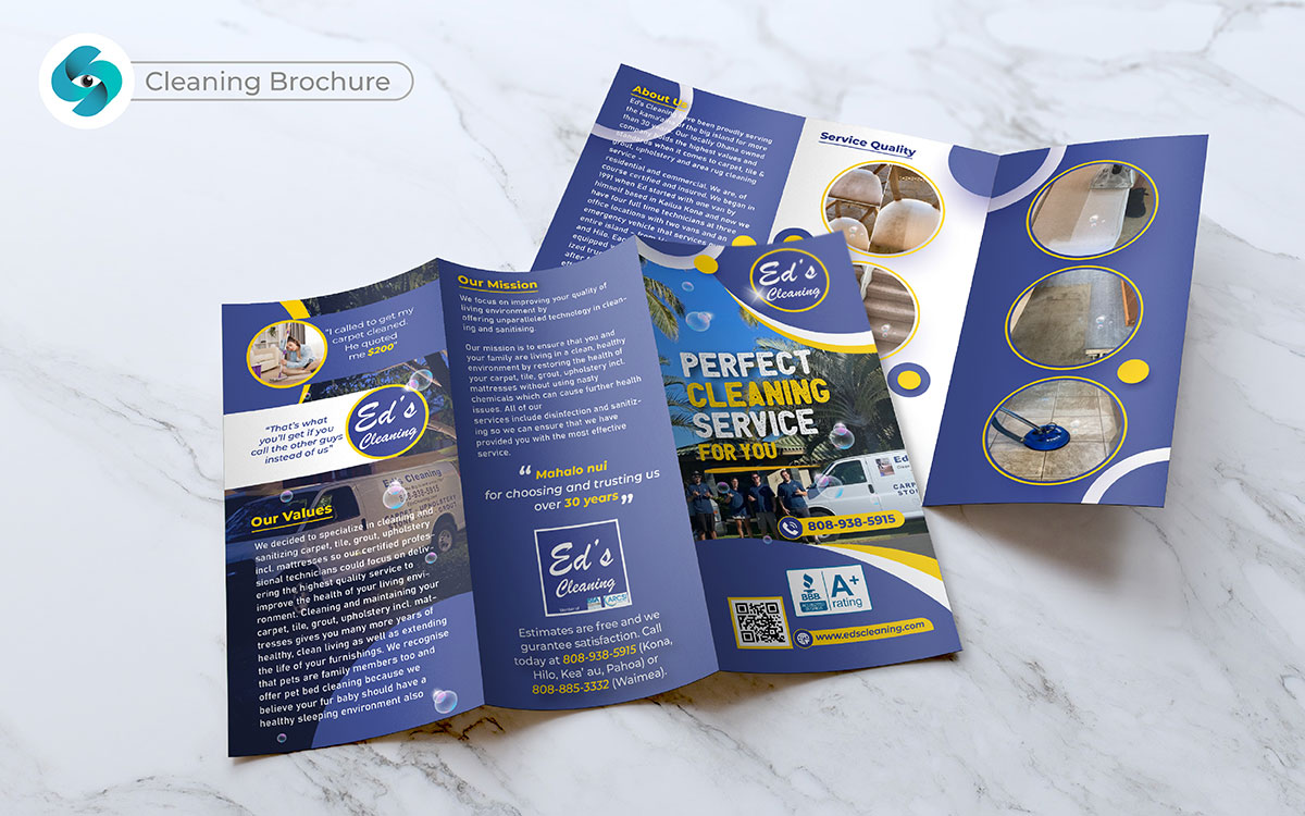
We’re exploring many brochure design ideas. But a cleaning brochure design can stand out easily. Everyone needs cleaning, but they might not realize how much they need your service. The secret is to make it feel personal and useful. Show them how you can make their life easier.
Many people see a clean home or office as a nice thing, but when you show them the health benefits or the time they’ll save, it changes their perspective. Offering a discount for the first cleaning or a “refer a friend” program can push them to try it. I’ve seen people switch cleaning services just because a brochure gave them a clear reason to try something new.
I’ve got a story for you. A friend didn’t get their car fixed because they didn’t know who to trust. A good car shop brochure can build that trust. It’s not just about listing things like oil changes or brake repairs. The real key is showing what makes you special—like customer reviews, certified mechanics, or quick service. That’s what makes people feel confident in picking your shop. When they see a “Free diagnostic with your first visit” in the car shop brochure, they’re more likely to give you a try. And once they come in, your great service will keep them coming back.
Manufacturing can seem complicated to those who don’t know much about it. But this is where a brochure really helps—it makes things simple and easy to understand. Picture this: a client holds your brochure and quickly understands the quality and trustworthiness of your services. By showing your processes, certifications, or listing the industries you serve, you build trust.
Many clients won’t even think of contacting you unless they clearly see how you can help them. Add something like, “Contact us for a free consultation,” and that brochure could start a strong business relationship.
Here’s something interesting—photography brochure designs don’t just show pictures, they tell a story. People are emotional. When they see wedding pictures or family portraits in your brochure, they picture their own special moments being captured. It’s not just about selling a service. It’s about selling memories.
Sure, you can include your prices and packages, but share some testimonials and show the feelings behind the photos. That emotional connection makes people want to reach out to you. And when you add a special offer like “Book by [date] and get a free print,” it creates urgency. This is how you grow your client list.
Amongst the trendy brochure design ideas, a sports club brochure design is all about showing the benefits of being part of a community. Sure, people want to get fit, but it’s the personal stories, the group photos, or the inspiring trainer bios that really make them want to join. It’s not just about listing your classes.
It’s about showing them what it’s like to belong to your club. Offering something like a “First week free” or a “Bring a friend for free” offer makes it easy for people to try. People love trying things without risk. Once they feel the positive energy of your club, they’ll want to stay.
Making and sharing a brochure needs careful planning and teamwork. To get the best results from your work, follow this simple 3-step process. This helps your brochure look great and reach the right people.
Here’s an idea: working together is important when you start your business brochure design. Finding the right professional brochure design service can help make your project successful.
It’s interesting how a clear creative brief helps guide the design. This brief should outline your goals, target audience, and main messages. It helps everyone understand what to do from the start and makes the design process easier.
Here’s something funny: in-house designers give you consistent branding. But they might not have a lot of different ideas.
I once worked with a client who brought fresh ideas to the project. This opened my eyes to new options. Picking the right fit is important for a smooth process.
Now, imagine this: after getting your ideas on paper, it’s time to make them real. Prototyping and iterating help you improve your design.
Just take a moment to think about how early mockups help you see the design. They also let you gather feedback for changes. I remember the first time I saw a mockup of my design. It was exciting to get input from my team. Making adjustments improved the final product.
Picture this: going through multiple rounds of changes is important. This ensures that the final product fits your branding and messaging well. I’ve seen how this back-and-forth process helps improve clarity and looks. The result was a brochure I was truly proud of.
Now that your design is ready, focus on printing and sharing it. Good printing and smart distribution will help your brochure make a bigger impact.
You might be surprised to learn that checking color accuracy, paper quality, and layout can prevent mistakes before printing. I’ve learned the hard way that skipping this step can lead to costly errors. Ensuring quality shows the standard of my brand.
The funny thing is, targeted email campaigns helped me reach specific audiences well in my past projects. Digital sharing through email or website downloads expands your reach and connects with potential customers. I’ve seen how sharing digital brochures online boosts visibility. Handing out brochures at events or trade shows creates personal connections with potential customers. Each method should fit your overall branding goals for the best results.
So, what do you think? With these steps, you can make a great brochure that truly connects with your audience.
At the end!
How were the best brochure design ideas? Hope, you have found the above brochure designs as the most creative, informative, and eye-catching for your business. Isn't it so?
Hmm, captivating brochure designs are a cost-effective marketing tool that conveys clear information, builds trust, and even works as a sales pitch. Indeed, top-quality brochures help businesses and organizations with brand marketing and a clear message of the brand to the target audiences.
Brochure design is more than a design piece. Affordable advertising. Leaves a lasting impression. Grabs the customer’s attention in no time. And, acts like a top-notch marketing tool with coupons, discounts, or exciting deals to attract target customers.
That’s why top brochures can gear up your business. Hopefully, the above 79 brochure design ideas can be highly practical for the next campaign for your business to grow!
Anyway, if you’re looking to get top-notch brochure design services to grow fast, contact us right now with your concept. We, Graphic Design Eye, are a team of world-class designers to dive into your expectations and deliver the best output to surprise you!
Why delay? Waiting to hear your words! Let’s grow together. 🎉