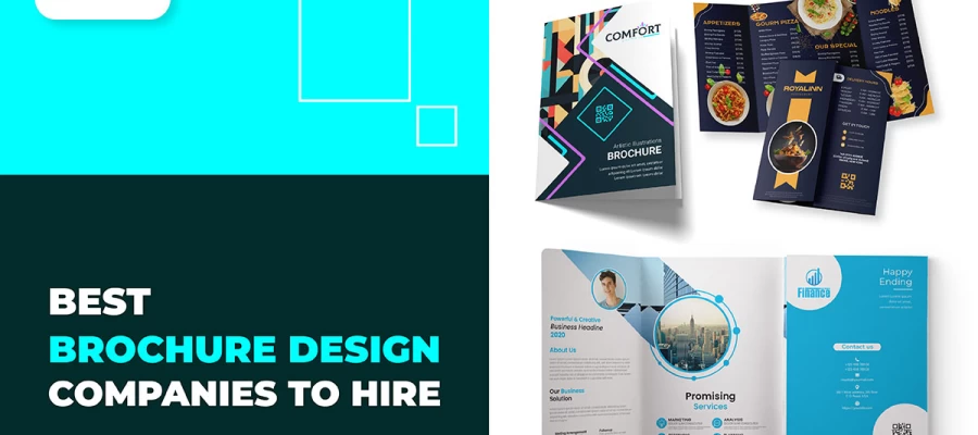
The branding in brochure design is all about narrating your brand story through simple design choices. Every color, font, and image should feel like a piece of your brand. Whoever picks up your brochure should instantly feel the presence of your brand. It's like giving them a small piece of who you are and what you represent.
The following instructions will show just how your branding can seep into each and every part of the brochure. We're going to take a close look at precisely how fonts, colors, and imagery all tie together in their development of an original experience: How minor design decisions often serve to make people remember your business even after having flipped through your brochure. So, let’s go on this journey together and explore how to make your branding unforgettable!
Think of your brochure as a small piece of your brand's bigger story. When someone picks it up, they immediately should feel the presence of your brand. Colors, images, and even fonts should speak to the very same story your brand tells elsewhere. Without strong branding, a brochure can often feel disconnected. But when designed with the brand in mind, the brochure becomes a true powerhouse with which to touch and recognize your audience. It's like handing them a little taste of who you are.
Your brand sets the cue for what your brochure is going to look like. If your brand is bold, so does your brochure need to be: bright colors and strong fonts. If your brand is bright, then your brochure needs to be, too, with bright colors and stylish fonts. If your brand is languid and professional, the brochure design should come right along with it in soft colors and clean lines. Anything from layout to imagery needs to be chosen from the perception of your brand's personality.
Your brand identity is what sets you apart, and that should be conveyed through your brochure. If your brand is all about going green, then the natural colors and earthly designs should be apparent in your brochure. If your brand is all about technology, it should have a sleek, modern feel to the design. This means that this brochure should speak the same language as your brand, and anyone who picks up the brochure will surely know what your company stands for. It's all just about the perfect match of design and identity.
Consistency of your brand in all avenues creates customer trust. Your brochures should resemble your website and the business cards, among other branding kits. This helps people become aware of your brand no matter where they see it since all your designs will be using the same fonts and color tones. A consistent brand means that no matter how somebody interacts with your business, it always feels familiar. That's why every brochure you create should be a part of the big picture.
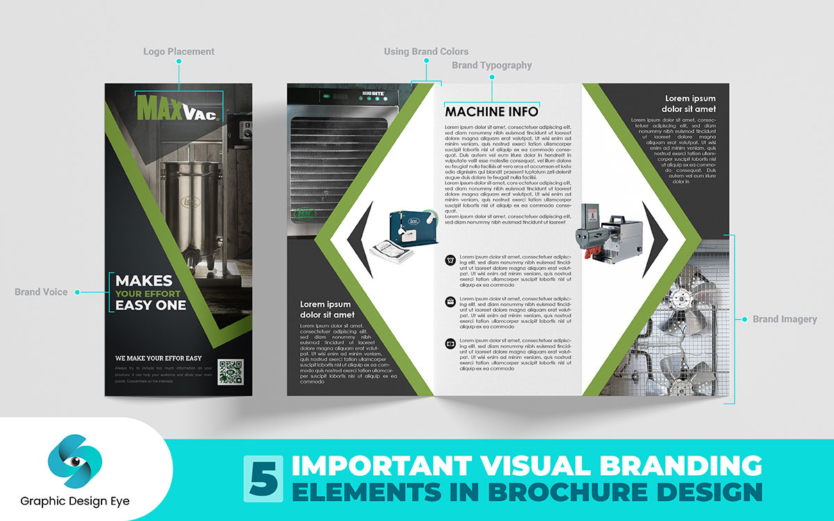
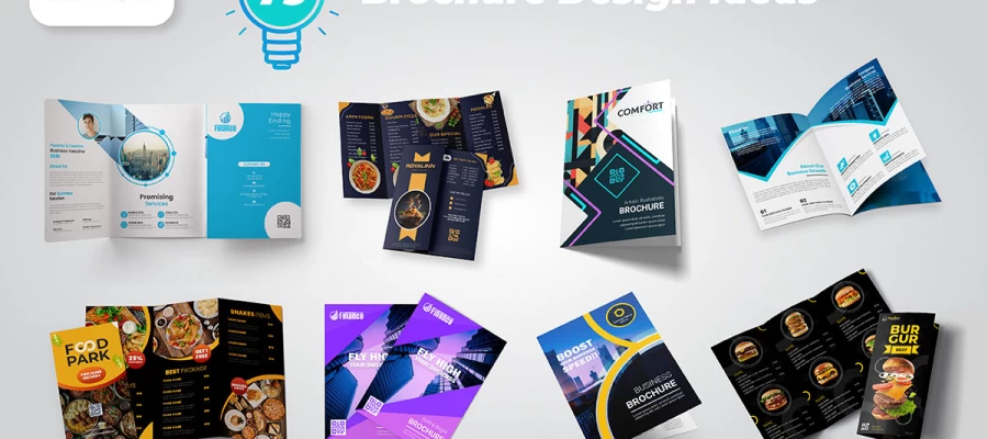
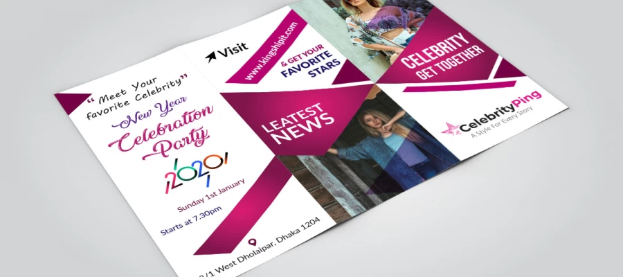
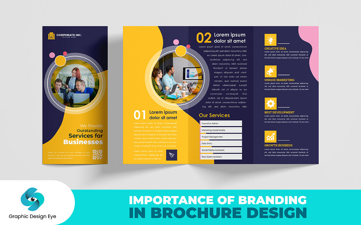
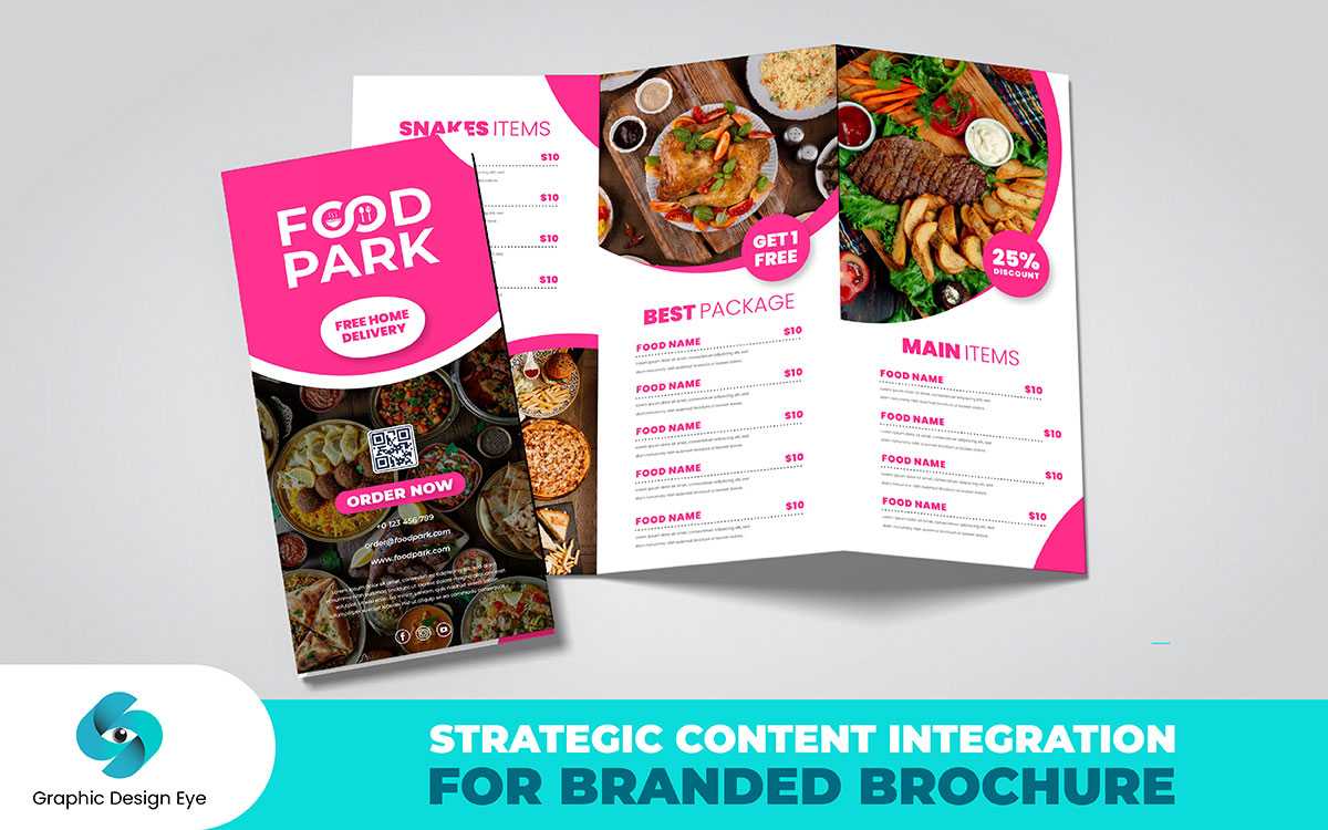
A brochure is the most powerful medium for the showcase of your brand identity. Everything, from colors and fonts to each minute detail, amalgamates to create an indelible mark. Look at the key branding elements that help your brand shine through in brochure design.
Your business logo is the face of your brand; where you place it on your brochure can make all the difference. If your logo is too small, people might miss it. And if it is too big, well, that can be a bit overwhelming, too. The perfect spot, the perfect size the logo is there but does not intrude. It seems to whisper in your ear, popping just at the right place for maximum impact.
Colors are not for decoration only; they stir something in people and immediately connect with your audience. When your brand colors kick into a brochure, they take people through their emotions with each turning page. These colors build trust to remind your audience of who you are. It is like a silent signature that would potentially stay in their memory long after they read the brochure.
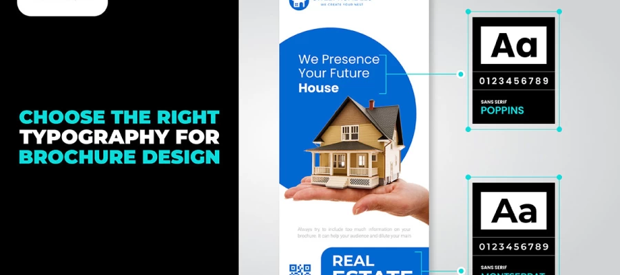
Typography is the personality of your text: it can actually alter how people feel about your brand. A playful font gives a light, friendly vibe, while a classic typography feels more formal and professional. The right font helps tell your story in your brochure by assuring that the voice of your brand is clear and makes it all fit with the message.
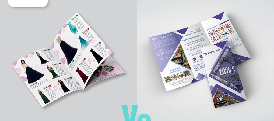
Images speak before words do. Even the images and graphics in your brochure aren't fillers but part of the tale that your brand communicates. Every image shows your audience what your brand represents without having to give long explanations. This could bring about instant attention to your people by drawing them and letting them feel related to your brand with just one glance.
Your brand voice refers to the way you carry on a conversation with your customers. It is in every word you type, and it must be consistent with your identity. Whether your tone is friendly, serious, or playful, it must sound natural and should stick consistently. A broad, clear voice transforms the text in your brochure into a conversation. It's not what you say but how it makes your audience feel.
Your brochure should say something. First of all, set out your content in a very clear and logical way. Each piece should naturally flow into the next. Bring in what's unique about your brand. Make sure your main messages are easy to find and understand. Everything in the brochure should build a consistent picture of your brand's values and what it offers. Let's dive into how making your brochure shine focuses on how you use the content, design, call-to-action, and brand stories.
Design is not just about looking good, but actually, it's one way to help get your message delivered. As Oscar Wilde once reflected, "One should either be a work of art or wear a work of art." Keep your layout clean, uncluttered, and simple. Use images in your work, but to complement your text, not to compete with it. Make sure the design directs one's eyes to the highlights. Good design presents the information in an easily readable format without becoming overwhelming.
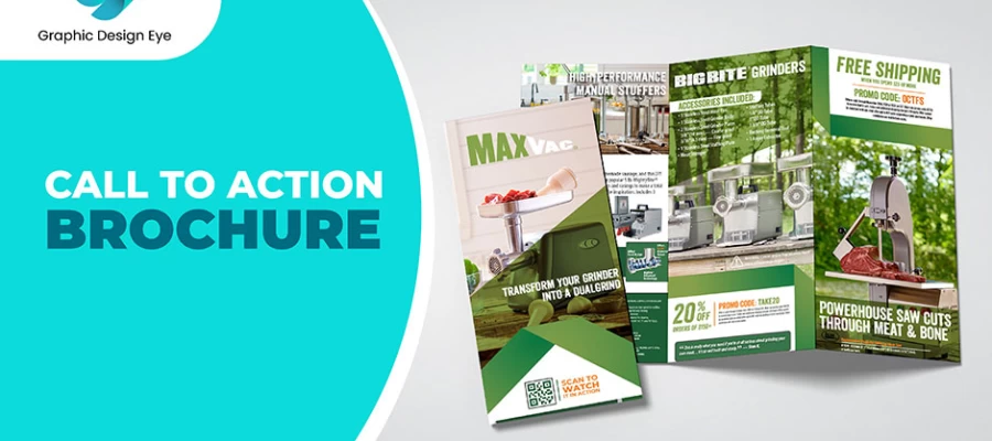
The brochure call to action CTA describes what the reader is supposed to do next. Make it clear and easy to find. Use simple words like "Call Now" or "Learn More." Place it where people will see it after reading your message. The design should render the CTA noticeable but not overblown. Your goal is to make it easy for the reader to take action on what you are offering.
Brand stories make your brochure memorable. Share stories that show who you are and what you are made of. These stories should be woven through your brochure. That way, such stories help to create an emotional bond between your readers and you. Be it your mission, successes, or behind-the-scenes moments, stories can make your brochure more than just information. Paying attention to and working on each of these aspects will make your brochure engaging to your readers and convey the message of your brand.
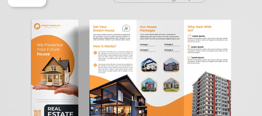
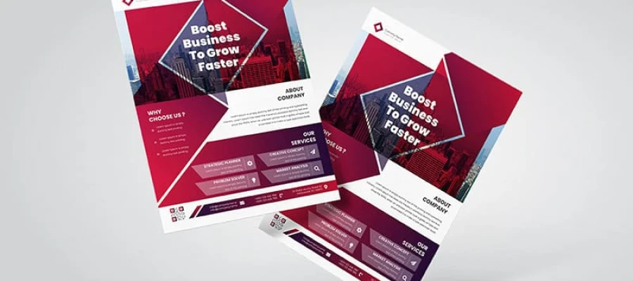
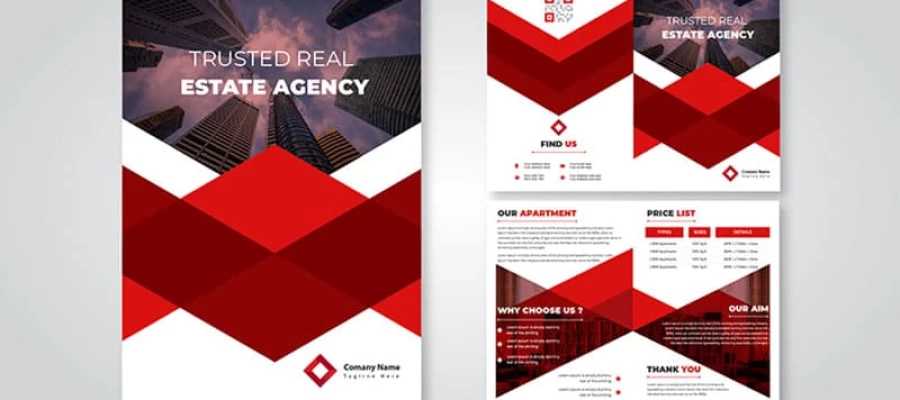
Also, brochure design services can greatly boost your company’s marketing by creating eye-catching kits that quickly grab customer attention. A well-designed brochure helps explain your products or services in a clear, more organized way so that potential clients understand what you can offer. It sweetens your branding with professionalism for trust and credibility. They are such versatile kits because one can use them at events, send them directly to customers, or even hand them out. The way to get to your audience is varied. And, a well-thought-out brochure design can make all the difference in leaving your mark and making you different from your competitors.
A brochure works effectively to convey the right information to the readers. Everything from the attention-grabbing headline down to the call to action, which moves the audience forward to take some kind of next step, serves a purpose in a brochure. The content must be concise, informative, and logical in flow. The following are the ideal writing guidelines that make for branded brochure content.
Revising your brochure design is more than just looking fresh; it is about staying connected with your audience as your brand grows. But how often should this be changed?
If your brand is undergoing some sort of drastic change, such as a new logo, different colors, or even a message, it is time to readily change that brochure. That keeps the message clear and consistent, you would agree. Just imagine trying to envision a customer receiving an older brochure. Then they go to the website, and it is just foreseeable how drastically it may look. That is confusing. And the more confusion, the harder it will be for people to trust your brand.
Sometimes, your brand evolves over time. Perhaps you have added services or grown in a new way. If that is the case, then it is good to give your brochure a once-over every 1-2 years. You do not always need a full redesign but more along the lines of a small update to match where you currently are.
Design trends change, too. What looked modern a few years ago could look old today. Keeping up with these graphic design trends shows that your brand is active and paying attention. It helps you avoid looking outdated.
Think about your customers, too. Are they still connecting with your current brochure? If so, great; if not, it's time to refresh it. The brochure should be reflective of how you want people to see your brand today, not how it looked when you first created it.
Ultimately, the update of your brochure is about keeping it real and keeping current. It shows that you give a damn about what you look like and who you're talking to.
Since this is the case, creating a brochure that really speaks for your brand is much more than simply tossing information onto a piece of paper. All in all, this is truly how to create an image that will speak to your audience and further define your identity. No matter the best of intentions, though, common mistakes do occur that tend to really reduce the effectiveness of your brochure. So, with that said, let's delve into the pitfalls so that you will know what to avoid and how to make your brochure shine.
It is a very easy feeling to think that the more you add to your brochure, the better it gets. Sometimes, you get so overwhelmed by just trying to fill the brochure with lots of text. In reality, this is destructive, for a target audience shall either skim through it or also stop reading it completely. Just focus on the most important things to say. A clear and concise message proves to be far more effective. Think about this like a conversation: simple and to the point.
But if the brochure doesn't replicate the general expression of your brand, then it may confuse an audience. Using different fonts, colors, or styles alienates your brochure from other branding kits. Imagine walking into a store that looks nothing like their ads. That feels off, right? Your brochure should feel like an extension of your brand. Consistency breeds trust and recognition.
Sometimes, in trying to appeal to all, you end up appealing to none at all. If your brochure isn't directly talking with your target audience, then it's not going to be able to have an emotional connection with them. Who are your ideal customers? What is the need for and concerns about them? Make sure to tailor a message to their specific needs. A well-targeted brochure resonates more deeply and drives better results.
Without an explicit call to action, your brochure fails in its goal. If you fail to let your readers know the next step they need to take, they might fail to take one at all. Whether this is a visit to your website, calling you, or setting up an appointment, make sure your call to action is right there and loud. Keeping confidence guides your readers through to the next step.
An unclear or messy structure will go away running. If your brochure is cluttered and hard to read, the readers will lose interest in it in less time. Make sure the design is neat and clear, and do not cause any hassle to read. Practice white space sufficiently to allow your content to be scannable. Logical flow allows readers to absorb information better and keeps them involved with the text.
Images will play an important role in the effect your brochure has. Low-quality, generic photos of people or objects make the brochure look equally low-quality and unprofessional. It's the difference between having a good story and using bad illustrations to go along with it. The investment of high-quality images into your brand's personality adds that polished touch and builds credibility with your audience.
The print quality of your brochure is as important as the design of the brochure. Using cheap paper or poor printing techniques can undo all the work your brochure is supposed to achieve for you. People get a notion of a brand by the way it feels when they hold it in their hands. Print on high-quality material and ensure the printing is good to give your professional brochure a professional feel. This will speak much about your business since attention to such details will speak volumes about your business.
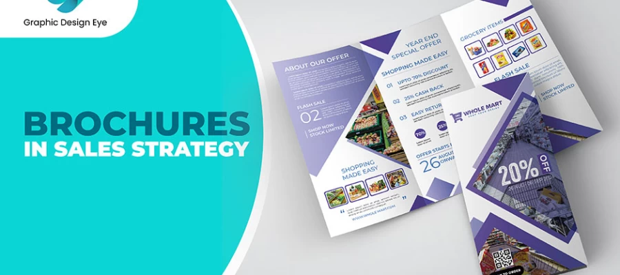
If you can keep your brochure out of these pitfalls, it may turn out to be one of the most powerful kits you need for your sales strategy. It would better convey the message and leave a deeper imprint on the minds of the audience.
We find it, important of branding in brochure design. From the fonts to the colors, each choice has a way of allowing people to connect with your business. The well-branded brochure does more than inform the people; rather, it provides an experience of who one is. What we have been reading brings out how such brochure elements make your brand recognizable and create a lasting impression.
These brochures can frame the way others perceive your business and will start to build trust with time. If there's anything you can think of or would like to add to the ways branding can make brochure design even more effective, please share them! We are all ears.