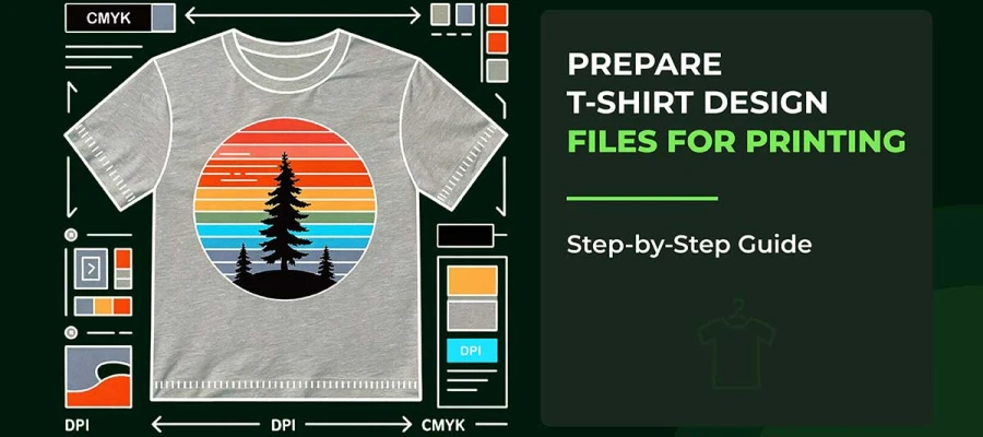
If you want to learn how to design a T-shirt in Illustrator, you're in the right place. We’ll walk you through everything from basic to advanced t-shirt design techniques in Adobe Illustrator to make sure you’re comfortable with the process.

It might be a really simple task once you get the hang of it, but you can probably expect to learn something new at every stage.
Definitely, as you work through each step, you’ll feel more confident in your ability to create designs that look professional. Fact is, designing in Illustrator is a process, and each step is part of that journey.
Then, and this is important, once you get familiar with the basic Illustrator tools for t-shirts, you’ll find that designing becomes much easier.
You’ll hardly need to worry about getting everything perfect on your first try. There is always a good chance that your design will evolve as you go along. No doubt, this is just part of the creative process.
To be clear, you’ll want to focus on the details that make your design stand out.
Importantly, remember that designing a T-shirt is about making choices that fit your style. For sure, you’ll face a few challenges along the way, but it’s just how it is when you’re creating a unique t-shirt.
No matter how many adjustments you make, the key is to enjoy the process and see where it takes you. Keep reading to learn more!
We’ve put in the effort to break down the entire process of how to design a T-shirt in Illustrator in the simplest way possible. With clear, step-by-step instructions and helpful screenshots along the way, we’ve made sure you have everything you need to succeed.
Alongside each step, you’ll find t-shirt design tips that offer practical advice to guide your creative decisions. By following this easy t-shirt design tutorial, you’ll be designing T-shirts like a pro in no time! Read on to learn!
When you start a T-shirt design or want to explore new t-shirt design ideas for your next project in Adobe Illustrator, it’s like stepping into a world full of creative possibilities, even if only briefly. The first thing you’ll do is open the "New Document" window, right under their noses, where all the magic begins.
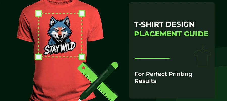
Moving right along, this is where you’ll decide the size and layout of your artboard—the space where your design will come to life. Alongside it all, you’ll need to think about the area where your T-shirt design will fit.
It’s like picking the size of the print area on the shirt. You can also look for an Adobe Illustrator T-shirt template to make this step even easier and more accurate.
In no particular order, this decision helps ensure your design flows and fits just right, whether it’s a large graphic or a smaller t-shirt logo.
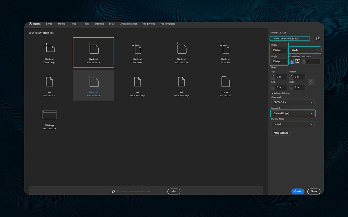
Next, you’ll choose the size of your artboard, which will determine how your design fits onto the T-shirt. Sneaking up somehow, you’ll want to pick a width and height that align with the size of your print area.
If you're designing something big, like a graphic across the front, go for a larger size—like 12 x 16 inches. If it’s a smaller logo or text, something just off in the corner, consider a size like 5 x 5 inches.
Behind the scenes, you’ll be able to adjust the artboard settings to fit your design just right. During all that, make sure your design will fit perfectly within the space, whether it's for a small logo near the chest or a bold graphic across the back.
When choosing the size, down the road, it’s about understanding where your design will end up on the T-shirt. Whether the design is close by or far off in the distance, this step ensures your T-shirt design works seamlessly.
After slipping by the initial setup, you’ll want to make sure everything aligns with the print area, which usually works best in inches. Even on days like that, when you’re unsure, the right artboard size helps you keep your design looking perfect on any shirt, no matter the size.
As you move along, you’ll need to set up bleeds and margins if your design is going to print. Let me explain.
Bleed refers to the extra area beyond your design’s trim line. Think of it as a safety zone. It ensures there’s no ugly white border when the design gets cut.
So, any t-shirt branding elements (like background colors or images) that need to reach the edge of your design should extend into this bleed area. Isn’t that true? It’s an extra measure to ensure a clean, flawless print.
In the screenshot, you can see the "Bleed" section. You can set bleed values for each side of your artboard, and they can all be linked to the same number if you want. A common bleed size is 0.125 inches or 3mm.
Margins (also known as safety margins) are spaces that help protect the important t-shirt elements of your design—like t-shirt logos or text—from getting cut off during printing.
As far as I'm concerned, it's like creating a protective zone around your t-shirt vector artwork to ensure nothing essential gets lost. Doesn’t that sound right? Especially when you're working on a clean, well-aligned vector-based artwork, setting margins helps keep everything balanced and easy to read, without letting anything drift too close to the edges.
Let’s talk about color. The mode you choose affects how your T-shirt design looks in print. After some time working on your design, you’ll see the difference between RGB and CMYK:
Without missing a step, CMYK gives you the most accurate color reproduction for T-shirt designs.
So, without a second thought, always use CMYK when you’re designing a T-shirt that will be printed.
Somewhere in between trendy and timeless, circles and gradients show up pretty often in T-shirt designs. It turns out, playing with gradient radius around circles adds a dreamy, modern touch—almost by accident.
Right alongside bold text or icons, these shapes add movement and mood. Let’s walk through how to use them on your shirt design, step by step.
A circle feels peaceful—simple, quiet, and whole. That’s why many of my favorite designs begin with this one shape. It works beautifully in everything from playful icons to elegant patterns.
And the Adobe Illustrator design process makes it really easy to get started. By breaking down the steps and using the right tools, you can turn a simple circle into a stunning piece of art in no time.
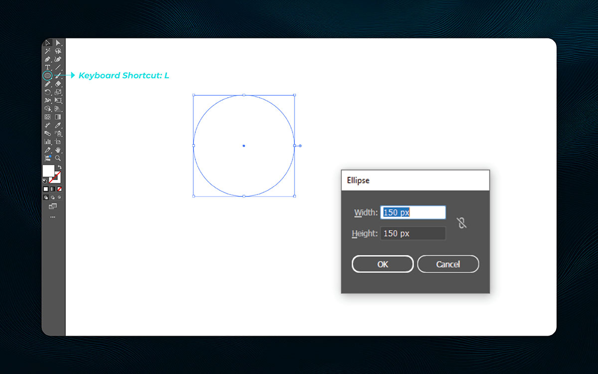
To create a perfect circle in Illustrator, start by selecting the Ellipse Tool from the toolbar on the left, or simply press L on your keyboard as a shortcut. Click and drag while holding Shift to create a perfect circle.
If you want more precision, click once on the artboard instead of dragging. This will bring up a box where you can type in exact dimensions. For example, type 150 px by 150 px (or any equal numbers) and then click OK to create your perfect circle. This circle becomes your first building block—quiet, balanced, and ready for the next step.
Pro Tip: To maintain a perfect circle at any size, always hold the Shift key while dragging, ensuring it doesn’t distort.
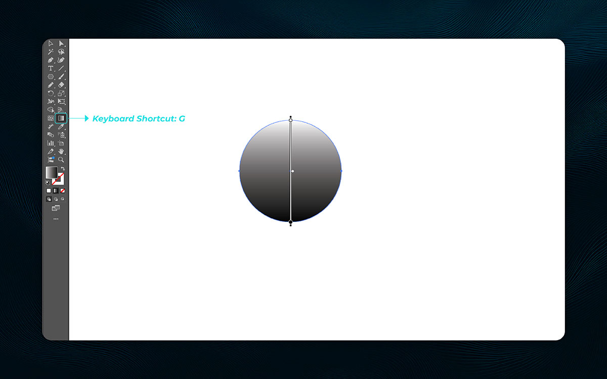
Once you have your circle, it’s time to bring it to life with color. Gradients are soft and expressive—like a sunset or the sky before a storm. Illustrator allows you to apply gradients in a few simple steps.
Start by ensuring your circle is selected (you’ll see the bounding box around it). Next, press G to activate the Gradient Tool. When you click and drag across the circle, a default white-to-black gradient will appear.
You can adjust the flow by dragging from left to right for a horizontal gradient or from top to bottom for a vertical one. A gradient annotator (slider) will show up on your shape, allowing you to adjust the gradient handles, shift the midpoints, or change the direction of the gradient.
The goal here isn’t perfection—just start playing around with it, and watch your flat circle gain life.
Pro Tip: Use the Gradient Panel to adjust the colors more precisely and to get a smoother gradient effect for a more polished look.
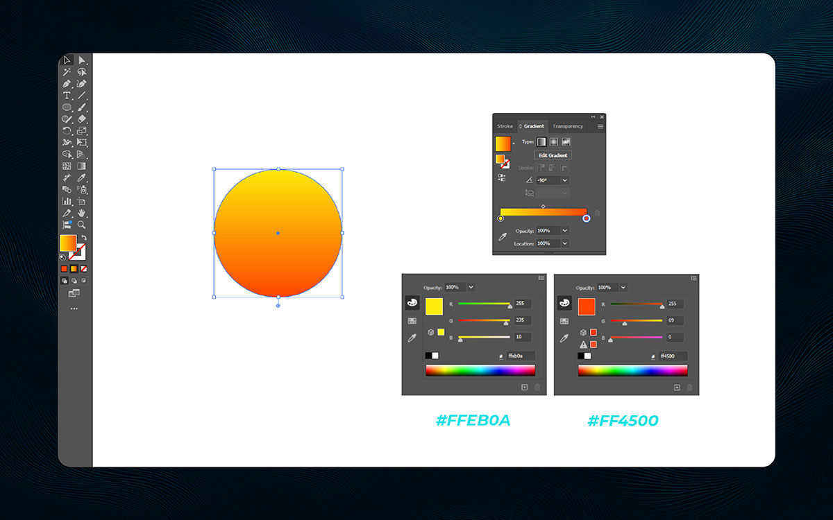
Now it’s time to take that default black and white gradient and turn it into something warmer—something that glows like the sun. We’ll change the gradient to a sunny yellow and deep orange to mimic the colors of sunlight. With the circle still selected, open the Gradient panel.
If it’s not visible, go to Window > Gradient to bring it up. Under the gradient bar, you’ll see two color stops. Double-click the left stop (which is white by default) and enter the hex code #FFEB0A for a bright, sunny yellow. Then, double-click the right stop (which is black by default) and change it to #FF4500, a deep, rich orange.
You can also adjust the stops by dragging them to control the placement, and moving the midpoint slider (the diamond icon) to control how the colors transition. Step back and take a look—now your circle should feel warm, glowing, and alive, just like the sun.
Pro Tip: To make the gradient feel more natural, try adding a third color stop for a subtle transition that enhances the glow.
Rectangles might seem basic, but on a T-shirt, they’re powerful. Right alongside your text or illustration, a rectangle can frame, support, or highlight the message.
Somewhere nearby, it helps bring balance or a bold edge. As it turns out, even a simple shape can shape the whole design. Let’s break down how to use them in smart, subtle ways.
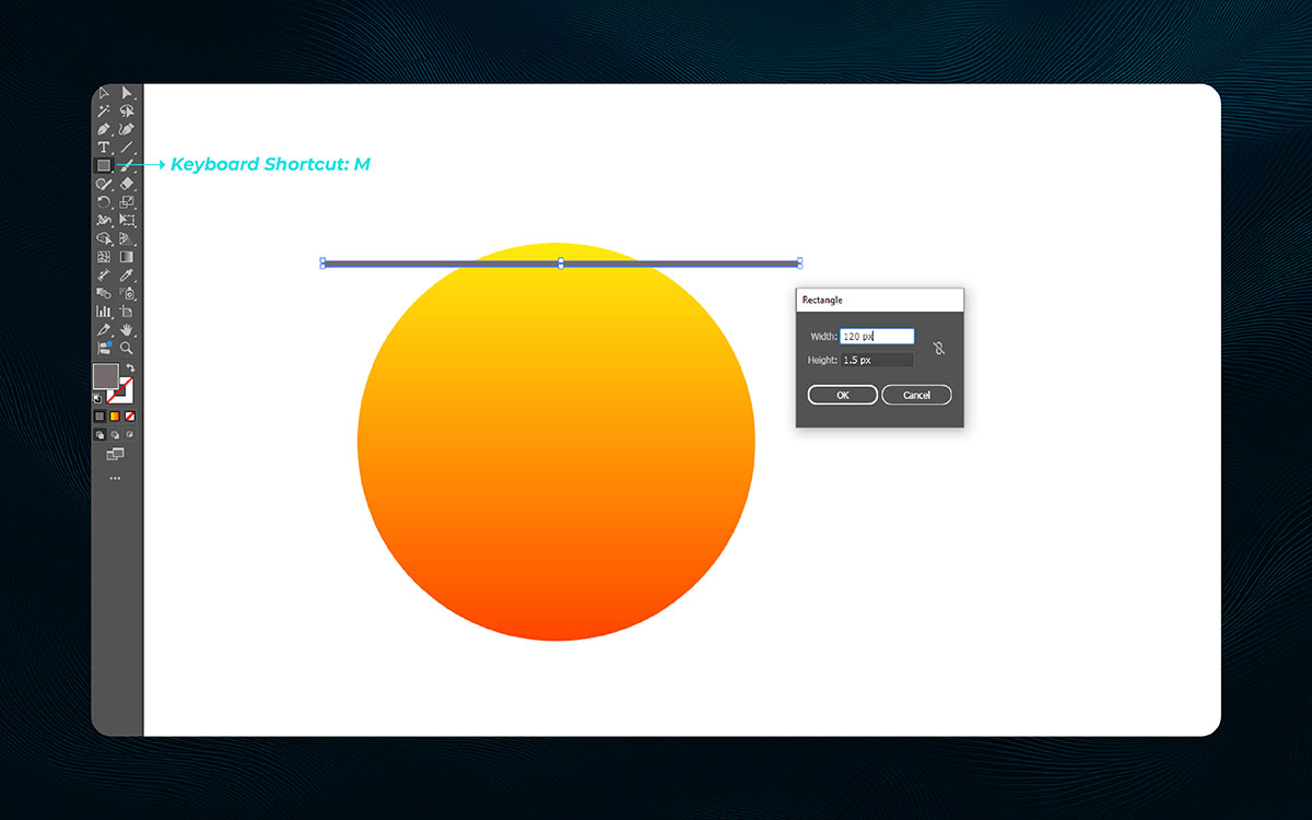
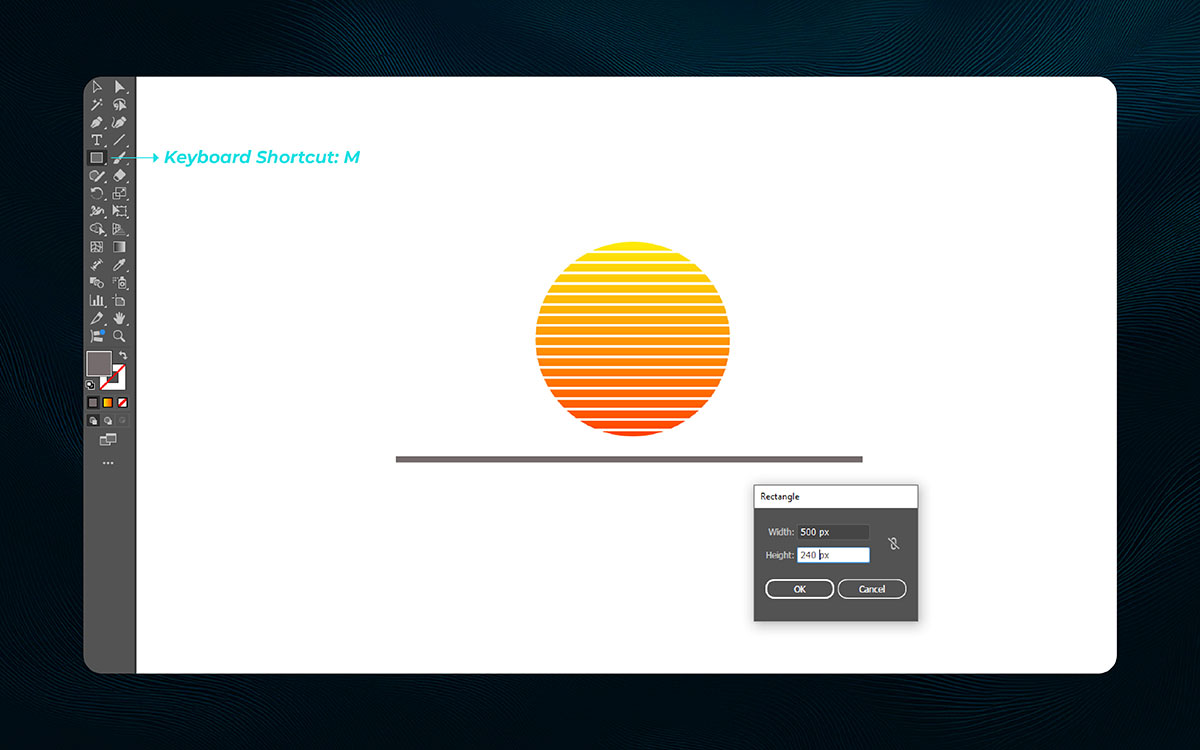
With the sun-like circle now ready, it’s time to add a small horizontal rectangle across its top. This is a simple shape, but it opens up creative possibilities for adding rays, highlights, or even masks.
To draw this thin rectangle, select the Rectangle Tool from the toolbar or press M on your keyboard. There are two ways to create the rectangle: you can click and drag across the top edge of the sun to draw freely, or click once on the artboard and enter precise dimensions.
For example, set the width to 130 px and the height to 1.2 px, then press OK to create the shape. Use the Selection Tool (V) to position it right over the top of the sun. Typing in exact values gives you more control, and small details like this bring your design to life with precision and purpose.
Pro Tip: Use Align to Artboard when positioning the rectangle to make sure it’s perfectly centered or aligned with your circle for a more polished look.
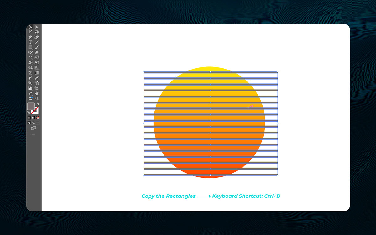
Now it’s time to build on that first rectangle. By duplicating it, you can form a pattern—like rays from the sun. It’s a small step that leads to something much bigger. To duplicate your rectangle into a pattern:
This “Transform Again” shortcut captures your first move and echoes it, building rhythm and flow. You’re not just copying shapes—you’re shaping light.
Pro Tip: If the pattern isn’t spaced exactly how you want it, hold Shift while dragging the duplicate rectangles to align them in a straight line.
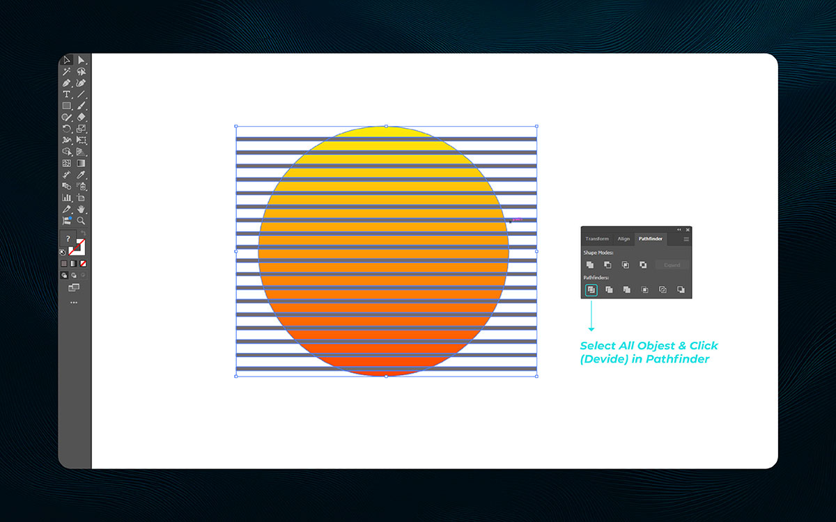
Okay, so you’ve got your sun. You’ve got your lines shooting out like it’s ready to bless the whole sky. But now comes the moment where we turn chaos into clarity.
This step? It’s about cutting those shapes so they can actually start talking to each other. You ever feel like things are messy but almost there? That’s where we’re at. Here’s how to do it:
That’s it! Now all your shapes are cut into small pieces. You can move them one by one. It’s a lot, I know. But this is where things start to make sense.
And of course, if you forget to ungroup? Nothing moves. I did that once, felt like the whole thing broke. What a time to be alive, right?
Pro Tip: If you need more control, try selecting individual shapes and moving them manually for precise adjustments.
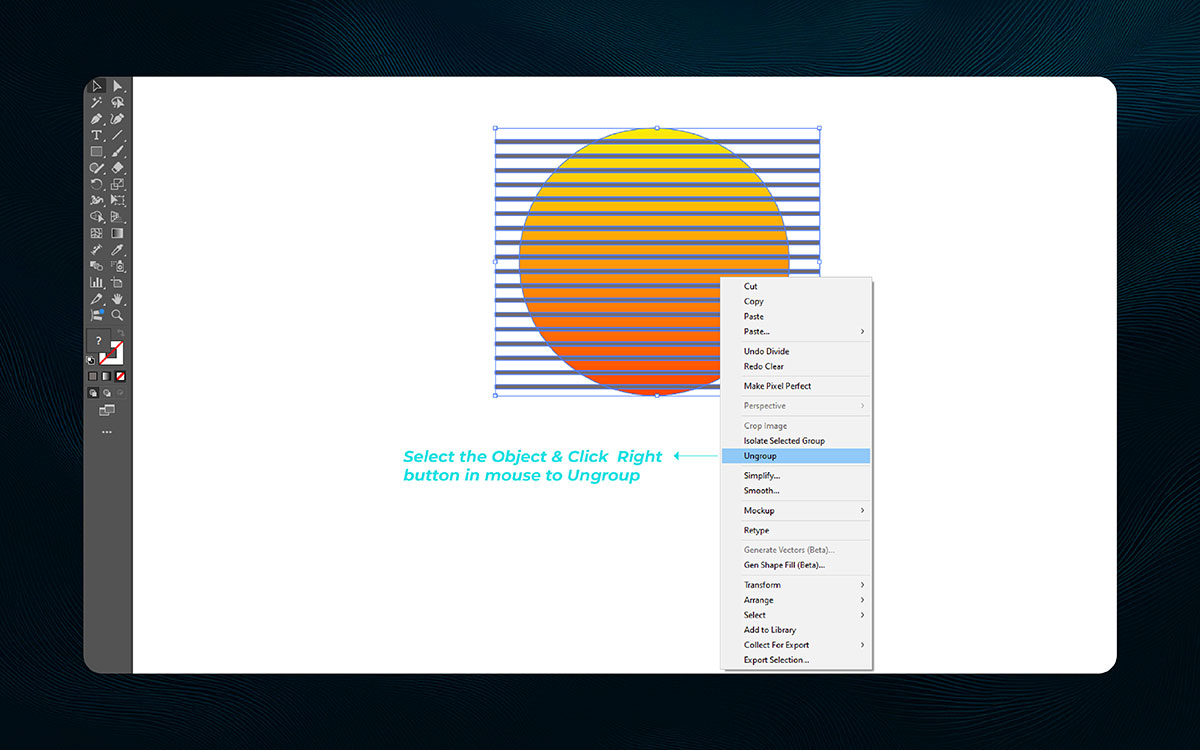
Naturally, right after Divide, you need to set those little pieces free. Without ungrouping, you’re stuck editing the whole sun like it’s one big chunk. And for what?! Ungrouping lets you play with each part. That’s where the beauty is. What to do:
Feels good, right? You get full control now. That’s how it played out for me too. Just a few clicks, and things start feeling clear.
Pro Tip: For faster work, use Ctrl + Shift + G (Cmd + Shift + G on Mac) to quickly ungroup the shapes.
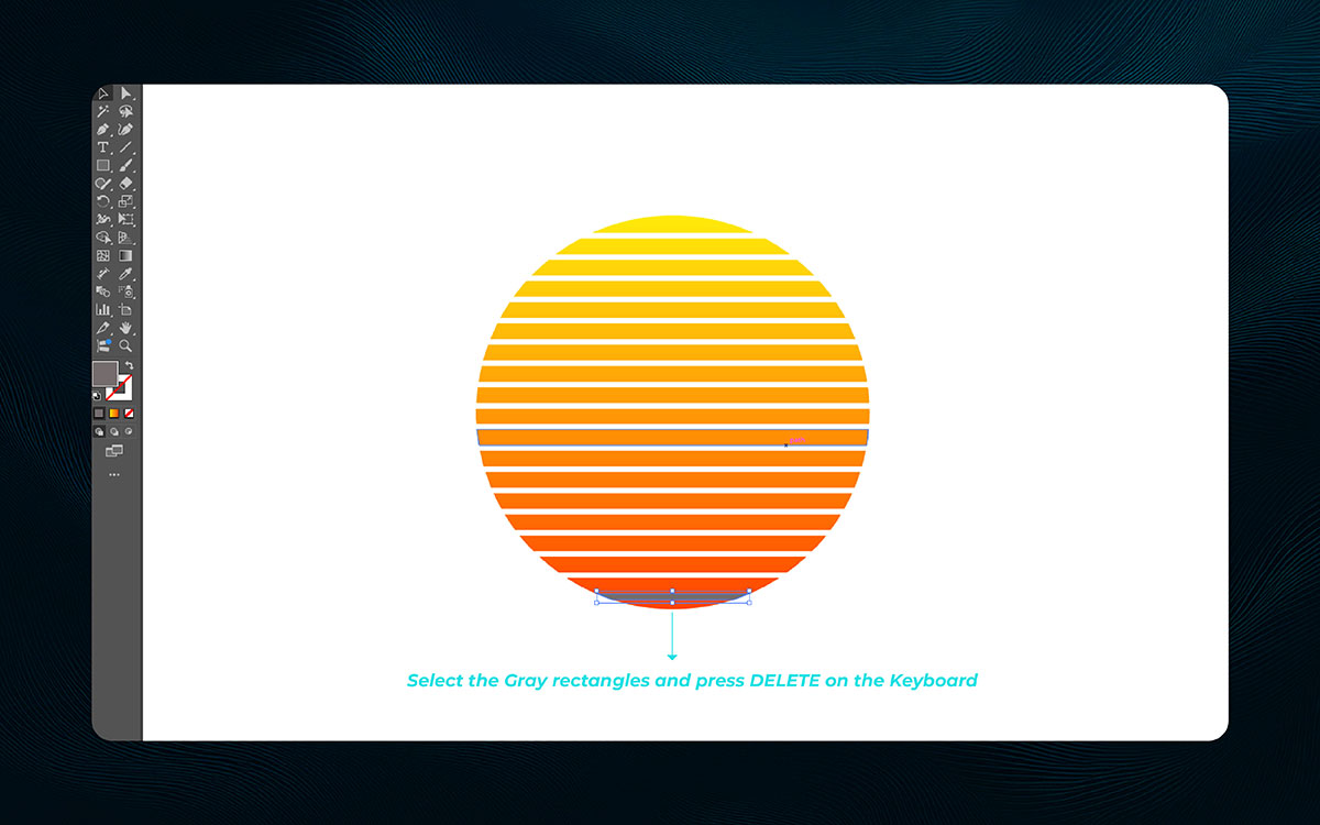
Okay, now take a breath. Because what you’re looking at might feel like a hot mess. Random rectangles sticking out like they’ve got no idea what the assignment was. That track. But don’t worry, we’re cleaning it up. Do this:
And just like that—clean! Nothing new there. It’s like tossing out stuff you don’t need. Honestly? Feels great.
Pro Tip: Zoom in for precision when selecting small areas to delete. This helps prevent accidental deletions.
Just nearby your logo or quote, space matters—a lot. All the while, your t-shirt design needs to breathe, not feel squished. Somewhere down the line, poor spacing can make a shirt look “off,” even if everything’s technically there.
On top of that, your text needs room to pop. Let’s look step by step at how to space your graphics and words in a way that really works.
Now we add a base. Why? Because even the brightest sun needs a ground to rise from. It’s like putting shoes on before stepping outside. Otherwise, what’s even happening? Steps to build the base:
It gives your design balance. Even simple shapes help tell the story.
Pro Tip: Keep the rectangle’s height smaller than the sun to give it a more natural feel, like the sun rising from the horizon.
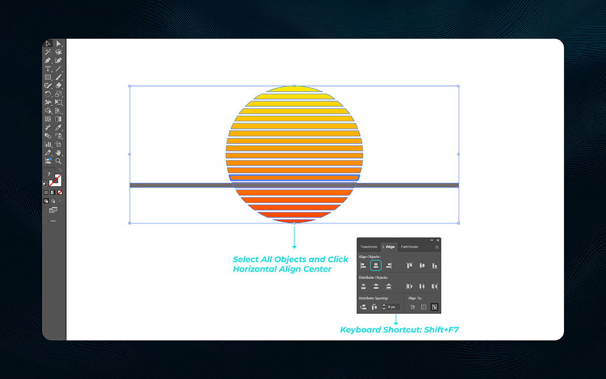
You’ve got the sun. You’ve got the base. But right now? It’s floating weird. Off-center. It is what it is… but we’re fixing it.
Do this: Select the sun and the rectangle. Go to Window > Align. Make sure “Align to Selection” is on. Click Horizontal Align Center. That’s it. Everything lines up and looks clean. It’s small, but it makes a big difference.
Of course that would happen, one click and suddenly, it all looks better.
Pro Tip: If you’re ever in doubt about alignment, use the alignment panel to experiment with other options, like vertical alignment for further refinement.
Don’t sweat the tiny stuff. If things aren’t perfect yet, that’s okay. Nobody’s grading you. Honestly? Even pros adjust ten times before they feel good about something.
So if you’re nudging pieces around for 15 minutes, that’s valid. That’s the process. You’re not just aligning shapes, you’re aligning your vision. So, yeah… keep going. You're doing great.
Start by selecting the entire sun graphic with the Selection Tool (V). This includes the stripes and the circle outline. It’s all looking good, and you’re laying the groundwork for the next steps. Once everything’s selected, it’s time to move forward.
Look carefully at your sun graphic. The lower part of the sun overlaps with the horizon. This part needs to be removed, and that’s the next step. Use the Shape Builder Tool (Shift + M). Hold Alt (or Option on Mac) to switch the cursor to a minus sign. Click and drag to remove the lower section of the sun.
It’s coming along well. With the lower part removed, the sun now looks like it’s setting behind the horizon. Things are shaping up nicely as the scene gains a more realistic feel.
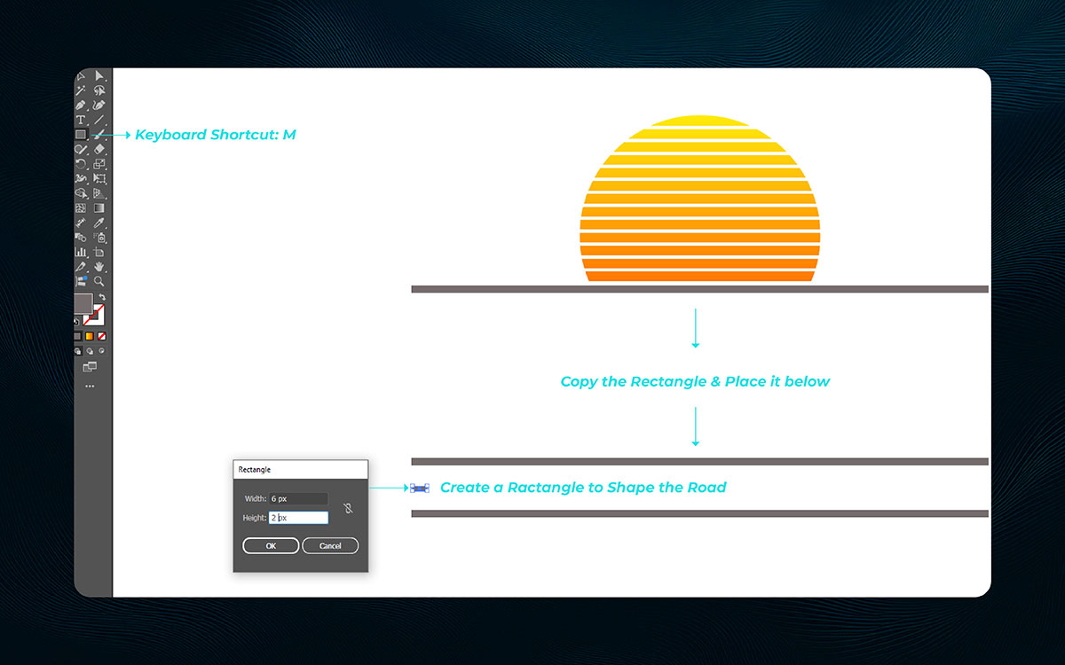
Next, focus on the road beneath the horizon. Copy the horizon rectangle. Press Ctrl + C (Cmd + C), then paste it using Shift + Ctrl + V (Shift + Cmd + V). Everything’s on track with this simple step.
Move the new rectangle downward to create a parallel line. It’s all heading in the right direction, as this step defines the road’s bottom edge.
Use the Rectangle Tool (M) to create a small rectangle. Set the width to 8px and the height to 2px. Place it between the two parallel lines. It’s coming along just as expected. This forms the base of your road, heading in the right direction.
Pro Tip: Use smart guides for perfect alignment.
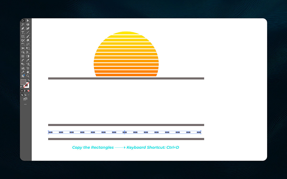
Now that the base is in place, let’s focus on road markings. Select the thin rectangle you created for the road surface. This will serve as the foundation for your markings. Press Ctrl + D (Cmd + D) to duplicate it.
Drag the duplicated rectangle horizontally to create the first road marking. Things are falling into place as the markings begin to take shape. If the distance between them feels off, adjust it until it feels just right.
Keep pressing Ctrl + D to duplicate more markings. Things are progressing well, and the road is taking shape. The markings are now evenly spaced.
Pro Tip: Follow real road markings for spacing. It’ll look more authentic.
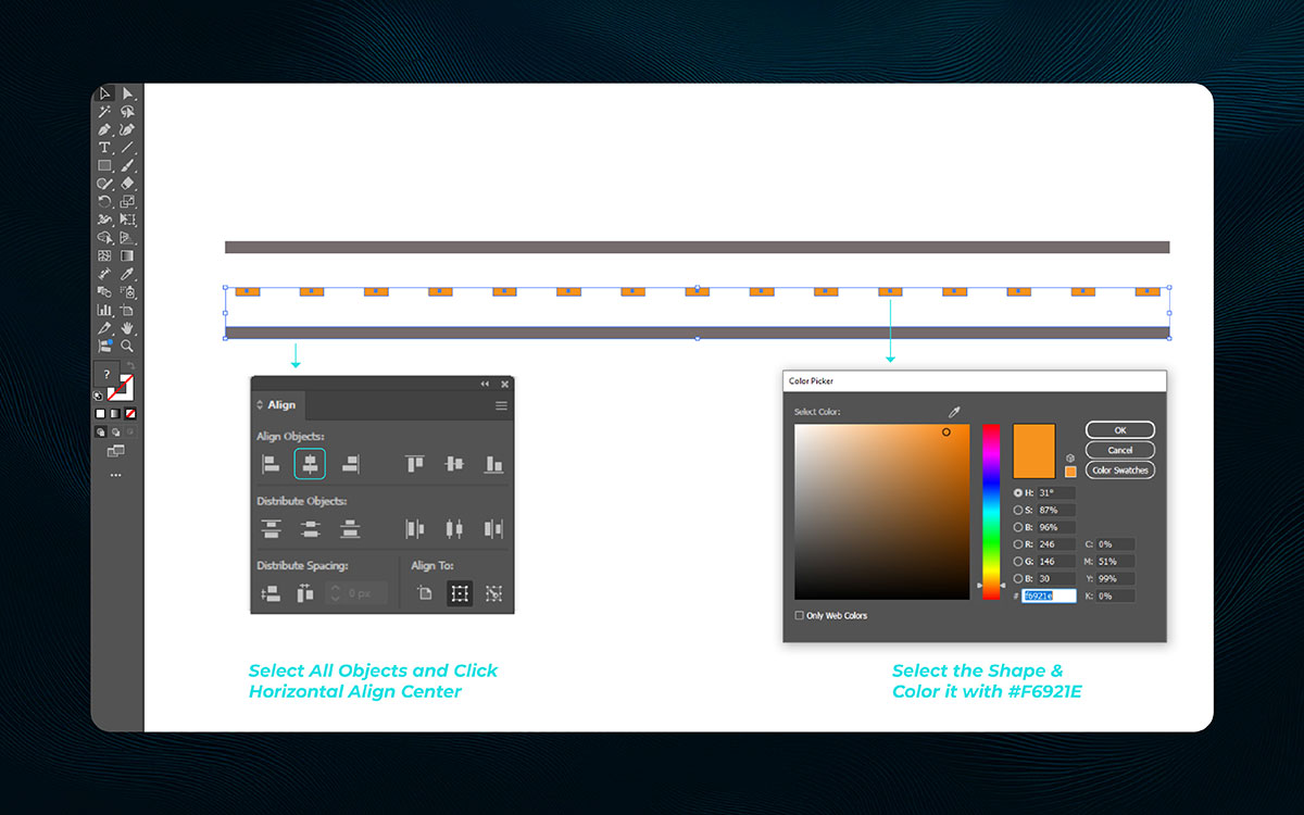
At this, select all the road marking rectangles. Use the Selection Tool (V) and hold Shift to select multiple at once. It’s all moving ahead, and now it’s time to add color.
Open the Color Picker in the Properties panel. Type in the hex code #F6921E. This vibrant orange will make the markings pop. That’s the way forward, and this color will enhance the design.
Once the color is applied, the markings turn bright orange. It’s all coming together, bringing the scene to life. The road now looks realistic with those eye-catching markings.
Pro Tip: Add a gradient for depth. It will give your markings a more realistic feel.
Almost without thinking, you’ve seen cloud shapes on fun, dreamy, or relaxed shirts. Somewhere deep down, they make things feel soft and free. Right about now, they’re trending again.
On a whim, you can mix a few circles and ovals and get something great. Let’s go step by step to create your own cloud graphics, perfect for tees.
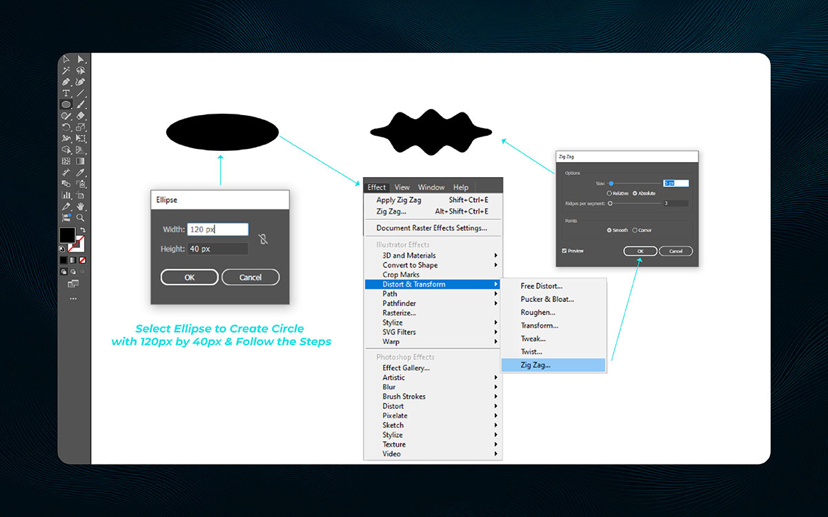
Start with a simple oval using the Ellipse Tool- 120 px wide and 40 px high. It’s not too tall or round, just balanced enough for a cloud base. It just makes sense now why we’re starting this way.
Next, go to the ZigZag effect. Set the Size to 6 px and Ridges per Segment to 4, then choose Smooth points. With Preview on, you’ll see a puffy edge form. Things lined up perfectly and it already looked like a cloud.
Click OK and admire the shape. The cloud is soft and charming and still an editable vector design! It all worked out just fine and that’s one step closer to your final dreamy design.
Pro Tip: If the waves look too sharp or too soft, try adjusting the Ridges per Segment slightly. Small changes can make a big difference!
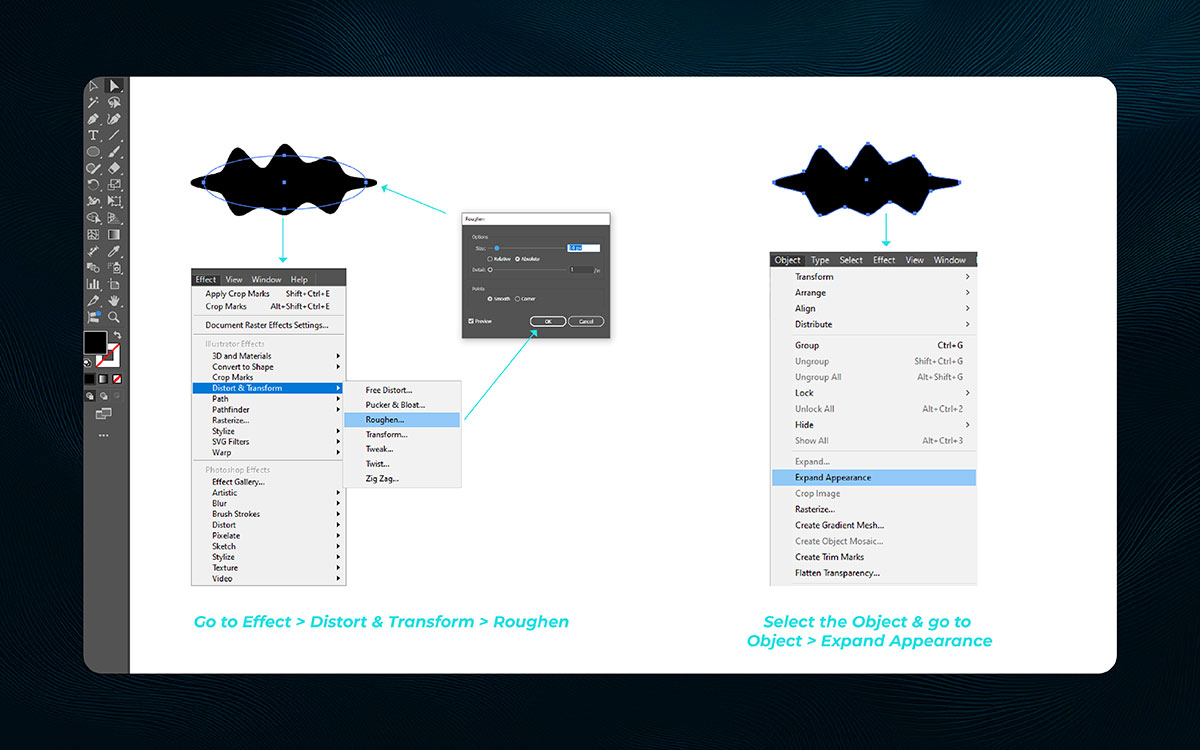
Real clouds aren’t perfect, so let’s add the Roughen effect. Set Size to 1 px and Detail to 8 per inch. Choose Smooth points again. Everything adds up when you make it slightly uneven.
With Preview on, you’ll see the edges get more organic. Not too crazy, just right. It’s all falling into place and gives your cloud that natural touch.
Once it looks good, go to Object > Expand Appearance. Now the shape is fully editable. That’s how things unfold, you’re turning a live effect into real design work.
Pro Tip: After expanding, use the Direct Selection Tool (A) to tweak just one or two points if something looks off—it gives a hand-drawn feel!
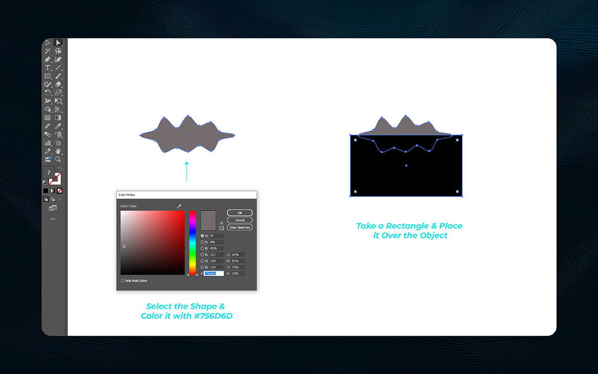
Now it’s time for color. Choose a soft gray like #756D6D. It gives your cloud some style, and when paired with the right t-shirt color combination, it’ll pop even more. All things considered, this color fits the design perfectly.
Then draw a rectangle to cover the whole cloud. It doesn’t matter what color it is for now. That’s one way to look at it, you’re just getting ready for later effects.
Keep the cloud and rectangle separate. This gives you flexibility for shadows, masks, or backgrounds later. It came together just right and that’s where things stand for now.
Pro Tip: Lock the rectangle layer once it’s placed. That way, you won’t accidentally move it while working on other parts!
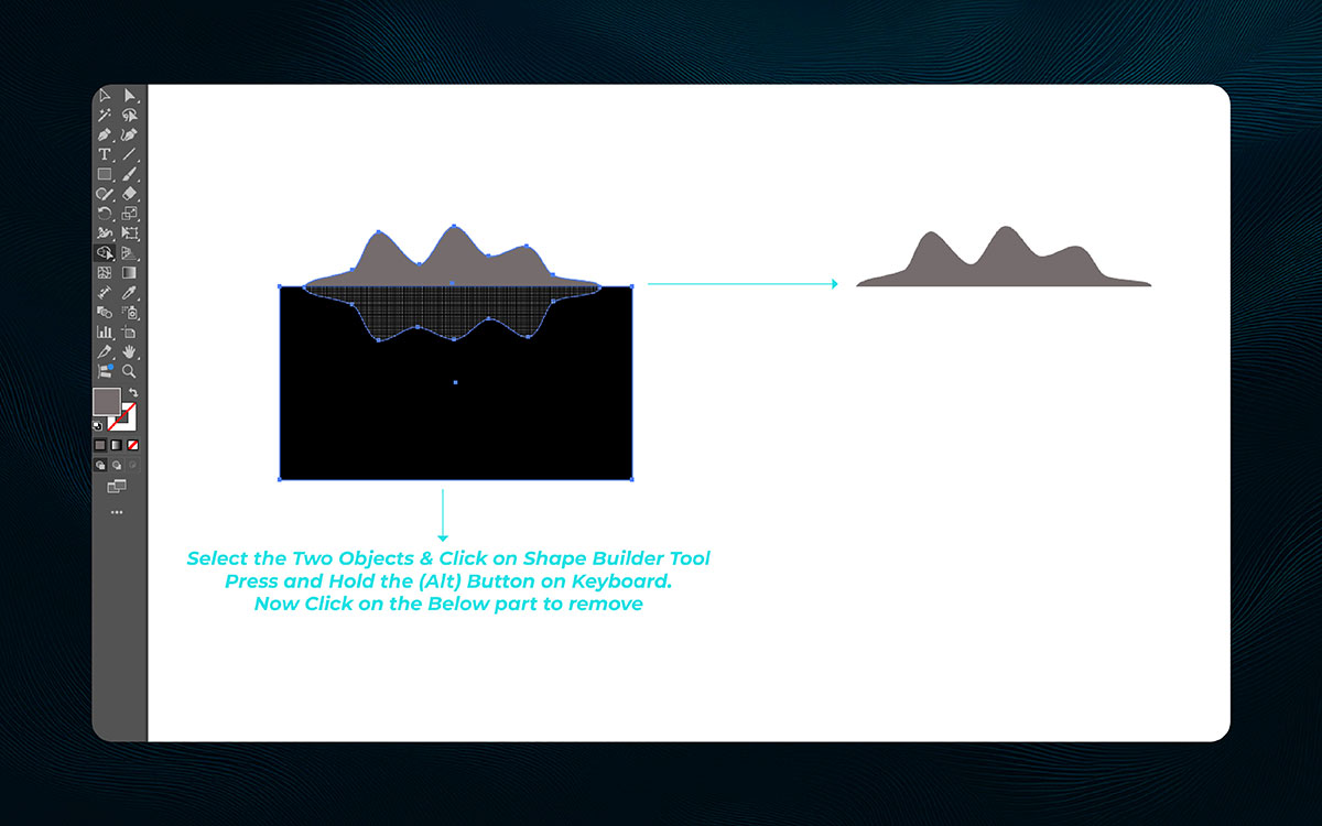
First, you’ll need to select both the cloud and the rectangle. It’s good to know that you need to do this before moving forward. Use the Selection Tool (V) to select both. That’s where things stand now—we’re ready to proceed.
Next, activate the Shape Builder Tool by pressing Shift + M. Naturally, the cursor changes to an arrow with a plus sign. Hold the Alt key (or Option on a Mac) to enter “delete” mode.
Click and drag across the overlapping part of the cloud. It turned out well, and now the excess part of the cloud is removed, leaving a clean edge along the bottom.
Pro Tip: Ensure the overlapping shapes are perfectly aligned. Misalignment could result in jagged edges.
Right back at it, you’ve got all the parts—but something still feels off. Somewhere in between done and perfect, your design needs balance. Just off to the side, one shape might need to shift.
As it turns out, a few small moves make a big difference. Let’s walk through how to bring everything together so your T-shirt design feels just right.
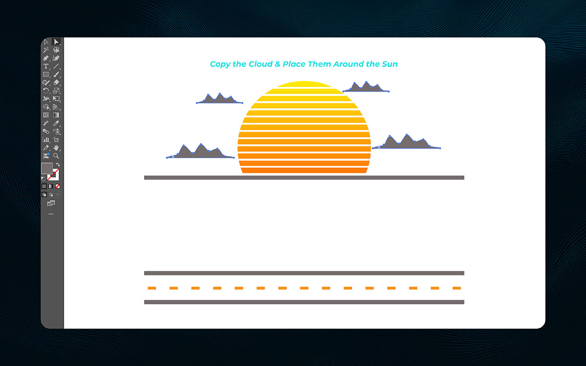
Now, select the half-cloud shape you just created. Interesting, right? Duplicate it by pressing Ctrl + C (Cmd + C on a Mac) and Ctrl + V (Cmd + V), or simply hold Alt (Option on Mac) and drag to create a copy.
With the duplicate cloud selected, place it around the setting sun. It makes sense that happened; positioning them differently adds depth. Scale each cloud while holding Shift to keep them proportional.
Rotate them to change the angles. This gives the clouds the appearance of different heights and distances.
Pro Tip: For more depth, Illustrator layer the clouds with varying opacities. The clouds closer to the sun can have a higher opacity, while those farther away can be more transparent.
Right about now, your T-shirt design might look clean—but kind of flat. Somewhere nearby, texture can turn that blank shirt into something people want to wear.
Even without trying too hard, a soft grain, rough edge, or distressed effect can say so much. In a way, these touches give your design real attitude. Let’s take it step by step and add effects that feel just right—without a doubt.
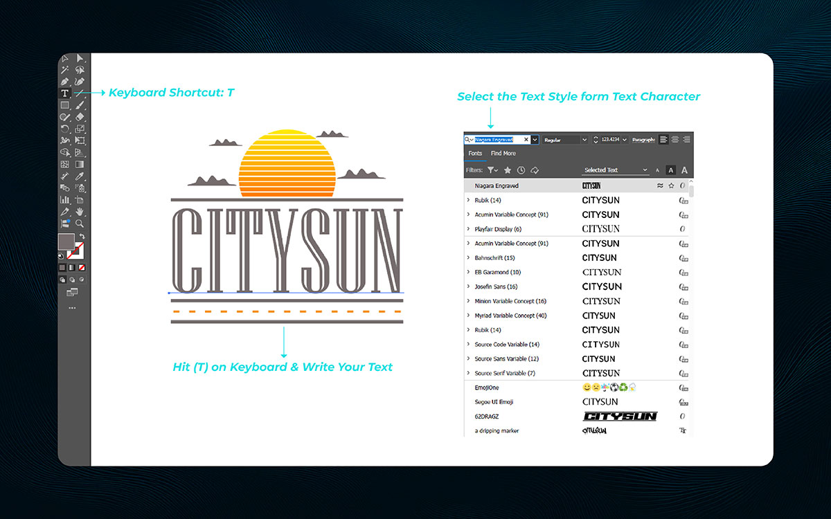
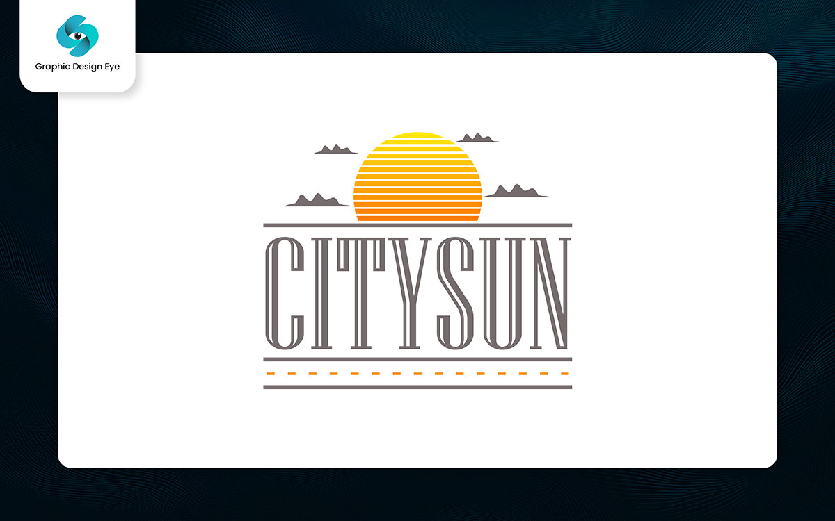
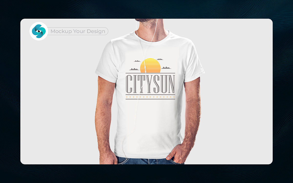
Next, grab the Type Tool (T). Why not, right? Click where you want the text to appear. For short text, a single click will do. For longer text, click and drag to create a text box.
Type the text you want, such as “CITYSUN.” It’s surprising, but understandable- adjust the font, size, and color to match the mood of your design. Use the Selection Tool (V) to position the text where it fits best in your composition.
Pro Tip: Choose the best t-shirt font style that fits your design’s mood. A smooth, flowing font fits a sunset theme, while a bold one creates a more dramatic effect.
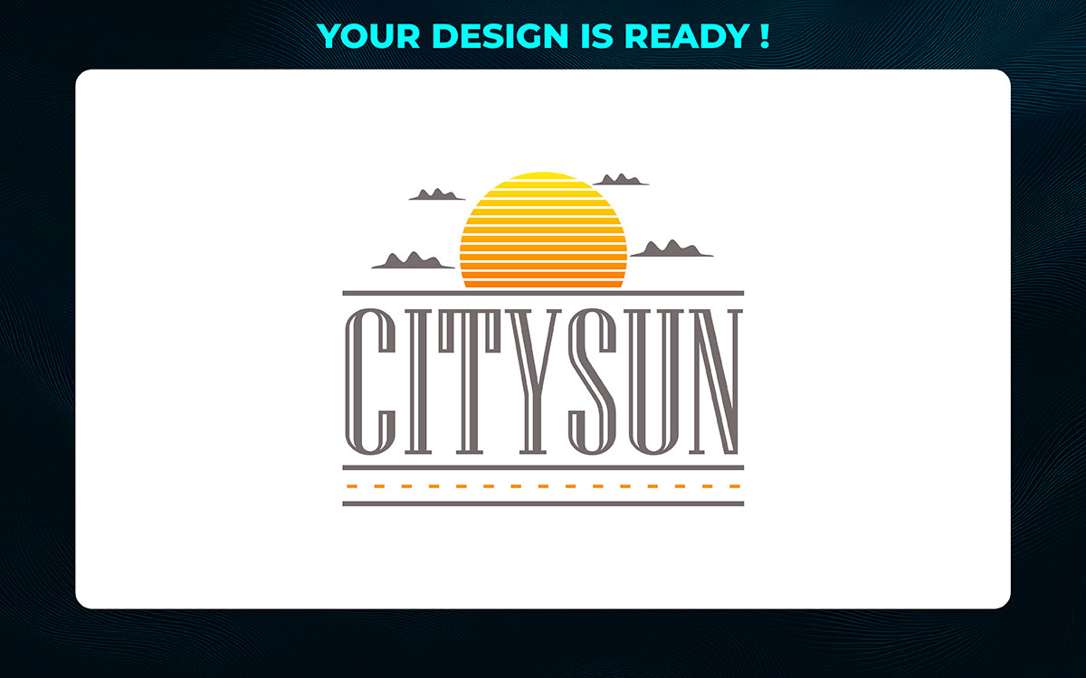
Now, your design is ready. Of course, that happened—everything is in place, and it’s time to take it further. It’s a lot to handle, but the pieces have come together well.
Your t-shirt design is solid, and it’s time to prepare it for a mockup file. Honestly, not sure if this is the final version, but it’s a great start. It is what it is—you now have a strong foundation to move forward with.
To see how your design will look in the real world, you’ll want to create an illustrator clothing mockup. This will give you a clearer idea of how the design fits and looks on an actual t-shirt before you go into the final production.
Pro Tip: Before exporting artwork for print, double-check the alignment of all elements. A small misalignment can mess up your design when it’s placed in a real-world setting.
That’s how it starts. You’ve shaped something warm and beautiful. Your sun is glowing, grounded, and full of life. Now? It’s time to send it off—to share it, print it, post it.
One thing leads to another, right? That’s where exporting T-shirt design comes into play. Let’s walk through how to export for print—and create a design mockup file for use online.
Just the usual flow, when it comes to artwork for garment printing, you need your design looking crisp and clean. Print likes big resolutions and colors that match the real world. That means going for CMYK and high-quality formats.
| Set the Color Mode to CMYK. |
| Set the Design Resolution to 300 ppi for Print. |
It all connects somehow- the colors, the sharpness, the clarity. That’s the rhythm of it: setting up your design to look its best when it finally lands on paper.
Pro Tip: Double-check bleed and trim if you're printing professionally. Printers like things tidy, nothing out of place.
Just another day, but now it’s for screens. If you’re posting online or adding this sun to your digital portfolio, you want smaller design file sizes and colors that pop on any device.
| For PNG, pick 72 ppi or 150 ppi depending on how sharp you want it. |
| For JPG, slide that quality bar to “Maximum.” |
That’s part of the routine—adjusting for where your work is going. Going with the flow of screen vs print. It fits right in.
Pro Tip: Always preview your export on light and dark backgrounds—it's the easiest way to catch contrast or color issues before sharing online.
So, you’ve made it to the end of our guide on how to design a T-shirt in Illustrator. It was bound to happen, you’ve worked through every step, and now, everything's coming together. It’s safe to say you’re ready to share your design with the world.
Fair enough, the Adobe Illustrator design process has been a journey. At some point, you hit a few bumps, but now it’s clear: your design is exactly what you envisioned. Not exactly every step was easy, but it’s just how it is in the Adobe Illustrator design process.
I guess that works, though, because that’s how you grow and improve. Wouldn’t go that far as to say it’s been effortless, but here you are, ready for the next stage. There’s a good chance your design is going to look amazing once it's finalized.
It’s only a matter of time before you hit that “save” button, and your design is out in the world. I wouldn’t be surprised if you feel a sense of accomplishment, knowing you’ve learned how to design a T-shirt in Illustrator. The process, though long, has shaped your skills into something powerful.
And if you ever feel stuck or want a second pair of eyes, Graphic Design Eye LLC is always here to help. Just reach out and let’s make your design even better.