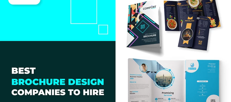
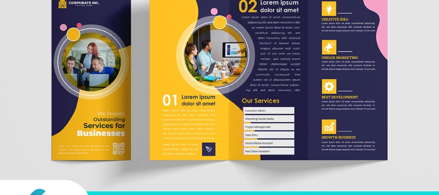
Picking the right typography for your brochure is very crucial. It is not just about making it look good. The reason is that every font has been designed to evoke certain emotions, and it can change the feel of a message. With fonts, your booklet may look friendly, serious, and even creative.
Each single font has its own style and mood that characterizes it. The following instructions are here to guide you through five easy steps to make up your mind on the perfect typography.
By the end, you will learn how to choose fonts that really speak to an audience. How good typography will elevate your message and make your brochure pop. Now, let's fire up this exciting journey of discovery!
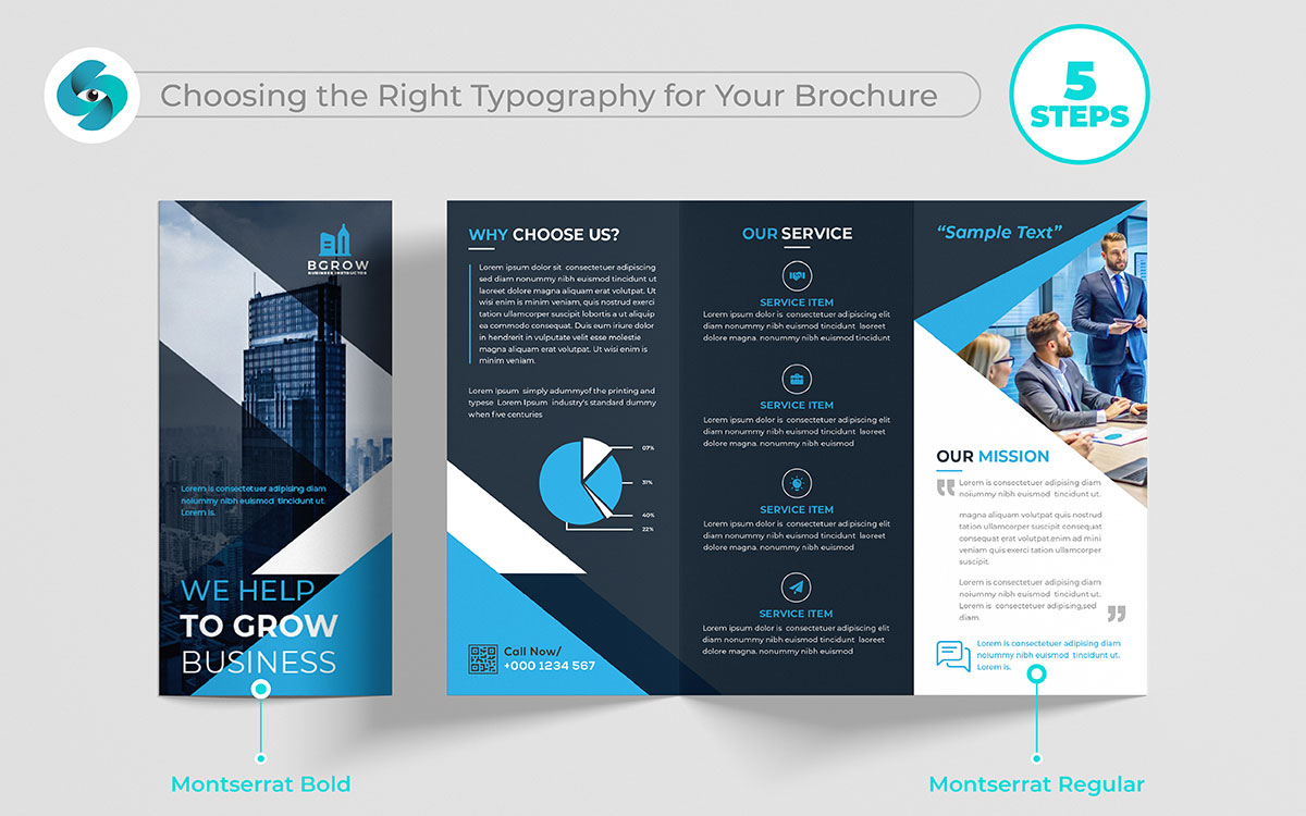
Typography is a very important factor for your brochure. The fonts you choose actually change the feel of your message. They can make your brochure look friendly, professional, or creative. Each typeface carries its unique style and mood. This guide will take you through five simple steps to find your perfect typography. You will know just how to choose fonts that connect your audience with your message and uplift it. So, let's get started!
Think of your brochure design as a medium in which you're really showcasing the personality of your brand. The fonts you use describe the voice of your brand: fun, serious, fancy, bold. The right font will make your brochure pop; it just feels right.
Key Tips:
Table: Font Choices by Industry
| Industry | Type of Font | Example Fonts |
|---|---|---|
| Luxury Fashion | Serif | Garamond, Bodoni |
| Tech Startup | Sans-Serif | Helvetica, Roboto |
| Children’s Toys | Display | Comic Sans, Chalkboard |
| Corporate | Sans-Serif | Arial, Lato |
Font size acts like a signaling device to direct people through your brochure. Larger fonts draw attention to something, while smaller fonts keep the information countdown. By adjusting font size, you ensure that your reader knows what is most important.
Key Tips:
Table: Recommended Font Sizes
| Text Type | Font Size (in points) | Example Use |
|---|---|---|
| Headline | 24-36 | Main title of the brochure |
| Subheading | 18-24 | Section headings |
| Body Text | 10-12 | Main information in the brochure |
| Call to Action | 14-18 | Emphasizing important steps |
Pairing fonts is similar to finding two friends who look great together. Matching fonts make your brochure more interesting and easy to read.
Key Tips:
Table: Effective Combinations of Fonts
| Font 1 (Primary) | Font 2 (Secondary) | Style Description |
|---|---|---|
| Garamond | Helvetica | Classic and contemporary blend |
| Lora | Open Sans | Refined yet accessible |
| Raleway | Roboto | Sleek and modern |
| Merriweather | Montserrat | Mixing serif with sans-serif |
Font weight: The term given to the width of the letters. Using different weights, you can show what is important in your text. It is like using bold letters to say, "Hey, look here!"
Key Tips:
Table: Font Weight Usage
| Weight | Usage Example | Impact |
|---|---|---|
| Light | Body text, captions | The elegant, soft look of Regular |
| Regular | Standard body text, subheadings | Easy to read, crystal clear |
| Bold | Headlines, main information | Strong emphasis, catches the attention of |
| Extra Bold | Call to action, headlines | Very strong, impactful |
Line length simply refers to the length of every line of the text. If the lines are too long, they might cause the readers to lose their place, while if the lines are too short, the text may be choppy. An optimal line length will make your brochure an easy read.
Key Tips:
Table: Line Length Recommendations
| Line Length | Characters Per Line | Best Use |
|---|---|---|
| Short | 30-45 | Narrow columns, captions |
| Optimal | 45-75 | Body text, main content |
| Long | 75-90 | Large text areas, block quotes |
With these simple tips, your brochure’s typography will not only look great but also be easy and enjoyable to read. The right fonts and layout can make all the difference!
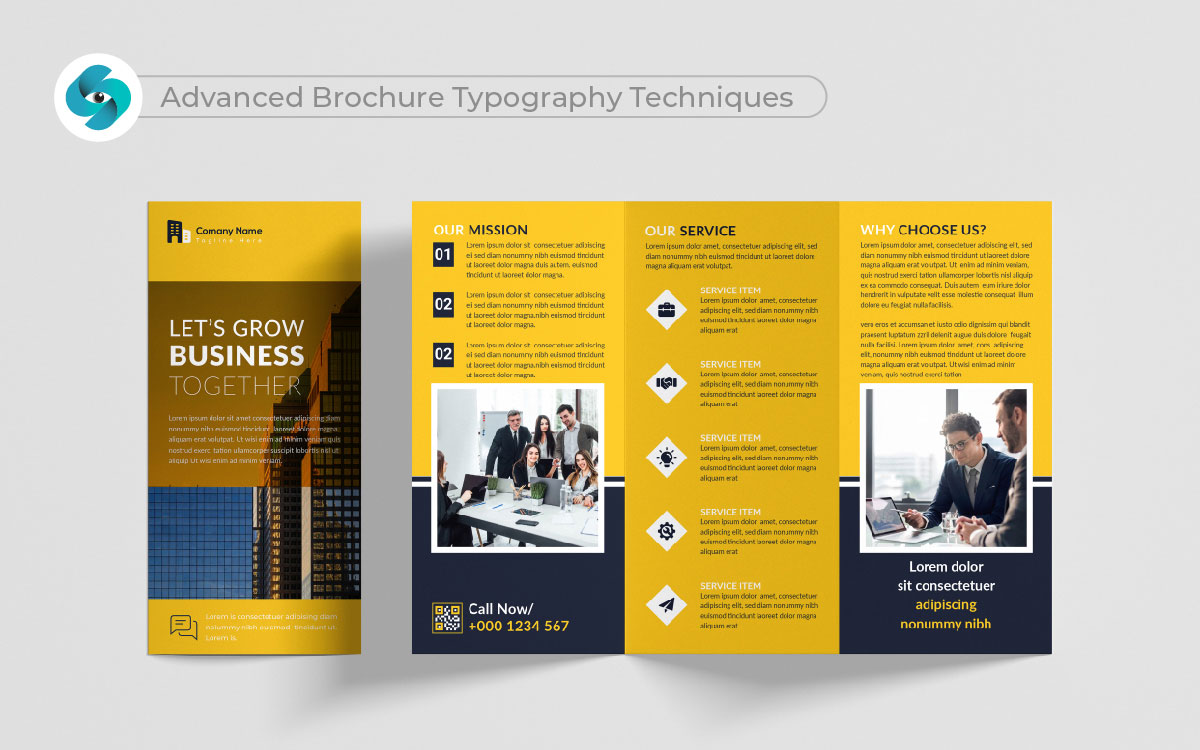
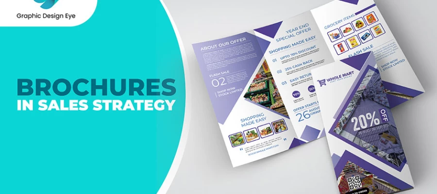
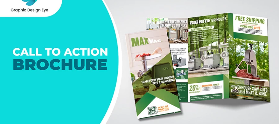
Typography is more than a design element; it's the heartbeat of your brochure. When someone looks at a brochure, a good or bad impression can be formed instantly just by looking at the way the words appear. Advanced typography techniques are changing plain Text into an appealing visual journey that resonates with your audience on a deep level. Think of creating a voice for your brand, one that speaks directly and specifically to the heart of whoever will read it. Within this exploration, there are two major focuses: creating custom typography and dodging the jagged legal landscape of custom fonts.
Just imagine going into a coffee bar and being immediately greeted at the door with a menu in unique, handcrafted letters. Immediately engaging, right? Custom typography can do that for your brochures, too. Here's why it's worth considering:
Experiment with styles, play with shapes and make your creativity take flight. This will make the brochure not only stand out but tell your story in a way that really resonates deeply with your audience.
Now, the other side of the coin seems to be legal consideration. A font can be a powerhouse, but it does not come under regulations. A few key points are hereby mentioned:
Just because a font looks good doesn’t mean it’s free to use. Before you get too excited about your beautiful new font, do your homework. This step can save you from headaches down the road. Remember, creating something unique is great, but doing it the right way is even better.
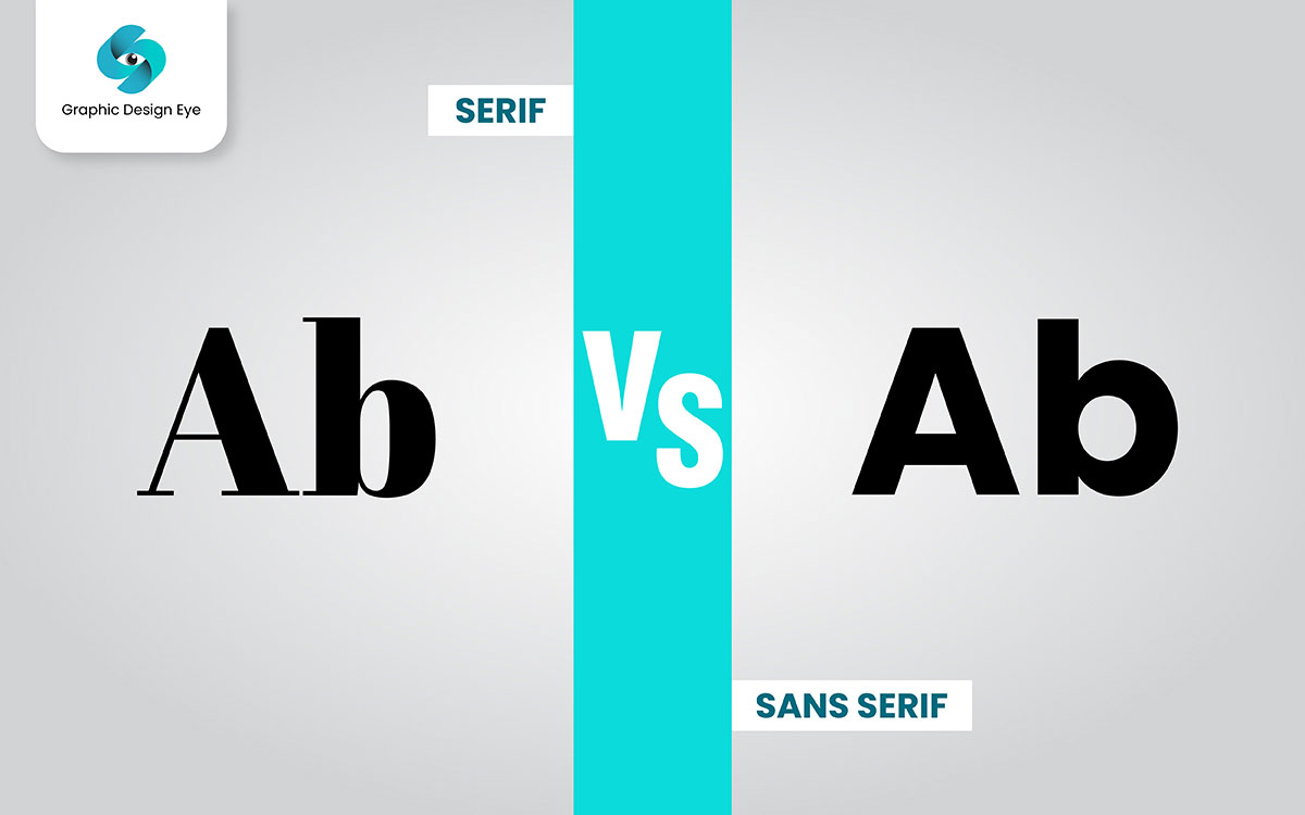
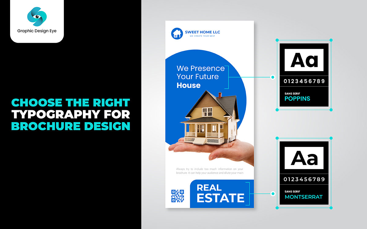
The font one selects for a brochure is another critical factor in interpreting a message. In simple terminology, there are two kinds of fonts: serif and sans-serif. Each has its look and feel and can create different impressions on the reader. Knowing the difference will make a positive choice if one not only knows the audience but also the message that is to be conveyed.
Serif fonts have small lines or other marks at the ends of their letters. Examples include Times New Roman and Georgia. These fonts can easily give a classic and formal air. They convey an impression of dependability and tradition. Serif fonts tend to be more easily readable in printed material, especially in texts that are longer in length. The tiny lines guide the eyes along the lines of text. Because of this, serif fonts often work best for formal brochures, reports, or anything that commands credibility and trust.
The sans-serif ones do not have such small lines. Examples include Arial and Helvetica. These fonts are clean and modern-looking. They often tend to be less formal and friendlier. Sans-serif fonts are normally easier to read on screens, and thus, they can be an excellent selection for digital brochures. Such fonts would be perfect in casual brochures, promotional materials, and for everything that needs to address the mass audience.
Here are some important considerations for choosing a serif or sans-serif font when it comes to your brochure.
Consider Your Audience: First, decide who your audience is going to be. Whether your audience will be formal or professional, serif fonts are usually your best bet. On the other hand, if your audience is going to be young or casual in nature, sans-serif fonts would be better suited.
Define Your Message: What feeling would you like to evoke? If a brochure is about tradition, stability, or even professionalism, use serif fonts. If you're trying to convey creativity or innovation, you should use sans-serif fonts.
Think About Readability: If your brochure has a lot of text, serif fonts are usually easier to read in print. For shorter texts or digital formats, sans-serif fonts can work better because they are often clearer on screens.
Mixing Fonts: Of course, you can use both kinds of fonts in your brochure. For instance, you can have a serif font for headings and a sans-serif font for the body of the text. Doing so will develop a good contrast that will help your readers to lead them through your text.
Test Your Choices: Before finalizing your design, print a sample or check it on different screens. See how the fonts look together and how easy they are to read.
By understanding the strengths and weaknesses of serif and sans-serif fonts, you can make a smart choice that enhances the effectiveness of your brochure and makes it visually appealing.
When designing a brochure, the choice of fonts is really important. Fonts can set the tone and help convey your message. Too many fonts can make a design look chaotic and confuse the reader. Instead, simplicity allows for clear and easy reading.
Using a few well-chosen fonts will make your visual statement strong and bold, besides giving your brochure that professional look. Consider what each font will say with your brand's personality and the message you'll share. Here are some important pointers to understand while using fonts in brochure designs.
2-3 Fonts Limit: Use only two to three different fonts. This keeps your design clean, neat, and easy to follow. Too many fonts introduce clutter.
Hierarchy is Important: pick one font for heads. That font should be bold and grab the eyes. nr. Then, use a different font for the body copy. It should be as plain as possible, and very readable.
Consistency is Key: Stick to one or two fonts throughout the brochure for a smooth, cohesive look.
Readability: If there is a need to use fonts that may be used along with minor or small text, it is better to use readable fonts so that your readers can read your message faster and not hurt their eyes.
Complementary Styles: The fonts that you set should be compatible. They need to work together in style and weight to make a polished design.
If you follow these guidelines, not only will your brochure look visually attractive, but it will also convey your intended message.
Yes, you can use free fonts for brochures, but you need to be careful. Not all free fonts can be used for business. Here’s what to do:
Check the License: Each free font has rules, called a license. This tells you how you can use it. Some fonts are only for personal use. That means you can’t use them for anything you sell or make money from.
Look for Commercial Use: To use a font in a business brochure, you need one that allows commercial use. Make sure the font’s license says you can use it for business.
Read the Details: Always read the license details. Some free fonts have limits. For example, they might only be for certain kinds of projects.
Ask for Permission: If you’re not sure about the license, ask the creator. Or find a different font. Some other creators are allowed to use their fonts commercially if asked to do so.
Consider Purchasing a Font: You may want to consider buying a font. Typically, purchased fonts have straightforward guidelines regarding business use of the font and are usually better in quality.
Quick Tips:
This way, you can safely use free fonts in your brochures and avoid problems.
Typography is a keystone of brochure design. It presents your message more clearly and makes your brochure more appealing to view. Poor typography confuses your readers or projects and makes your brochure look unprofessional. Such mistakes will distract from the message at best and can devaluate an otherwise great brand.
To create an effective brochure, it’s important to pay attention to how you use fonts, sizes, and spacing. Making the right choices helps your brochure communicate clearly and engage your audience. Here’s a list of common typography mistakes to avoid:
Using Too Many Fonts: Many people commit the mistake of sticking to more than three fonts. Such fonts are going to make a mess in your design and may look messy and confusing for readers. Keep it simple and go with two or three complementary fonts.
Inconsistent Font Sizes: Similar text in different sizes disrupts the flow. For example, all your headings and subheadings should be the same size. The thing is to decide on a size for each particular type of text and stick with it.
Poor Readability: Fancy or overly complicated fonts reduce readability. It is necessary to use clear and simple fonts, specifically for the body text, so your readers can understand your message with ease.
Neglecting Line Spacing: When some text is too close together, it feels crowded. Proper line spacing, also known as leading, helps make your text comfortable to read. Aim for little space between the lines for better readability.
Ignoring Contrast: If there isn’t enough contrast between your text and the background, it can be hard to read. Make sure your text stands out clearly against the background color or image.
Overusing All Caps: Writing everything in all capital letters can seem like shouting. It’s also harder to read. Use uppercase letters mainly for headings, not for the entire text.
Misaligned Text: Text that isn’t properly aligned can make your design look unprofessional. Keep your text aligned consistently, whether it’s left, right, or centered.
Lack of Hierarchy: If you don’t create a clear hierarchy, readers might get confused. Use different font sizes and styles to guide them through your content. This helps them know where to focus their attention.
Using Ornamental Fonts for Body Text: The ornamental fonts look nice but are a pain to read over long paragraphs. Save those fonts for your headlines or special accents, not regular text.
Forgetting Proofreading: Types and grammatical errors may be costing your credibility. Always proofread your text before completing your design. This will ensure that your brochure is polished and professional.
Avoid these common typography mistakes to ensure that your brochure is good and conveys your message, leaving a great impression in the minds of your target viewers.
We’re at the end! This type of journey can be a lot to take in, but it’s all about helping you choose the right typography for brochures. We covered a lot of ground today. From choosing the right fonts to understanding how typography impacts your message, it’s clear that good design matters.
Keep in mind that a brochure is usually the first display of your branding people receive. The right typography can make that count. We also hope that this session has been helpful and informative, with helpful brochure design tips.
Should you have any questions regarding what we talked about, please feel free to get in touch with us at any time. Our team is here to help and will get to you really fast once you have shared your thoughts with us.
We are very excited to see you succeed in your business and goals. Cheers to your creative journey! We hope to hear from you soon!