Graphic design tips and tricks help bring your vision to life, it's not just about color and fonts. At its core, graphic design tells a story. Graphic design is not just about making things look good — it's about creating a meaningful experience.
And definitely, it’s about reaching out to your audience. A design should speak. It should feel like a conversation.
You don’t need to follow every rule. But the right principles matter. No matter how small the detail, it adds up. I’m sure you’ve noticed that some designs just catch your eye. It’s not by chance.
It’s the balance, the rhythm, the flow. No doubt, those little things make all the difference. They guide the eye. They hold the story.
It’s easy to forget the basics. But those basics are powerful. At some point, you’ll feel the magic of good graphic design. Nothing too crazy, but it feels like something clicked. The way the pieces come together.
You’ll see how a tiny shift in spacing can change everything. It’s safe to say, even the smallest tweaks can have a huge impact.
This guide will show you how to make those small changes. Graphic design tips and tricks that will take your graphic designs to the next level. More or less, these are the little things that make a design great.
But it’s ok, you don’t need to know it all at once. It’s about practicing, growing, and seeing what works. For sure, let’s drive in!
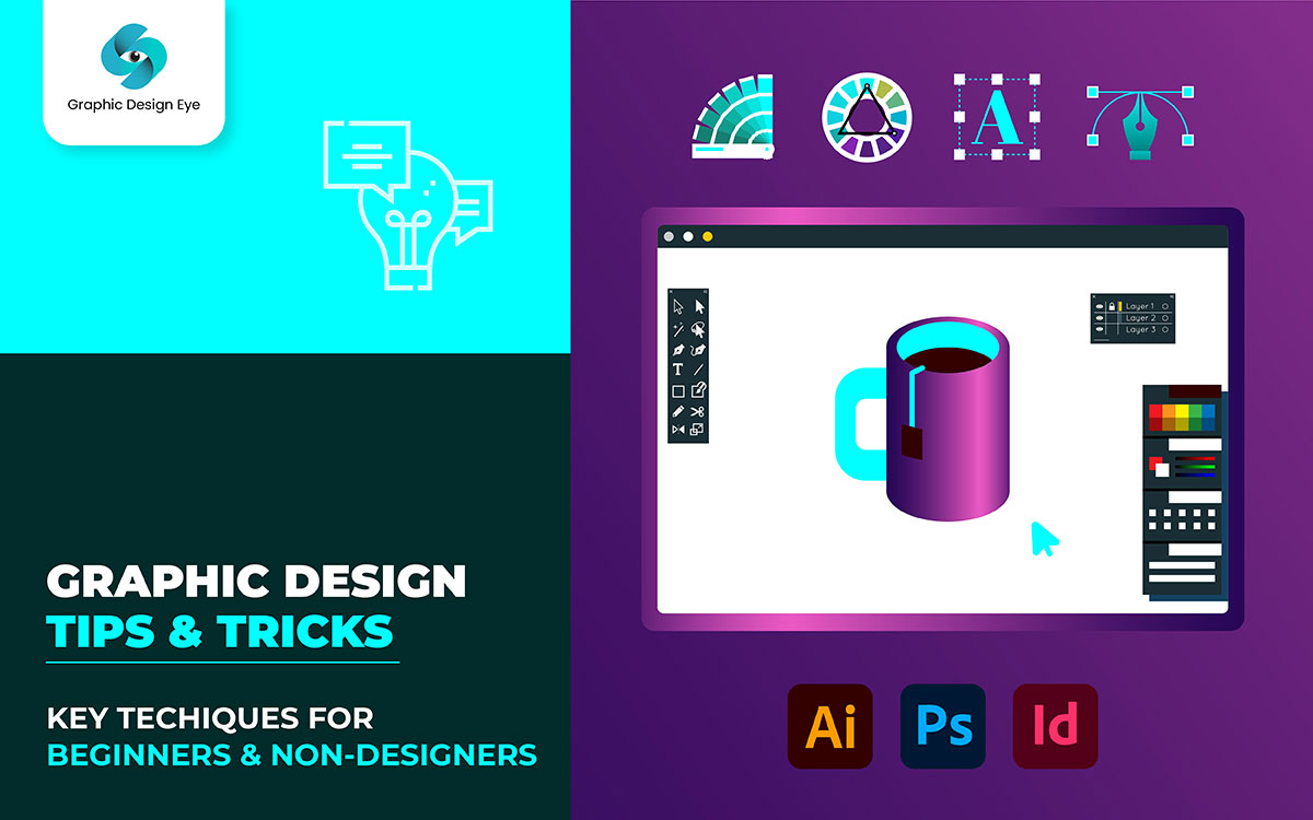
You know we put in hard work. We did lots of research. We gathered wisdom from experienced designers. Then we picked the 35 graphic design tips and tricks that matter most.
Each tip is a gem, ready to polish your skills. Simple, yet powerful. They’re crafted to elevate your designs, one step at a time. So, let’s start now.
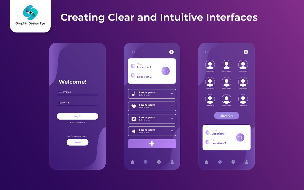
From the beginning, design is about making things feel just right. Feels obvious, doesn’t it? Keep it simple. The only thing that finally matters is how easily your audience can engage with your design. To be clear, it’s about clarity and flow. So let’s break it down.
If people can’t read your text, the rest of the design doesn't matter. For sure, readability is key. Not exactly, but it’s the first thing people notice. So, keep it clear, clean, and easy.
Choosing the right font is a huge part of this. You want fonts that speak to your design but still make the message easy to understand.
Use legible fonts: Stick with fonts like Arial or Georgia. They’re easy to read, and you can still add character.
Practical Tip: Just so you know, try viewing your design in different light. It might as well be harder to read in bright conditions.
Not all information deserves the same spotlight. I wouldn’t be surprised if you find that prioritizing information is key. It’s only a matter of time before you realize the importance of good structure.
Use headings and subheadings: Break up your content. Let your readers breathe and follow along.
Practical Tip: To be clear, focus on the most important thing your audience should remember. Make it stand out.
Letter spacing is often overlooked. That being said, it can change everything. Regardless of how good your idea is, if your letters are too tight, it’s hard to read. You can probably guess that the spacing matters.
Practical Tip: Ultimately, the fact that even small adjustments in kerning typography can make a big difference.
Caps lock is powerful, but it’s also loud. It’s just how it is—too many capital letters feel like shouting. Then, and this is important, don’t let it overwhelm your design.
Practical Tip: Yeah, I actually suggest tweaking the size and spacing of caps for a softer effect.
Alignment in graphic design creates order. One way or another, it makes your design clean. Not exactly a secret, but well-aligned text looks professional.
Practical Tip: Regardless of how good your idea is, always check your alignment on different devices.
Grids are the foundation of balance. You are basically building a structure with them. Some people may suggest that grids are the secret to harmony in design, as they follow the principles of design.
Practical Tip: It might as well be that using grid tools in software like Figma or Adobe can save time.
Great design isn’t just about colors, fonts, or images. It’s about making everything feel right. Naturally, a good layout guides the eye. It should be smooth and easy. If things feel messy, people won’t get your message.
You ever feel like that? Looking at something and just—nope? A bad design can do that. It’s a whole disaster, but don’t worry. Take it one step at a time. No rush, no pressure. Let’s break down five simple tricks to fix your layout.
Balance keeps your design stable. Without it, everything feels off. If one side is too heavy, it throws the entire design out of whack. Balance makes things easy to look at. Simple. Clean.
It’s all about the elements of design working together.
But trust me, it works. Balance doesn’t mean things have to match perfectly. You can balance things in many ways:
Practical Tip: Step back. Squint. Does one side feel heavy? Fix it. Adjust size, placement, or color.
Clutter makes things confusing. If too much is happening, honestly, you won’t know where to look first. People get frustrated. A simple layout? That’s the way.
Keep a clear order. Guide the eye. Every part of your design should have a reason to be there.
And remember, staying on top of graphic design trends can help keep your layout fresh and modern.
Practical Tip: Remove one thing. Does it still work? If so, it’s cleaner and simpler.
Shapes aren’t just for decoration. They create order. They guide the eye and separate sections. But when shapes get too fancy, it’s easy for them to distract rather than help.
This is why using shapes in designs is so powerful. They help maintain balance and focus.
Ever seen a design with weird, overly complex shapes? Maybe a jagged border or an unnecessary swirl in the background? Instead of helping, it adds clutter.
Practical Tip: If a shape doesn’t help, drop it.
Ever seen a design that just felt overwhelming? Too much going on? Words squished together? Images packed in with no space? White space fixes that.
White space (negative space) isn’t wasted space. It’s active. It directs the eye. It gives the design room to breathe. When a design has too much crammed in, people don’t try to process it—they move on.
Practical Tip: Things feeling squished? Add spacing. Check again. Better, right?
Ever looked at a design and thought, “This feels… flat?” Sometimes, designs need a little texture to feel alive.
Textures can add depth. They make things feel more natural. But there’s a fine line. If you overdo it, the design can look messy.
Practical Tip: Before adding texture, ask yourself: Does this help? If not, ditch it.
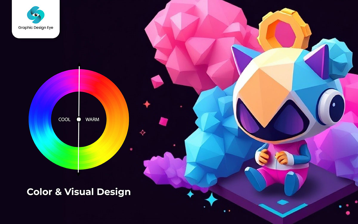
Color is powerful. It sets the mood. It creates emotions. It helps people decide. I’m here, always thinking about how color influences design. It’s not just picking pretty shades. It’s about how colors work together. That’s all, just sharing why this matters.
Let’s explore how you can use color wisely. Just a little reminder for you—color isn’t just decoration. It has a purpose. You’re never alone in this if color choices feel confusing. Keep going. Keep reading.
A messy color palette? It ruins everything. Colors should match. They should flow. Personally, I love when colors feel connected. That’s what makes designs look polished. You’re here to look for ways to make colors work better together. Here’s how.
Practical Tip: Wouldn’t you say that’s true? When colors are planned, designs look professional. They feel more natural. They leave a strong impression.
Colors talk. They express feelings. They create expectations. Now most probably, you’ve noticed how different famous brands use colors to send messages. It’s not random. It’s psychology.
Practical Tip: The ideal way to use color theory is to match it with emotions. Think about the message. Think about your audience. Choose colors that feel right.
Great designs fail when text is hard to read. The best colors won’t matter if your words disappear. In my opinion, contrast is everything. High contrast means high readability.
Practical Tip: Yup, always check your text. Step back. Look from a distance. If it doesn’t pop, fix it.
Where should people look first? Contrast decides that. Without contrast, everything blends. Which not everyone is, obviously, aware of. But once you learn this, your designs will improve.
Practical Tip: Use contrast wisely. Bright colors. Bold text. Large spacing. Ask yourself: What do I want people to see first? Then, make that element pop.
Bright colors are exciting. But too many? It’s overwhelming. I’m here, always reminding myself to use them carefully.
Practical Tip: Step back. If your design feels too intense, adjust. Bright colors should highlight, not overpower.
Color directs focus. It leads people through a design. Personally, I use it to control where people look first.
Practical Tip: When you assign something a color, do it with purpose. Colors should guide people, not just decorate.
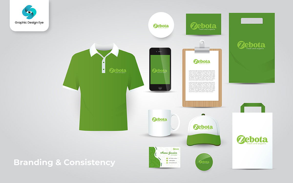
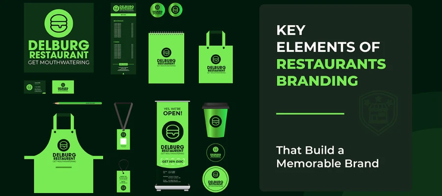
Branding is more than a logo. We understand that. It’s a feeling, a presence, a promise. Well, what do you think? When people see your brand, they should know it’s you.
Without a doubt, consistency is key.
But it may seem impossible to keep everything aligned. Colors. Fonts. Designs. Messaging. So many options out there. How do you make it all fit? But don’t worry!
With the right steps, everything is starting to fit.
Your brand’s style makes you memorable. Catch the dream you cherish. A scattered brand is forgettable. A consistent brand? Unshakable. Now it makes sense, and a great business website builder can help you build this consistency online.
Practical Tip: Before finalizing, ask yourself, “Does this match my brand?” If not, adjust. You’re getting it.
Your brand should be the most understandable way for people to recognize you. Instagram. Websites. Business cards. Everything that you want to show should feel connected.
A good way to ensure this is by picking the right color palettes that work across all platforms.
Practical Tip: Compare your website, social media, and printed materials side by side. Things are looking good, but is there a mismatch? Adjust it.
Looking to get inspiration? The world is full of trends. But trends fade. Best motivation for moving ahead? Create something that lasts. You can start by using mood boards to gather your ideas and stay focused on a cohesive vision.
Practical Tip: Place your brand next to competitors. What’s your view—don’t you think so? If it blends in, tweak it.
The biggest issue is that some designs look great big, but awful small. Tiny logos. Shrinking fonts. Primarily, clarity is everything.
Practical Tip: Resize your logo and test it everywhere. Nothing to be worried about—just small tweaks for big impact.
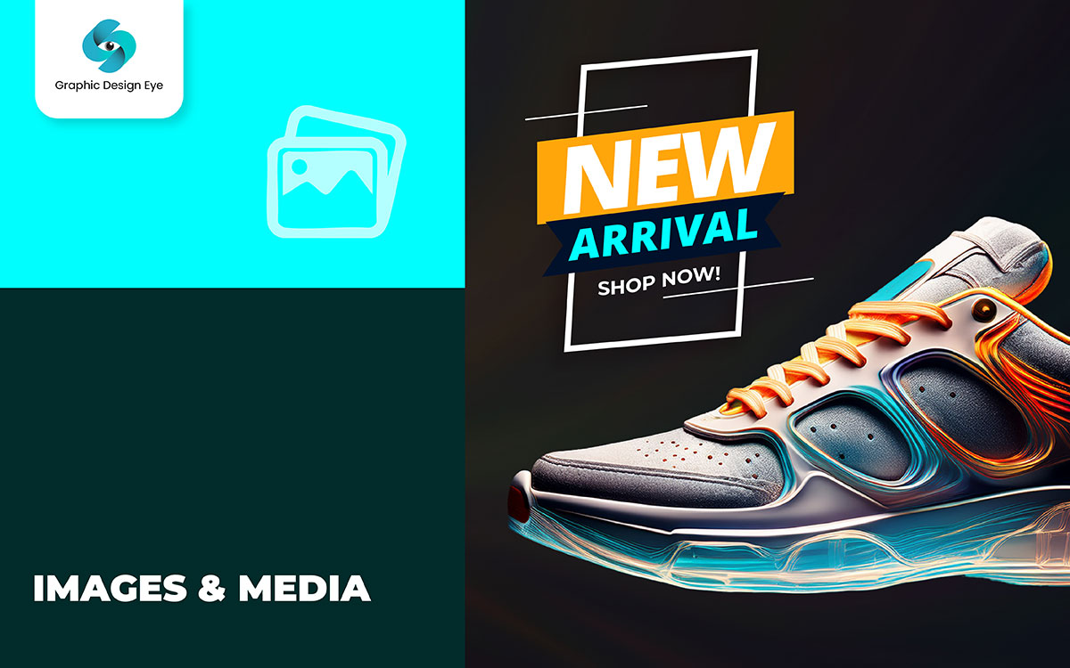
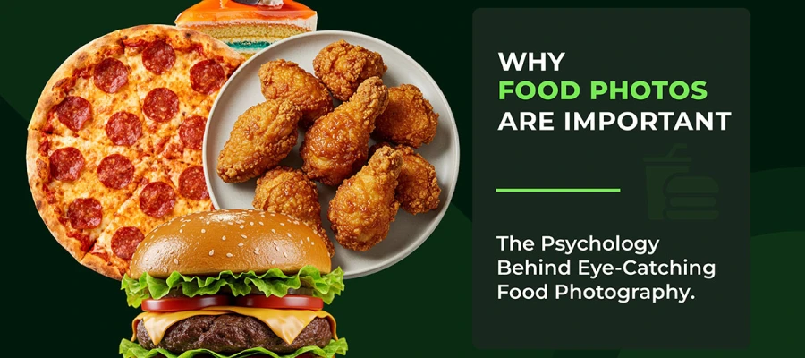
Look, images do more than decorate. They breathe life into your design. They whisper stories. They pull emotions. Isn’t that the case? Without them, a design feels flat. Empty. Lost. You may find it hard to connect without the right visuals.
Expanding reach day by day. That’s what good images do. They don’t just sit there. They work. They are invited. They are convinced. But this will not matter if they don’t fit your brand. If they feel random. If they confuse instead of clarify.
Keep going—you’ll love what’s next! Let’s dive into what makes an image work. Let’s make every visual count.
Doing the same thing with images as you do with fonts and colors? Smart. It keeps everything smooth. Connected. Familiar. Otherwise, your design will feel scattered. Unpolished. Untrustworthy.
Probably a better idea is to pick a visual theme. A style that speaks for your brand. A look that feels intentional. Now a question keeps coming—how do you do that?
Practical Tip: Take a step back and scan your images. Do you feel the same way about all of them? If they feel disconnected, tweak them. Adjust the tone, colors, or edits until they belong together.
Some images grab attention. Others steal focus. The difference? Relevance. I honestly didn’t know this early on, but a perfect-looking image can still be the wrong one.
If you’re still reading, you care about getting this right. So, what will help the most is choosing images that add value. Images that reinforce your message.
Just a minor distinction I think you’ll find useful—your images should speak the same language as your words.
Practical Tip: Before adding an image, ask yourself—does this strengthen my message? If not, it’s just noise. Replace it with something that does.
You’re never going to feel like optimizing images is exciting. But it matters. Slow-loading pages kill interest. Chase the vision you hold dear, but don’t let heavy images slow you down.
Practical Tip: Run your site through Google PageSpeed Insights or GTmetrix. If your images are slowing things down, compress them. Fast pages keep visitors engaged.
I figure I should be honest—generic stock photos can ruin trust. They look staged. They feel cold. The only thing I know is that authenticity wins every time.
Practical Tip: Browse your website. Do any photos feel overused? If yes, swap them out. People connect with real images, not generic ones.
Blurry images scream "unprofessional." Don’t worry if you think you can fix them later—start with high resolution.
Practical Tip: Zoom in to 100% before uploading an image. If it looks blurry, it’s too low-res. Find a sharper version.
Want clean, seamless designs? Stand out from the crowd with transparent backgrounds. They blend. They adapt. They make layouts feel smooth.
You can even use an online icon maker to create custom icons with transparent backgrounds, making them easy to place on any design.
Practical Tip: Always use transparent backgrounds for logos or icons that will sit on multiple background colors. It keeps your design polished and flexible.
A messy workflow can steal your time. It makes you stumble and lose momentum. Imagine you need to update a design, but searching for the file takes 15 minutes—frustrating, right? I suggest you focus on organizing your files early on. You get the point, right?
Good organization saves time and keeps you on track. Ultimately, the fact that even small changes can throw off your whole process makes structure a necessity. Let’s dive into the best practices to stay organized.
A cluttered folder is chaos waiting to happen. You are basically setting yourself up for failure if your files are everywhere. But you need to keep everything in its place.
What will that take? Just a little effort to keep it tidy. A neat structure saves you from wasting time. It’s that simple.
Practical Tip: Set a consistent structure. Stick with it for every project. It’s pretty simple, but oh so helpful.
Ever opened a folder and found files named "final-final-REAL-final.psd"? I have pretty much seen this in every designer's life. Clear file names prevent mix-ups. But don’t just give random names. Be specific.
Practical Tip: Stick to a naming format like ProjectName_Version_FileType. It makes life easier.
You never know when you’ll need to tweak a design. Believe me, it’s all good to save your editable files now. What will that take? Just a little foresight. If you save only flattened files, you’ll regret it later.
Practical Tip: Always keep the source file with layers intact. Doesn’t that sound right?
Losing your work to a computer crash is a nightmare. But obviously better if you can avoid it. You should always try to back up your work. At the end, you’ll be glad you did.
Practical Tip: Set up automatic backups. What’s your take on that? It’s peace of mind.
Good designers don’t just stop at great visuals. Some people may suggest sticking to what you know, but that’s not how you grow. You’ll struggle, but you’ll eventually get there. Let’s look at ways to keep improving your skills.
Great ideas don’t just come from nowhere. I know that’s a fact. But if you’re willing to stay connected with others, you'll expand your creative world. At this point, it’s safe to say you can learn a lot from others.
Practical Tip: Create a Pinterest board or inspiration folder. You’ll learn what you need to by revisiting them later.
Feedback stings, but it’s pretty essential for growth. The best designers know how to listen. You’ll learn what you need to by taking the feedback and improving, You’ll learn what you need to by taking the feedback and improving, which is key to developing skills graphic designers rely on to refine their work.
Practical Tip: Ask specific questions, like “Does this layout feel easy to navigate?” Instead of just, “What do you think?”
But obviously better if you can push your boundaries. Trying new styles will keep your work fresh and exciting. Especially if you want to try new things, don't hold back.
Practical Tip: Try designing one poster in a different style every week. Wouldn’t you agree? It helps you discover new strengths.
Design skills improve with practice, not occasional projects. You will struggle, but you’ll eventually get better. Set time aside to keep honing your craft.
Practical Tip: Keep a design journal to track your progress. Reflect on what you’ve learned over time. Doesn’t that sound right?
It was bound to happen. We’ve reached the end.
But now, you have what you need. The tools are in your hands. For what it’s worth, these tips are more than just concepts. They’re real steps to better design.
One way or another, you’ll start seeing results. Your designs will feel stronger. More aligned. So you would have to trust yourself. You’ll know when it’s right.
Absolutely, try new things. Experiment with your choices. It’s all part of the journey. It’s just how it is—the more you try, the more confident you get.
At some point, you’ll feel the difference. You’ll understand design like you understand music. I wouldn’t be surprised if, with time, you start seeing the magic. Definitely, these tips will make your designs shine.
It’s all about what works, not just what looks good.
That being said, let us help. Graphic Design Eye is here. We turn your ideas into polished creations. It might as well be the perfect time to take that next step. Let’s make your designs work for you.
Fair enough, we’ve got your back. Keep creating. It’s only a matter of time before you find your rhythm. Cheers. 🎉