The most famous personal logos will inspire and motivate you to create a creative logo for your own brand identity. From simple shapes to unique letters, these logos tell your stories. They make people trust the person behind the logo.
So, how do you design a logo that truly represents you and connects with your audience? It’s about simplicity, uniqueness, and an emotional connection that lasts.
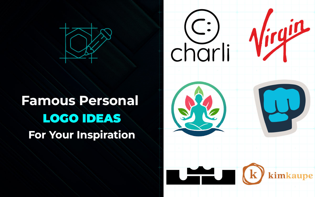
In this post, we’ve gathered 15 of the most famous personal logos to inspire your own brand identity. By looking at these personal brand logo ideas, you'll learn how to design a logo that stands out and boosts your career.
Let’s dive in and explore!
The great personal logo examples feature images that convey a deeper meaning. They make you feel excited. Yet, they remain simple. And their shapes make them look fun.
You’ll notice these logos everywhere. There are so many, big and small, and they’re all amusing to look at.
Here, we’ve listed 15 famous personal logos that will inspire you to create an amazing one for yourself. Let’s explore the secrets behind these stylish personal logo ideas!
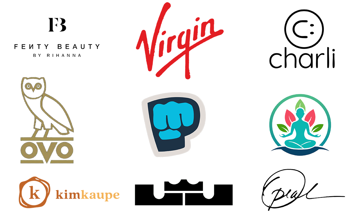
Dr. Marc Hirner is an experienced orthopaedic surgeon from New Zealand. He uses personal branding to build trust with patients in a crowded healthcare market. His logo is simple but smart. It uses black and white, with a pop of orange. This color choice shows that he is professional, but also friendly and energetic.
Many patients, about 77%, look up doctors online before booking an appointment. Dr. Hirner’s logo helps him stand out in this online world. His logo is abstract, but it clearly represents his work with knees and shoulders. It’s designed to appeal to patients in the UK, US, and Canada, where doctors need strong branding to stand out in a busy market.
Julie Margo's iconic personal logo for Full Spectrum Self is a great example of how simple design and holistic branding come together in 2025. Julie is a certified Reiki Master Teacher and Essential Emotions Coach. Her logo uses clean, easy-to-read text and simple shapes that feel balanced and real.
It builds trust among people. The logo is simple but smart, making it easy to recognize on different platforms. It reflects Julie’s work in spiritual healing, showing how practitioners can create strong, memorable logos that connect with clients, without using complicated symbols.
Cristiano Ronaldo’s CR7 logo is a symbol of confidence. It looks cool and simple, just like Ronaldo himself. Every line in “CR7” shows coolness and control. It feels like the logo is the greatest.
The design is clean, bold, and timeless. CR7 is a brand that’s taken over the world. You notice it on clothes, perfumes, and ads everywhere. It’s like Ronaldo’s way of saying, “I’ve ruled football, now it’s time to rule everything else.”
When you spot those letters, you’re seeing a symbol of greatness. It’s a quiet flex that says, “Yeah, I’m the best, and I’ll let the logo prove it.”
Drake’s OVO Owl is the symbol of his brand. It’s simple and cool. The owl symbolizes wisdom and nighttime vibes. It matches Drake’s style of mystery and sharpness. You notice the OVO Owl on hoodies and billboards. Wearing it feels like being a part of something big.
The OVO Owl is a sign of being cool. It stands for smarts, power, and success. The design is sharp and clean. It looks fresh without trying. The owl is a statement. A flex. It feels mysterious and grabs immediate attention. Being part of OVO is always special.
Rihanna’s Fenty logo is a fashion statement. It’s clean and bold. The name “Fenty” feels confident. Rihanna didn’t just make a clothing brand; she made a vibe. This logo represents that vibe perfectly.
The fantastic personal logo example behind Fenty is cool. It’s a place where people can hang out, drink beer, and make friends after shopping for makeup. The logo fits this playful vibe. It’s a breath of fresh air.
This year, going online to shop and collecting makeup while chatting with people at the mall will match the vibe of this logo.
The Jumpman logo and the Nike Swoosh almost made it to the top of our list. But they still deserve a shout-out. The Jumpman, which shows Michael Jordan jumping, was the first official shoe logo ever. This year, it was redrawn, and it’s now one of the best-looking famous personal logos ever made.
Nike’s logo is a computer-made design. It’s full of sharp, clean lines and lots of colors. The picture might not show all the details, but it’s still stunning and impressive.
The Jumpman logo’s idea is also interesting. A man jumping becomes a place where people can hang out, meet new friends, and enjoy sports drinks after playing basketball. It gives it a mix of action and social gaming.
When we first heard in January that LeBron's new logo would be a crown with "LJ," some people weren’t sure about it. But once they saw it, everyone understood the logo designer’s choice.
The crown really makes you feel like a king. The shadow it casts on the wall, and the gold color that sparkles in the light, all add to the effect. The "LJ" letters blend in so well. They make the crown feel like something a real king would wear.
What’s even better is how LeBron and the Nike logo designers worked together to create one of the famous personal logos of all time. Nike knew that a great sports logo needs variety. And this crown logo has just that. It looks great on a hat, shirt, or shoe. It’s a strong, memorable logo that works everywhere.
Kim Kaupe's logo has a bird, but the bird is just part of it. The main idea is about flying high. You can use a pencil to draw the bird’s wings or even knock the eraser off the table, but the goal is to make the bird look like it’s about to fly off the page. It gives the logo an exciting feeling, just like in the new business meetings.
The name is written in small letters, which makes the logo look professional. You’ll notice the bird and its feathers, both big and small. They’re amazing to look at and figure out.
The logo shows Kim’s creative style. It makes you feel inspired and excited. If it could talk, it would say, “Let’s get to work and have fun doing it!”
The start wasn’t great, and it left some people feeling disappointed. But things got much better when Oprah and her team started working on the new version of her talk show logo. They made the "O" look even better than before, with a more beautiful and realistic design than the one from 2021.
They added more things to explore, like pictures for the book club and magazines filled with every "O" from around the world. The shapes and other details were also improved.
When it was finally revealed this year, it became known as the best-looking "O" ever made. The shape is simple, more like a circle than a letter, but it’s still a stunning shade of purple and looks amazing. It’s definitely worth checking out.
The Virgin logo is full of personality. You can feel Branson’s adventurous spirit in the way it’s written. The letters are free and exciting. It’s like saying, “We do things our way.”
The smooth lines make it feel personal. Virgin isn’t just a company; it’s a movement. In a world full of boring famous logos, Virgin stands out with style and attitude.
The handwritten logo looks real and personal. It’s like Branson is saying, “I’m with you. Let’s do something amazing together.” Every time you notice that swoosh, remember Virgin loves breaking rules and having fun while doing it!
The Brofist logo is a symbol for PewDiePie's "Bro Army." It first appeared in 2010. The fist is a digital high-five. It says, "I’m with you." It makes fans feel like they’re part of something special.
The design is simple and easy to spot. When you notice it, you know you're connected to PewDiePie. A hand can make a fist, or knock over a soda, but mostly it’s used for a brofist to say "hello" to friends online.
The happy music in PewDiePie's videos makes big moments feel even bigger. The fist itself looks great, and the orange color makes everything feel fun. It’s never too serious or dark. You’ll notice the Brofist everywhere, in all sizes.
Charli D'Amelio's logo is new and bright. It has a fresh, Gen-Z feel. The design is clean and modern. It connects with her fans. The logo shows how much she has influenced people. It stands for the energy and creativity of youth.
The logo also shows Charli's closeness to her followers. It's simple but meaningful. The design is easy to understand and stands out. The font is casual, like something you'd notice on Snapchat.
It's easy to recognize. The logo fits Charli's down-to-earth style. It’s modern, but still has a classic vibe. People will remember it. It represents success and fun. And it stays cool and on trend.
Puri Yoga's logo shows a person sitting, but that person is just part of the bigger picture. The real focus is on calm. Your body is used for stretching, or maybe knocking the pillow off the mat. But mostly, it's about sitting still, breathing, and forgetting about homework for a bit. The soft, quiet music makes the big breaths feel even bigger, just like in the yoga class.
The drawing is simple, with clean lines that help you feel calm. It never gets too loud or exciting. You’ll also be trying to sit like that. There are so many poses. All of them are fun to try out.
The Puri Yoga logo was the first official yoga logo ever made. When it was finished this year, it earned a special title: the best-looking calm logo ever. It’s definitely worth taking the time to enjoy the peaceful feeling of sitting.
DirectMD’s logo looks professional and modern. It shows the brand is serious but still cool. The logo mixes a stethoscope with digital elements, which makes it feel tech-savvy and friendly.
It’s perfect for today’s doctors who want to connect with patients through technology. The sharp, energetic fonts make it clear that this isn’t a boring healthcare brand. Whether you’re a doctor or a patient, the logo says, “We’re ready to help you, and we’ll keep it simple and effective!”
The first photo didn’t go over well. It made people feel annoyed. But things got better quickly when Karl, the designer, reached the right level with the new camera logo he was working on. The team made the camera look even better than the one from 2021. It looked more realistic and beautiful.
They added new features too, like bird photo shoots and hundreds of real-world lenses scattered around the game world. They also improved the shutter buttons and fixed many hidden details.
What’s cool about this logo is that it’s not in-your-face, but it still works. It feels natural, just like a good photographer. The mix of a strong, professional font with playful visuals is perfect. When you notice it, you think, “This is exactly what I need to capture my memories.”
The logo has a personality that makes you wonder about the artist behind it. Just like the best photos, it shows the subject without overdoing it.
Creating a perfect personal logo is an important step in showing who you are. A good logo helps people recognize you and remember you. It should show your style and what you believe in.
To start, think about what you want your logo to say about you. Ask yourself: What do I want people to know about me? What makes me unique?
As you ask these questions, let us help you find the answer:
Your personal brand is how people notice you. It’s the story you tell with your actions, words, and the way you act.
Think of it like a big sign that shows who you are. Your brand is about what you do and how you do it. It’s like being the guy in a neon green outfit at a fancy party.
Your brand should be bold and stand out. It should make people remember you. It tells the world what you’re about and why they should care. When you get it right, it’s like a big high-five and a mic drop at the same time.
Building a brand takes a lot of thought, creativity, and being a little different. You need to know your values and show them confidently.
Don’t try to be fake. People can tell. Embrace your flaws, share your story, and add something special that makes people want to follow you. If you do it right, your brand will stick in people’s minds and be shared everywhere.
Colors are more powerful than words. A bright red or a calm blue can make your brand stand out. They help people understand who you are.
Red shows energy and passion. Blue shows trust. Yellow says, "I'm ready to do something." Colors make people feel something. Pick colors that match your style and give off the right vibe, like a cheerleader supporting you.
This next part is about choosing colors carefully. It mixes bold choices with some mistakes in a dark, artsy classroom. But it creates a new, cool color loop that feels both classic and fresh.
When it first came out, it had some bad colors, but it was quickly updated. Now, if you're just starting, you'll only notice the improved version. So, enjoy the world the game builds, because the creators clearly had fun making it.
When you’re making a logo for your brand, you have two choices. You can hire a professional design agency or design it on your own. But you wouldn’t trust Google (Instead of a doctor) with your health, right? So, why trust free tools with your brand?
A professional agency brings creativity and experience. They know how to connect with your audience and understand color psychology.
Graphic Design Eye could be your go-to choice for hiring a professional personal logo design service. We ensure everything stays consistent over time. We get your vision and understand your goals. We will make a logo that fits your business. Hiring us would be like hiring an architect for your brand.
You can also opt for DIY. DIY logos might work, but they often miss that "wow" factor. It certainly saves you money, but a professional logo can boost your brand in the long run.
We’ve reached the end of the 15 famous personal logos! It’s time to think about your own logo now. A logo is more than just a picture. A good logo builds trust, creates memories, and keeps fans interested.
Before people even know you, a logo starts to make an impression. It boosts your fame, gives people confidence, and makes them feel like they know you.
So, what do you think? Which sort of design would match your vibe? Think tonight, take action tomorrow. Contact us for any kind of suggestion.
Until then, good luck creating an iconic personal logo that lasts for decades!