The Importance of color in graphic design: An In-Depth Exploration
Can you imagine a world without color? Color has a great impact on our minds, mood, and visualization. Most of the time color plays a role to make our minds and influences while making decisions. The blessing is that our brains can perceive each color differently. We can understand that tree leaves are green, roses are red, and yellow for bananas.
So many different colors surround us. In the past, artists, are exploring the world of color to utterly understand their nature and composition. Materially, each color has a different effect on the human mind. There is a great relation between colors and emotion. Colors are used as signs for arousing various emotions, for instance,
Red for love, anger
White for purity, freshness, cleanliness
Black for evil, strength, mystery
Orange for warmth, happiness, energetic
Yellow to catch attention, cheery and optimism
Green for fertility, harmony, and calmness
Blue for wisdom, loyalty, and truth
Pink for romance, love, and gentle
This is why, when choosing a color for design and art, artists have to pay huge attention and consider a lot of things to make the design perfect and appealing. And when it comes to the importance of color in graphic design, you have to count user interface design for websites, and applications, advertisement design, branding design, etc.
Color is essential in graphic design, but understanding the proper use of color is more important than that. In this article, we will dig deeper and find out the importance of color in graphic design and so on.
The Importance of Color in Graphic Design
It’s nothing new that colors have a significant effect on evoking emotions. If you are a fan of art, you may notice that thematic art can make you surprised, sad, and sometimes curious. Artists know the right use and the perfect combination of colors to evoke certain emotions in the minds of the audience. When designing banners, poster design, billboard design, brochure design, flyer design, etc,
Designers have to think about the audience. If the design and color composition is not attractive to the audience, they will not pay attention to the advertisement. Different colors evoke different emotions. According to research, colors are divided into some categories such as:
Warm Color
Warm colors are those that are used to depict warm effects in arts and graphics. For example, we often use red and yellow colors to draw the sun and to make fires. That’s why red, orange and yellow are known as warm colors. Warm colors are so effective to grab attention and create a feeling of optimism. You can use warm colors to get a strong visual effect on the design.
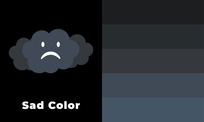
Sad Color
In color psychology, sad colors are muted and darkened colors that evoke negative feelings in our minds. For example, we use black in mourning or at funerals. Wearing black dresses at funerals, and black badges on national mourning day have become a tradition around the world.
Other sad colors are gray, dark shades of green, blue, purple, beige, and brown are caused to evoke negative feelings like boredom, impatience, gloom, and frustration.
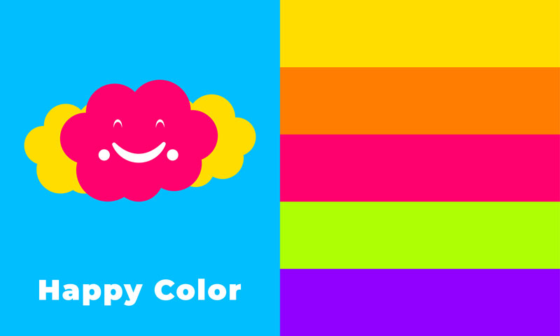
Happy Color
Happy colors are mind boosters. This type of color keeps you productive, attentive, energized, and also a good refresher. Happy colors are bright but they are also effective in light shades. You can use these colors for room painting, decoration, and wherever you want.
Some happy colors are pink, lilac, yellow, light yellow, green, yellow-green, sky blue, etc. you can explore more to learn about more happy color variations.
Calm Color
Since all the colors have different modes like darker and lighter, a specific color can drive different emotions, making color a powerful tool in branding. Therefore, a single color can bring both sad and calm feelings to the mind based on its mode.
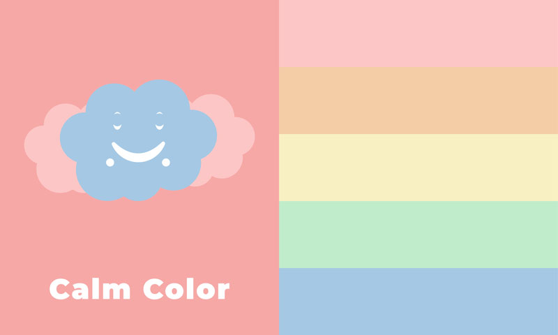
Calm colors are the color which evokes relaxation. Calm color gives serenity and it’s scientifically proven that they calm your mind and reduce anxiety. Calm colors are light blue, green, pink, white, yellow, and violet.
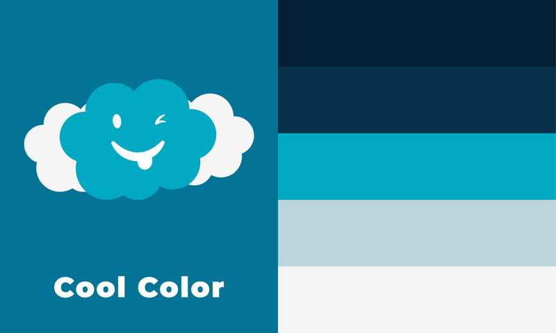
Cool Color
Cool colors are closer to happy colors. They arouse cool and pleasant feelings in mind. Cool colors often come as a composite of happy colors in various shades. Cool colors have a good impact on the audience’s mind. Therefore, brands use these colors to design company profiles and brand materials so that they look cool in the eyes of the audience. Some cool colors are green, blue, purple, and different shades of these colors.
Color is the Fundamental to Graphic Design
Graphic design is modern art and illustration that employs modern tools and, software like Photoshop, illustrator. These tools have made the job easy for designers. The graphic design incorporates all kinds of visual design we perceive through our eyes. Whatever the design, it should be good in texture and color combination.
Designers first create a prototype of the design, add the necessary colors to it, and finally evaluate whether everything is OK. The process may seem so easy that it just requires the design and filling it with colors. But it isn’t like that. To generate a crushing and striking design, designers have to think for hours about the concept.
Moreover, in web design, application user interface design, branding, and product packaging design, designers not only do the design but also conduct investigations into how these designs will affect the minds of viewers.
No matter how good the design is, if it doesn’t come in the perfect color combination, it can’t make a good impression at all.
Therefore, having a good sense of color combination is equally important as having good skills in design and art. Although, there is a color theory that refers to the scientific exploration of colors. Next in the article, we will go through,
Color theory
Primary, secondary, and tertiary color
Additive and subtractive color model
Different color schemes
How colors evoke emotion
Color Theory
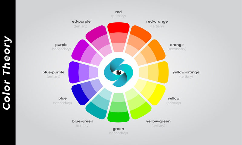
Color theory is also known as a color wheel, color tops, filter wheels, or newton disc that you could learn in kindergarten art class. It is the very basis of art and is so important. Isaac Newton was the mover of the color circle. In his book ‘Opticks’ which came out in 1666, he showed a circle consisting of several portions where each portion holds a unique color.
The color wheel was created schematically and included the primary, secondary, and tertiary colors together. The goal was to easily understand color theory, and how colors are interrelated so we can choose the exact color, and combine colors to form a unique color concept.
For graphic designers, understanding color theory is so important. It helps to improve color sense and create a harmonious design with pleasant color combinations.
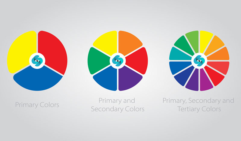
Primary Secondary and Tertiary Color
Since we know that, Newton’s color wheel was created with primary, secondary, and tertiary colors. If you don’t know about these color variations, here are the three types of color.
Primary color: Red, Yellow, Blue
Secondary color: Mix of primary colors such as Purple, Green, Orange
Tertiary color: Mix of a primary and a tertiary color such as Yellow-Orange, Red-Orange, Blue-Green, Red-Purple, etc.
This is the base of traditional color theory which has a long history dating back to antiquity. Aristotle was the first who develop color theory.
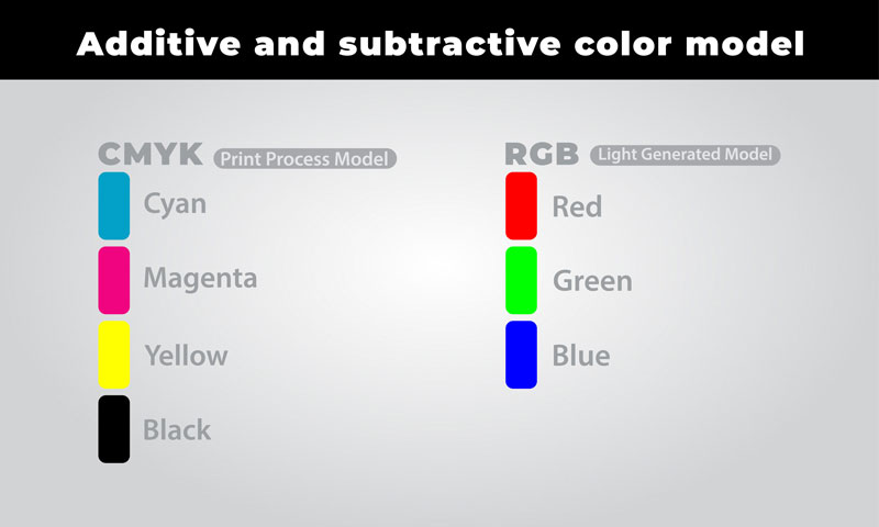
Additive and Subtractive Color Model
We see colors in light waves. We see any object when light from any source is reflected by the object and comes to our eyes. There is a huge scientific explanation about human vision, light, etc. However, additive and subtractive colors are two different color models that formed the RGB and CMYK color patterns.
If you have a little knowledge, you may have heard of RGB and CMYK. These two models are mainly used in two different functions. Additive or RGB model made for electronic screens. RGB stands for Red, Green, and Blue. In the additive color model, these three primary colors combine in different intensities to form other colors.
Modern television, computer display, mobile phones, and tablets use RGB color models to create pictures on the screen. When the mixture involves a blend of pure Red, Green, and Blue in any area, we perceive that as white.
On the other hand, the subtractive color model goes to CMYK mood which is mostly used in print design processing. Colors on paper, PVC, and plastic packaging use subtractive color models to get the accurate color form on the print material. CMYK stands for cyan, magenta, yellow, and key (Black). These four colors subtract and add to each other while the printing process is going on.
Different Color Schemes
In the above discussion, we have come through the color basics. All designers need to have a basic knowledge of these colors so that they can use colors like a master in their designs. Professional designers nailed the color basics to form a perfect color palette for designs within a few moments.
When UI designers have to design an interface for websites or mobile applications, they choose one or two primary colors or mix them to get a unique color combination. Here come the color schemes which are some pre-arranged color combination conditions that help designers get rid of the difficulty of choosing colors for their designs.
Monochromatic: based on a single color but used in different intensities to give a soothing look to the design
Analogous: it is created by three colors which are stated adjacently in the color wheel. You have to decide on a color (green) first and then take one from the right and another from the left to complete the formation
Complementary: on the color wheel, two colors that are placed in opposite directions create a complementary color scheme
Split complementary: it is quite difficult to balance the split complementary colors scheme but if you get it easily, select a color on the color circle and follow the complementary pattern. But instead of choosing the exact opposite color, you have to choose the two adjacent colors that are placed beside
Triadic: It has three colors that are equally distant from each other. You can balance by maintaining a 120° angle to choose colors from the wheel
Tetradic: it is defined by four colors which are generally two complementary pairs. If you draw a line between these colors, you will get a rectangle in the wheel
Why Does Color Scheme Matter?
Designers who know about color schemes, can easily construct color patterns and use different color schemes to find the most relevant one for their design. Since the complete color wheel is a science itself and color schemes are also based on the wheel, colors in the schemes and patterns opt scientifically.
Each color scheme has separate applications and distinct uses. For instance, monochromatic and analogous are often used in design operations where high contrast isn’t necessary. On the other hand, complementary color schemes are used for high contrast.
The crucial part of using a color scheme in your design is, properly balance contrast, shades, and tints between colors. But the main goal should be to express the best color feel of the graphics no matter what color scheme is used. So, before ensuring colors for your design, you should get proper use of the Photoshop color picker. It offers more subtlety and helps to discover new color schemes for designers.
Endnote
Color is not something you use in any way in design. Rather, the color used in design psychologically impacts the viewers. Different colors have different effects. A professional graphic designer needs to understand these effects to get the correct use of colors in designs. Graphic designers have to create visual designs online and offline.
They do it for various purposes such as marketing, advertisement, communication, brand recognition, and so on. So, they have to define the right color format for every particular design operation.
In this regard, knowing color basics including color wheel, different types of color and color schemes, and the absolute color effects on the human mind is highly important for graphic designers.
Hi! I'm the Chief Content Developer at Graphic Design Eye. I explain things to make them clearer to our regular readers and site visitors. Feel free to connect with us to get more ideas of your interests!