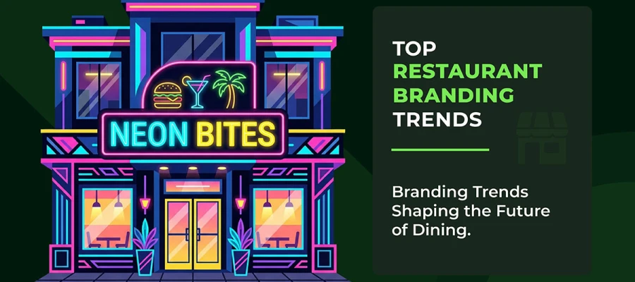
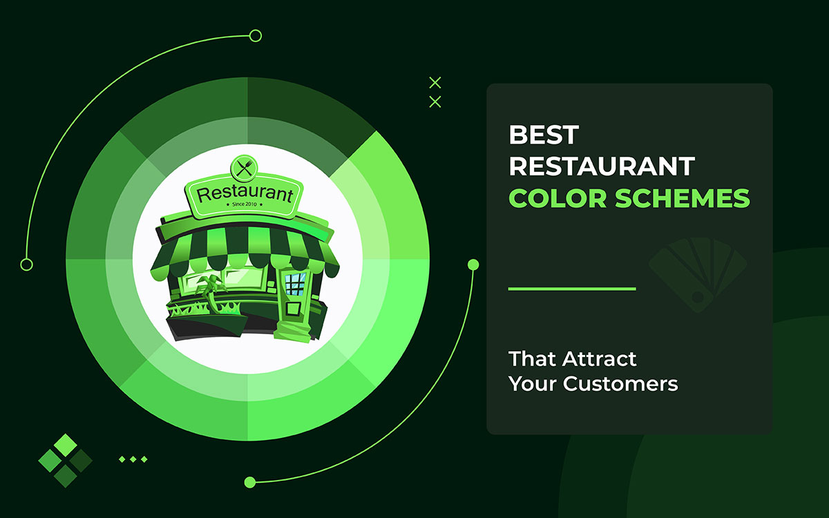
TL;DR
What are the best restaurant color schemes to boost customer hunger, longer visits, and more sales? The answer is simpler than you'd think. The right color scheme can improve your reviews, bring customers back, and increase your revenue. This guide breaks down the top restaurant color schemes. There are also simple action steps to help you see real results.
Color is just one of the key elements of restaurant branding you need to get right. Red and yellow colors can increase appetite by 20%; they actually speed up your heart rate. Green and brown make people feel calm and trust the place. McDonald's and Sweetgreen already use these tricks.
Colors aren't just decoration. They shape your first impression (90% of it is based on color alone), what you order, and how much you spend. Warm reds make people eat fast, while cool blues help fine diners relax and stay longer.
Picture walking into a restaurant and already feeling hungry or fancy, before even seeing the food menu design. That's the power of color.
Red and orange work great for fast food. Black and gold feel expensive and classy. Research shows warm tones like orange and cream can boost dessert sales by 15–20%. Soft pastel colors look amazing in photos, which helps restaurants blow up on social media.
So, let’s finish this at a glance. Your restaurant's glow-up starts here!

Color is a strong tool for a restaurant’s branding strategy. Many people don't realize how powerful it is. The right colors can boost your hunger, set your mood, and even make you spend more. This happens before you even see the food.
Check out these top 10 best restaurant color schemes backed by psychology. See how America's top restaurant chains leverage these colors for massive success.
Beginning now!
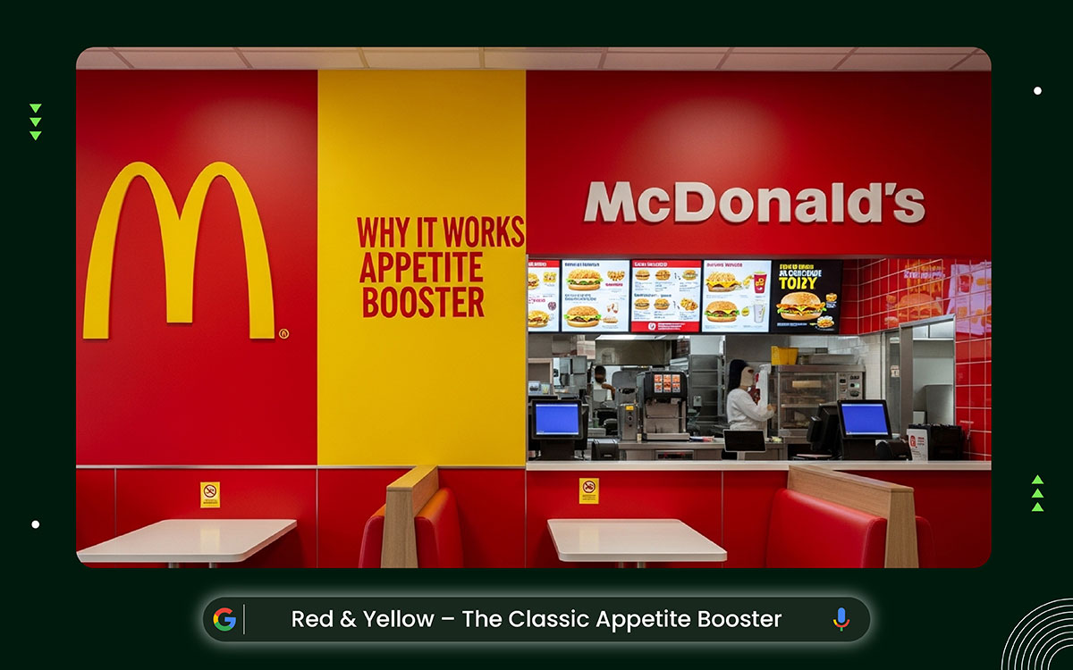
Red and yellow make a powerful team in restaurant design. Together, they create bold, eye-catching visuals that are hard to ignore. Red feels intense and exciting, while yellow feels bright and cheerful. Mix them together, and you get a look that's full of energy.
This color combo builds a strong, unforgettable brand. It's no surprise that major American fast-food chains love it, using red as the main background color and yellow to make restaurant logos and details pop instantly.
Why do red and yellow make you want to eat more? Red makes you feel hungry and rushed, while yellow puts you in a good mood and helps you make quick decisions. Together, these colors actually speed up your heart rate, making you eat faster.
Studies show this combo can increase last-minute food orders by 15%, because people feel pumped up and want to chat and share.
Ever thought about how McDonald's uses red and yellow? The big golden arches and red backgrounds make it recognizable everywhere.
In the US, these colors have helped McDonald's grow since the 1950s. They create a warm, quick-service feel that fits perfectly with fast food life and keeps the brand stuck in your head.
If you want to use red and yellow in your restaurant, keep the balance right. Try bold red walls with small yellow touches here and there. Throw in some white too, so it doesn't feel too intense.
Black outlines on your signs make them sharp and easy to read. A little green here and there keeps things feeling fresh. Bonus: these colors look great in photos, which means better social media page post designs.
So, which restaurants work best with red and yellow? Fast-food spots, drive-thrus, and burger joints love these bold, lively colors. They're perfect for busy American chains like diners or food trucks, all about quick service and good vibes.
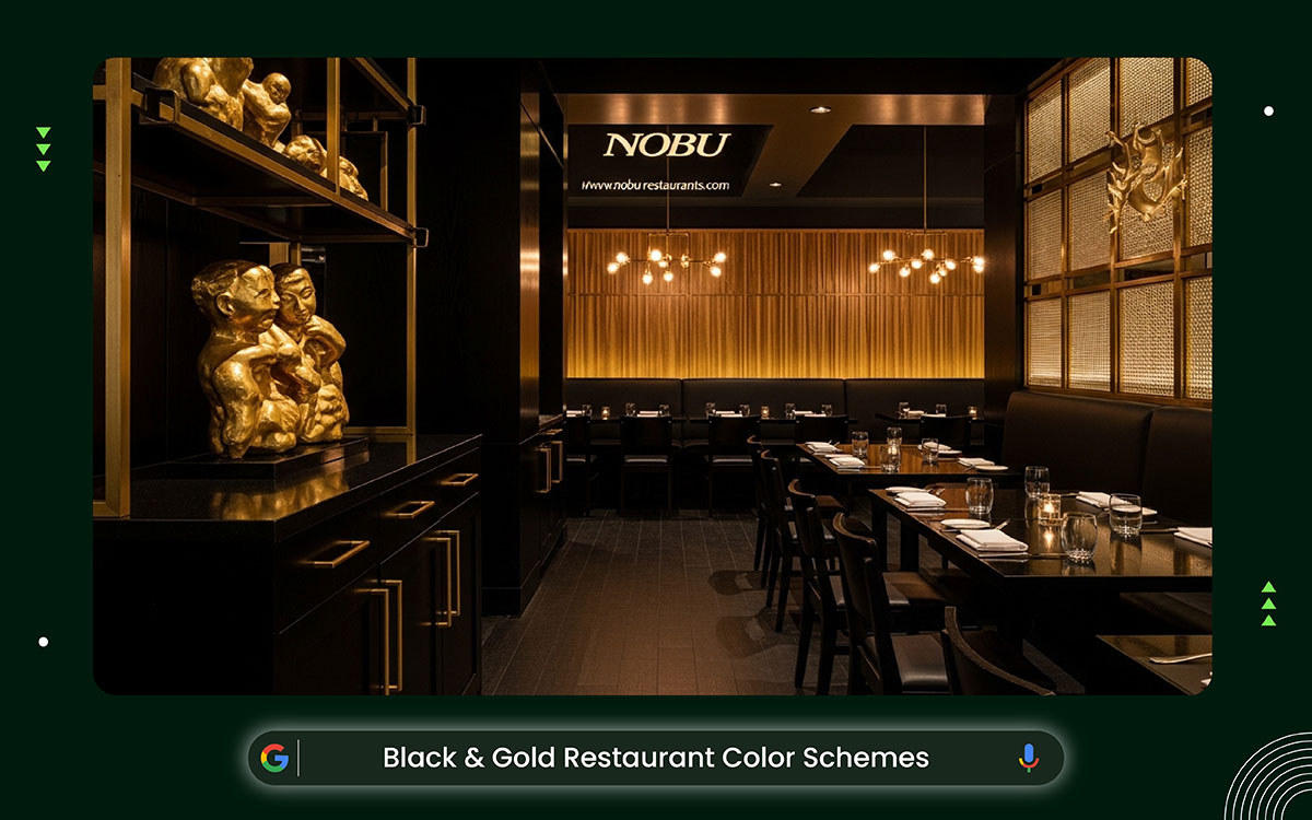
Black and gold make a bold, luxurious look. Deep black creates a sleek, mysterious background, while shiny gold adds rich, eye-catching accents. Together, they tell a story of class and quality.
The mix of flat matte textures and metallic shine feels timeless and modern. It’s perfect for high-end American venues that want their logos, signs, and spaces to look polished and impressive.
Black feels powerful and cool. Gold feels rich and warm. Together, they make a place feel special and exclusive.
This color combo actually affects how you behave. It makes you feel confident and want to treat yourself, so people stay longer and spend more; sometimes 25% more in fancy restaurants. You feel like a VIP. That fits perfectly with what people want nowadays: luxury that feels real and grounded.
At Nobu, black walls and sculptures sit alongside warm golden wood and soft lighting. Together, they match the restaurant's Japanese-Peruvian style perfectly and make the brand feel powerful and world-class.
Start with black walls or tables as your base. Then add gold through handles, frames, and small details. Use warm, soft lighting so the space doesn't feel dark or heavy.
Bring in white or cream tones to keep things from feeling too intense. Add shiny metal fixtures for extra glow. The result is a space that looks great in photos, gets shared on social media, and helps people find your restaurant online.
Now, the question is, which restaurants work best with black and gold? Think fancy dinners, steakhouses, and creative fusion spots; they all shine with this rich color combo.
It's a perfect fit for upscale American spots like cocktail bars or celebrity-chef restaurants that are all about making guests feel special.

Nature's colors tell a story. Green and brown work together to create a look that feels real, grounded, and good for the planet. Olive greens mix with warm terracotta browns, building a rich, earthy vibe that makes you feel like you're outdoors.
This color combo shapes how U.S. restaurants look and feel, showing up in logos, menus, and wooden decor. It pulls in customers who care about healthy food and the environment.
Green makes people feel calm and relaxed. It reminds them of fresh food and healthy choices. Brown feels warm and trustworthy, and it actually makes people hungrier, especially for natural foods.
When you use both colors together in a restaurant, customers tend to stay longer, rate the food higher, and lean toward eco-friendly options. For health-conscious Americans, this combo builds real loyalty.
Sweetgreen's bright kale-green color shows up everywhere: logos, bags, cups, and food packaging design. Inside their restaurants, warm wood tones give everything a natural, earthy feel. This makes perfect sense. It complements their farm-fresh salads and attracts people who care about eating clean and living sustainably. It's a vibe they've really leaned into.
Use different shades of green to add depth and interest. Choose soft, rich brown tones for the furniture to make the space feel stable and warm. Add small touches of beige or light gray to keep the look clean and calm. Place a few plants around the room to bring life and freshness.
Perfect for farm-to-table places, vegan restaurants, organic cafes, and eco-friendly bistros. It represents fresh, healthy food, made from natural ingredients.

Blue and white make a simple, classy look. They copied the sea and sky for a boat theme. Light blue walls go with spotless white tables and cloths. The room feels bright and open. This setup helps flow. It makes tiny U.S. eateries seem bigger. Plus, it spotlights food signs and decor. The whole place shouts clean and fancy.
This classic pair evokes a sense of calm oceanic feelings. It fits U.S. beach-style spots. Mix sharp whites with gentle blues. You get a welcoming, clean space. It hints at fresh air and chill times. Diners love it for a peaceful break.
Blue brings calm. It cuts stress. People stay longer. It's great for relaxed meals. White shows cleanliness. It builds trust in the food. Both quietly curb hunger. This helps with smaller, healthier bites. Yet they boost happiness. U.S. diners link the place to peace. They return often. They leave good reviews.
This place is one of the best Greek and Mediterranean seafood spots in the U.S. The inside is mostly blue and white, giving it a clean, beachy feel. The seating is cozy but not cramped, and you can actually see the fresh seafood on display. It has that classic Greek taverna vibe; warm, chill, and real. People love coming back because it feels so relaxed and welcoming, making it a perfect place to enjoy a great seafood meal.
Pick matte blue walls. They cut down on glare. Add white shiplap layers for a nice texture. Use wood furniture or soft gold touches to bring warmth. In U.S. homes, toss in potted plants for a green feel. Make the lights shine on the cool colors. You'll get that perfect Instagram look.
Places like seafood huts, beach cafes, and fancy restaurants love these colors. They pop up a lot in coastal U.S. spots. There, the shades match the fresh ocean vibe perfectly.

The orange & cream palette mixes bright orange with gentle cream shades. It builds a cozy, old-school look. Think sunset colors and smooth desserts. This pair makes things feel welcoming. It's perfect for US diners who want comfort.
Orange adds energy to rooms. Cream smooths harsh lines. You get a fresh, friendly style for busy American spots. It suits crowded places well.
Orange sparks hunger and chatty vibes. It mixes red's zip with yellow's joy. This pushes quick buys and longer stays. Team it with cream's chill feel. That builds trust and satisfaction. People then order more.
Studies say warm shades like this make food seem worth extra at US fast spots. Guests feel good. They grab 15-20% more sweets.
Dunkin' nails Orange & Cream in its look. It mixes bold orange highlights with soft whites and beiges. This gives a playful, quick-energy feel at over 9,000 spots in the US. The style pulls in crowds. It captures easy, tasty fun.
Try orange paint on walls or small spots. Use cream on the tables. Mix in wood textures or teal colors for more style.
It’s best for quick-service cafes, eateries, ice cream stands, and brunch places across the US.
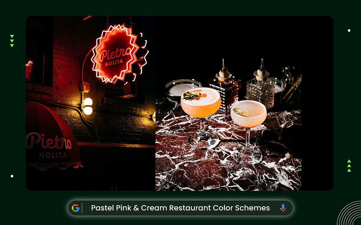
Pastel pink and cream make a dreamy, fancy look. Blush walls mix with creamy chairs. Subtle fades add depth. This setup builds a strong brand feel. It's light and breezy. It fits U.S. city spots like NYC's Pietro Nolita. There, pink rules for a girly, old-school charm. It spotlights decor and food plates for shareable pics.
This gentle mix blends soft, rosy shades with warm neutrals. It creates a fun but classy mood. It's great for U.S. trendy places, from New York cafes to California bistros. It taps 2024 color fads.
These spots look amazing in photos. They spark social posts. They bring cozy joy, too. That quietly keeps folks longer and coming back through feel-good vibes.
Pastel pink brings calm, girliness, and a sweet vibe. It quietly sparks thoughts of desserts. It also cuts stress for chill meals. Cream gives a cozy, trusty feel. It makes folks hang out longer and chat more.
In American spots, these colors boost happy vibes. That leads to happier customers, more frequent returns, and excited posts online from people who love the comfy setup.
Pietro Nolita is a popular Italian restaurant in New York City's Nolita neighborhood. The whole place is decorated in soft pink and creamy white. The walls are a light blush pink, and the seats and little details match with warm, creamy tones. The soft colors make you feel relaxed and happy, so you want to stay longer and come back again.
Use different shades of pink. This adds depth and fun layers. Mix them with soft cream fabrics, like velvet. They bring a cozy touch. Toss in gold or brass details. They make it classy.
Ice cream shops, brunch places, and fancy little cafes nail this trick. Young folks from the millennial and Gen Z generations love it. They want pretty food they can snap and share.
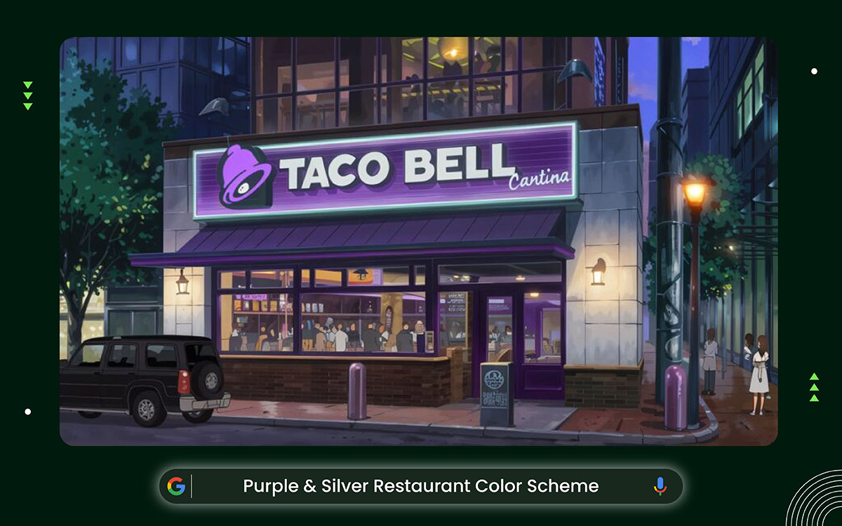
Purple and silver are one of the best restaurant color schemes, giving a cool, fancy, futuristic vibe. Think deep purple walls like shiny gems. Add silver tables and chrome accents for a sleek, shiny look. This mix makes a strong brand that's daring but classy.
There, soft purple fades and silver glows add depth. They highlight pretty food plates and cool lights. This builds a fun story you won't forget.
This fancy combo brings mystery and fresh ideas. It's perfect for U.S. restaurants looking to chase 2026 styles. Dark purples with sparkly silver bits make a puzzle-like, top-shelf feel. It gets people curious. It makes meals feel special.
Purple sparks ideas, fancy vibes, and mystery. It quietly cuts hunger. Yet it tempts with treats for posh dinners. Silver shows modern style and spotless freshness. It builds trust and class. Together, they make U.S. eaters feel it's worth more.
Taco Bell's famous purple look got a fresh update in the 1990s. It mixes bright violet logos with soft silver touches. You see them in today's U.S. stores on shiny counters and signs.
The style feels fun and strong. It boosts the quick-eat charm. Plus, it matches their wild menu design ideas for lively, young crowds.
Pair deep purple walls with shiny silver touches. This stops the room from feeling too much. Add LED strips for a cool glow. Add black or gold accents for pop. Try velvet cushions and mirror pieces. They add fancy vibes. Use lights you can dim. It builds a magic feel.
Fusion restaurants, cocktail bars, and creative fine-dining places stand out here. This is especially true in the U.S. The design attracts young people who like to explore and taste something different. Many millennials and Gen Z customers enjoy such fresh and exciting restaurants.

Navy and copper make a cool color combo. It looks modern and industrial. Deep navy mixes with shiny copper touches. Navy gives a smart, city vibe. Copper adds a fancy glow and cozy warmth.
Together, they balance old-school style with fresh looks. US restaurants love it. It creates a smooth, welcoming spot. This helps them shine in busy places.
Navy blue brings calm, trust, and peace. It quietly sustains hunger. It leads people to eat slowly and enjoy meals.
Copper's cozy shades feel rich and snug. They spark happy feelings and a touch of splurge.
Side by side, they sway US shoppers. They create fancy vibes. Folks stay longer. Loyalty grows in quick-eat spots. It fits today's taste for smart, friendly spaces.
Shake Shack is a US chain. Some spots mix modern factory aesthetics with bright blue hues and shiny metal accents. This sparks ideas for navy-and-copper designs. Their open rooms have wood panels.
They use dark shades for a cool city vibe. The spots feel cozy. They make junk food taste even better and keep fans coming back.
Paint the walls navy blue. It adds depth. Add copper to lights or bar handles. That brings warmth. Use white quartz counters or old wood accents. They light up the room. In cold US areas, add soft LED lights. They boost comfort and looks.
This color combo fits fancy-casual eateries, fish spots, drink bars, and city coffee shops. You'll find them in Chicago or San Francisco. In the US, chill but classy pulls all kinds of people.
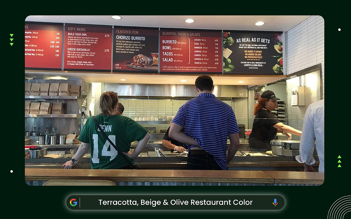
Earth colors like terracotta, beige, and olive make US restaurants feel warm and welcoming. They pull from nature's landscapes. Terracotta gives a cozy, rusty glow. Beige stays soft and calm. Olive adds a fresh green touch. Together, they build a real, down-home vibe.
These shades mix perfectly for snug, lasting spots. You see them in cool California farm-to-table places.
Earth colors help people relax, feel steady, and get comfy. They quietly make US eaters stay longer so we can enjoy their food. Terracotta and beige bring a cozy, trusty vibe that sparks hunger for big, filling dishes. Olive adds calm and a link to nature.
All this sparks good feelings. It boosts time spent there and keeps folks coming back to laid-back spots.
Chipotle restaurants across the US use cozy colors inside. Think warm browns, reds like terracotta, and soft greens in wood details and wrappers. This simple, earthy look hints at fresh, real food. It draws people in and boosts quick-eat charm.
Layer terracotta walls with beige fabric. It adds depth. Mix in olive green plants or cloth touches. Add brass lights or old wood pieces. They bring warmth. In cold US spots, use soft lamps. They boost coziness and show off natural feels.
Perfect for farm-to-table eateries, Mediterranean spots, vegan hangouts, and laid-back American diners. It brings fresh, organic, and healthy feelings.

Black, white, and gray color schemes give US restaurants a sharp, simple look. They focus on neat lines and classic style. Black brings depth and class. White feels fresh and open. Gray connects them smoothly without standing out.
This mix makes flexible, fresh spaces. It's perfect for city spots, as it mixes easy style with a fancy vibe.
Black-and-white colors create a sense of calm, focus, and class. They let US diners chill out. No bright shades distract them. Black shows luxury and power. It makes food seem worth more.
White means clean. It builds trust. Gray brings balance and peace. People stay longer. They pick meals carefully. They come back often to fancy spots. This fits their love for simple style.
This Michelin-starred restaurant keeps things sleek and simple. The walls are bright white, the ceilings are tall, and the whole space feels open and fresh. Black chairs and dark frames add sharp, stylish touches. The floors stick to soft grays and neutral tones, tying everything together.
Nothing feels loud or extra, just clean lines and quiet textures that look really expensive without trying too hard. The vibe is cool and city-chic, but still relaxed enough to sit back, enjoy the seasonal food, and not want to leave.
Pick white walls to make rooms feel big and airy. Add grey cushions or seats for a soft touch. Put black in lamps or handles for a sharp pop. Mix in shiny silver or light wood for cozy vibes. They boost the feel and show off textures.
Great for fancy coffee shops, nice restaurants, simple bistros, and modern cafes. These spots shine in big US cities. There, style blends into everyday life.
Picking the best restaurant color schemes for your restaurant begins with knowing how colors affect people. Match them to your brand's feel. This draws in more customers and boosts sales.
In the US, people spend over $1 trillion a year eating out. Colors like bright reds and oranges make folks hungrier by up to 20%. They lead to extra orders at quick eateries.
Use lively colors for fun American spots. Fit shades to your brand's character. Go with natural browns for green cafes. Think about lights, room size, and walls. Light grays make tiny city places feel bigger.
This smart method grabs visitors' attention. It also helps searches like "top colors for US eateries." Go further to build spots that touch hearts. That brings folks back and good feedback.
Bright reds, oranges, and yellows make people hungry and help them decide what to order faster. That's exactly why U.S. chains use these colors during the busy lunch rush.
Fast-Casual and Diners: Pick bright, lively colors like red, orange, and yellow. They make people hungry and want to eat fast. This works great for busy US spots like old-school diners. Chains like McDonald's know how to design a menu for a restaurant. New 2026 studies in Hospitality Design say they can boost quick buys by 15-20%.
Wins: Speedy service, more crowds at lunch, and a buzzing vibe for city rush.
Fine Dining Spots: Go for classy neutrals or rich shades like navy, charcoal, or eggplant. They create a fancy, cozy mood. This keeps guests longer and spending more. Upscale US eateries love these dark 2026 looks from Veranda. They feel special and raise Yelp scores.
Wins: Perfect setting for dates or work meals, better wine sales from the chill feel, and fits high prices well.
Health or Organic Spots: Add fresh greens, dirt-browns, and gentle blues. They show health and green living. This clicks with fit US eaters. Color tips from Medium say they build trust and purity. They link to nature and sell more salads or veggie dishes.
Wins: Draws green fans in spots like California, builds repeat visits with good feels, and stands out in calm spaces.
Cafés and Breakfast Places: Try soft pastels or cozy beiges. They bring morning energy and ease. Ideal for chill US coffee hangs. 2026 YouTube vids show they make tiny spots feel bigger. This gets folks to stay and grab extras like muffins.
Wins: More hang time for laptop users, fun social media posts, and a friendly day-start that grows local fans.
Ethnic or Themed Eateries: Match colors to the culture. Use warm terracotta for Mexican vibes or cool aqua for fish houses. It pulls you right into the theme. Reddit chats say it amps up realness and gets 10-15% more reviews in mixed US towns.
Wins: Cool brand tales, culture hits home, and epic memories that bring groups back.
Bright, fun brands use bold reds, yellows, and oranges to grab your attention. These colors can actually boost your mood by 25% and get people talking on social media.
Fun and Lively Brands: Pick bright reds, yellows, and oranges. They show a playful, bold style. These colors spark chats in busy US bars. Total food service 2026 says they fit quick spots like burger places. They boost fun and lift customer moods by 25%.
Wins: More social media hype, faster seat changes, and energy that pulls in young crowds in cool spots.
Chill and Classy Spots: Choose cool blues, greens, or soft purples. They give a calm, fancy feel. These help people relax in nice US dinners. Medium's color tips say they build trust. Guests stay 30% longer, per Wasserstrom data.
Wins: Feels high-end, pairs well with wine, and gets rave reviews for quiet getaways in tough spots.
Green and Earthy Feels: Use browns, light greens, and plain tones. They match real, nature-loving styles. These draw eco-smart US eaters. Hospitality Designs 2026 notes that they feel honest. They boost sales of healthy food with wellness links.
Wins: Tighter local bonds, good buzz on X (old Twitter), and standout style in eco zones.
Fancy and Top-Tier Vibes: Go for rich golds, purples, or blacks. They scream luxury and special access. These signals are of top quality in posh US eateries. Remick Arch research says they feel royal. People pay 15-20% more.
Wins: Draws rich folks, easier upsells on deals, and Insta looks that go viral.
Fresh and Cutting-Edge Ideas: Blend strong pops like teal on warm bases. They suit new-thinking brands. YouTube design vids say they spark fresh ideas. Veranda's 2026 tips boost that modern spark. They push bold menu tries.
Wins: Hooks city tech fans, ramps up buzz, and beats old-school rivals.
Light changes how colors look. Warm LED bulbs make terracotta walls glow even richer, almost as if the color had been turned up.
How Lights Change Colors: Try colors under your restaurant's lights. Warm LED bulbs make earthy colors like terracotta pop. Cool fluorescent ones can make bright reds look flat. WebstaurantStore's 2026 tips say so. In US spots with sunlight, like California beach cafes, dimmers let you change the vibe. This can keep people awake for about 20% longer at night.
Wins: Food looks great, moods shift from day to night, and smart lights save power.
Room Size and Tricky Looks: Pick light colors or soft pastels in tiny city restaurants. They make cramped New York spots feel 30% bigger with eye tricks, from Paint Columbia ideas. Go dark in big places for a cozy feel.
Wins: Smoother customer flow for faster service, more comfort, and cheaper fixes without knocking down walls.
Matching Colors to Textures: Team colors with surfaces. Wood patterns boost warm browns for a country vibe. Metals highlight cool grays in sleek spots, per B3 Designers' 2026 notes. Mixes like leather seats or stone tops last longer and look sharp.
Wins: Less fixing up, better overall style, and fun feels that spark good feedback.
Mixing Sunlight and Fake Light: Add bulbs that copy real sun for healthy color schemes. This stops colors from fading in dark basements, common in Midwest US towns. YouTube pros push layered lights for real depth.
Wins: Hungrier customers, flexible party spaces, and green energy rules.
Toughness and Easy Care: Pick paints and stuff that don't fade in busy spots. Deep blues stay bold even after many wipes, according to TimeWorn USA's advice. This keeps your brand strong over time.
Wins: Cheaper cleaning bills, steady wow factor for guests, and earth-friendly picks with low-VOC paints.
The following shares smart, science-based answers to the most common questions about the best restaurant color schemes. Use them to draw more crowds, boost bills, and earn top Yelp stars in tough places like NYC.
Red leads the pack. It sparks your appetite. It ramps up your heart rate and hunger by 20%. That's from Total Food Service's 2026 color psychology research. Mix it with yellow or orange touches. This works great in US fast-casual eateries. It drives quick buys and pumps up the vibe.
Yes, blue colors can curb hunger. They're rare in real foods. This makes you feel calm, not hungry. Add them lightly as touches in fancy US seafood spots. They bring peace. Skip big blue walls. They might cut down on orders.
Pick 3 to 5 colors. Use one main color for walls. Add a second for fun details. Mix in plain ones to keep things calm. This matches Medium's style tips. It makes rooms feel good together. It boosts the US diner vibe and helps people remember the brand. Plus, you can swap shades for holidays.
Not exactly. Match shades for brand sameness and easy spotting. But tweak tones to fit the mood, says FMC Printing's 2026 tips. In US stores, small changes spark feelings. They grow customer love. This skips stiff matching that blocks fun decor ideas.
Light shades like pale beiges, whites, and pastels make spaces seem 30% larger, according to Paint Columbia 2026 trends. Great for city spots like Chicago cafes, these bright tones bounce light around. They add a sense of space without making big changes.
Change main colors every 5-7 years to feel new. Add yearly touches for seasons, says TimeWorn USA. This helps US places stay ahead. It boosts the vibe, draws folks back, and fits new looks like 2026 earth tones.
Cozy neutrals work well and feel calm. They cut risks and build trust, per Hospitality Designs 2026. Ideal for US starters, they suit any style, gently spark hunger, and please everyone without wild mistakes.
Color is the secret weapon behind every great restaurant brand. And now you know how to use it wisely. But understanding the best restaurant color schemes is only part of the story. The other part is actually making it work, and that's where most restaurant owners get stuck.
Taking a color idea and turning it into a real brand takes great creative skill. It's way more complex than just picking a shade you like.
That's Graphic Design Eye LLC is here to help restaurant owners, food entrepreneurs, and hospitality brands across the US. We don't just make things look pretty. Every color, image, and brand element we choose for a reason, to tell your restaurant's story in a clear, bold, and impossible-to-ignore way.
Whether you're opening your very first canteen or giving an existing restaurant a fresh new look, we're ready to build something great with you. Contact us today, and let's turn your restaurant's color vision into a brand people won't forget!