For instance, if you want to start an online eCommerce like product selling, service providing, or whatever it is, you need a website first. With a website, you have control over your online business, magazines, and blogs and you can manage as you like.
However, creating a user-interactive website comes through the proper use of all the web design elements and making it user-friendly. By the way, that is not an easy task. Hence, not all know about designing webpages and development.
In addition, you have to take the help of a web design specialist to create a beautiful and responsive web layout for you. In this article, we will highlight all the important aspects of web design that should be known before setting foot in the online world.
Web design simply means the process of making a beautiful outlook for web pages that works to keep visitors connected to the website. think in the way, you follow blog posts of a website and visit that to get a daily new content update. What are the things that keep you following a website?
Content your interesting topic
Websites interface that encourages your vision to spend more time on the webpage
The font and color combination of the web page matches your eyesight visually
Other options of the website like navigation, mailing, and visual hierarchy you love
When making a website from scratch, you have to find a user-friendly layout with a sophisticated color feeling that goes with your brand. But more than that, you have to focus on the user’s interactivity and their needs. There are various types of websites online and all of them are different in color scheme, content gathering, outlook, navigation, and other systems. Before going into the deep, ask yourself what type of website you need and what is your purpose to create the website. Here are a few examples,
E-commerce website
Business website
Video streaming website
Personal website
Educational website
Nonprofit website
Entertainment website
Social Media website
Wiki or community forum website
News website
Directory websites
So, you have to realize your need and purpose first. According to the need, you have to customize the web page layout. And the design process responsible for creating functional layouts or interfaces for websites is commonly known as web design.
So, the process of web design is nothing but designing a perfect layout of the website. but doing this simple job requires understanding a lot of favors to make it distinguished. As there are approximately 1 billion websites in the world. When everyone’s prime goal is to make a distinct website for their purpose, web designers have to find a feasible solution in this regard.
Fortunately, some fundamental elements are used in web design. In creating a layout that captures the core theme of a brand online, they have to combine graphics, color, readable font, and a beautiful theme to build it properly. So, what constructional element is used in web design? they are,
The color palette that you're going to use on your website is an important issue to consider. Because it is the theme, and brand look and will cause visitors to make visitors a great feel in mind. We people always love to see colorful things. Different colors have different effects on our bodies and mind. It has a great influence on our emotions as we feel good whenever we see any of our favorite colors.
You can’t keep the website color monochromatic; you have to use at least two or three different color combinations to make the web pages look distinct and outstanding. Besides, you also have to think of the visitors for which you are creating this. which means, the application color should be appealing to the visitors. If you have a brand color palette, you can keep that focusing on the webpage.
If yours is a business or eCommerce website solution, try colors that can inject trust into consumers. Try to mix certain colors to find unusual color feelings. But don’t be so overlapping with colors as that can distract visitors’ attention from the website.
Graphics means the overall visual appearance of the website. In the world of visual content, graphics can be seen everywhere. We need to use graphics in different practical and modern life problem solutions. You must have to use graphics to make sense of what the site is related to. Ecommerce websites that we see are full of graphics of specific products.
So, graphics are at the core of websites’ elemental value for eCommerce business. retailers have to manage product images and take care of them with photo editing and photo retouching properly. Either you are a blog website and upload beautiful content on that. you have to add relatable graphics in blog posts to make them more meaningful. In this way, beautiful graphics make it into every website and we need them highly as well.
When using eye-catching graphics on the website, you have to think about the fonts at the same time. Fonts are the way of visualizing texts that a webpage holds. Think you need to gather some knowledge about a specific topic. So, you searched the term on the browser and it shows results with thousands of contents related to the term. No matter what type of website you have, you need to add additional information, content, and product description in texts.
Through images, and videos are the trendy option when it comes to creating content. but typography is still in its unique presence. However, choosing the best font will help you a lot. Because readability is one of the important facets considered in web design. You have to present content in a way that visitors can feel comfortable while reading that. If you keep text fonts hazy and problematic to read, then visitors will instantly leave the website.
Choose fonts that are easy to read, and don’t cause abashment reading for a long period. There are thousands of fonts available online, you can choose one but remember the readability while choosing a font.
Not all the areas of the webpage you keep full with graphics and texts. you need to manage white spaces on the website and it is important enough. In web design, white space is considered a part of the design. It is important because our brain does things continuously and it needs to understand what it is taking or seeing. As we can see, the study is a kind of activity that is dislikable in most human psychology.
We like watching television and spending time with friends more than studying. Designs that are so busy and gathering to look, at will not be good and optimistic for you. When visitors will see that kind of busy design, if it's full of information and graphics, they won’t keep it up.
However, here comes the importance of white space. White space ensures the elegance and readability of the whole web page. It helps to improve the user experience of a website. white space removes business and keeps the reader’s eye feeling comfortable while reading a huge blog post.
As there are various types of websites, the way of presenting and featuring them is also particular from each other. For instance, look at the four images given below. The first image shows a web version of a mail list that is common to us, it is called a single-page layout. The second image showed a few thumbnails and a description of the services that the website provides. It is called headlines and thumbnails gallery layout.
Similarly, the third is the example of a featured image layout where the layout is designed through the feature image, and the fourth image is the full-screen photo layout. Web layouts are also distinguished by requirements and skills. Here is a full list of different web layouts for you.
Zig zag layout
F layout
Full-screen photo
Grid layout
One column layout
Featured image layout
Asymmetrical layout
Split-screen layout
Headline and thumbnails gallery layout
Modular layout
Magazine layout
Single page layout
Radial symmetry layout
We have seen the list of different web layouts, but it is a matter of realizing which one will be perfect to use for your purpose. Suppose, you are going to start an eCommerce business or you are making an online identity for your brick-and-mortar business with a website.
In such conditions, a similar layout won’t result well and the same for them. In addition, you can’t use the magazine layout for your eCommerce store. The magazine design layout is best to show content about different topics whilst eCommerce needs a more categorized layout with huge product displaying capability.
That’s the point, you have to consider before making an exact decision. However, get that precious information about the relativity of web layouts for different purposes here,
The zigzag layout is a common type of layout highly used in a wide range of websites
F shape layout is very popular because of its eye-catchy pattern of views. It uses for business and portfolio websites
A full-screen photo layout is good if you want to catch the visitor’s attention at the moment of landing on the website. it implies a strong mental effect that hooks the visitors and makes them surf the webpage
If your website is a kind of newspaper or vlog, you can choose a grid layout to display all the contents vertically
One column layout is perfect when you have to create research papers or long-term articles
Featured image layout is the best option and is constantly chosen by bloggers to make blog pages alluring with the contents feature image
If you are looking for perfection and professionalism for a website outlook, then go for an asymmetrical layout. It works well for business websites
The split-screen layout is suitable for eCommerce business, offering services, and presentations
We’ve come this far in the discussion of web design and now we know what things you should keep in mind when you’re trying to create one for yourself. These listed options are gathered practically. The website offers uncountable opportunities but before starting, you have to build it properly. It should come out with great designs and developments to make a distinct place in the crowd of online media. how to do that?
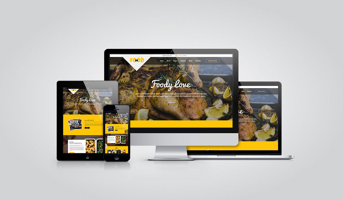
First of all, it is important to point out the main reason for creating a website. The intention regulates the website's outlook, color scheme, content variations, graphics, and overall things. We have known so many different types of websites the above. According to the types, the websites will change their looks and perspective.
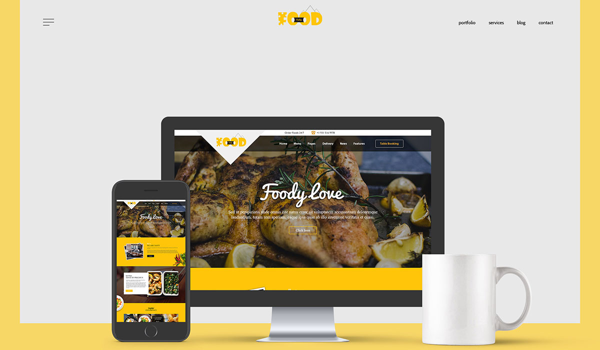
Your website should look as simple as possible. Simplicity is the key to interaction. Simple design is always preferred to provide a good user experience. Simple designs mean what we already described. Use colors, and fonts in a planned way. make the layout beautiful as well as eye-catching. Keep consistency while using so many graphics to make sense of visual communications.
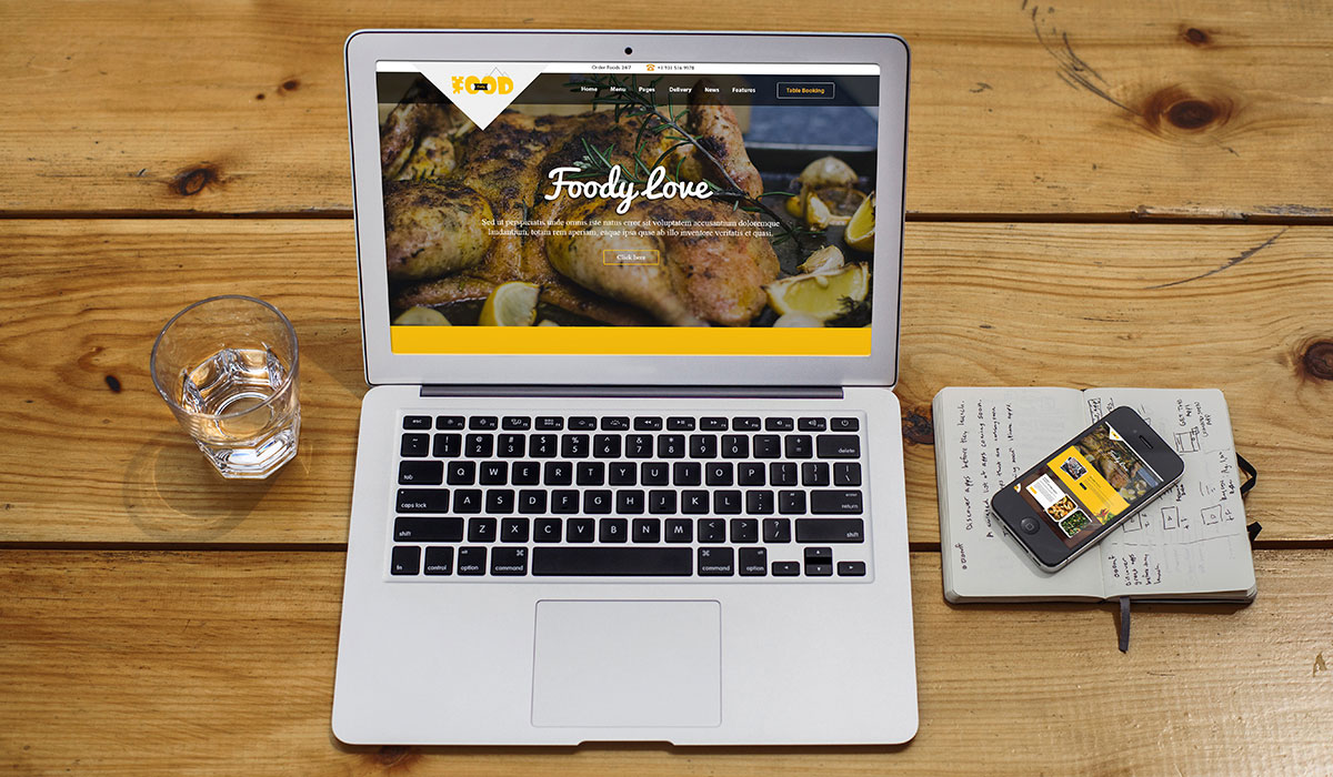
Navigation is a powerful website feature. It directed visitors and customers to the page where they want to be like the website’s menu bar. It also helps to find any specific content, or products no matter where it is, like a website's search bar. Properly categorizing content and products through their category is the key. You should keep your website’s navigation system as easy as possible. If visitors find the navigation confusing and uncomfortable, they would leave the site and find another to get what they want.
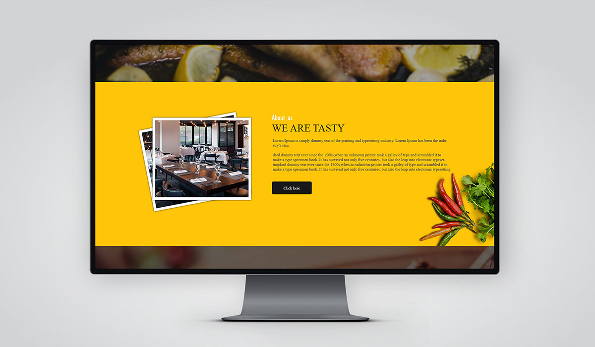
Visual hierarchy is so important to let visitors know what’s going on and what the content is. It shows information hierarchically and helps to realize its importance. Maintaining visual hierarchy in web design means taking care of image size, color, imagery, contrast, typography, whitespace, texture, and more. Contents that upload on a website, should have been properly managed in all those aspects.
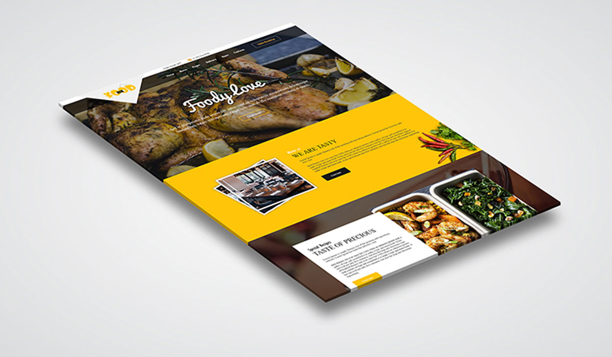
Content is the life of a website. contents are the purpose for which a website would create. So, you should take an effort to publish beautiful reader-friendly content on the website. write about interesting topics that people want to know. Do keyword research to inform what topics are on the top chart of people's attraction. Learn SEO techniques to find content on the first page of google rank.
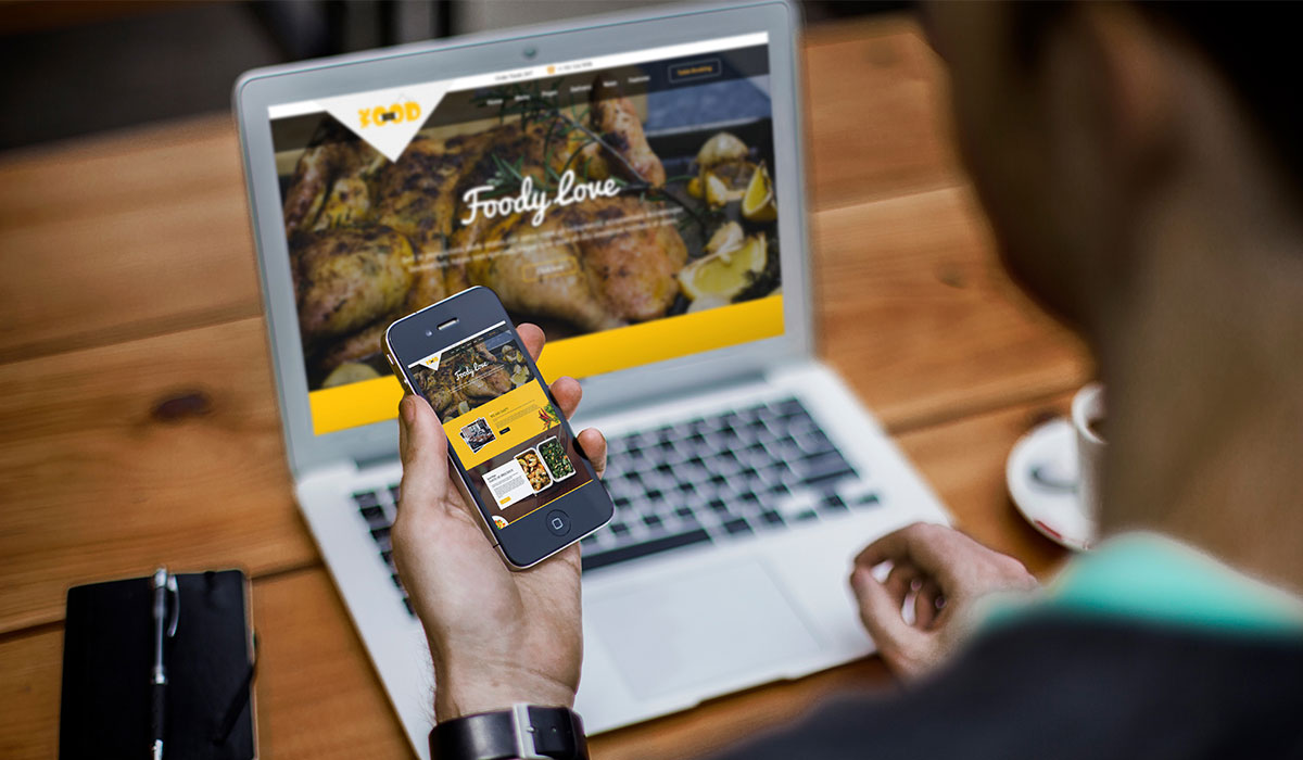
Mobile-friendliness is one of the claims of main targets of most website owners. Because the smartphone becomes the most used device for surfing online. you may be familiar with the fact that generally, a web page comes differently in mobile and web interfaces. Making a website mobile-friendliness will ensure that your website is perfect to appear in a mobile browser.
So, if anyone uses smartphones to get the webpage, it could perform smoothly. Web design is half of the course of making a website for business or any purpose. The next half is development. When web designers prepare all the visual aspects of the website with those visual elements, then the development phase begins.
We have tried to cover up all necessary issues that take part in web design. If you are thinking of taking your business online, you need a website and a better design for that.