Look at the most inspiring nonprofit organization logos and you’ll notice they’re more than just elements or colors. They create a feeling of comfort, care, and hope. The best nonprofit and charity logos connect emotionally, showing compassion and purpose through simple, meaningful design.
They remind people that support is out there and even small actions can make a difference. These nonprofit logo designs speak quietly but clearly. They stick in your mind because they feel human.
A charity logo design for this kind of work has to do more than look nice. It has to show trust, comfort, and belief. It’s supposed to be made for the people who support the group, the donors who keep it going, and the communities that feel its impact every day.
Making such a charity foundation logo is all about understanding people, the mission, and the story. Then, and only then, you can create a design that feels right. And when you do, the charity’s logo design carries meaning on its own.
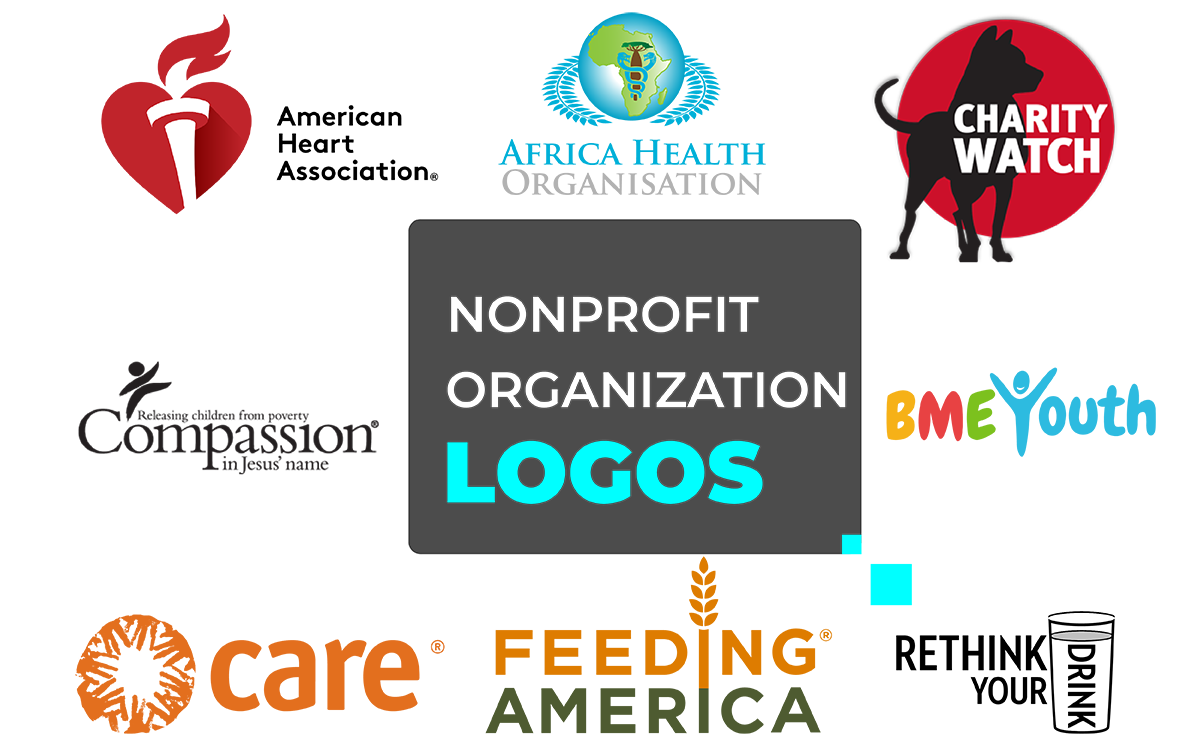
Here, we've collected some inspiring nonprofit organization logos that are easy to recognize and perfectly aligned with each nonprofit's brand mission and branding.
Let’s explore the best nonprofit and charity logo design inspiration to spark logo design ideas for your organization!
Good nonprofit logo designs tell a story. They show what the group cares about. They make people feel trust and kindness right away.
Nonprofit organizations don’t sell stuff. They share a purpose. Their charity logo designs need to feel trusty, friendly, and timeless.
Below, we’ve gathered 25 nonprofit organization logos to inspire your next logo design project. Each logo shows how colors, shapes, and spacing can express your organization’s values and build stronger connections with supporters, donors, and communities.
Keep reading to explore charity foundation logo ideas that can help your nonprofit branding strategy with meaning and impact!
The BME Youth charity logo design lands softly, like a friendly rush. Orange, red, green, and blue sit side by side, like different voices sharing a room.
Nothing shouts. The letters are rounded, soft at the edges; the kind you trust without thinking. Then the “Y” turns into a person, arms up, joy in one stroke. It feels like a welcome. Like someone saying, “You belong here.”
What makes it quietly inspiring is its simplicity. No heavy effects. No drama. Just warmth in the colors and one small human shape tucked into the name.
You can feel growth without being told. You can feel community without a tagline. The mood is gentle, hopeful, and young.
For anyone who needs a push to start sketching, let this mark be it. It shows how a simple logo design can spark confidence and bring people closer. Just by being open and kind. That’s the feeling you get at first glance, like you want to do something good.
The Rethink Your Drink charity foundation logo is like a clear reminder. Tall black letters. Clean spacing. Nothing extra. Then you notice the DRINK in a slim glass. One small change, and the word becomes a message.
That restraint is its charm. No storm of colors. No busy icons. The contrast does the work. The upright type keeps the tone steady. It feels trustworthy, like something you’d see in a school hallway or a clinic poster. Honest, practical, close to everyday life.
For creatives, there’s a quiet spark here. The nonprofit’s idea hides in plain sight. That’s why it works. Letter as object. Object as story. A single, precise change reframes the whole line. The look stays simple. The meaning grows. It’s a mark you remember, not because it shouts, but because it’s clear.
The Africa Health Organisation (AHO) logo design looks official, yet gentle. A calm blue circle frames the design. It’s the kind of blue you trust in a clinic. At the center is Africa, outlined in green. White laurel leaves curve around it like open hands, holding the continent with care. A small golden medical symbol sits on top, adding dignity without shouting. The charitable trust logo design is clear, respectful, and easy to remember.
Designers find it inspiring because it mixes authority with warmth. Blue shows steadiness. Green suggests healing. White leaves soften it, adding a sense of protection. Everything feels natural. The elements sit close, working like a team. This shows that health nonprofit organization logos don’t need flashy effects. They need trust, balance, and a clear focus.
If you’re looking for nonprofit logo design ideas, this one guides you toward clarity. Focus on a single element, like the map, and let supportive shapes tell the rest. The result is a symbol that feels local and global at once. Strong enough for a seal, gentle enough for a community poster. It’s the kind of design that quietly inspires confidence before a single word is read.
The National Council of Nonprofits logo design feels calm at first glance. That calm is its charm. A soft blue “N” has a slight brush-stroke curve, so it feels human, not mechanical.
Next to it, the black wordmark sits with plenty of space around it. The whole design feels steady, practical, and friendly. It’s easy to trust, whether on a website header or a simple PDF handout.
What makes it interesting for creatives is its subtle sense of movement. The curve in the “N” hints at a connection. Blue keeps it dependable; black keeps it clear. There are no textures or shadows, just honest shapes that let the message shine.
If you’re designing for a coalition or network, this is a quiet lesson: soften one letterform, give the type room, and let the tone do the work.
It’s a small mark with big thinking behind it. Modest, yet warm and directional. Not flashy, but memorable. It makes things feel easier and stays in your mind.
The Direct Relief symbol feels warm and welcoming. Four soft shapes lean toward each other and make a quiet cross in the middle. It looks a bit like folded paper catching light. Orange feels lively, yellow feels comforting. Together, they shine without being loud.
Below the symbol, the name is written simply and clearly. This lets the symbol show emotion while the words stay professional. The mix works really well for anyone looking at a strong charitable foundation logo design.
The rounded edges make it feel friendly. The compact shape looks clear on boxes, clinic doors, or a volunteer’s vest. When you see it, you think, “Help is here.” There are no fancy effects, no complications. Just a clear symbol that feels caring and urgent at the same time.
If you’re drawing nonprofit organization logos for health or emergency work, this can be a simple idea to start with. Begin with a shape people already know, then make it softer and warmer. Give it space to breathe. The result is a symbol that feels strong in tough moments and kind in quiet ones. A small sign that calms people even before they read a single word.
The Smithsonian charitable foundation logo is a small sun inside a calm blue circle. It’s simple, but it feels just right. The yellow looks warm, like sunlight in a museum hallway. The blue makes it feel steady and trustworthy. Below it, a plain black wordmark stays quiet so the symbol can shine. It’s not a flashy or trendy logo design. It feels like it’s always been there, which fits a place full of history and discovery.
Designers like it because a few simple shapes can mean a lot. The rays of the sun reach out in every direction. It quietly says that knowledge is for everyone. The circle keeps the charitable trust logo design friendly and approachable. You don’t need fancy effects or tricks when the idea is clear. That’s the lesson the logo teaches.
If you’re looking for ideas for a nonprofit logo design, this one is inspiring. One bright center, one steady frame, and some space around it. That’s enough to feel curious, welcome, and trustworthy. When your design feels crowded, try the same approach. Take away the extras, let the main idea shine, and aim for that same soft glow this charity logo has.
The Feeding America charity foundation logo design feels calm and kind. The colors remind you of the earth after rain. The orange is soft, like sunlight, and the green feels close to the ground. It’s simple, but it feels warm.
The little wheat sprout growing from the “I” is the first thing you notice. It’s tiny, but it says a lot.
Nothing about it feels fake. The letters are bold but gentle. There’s space between them, so it doesn’t feel crowded. It doesn’t shout for attention. It just sits quietly, but you still notice it. You can feel community, maybe even thankfulness.
What makes this charitable trust logo design stick in your mind is how it feels, not just how it looks. It gives a little push, a reminder that good things can grow from small starts. One sprout, one meal, one small act, one change. It’s honest. It feels human, and that’s why it stays with you.
The Charity Navigator charitable trust logo design feels calm, like a soft light showing the way. At the top, there’s a blue star with a few tiny dots near it. The name sits neatly underneath. That’s all. But even simple, it tells you a lot: guidance, trust, direction. The blue color isn’t cold. It feels steady, like someone quietly pointing the way.
The design doesn’t try to be fancy. It uses simple shapes and looks balanced. You can tell it’s made with kindness, not just to look cool. The dots around the star almost seem like they are moving, like little lights spinning around one big truth.
It makes you feel a gentle pull. You don’t think about the techniques used. You think about calm, trust, and being guided somewhere good. It quietly shows that good design can help people find their way.
The Americares charity foundation logo design feels really human. Three small shapes come together to make a little person. That tiny figure with open arms feels like someone ready to help. The colors are close together, warm and friendly, almost like people standing side by side.
It’s not trying to be flashy. The letters are lowercase, easy to read, quiet. It doesn’t try to impress, and that’s what makes it good. It feels kind, real, and steady. When you see it, you think about care, not design.
What’s really nice is how natural it all looks. The balance, the space, the small human fit together like a good moment. It leaves a soft feeling, like hope tucked in the lines. Not loud, not perfect, just something that feels right and stays with you.
The Samaritan’s Purse charity trust logo feels calm right away. There is a blue cross standing strong. A soft gold curve wraps around it like an arm. It feels protective and warm, almost like a sunrise frozen in place.
Nothing here is busy. The lines are clean, and everything moves at a gentle pace. The cross shows what matters. The curve shows care without saying a word. It feels like help that knows when to stay quiet.
The colors say a lot, too. The blue feels like trust, the kind you rely on when things are tough. The gold adds a little light. It’s not bright or flashy, just warm enough to soften the ngo logo design. Even the space around it matters. It gives the charity logo room to breathe, so nothing feels crowded.
What you remember is how calm it feels. The symbol doesn’t try to grab attention, but it keeps it. You look once and think of shelter, steady hands, doors that stay open. It quietly points toward kindness and showing up. That’s why it sticks in your mind: quiet faith, steady help, hope that doesn’t need to shout.
The International Rescue Committee charity foundation logo looks strong, important, and hopeful. A dark arrow points up through a golden square. That one arrow shows moving forward, safety, and direction. The yellow feels bright, like sunlight after a night. The black makes it feel serious and solid.
There’s nothing extra in the design. No hidden symbols, no fancy curves. Just an arrow and a block of color that feels steady. It works because it’s clear and direct. You don’t have to guess what it means. It shows motion, like help is on the way. The arrow isn’t sharp or scary. It feels strong, like it could lift something.
There’s a quiet power in this charity logo. It doesn’t shout, but it doesn’t whisper either. It stands for hope and movement. You see it once, and it sticks in your mind. It shows that good design doesn’t need to explain itself; it just makes you look up.
The Compassion International logo feels calm and caring. Its soft blue color is peaceful, like the quiet you feel when you’re relaxed.
There’s a small figure with arms raised above the “C.” It looks honest and simple, like how a child might see the world. It doesn’t try to impress anyone. It just shows what compassion feels like.
The nonprofit organization's logo design is quietly beautiful. The letters are clear and easy to read, with space around them. The color is warm, but not too bright. Just by looking at it, you can feel what the name means.
It gives a quiet feeling inside, something you notice more than see. The charitable trust logo doesn’t try to sell anything. It comforts. It feels real, made from kindness, for people who still want to do good. It only asks you to look up.
The UNICEF nonprofit logo design has a clear blue circle with soft white letters inside. The letters are lowercase on purpose. Nothing is sharp or harsh. The blue looks like the sky and light. It’s the kind of blue that makes people feel safe without thinking. When you see it, your shoulders relax a little.
Next to the name is a small picture of a mother and child. It’s simple and gentle. It doesn’t take over the charity logo. It just sits there, reminding you why UNICEF matters. The letters and shapes have space to breathe. There’s no shine, no tricks—just care shown in simple shapes.
The nonprofit logo design gives a steady, calm feeling. It makes people want to help. It feels like the work will keep going, even if no one is watching. The blue gives trust, the white gives calm, and the tiny mother-and-child moment connects it to real life. You think of clinics, schoolrooms, clean water, and little hands being held. The charity logo doesn’t push you. It just stays. And because it stays, the idea behind it stays too.
The Good360 logo feels calm and confident. A soft green circle wraps around the mark like a promise. It doesn’t squeeze it. Inside, the letters are simple and clean. Nothing fancy.
The name of the organization follows the same style: balanced, modern, and clear. Green does the talking here. It stands for second chances, things being reused, and kindness that keeps going. When you see it, you think of items reaching the right people, not going to waste.
What makes it work is how complete it feels. The circle isn’t just a shape. It looks like a loop; give, receive, give again. This feeling shows in the space around the letters, too. There’s plenty of air. Nothing feels crowded.
The nonprofit organization logo design has a gentle pace. It matches the mission. It looks good on a box, a truck, or a website. Everywhere it goes, it gives the same calm, confident feeling.
There’s a small hint in the design. Not a push, just a reminder that “good” can travel. Value can come back. Design can show care without shouting.
The green circle draws your eye, and the tidy letters make you trust it. You see it once, and the idea clicks: a circle of giving that never breaks.
The Habitat for Humanity charity trust logo design feels like a safe little home. The background is sky-blue. Inside, a simple roof sits over three people with their arms up. The roof and the people together show one idea: home. It feels safe, welcoming, and full of teamwork. The name is written neatly under the roof. It’s small, friendly, and works well on signs, t-shirts, and building sites.
What makes it work is honesty. There are no extra lines or decorations. Just a roof, a family, and a circle holding them close. Blue feels calm and trustworthy. White makes it clean and open. You see it once and think of real homes.
For anyone looking at nonprofit organization logos, this one shows how a simple symbol can share its mission without noise. It quietly encourages people to build with heart.
The Feed the Children charity foundation logo looks bright and happy. On the left, there are blocks of color stacked like boxes on a pallet. On the right, the name is written in a clean, simple way. Together, it feels practical but also hopeful, like a well-planned delivery turning into full plates of food.
The colored bars tell a story. They show supplies moving, meals being packed, and food being delivered. They don’t need fancy shapes. The letters are clear and modern. You can see them easily on a truck or a banner. There’s a small dot at the end, like saying, “All done.”
The charitable trust logo design gives a feeling of organized help with a kind heart. The colors show care, and the structure shows trust. It sticks in your mind because it feels active, but not loud. It quietly reminds us that simple systems, run with love, can make a child’s day better.
The Silicon Valley Community Foundation logo design looks modern but not cold. The black letters are clean and simple. Around them is a small ring of color. It’s simple, but it feels alive, like a tiny circle of nonprofit organization logos moving together. Nothing is too much, nothing is loud.
You can tell this charity foundation logo design comes from a place that cares about connection. The colors feel friendly, like different voices meeting in one room. Each color has its own space, but they all fit together. The shape seems to move, even though it doesn’t. That’s its charm. It feels like quite a progress.
There’s a little warmth in the design. It gives you a feeling that things are growing and coming full circle. It doesn’t demand attention. It just leaves you with a small, good thought: when people work together, something steady and strong can form.
The Charity Watch nonprofit organization logo grabs your attention right away. A deep red circle fills the center. It’s bold but not too bright. Inside, the name is written in white letters. The letters are simple and easy to read.
A small figure holds a magnifying glass over the words. It’s a tiny detail, but it shows what the charity logo is about.
The design doesn’t hide behind fancy symbols or effects. Red gives it strength. Black gives it weight. Together, they make the nonprofit logo feel serious but friendly. It looks like it stands for something real, not just something that looks good on paper.
It reminds you that watching carefully is a way of caring. A simple mark, honest and strong, made to protect what matters.
The United Way charity foundation logo feels friendly the moment you see it. A blue hand holds a red person in the middle. A few yellow lines rise above them like morning sunlight.
The colors feel right. Blue stands for trust, red for heart, and yellow for hope. The shapes fit together like they belong. It doesn’t try to look perfect. It just feels natural.
There’s something warm about how simple it is. It shows a sense of community without using any words. You see it, and it almost makes you feel a little lighter, like getting a smile from a stranger. It’s quiet, but it sticks with you.
The American Heart Association charity foundation logo design feels alive. The red heart is bright but soft. A tiny white flame at the top makes it look like it’s breathing. It feels real, like life itself is drawn in one clean shape.
The red color grabs your attention first. It’s warm and strong, the kind of red you notice without even thinking. The little flame adds a touch of light. It makes the heart feel like it’s moving. Together, the red and the flame feel balanced. They show health, care, and motion.
What sticks with you is that heartbeat feeling. The charity logo design idea doesn’t feel like it was just made; it feels alive. A simple shape that somehow makes you think of care, effort, and life going on.
The CARE International charity foundation logo feels human first. The orange color isn’t too bright. It’s warm, like the sun in the evening. Around the name, open hands make a circle. You might not see them right away, but when you do, it makes sense. Hands holding, helping, connected.
The letters are soft, all lowercase, and easy to read. Nothing stiff, nothing trying too hard. It feels like people, not an office. That’s the charm. It’s calm, steady, and warm all at once. The design shows what care really is: simple, shared, honest.
The circle of hands feels endless, like help that keeps going around. It has a bit of heart in it, the kind that makes you want to do something good without thinking.
The Save the Children charity logo design feels strong but gentle at the same time. It’s a small red circle with a little figure in the middle, arms reaching up. It looks like a child, maybe, but it could be anyone reaching for something.
Red always grabs attention, but here it feels alive, not heavy. The black letters underneath are simple and steady, letting the circle do all the talking. When you look at it, it almost feels like movement, like someone is being lifted.
It’s simple and real. Every part fits together. The charity logo design doesn’t try to force you to feel anything. It just shows what care looks like. It gives a small spark of hope, the kind that feels human, not fake. You can feel the heart in it, and that’s why it sticks with you.
The YMCA nonprofit organization logo feels welcoming. The big “Y” is blue and purple. It looks strong but also friendly. When you see it, it feels like people belong there. It’s not perfect or fancy, but it doesn’t have to be. The shape makes it look like a group or a community.
The colors do their job quietly. Blue is calm. Purple has a little energy. Together, they make the nonprofit organization logo feel alive. It feels like something good is happening inside. Like a place where people can find purpose, work together, talk, and laugh.
This charity foundation logo gives a quiet kind of inspiration. It shows that being part of something can matter. It’s not about perfect design or symmetry. It’s about a feeling; hope, life, all in one simple letter.
The Transparent Hands charitable trust logo feels soft and honest. A green hand wraps around a white heart. Its shape says it all. It feels caring, like someone is protecting something important. The green isn’t just a color. It feels alive, calm, and kind.
The words below are simple and clear. Nothing fancy, just words you can trust. The whole charity foundation logo gives off a quiet, real feeling. No pretending. No flashy stuff.
It makes you want to care a little more. Not in a loud way, but in a way that feels right in your chest. It’s the kind of symbol that shows gentle things can still be strong.
The Oxfam nonprofit logo design looks calm. The green color fills the space. It’s not too bright or too dark; just steady. In the middle, there’s a white shape inside a circle. It almost looks like a person standing there. It’s simple, but it works. You get a sense of people coming together, a quiet kind of unity.
Next to it, the letters are plain and clean. They’re all lowercase, soft, and friendly. Nothing feels strict or heavy. The green color does a lot here. It feels alive, like grass or leaves; something that keeps growing even when no one is watching.
This nonprofit organization's logo design shows that big changes can happen through small, everyday actions. It’s about many people working together and everyone having a voice. It doesn’t need extra decorations. It’s simple, honest, and made for everyone.
Making a logo for a nonprofit isn’t just about choosing colors or shapes. It’s about turning your mission into one clear image people can trust. A good logo makes people feel confident. It shows your purpose. And it helps you connect with supporters, donors, and the community.
If you’re making a new logo or redesigning an existing logo for a nonprofit brand, start with the basics. Listen to your mission. Learn who you are helping. Then only add what’s really needed. The nonprofit organization logo should be simple, easy to remember, and honest. It should feel right at first glance and still look good years later.
Here’s a 3-step guide to help you do that:
Before you start drawing or picking colors, you need to know why the nonprofit exists. That’s where it all begins. Every group has its own heartbeat. Some fight hunger. Some protect nature. Some help kids have better lives. You can’t make something meaningful until you understand that heartbeat.
When you do, the charity foundation logo becomes more than just a design. It becomes a voice. It talks to people who might never meet you but can still feel the help you give.
Ask the right questions:
Think about the real reason behind what you do. Giving people food isn’t just about filling their stomachs. It’s about giving them dignity. Teaching someone isn’t just about giving books. It’s about giving them a chance to succeed. Knowing this changes how you see everything you do.
A best logo design for a children’s charity carries color combinations and comfort, while one for a medical nonprofit might convey calm and trust. Know who will see it, and build around their world.
A good mark always has feelings. It can show care, hope, strength, or peace. The emotion becomes the bridge between the cause and the people who believe in it.
Once you understand the mission, everything else falls into place; the shape, the tone, even the silence between lines. That’s where the meaning begins.
Color speaks faster than words. Before anyone reads a name or shape, they feel a color. For nonprofits, that first feeling matters most. It builds trust, warmth, or hope in a single glance.
Blue feels steady. It carries calm and care. It’s the color of safety, of open skies and clean water. Many nonprofits use it because people already trust it.
Green brings life. It reminds people of health, of new starts, of things that keep growing. It works quietly but always gives a sense of progress.
Orange and yellow feel warm, like light after a long day. These colors bring comfort, a bit of joy, and a sense that things will get better.
Red catches your eye right away. It feels strong, human, alive. It suits causes that care deeply and move fast, the kind that work straight from the heart.
Two or three colors are enough. Too many can drown the message. The right shades make a logo feel alive, and that’s what people remember.
Every nonprofit has its own feeling. Some give comfort. Some spark change. Some offer quiet strength. A logo design should match that feeling.
You can’t design blindly. The tone comes first. When the style feels right, people get the group’s purpose even before reading the name.
Style isn’t just decoration. It shows attitude, personality, and emotion through shape and color. The right look can make someone pause, and maybe care a little more.
A clean logo design feels calm and sure. It works well for professional appeal, especially when a group wants to show stability and focus. Nothing extra, nothing loud. Just space, balance, and quiet confidence. The simplicity lets trust do the talking.
Some nonprofit organization logos lean on meaning instead of detail. A heart, a tree, an open hand, a circle; they all speak in their own way. They show care, unity, or growth without spelling it out. It’s the kind of design that makes people feel first and think later.
Sometimes, a simple wordmark with the right font conveys trust and credibility. Letters can carry feelings, too. The curves, the weight, the distance between each one, all of it says something. When the typography of the logo fits the story, the logo doesn't need more. It already feels whole.
The right style doesn’t try to impress; it fits quietly, like it was always meant to be there.
Pro Tip: A nonprofit logo design should do more than look nice. It should have meaning. When you see an iconic logo design, you should feel the story it tells. The real beauty is in the feeling it leaves, not in how flawless it looks.
We’ve reached the end of our collection of the top 25 nonprofit organization logos. Each logo design is small, but it means something. A bit of color here, a shape there, nothing huge. Altogether, they tell stories that stick. If you look closely, you can see their purpose.
Making a logo isn’t just about how it looks. It’s an experience. It helps you see more than just shapes and colors. You start to notice how one idea can inspire another, how a single line can feel like it’s speaking.
We hope these nonprofit organization logo designs give you a little push to make something of your own. The best nonprofit logo designs don’t follow strict rules. They grow from feelings, patience, and trusting what inspires you.
If you’re ready to design a nonprofit logo that truly represents your mission, Graphic Design Eye provides professional nonprofit logo design services to meet your nonprofit brand identity. Our team creates a meaningful logo that reflects your values, message, and brand identity. And helps your organization connect emotionally with supporters and donors.
Have questions or nonprofit logo ideas? Contact us anytime. Until then, keep creating with care. Let your work carry a bit of heart wherever it goes!