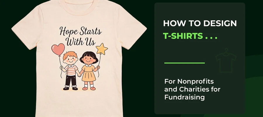
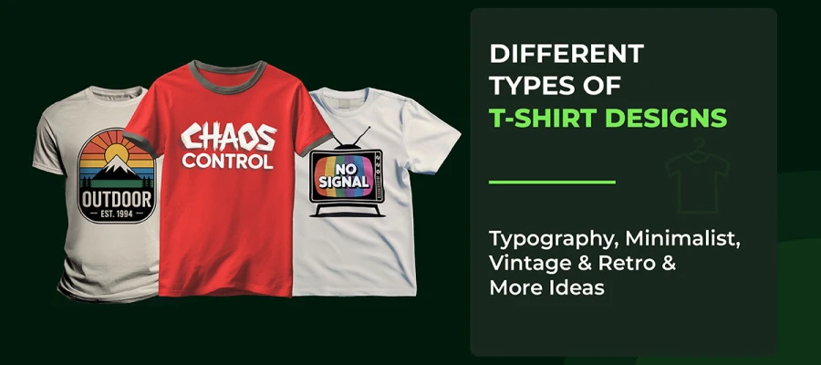
Do you really know what key elements of T-shirt design make a T-shirt connect with people and sell easily? The truth is, creating a great T-shirt goes far beyond bold colors or striking graphics. It’s how typography, color, texture, placement, and balance come together to communicate instantly and feel natural when worn. A great T-shirt speaks, expresses personality, and connects with people.

Many designers, even experienced ones, miss small but powerful details. Thin fonts can disappear after washing. Colors that look bright on screen may fade in sunlight. Designs can feel “off” when worn on a moving body. These issues quietly ruin otherwise creative t-shirt ideas. That’s why many designs fail, even after hours of work.
In this article, you’ll learn the key essential elements of T-shirt design. You’ll get practical tips on typography, color, placement, and emphasis. By the end, you’ll know how to create T-shirts that look good, work in real life, and leave a lasting impression.
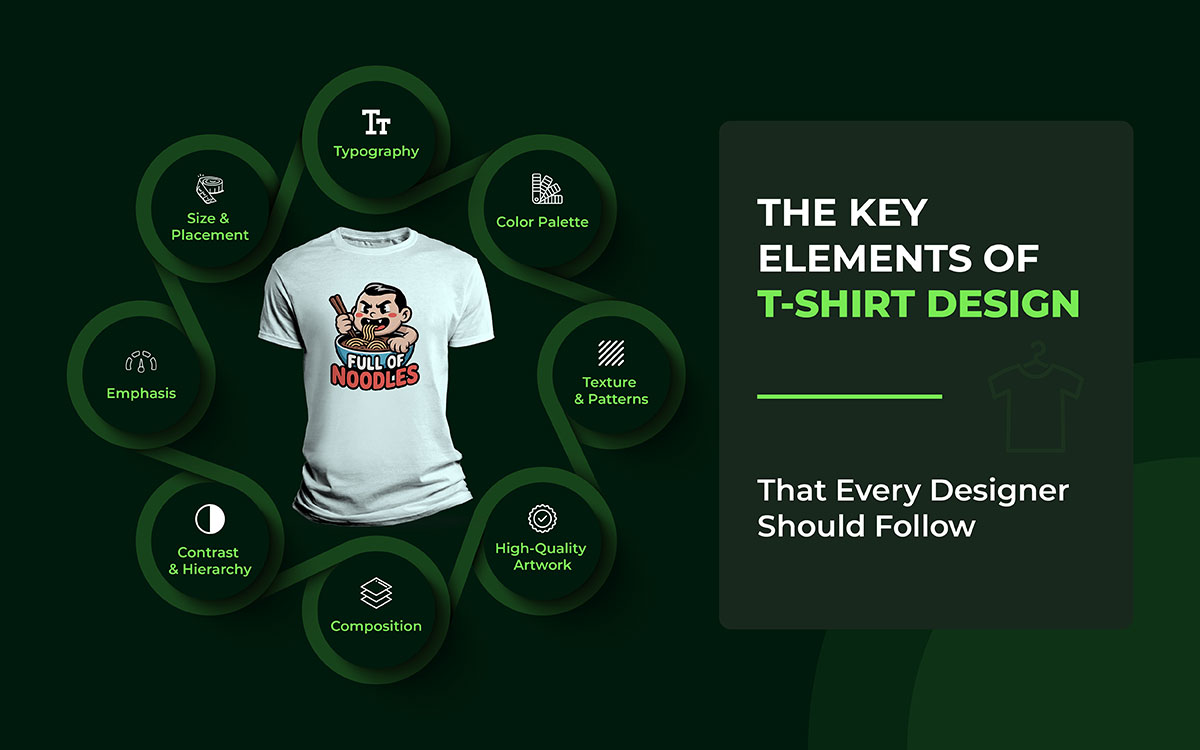
At the heart of every standout T-shirt are the core elements of design: line, shape, color, texture, and space. When these come together with principles like balance, emphasis, and unity, they form a visually appealing and impactful final product. Beyond that, typography, placement, and a clear, audience-focused concept play a critical role in making a design truly resonate.
Let’s dive into each of these key elements of T-shirt design and see how they bring a T-shirt to life.
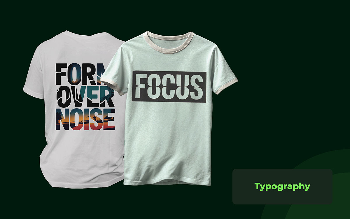
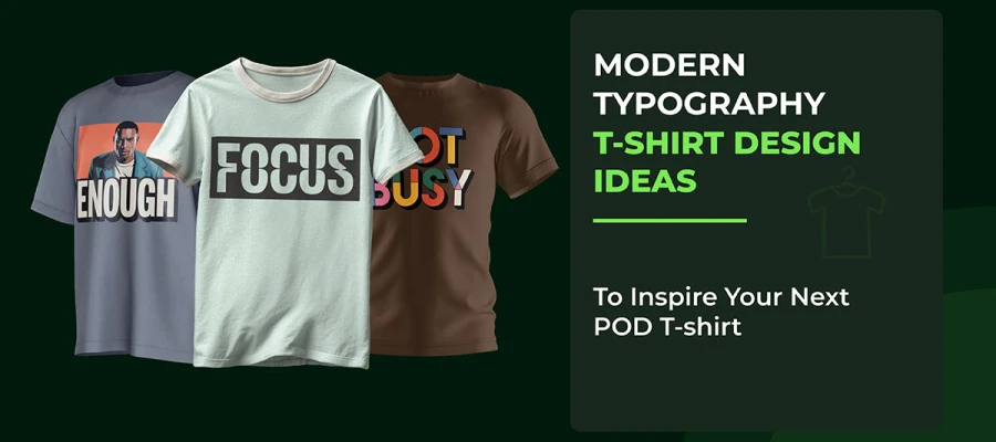
Typography is the backbone of most best-selling T-shirts, even when people do not realize it. In brick-and-mortar stores and online shops, text-based designs consistently outperform complex illustrations because they communicate more quickly. A phrase, word, or idea hits the brain instantly.
From experience, thin or overly decorative fonts almost always fail in real printing. They look elegant on mockups, then crack, blur, or disappear on fabric. That is why brands that sell volume choose fonts with weight and presence. Think of streetwear labels that use strong uppercase letters or slightly rough fonts. They feel confident. They feel wearable.
You have probably noticed that gym and fitness brands rely on heavy block fonts because the type itself feels powerful. Minimalist lifestyle brands use wide-spaced, clean fonts because they convey a sense of calm and modernity. When typography matches the audience’s lifestyle, the shirt feels personal.
Another overlooked factor is distance. If your design cannot be read from six to ten feet away, it is already losing sales. People notice shirts in motion, not in perfect lighting. Good typography respects real life, not just design theory.
Color is one of the most essential key elements of T-shirt design, and it often decides comfort even before style. A design might be visually striking, but if the color feels awkward to wear, people simply won’t buy it. That’s why timeless shades like black, white, gray, and muted tones dominate best-selling lists year after year.
Colors behave very differently on fabric than on a screen. Bright blues can dull, reds can turn muddy, and what looks perfect digitally can fail in reality. Experienced designers know the power of a limited palette; one intense color outperforms five mediocre ones.
A simple off-white print on a black shirt feels bold, premium, and safe, while earth tones like sand, olive, or washed brown convey a modern, mature vibe. Neon colors might spike during trends, but they rarely last beyond a season.
Color also shapes perceived quality. High contrast conveys strength, while low contrast conveys softness. If a design blends into the fabric, buyers assume it’s cheap, even if the shirt itself is well-made. Thoughtful color choices don’t just look good—they silently build trust and confidence in your design.
Texture is what separates a design that is simply made from one that is crafted with care. Flat, perfectly clean designs often feel cheap in real life. They look digital, and since people are used to subtle texture in clothing, designs without it can feel out of place.
This is why streetwear and vintage brands embrace distress, grain, or faded effects. A slightly worn texture gives a shirt a familiar feel, as if it already belongs to the wearer. It softens the stiffness of something new and adds character instantly.
Even bold text benefits from texture; light cracking makes it feel intentional and stylish, while a perfectly smooth design can look flat, like a sticker. Patterns also fill space naturally, and subtle background textures add depth without distracting from the main design.
Texture also serves a practical purpose. It hides minor print flaws and wears gracefully over time. Shirts with texture age better and continue to look appealing after many washes, a detail that most designers overlook but buyers notice immediately.
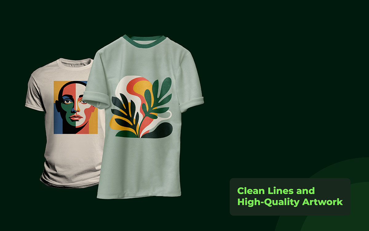
One of the most essential features of a great T-shirt design is clean lines. Fabric is never as smooth as a screen, so any weak or sloppy detail becomes immediately apparent. Without strong lines, a design appears cheap and low-quality.
Many designs that look impressive on a computer fail in real life. Thin lines spread on the fabric, tiny details disappear, and low-quality images can appear faded or soft, even on a brand-new shirt. That is why experienced designers always focus on bold, clean artwork that holds up in reality.
Consider a simple logo or symbol. With a strong outline, it stays crisp and visually appealing even after multiple washes. A highly detailed illustration with tiny lines might look impressive at first, but over time, it usually becomes unreadable.
This is why streetwear and merchandise brands favor simple shapes and clear lines. Clean artwork acts as a guarantee of quality, giving customers confidence without even touching the shirt.
Composition and balance are what hold a T-shirt design together. Composition is how words, images, and blank spaces interact with each other, while balance is the sense that everything feels even and harmonious. When done right, balance transforms a T-shirt into a garment that feels natural, comfortable, and effortless to wear.
Many people encounter poorly balanced designs without even realizing why they feel off. A layout weighted to one side appears lopsided, while a design with too little content can feel empty and unfinished. Skilled designers always consider the human body when placing designs, taking into account shoulders, chest, and movement to ensure the design flows naturally.
Symmetrical designs around the center feel classic and safe, while asymmetric designs, when handled well, can feel modern and fashionable rather than random. This is why many top T-shirt brands prioritize balance. It is not just about screen aesthetics; it is what makes a shirt comfortable, wearable, and visually appealing in real life.
Contrast and hierarchy are visual cues that help people quickly grasp a design. In reality, people see T-shirts while walking, sitting, or just passing by. They do not stop and analyze them closely.
When contrast is low, the design appears to merge with the fabric, making it difficult to distinguish. When all elements of the design are the same size and color, it is perplexing. The eye does not know which area to focus on, so the message gets lost.
For example, a bold main word in white on a black shirt grabs the viewer's attention immediately. A shorter line below helps convey the main message without distracting from it. This stark difference in size and weight establishes a good hierarchy. Conversely, dark text on dark fabric is a common failure, as it is hard to read.
Strong contrast gives a design a sense of strength and makes it very noticeable. Having a clear hierarchy makes it inviting and simple to understand. As a result, they can work together and communicate clearly in real-world contexts.
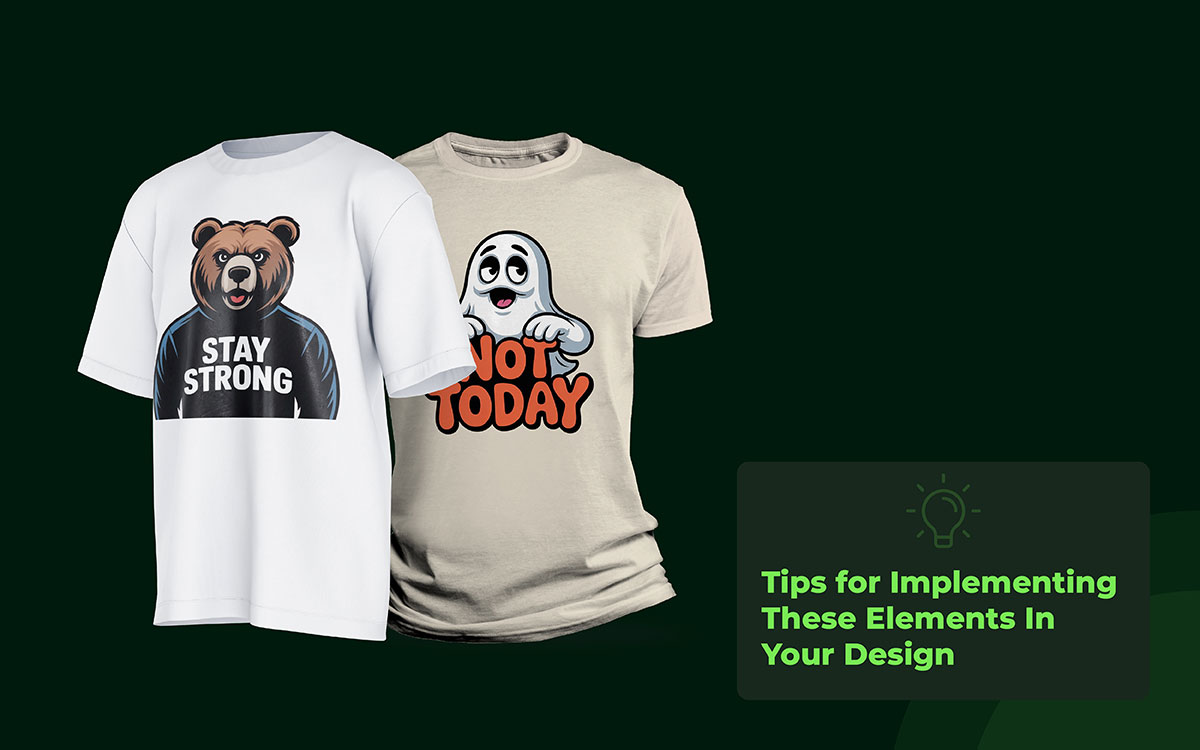
Emphasis is the practice of highlighting the most significant elements of your design to capture attention at first glance. People have only a couple of seconds to glimpse T-shirts. When there is no emphasis, the design can appear flat and dull, and people might not even notice it.
A well-designed layout designs the eye and gives the shirt a sense of purpose. Designers don't have to think too hard to create emphasis; they have plenty of ways to do so. One way is to use a bold font, a bright color, or a large central image. Additionally, size and space can determine which parts of the design are more important than others.
For example, a T-shirt with an inspiring slogan can feature one word in a large, bold typeface, while the rest of the text is small. In that way, people can grasp the main idea in under a minute. Streetwear labels also emphasize the center by placing a solid logo or a striking image.
Lack of emphasis, a particular shirt might be just a combination of random shapes and words, and no one would be interested in it.
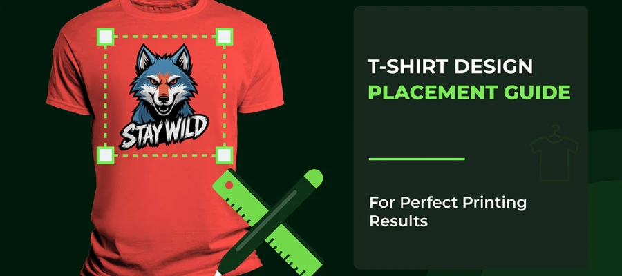
Size and placement matter a lot because they not only determine how the design looks on the shirt but also how it feels when worn. An overly large design can make the shirt feel heavy and uncomfortable. On the other hand, a design that is too small may be complex to see and easy to forget. Placement of a design is just as important. A design placed in the wrong location can make the shirt look odd or uncomfortable.
There are definitely better and worse places for designs in real life. Center chest designs are timeless because they appear balanced and natural. Large prints may look great when positioned carefully with sufficient space around them. Small left-chest designs are discreet and make the shirt feel like a luxury, typically used for logos.
A design that is too high on the chest may feel tight, whereas one that is too low may look messy. Size and placement can also affect how the shirt looks when someone is moving, sitting, or taking pictures. A design that fits well with a moving person will always be more comfortable in real life.
Knowing the key elements of T-shirt design is just the first step. The real challenge is using them well so your designs look great in real life, not just on a screen. You need to choose the right colors and typography. You also have to balance composition, contrast, and texture. Every choice affects how a shirt is seen, worn, and remembered.
Many designers ignore how their designs will work in practice. That’s why even strong ideas can fail when printed. In this section, you will find practical tips. They will help you combine these elements smoothly. Your designs will not only look good but also be wearable, functional, and ready to impress in the real world.
It is better to know what the shirt is about before you buy fonts or images. People notice only one thing, so they decide what it will be. A shirt with a strong central idea serves as a communication tool and does so very quickly.
For instance, in a case where you are making a funny T-shirt, decide which one phrase would make people laugh the most and use that instead of trying to cram in five jokes. A single main idea strengthens the design and helps other elements come together naturally.
People generally do not look closely at shirts; they see only the first thing that stands out. Emphasis focuses the reader's attention on the central part. You can do this by using size, bold letters, bright colors, or a powerful central image. I have come across a significant number of T-shirts with awesome messages, but they failed simply because nothing was emphasized.
A motivational shirt will be more effective if the main word is large and bold, with the rest of the text smaller. Streetwear brands often place a large design at the center of the shirt to draw immediate attention. A T-shirt without emphasis can appear flat or dull, and passersby may not notice it.
Size and placement are highly functional elements that are often overlooked. A design that is too large may overshadow the wearer and give an awkward impression. A design that is too small may be neglected. Placement determines the level of a shirt's naturalness.
Designs that are placed too low appear lazy or sloppy. People are more concerned with how the shirt looks on them than on a screen. Centered chest designs are standard and timeless, oversized prints may look fashionable if carefully spaced, and small logos on the left chest can be your secret weapon for a subtle and premium look.
If the design matches the T-shirt color, it will be hard to see. A significant contrast makes the main element not only visible but also visually powerful. For instance, a white text on a black t- T-shirt can be scanned.
A dark gray on black is not visible most of the time. Even a fantastic concept can fail if the colors are not bright enough. Moreover, contrast helps display hierarchy. People first recognize the main message, then the supporting details, which gives the impression of the shirt being orderly.
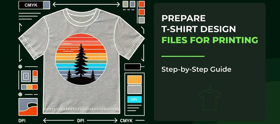
A design looks perfect on your screen, but when tested in real life, it fails. It is always better to print a sample of your design and check how it actually prints on the T-shirt. See it in different lighting, from various distances, and as a person is wearing it.
Test the movement. Does the shirt still look good when the wearer is sitting or raising their arms?
Most beginners overlook this step, resulting in purchases of shirts that do not work. Testing saves money and helps ensure the shirt is comfortable in real-world use.
Don't add a handful of elements simply because you've got the option of doing that. Excess words, colors, or pictures make a layout puzzling for the viewer. Minimal designs convey a professional, trendy impression.
For example, a clean logo with one or two accent colors is far more effective than a design with numerous small details that disappear in print. People in the real world relate to simple designs more quickly because the communication is straightforward.
Pay attention to how they employ size, position, focus, harmony, and contrast. Figure out what makes the shirt safe and simple to wear. Many trendy brands may not have complex designs, but they perfect every element. Learning from successful shirts offers insights no theoretical model can provide.
After learning the key elements of T-shirt design, you can see what makes a design stand out. It’s not just about bold graphics or bright colors; balance, readability, and knowing how people wear and connect with the shirt matter too. Every choice, like the font, fabric, spacing, and color, shapes how your design is seen, just like characters in a story.
The best T-shirt designs feel effortless. They fit into everyday life, age well like a favorite vintage shirt, and still share their message after many washes. Design is more than decoration. It’s communication that works in motion, in crowds, and in real-life moments.
If this feels overwhelming or you want professional help, Graphic Design Eye can bring your vision to life. We are a leading graphic design company offering a range of creative t-shirt design services. Our team focuses on quality, fast turnaround, and designs that truly connect with your audience. This way, your shirts will not only look great but also succeed in the market.
Take a moment to think about your next T-shirt design. Use the principles you’ve learned carefully. You can create designs that people love to wear, share, and remember long after they first see them.