Product images are considered the most valuable content for ecommerce websites. It is not just my saying; surveys and research behind buying intentions have proved it. So, you can guess the importance of these product images. Now let's explore 16 inspiring eCommerce websites with product photography to show you how they represent their product images and attract customers. So, look now.
Right below, I will share my top websites to show you how they represent their product images. But before that, let me explain why it is important for new ecommerce websites to follow them and learn from them.
As we know, in online shopping, the first thing customers see is the image of the product. Good-quality images surely do grab customer’s attention. On the other hand, low-quality images may not instill confidence in the customer, as they show a lack of professionalism. People tend to buy from a professional business rather than an unprofessional one. And if you check out the inspiring ecommerce websites, you will see how all of their images are clear and of very high quality.
The second important thing is that customers like to see all the angles of a product before purchasing. Big ecommerce websites often use multiple angles, close-ups, and even zoom features to give a full view of the item. This helps the customer feel like they know what they are buying. This adds a personal element between the product and the customer.
The website user interface design is also user-friendly on these big websites. A creative interface allows customers to comfortably browse the website and check out the products they like. Small businesses should also focus on the website user interface, along with product images.
So now you know why good product images are that important in the ecommerce business. When a customer clearly sees a product and its features, they feel more confident in buying it. Big eCommerce websites use high-quality edited images to reduce doubts and ensure the product matches the customers' expectations. Small businesses should also invest more effort into product images, as it will help them gain the customer's trust more and more.
I could have directly featured the top inspiring eCommerce websites for product images. However, you should also know why this is so important, right? Thanks for your patience. Your wait ends here.
Now let's learn the 16 inspiring eCommerce websites with product photography to get inspiration for your own ecommerce business for product image.
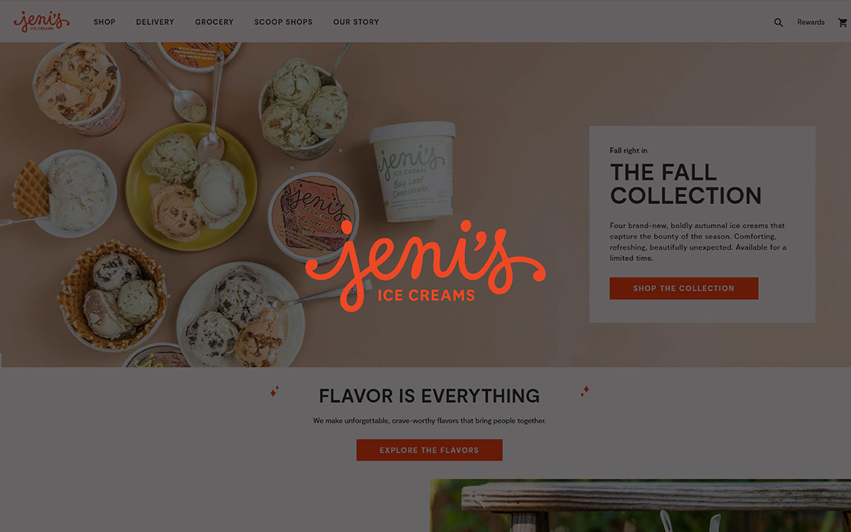
The first thing I would say about this website is you won't get bored after spending so much time on it. The owner of this website did a splendid job, of making the user interface simple and easy to navigate. The design is clean and colorful. Also, the elements have the perfect amount of space between them. This makes it easy to find what a customer is looking for.
Innovative Features:
Another basic but useful thing is that the homepage shows close-up images of fresh and tasty ice cream. They did a nice job showcasing their product images across the website.
The nice, vibrant product images all over the site tell a story and provide context for how the ice cream can be enjoyed in everyday life. Each page consists of 4 product images. The interesting fact is that all the images of their product are of high quality and presented with a very nice solid background color.
Along with all that, they have a cool feature. When you put your cursor on the image, it gives a close-in effect of the ice creams, which is a good way of representing products. Not only that, they also have a toggle section where you can see the ingredients of their tasty ice creams.
User Experience:
The features on their website make it easy for customers to explore products. Fast loading of large images, zoom-in options, and bright visuals create a good user experience.
The images will not bore you. Even if you don’t like ice cream, you will be amazed by how beautifully they have organized and presented their product with such colorful backgrounds.
Marketing Impact:
All the design, user interface, and images give off a strong presence of a solid brand. Now the last question remains: did they actually create an impact by doing all this? The answer is yes. Jeni’s focuses on handcrafted ice cream, and it has gained a lot of popularity, as you can see in the reviews.
Whether you agree or not, product images play a big role in their success. The seasonal ice creams and their presentation make them stand out from the rest.
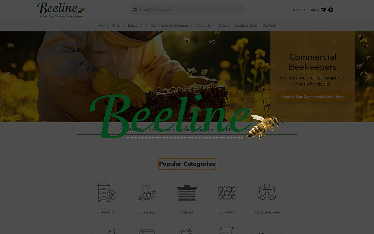
The Beeline Woodenware website has a clean, straightforward design. The page layout focuses on the user experience through easy navigation and a product-centered design.
The design of the website showcases its products clearly. It’s basically a simple, clean website. You wouldn’t find that modern ecommerce store feeling here. The overall user interface design and image quality are good and basic. Nothing fancy.
Innovative Features:
Beeline Woodenware didn’t do anything special to present its product images. Their product images are simple and clear. One thing I didn’t like was that they only uploaded one product image for each product.
All the images use a white background. The photos focus on showing the basic look of their beekeeping products. It seems to me that the goal is to show the product straightforwardly. Keeping it simple to understand.
User Experience:
The experience of showing the product images is basic. You wouldn’t get any catchy vibes or feel any boringness. One thing you may feel incomplete about wooden beelineware is the single image with no zoom in or rotation of the products to see them from different angles.
Although they are selling products about beekeeping. So, in their cases, it might be considerable to not have images of close-up views and multiple angles. Users can see what the product looks like, but they may want more detailed images or a closer view to feel more confident in what they are buying.
Marketing Impact:
The simple images might work well for practical customers who have been in this field for years. They just need to see the basic products. However, for an ordinary customer, the impact will be less. Without more detailed or interactive images, they might miss out on attracting customers. Most people who buy online prefer to explore products closely before buying. So, adding more features could help to get more sales.
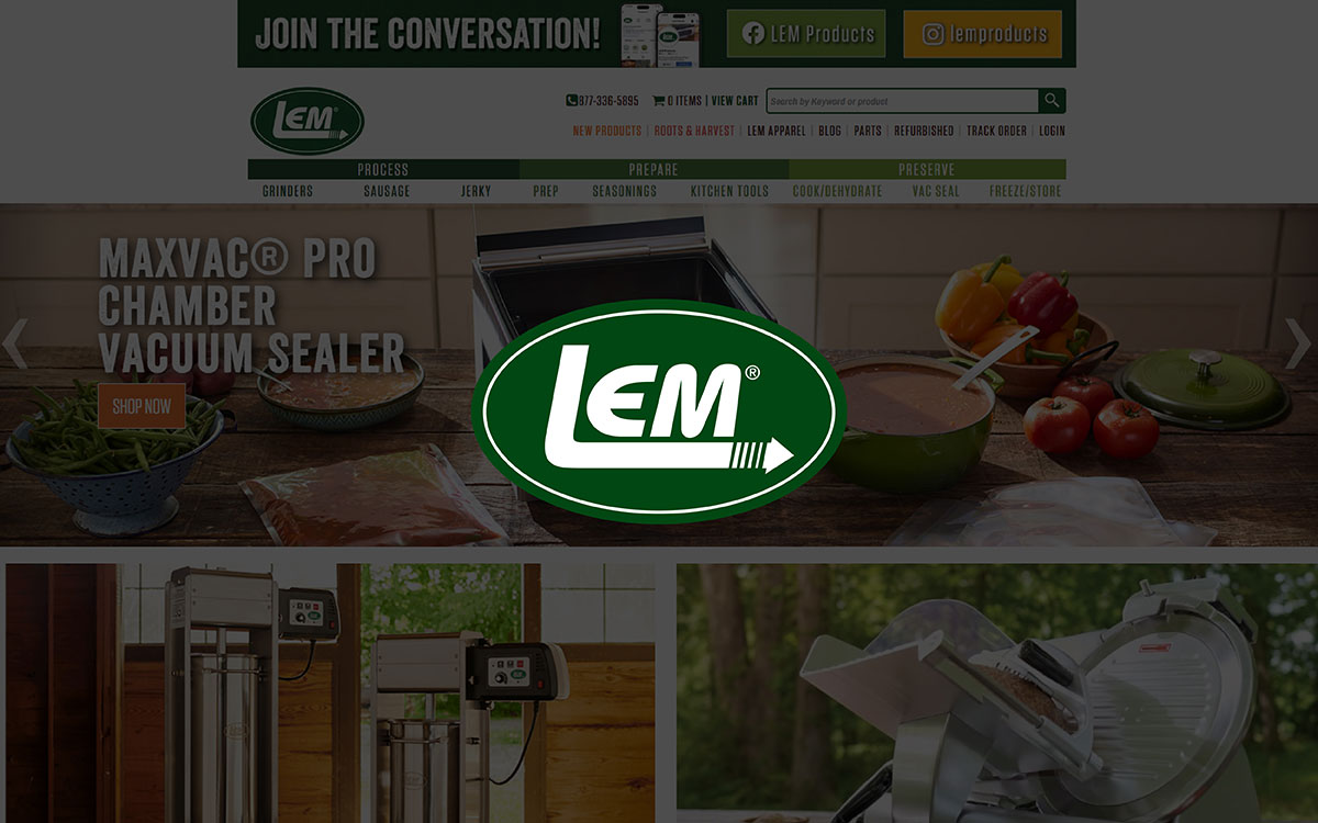
I wouldn’t say they have the best design I have seen. But the thing that makes them user-friendly is the product images. The design doesn’t look all that simple. However, the user-friendliness and product images of the website make up for that.
Innovative Features:
LEM Products have high-quality, clear images to display their products. They provide multiple images of a single product from different angles on their page. This helps the customer get a clear idea of what they are buying, as I mentioned before.
However, they don't use features like 360-degree views. But use videos to engage with customers even more. Their main focus is on showing the product's details, such as parts and functionality.
User Experience:
The images are straightforward with a white basic background. And the little zoom-in features provides with a nice experience on observing a product. The short video is also useful since they are selling machine-like products.
Overall, you can see the basic details of the products in the images. The images do the job but could be more engaging with a nice background.
Marketing Impact:
They did quite a job in showcasing products. They added the features, and the experience is good too. But the presentation is very simple and basic.
Customers will get a nice experience while checking a product. No disagree on that, but adding a bit of a nice background to the images would be attractive.
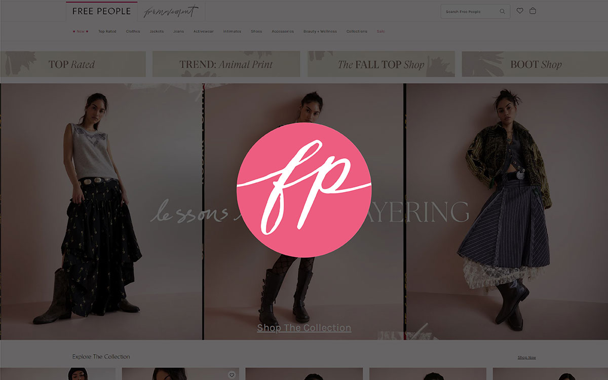
This website can be the representative of how every clothing ecommerce website should look. The website design is super simple and easy to navigate.
It gives off a boho and modern vibe. The website design is very image-driven, with vibrant product photography. Multiple images of the product, with models wearing the clothes, help customers get an idea of how they would look in those dresses.
Innovative Features:
Free People uses clear, high-quality images to display their products. Each product has several images from different angles with a zoom-in feature. A single page has 5 product images on models. This helps customers imagine how the clothes will look in real life. They don’t have special features like 360-degree views or videos.
They use another section called "Style With," where they feature how that individual product can be paired with other products to create an exclusive look.
User Experience:
The product images provide a nice, easy-to-view experience. Customers can see the clothes from different angles and how they fit. Along with the zoom-in feature, this allows customers to closely inspect the fabric or design details. So, surely we can get a useful experience from this website.
Marketing Impact:
The lifestyle images of models wearing the clothes make the products look attractive. This helps buyers feel confident about their choices, which is a psychological effect. When we see others looking good in something, we believe we will look good wearing the same products.
This supports their marketing, ultimately leading to more sales. While the pictures are nice and stunning, they continuously help increase sales over time.
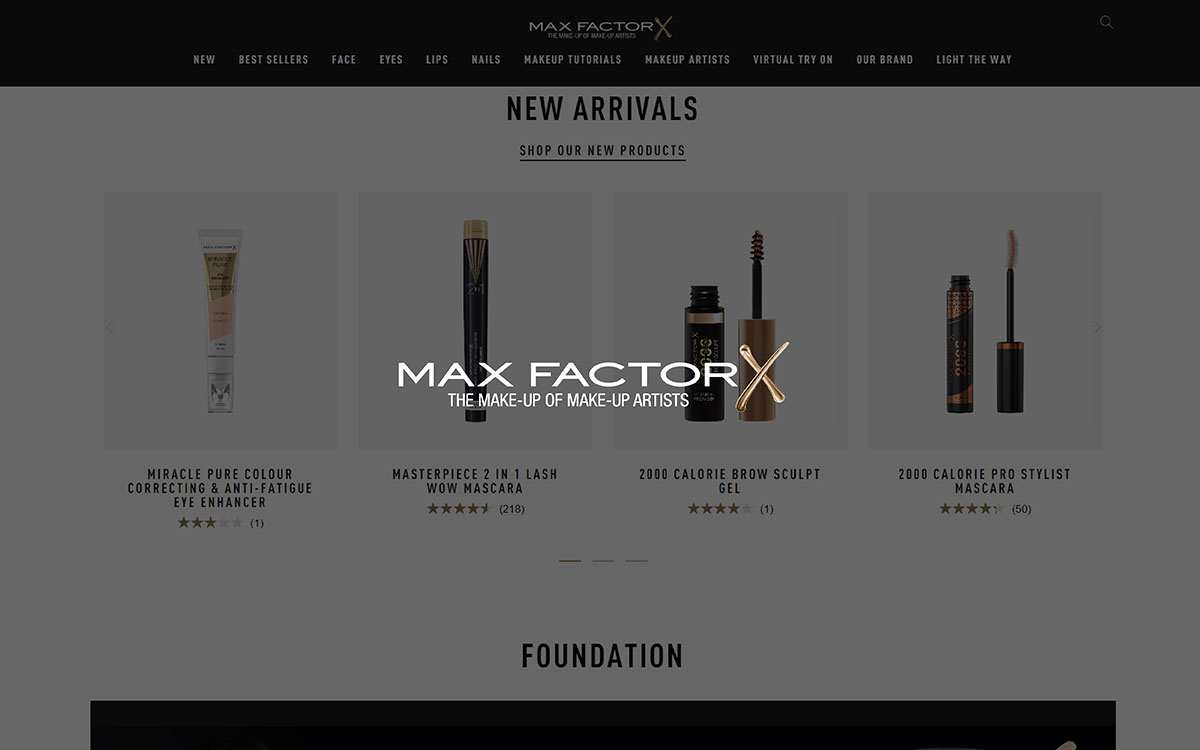
Another simple yet good website design with appealing product photography. The black and white website design with titles in golden color represents the classy feel of their website. All the high-quality editing images show the stylishness and reflect the brand's premium feel.
Innovative Features:
Each of their product images features a plain white background, presented in a very classy style with other infographics. These infographics present the details of the product, along with before-and-after effects showing the results of their products. They did a good job here, with a strong focus on product details.
They also use a unique feature called "Virtual Try-On," which allows customers to engage with the products personally.
User Experience:
The presentation is clean. Customers can easily browse the products. Some products are shown in various shades, and creatively written product descriptions help customers understand the benefits of a product without reading long paragraphs. It helps customers quickly learn about their products.
Marketing Impact:
In short, Max Factor’s product imagery is polished and professional. The “Virtual Try-On” feature is an interactive tool to help customers and make them confident in their purchase decisions.
Overall, this simple and descriptive product imagery will help drive more sales. However, the appearance could be made more attractive.
Undoubtedly — As you can see in the images, it’s not just about clicking and posting. There was a lot going on after the shoot of the product. You also must know this, and we call it photo editing. You may also need the necessary photo editing service for your product photography because you can’t just directly upload a photo; you need to do color correction, change backgrounds, or make some product infographics.
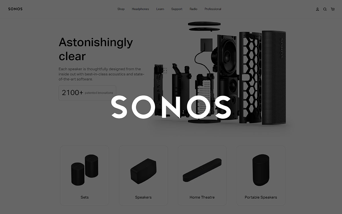
This website presents a modern design with simple and functional design elements. The high-tech nature of Sonos products is presented in black and white, as it marks the premium quality of their product.
This website could be an example of how a modern ecommerce website should look like. The product images and navigation options all give off the feel of modernity and the premium nature of the brand.
Innovative Features:
Sonos uses clean, minimalistic product images and also lifestyle photos. It shows how their products would look in real life.
The site uses video backgrounds to highlight products with amazing videography. This creates a more engaging experience for customers. The multiple images, along with lifestyle photos, are presented in different angles and environments to present attractively to customers.
User Experience:
Sono’s visuals are attractive and modern. The lifestyle images and video create a smooth browsing experience. As it helps customers imagine the products in their homes. I would say this is the look of perfect product imagery.
Marketing Impact:
Every single product image and video represent their premium brand quality. Their product imagery is visually very appealing. This says a lot about their brand.
The stunning videos and lifestyle images surely would engage with customers and drive more sales. Especially for those who are looking for high-end music solutions.
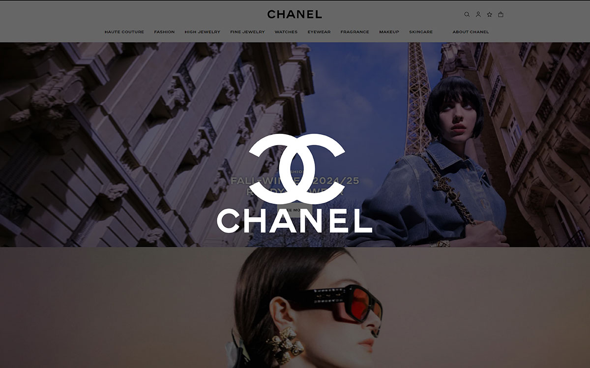
You can guess that "this is a premium brand" by the looks of it. This website is that type of ecommerce store. Minimal and elegant design is all they focus on. The simple website design focuses heavily on product images and presentation.
Innovative Features:
CHANEL shows its products from different angles with artistic backgrounds to showcase their luxury. This gives customers a clear view of each product. Although not every product is shown in nice backgrounds, some have premium solid color (#F6F3EC) or black backgrounds.
All the products receive a closer look to show the details of their work. They also offer a virtual try-on feature, where customers can see how the products would look on them.
They also use 3D featured images, so customers can have an even better idea of the product. They really invest a lot in their images; you can just tell by their looks.
User Experience:
You will get one of the best online shopping experiences on this website. The premium high-quality images with zoom-in effect really give off a luxury feel and help inspect a product closely. The ‘‘Try-On’’ feature is also really useful to get an idea of how the products would look on a customer.
In short, Chanel will give you one of the best ecommerce website experiences.
Marketing Impact:
As I said earlier, Chanel invests a lot behind their product photography. Surely, they do it for a reason. Chanel is a luxury brand. Like any other brand, their target is also to get more sales by presenting the luxurious images of their product.
CHANEL’s high-quality images and features, like virtual try-on build trust with customers and highlight the luxury of their products. This presentation style helps to boost customer confidence and drive sales.
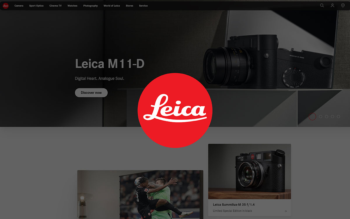
The design of Leica Camera's website has a clean and modern look. This matches with the brand's premium positioning in the camera market. The visual elements enhance the overall experience you will get on this camera website.
The overall design and product images surely create a positive user experience and visually appealing looks.
Innovative Features:
Leica itself is a camera brand. They uphold this in their presentation. The product images are presented in a sleek using drop shadow and a white background.
They are not the usual ecommerce site. Their presentation is somewhat unique. They mainly focus on heritage and quality rather than relying on flashy visual effects.
So, nothing fancy like zoom-in or close details, yet they still give a strong luxury brand feel.
User Experience:
The edited images present a clear and luxurious experience. Their primary focus is on clean, sharp, and detailed, attractive images. All these qualities are enough to make the camera or lens stand out.
Any customer would feel a sense of clarity when browsing through their product images. The simple, luxurious, and elegant images provide a smooth user experience.
Marketing Impact:
Leica’s primary targets are professional photographers and enthusiasts. Their product image displays play a solid role in maintaining their spot as a luxury brand.
The clean and detailed presentation seems to value tradition and elegance. Their targeted customers are likely to appreciate the quality and craftsmanship. This helps the brand image remain strong and boosts sales among their targeted customers.
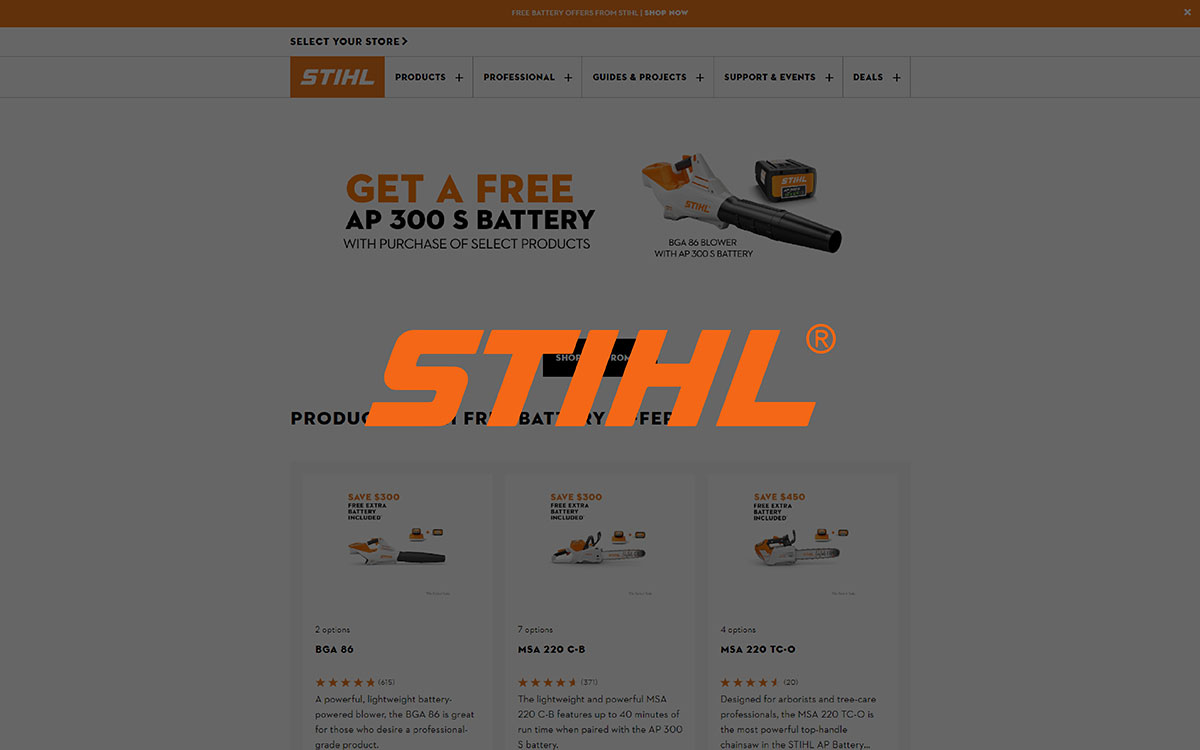
Focusing on a primary color as the brand identity is the first sign this US base website will be quite good. The robust design, clarity, and product description and infographic appeal to customers looking for performance-focused tools.
This may not be as visually great-looking a site as others, but it efficiently delivers information and product imagery.
Innovative Features:
STIHL presents its primary product images on a white background and infographic. On the main page, you will find multiple images; some highlight the features of the products, while others show real-life uses of their products.
They also include videos presenting their products in real-life action, which is a good step to showcase the quality. The main focus is on practicality and durability, which highlight the product itself.
User Experience:
The website product images provide a clear view of the products, making it easy for customers to understand the product’s size and build quality.
Although the experience might seem simple, it is functional and direct due to the clear visuals of their products.
Marketing Impact:
STIHL’s product presentation supports their reputation as a reliable, professional brand. The real-life action videos and quality editing images help build trust with customers. This straightforward approach is likely to support their sales.
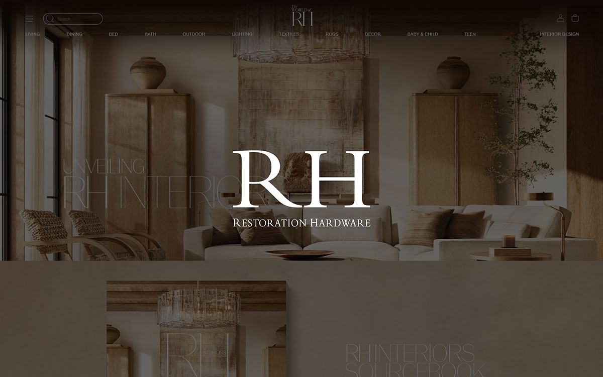
Only if an image of a shelf can be that good? This website shows how product photography should be done. The direct visual approach to product images makes for an elegant and simple look.
Innovative Features:
Restoration Hardware uses retouching images with neutral, elegant backgrounds to highlight the luxury of its products. This truly gives their product images an aesthetically pleasing look. All of their products are displayed with multiple images from different angles to show their craftsmanship.
They use lifestyle images to give a clear sense of the actual product. There is also a zoom-in feature, which allows customers to see details like textures and finishes.
User Experience:
The photo retouching they provide through their product images feels luxurious and polished. The zoom-in feature helps customers see details clearly, like fabrics, wood grains, and textures. They present their products as the central focus of the page without distractions, with high-quality images and multiple angles. Overall, the experience feels minimalist and elegant.
Marketing Impact:
The focus on retouching images sets them apart as a premium brand. These edited images help them get more sales by showing them to customers who want sleek and stylish furniture. Their creative presentation deeply engages customers who desire luxury.
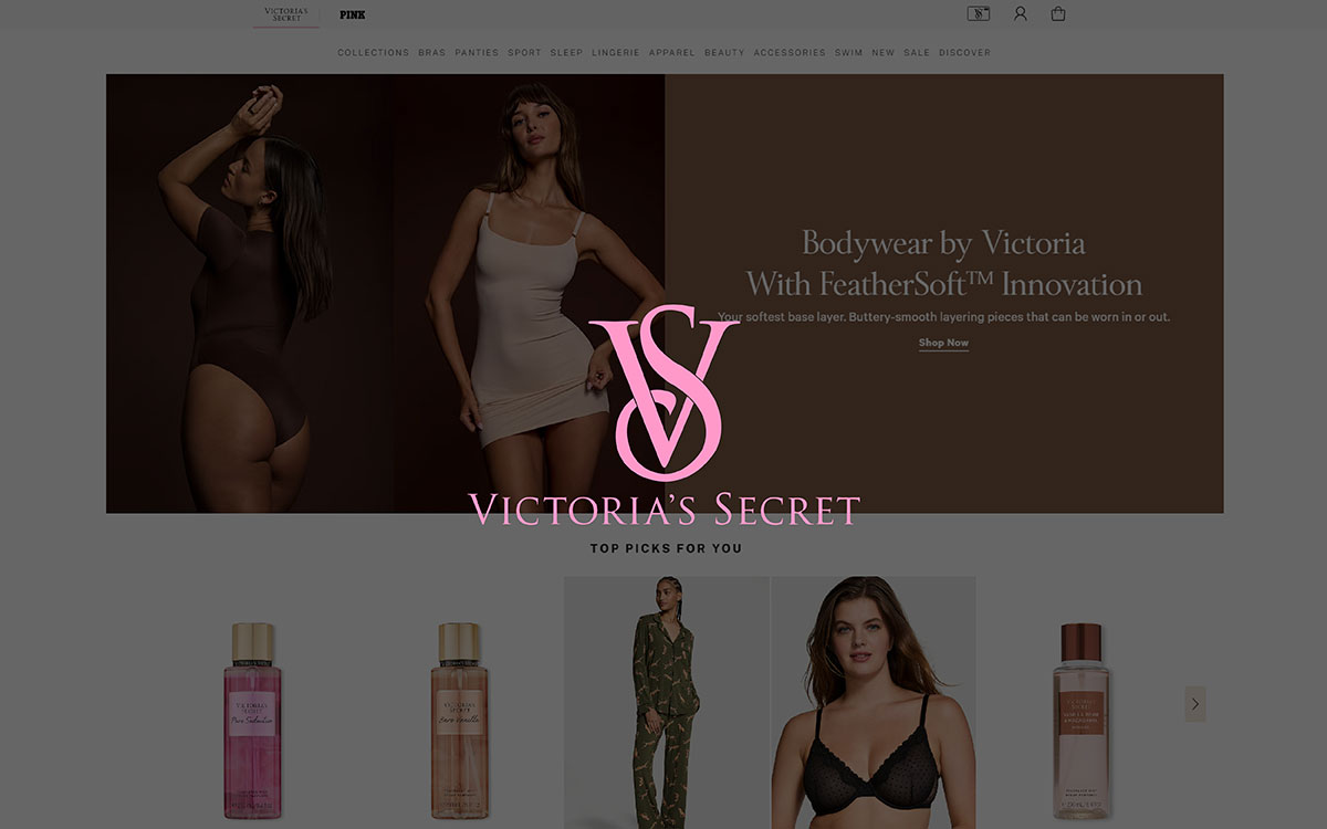
This fashion brand has a clear targeted audience. This women’s brand uses edited product images of different models wearing the products. This approach inspires all types of female customers.
Innovative Features:
Victoria's Secret uses high-quality product images with a zoom-in feature for a closer look at the details. They also feature images of multiple angles for most products.
Their images are mostly shot on background color (EBECE9). They also showcase the items on models to give a real-life perspective.
User Experience:
For a fashion ecommerce site, a customer can get a fully pleasant experience through this website. The models in product images help customers get an idea of how the products might look in real life.
The product presentation using different types of models and attractive images provides a friendly user experience.
Marketing Impact:
The clean, professional presentation with high-quality product images positively impacts marketing. Victoria’s Secret is already a well-known brand, and their product imagery helps it become even more famous. It helps them build a strong visual brand that drives more sales.
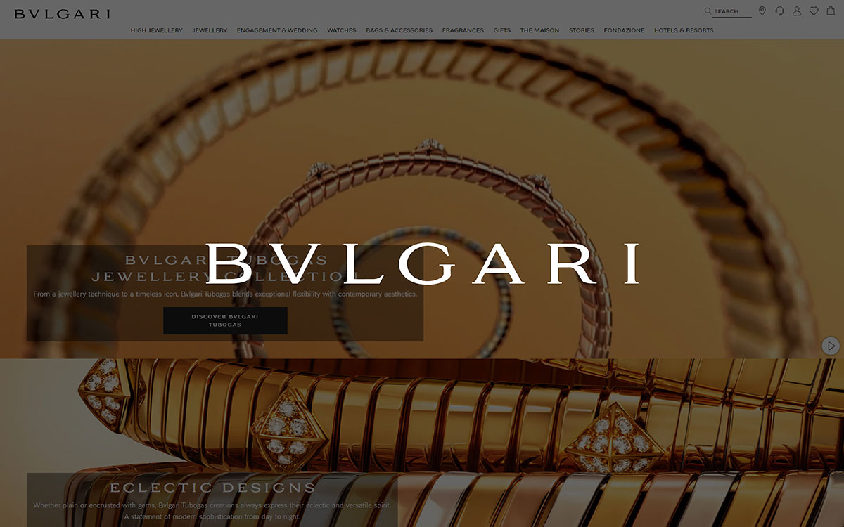
Bulgari is a luxury brand with a minimal way of presenting its products. All their product images show the quality of their brand.
Innovative Features:
Bulgari’s website uses 360-degree and edited product images. They also use a close zoom-in feature. All these features, with white and beige background images, present a minimal and simple luxury design overall.
User Experience:
The features added to their website allow customers to explore the details of the product very closely. The creative presentation with a 360-degree view gives customers a new online shopping experience.
Marketing Impact:
The presentation of Bulgari’s product images supports its luxury brand identity. This makes the products more attractive to their targeted customers. The detailed view and amazing images are likely to boost any customer's interest in buying.
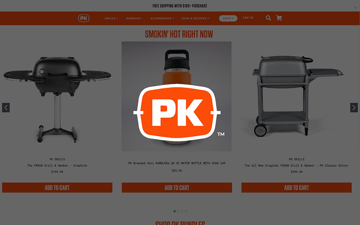
The design of PK Grills' website is simple and clean, which makes it easy to use. The product images are clear and show off the quality and structure. The site highlights how portable and reliable their products are through close-ups and full images.
Innovative Features:
PK Grills presents their product image in a clean, focused way. The images are placed on simple white backgrounds. They primarily highlighted the product design.
They also feature multiple angles of their product. The product details are well captured. Some images also showcase grills in real-life work.
User Experience:
PK Grills offers quality edited images that give a clear view of their product. They present their products in a simple, detailed way. Nothing fancy. Customers won’t face any trouble exploring their products.
Marketing Impact:
They present their product in a simple, minimalist way, and there is no trouble in exploring the products. However, I think they could present their products in a more creative way, such as with background edited images or showcasing their products in real-life action. This could attract more customers.
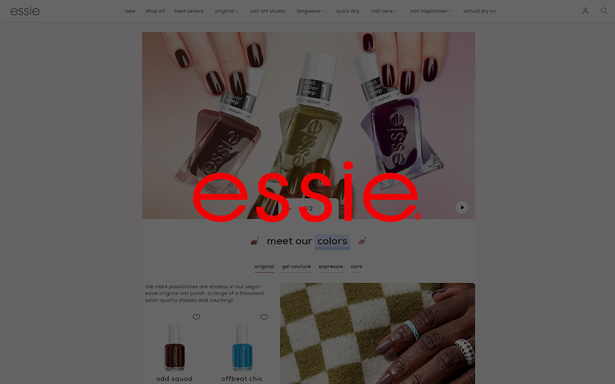
Essie is an example of a clean and creative website design with vibrant, colorful images. Through their website, they present their products with creativity. editing background, detailed images, and presentations of real-life use are all done in an interesting way.
Innovative Features:
As I said, they did a wonderful job in the presentation. All of the pages have four product images that show the quality and how the polish would look on different hands, with a plain white background.
They have a creative feature to show their products. You can find a "try it" button on their website, where you can see how the polish would look on your nails.
User Experience:
Analyzing Essie’s product images gives a pleasant experience because of the clear, retouching images. If they had a zoom-in feature, I think customers could have a closer look. Overall, the image-exploring experience is pretty good.
Marketing Impact:
Essie’s vibrant presentation with virtual “try-on” features gives customers a nice experience in online shopping. This will attract more customers because of the personalization.
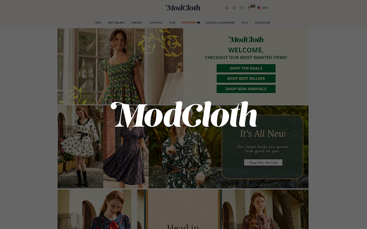
ModCloth presents real-life models wearing their clothes. Most of them in natural or lifestyle environments. Some images are also presented with Catskill white backgrounds.
Innovative Features:
ModCloth shows different angles of each product, including close-up details. The close-up features allow customers to see the fabric and design in detail. They also keep all body types in mind by featuring models of different sizes.
ModCloth also presents several images of their products in a single presentation, mostly with models wearing them.
User Experience:
This is the type of website that makes you feel good just by exploring it. The product images of models wearing the clothes in various locations provide a pleasant user experience.
Also, with the close-up feature, customers can see the details more clearly, which is an important feature many people want in online shopping.
Marketing Impact:
ModCloth connects with its customers on a personal level by using diverse models and real-life images. This inclusive step builds trust and grows customer loyalty. This ultimately increases sales because of their unique marketing.
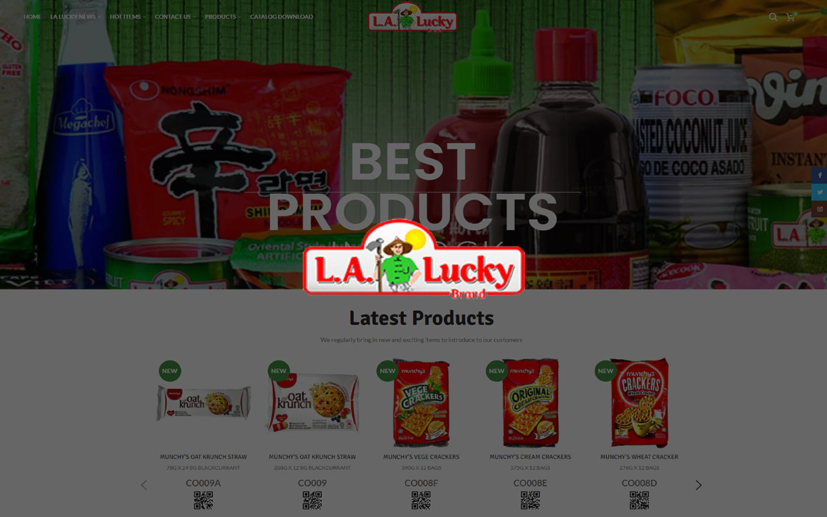
This shop is more like an import and export house than an ecommerce shop. It’s a very basic website. It doesn’t have any fancy image presentations. Their primary focus is to tell a customer what category of product it is, with nothing detailed about the products.
Innovative Features:
They present a single basic image of the product on a page. Nothing more.
However, they have a feature called “quick view,” which allows customers to see a product without leaving the main page.
User Experience:
The La Lucky website is not for everyone for exploring. The user experience is straightforward and basic.
Marketing Impact:
As I mentioned, this La Lucky website is mainly for importers and exporters. Ordinary customers might not feel too good exploring this website. But customers come here with a purpose, and this website can fulfill their purposes without any hassle.
Final thoughts, if you study the 16 inspiring eCommerce websites with product photography, you will see that whatever products they are selling, they are very dedicated to their product images. In online shopping, the image is the only way a customer gets an idea about the product.
Quality edited images are very important for eCommerce stores. They help customers make decisions and trust the seller. Clear, detailed images show what a product looks like, how big it is, and why it's great. This helps the buyers to choose better. Spending time and money on good product images is not totally making things look nice, rather it is a smart strategy for businesses to get more sales. And build a bond with your customers.
So, everyone who is in the eCommerce business should invest more work in their product images.
A little tip for you: by now, you have seen how product images contribute to the growth of an ecommerce website. If you also have a website, try to go for professional photography with customized backgrounds, infographics and a zoom-in effect feature. Also, adding a short video would likely boost marketing.
Enough for today. If you have any more questions, like what background you should choose or what type of images would suit your brand, feel free to drop us an email or simply contact us. Our team will reach out to you as soon as possible.