Updated Sep 05,2024
Photo Editing

Common Photo Background Color Mistakes: Step-by-Step Solutions [Key Takeaways]

common photo background color mistakes

The choice of appropriate background color when taking a product photograph is important. This may seem to explore the specifics of the task, but rather harmful, an even the most good-selling products can look unpleasant because of the background color.

There are a lot of such examples today in the practice of many companies, and they do not even consider the background color of the photo to be a problem.

Nevertheless, there is something fundamentally missing in all their made-up adverts. Some illustrative pictures containing all of the don’ts and overdo’s do picture the nature of the consumers’ behavior in most situations. Dreadful lighting on photographs or wrong choice of background colors that do not conform with any of the branded guidelines can also confuse the customer and water the brand.

These mistakes ruin the appearance of your products and can also drive prospective consumers away.

Anyway, there is no reason to panic, as these background color mistakes can be remedied by eliminating or altering some things.

We write in this article, that common photo background color mistakes will be analyzed together with ways in which they can be altered in order to achieve maximum product/table photography. Images of your products will remain pretty nice, and even if you have the imagination to create, will surely depend on the level of any skill.

7 Common Photo Background Color Mistakes And Solutions

common photo background color

At times, you might have wondered as to why certain product photos do not look good. Well, it could be that the background color does not suit the picture. Well, choosing the wrong background can be quite off-putting in how your product looks.

We will discuss the mistakes that one should not commit when trying to choose a background for the products and how they should go about it:

Mistake #1: Wrong Background Color Combinations

Using the wrong background color combinations can make your product look bad. Instead of achieving the intended purpose of complementing the product, poor color selections may have puzzling or excessive results.

Take for example when a bright red product is placed on a bright neon green background, which feels clashing. In fact it only distracts from the product as it does not help much and draws attention away from the product. It is the problem of visual conflict. It creates an overload on the viewer’s eye making it hard to appreciate the actual product appearance.

The effects can be quite damaging in eCommerce where the picture of the product in most cases serves as the point of contact for potential clients. A negative first impression could mean that a sale has been missed out on.

Solution:
  • When background selections, it is best to choose background colors that highlight each other. They are on opposite sides of the color wheel: e.g. Blue and orange or purple and yellow.
  • These types of color combinations are very effective in maintaining the focus on the product rather than the color and they help in creating a very harmonious look.
  • Any background that is neutral in tone, white, grey or beige is appropriate for most products. They serve to emphasize the product's colors and particulars without being distracting.
  • When they are complimented with bold or elaborate products, neutral tones act as a curing aid to the product in focus because the backdrop is simple.
  • The choice of colors in any image should always depend on where the product falls. If the end product is brightly colored or multi-colored, a more plain or white background would be appreciated.
  • Lightweight products generally allow one to use more adventurous backgrounds if the product has a neutral color tone as long as there isn't any conflicting.

Mistake #2: Backgrounds With Lots of Different Patterns

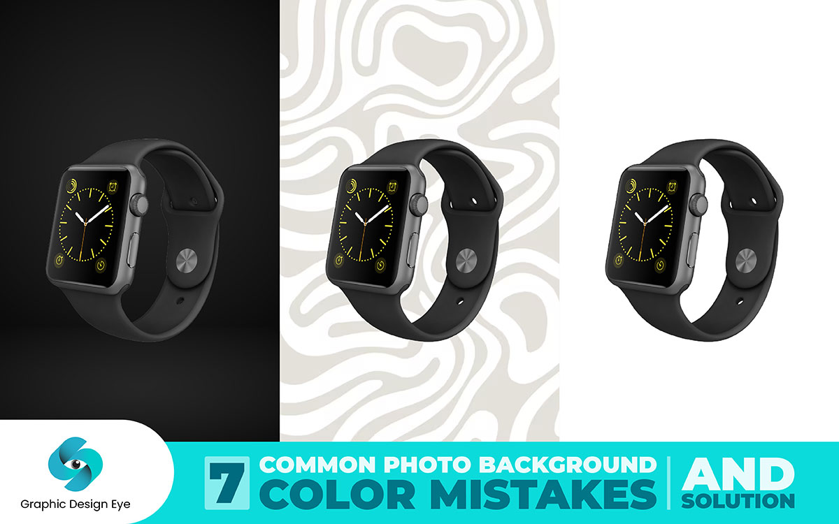
One of the mistakes that people make is using disturbed backgrounds with many different patterns of layering etc. Backgrounds with many different pattern surfaces easily become a backdrop shrouding the product and its outlets.

For instance, the image of a watch where many swirling colors have been used as the background to highlight the watch. There is even a possibility of the watch being overshadowed by many patterns that may be in the background.

Products with tiny details or minimalistic will disappear on a more sophisticated background.

Solution:
  • Don't overload the subject with excessive details. A solid color and transparent background will help bring the focus on the subject of the photograph.
  • If a variety of products is being captured for a catalog or an online store, same backgrounds should be used for the images. It will assist in creating a cohesive look for the relevant range. Those pattern reduce distractions in viewers helping them to better appreciate the items on offer.
  • Use Adobe Photoshop to blur or reduce the contrast of a busy background, making it less prominent. This technique can help bring the focus back to the product. Alternatively, you can replace the background with a solid color or gradient that matches the product’s theme.
  • Such backgrounds as white, gray, and black remain very flat. This is the best color for a professional appearance, it ensures that only the product is visible.
  • If you want the background to have some texture but not distract too much from the product, pick simple colored textural patterns or even very faint prints. Use them to enhance the image without letting them take the center stage and making the product look ordinary.

Mistake #3: Damage Your Branding

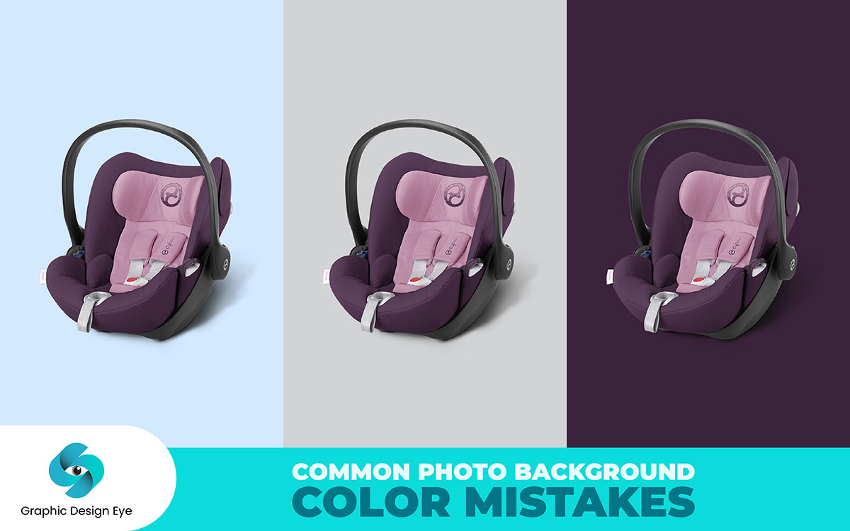
Branding can be hurt by different choices in product image backgrounds. Brand recognition can be diminished if the supporting elements such as backgrounds or images for products decorate with the new style instead of melding with the brand concept.

For instance, a loud and vibrant background will go hand in hand with a brand that is known for going all out using color-spelling design. This tendency breaks the mirada geared towards doing proper branding.

Therefore diminishes the power of the marketing activities.

A background filled with colors and designs may not sit very well for a bold and continuous branding exercise that is simple and clean. This can make customers confused about what your brand stands for instead of enhancing the brand.

This could especially be a problem in e-commerce which is image-based and risks showing different images of a product to the user. If these supporting elements are styled differently or do not complement the brand then continuity is disrupted.

Solution:
  • First, make sure that it matches the image that you would want your brand to reflect. For clean-cut brand images, adopt a plain background which will accentuate the sleek nature of the brand’s products. For dominant brand consider incorporating dominant colors, however, be uniform with how these are used on images.
  • Design a brand style guide which contains the color palette and all the related elements. Follow this guideline to make every image serve the purpose of the brand's purpose.
  • Lastly, look at images of all your product images and consider them as a set. Check if the background color follow the character of your brand.
  • Understand what your potential customers will wish to see from your brand. Use designed backgrounds for sophistication and class on the luxury ends. Keep the brand image suitably to vibrant and lively images.

In addition, one can use of photo background removal service to eliminate any mistakes made with a background color by taking the subject out of the image which is held against a color. Doing so enables one to change the affected area without touching the main subject of the image.

Availing oneself of this service guarantees the physical background and any imperfections that would include wrong colors, inappropriate images and the like could be improved or even better and so the end product would look better.

Mistake #4: Lack of Good Lighting

Use of wrong lighting is the worst most because even after meticulously selecting the best background color for the image, it will not do any good as you have already ruined the shot. Lighting is one of the primary aspects of product photography. It showcases the texture, detail and right color of the product.

On the other hand, your product will lack a luster, it will look ordinary and ugly, or potentially even wrong, as you have simply had a poor shot of the subject. Indirect lighting can also hide important characteristics of a product which can impact the buying ability of the consumers. Parts of the product can be overexposed and underexposed due to excessive presence of light or no light at all.

This problem is worse for online retail in which all images are the only source of information for the customers. For example, if some colors are made in adequate lighting conditions some colors can read quite right causing issues helping in getting returns and happy clients. It can also portray your business as unprofessional, with too little focus to detail and quality.

Solution:
  • Soft lighting helps control a drastic change in light and blends illumination of the product with the surrounding area. This can be done with a lightbox or by covering the bulb with a diffuser. This way of lighting is mostly required for detailed and reflective products.
  • Tilt the lighting sources strategically to avoid unnecessary silhouettes and light the product from different directions. This allows the highlighting of a product without having other cluttering shadows masked in most features.
  • Where possible, try to make use of the sun’s rays, for this comes in a nice and mild light and gives one the desired look. Use a north window or indirect daylight for display as flattering light will accurately represent the colors of the product. There shouldn’t be any direct light as it would give too much ‘bite’ and create sharp edges.
  • Attempt to achieve uniformity in the distribution of light on the subject, as well as the background. An even more severe problem with shadows is too gradient having nearly half and some were too light caving in and most parts of the product would have colored too grey or black. Gelled light and reflectors in addition to the lights should be used for shadows.
  • You should prepare for the final shot by taking test shots and correcting the underexposed areas and lighting conditions as necessary. Assess the picture for the presence of shadows or any discrepancy in colors if the details of the product do not stand out. Change the positions, the amount of light, or the way its diffuseness, softness, or both, are used to get a more favorable outcome.
  • If you’re having a hard time getting the correct lighting or if you just simply prefer the best photos, you might want to hire a photographer. They clearly know what to do when confronted with complicated lighting since they have all the skills and Photoshop to get your product at its optimum appearance.

Mistake #5: Wrong Background Color

Hide any key points required to be fully visible. Such as texture, detail, pattern or anything that makes something unique. Because of this lack of adequate color, the value of the product is not obvious to the customers.

But even more, dissatisfaction causes lower customer satisfaction as well as decreased sales.

Solution:
  • Select a right background color that will provide contrast against your product to enhance visibility of the product. For example, light background for dark numbered pieces or neutral for bright numbered parts. Such contrast assists draw the viewer to the details of the product.
  • Assess how the product is to be used and select a background that emphasizes this. If the product has intricate details or surface texture, the background should be plain enough to bring such details.
  • Try different background colors to find what will best implement the product. Make images with different backgrounds and pick those where contrast and clarity are the best.
  • Be sure to use photoshop software in order that you can get the proper color of background that enhances the color and attributes of your products. The software have the ability edit the best competences that are suitable.
  • If you have any doubts about the background color during the shoot, you can change it later using photo editing software like Adobe Photoshop. You are free to change the color settings, contrast, brightness and even swap the background if the situation demands. Most enhancement features available on this tool enables you to adjust the background color to suit the product best.

Mistake #6: Bright Colors Background

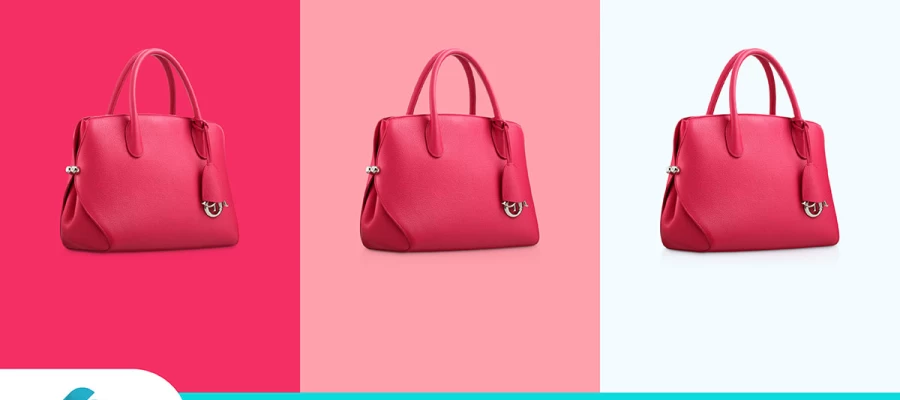
Bright bold colors can never fail to get attention. However, they may in some instances, emphasize the background rather than the product itself especially if it is something soft, or low-toned.

For example, if a soft white dress is placed on a bright yellow background the dress will not be really noticeable, and everyone’s attention will be on the background. This background can hinder the viewers to appreciate the details of the product. Your pictures may appear dull, thus reducing the overall performance of the presentation.

Typically, there cannot be a bright or multicolored background to make the product look desirable. Neutral or light colors can also be washed out on a very bright background. So, the product can appear to be dirty, which is a blow on the aesthetics and pricing of the product.

Solution:
  • The demo of the product should not be buried under the bright background. Instead, add muted and soft shades to the background. Soft gray, beige or pastel, and the like can set off the product without drawing attention away from it all too much.
  • It is important to strike a balance between color and intensity. In this circumstance, a dull hue of the core color helps improve visibility without compromising design coherence.
  • Imagine implementing gradient backgrounds that go from light to dark or from one subtle color to another. It gives volume and attractiveness to the image without actually making it look clustered.
  • Make sure that the background goes well, comprises the visually appealing elements of the product and is free from disturbances. Rather it is the enhancement of the product which is required and the background is irrelevant.
  • Try playing around with different background colors to see which one works the best in your favor for your product. Consider the influences of each color on the product as appropriate and do necessary corrections

Mistake #7: Background Color Doesn’t Fit Product Context

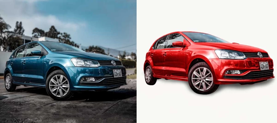
Using one color for the background might be great for the overall presentation of the product but if that color is not proper for what the product is all about can really cause problems.

A rustic wooden surface background may not favor the experience of displaying high-tech gadgets. It may create contradictions on the customer's understanding of the product features and the intended consumers.

If the background does not match the properties of the product and its application, the usability of your promotional materials is decreased. It has to be a betterment towards the characteristics of the product rather than a distortion.

Solution:
  • When you select the background then you should select the one which is relevant to the objective of the product, say First order a thanned handmade product on a modern clean background.
  • Consider the story or message that your product targets and then pick the background which tells this story. For example, natural wood background suits eco-friendly products, while minimalist white background is appropriate for luxury goods.
  • Also increase context appropriate background to boost brand awareness and ensure image consistency over time. Make sure the selected background corresponds with the overall design and identity of the company.
  • Choose such backgrounds which will be beautiful and show off major selling points of the product. For instance, you can have a high contrast background to enhance the visibility of some text or particular features.
  • Experiment with different backgrounds to see what works best for the product. Look around for appropriate anchor points that would indicate the product’s environment because certain backgrounds may not be supportive of the product context.
  • If you are still confused about what background to choose and whether to select or edit the background yourself, it is advisable that you hire a qualified graphic design company. They can edit the background to be more effective when marketing your product.

EndNote

It is enough to say that every product virtually requires one to include a color background. Stay away from basic mistakes which, include contrasting background colors and busy designs. Remember that consistency in branding and illumination is the secret weapon in making sure your products are at their best. A Transit bright and busy background often plays the opposite role and makes viewers too busy to even register the product.

We hope that our article reviews some of the common photo background color mistakes that every beginner does and how to eliminate them has been of assistance. The selection of your product will require a background, which choice is not just a choice. It is a choice that is more than a choice.

Bear in mind that when all the pictures have the same level of lighting, it is more eye-catching and establishes trust among the customers.

All the best in taking photographs!

Leave a Comment

Your email address will not be published. Required fields are marked*