The best logo design ideas help you create a custom brand logo with a meaningful symbol, combining typography and creative use of colors. And why does your logo need to be perfect? Because it leads to the brand’s success.
Around 1.8 billion websites exist worldwide. Competition is fierce. So, your logo needs to be up to the mark. As a matter of fact, 60% of consumers form a first impression based on the logo.
Making a perfect logo is not a big deal if you know where to look for inspiration. Whether you provide a logo design service or searching for the ideal logo symbol to represent your brand, the following will be beneficial to you.
Here, we’ve brought the best branding logo ideas that’ll create visions. As you explore these ideas, you’ll know what makes a perfect logo and how to create one that aligns with your brand.
So, open your mind, let creativity flow, and get ready to explore creative logo ideas that don’t just look good; they feel right. Let’s dive in and explore together!
No matter which field you are in, the following best logo design ideas will cover all. The list will bring trendy logo designs of all sectors, inspiring you to make one that catches attention. So, without further ado, let’s begin.
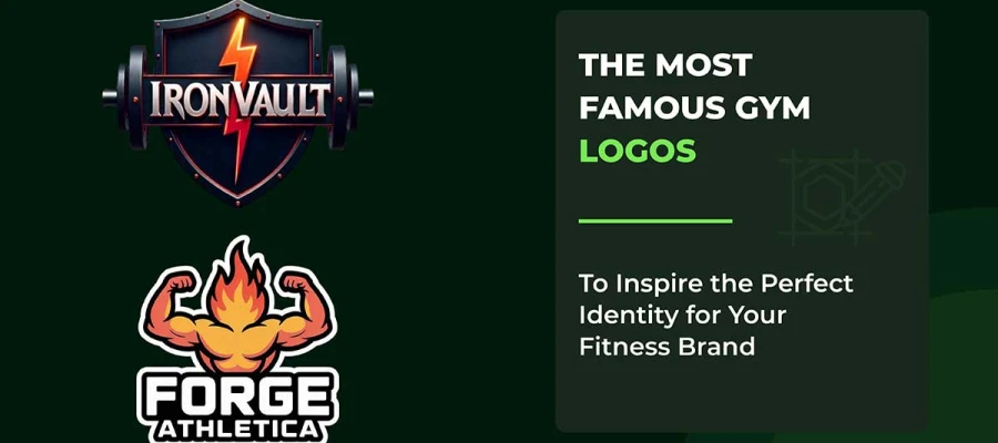
Mascot logos make brands feel like real characters that people can connect with. These characters create stronger bonds with customers, about 41% stronger than regular branding. Mascots can be anything from cute animals to people. They make a company seem more friendly and relatable.
They also help brands reach people in different countries because they don’t rely on words. Brands with mascots tend to do 37% better than those without. Famous mascots, like the Pillsbury Doughboy, are recognized by more than 87% of people.
In 2026, mascot designs will focus on simple shapes and bold lines. They’ll also have 3D characters with fun personalities and designs that include different cultures. In the UK, the US, and Canada, mascots work really well for brands that focus on families. They can keep customers loyal for a long time.
Wordmark logos are common in corporate branding. About 31% of companies use text-based logos that focus on clear typography rather than symbols. Google, Coca-Cola, and FedEx are good examples. These logos use custom fonts to become recognizable brand assets. Research shows 48% of consumers feel more loyal to brands with well-designed wordmarks.
For Fortune 500 companies, 60% choose text-only logos. They’re easier to scale on digital platforms, where 55% of consumers prefer simple designs. Wordmarks work well across different languages while staying easy to read. This is important because 42% of consumers see modern typography as more trustworthy.
Vintage-style logo design ideas make people feel nostalgic, which makes 75% of them more likely to buy. These logos often look old. They use faded textures, old fonts, and earthy colors. These styles remind people of the 1950s to the 1980s.
Surprisingly, 68% of Gen Z likes vintage designs too, even though they weren’t around back then. This style connects with people of all ages. Popular logos are badges, hand-drawn images, and retro fonts. These make brands feel real and tied to tradition.
This is especially useful for craft breweries, barbershops, and coffee shops. It helps them stand out and charge a bit more, around 10-15%.
Icon-based logo design breaks language barriers. They boost brand recognition by 75% because consumers recognize brands just by their visual marks. This is more effective than text-based logos.
A study from Harvard Business Review, analyzing 597 logos, shows that descriptive icons build trust and authenticity faster than abstract ones. These logos work because the brain processes visuals 60,000 times faster than text.
Apple, Twitter, and Nike prove this approach works worldwide. In fact, 89% of users remember logos with traditional icon designs better.
For tech startups, environmental companies, and mobile businesses, symbol-based logos help people remember them better. When done well, they can boost brand visibility by 80%.
A combination mark logo mixes text and symbols. Currently, 307 of the top 500 companies use this style. These kinds of unique logo concepts help brands get noticed and give them more options for how they use them. Companies can use just the text, just the symbol, or both together in their ads and on their websites.
Doritos, Burger King, Lacoste, and Adidas use this logo style. The text and symbol work together to create a memorable identity. This makes the brand easy to recognize, no matter where you see it. And it keeps the brand’s message clear.
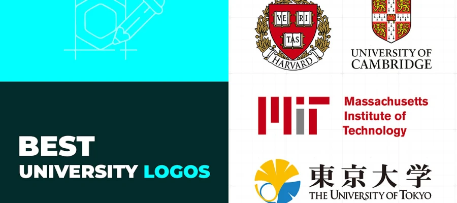
An emblem logo puts text inside a shape, like a badge, shield, or crest. This design makes it look more official and shows tradition, authority, and exclusivity. Starbucks, Harley-Davidson, BMW, NFL and Harvard University logo use this style. It helps them look trusted and established.
Emblems feel formal and real, which is why schools, sports teams, and heritage brands like them. But, because they have a lot of details, they need to be resized carefully for digital use. It makes them perfect for businesses that want a classic, prestigious look instead of something simple and flexible.
An abstract logo uses simple shapes and designs to represent a brand's values, but not in a way that’s easy to picture. Big companies like Pepsi, Adidas, and BP use abstract logos. These logos might have split circles or bold stripes. Such designs work because they’re flexible and unique. They avoid the usual ideas that most logos use.
Abstract logos are interesting because they are different and surprising. They let companies create designs that make people think. These logos can have deeper meanings and still look good as the company grows and changes.
Minimalist and flat logos use simple, two-dimensional designs without gradients, shadows, or 3D effects. These logos focus on clarity, perfect for digital-first brands that want flexible identities.
This style leads branding in 2025. About 75% of consumers recognize brands by their logos. Plus, 42% find minimalist logos more trustworthy. By cutting out complexity, flat designs help people process information faster and reduce confusion. Uber and Airbnb have used this style. Minimalist logos offer great ROI through better memorability and easier scalability.
Lettermark and monogram logos use brand initials (like IBM, CNN, HBO, HP) to create memorable identities. These logos are great for companies with long names.
Creative monogram logos will move from rigid corporate symbols to creative, personality-filled designs. Custom quirks and artistic touches will make them more unique. These logos boost brand recall, helping companies keep customers. Logos with simple letter combos are easier to remember than complex images. They lead to a 30% higher customer retention rate.
In the UK, the US, and Canada, lettermarks are popular with Fortune 500 companies, making up 5% of top brands. It proves their lasting power in building trust. Their clean design crosses cultural and language barriers and works well on digital platforms.
Geometric logo patterns use circles, triangles, and square shapes. These shapes are arranged in neat, balanced patterns. Logos with symmetry make people think a brand is more reliable and of better quality. It makes them trust the brand more. Symmetrical logos use math and balance to create a strong connection with people’s feelings.
A study from Harvard Business Review found that symmetrical logos help brands that aren’t very exciting seem more dependable. Geometric shapes also give logos a timeless look that works everywhere. Toyota, Chanel, and Target show how symmetry can make logos easy to recognize and adaptable to any platform.
In 2026, the trend will be towards simple geometric designs. Clean lines and space will be used to create a modern look. This style is perfect for tech, cars, and luxury brands, especially in America and the UK, where businesses want their logos to feel sophisticated.
Hand-drawn logos use rough, imperfect lines and custom fonts that make a brand feel real and personal. These logos are easier to remember. People remember these logos better than those with digital logos. This style is popular in industries like food, art, and handmade products, where brands want to feel friendly and approachable.
The hand-drawn style is a big trend currently. It embraces flaws on purpose to make brands feel more human and connect emotionally with people. H&M, Ray-Ban, and Kellogg's brands use this style to show authenticity and skill.
It works well with consumers in America and Britain who want brands to feel real, not robotic. This approach is perfect for small businesses, craft drinks, organic products, and creative studios that want to stand out from the perfect look of digital designs.
In 2025, most logos use 3D designs and colorful gradients. These logos look more interesting and help brands stand out. They make logos pop, which helps people remember them 80% better.
The smooth color changes, like Instagram's warm colors or Asana’s glowing effects, make the logos feel more emotional. Compared to flat logos, these designs help people remember brands 21% more.
Big companies are using 3D logo designs with bright neon or soft pastel colors. These designs make logos look modern, trustworthy, and creative on websites and apps.
Negative space logos use empty areas to hide images. These logos are up to 80% more memorable than regular ones. Take FedEx, for example. The arrow hidden between the 'E' and 'X' is right in front of you. It's won over 40 awards for its smart design.
Big brands, like WWF and NBC, use negative space too. WWF's panda and NBC's peacock are easy to spot because of it. This technique helps people remember the logo. It also tells the brand's story without looking too crowded. Because of this, 96% of people can recognize these logos instantly.
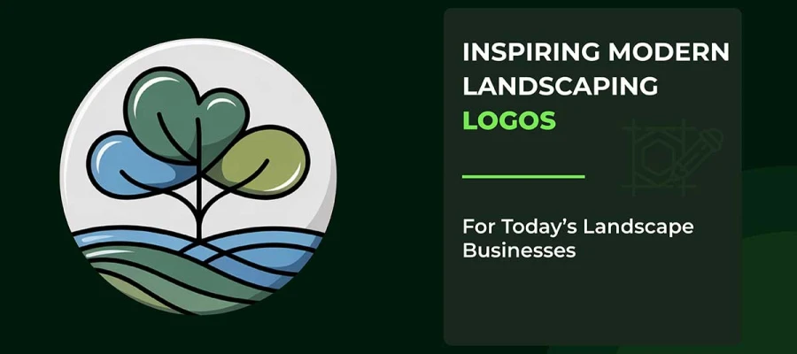
Line art logos are everywhere. These are the modern landscaping logo inspirations. They use simple, single-line drawings and clean lines. Brands love them because they look sleek and easy to understand. These designs help people remember a brand better and make it easier to see on any size.
Research shows that minimalist logos like this make a brand more recognizable online. This style is popular in the UK, the US, and Canada. Line art logos work well with almost anything and still look cool, no matter how many trends come and go.
Dynamic or responsive logos are changing the way brands adapt. These logos adjust to fit different devices and screens. Brands that use them have seen a 15% boost in user engagement.
The logos change their design, colors, and style depending on screen size, the platform being used, and how the user interacts. Netflix already uses this trend. Their logos change from detailed ones on desktops to simpler ones on phones. 55% of brands started making logos that work better on mobile. These logos are now a must for brands in the UK, US, and Canada as more people switch between different devices.
Tech logos are simple and clean. Most of them (93%) use easy-to-read fonts without extra curves. About 72% of logos use both an icon and text together. These logos often have basic shapes and the best color combinations to create a feeling. For example, blue is the most common color, used in 18% of logos, which represents trust.
The logos look good on all kinds of digital platforms. More than half (51%) of logos use just one color. It makes them look clear and professional. It also shows how tech focuses on being digital and data-driven.
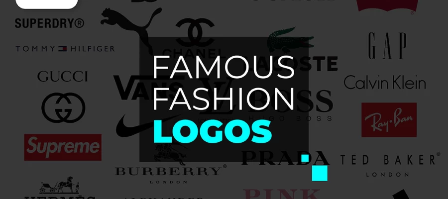
Fashion logos are designed to look classy and flexible. Around 84% of people feel an emotional connection to these logos. Modern clothing brands like to keep things simple but add their own special touches. They mix stylish fonts with designs that change depending on where they are shown.
Research from Corsearch shows that people trust recognizable logos because they think the product is authentic and high-quality. In 2026, fashion logos will mix old-school styles with AI to create designs that speak to Gen Z’s love for real brands. These logos will change with the seasons and stay true to the brand's roots.
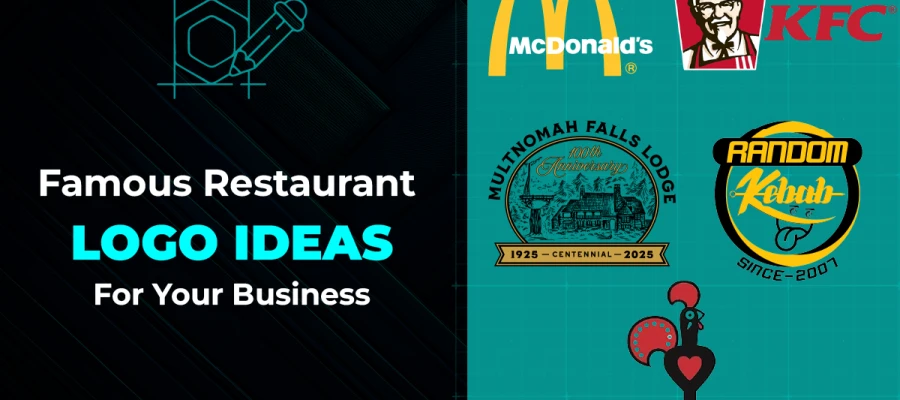
Food industry logos use red colors and handwritten fonts to catch attention and make people remember them better. These designs make brands feel more real and trustworthy. Studies show that logos with red are remembered 75% more than those with other colors.
People like logos with red more than green. Also, logos with the brand name in them work better than those without any text. Big brands like LaCroix and The Coconut Cult show how using hand-drawn fonts makes a brand feel more authentic.
Health and wellness logos use calm blue and grounding green. These colors build trust. About 82% of people around the world want honest branding from wellness companies.
Wellness logos use clean lines and fewer colors. It makes them look more real and trustworthy. For example, their orange circle stands for calmness. Blue is often used to show trust and peace, which is important in healthcare.
The best wellness brands in the UK, US, and Canada use nature-inspired designs and clear fonts. They know that 70% of people want eco-friendly, ethically-made products.
Real estate and construction logos need to look solid and reliable. People trust these brands when the design feels strong and clear. In fact, 88% of customers say trust is a big deal when deciding on a real estate business. That’s why simple designs with bold shapes are important in this field.
In the UK, the US, and Canada, people like logos that use one color, like dark gray, navy, or slate. These logos use simple letters or modern fonts that are easy to read. About 26% of people trust brands they recognize more, so adding roof shapes, beams, or hidden symbols can make a logo stand out. It keeps the logo professional and memorable on websites, business cards, and signs.
Education and eLearning logos are usually simple and bold. They use clear fonts that are easy to read. This builds trust fast. Most people (81%) need to trust a brand before they interact with it, so colors matter.
Blue makes people remember a brand by 80%. Green is often used because it shows growth, which fits with digital learning. 73% of big companies use them. These logos include icons like books or graduation caps.
As schools and companies update their looks, they need to make sure the logos work well on phones. This shows that they are modern, easy to access, and care about education.
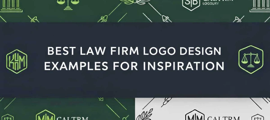
Financial and legal logos need simple yet strong designs. They use colors like navy, black, gray, and burgundy to show authority. 81% of consumers won’t buy without trusting a brand. That’s why serif fonts and geometric shapes are important for building credibility.
Fintech companies prefer earthy tones and gradients. Law firms often use scales of justice, but with modern typography. These logos must scale well across digital platforms, business cards, and signs to keep a professional look.
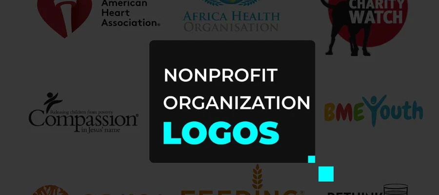
Nonprofit logos need to show what the group stands for. They should use colors that make people feel good and keep things simple so people can easily remember them. A good logo is clear, easy to recognize, and works on any platform.
A nonprofit logo is a symbol of trust. It shows that the organization is reliable and serious about its mission. Research by Blackbaud shows that colors in logos can affect how donors feel.
For example, blue makes people trust the group, and green is great for environmental causes. The best nonprofit logos, like the WWF panda, are simple but meaningful. They make an impact right away and remind people of the organization’s values, whether online or in print.
Black-and-white logos are all about keeping things simple. They remove all the extra colors so you can focus on the shape and idea behind the design. This style works almost everywhere. It looks good on printed papers, on websites, and on any device. No matter where you see it, the brand still looks the same.
About two-thirds of high-end brands use black and white as their primary logo color scheme. These logos are also less expensive to print, yet they still look serious and professional. Companies in the UK, the US, and Canada use them a lot for this reason.
Think about the Nike Swoosh or the Apple logo. Both are black-and-white designs that stay popular year after year. They don’t go out of style. Simple logos help people remember a brand much better. Because of that, black-and-white logos are a smart choice for businesses seeking a long-lasting identity that works across every platform.
AI logo maker makes it easy for anyone to create a logo. They can make thousands of design ideas in just a few seconds. These tools use machine learning models trained on millions of real logos. They consider color meanings, font styles, and common designs across industries.
AI-generated logos can reduce design time by nearly 90% while still looking as good as work from new designers. As a result, many new business owners in London, New York, and Vancouver are beginning to use these tools. They like how fast and affordable the process is.
But human designers still matter. AI is effective for providing a starting point. It can provide many ideas. Still, people are the ones who add real personality, culture, and long-term strategy to a brand. That final touch is something only creative experts can bring.
Brainstorming the best logo design ideas is a journey into the heart of your brand. It begins with understanding your brand’s true personality, voice, energy, and the emotions it wants to awaken in others.
Once you connect with that essence, choosing the right colors and fonts becomes easier. Each hue tells a story, each font carries a feeling. Together, they breathe life into your vision.
And when you finally sketch your idea, you’re shaping meaning. Every curve, every symbol becomes a reflection of what your brand stands for.
Here are 4 steps to brainstorm your own logo:
Understanding your brand’s identity is a must. 75% of consumers recognize brands by their logos. So it’s important to represent your brand authentically.
Start by identifying your brand archetype. You can do this through competitor analysis and research into your customers. Write down your mission, vision, and values in a creative brief. Then, turn these ideas into visual metaphors.
Burberry in the UK and Apple in the US show how powerful design can be. Their logos communicate their heritage and innovation clearly, without any words. This is how aligning your strategy can create immediate recognition.
Create visual systems that guide color choices and design. Signature colors can increase brand recognition by 80%.
Collect logos from competitors, track industry logo design trends, find typography examples, and gather emotional images. Milanote or Pinterest are great for this. Use the 60-30-10 color rule: 60% for the main brand color, 30% for a secondary color, and 10% for highlights.
Professionals can maintain these criteria very well. They can certainly make your brand logo top-notch.
Sketching by hand speeds up the creative process. It’ll let you explore the best logo design ideas before technical limits hold you back. Sketching leads to more varied ideas than starting on a computer.
Spend 30-60 minutes making quick thumbnail sketches. Try for 20-50 variations in different styles like wordmarks, pictorials, or abstract designs. Sketching will bring out unexpected insights that digital tools often block.
Design logos that work well everywhere and stay true to the brand. Brands with adaptive logos see 15% more engagement. Create different versions: main logo, simplified, and icon. These should work from huge billboards down to tiny 16px favicons.
Test them in vector format, making sure they look clear at all sizes. Check how they perform on digital screens, printed materials, and on products. In the UK, the US, and Canada, your logo needs to be consistent across all channels.
Now that you've read the entire article, you should have a clear understanding of what makes the best logo design ideas truly great. It all comes down to three key steps: aligning with your brand, choosing the right colors and fonts, and ensuring it looks perfect across all screens and platforms.
If you find it hard to handle, don’t worry. You can always hire a professional logo design agency. These experts understand the art and emotion behind every logo. They know how to capture your brand’s essence and turn it into a design that feels right.
With their experience and creative vision, they’ll design a logo that leaves a lasting impression, one that tells your story with heart and purpose.
So let’s give a thought to your logo today. We will be with you all the way to this journey.