Looking for the best law firm logos that build trust at first glance? A creative logo is more than a clean design. It shows strength. It quietly promises honesty and guidance. It tells people, “You are in safe hands.”

A strong legal logo feels steady and clear. You may have many logo design ideas, but only one design will truly capture your firm’s heart. That logo can set you apart. It can shape how clients see you. It can give them confidence to choose you. It can make your name memorable.
Think about what you want your brand to say. Bold and confident? Calm and trustworthy? Modern and simple? Your logo should match that feeling. It should feel natural. It should sound right when people talk about it. It should create a connection the moment someone sees it.
In this post, you’ll find some of the best law firm logos for your design inspiration. These examples show how simple shapes, balanced letters, and clean layouts build trust and lasting authority.
Take a slow breath, settle in, and explore!
In law, every detail matters; every word, every gesture, every choice. A law firm’s logo is the first thing a client notices. It sends a message. It says, “You can trust us. We will protect you. We will fight for you.”
Here is a handpicked list of 20 law firm logo designs for your design inspiration. They are meant to inspire trust, clarity, and connection.
Let's go deeper!
Romano Law’s logo is all about its letters. The name ROMANO appears in a bold, stylish typography. The vertical lines are thick, and the horizontal lines are thin. This gives the logo a strong, modern look. The all-caps lettering adds confidence and importance.
The firm works with entrepreneurs and creative professionals. They take a practical, friendly approach. They focus on getting real results. The logo uses a teal, deep-sea green color, which is rare for law firms. This shade suggests creativity, trust, and steady strength. It also helps the firm stand out from the usual navy or black.
Below the main name, the word LAW sits in a smaller, simpler font. This keeps the design balanced and clean. The two-line layout makes everything easy to read. The simple design shows that the firm relies on skill, not extra graphics.
Overall, the logo feels elegant, clear, and professional. It gives the sense of a small, focused firm. Even without symbols, the letters show personality, expertise, and style.
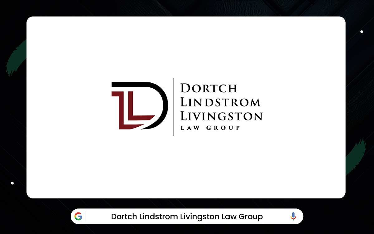
When you look at the Dortch Lindstrom Livingston Law Group logo, the bold letters stand out first. It uses the initials D, L, and L. The letters fit together in a way that feels strong and careful. The D almost wraps around the others, giving a sense of protection. The two L’s hint at law and show the firm’s dedication to its clients.
The firm has more than 60 years of experience. They handle complex civil cases across the country, not just in Texas. Some cases are huge, including the $10 billion Roundup settlement. Knowing this gives the logo even more weight. But even without the numbers, the design still shows skill and authority. It’s quiet but powerful.
The colors matter too. Dark backgrounds feel strong and serious. The white letters feel clear and trustworthy. The contrast makes the logo easy to read on a website or a printed flyer. The typography and layout play a role as well. The partners’ names use a bold typography, which feels traditional and steady.
The words “LAW GROUP” are smaller and lighter, guiding your eyes gently downward. Even the thin line between the letters and the text adds balance. Every choice makes the logo feel stable, professional, and easy to trust.
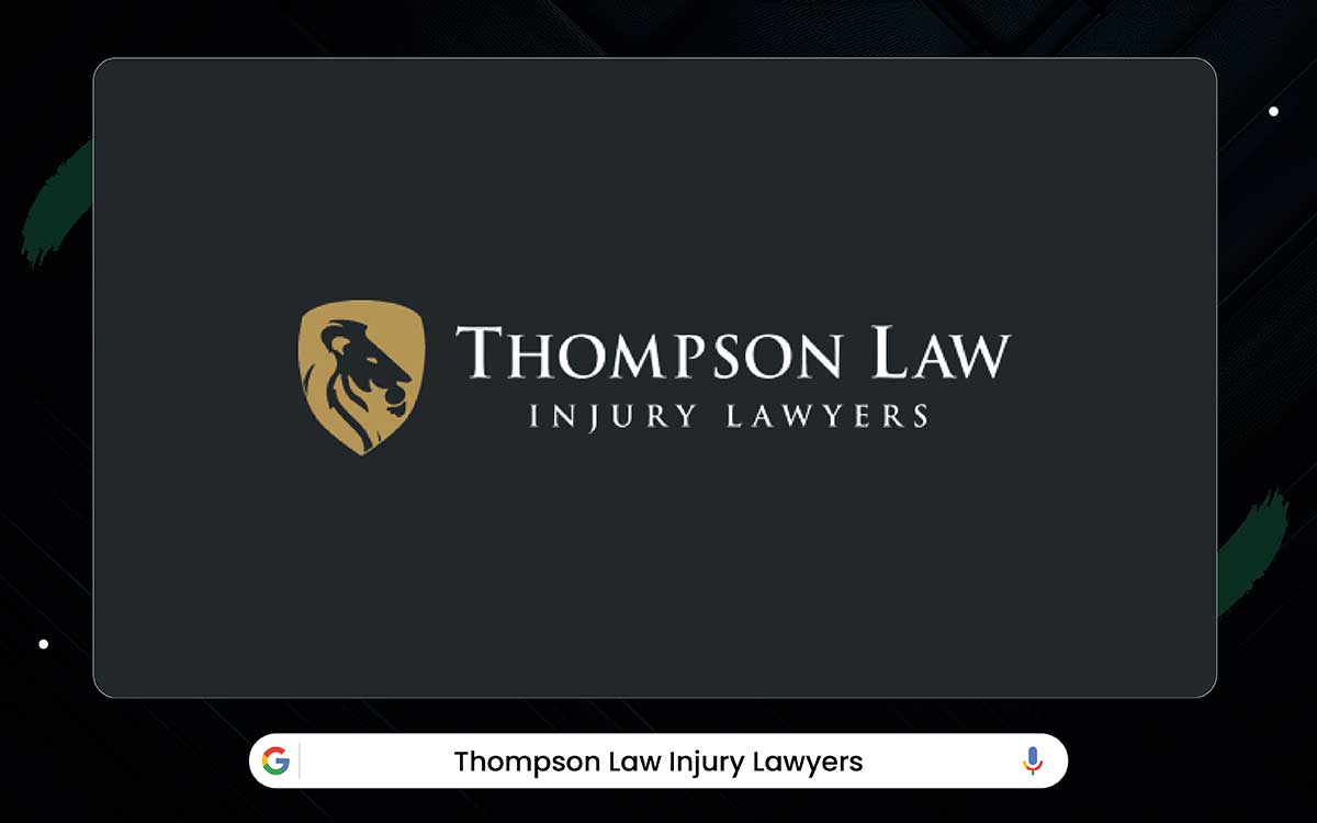
Thompson Law may look a bit different at first, but it works the same way as before. Their logo shows a lion inside a shield. The lion feels strong and bold. The shield gives a sense of safety. Put together, the symbol says the firm fights hard while keeping its clients protected.
The firm has recovered over $1.9 billion for clients, and that record makes the logo feel even more trustworthy. But even without knowing the numbers, the lion and shield already suggest you can rely on them. The colors help send the same message.
Gold hints at success, quality, and value. Black brings a serious tone. The text is bold. “THOMPSON LAW” stands out the most, while “INJURY LAWYERS” appears smaller but still clear. The icon on the left keeps everything balanced and clean.
Overall, it shows how simple shapes and colors can quickly express trust and strength.
Roy Petty & Associates has its own style. Their logo shows a globe with a person standing in the center, arms raised. It feels hopeful, caring, and guiding. The globe suggests they look at cases from a wide view. The design is simple, but it clearly reflects what the firm stands for.
The firm has a long history in immigration law. Many on the team once served as judges or attorneys with years of experience. Some led major cases. Others are trained professionals in the field. This background gives the logo a real connection to their work.
The colors are calm and professional: dark gray and white. Gray feels steady and balanced. White feels honest and clean. The text is modern and easy to read. “Roy Petty” stands out, while “& Associates, PLLC” appears smaller to keep things organized.
The layout is wide, clean, and inviting. It shows that even a simple, human-centered symbol can express professionalism, care, and reach.
The Cobos Law Firm logo mixes symbols with simple text. A sword stands upright, showing strength and action. Quills sit beside it, hinting at knowledge and careful work. Everything fits inside a shield, which suggests protection. Together, the pieces show a firm that fights hard but plans.
Andrew Cobos built the firm around personal injury cases. His time in the military and the courtroom guides his style. The sword and shield use gold or bronze tones to show success and high quality. Dark gray and off-white keep the look clean and professional. These colors also add a sense of history and value.
The text matches the icon. “COBOS” appears in bold gold or bronze typography. “THE LAW FIRM” is smaller and simpler. This keeps the name strong and the logo balanced.
Overall, the logo feels solid and timeless. It proves that clear symbols and clean text can deliver meaning without clutter. It’s a strong example of trust and skill shown through design.
Xavier Injury Law Firm’s logo features the scales of justice. The scales stand for balance, fairness, and authority. They are gold against a dark gray background, so they stand out right away. The firm’s name appears in white, making it easy to read. A single vertical line separates the icon from the text. It helps the whole logo look clean and organized.
The firm began in Houston and later expanded to California. They handle criminal defense, immigration cases, and civil matters. Lead attorney Xavier Chávez has years of experience and truly cares about his clients. The logo reflects this mix of strength, warmth, and personal attention.
The firm’s name is written in bold, all-caps letters. This gives it a modern, strong look. The smaller text that lists the practice areas is simple and clear. The vertical line keeps everything tidy and balanced.
Overall, the logo feels professional, reliable, and welcoming. It shows how symbols, typography, and colors can work together. A simple icon and clean lettering can make a logo look strong yet human at the same time.
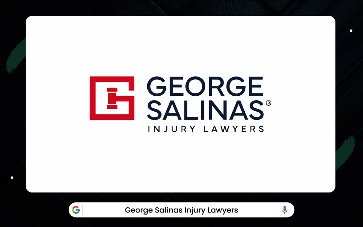
When you first look at the George Salinas logo, the big red “G” inside the square grabs your attention. The “G” even looks a bit like a gavel, so you instantly think of law and justice. The red feels bold and full of energy. It gives a sense of courage and action, which fits a firm that fights hard for its clients. The navy letters calm the red and bring balance.
They make the logo feel steady, trustworthy, and professional. Together, the colors and symbol send a clear message: this is a firm you can rely on.
George Salinas Injury Lawyers is based in San Antonio and has over 100 years of combined experience. Over time, they’ve helped clients win hundreds of millions of dollars. Their success shows how committed they are to justice, which matches the strong tone of the logo.
The text works well, too. “GEORGE SALINAS” is bold and easy to notice, while “Injury Lawyers” below explains their service. The horizontal layout keeps everything neat and balanced. It also makes the logo easy to use on websites, letters, or signs.
Overall, the logo blends a simple symbol, clean text, and strong colors. It feels confident, approachable, and memorable.
Red Law Firm has its own style, but the message stays the same. Their logo shows a bull inside a sharp, modern shield. The bull stands for power, courage, and determination. The shield stands for safety and protection. Together, they show a firm that fights hard for its clients while keeping them secure.
The firm has handled personal injury cases in Texas since 1992 and has recovered over $450 million for clients. Their bold history matches the strength of the logo. The text supports this feeling too. The letters RAD are large, bold, and in all caps, giving the name a strong and confident look.
The smaller “Law Firm” is simple and easy to read, and it doesn’t pull attention away from the bull. The colors add more meaning as well. Navy shows trust and professionalism. Gold shows success, quality, and high value.
Together, the bull, the shield, and the colors prove that a logo can feel powerful and dependable without using traditional law symbols.
FVF Law Firm uses a design that feels simple but uplifting. Their logo shows a bird in flight, something like an eagle or a phoenix. It suggests freedom, justice, and hope. The sharp lines make it look fast and full of energy.
The white bird on a dark green background feels both fresh and calm. It hints that the firm moves quickly for clients while still offering care and support.
FVF Law began in 2014 in Austin. The firm is led by Josh Fogelman and Aaron Von Flatern. They handle injury and wrongful death cases. They value honesty, transparency, and strong client support, and the logo reflects those ideas.
The bird in flight shows progress and rising above challenges. The text fits this mood. “FVF LAW” appears in bold, clear, all-caps letters. The smaller “Injury & Wrongful Death” line is also easy to read.
Together, the symbol and colors create an emotional message. With its clean shapes and clear wording, the logo looks professional while still feeling personal and human.
Paykin Law has a logo that stands out. It combines two smart symbols. The pen nib represents writing, accuracy, and legal documents. Inside the nib, the scales of justice show fairness, balance, and law. Together, these symbols make the logo meaningful and easy to recognize.
Alexander Paykin started the firm after moving from Russia in 1989. He has experience in finance, IT, and real estate. This mix shapes the firm to be modern, smart, and focused on clients. The logo reflects this. It feels strong, professional, and clever.
The text in the logo is simple and clean. It uses a modern typographic. A soft blue glow on a dark background gives a sense of trust and intelligence. Even the small period at the end shows precision, like the careful work the firm does.
The design is simple but works everywhere. Clear shapes, meaningful symbols, and strong colors make the logo professional, confident, and easy to remember.
Tormey’s Law delivers strength at first glance through a bold and disciplined logo structure. The interlocking “TL” monogram acts as the core symbol and instantly anchors the brand. The taller “T” sits above the “L,” visually expressing leadership, authority, and control. The “L” forms a stable base, reinforcing the idea that the firm is grounded in law.
Both letters are tightly connected, creating a single, unbreakable visual unit. This compact construction suggests stability, structure, and long-term reliability.
Well, the overlapping letterforms add depth, giving the logo an architectural and established feel. The serif typography feels traditional, serious, and rooted in legal history. Sharp serif details communicate precision, focus, and courtroom readiness. The all-caps letterforms project confidence and demand attention without excess.
The navy blue color represents trust, intelligence, and professional discipline. Muted gold introduces a sense of value, prestige, and proven excellence. And the cream background subtly recalls parchment and formal legal documents.
The phrase “A Trial Lawyer” is a deliberate statement of action and experience. It shifts perception from legal service to courtroom strength. Overall, the logo feels authoritative, experienced, and built for high-stakes cases.
Shapiro Legal Group takes a different approach. Their logo shows a map of the USA inside a rounded capsule. It shows the firm works nationwide. The capsule gives a sense of protection and completeness. The design feels confident but friendly. It suggests the firm can handle big cases while keeping clients safe.
The firm handles mass tort cases. It has helped clients across the country for many years. The red, white, and blue colors highlight its national work. Navy conveys trust and stability. Red shows action and urgency.
The text complements the symbol. The main name is in all caps with a classic font. The tagline below is spaced out and easy to read. The horizontal layout balances the colorful symbol with the text.
Together, the shapes, colors, and text show law, protection, and national reach. A simple symbol with clear text tells clients what the firm does, where it works, and why it can be trusted.
The Sullo & Sullo logo makes a strong first impression. The bold letters feel heavy and steady, like stone carved slowly and carefully. It shows right away that the firm stands for strength and reliability.
It fits a practice that has helped over 300,000 clients in nearly twenty years of Houston courts. In the center, a gold S softens the look and adds a touch of elegance. It sits between the two Sullo names like a bridge, showing partnership and unity.
Gold also hints at skill, success, and experience without being flashy. The symmetrical design makes the logo balanced and calm. Your eyes move across it easily, and the steady structure quietly builds trust. The small tagline below explains the firm’s focus without taking attention away from the main name.
Together, these elements create a logo that feels strong, professional, and lasting. It shows that careful type, detail, and balance matter more than trends.
The first thing you notice in Lincoln-Goldfinch Law’s logo is the bird in flight. It rises gently, with wings of gold and black. The movement suggests hope and new beginnings. It fits an immigration firm well, since many clients seek safety, progress, and a fresh start.
The colors add depth but keep the bird light and modern. Below it, the firm name appears in a flowing script. It feels personal, like a signature, showing care for more than ten thousand families. The letters move like the bird’s wings, making the logo feel friendly and connected.
A small Spanish tagline sits under the name. It is bold and easy to read, speaking directly to the community the firm serves. The clean text balances the warmth of the script with a professional touch.
The logo feels like a journey. The bird leads, the name follows, and the tagline guides. It shows that a design can be gentle and caring while still confident and trustworthy.
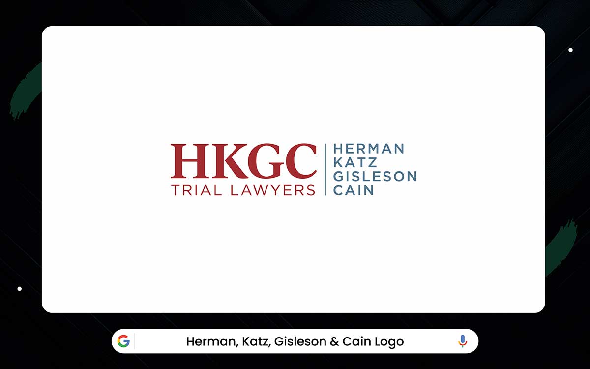
The HKGC initials make a strong, serious first impression. The thick letters feel solid, almost like they are carved in stone. They sit close together, forming one strong unit. This shows teamwork and unity, which fits a firm handling serious cases and long-term litigation.
The full name below acts as a steady base. It links the bold initials to the partners behind the firm. The smaller letters are easy to read and give balance. They slow the eye so the logo does not feel too heavy.
The design feels calm and steady. It is serious, but not flashy. Every part works together to show focus, strength, and experience. The type of logo spacing makes it feel trustworthy and lasting.
It shows that a simple monogram can express unity, power, and reliability when designed well.
The Abel Law Firm logo feels strong and trustworthy. The gold color shows success, skill, and achievement. The deep blue behind it feels calm, reliable, and serious. Together, these colors make the logo look classic yet modern. It shows the firm has experience but also looks ahead.
The shield with the “A” adds more meaning. Shields suggest safety, protection, and honor. The lines inside the “A” remind you of courthouse columns. This quietly signals law, stability, and tradition. The shield sits to the left of the name. This guides your eye from the symbol of protection to the firm name.
Abel Law Firm has helped clients for over fifty years. The special “Ed Abel Day” shows the respect the firm has in the community.
The letters also send a message. The bold “ABEL” stands out and feels strong. The clean “LAW FIRM” below is easy to read. Every part of this logo works together. It makes people feel confident, safe, and sure about the firm.
The Gonzalez Law Group logo feels strong, clear, and welcoming. A large white G sits in the center. It stands out against the dark background. It feels solid, important, and steady. The typography adds a sense of tradition and experience.
Behind the G, a square shape brings order. It shows balance and careful planning. The colors mix seriousness with warmth. Dark gray and charcoal feel professional. Burnt orange and taupe add friendliness. This makes the firm seem capable but also approachable.
Gonzalez Law Group handles many areas of law in Houston, from criminal defense to immigration. The logo reflects their wide knowledge and skills.
The letters add to this feeling. “GONZALEZ” is bold and framed with thin lines. The smaller words, “THE LAW GROUP, PLLC,” are simple and easy to read. Together, the colors, shapes, and letters show authority, clarity, and a friendly, trustworthy personality.
The Sul Lee Law Firm logo shows strength and style in a simple way. The L icon is a solid navy column. It gives trust and stability. The light blue flourish adds movement and personality. It shows the firm can adapt and think creatively. The Navy feels professional and smart. Sky blue feels calm, clear, and friendly.
The color difference between “SUL LEE” and “LAW FIRM” makes it easy to see the name and what the firm does. The flowing accent shows flexibility. This fits their work in Dallas since 2013 in business, corporate, and intellectual property law.
The letters add to the feeling. The main name uses a medium serif to feel strong. The small all-caps sans-serif for the practice areas is neat and clear.
Together, the icon, colors, and letters show a balance of strength and friendliness, order and creativity. The logo gives a first impression that the firm is strong, smart, caring, and reliable.
The main shape of the logo is a bold cube, showing stability and careful planning. White letters on a red background stand out and look professional. The cube also forms the letter B, linking the icon to the firm’s name. It gives the feeling that the firm solves problems step by step.
Bowen Law started in 2013 in Houston, Texas. They work in family law, personal injury, and estate planning. The firm is known as strong but friendly. The cube shows careful work, and the bold letters show clear, modern thinking.
The text is easy to read. “BOWEN” is in all capitals and feels confident. “LAW FIRM, PLLC” is smaller and also in capitals, with a thin line separating it from “ATTORNEYS & COUNSELOR AT LAW.” This order guides the eye and shows structure and professionalism.
The logo gives a clear message. A strong shape and clear letters build trust. The hidden B adds extra meaning without words. Bowen Law shows how a logo can be balanced, clear, and professional.
This logo design feels like open, moving, and positive. It has a round shape with a gold line around a dark circle. The gold line shows hope and energy. The dark circle shows strength and stability. Together, it looks like the firm guides clients safely through complex legal matters.
Quan Law started in Houston in 2014 and grew quickly. By 2016, it made the Best Law Firms list. The firm added offices and partners over time. The logo stayed the same, showing trust, care, and professionalism. It fits the firm’s work in immigration law and helping people from many countries.
The letters add meaning too. “QUAN LAW GROUP” uses a serif font that feels serious and strong. The PLLC letters are gold, matching the orbit line, which adds prestige. The tagline, “YOUR PARTNER IN IMMIGRATION,” is light gray and easy to read. The layout is balanced. The icon catches your eye first, and the text is clear.
This design shows how symbols and letters work together. A strong icon with classic letters can feel modern, trustworthy, and friendly. The gold line adds hope and motion. The colors are serious but welcoming. Quan Law Group’s logo shows that smart design can share a firm’s mission and values in a way people remember.
Picking logos for law firms isn’t just about finding something that looks good. It’s about finding one that feels right for your firm. One that shows who you are, hints at what you do, and speaks to the people you serve. Take a little time to think it through, and you can land on a logo that actually works. Here’s how to choose the law firm logo for you:
Your law firm has a personality. Some firms are formal. Some are friendly. Your logo should match your firm’s personality.
One way to start is to make three sketches. Make one traditional, one modern, and one that mixes both. This helps when talking with a logo design company.
Your logo should also speak to your clients. Different legal services have different clients. Not every style works for every client.
Think about the people your firm serves.
Your logo should make them feel understood.
Think about your practice area, too.
Look at other firms in your area. See what is common and what stands out. Your logo should feel familiar. It should also be unique.
Deciding between traditional and modern styles matters.
You can also mix styles. A modern font with a classic symbol can show both trust and a forward-looking attitude.
A law firm logo design isn’t just a fancy typography or a set of scales of justice slapped on a page. Too many firms treat it like decoration. But here’s the truth: a logo is much more than that. Think of it as your first handshake with a client. They don’t know you yet, but they will notice if your logo looks messy, dull, or stuck in the past.
A strong logo does more than look good. Without saying a word, it speaks of trust, strength, and skill. And it has to shine everywhere; on a tiny email signature or a massive office sign, it should always feel like your firm. That’s why templates or letting someone “wing it” rarely works.
So how do you get a law firm logo that actually works? One that saves you time, money, and headaches? Let’s dive in.
This is where most law firms either get it right or regret it later. In real life, experienced logo design agencies think very differently from freelancers or template tools. They do not start with “What font do you like?” They start with questions about your practice, your clients, and how you want to be seen. For example, a criminal defense firm needs authority and calm strength, while an estate law firm needs trust and warmth. An experienced agency knows this difference without you explaining it twice.
I have seen firms redo their logos after one year because the first one looked fine on a website but failed on office signage or legal documents. A professional agency avoids that mistake from day one. They test the logo on letterheads, email signatures, court files, and even mobile screens before finalizing anything.
Another big advantage is strategy. Good agencies know when not to use obvious symbols like scales or gavels. Many modern firms now use clean typography or subtle symbols that feel timeless. That choice often comes from years of seeing what ages well and what looks outdated fast.
Yes, experienced agencies cost more upfront. But they save money long term by giving you a logo you will not need to fix, explain, or apologize for later.
AI logo makers look tempting. They are fast, cheap, and promise a “professional” logo in minutes. But in real life, they often create the same problem in a different color.
AI tools work by mixing existing patterns. That means your logo is never truly yours. I have seen law firms using AI logos that look almost identical to accounting firms, tech startups, or even coffee brands. When a client notices that sameness, trust quietly drops.
Custom design works differently. A real designer listens before designing. They understand your firm’s tone, your location, and your type of clients. For example, a boutique family law firm should not feel sharp and aggressive, while a corporate litigation firm should not look soft or playful. AI cannot feel that difference. Designers can.
Another issue is control. AI logos often fail when resized, printed, or used on legal documents. Custom logos are built to survive everywhere, from court files to billboards.
AI saves time today. Custom design protects your reputation for years. For a law firm, that difference matters more than people think.
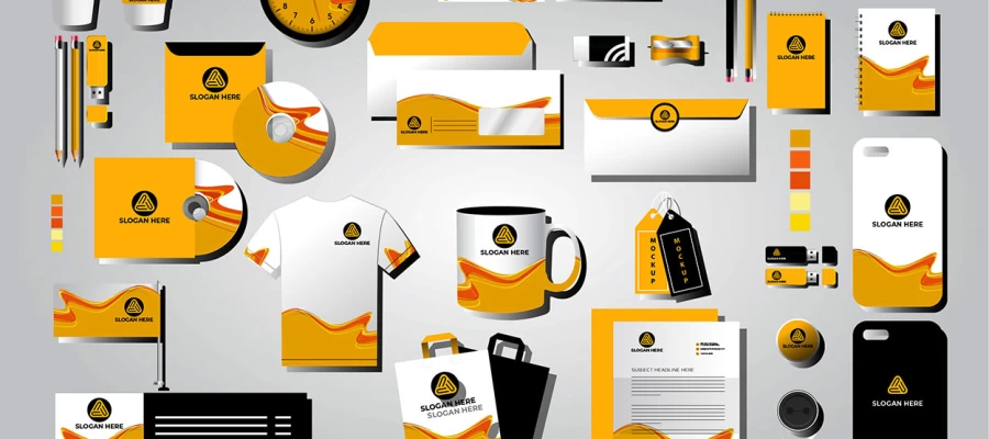
Many firms get just one logo file and then struggle to use it. A professional logo is a system:
Always get vector files (SVG, AI, EPS). PNG or JPEG is okay for now, but vectors scale without losing quality. Ask for color, black-and-white, and transparent versions. Your logo should work everywhere.
Step by step:
Bottom Line: A law firm logo shows trust, skill, and professionalism. Missing experience, a custom design, or the right versions can create small issues. Clients may notice them without knowing why. A strong logo works everywhere, earns trust, and makes your firm stand out.
We’ve reached the end of our tour of the best law firm logos. At first, each design looks simple. A line here. A symbol there. Nothing flashy. But every small choice matters. Together, they build trust. They quietly show authority. Look closer, and you’ll see why each logo works.
A strong law firm logo does more than look nice. It makes people feel safe. It sends a message even before a word is spoken—clarity, honesty, confidence. A clean shape. A steady typeface. Small details can change the whole mood.
We hope these examples inspire your own ideas. Great logos don’t appear overnight. They grow slowly, with care. They begin with understanding how you want people to feel when they see your firm’s name.
If you want a logo that shows quiet strength and calm, Graphic Design Eye can help. We create thoughtful, trustworthy brand identities that match your vision. Graphic Design Eye provides law firm logo design services that feel professional, reliable, and made to last.
Contact us anytime! Meanwhile, keep exploring. Let your logo tell your story clearly, confidently, and with a touch of grace.