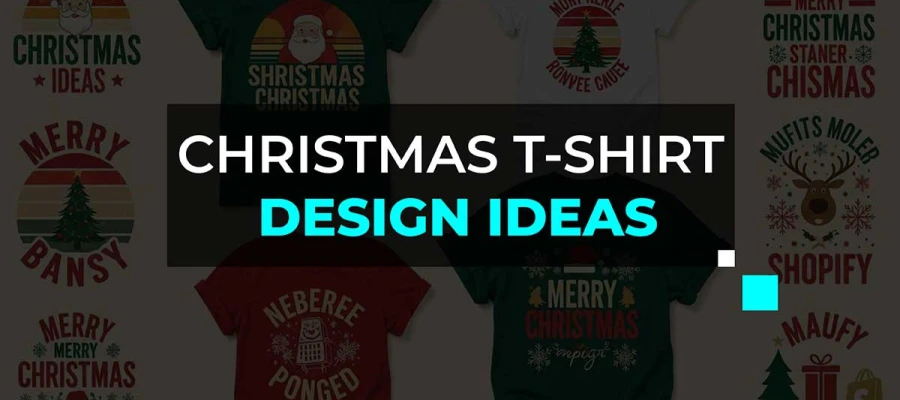
Are you looking for vintage t-shirt design ideas that will give you a cool retro vibe? The following design inspirations will do just that, combining nostalgic elements from past decades with a modern creative touch.
Their vintage t-shirt graphics are unique and full of nostalgia. You can get inspired by ‘70s band tees, ‘80s retro graphics, or ‘90s streetwear fonts. Some cool old-school creative t-shirt designs capture the emotion of every era.
From faded typography to hand-drawn illustrations, each retro-inspired t-shirt design tells a story, one that feels authentic, worn, and full of character. If you love retro style that connects past and present, our collection of vintage t-shirt design ideas will help you create designs that look cool, feel a classic retro vibe.
So, why wait? Dive into and discover how to connect that classic retro vibe to your next design project!
Every vintage T-shirt starts with a moment that meant something. Even if the shirt looks old now, the memory is still there. Take what feels right for your own story and make it your own.
These shirts come from different decades. Some have loud vintage t-shirt designs from the 1970s and 1980s. Others have the simpler, relaxed look from the 1990s.
Maybe you're planning to create your custom vintage T-shirt line. Or maybe you just like collecting cool shirts with inspiring vintage t-shirt designs.
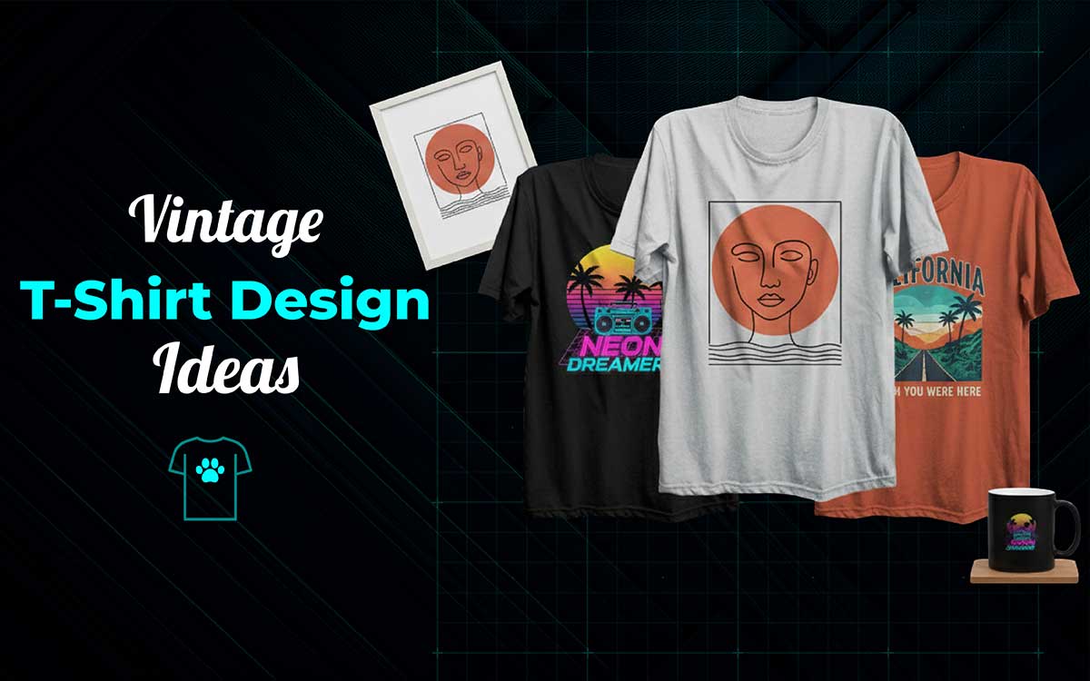
Here, we’ve listed 25 inspiring vintage T-shirt design ideas to spark your creativity and help you design or find the perfect tee.
Let’s get into it.
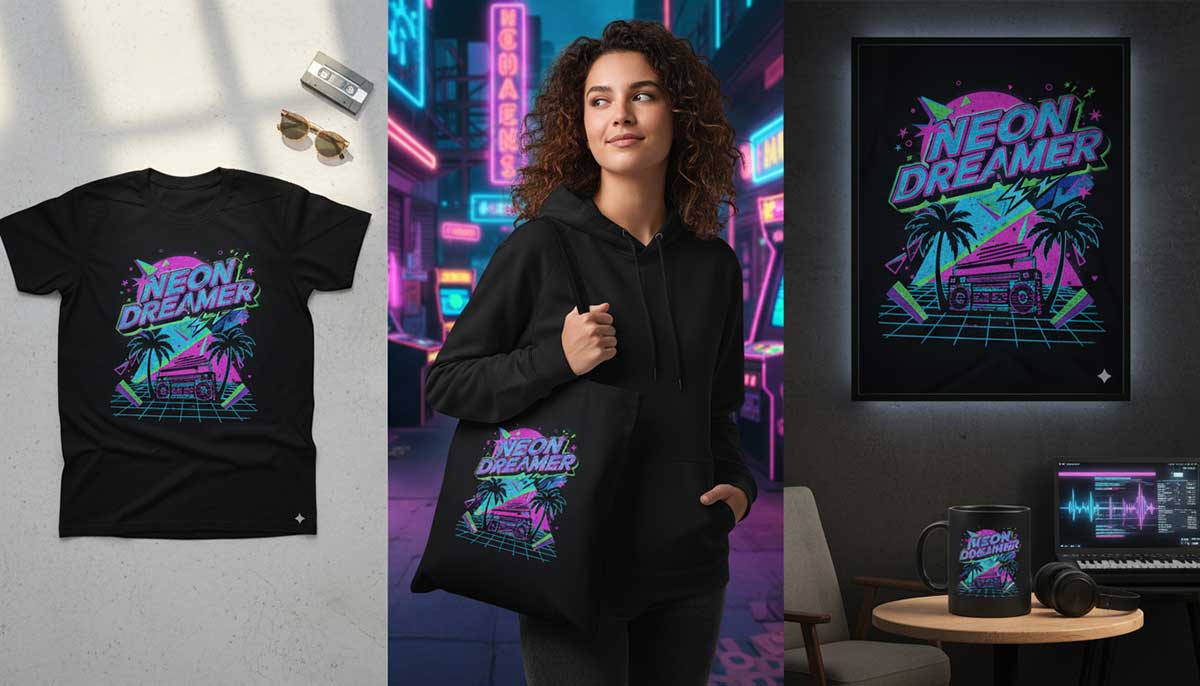
80s Neon tees take you back to the days of mixtapes, arcade nights, and bright neon lights. They are perfect for anyone who loves the energy of the 1980s. The neon colors glow like city nights or arcade games.
These shirts remind you of loud 80s music, spinning roller rinks, and shiny chrome lights. They are full of bright colors, electric vibes, and classic retro style. You don’t control neon, you just let it shine.
Start with colors that seem like they shouldn’t go together, but somehow work, like magenta, bright green, and sky blue. Use bold fonts that feel a little wild. Add some grain so it looks printed, not digital.
Don’t worry about perfect lines. The messy, noisy style is what makes it fun. When your vintage design looks like it glows under a blacklight, you’ve nailed it.
Key Features:
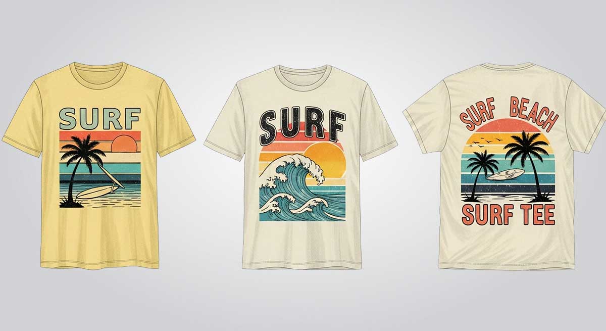
Surf and beach vintage t-shirt design ideas show a relaxed beach life with a cool retro style. They have old-school surf pictures, faded colors, and chill coastal vibes. These tees are made for taking it slow. The fabric is soft, the colors look sun-bleached, and the prints feel like they’ve been through a few summers. They remind you of salty skin and easy days that didn’t need any plans.
Think washed yellows, ocean blues, or coral. Draw waves or palm trees by hand so they look a little imperfect. Make the letters lean like the wind is blowing on them. A great surf tee doesn’t shout “summer.” It just feels like summer is always here, like sand that sticks together even after you leave the beach.
Our Surf Tee brings that natural summer feeling. It’s made for people who love the beach, chase waves, or just feel at home in the ocean breeze.
Key Features:
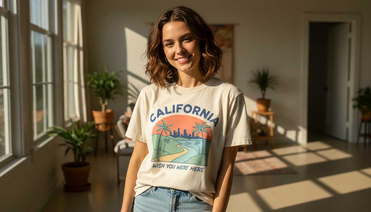
Vintage travel and souvenir t-shirts feel like an adventure. They smell a little like sunscreen and old luggage. Each shirt shows a place: a Miami sunset, Tokyo street lights, or Paris streets. They have retro letters and classic travel pictures.
The goal is to make them look homemade, not like cheap tourist souvenirs. Use hand-drawn landmarks, tiny text, and letters that aren’t perfectly spaced. Let the colors fade, like a memory: coral, mint, sky blue. Add a simple slogan that still works: “Wish you were here.” It’s a line that never fails on a vintage tee.
Key Features:
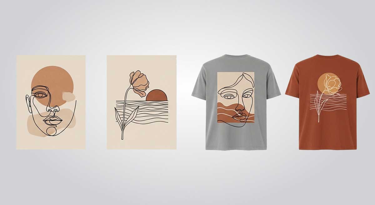
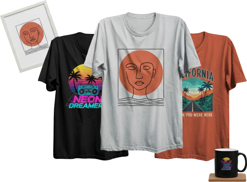
Minimal retro line art on a vintage t-shirt makes you feel calm and confident. It’s simple and timeless. The thin lines and empty spaces let the shirt breathe. These vintage t-shirt design examples work because they don’t try to fill every inch. They give the art room to exist.
Line art can be many things: a face drawn in one line, a flower bending in the wind, or the sun resting on the horizon. The minimal vintage t-shirt design idea is simple: draw less, feel more. Every line matters. A small wobble in the line shows it’s hand-drawn and real.
Keep colors simple, too. One color is enough, like warm brown, soft gray, or faded clay. Don’t use gradients or fills. Let the fabric’s texture show through.
When it’s done right, the art feels balanced. It looks modern but also a little nostalgic. It just works.
Key Features:
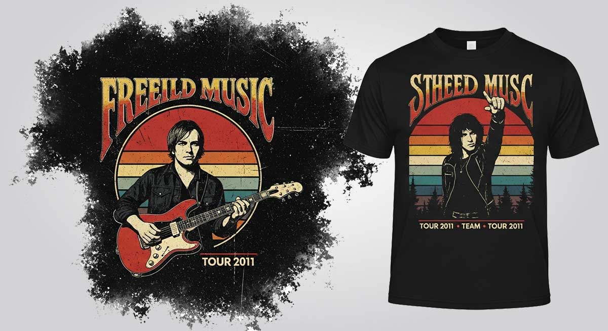
Vintage music t-shirt designs are about mixing old memories with a classic look. These shirts still feel like the sound of the crowd, the sticky floors at shows, and lights that never fully went dark.
When you start a vintage t-shirt design, think of a song playing late at night, after the last performance. Still loud, but drifting away.
Use textures that look worn down. Choose the best t-shirt fonts that feel old, like something from the 70s or 80s. Let the ink look a little cracked or uneven. Pick colors that seem faded: washed-out black, dull red, soft cream. Put the tour dates small, near the bottom.
Key Features:
T-shirts with old cartoon and comic vintage designs remind us of childhood mornings. We think of eating cereal and hearing the TV in the background. These shirts are great for people who love classic cartoons and comic culture. They feel fun and old-school at the same time.
These shirts bring back favorite characters and memories in a retro style. When you start making vintage t-shirts, don’t try to make everything perfect. Draw fast, like the joke is too funny to wait.
Let the colors mix a little. Let the lines look soft or uneven. You can even fade part of the picture to make it look like an old VHS cover.
The point isn’t to make the art perfect. The point is to make it feel warm and familiar. A good cartoon T-shirt looks hand-drawn, a bit goofy, and happy to be that way. It’s the kind of design that makes someone say, “I loved that show when I was a kid.”
Key Features:
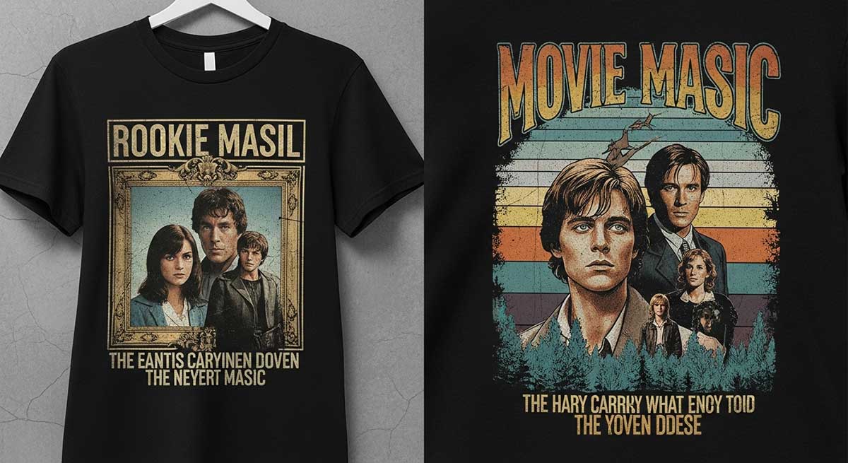
Vintage movie t-shirts bring old movie magic into everyday clothes. They show famous films, well-known characters, and scenes people will never forget. Wearing one feels like you’re carrying a piece of movie history.
These shirts don’t look new or shiny. They look worn. The colors fade. The print cracks. And somehow, that makes them even better. Picture the shirts you find in a thrift shop, where the image is almost gone, but you can still tell what it is. That’s the vibe you need.
When you make a vintage design, don’t try to make it perfect. One scene from the movie is enough. Or maybe a t-shirt slogan that real fans know by heart.
Let the picture sit a little off-center. Let the lines be a bit blurry. Use colors that look soft and faded. A real movie tee doesn’t just show the movie. It brings back the memory of watching it. These vintage t-shirt design ideas look especially good on black or gray shirts.
Key Features:
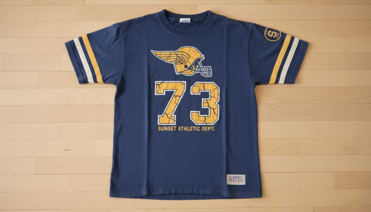
Old-school sports T-shirts celebrate the famous players, teams, and big moments from the past. They let fans show their love for sports history while looking cool with classic colors and old-style logos.
Wearing an old sports tee feels like standing on the field again. You can almost smell the grass. The numbers might be peeling. The stripes might be cracked. The colors may look faded from time and the sun. That worn look tells a story.
Use varsity-style fonts, but make them look a little rough. They shouldn’t look perfect. The small flaws are what make it interesting.
Choose washed-out navy, dull yellow, and off-white colors. Add small patches or stitching to make it feel like a shirt from a local team. The kind of team that tried hard, even if it didn’t always win.
Key Features:
Retro logo and brand revival shirts bring old names back into style. The old logos, the faded letters, and the familiar vintage designs still look cool today. They feel like a quiet hello from the past. They look stylish, personal, and confident without trying too hard.
These vintage t-shirt designs are bold and a little strange. They feel real. When you bring them back, keep the rough parts. Don’t make everything perfect. The small flaws show the history. Use older-style vintage typography, soft faded textures, and maybe let things be a bit off-center.
Pick colors that feel old and lived-in: mustard yellow, cream, brick red, dark navy. If you’re making a brand that didn’t really exist, make it seem like it “could” have. Maybe it was a gas station from 1978. Maybe it was a diner with bottomless coffee. The best revival logos make people stop and think, “Wait… have I seen this before?”
And if they do, that means you did it well.
Key Features:
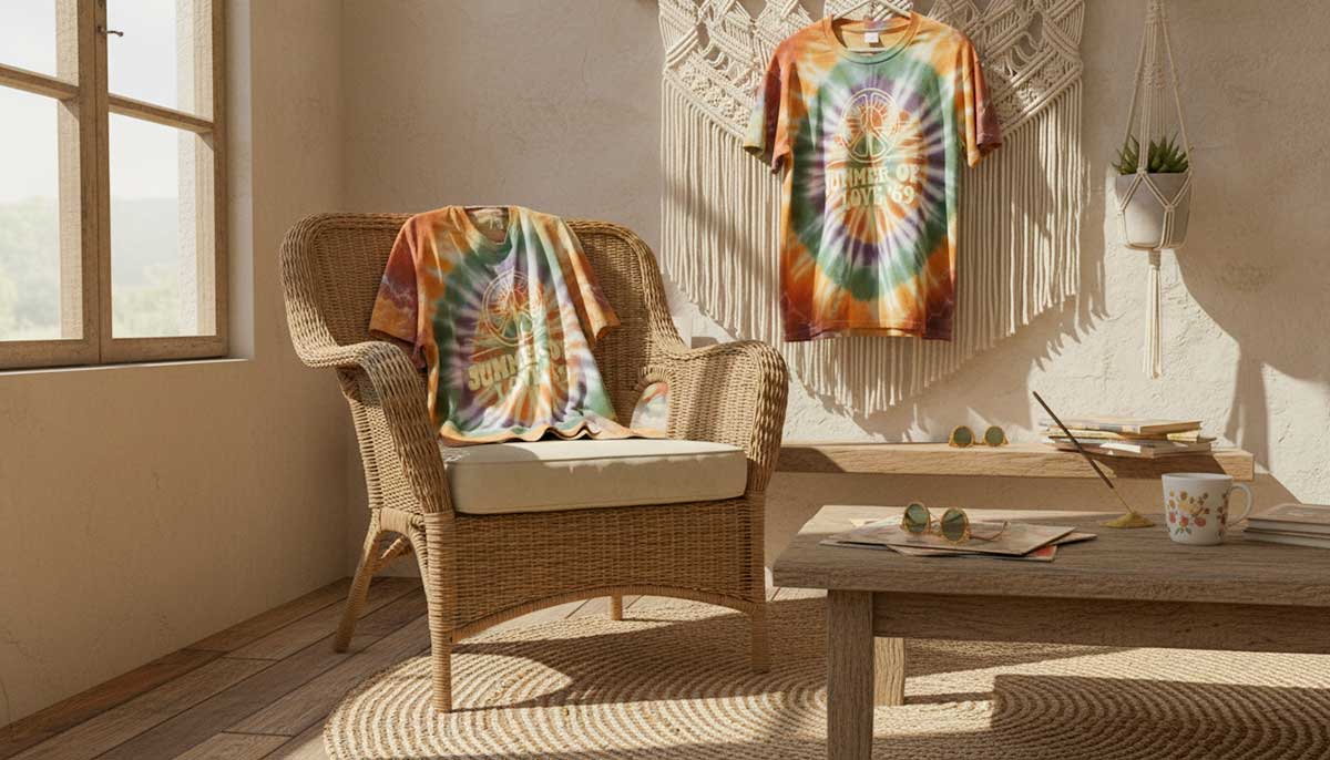
Tie-dye and old-school psychedelic t-shirts show off the fun, free spirit of the ’60s and ’70s. They’re full of color and movement. The colors fade softly, twist and swirl, and give off a chill, nostalgic vibe.
There are no rules. No perfect patterns. Just colors dancing wherever they want. The best shirts look like they’ve been to beaches, road trips, or long concerts. That feeling can’t be faked.
If you can design a vintage t-shirt, don’t worry about being neat. Let the spirals go wherever. Use soft, faded dyes so nothing is too bright. Mix oranges, purples, and blues so they melt together. A real psychedelic shirt shouldn’t look planned. It should feel like it came from a summer that never ended.
Key Features:
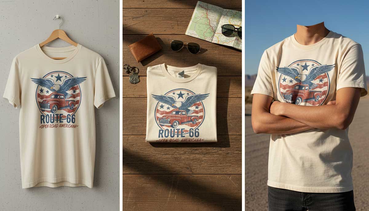
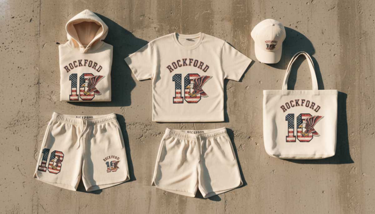
Americana and patriotic retro t-shirts bring back old-school pride. Think of classic flags, vintage logos, and worn-out prints that still mean a lot. They let you show love for your country while keeping a cool, timeless style.
These shirts feel like sunny highways, diners, and gas stations. They show stars, stripes, eagles, and old trucks symbolizing pride. Not in a loud way, just quiet love for wide-open spaces.
Use colors that look faded by the sun, and typography that feels hand-painted on wood. Soft reds, faded blue denim, and cotton white are the best. Add a hand-written style or a small logo on the sleeve.
Key Features:
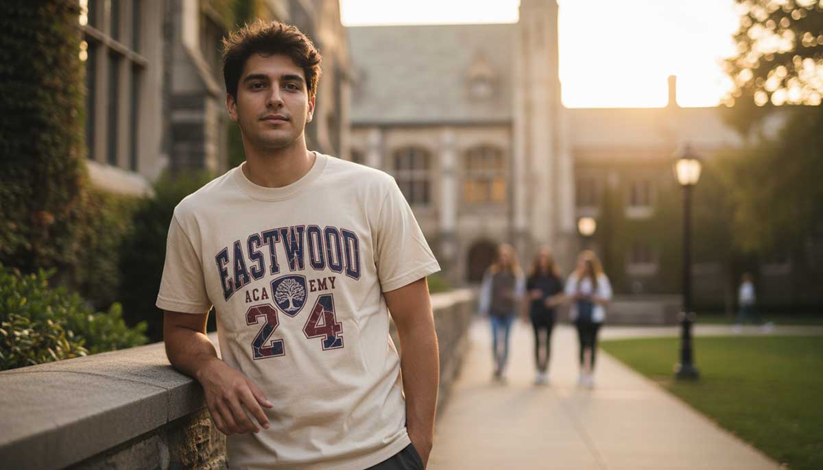
Remember the best days of college? This College and University Throwback collection takes you back there! These clothes show the fun of late-night studying, game days, and amazing friendships. They have a vintage style that celebrates your school and memories.
Old college t-shirts are soft and worn in. The print might be cracked, but the feeling is still there. You might see faded mascots, big letters, or a school crest that’s lost some color.
For new shirts, keep them simple. Put big letters that aren’t perfectly straight, soft gray, navy, or oatmeal colors. A throwback shirt shouldn’t shout your school. It should feel like a quiet nod to good times, like an inside joke with friends.
Key Features:
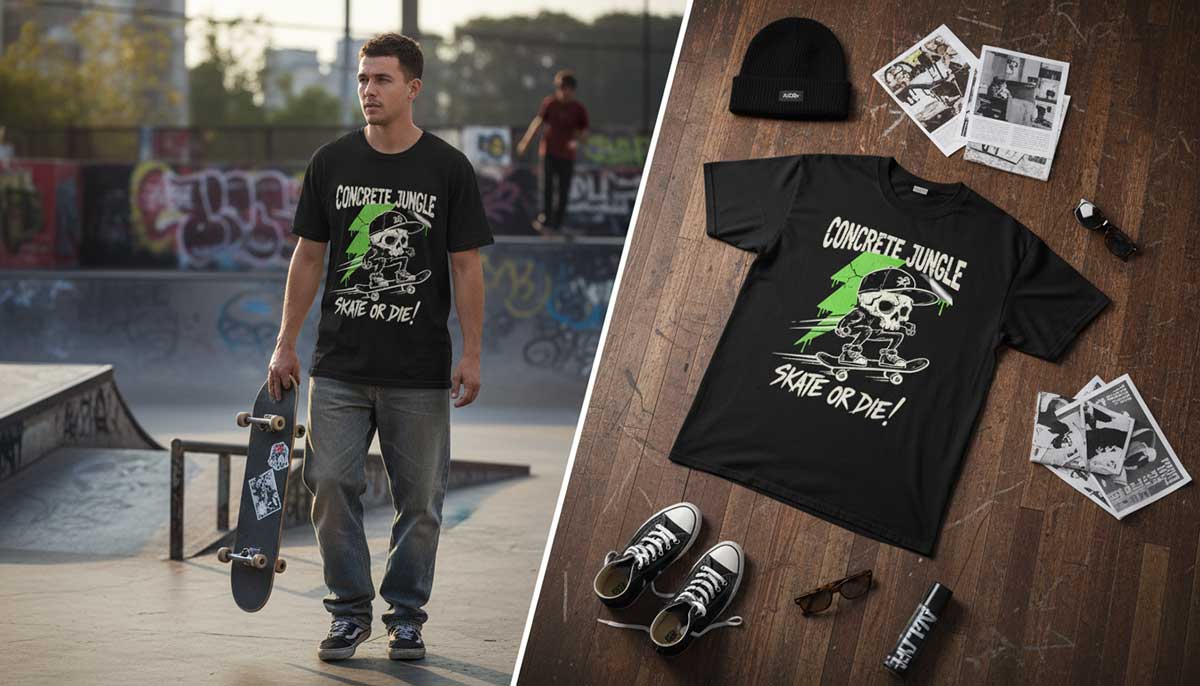
Skateboarding and retro streetwear mix city style with old-school t-shirt vibes. Skate tees are all about attitude. They’re soft and comfy, but full of personality.
They have classic skate t-shirt graphics, big letters, and a vintage feel. Wearing one shows you love skate culture and retro style. These tees come from the streets; scratched, torn, and painted.
You make a vintage t-shirt design, think about the pavement: rough, alive, and unpredictable. Use bold colors like black and white, bright green, or broken-up fonts. Make the logo look like a sticker peeling off a board. Add doodles, tape marks, or jokes only skaters get.
A great streetwear tee doesn’t follow rules. It breaks them, and still looks awesome.
Key Features:
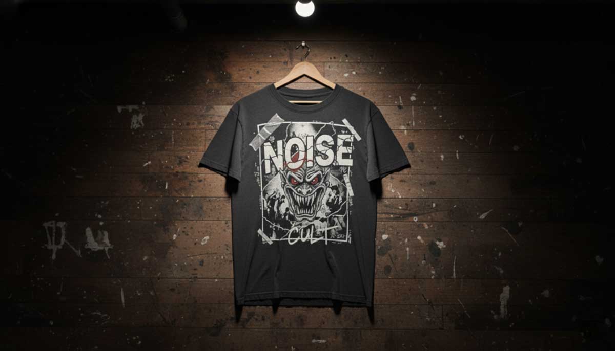
Grunge and punk rock vintage tees carry that raw, untamed spirit of the '90s. Grunge never tried to be neat; it was loud, messy, and proud of it.
Ripped textures, bold graphics, and that underground edge make every shirt feel alive. They look like worn flyers on old walls, ink bleeding through the paper, photos copied one time too many. That’s the art of it; rebellion turned into style. That’s where the attitude lives.
Start loose. Tear your edges. Drop your layers until they almost fall apart. Stick with blacks, browns, and dull reds, colors that feel tired but honest. Nothing should match. Nothing should feel finished. A good grunge tee looks like it’s been worn through years of noise and still refuses to fade out.
Key Features:
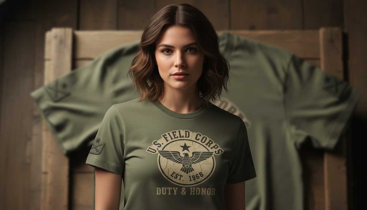
Military-style retro t-shirts take ideas from old army clothes but with a vintage twist. They mix tough vintage t-shirt designs, old army logos, and classic army colors. These shirts honor strength, discipline, and history. They’re great for anyone who likes bold, practical clothes that feel a little nostalgic.
These shirts don’t shout, but they’re solid. Faded olive, sand, and black; colors that get the job done. They feel patient, not fancy. This isn’t a costume; it’s something you can count on.
Use stencils or old-style logos. Make the edges a bit rough, like the shirt has been used for years. Keep the prints flat and soft. Shiny prints don’t look real here. One logo, one line of text is enough. When it looks steady and worn, stop.
Key Features:
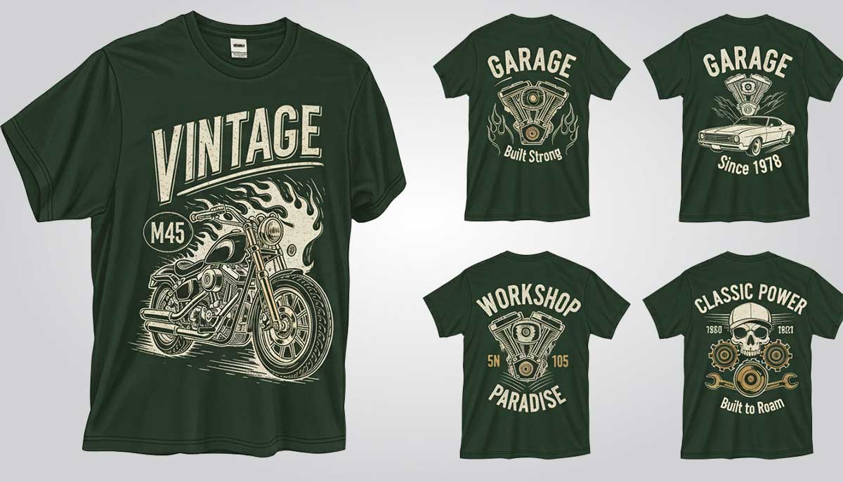
The vintage motorcycle and classic car tees make you feel like you’re driving down an open road. Each vintage design is inspired by old cars, garage life, and the freedom of the highway. They’re for car lovers, dreamers, and anyone who feels alive when an engine roars.
These shirts are made for the road. For loud engines, greasy hands, and long miles. The best vintage t-shirt design ideas look like they’ve already been on a ride. Black or dark gray shirts work well with off-white prints. Draw the art roughly. Use thick lines, even shaky ones. Make it feel like it was sketched in a garage with a grease pencil.
The letters should look like old gas-station signs. Let the print look a little faded on the edges. Keep the ink dull. No shine, no sharp lines. It should feel used, like it’s already hit the road a few times. When you pick it up and it reminds you of long drives and bad weather, that’s all you need.
Key Features:
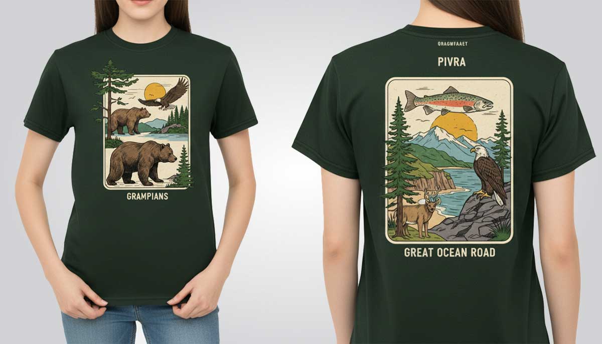
People who love nature often wear T-shirts with outdoor vintage designs. This one shows the beauty of the outdoors. It has classic drawings that feel adventurous and remind you of wildlife.
Nature vintage t-shirt design ideas last because they don’t follow trends. Think bears, trout, eagles, and pine trees. Simple shapes with a little scratchy texture. Draw it like a field guide, not like a poster. Give the art space. Don’t put lots of text around it. You want it to feel open, like fresh air, not crowded.
Use earthy colors: moss green, clay, faded river blue. Add a small location name, like “Grampians” or “Great Ocean Road,” under the design. Keep it small and simple. A light-worn effect makes the print feel like part of the fabric. If someone looks at the T-shirt and thinks of dirt under boots or a cold morning outside, that’s all you need.
Key Features:
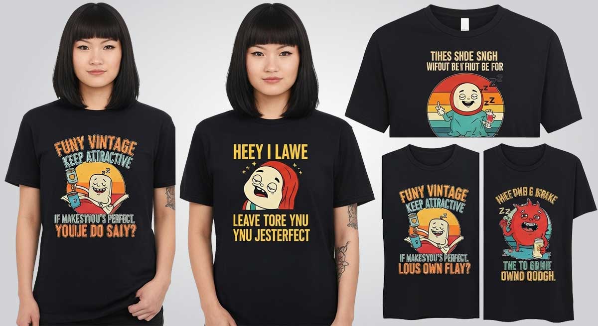
Make people smile with our funny vintage t-shirt design ideas. The vintage t-shirt design example is playful and has a retro vibe. They bring nostalgia in a funny, cool way.
Think weird clip-art, a sleepy mascot, or a line that hits without warning in funny t-shirt designs. Keep the drawing a little off. Things are attractive when they’re not too polished.
Use simple letters, maybe a bold 90s-style vintage typography. Put the text low or off-center so it feels casual, like you just found it. Two colors are enough.
Tiny mistakes are okay; they make it charming. If it makes you laugh before it’s perfect, leave it. The more you try to fix it, the less funny it gets. Let it be its own thing and move on.
Key Features:
Celebrate your creativity with DIY and handmade vintage t-shirt designs. Cute, crafty visuals give your style a personal, old-school touch.
Handmade prints feel different. You can see the work in them: the brush marks, little mistakes, and colors that fade a bit too fast. That’s what makes them alive.
Most t-shirt designers start simple: a sponge, a cut-out stencil, or a rubber stamp. No fancy tools, just hands and fabric.
Every shirt turns out a little different. You iron it, wash it once, and it already feels like yours. It’s not perfect, but it’s real.
Key Features:
Old sports jerseys have a special vibe. They remind us of big games and proud teams. The letters, bright colors, and worn-out look make them feel real. They aren’t about following t-shirt design trends; they tell a story.
Big numbers, quick doodles, even a mascot drawn last minute, that’s what makes them feel alive. They’re old-school but still cool. Simple but full of memories. You can actually wear those memories.
Start with a big number. Curve the town’s name over it. Give it lots of space. If it looks a little off, that’s okay.
Use colors like navy, brick, or cream. Add stripes on the sleeves, but make them look faded, like they’ve been washed many times. Don’t pile on too many details. One is enough. If the shirt feels like the team matters, win or lose, you got it right.
Key Features:
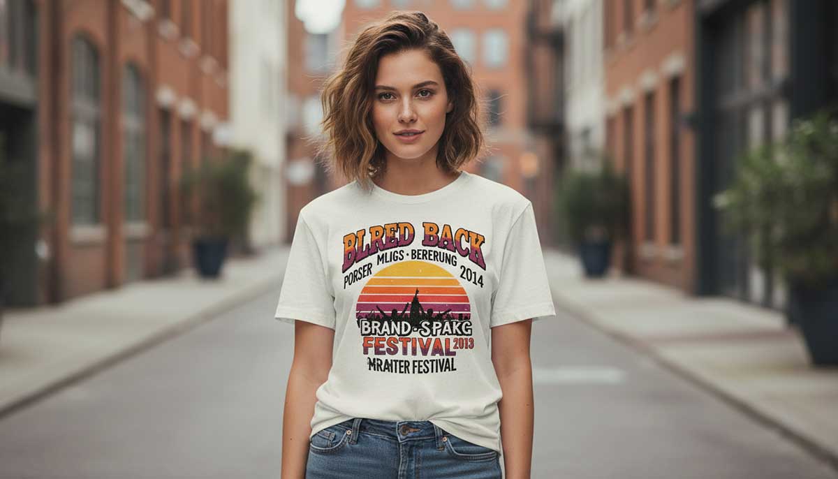
Bring back the spirit of great music & legendary live performances through vintage-inspired concert tees. Vintage-style graphic tees, bold letters & a worn look will allow you to capture the essence of memorable shows that have made history.
These shirts feel loud even when nobody’s wearing them. Every stain and crack remembers a song. You can almost hear the crowd. Real ones aren’t clean, ink bled into cotton, letters missing, sweat marks turned to ghosts. That’s what keeps them alive.
So, when you start making a vintage t-shirt, don’t chase perfection. Stack the graphics like flyers on a pole, half-torn, half-covered. Use warm ink, something that looks sunburned: orange, wine, dull yellow. Put the year crooked, let the brand name fall a little low. Nothing straight, nothing polished. A proper festival tee should look like it partied hard and somehow made it home.
Key Features:
Our hand-drawn retro graphic tees take you straight into artistic nostalgia. Each vintage design starts with careful sketches inspired by vintage posters, comic strips, and old-school ads. The lines are bold, the layouts balanced, and the colors pulled from a classic, vintage palette. It’s a tribute to the timeless charm of hand-drawn art.
Hand-drawn vintage t-shirt designs have a life of their own. You notice the pauses, the uneven strokes, even when the pen slips a little. That’s what makes them real. Tees made from sketches feel closer to the artist who drew them.
Work freely. Don’t overthink it. Use thin ink and one or two colors, like faded brick, worn blue, or mustard. Add a tiny handwritten note like a thought, not a slogan. Keep the small wobbles. Those little shakes make it feel handmade, not printed.
These tees are perfect for art lovers, retro fans, or anyone who likes wearable stories. They bring a personal touch to your daily style while nodding to the past.
Key Features:
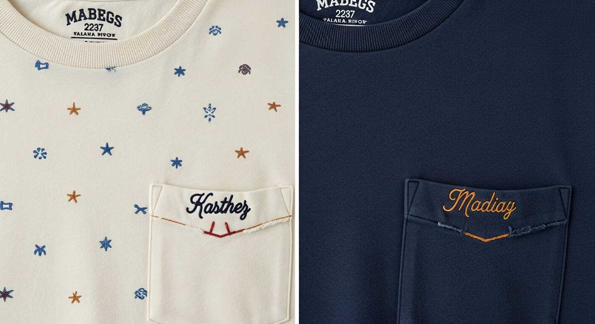
These t-shirts celebrate old-school craftsmanship but in a modern, vintage style. They mix classic fabrics with detailed embroidery and careful stitching. Each shirt feels handmade and has a timeless vibe. The embroidery is slow, done one stitch at a time. That slow process shows in the final shirt.
Every vintage design tells a story. Patterns, logos, and little motifs are made with simple elegance. These shirts are perfect for people who like thoughtful details, heritage styles, and clothes that last. They are stylish, wearable, and have a vintage feel.
Use soft-looking thread, not shiny ones. Adding a light print underneath can make it feel textured, like a whisper behind the thread. Old shirts with embroidery feel personal. A small name near the pocket or a slightly crooked stitch makes it feel real.
Don’t cut every loose thread. A tiny fuzz or knot gives it character. When a shirt looks like it’s been handled more than worn, you’ve got the feeling right.
Key Features:
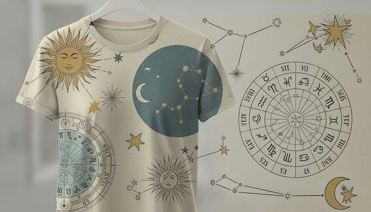
Astrology-themed retro T-shirts mix celestial charm with classic vintage style. They show zodiac signs, constellations, and cosmic designs.
These tees aren’t meant to be perfect. Lines wander. Stars sit wherever they want. They let you show your starry personality while keeping a timeless, retro look.
That’s why they feel real. They feel handmade, like someone drew stars on their wall and never erased them. Lines bend. Moons tilt. Nothing is exact.
Use washed blues, soft gold, and the gray of old paper. Keep the layout loose; circles, constellations, maybe a sleepy sun. Let letters curve unevenly. Add a small date or symbol in a random spot.
Stop when it feels easy on the eyes. If it reminds you of a horoscope ripped from a magazine years ago, you’ve got the right mood.
Key Features:
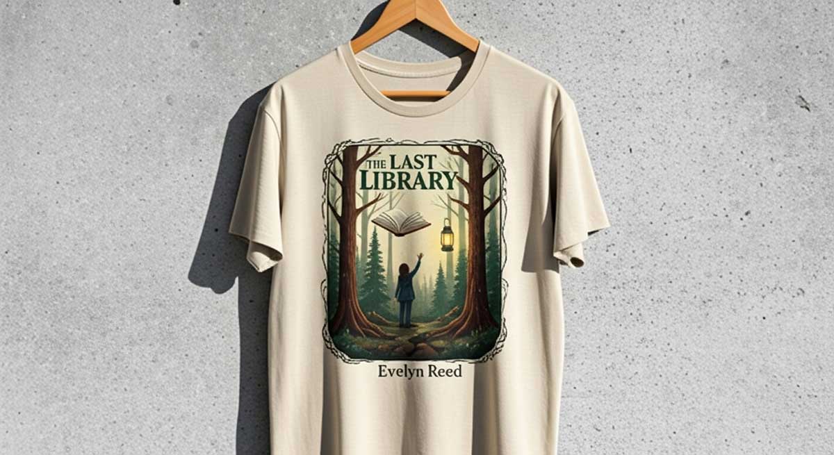
Vintage-style t-shirts with classic book covers mix old-school charm with a love of reading. The pictures come from famous books. The letters look old-fashioned. The shirts feel a bit nostalgic. They let you show you love books in a cool, retro way.
These shirts don’t just look like “design.” They tell a story. Pick covers that already stand out: big titles, wide margins, colors that have aged well. Print them flat, not shiny. Forest green, maroon, and light brown always look good.
Make the edges rough. Smudge them like a page that’s been folded a lot. Maybe add a tiny line of text on the side, like a book spine. It should feel borrowed, not brand new. Like a shirt you found tucked between old novels, still smelling faintly of paper.
Key Features:
Making vintage t-shirt designs is more about skill than shortcuts. Filters won’t make it look real. Overlays won’t either. It’s about a warm, worn-in feel, like it’s been around for years.
In a print room, every detail matters: the letters, the ink, the texture, even how the cotton reacts to heat.
The process is slow. Print. Check. Let it fade. Try again. What makes these shirts special is that they already feel old, even before anyone wears them.
Designing your own vintage t-shirts is a great way to mix your style with a cool, nostalgic vibe. Here’s a step-by-step guide to get you started:
Typography sets the mood for vintage t-shirt designs. Most t-shirt designers start by digging through old things, like gas-station signs, ticket stubs, or sports badges. They look for shapes with personality: curves that dip, letters that lean too much, spaces that don’t quite line up. Those little flaws make it feel real, like it was printed by hand, not made on a computer.
Designers don’t just check the text on a screen. They test it on fabric too. On cloth, everything changes a bit. Words can slide; some letters sit lower than others. That looseness is part of the style. Once the letters feel right on the fabric, the rest of the design can grow around them.
When you want a design to feel nostalgic, avoid bright colors. Choose colors that look a little faded, like washed-out pinks, soft navy, or off-white. These old-style colors feel warm and real. Ink is mixed to be soft and gentle, not loud.
Mix these colors with small contrasts and textures that look worn. This makes your design feel vintage and real.
Warm browns, soft blues, and sun-faded oranges often remind people of the past. Bright neon can bring back the energy of 80s vintage t-shirts.
Designers always test colors on real shirts, not paper. Cotton soaks up ink and darkens when it dries. After the first try, they might adjust the color a bit toward gray or brown until it feels just right. The final print should look calm, like it’s been faded by the sun over many years.
Digital files don’t always look the same when they’re printed. Thin lines can smudge, and smooth color fades can disappear. Before printing, designers make lines thicker, simplify colors, and change fades into patterns. Preparing files makes the final print feel softer.
Each color is printed on its own layer. The layers don’t have to line up perfectly, so tiny shifts happen. Those little shifts make the picture feel alive. After printing, the ink is heated just enough to stick, but it stays flexible.
Water-based ink is popular because it soaks into the fabric. Plastisol just sits on top and doesn’t feel right for this style. Make the ink thin so you can see the fabric weave through. For dark shirts, use a discharge under the ink if you want that chalky, worn look.
Some shops add small embroidery or chain stitching. The thread fades slower than the ink, so over time, they age differently. That difference adds depth without needing more colors.
Printing stops early, but finishing gives the shirt its soul. After the ink dries, the shirts go through a soft wash or an enzyme bath. This smooths out the ink and makes the fabric softer. When they come out, they already hang like your favorite old shirts.
Each shirt gets a quick look under warm light. The best ones all have the same feeling; you can’t tell where the vintage design ends and the shirt begins. That’s when it’s finished.
Now that we have come to the end, you surely have got some inspiration from the collection of vintage t-shirt design ideas above. The vintage pieces never fade away. They hold bits of people’s lives.
When a t-shirt looks like it has a story, it suddenly feels human. That’s where the magic lives. Every mark adds character, every fade tells another story.
And, if you’re looking for a vintage T-shirt design company, contact Graphic Design Eye for a custom vintage T-shirt design service that combines creativity and quality. Our expert t-shirt designers will create unique, high-quality vintage T-shirt designs perfectly suited to your brand.
Now, let’s make the deal to have productive days ahead!