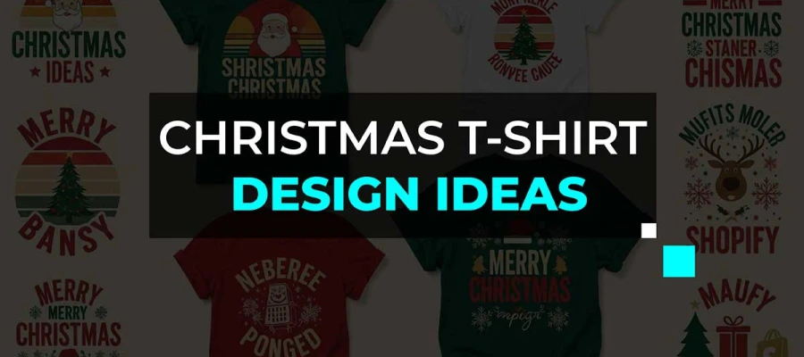
TL;DR:
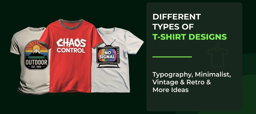
Looking for modern typography t-shirt design ideas that can turn a simple tee into a statement piece? In this guide, you’ll find minimal looks or bold, attention-grabbing design inspiration to create shirts that connect with buyers and stand out in competitive marketplaces.

It sets the tone, communicates personality, and grabs attention before anything else. A clean, minimalist type can make a shirt feel sleek and sophisticated, while bold lettering can inject energy and attitude into a design.
But choosing the right typography isn’t just about following t-shirt design trends. It’s about understanding your audience. Every font carries a vibe. Creative fonts can feel classic and reliable, script styles can add charm or elegance, and grunge or hand-drawn letters can appeal to those seeking something unique. Combining the right style with clear readability and strong visual hierarchy ensures your t-shirt design resonates and sells.
Let’s explore what designs can really do!
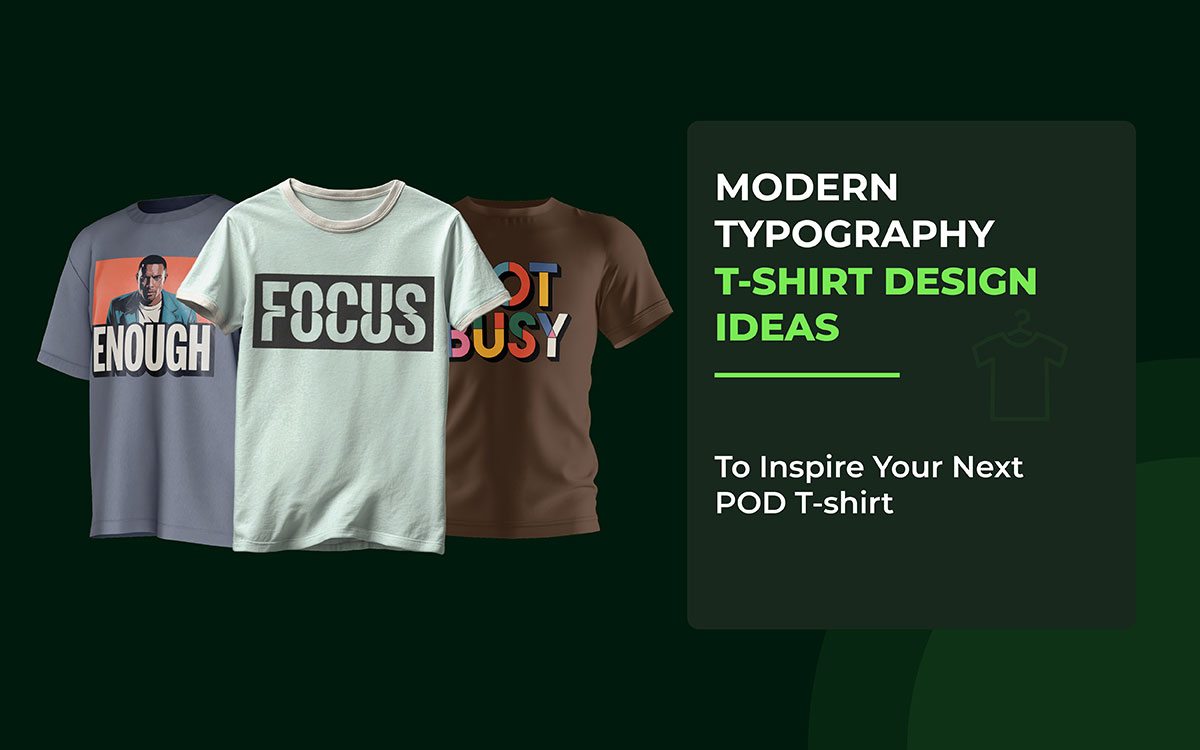
Typography isn’t just letters on a shirt. It shows personality, mood, and attitude all at once. The right font can make a casual tee look chic, edgy, and even rebellious. But with so many styles out there, how do you choose the ones that really connect with your audience?
That’s where we come in. In this list, we share 25 creative custom typography t-shirt design ideas to help you find the perfect style for your business.
So, let's dive in and start exploring them now!
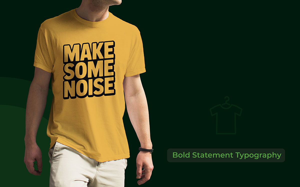
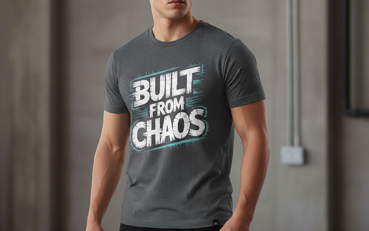
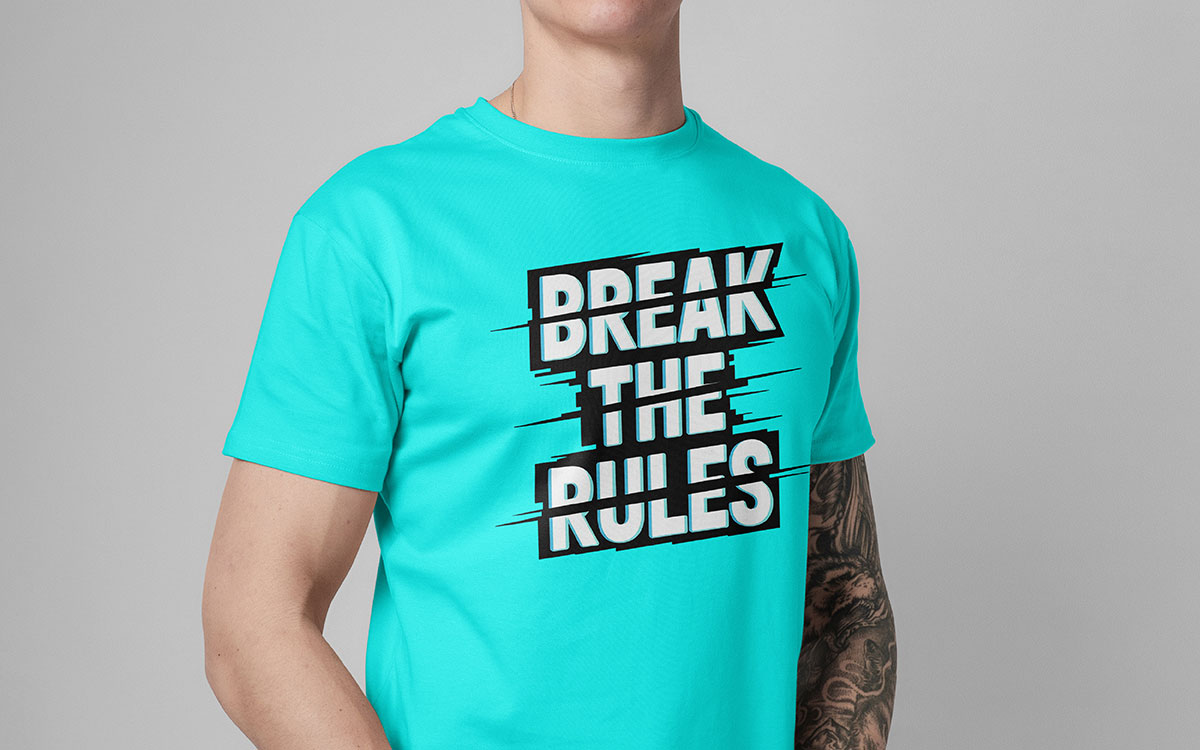
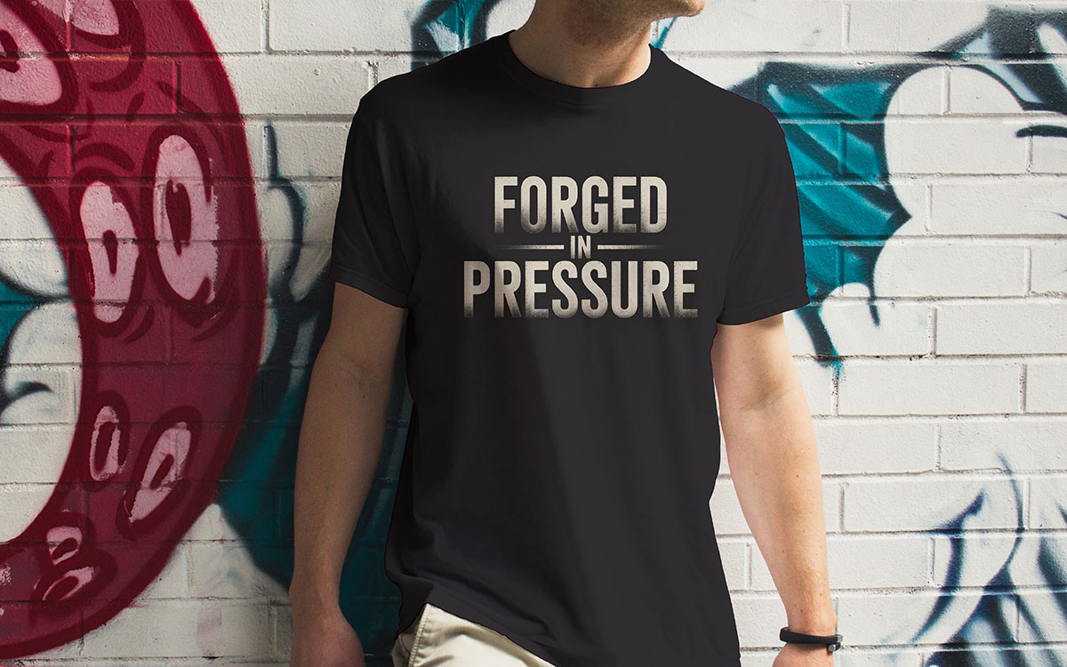
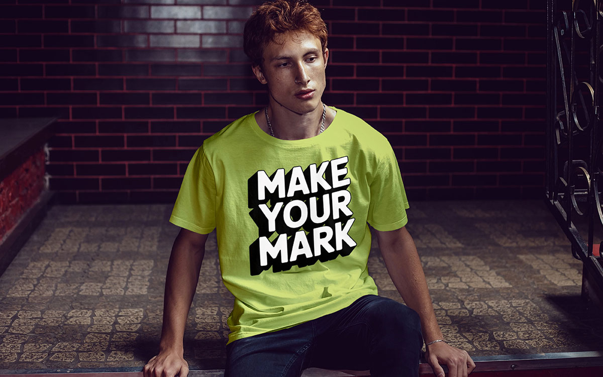
Bold statement typography turns t-shirts into a way to show what you believe. Nowadays, people want clothes that let them express themselves. This style uses big letters that can stretch across the chest. The fonts are thick and strong, like Impact, Bebas Neue, or Cooper Black.
Bold text t-shirt designs sell the most in online t-shirt shops. They are popular for activist, fitness, and funny shirts. The message needs to be clear, not subtle. It works especially well in the US for people aged 18-34 who like clothes that start conversations.
The best typography t-shirt design ideas use a single strong word, like “RESILIENT” or “UNSTOPPABLE.” Short, bold phrases work as well. They usually use colors that stand out. Streetwear brands say more than half of their online sales come from these bold statement t-shirts. They print them on thick cotton or trendy oversized shirts.
Key Features
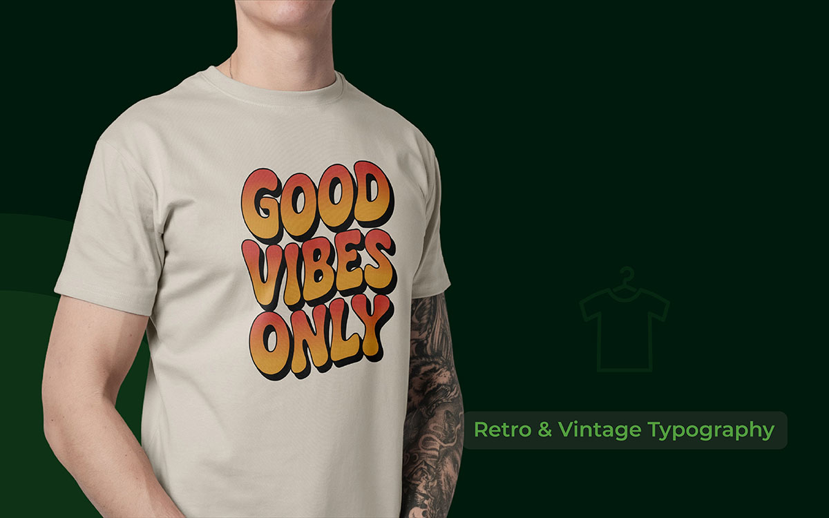
Retro and vintage typography is all about bringing back old-school styles. It uses designs from the 70s, 80s, and 90s and brings back groovy fonts like Cooper Black and Windsor. It also uses disco-era lettering and faded colors, like old concert T-shirts or vintage ads.
Tapstitch says vintage typography will be the fastest-growing trend for business in the coming years. Millennials love it because it connects them to the time before digital screens.
To make it look real, you need the right fonts and warm colors like burnt orange, mustard yellow, and avocado green. Adding worn-out effects makes it feel like it’s been around for decades. City references like “Brooklyn Since ’75” or “Vancouver Vintage Vibes” also make it feel authentic and connect with local pride.
Key Features
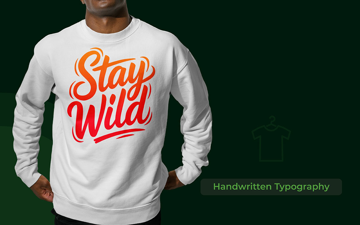
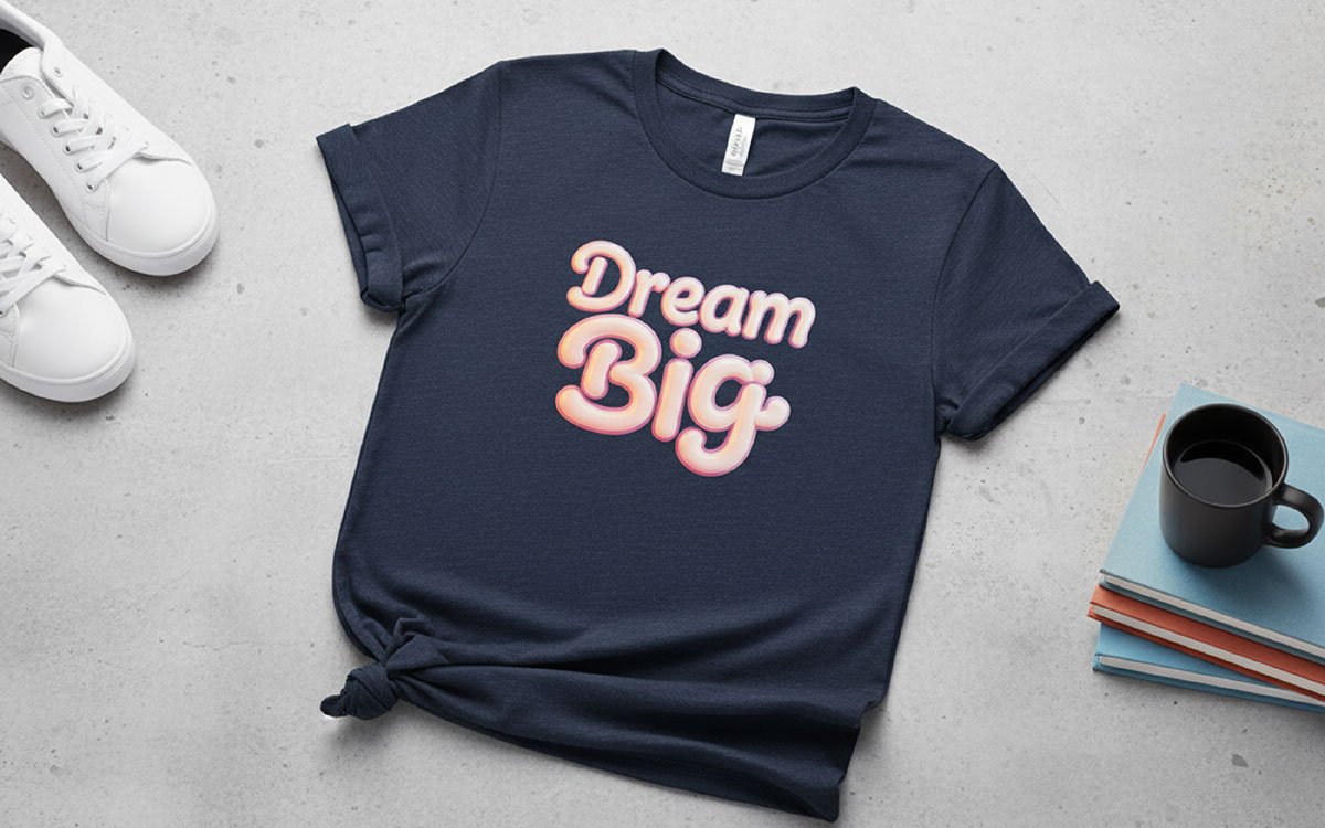
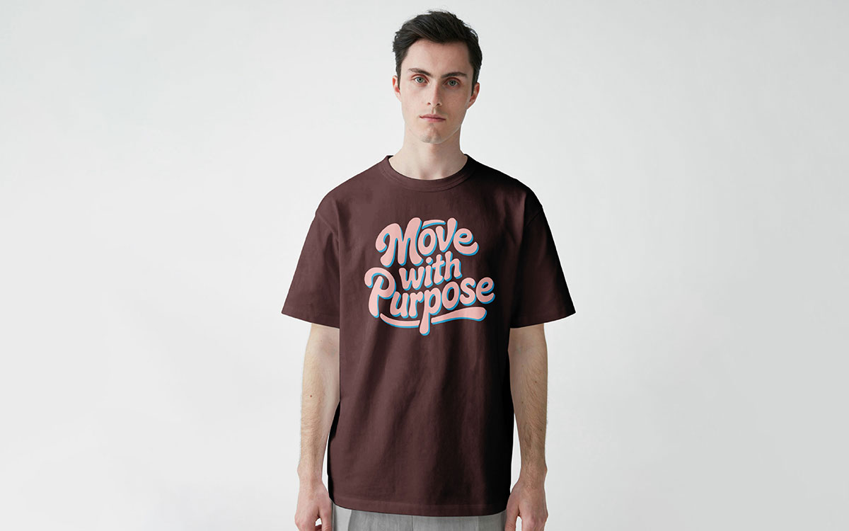
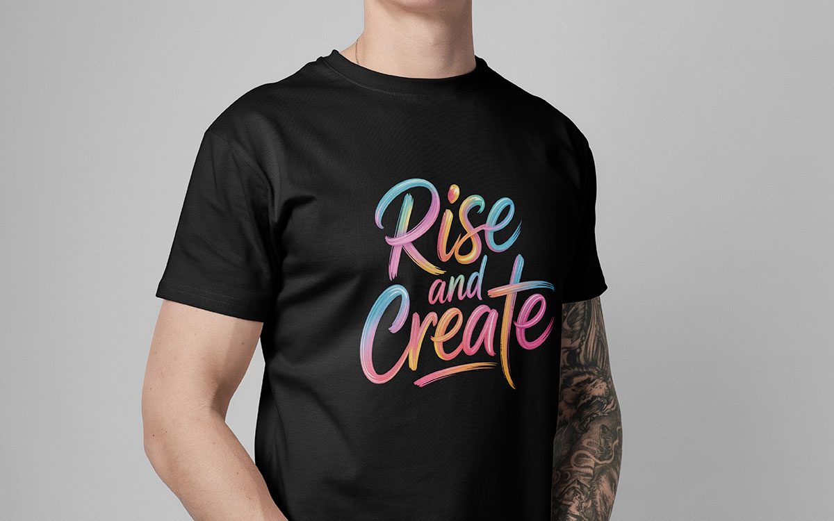
Handwritten and script fonts make business t-shirts feel more personal. They connect people with the design emotionally. Customers are more likely to buy this sort of t-shirt.
These fonts include brush scripts, casual handwriting, or digital calligraphy, like Playlist Script, Pacifico, or custom hand-lettered designs. They give a warm, friendly, and handmade feeling.
Research from Bonfire shows that script fonts look best when paired with simple sans-serif fonts. This combination makes designs clear and easy to read.
Handwritten & script typography design is popular for wedding items, inspirational quotes, and lifestyle products. It works especially well in the US Midwest and Canadian Prairies, where people like homespun, authentic designs.
To apply script font t-shirt concepts successfully, keep them short. Stick to 2-4 word phrases. Long sentences are hard to read on fabric.
Colors also matter. Soft pastels, muted jewel tones, or navy on cream make designs feel handcrafted and special.
Key Features
Grunge and worn-out style fonts give an edgy look. They work great for streetwear, music shirts, and alternative lifestyle clothes. The style adds scratches, rough edges, ink splatters, dots, and textures to bold or condensed fonts. It makes the text look worn and rebellious.
According to ZeitStitch, Gen Z loves these typography t-shirt design ideas because they feel authentic. They sell best at music festivals, gaming events, and on activist clothes.
Making these designs needs care. Too much texture can make the text hard to read. Too little looks fake. Canva and Kittl tutorials show how to do it right using layer masks and textures.
Designs inspired by London punk and Seattle grunge are especially popular. When done well with matching graphics, you can sell for $30–$38 per piece.
Key Features
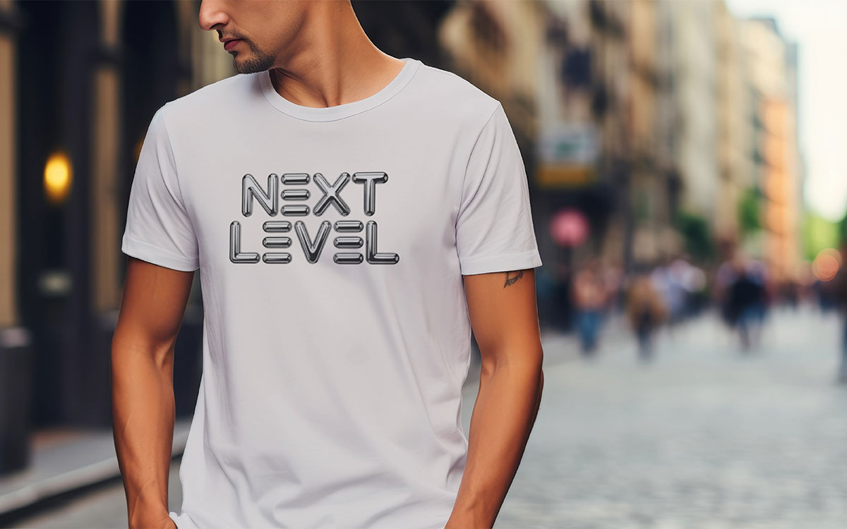
3D typography makes letters look like they pop out of the fabric. Designers do this using layers, shadows, and colors that give depth. The letters look bold and lively. It grabs attention, especially when lots of designs compete for a buyer’s eye.
3D typography turns flat text into designs. Today, more designers are using moving text effects and 3D tricks. They add depth, shadows, and layers of color to make letters look real. The style is popular in Toronto, New York, and Los Angeles because the designs look great in photos for social media.
Designers also use realistic textures and floating effects to make the text feel alive. In the UK, some designers mix 3D angles with big, simple fonts to make letters look like optical illusions. These effects change depending on how you look at them. This is helpful on Etsy and Redbubble sites, where a thumbnail can make people click and buy.
Key Features
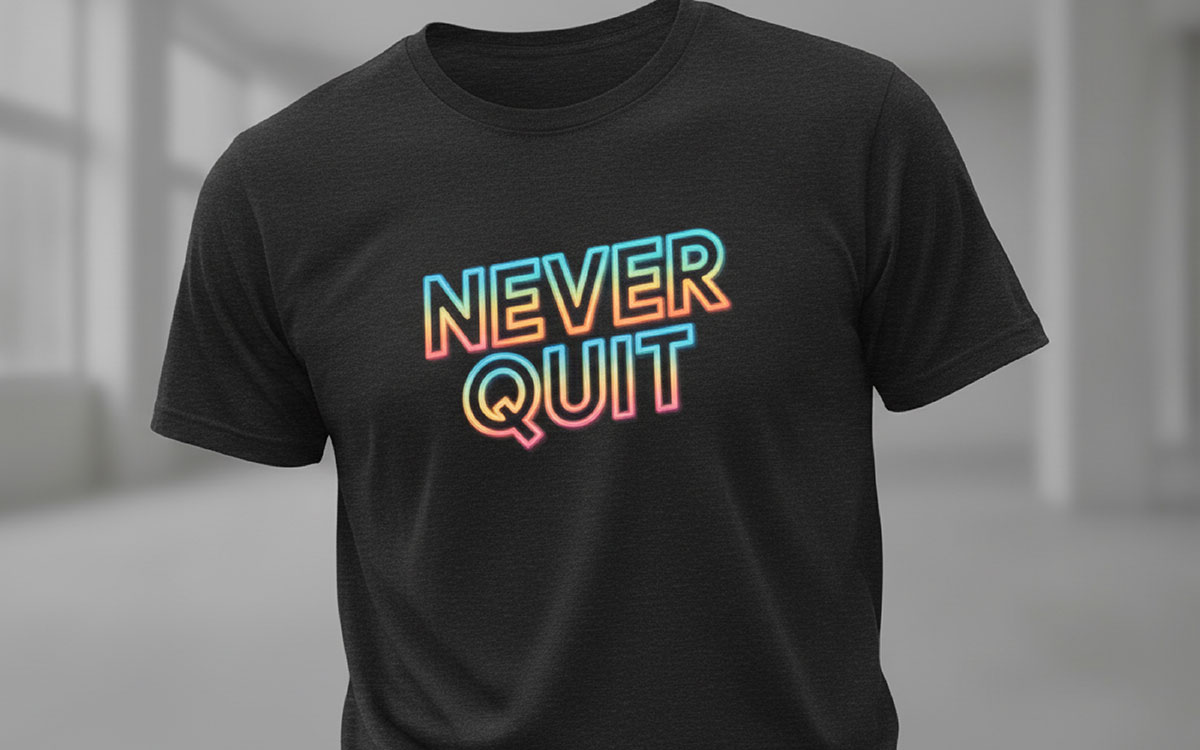
Neon glow typography looks like bright, glowing signs. It uses colorful outline fonts, blurred layers, and glowing color rings. This retro-futuristic style is popular in nightlife, gaming, and Y2K-inspired t-shirt designs. It mixes old-school vibes with modern digital styles.
Neon typography is making a big splash in the t-shirt market. It brings back 1980s Miami style and cyberpunk futures. People of all ages like it. Printify says that retro fonts with neon colors are among the top-selling t-shirt designs for 2026.
The style uses outline letters with blurred layers in bright blues, hot pinks, and neon greens. It makes the letters look like glowing gas tubes. In Canada, sellers see strong sales at Edmonton and Vancouver festivals. In the US, creators sell a lot at gaming conventions and music events.
Designers can easily customize these fonts with glowing effects and animations for different products. Designers in Manchester and Brighton add gradient glows that change colors. They make the design feel like it’s moving, even on a flat t-shirt.
Key Features
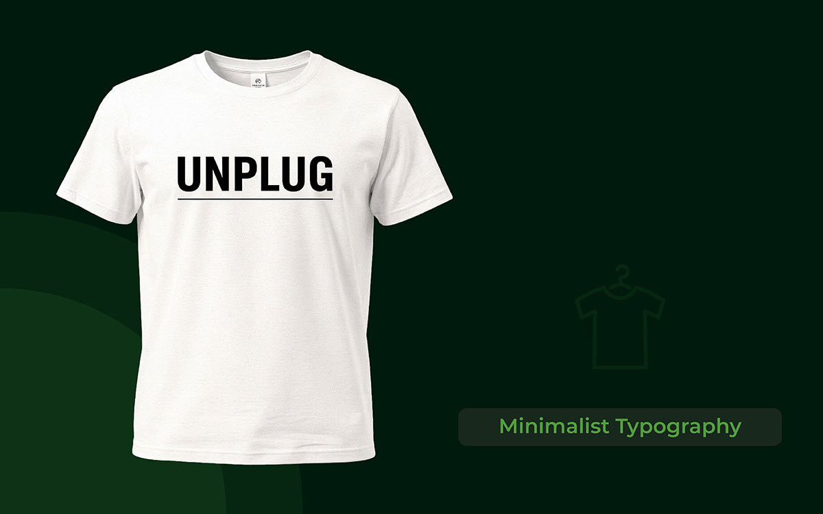
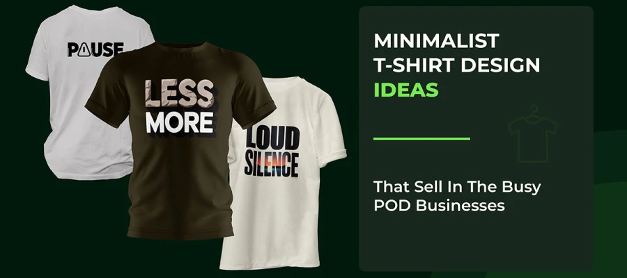
Minimalist typography is one of the best ways to create t-shirt designs in 2026. People in the US and Canada like simple styles. They prefer designs that look clean and not crowded.
Minimalist typography design uses simple t-shirt fonts. They use straight and neat letters. The space around the words is also important. It makes the design look modern and classy. The message on the shirt remains short. It can be just two to five words.
Studies show that simple text designs sell better than complicated graphics, about 40% better. This is because they look great in photos online. They also appeal to many different types of people.
The majority of modern type-based t-shirt designs use neutral colors. Many shirts are black and white, or white and black. Sometimes they use one soft color like light green or warm brown.
Designers say their best sellers are short motivational phrases. These phrases look sharp when written in clean and geometric letters.
Key Features
Curved and circular typography means arranging words along circles, arcs, or waves. It makes text look lively and guides the eyes smoothly. This style works really well for logos, badges, and vintage t-shirt designs. It breaks the usual straight-line text rules.
Circular typography changes how space is used. Curved letters guide the viewer’s eyes and give a feeling of motion and energy. Curving text around pictures or shapes creates a smooth and flowing look. You often see this in circular logos and badge designs.
Curved & Circular Typography T-shirt Design is popular in craft beer gear in Portland and Austin, vintage motorcycle clothes in Birmingham and Manchester, and outdoor adventure brands in British Columbia. The letters follow exact circular paths or custom curves. Designers adjust the space between letters so they don’t look squished or stretched at the curve’s peak.
Weft Apparel notes that curved text is great for brand names, slogans, and special text that needs a formal look. Many US POD makers put circular text around a central image. It makes balanced, medallion-style designs that look good on all sizes, from kids’ XS to adults’ 5XL.
Key Features
Vertical typography means stacking words from top to bottom. It makes text look tall and bold on shirts. The style is popular in streetwear, sports clothes, and modern typography t-shirt designs. Designers use the natural vertical space of clothing to make strong statements.
Vertical text breaks the usual left-to-right reading. It catches the eye and makes people notice it in stores. Brands like Weft Apparel say vertical text is different from regular horizontal writing. It looks dramatic, especially on big, baggy, or athletic-fit shirts.
This trend is huge in Los Angeles streetwear, Toronto’s urban fashion, and London’s modern clothing scene. Placing text on the sides of shirts adds stylish, runway-like asymmetry. Printify suggests using vertical, diagonal, or curved text. Adding hand-drawn letters makes it feel real and street-smart.
Vertical text works great for Japanese characters, single strong words, or text running from the collar to the hem. US print-on-demand creators say it gets the most attention when it contrasts with horizontal graphics. It looks great in photos and stands out on Instagram and TikTok.
Key Features
Split typography breaks letters into parts. These parts can be cut horizontally or vertically. It creates a cool, layered look. You can see colors, patterns, or images through the broken letters. Even though the letters are split, they are still easy to read.
This technique changes normal letters by slicing them on purpose. The spaces between the slices can show different colors, patterns, or photos. White Toner Transfer has tutorials on making split font designs. You can split letters horizontally to show two colors or smooth gradients.
Split & Cut-Out Typography T-shirt Design is popular with Gen Z. People like the “broken apart” design style. Cut-out effects remove parts of letters, creating empty spaces. These spaces can show the background or the color of the shirt. It works best with bold shapes or photos behind the letters.
Key Features
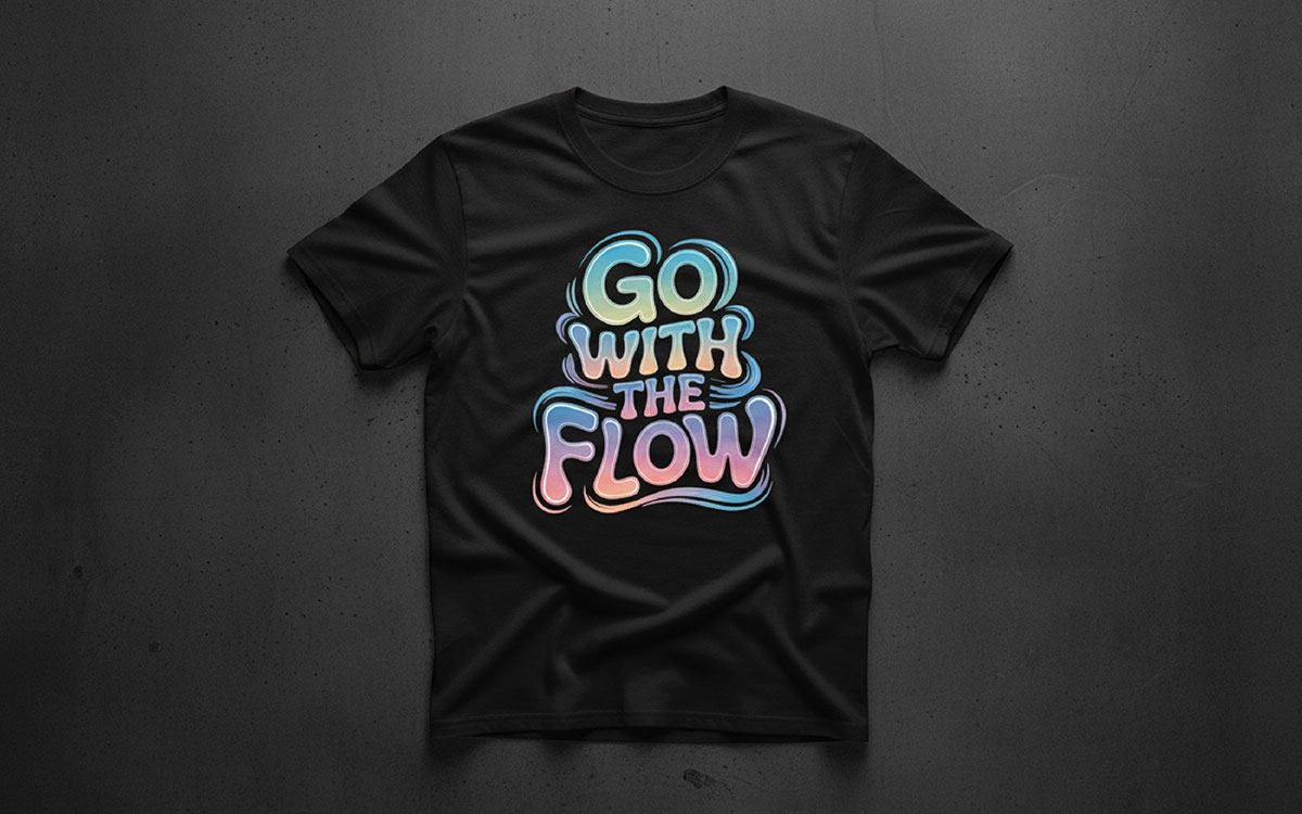
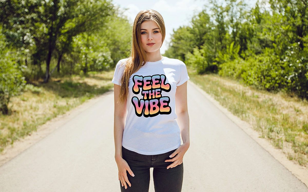
Gradient typography turns normal text into eye-catching art. It does this by blending bright colors that move smoothly across each letter. Designers usually mix metallic shades, neon colors, and glowing, aurora-like blends to add depth and energy.
Some popular gradient looks include orange-to-purple fades that feel like sunsets, blue mixes that look like the ocean, and rainbow effects that shine like holograms. Trend reports say this style is especially loved in the UK, the US, and Canada. People there want designs that are bold but still look classy.
Gradient typography works best with thick, simple fonts like Montserrat. These fonts give lots of space for the colors to blend. When designers add grainy textures or soft blur effects, the text looks more premium. Because of this, products with gradient typography often sell for higher prices on Etsy and Redbubble.
Key Features
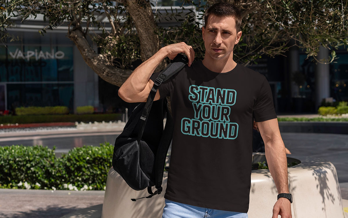
Outline typography uses space to make letters look clean and modern. Because the inside of the letters is open, the background colors and patterns can show through. This simple style fits perfectly with the big minimalism trend growing across North America and Europe.
The technique is great for making designs that look good on both light and dark clothing. That means POD sellers don’t need as many different versions of the same design. Strong, bold fonts and custom geometric styles work best since they stay sharp and clear when outlined.
There are many ways to use outline typography. You can make a single-line outline, a double-line look, or add a small shadow to give the letters a bit of depth without losing the clean style. People usually like outline fonts paired with motivational quotes. In the US, shoppers tend to prefer outline designs that focus on brand names or company logos.
Key Features
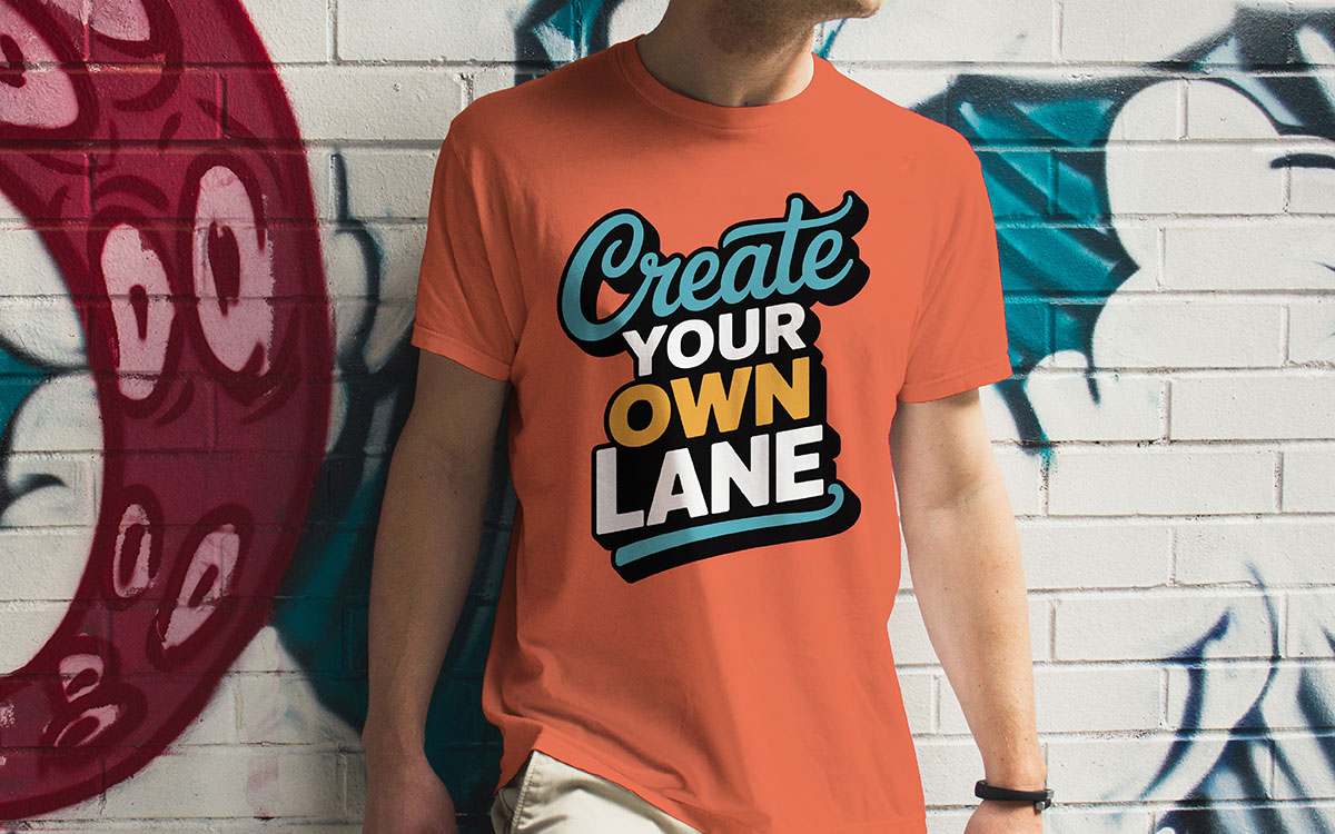
Mixed-font typography uses contrast to make text look more exciting. It usually mixes different kinds of fonts, like bold display fonts with smooth script fonts or simple sans-serifs. This style was huge in 2025 and is still getting more popular in 2026.
Some great pairs include thick slab-serif fonts with light handwritten scripts, clean geometric sans-serifs with loose brush fonts, and old retro fonts with modern minimalist ones. The trick is to keep everything clear.
Designers do this by changing font size, using different weights, and placing each piece of text in the right spot. It helps the reader know what to look at first.
Common mixed-font layouts include a strong headline with a smaller subtitle, a bold word used for emphasis with simple text around it, or a fancy first letter next to regular body text.
Key Features
Typographic shapes and patterns change the way we read text by turning letters into eye-catching art. Instead of writing in straight lines, designers arrange words in circles, waves, spirals, and other shapes. It makes the text look more like a picture than a normal sentence.
Some styles curve the letters so they follow smooth, natural lines. Others use letters to create simple icons, like hearts or stars. Many typography t-shirt design ideas repeat the same shapes again and again to make textures that seem to move.
People really like this kind of creative text, especially when it uses bold, bright colors. In the UK, circular badge-like designs are a big hit. In the US, people prefer text set at angles, with fast, energetic shapes.
This approach is perfect for streetwear, music merch, and teen-focused brands. In these areas, being artistic and expressive matters more than making every word easy to read.
Key Features
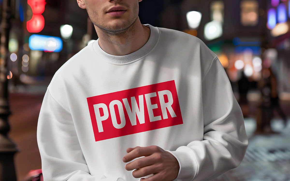
Monochrome typography uses just one color, usually black and white. It’s simple but stylish, and it never goes out of fashion. This type of design is very popular on t-shirt businesses because it looks good on many products, doesn’t cost much, and is easy to style.
Black letters on a white t-shirt or white letters on a black t-shirt are classic favorites. In fact, these combinations make up more than 40% of t-shirt sales that use text designs.
Using only one color lets the letters themselves stand out. Bold, skinny, fancy, or even playful handwritten fonts all look great without extra colors. Designers play with contrast, light gray shades for depth, or space to make the design pop.
Monochrome typography is especially popular with adults aged 25–45. But younger people who like simple, minimalist styles also love it.
Key Features
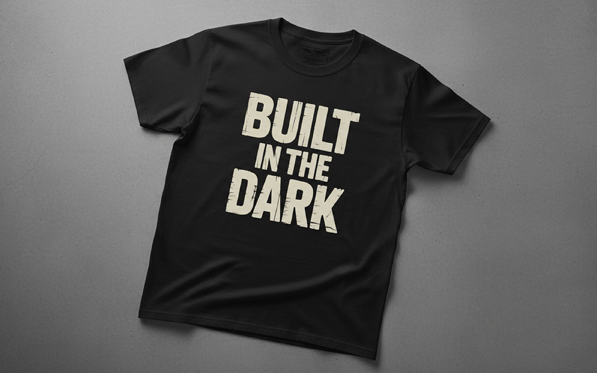
Noise and grain typography is a big trend in t-shirt designs. This style puts a grainy, vintage film effect on bold letters. It makes the text feel deeper and warmer. People who grew up with digital stuff like designs that feel real and handmade.
The textured look makes digital letters feel less flat and more natural. Big brands like Nike and Adobe are using it, showing it can sell well.
This style works best on neutral-colored clothes. The grain is usually light, around 10–15%, so it adds depth without being too loud. POD sellers can use it to create designs that feel raw and real. It’s perfect for streetwear fans who care more about authenticity than polished looks.
Key Features
Brush stroke typography is becoming popular in the t-shirt business markets. It mixes hand-drawn style with bold, eye-catching letters. The letters look like they were painted, giving off a creative and lively vibe.
This trend really took off in 2025-2026. Creators love it because it shows emotion and movement, but it’s still easy to read on t-shirts and other products. The best designs use big, sweeping strokes that flow across the chest or go down vertically.
What makes it special is its “perfectly imperfect” look. Every brush stroke feels human and full of energy. For people selling POD products, this style helps them stand out in a crowded market. It works especially well with motivational quotes or lifestyle messages.
Brush stroke fonts are softer and more natural than stiff, geometric letters, but they can still sell for a higher price.
Key Features
Big, bold letters are now the star of streetwear. Huge text covers clothes from top to bottom. It turns simple words into eye-catching designs that people notice from far away.
The trend comes from old-school bootleg culture and 90s fashion, where bigger always meant louder and cooler. The trick is to make the letters huge but also smartly placed. Designers avoid seams, think about how the fabric falls, and make sure the text is still easy to read.
In North America, print-on-demand creators are doing well with single words, broken-up phrases, or layered text that looks 3D. The main rule is to be bold. Oversized text isn’t quiet, and it shouldn’t try to be. It looks great on unisex and boxy clothes because they give the letters space to stand out.
Key Features
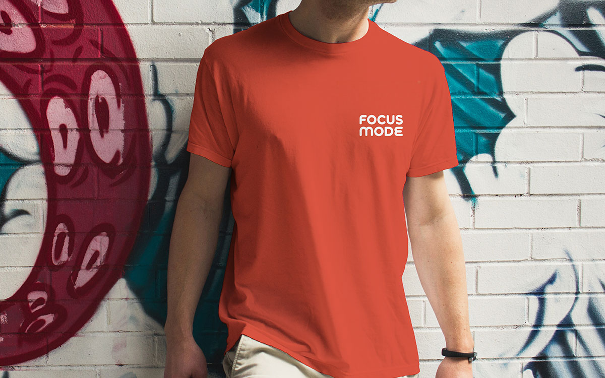
Micro typography is like a quiet voice in a noisy world. It’s a simple, minimalist style that puts small text in surprising spots on clothes. This style is for people who like details you notice only if you look closely, instead of typography t-shirt design ideas that scream for attention.
You might see this text on chest pockets, sleeve edges, the back of collars, or side seams. The trend shows that people want smart, subtle designs. It’s kind of an “if you know, you know” thing.
To make it work, the printing has to be very sharp. Tiny letters need to be clear and easy to read. Helvetica and Roboto fonts are popular for this design because their clean lines keep the text readable, even when it’s small.
For people who sell custom clothes, micro typography is a chance to offer something special. It’s perfect for minimalist fashion fans who like low-key, stylish designs instead of flashy ones.
Key Features
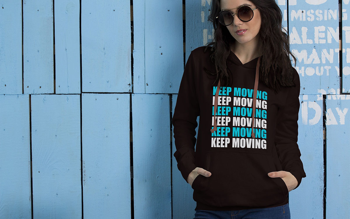
Repeating text t-shirt design ideas use patterns to grab attention and stick in your mind. They take simple words or phrases and repeat them across a shirt, hoodie, or other item. This makes the design feel like it’s moving and creates a cool rhythm.
The style comes from t-shirt design ideas about patterns, but keeps the message clear because it’s made of words. The trick is finding the right balance; too few repeats, and it looks empty; too many, and it feels chaotic.
Repeating Text Typography T-shirt Design works well for brand names, motivational quotes, or any idea you want people to notice. Designers often put a repeated text background behind the bigger, main words. This makes the design look layered and more interesting.
Another bonus is that it’s easier to make for different clothing sizes. The pattern works without needing a lot of resizing. People like repeating text designs because they feel modern and purposeful.
Key Features
Shadow and double-layer typography is one of the coolest design trends. It makes flat text look like it has depth by adding extra layers slightly offset from each other. It creates a 3D-like illusion without needing fancy printing tools.
The trick uses color contrast and careful placement of the layers. By copying the text and moving it just a few pixels, then adjusting transparency and colors, designers can make it look like the text is casting a shadow.
Shadow & double-layer typography t-shirt design is very popular with print-on-demand creators. Layered typography t-shirt designs can sell for higher prices because they look so stylish. Gen Z and millennials really like this look. It’s clean and modern, but feels more exciting than plain flat designs.
Key Features
Typography with negative space is a way of using the space around letters to tell another story. Designers usually ignore this space, but here it becomes part of the design.
To do this, designers have to carefully adjust the space between letters and shape the inside parts of letters. It lets them hide pictures or messages inside the text.
Today, t-shirt stores pay close attention to this space. Using less ink not only looks better but also makes clothes cooler to wear and cheaper to make.
Skilled designers make text that can be read in two ways. First, people see the main message. Then, if they look closer, they can spot hidden images or messages inside the letters.
This style is popular with people who know a lot about design, especially in big cities like Toronto, New York, and London. They enjoy clothes that have smart, hidden details.
Key Features
Wavy typography makes letters look like they’re moving, even though they’re on a flat page. The letters bend and flow like waves, giving them a fun, trippy vibe. The style became popular because people started loving retro-futuristic and Y2K-inspired designs. The wavy letters remind people of old digital experiments and rave posters from the early 2000s.
To make this look, designers use special tools that stretch and bend the letters without making them hard to read. Usually, the waves are small to medium in size, just enough to look cool but not confusing.
Wavy Typography style is popular in streetwear for people aged 18–34 in North America. Wavy letters show that you get current festival culture and alternative fashion trends.
Tip: You can get the best results if you use bold, yet simple fonts.
Key Features
Using icons and emojis in typography designs mixes words and visuals. It creates a hybrid way of communicating that is easy to understand across languages. It works well because many symbols are universally recognized.
Designers replace letters with matching icons, like swapping “O” for a heart emoji or “A” for a triangle. They also add emojis to text to boost emotional impact. Modern typography t-shirt design ideas use emojis a lot. They show complex feelings quickly in a way anyone can grasp.
Technically, icons should match the text in visual weight. They are usually sized 110–120% of the nearby letters to look balanced. This method works best for social commentary, motivational messages, and brand designs aimed at digital-savvy audiences who understand emoji-enhanced language.
Key Features
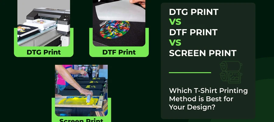
Metallic and foil letters make t-shirts look fancy. They shine like luxury packaging or magazine designs. Real foil printing needs special heat and tools. But now, new DTF printing can use metallic inks that look almost the same. It makes shiny designs cheaper and easier for t-shirt shops.
The DTF printing market is growing fast and was worth $2.72 billion in 2024. People like using metallic inks because tiny aluminum particles make the design sparkle in the light.
To make these designs work, the text should be bold and high-contrast. Gold, silver, or rose gold colors are most popular. Designers often use strong sans-serif or classy serif fonts.
These shiny designs are great for evening clothes, special events, and lifestyle brands that want a high-end feel. For the best results, the design needs at least 400 DPI. It stops the metallic particles from clumping and keeps the letters sharp and clean.
Key Features
Pro Tip: Use these typography styles smartly after studying your niche. Typography t-shirt designs work best for professional or lifestyle products. Grunge styles do well in music and alternative fashion. Try different print-on-demand companies on Printful, Redbubble, and Etsy. See which styles your audience likes most in the UK, US, and Canada.
A minimalist typography shirt concept consists of simple fonts, clean layouts, and short text. To create the best design concepts, use legible fonts, limited colors, and concise wording to create a timeless look. Focusing on readability, meaning, and visual balance is the right way to design aesthetic text t-shirt ideas.
To create the best minimalist typography design, learn the approach in detail:
Your typographic quotes for shirts need to match the people you want to reach. The global market for graphic t-shirts is huge, worth $2.6 billion in 2025. But it’s split into different groups. Each group likes different styles of letters.
For streetwear aimed at Gen Z in cities like Toronto or Manchester, bold, clean fonts like Bebas Neue work well. They look modern and cool. For vintage-style shirts aimed at millennials in Brooklyn or Austin, retro script or old typewriter fonts feel right. They give a nostalgic, “from the past” vibe.
Research shows fonts also send messages. Serif fonts (like Times New Roman) feel traditional and trustworthy. They work for school, work, or heritage themes. Handwritten fonts feel personal and close. They’re great for lifestyle quotes or motivational messages.
Trends show that eco-friendly or cause-based shirts do better with simple, modern fonts. They make the message feel urgent and real.
Check what your competitors are doing on Etsy or Redbubble. Look at which fonts appear on the best-selling shirts in your target group. It can give you clues about what works.
If people can’t read your text, your message is lost. Good design makes sure words are clear from a few feet away, about 3 to 6 feet. This is really important when your design is on a T-shirt, since the shirt is “talking” for you.
Use different font styles to show what’s important. Make the main message bold, supporting words medium, and only use light fonts for small accents.
Think about how the shirt will actually be printed. Very thin letters can disappear on dark shirts, especially with Direct-to-Garment or screen printing. Keep letters at least 2 inches tall so everyone can see them. Your design should be about 10.5 to 11 inches wide so it fits without wrapping around seams.
Check how your font-based graphic tees look on different sizes. Something that looks good on an adult XL might be too small to read on a kid’s small shirt.
In 2026, typography is loud, proud, and eco-friendly. Big, bold letters catch the eye. But success in t-shirt business isn’t just about following trends. You need designs that look fresh now and stay appealing later.
Add trendy elements like geometric sans-serifs or bold display fonts, but keep a structure that won’t feel old in six months. The basics of typography haven’t changed. Set clear focal points. Give your text room to breathe (use 1.4–1.6 line spacing for multi-line copy). Stick to 2–3 fonts per design. More than that gets messy fast.
Know your audience. UK shoppers like subtle elegance. Americans prefer bold, expressive type. Canadians fall in the middle, liking designs that stand out but aren’t too extreme.
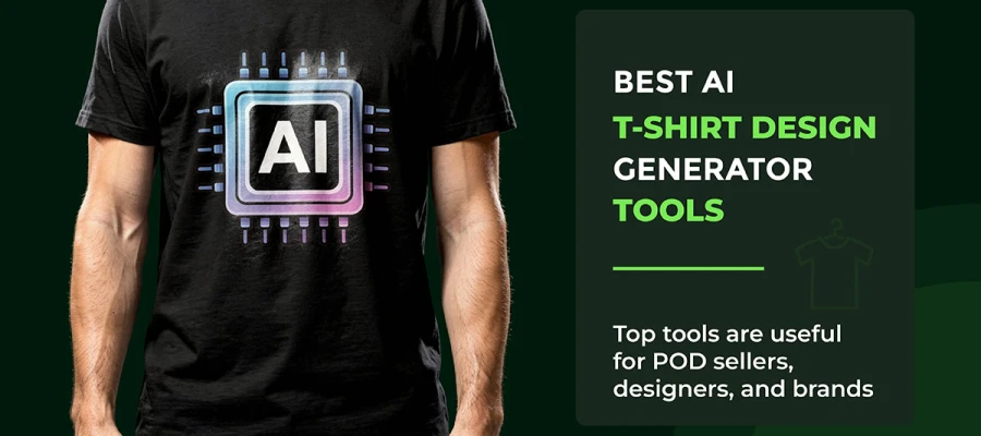
Use AI tools to spot new typographic trends in the t-shirt design niches. Experiment, but always prioritize readability and clarity. That’s how you make designs that sell season after season.
Now that you’ve finished the article, you’ve surely learned that modern typography t-shirt design ideas are all about intention. Every font has a job. Every space matters. And every layout choice sends a signal.
Get those right, and people feel it before they read it.
When clarity meets balance, and relevance shows up on time, typography stops being “just text.” It becomes a brand voice. The smartest POD creators know this. They borrow from trends, and they lean on solid design rules that never go out of style.
Want typography-driven t-shirt designs that look premium and sell consistently? Explore our typography t-shirt design services for your brand. We offer custom typography t-shirt designs built specifically for t-shirt brands. From custom type to full brand identities, our global team of 300+ designers delivers clean, consistent work around the clock.
We’ve been deep in t-shirt design since 2016. Long enough to know what sells and what fails. Even if you don’t have any strong idea, we’ll create one for you.
Contact us today and take the next confident step to building a recognizable, profitable t-shirt design!