TL;DR:
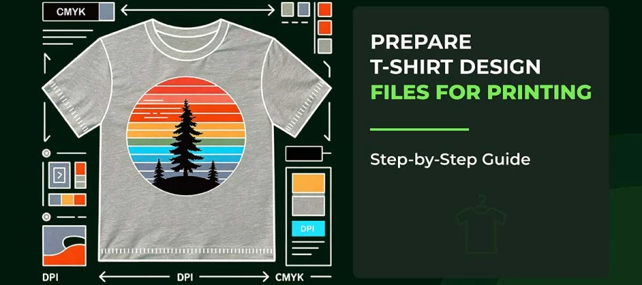
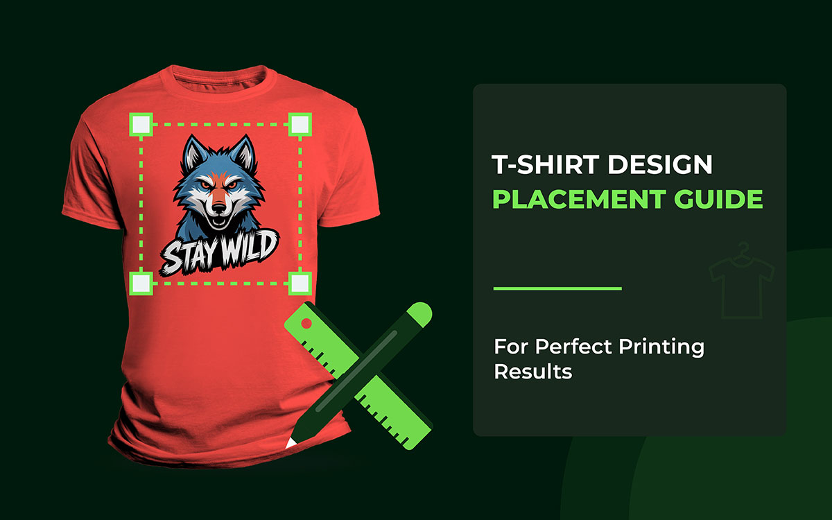
Are you looking for a T-shirt design placement guide to get the most out of your work T-shirts? This guide will help you identify the best spots for your designs, understand common measurements, and get valuable tips to ensure your t-shirt designs turn out fabulous every time.
A good design feels natural. It feels easy to look at. Every part of a t-shirt matters. The chest, sleeves, sides, and even the lower area each have their own rules.
When you follow these placement rules, your design looks great on any shirt. It does not matter if it is for kids or adults. Short sleeves or long sleeves. The design still works.
That is why designers and printers stick to standard placements. These spots keep designs clear, centered, and easy to see. No squinting needed. No awkward layouts either.
Using the tips and examples shared here can save you from common mistakes. Your design will not look too small. It will not sit too high. And it will not feel off-balance.
The following apparel design placement tips are invaluable if you want to make great t-shirts. It shows the correct numbers, the best spots, and competent advice. All of this helps your designs look clean and professional to print.
Sounds good, right? Let’s keep going!

Design placement on apparel decides where a logo or graphic sits on a T-shirt. It may look simple, but it is never random. Every good placement has a reason. It looks at how the eyes and the body move, and how the shirt is made. It also considers how the fabric acts when worn. The right spot can make a sweater feel clean and well-made. The wrong place can make it feel cheap.
When a design follows the body's natural shape, everything feels right. The shirt looks balanced and smooth. It feels professional. But when the design sits just a little off, something feels strange. Most people cannot say why. They just know it looks wrong.
In this section, I’ve explained how to position designs on t-shirts. It does more than say where to print. It explains why those spots work. These small choices make a big difference. They separate shirts that look professional from ones that feel like a mistake.
Let’s look at the t-shirt design placement guide for men and women!
Front placement isn’t a hard rule. It’s a series of choices that work together. Each choice changes how t-shirts feel on the body and how intentional the design appears. Where the design sits can quietly shape the entire look, even before someone notices the artwork itself.
Placement guides the eye. It tells people what to notice first and what to notice next. It also sets the shirt's mood. Some placements feel safe and familiar, while others feel bold or experimental. Many designs fail not because the art is bad, but because placement is treated as an afterthought rather than a design decision.
Once you understand how people look at things, placement starts to make sense. Fabric moves when a body moves. Nobody is perfectly flat or even. Shirts twist, fold, and stretch. When you see this, placement stops being a habit you follow and becomes a tool you use with purpose.
Now it’s time to break down the main front placement options. We’ll also look at the thinking behind each one, so the choices feel clear and intentional rather than random.
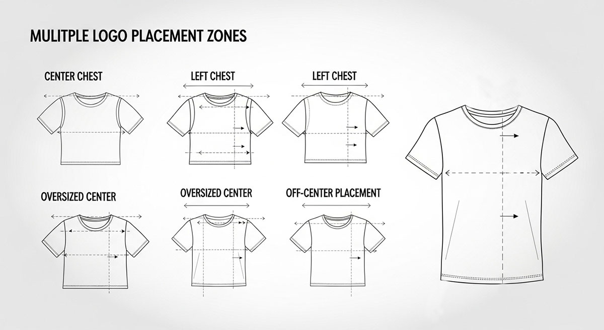
Center chest placement is the go-to choice for a simple reason. It just works. People recognize it right away. Your eyes know where to look. That’s why it feels comfortable the moment you see it. This spot has lasted through school uniforms, team jerseys, merch tables, and big brands. It matches how people expect clothes to speak without saying a word.
Why It Works So Well: Our eyes naturally start at the neckline and move down. That’s why putting a design in the center of the chest works so well. You see it right away. You don’t have to look for it. It just feels… right. It seems steady and planned. Years of seeing uniforms and sports jerseys have trained us to trust this spot. It gives a clear, confident impression.
Core Placement Logic: Sometimes, it’s not just about sticking something dead-center. It’s about how it looks on a real person. A design can be perfectly centered on paper and still feel off on a shirt. Things like collar height, chest length, and the shirt’s shape all change how your eye sees it. Brilliant designers leave a little space under the collar. That tiny gap lets the design “breathe.” It’s a slight touch, but it makes the difference between a shirt that looks professional and one that looks amateurish.
Advanced Considerations: When it comes to design, space really matters. The area above your design should feel lighter than the area below. If there’s too much space on top, the design looks like it’s sinking. If there’s too little, it feels cramped and harsh.
The “weight” of your design also makes a big difference. Heavy graphics or blocks of text need more breathing room from the collar. Small, simple designs can sit closer without feeling squished.
And don’t forget the shirt itself. A tight shirt squeezes the space. A baggy shirt stretches it out. So, where you place the design on the chest has to look right to the eye, not just follow a ruler.
When to Use It: This placement works best for the prominent logos, brand names, or designs you want people to notice right away. If you want your message to be clear and easy to read, this is the safest choice. It’s not about being fancy; it’s about being understood.
Expert Mistake to Avoid: Don’t line up the design with the collar instead of the chest. If you do, the image can slide up when someone wears it. Then it looks like it’s trying to climb up toward the neck, and that’s not a good look.
Pocket-style logos work because they remind us of something we know: a chest pocket. Even if the shirt doesn’t have a pocket, your brain fills it in. That’s why it feels right. It doesn’t look stuck on. It looks like it belongs.
This is why so many fancy or professional brands use this spot.
Why It Feels Professional: It does feel professional because this space isn’t about showing off. It’s about being there, quietly. Small logos don’t fight with the shirt. They sit like a signature. Your eyes don’t expect anything loud here. So when the logo is subtle, it feels confident. Strong brands don’t need to shout. This placement gets that.
Core Placement Logic: The basic rule is simple: pocket-style logos go on the upper left of the chest. They should feel connected to the body, not floating on the fabric. That means lining up with the shoulder seam, following the curve of the chest, and keeping everything balanced. If it feels off by even a little, the pocket trick stops working.
Advanced Considerations: There are a few other things to keep in mind. Size is huge. Tiny details vanish if the logo is too small. Keep it simple. Strong shapes, clean edges, and innovative use of space make it work.
Width matters too. If the logo is stretched too wide, it stops looking like a pocket. Then it just looks… wrong.
There’s also a subtle message here. Pocket-style logos show calm and confidence. They feel established, not aggressive. It’s quiet power.
Design Variations: Different shirts need minor tweaks. For fitted women’s tees, the logo usually goes a little higher on the chest. Oversized tees often need the logo to be a bit bigger, so it doesn’t get lost.
When to Use It:
Mistakes to Avoid: Placing the logo too low. Once it drops below the upper chest, it stops feeling intentional and starts feeling wrong.
Diagonal or off-center designs aren’t accidents. They’re meant to break the usual rules. They shake things up. They add energy, attitude, and personality. When done right, they feel bold and fresh. When done wrong, they look messy. The key is control.
Why Designers Use Them: Centered designs feel safe. They’re predictable. Off-center designs, on the other hand, create movement. They guide your eyes across the shirt rather than letting them stop at one spot. This makes the design feel alive. That’s why off-center layouts are popular in streetwear, teen fashion, and magazine-style graphics.
Core Placement Logic: Even if a design seems unbalanced, it still needs a “home.” The central part must have a point of weight, a spot that feels grounded. Without it, the design looks like it’s sliding off the shirt. People might not know why it feels wrong; they just think it.
Advanced Considerations: Angles matter. Sloppy angles look careless. Strong diagonal designs follow the body’s natural lines. They match the slope of the shoulders, the curve of the ribs, or the vertical pull of the torso.
Balance is important too. If a design leans one way, something else has to balance it. That could be space, lighter text, or adjusted spacing. Balance doesn’t disappear; it just becomes quieter.
Off-center designs move with the body. What looks perfect on a flat shirt can shift when someone wears it. Real-world testing isn’t optional; it’s a must.
When to Use It: These designs work best for brands that want to be bold. Streetwear. Artistic graphics. Pieces with a strong concept.
Printing Considerations: Placement has to be exact. DTG printing works best because it keeps everything precise.
Expert Mistake to Avoid: Don’t treat off-center designs like a free-for-all. They still need structure, even if you can’t see it.
Wrap-around designs change the way we see T-shirts. They don’t treat the shirt like a flat piece of fabric. Instead, they think of it as something that moves with your body. That’s what makes these t-shirt designs so cool. They give the shirt depth. They provide it with motion. The shirt feels like it was carefully made, not just printed.
Why This Works: When a design wraps toward the sides, it tricks your eyes into seeing the shirt in three dimensions. The artwork isn’t just sitting on your body. It moves with you. Every step, every twist, adds life to the design. That movement makes people notice it. It makes the shirt interesting.
Core Placement Logic: Placement is key. From the front, the design still has to look complete. Even if only part of it shows, it shouldn’t feel cut off. As the design wraps to the sides, it needs to look deliberate. The edges near the seams are tricky. Many designs fail here. If essential parts of the artwork hit the seam, it can ruin the effect.
Advanced Considerations: There are a few advanced tips. Side seams twist and stretch when you wear the shirt. Essential parts of the design shouldn’t be left out. Instead, they should fade or move into space.
Wrap designs also rely on subtlety. You don’t want to show everything at once. Suggestion works better than overloading the shirt. Fit matters too. Tight shirts squeeze the design. Oversized, loose shirts spread it out. Testing the design on different fits helps keep it looking right.
Design Variations: Different shirt styles affect how wraps work. Big, oversized tees can handle bold, wide designs. Tight, fitted shirts need more control. Too much wrapping can make the design look messy.
Printing Impact:
When to Use It:
Expert Mistake to Avoid:
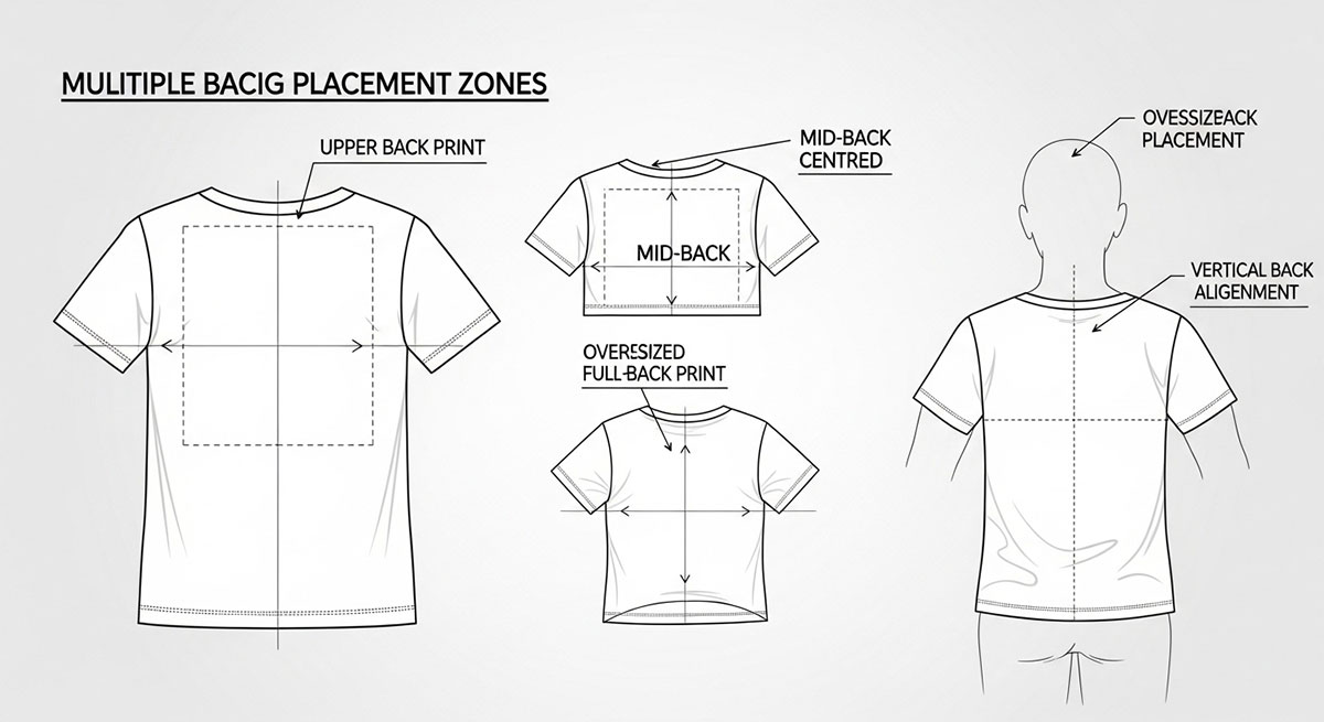
Back designs work differently from front designs. The front grabs people’s eyes right away. The back, though, does the quiet work. It tells the rest of the story. It sticks in people’s minds.
People usually see the back after they’ve already checked out the front. That means everything on the back should match the front. It should make sense with the story you’re telling.
A good back design feels like part of the shirt, not something added at the last minute. It flows with the front. A bad back design, on the other hand, can make the sweater look sloppy or unfinished.
The shoulder-to-shoulder print sits high on the upper back. It stretches across your shoulders, following their natural line. This placement feels bold but controlled. It shows confidence without taking over the whole back.
Why It Works: Your shoulders are strong and broad. A design placed here follows your natural shape, so it feels steady and robust. It grabs attention quietly, without shouting. Think of it as showing strength in a calm, confident way.
Core Placement Logic: The print should sit right between the shoulder seams. It shouldn’t hang too low or float away from your back. Imagine it like a headline on a page; short, clear, and intentional. People notice it right away, and it feels like it belongs.
Advanced Considerations: Be careful with horizontal tension. Designs too close to the seams may warp when your arms move. A little space around the edges keeps everything balanced.
Watch the neckline too. Too close to the collar, and it fights for attention. Too low, and it loses that strong shoulder-to-shoulder look.
Fonts matter here. Simple, tall fonts or all-caps work best. They naturally follow the long, horizontal shape.
Garment Variation Insight: Fitted shirts curve over the shoulders. Wide designs might get squished and need minor adjustments. Oversized tees are roomier, so the print may need to be wider to avoid looking narrow.
When to Use It: This style is perfect for brand names, team names, subtle authority statements, or secondary logos that pair with a simple front design. Anywhere you want a high-impact, confident accent, this works.
Common Expert Mistake: Printing too low. If it sinks, it loses power and can look awkward or like it’s floating.
When done right, shoulder-to-shoulder prints give shirts structure, clarity, and a polished, deliberate feel.
Putting a design in the middle of the back is so flexible. It’s calm, easy to read, and doesn’t fight for attention. Think of it like the center of the chest, but on the back, and with more room to play. This spot works when you want the back to say something clearly, without feeling crowded or messy.
Why It Works: The middle of the back barely moves when you sit, walk, or stretch. That makes it perfect for designs that need to stay readable. It also looks balanced and intentional, giving the shirt a clean, professional vibe, even if someone just glances at it.
Core Placement Logic: Imagine dividing the back into thirds. The top third is usually the sweet spot. It keeps the design away from the shoulders and the hem. Make sure it’s centered side-to-side, too, so it feels stable. This little trick makes the design look like it belongs there naturally.
Advanced Considerations: Size matters. You can go big here, but too much makes the shirt look heavy or crowded. Shirt shape matters, too. Fitted shirts for women may need the design to be lower to follow the back. Smaller shirts, like youth sizes, often need simpler shapes so the design doesn’t get lost.
Printing Method Impact: DTG (direct-to-garment) is excellent for detailed or colorful designs. Screen printing works best for bold, simple shapes with strong contrast. Whatever method you use, make sure the design is lined up right so it stays balanced.
When to Use It: Middle back prints are perfect for event shirts, band merch, promotions, or artsy illustrations. They get the message across without clashing with front or sleeve designs.
Common Mistake: Making it too small. Tiny prints look like stickers and ruin the shirt's flow.
When it’s done right, a middle back print feels natural, balanced, and professional. It lets the shirt speak for itself, without shouting.
The back of a t-shirt is more than just fabric. It is a canvas. Large, story-driven artwork treats it that way. Instead of a small logo or simple graphic, this placement allows for narrative, layers, and depth. It is where a design can tell a story and create an experience that the front cannot.
Why This Placement Exists: Story-based designs need room to breathe. The back provides space for multiple elements, including imagery, text, and symbols. It lets the artwork exist entirely without competing with front graphics. When done correctly, it turns the shirt into a wearable story rather than just clothing.
Core Placement Logic: Think of the back as a poster. The top section establishes context. The center carries the details. The lower section brings closure without touching the hem. Even large prints need hierarchy.
The viewer should know where to look first, next, and last. Negative space is as important as the illustration itself. Crowding the back kills readability and reduces impact.
Advanced Considerations: Fabric moves. Sitting, bending, and stretching distort large prints. Avoid placing crucial details near areas that crease or compress. Garment type matters. Oversized tees allow complex, layered compositions. Fitted tees require restraint and tighter layouts to prevent distortion.
Printing Method Impact: DTG is often best for multi-color, detailed artwork. Screen printing works well for bold designs but requires careful planning and limited color.
When to Use It: Large back artwork works well for concept collections, streetwear narratives, limited-edition releases, or art-focused brands. It is a statement piece meant to be experienced.
Common Expert Mistake to Avoid: Treating the back as a flat rectangle. The back moves with the body, and designs must account for motion, folds, and anatomy to feel intentional.
When executed thoughtfully, story-based back prints create T-shirts that capture attention, reward observation, and leave a lasting impression.
Bottom back placement sits near the hemline. It’s not where people usually expect a design, and that’s what makes it interesting. It’s subtle, playful, and a little unconventional. This spot doesn’t dominate the shirt; it rewards attention. When someone notices it, the design feels intentional, thoughtful, and clever.
Why It Works: Story-driven designs need room to shine. The back gives that space. You can fit images, words, and symbols without crowding. When it’s done right, the t-shirt stops being just clothes. It becomes a story you can wear.
Core Logic: Imagine the back as a poster. The top sets the scene. The middle shows the main action. The bottom wraps things up. Even big designs need a plan. Your eyes should know where to look first, then next, then last. Space matters as much as the art itself. Stuffing everything in makes it hard to see and weakens the impact.
Advanced Considerations: Clothes move. Sitting, bending, and stretching all change how the design looks. Avoid putting important details where the shirt folds or stretches too much. The type of t-shirt matters too. Big, loose shirts can handle detailed, layered designs. Tighter shirts need simpler layouts to avoid distortion.
Printing Impact: How you print the design matters. DTG (direct-to-garment) printing works great for colorful, detailed art. Screen printing is better for bold, simple designs, but it needs careful planning and fewer colors.
When to Use: Large back art shines in certain situations, like special collections, streetwear lines, limited-edition drops, or art-focused brands. These shirts are meant to be noticed and experienced.
Common Misakes to Avoid: Don’t treat the back like a flat rectangle. Remember, the shirt moves with the body. Designs should account for folds, curves, and motion. Otherwise, it looks sloppy instead of intentional.
When executed thoughtfully, bottom back prints turn ordinary T-shirts into memorable pieces. They reward attention, add personality, and give a shirt subtle depth. It’s a small space, but it can make a big impression.
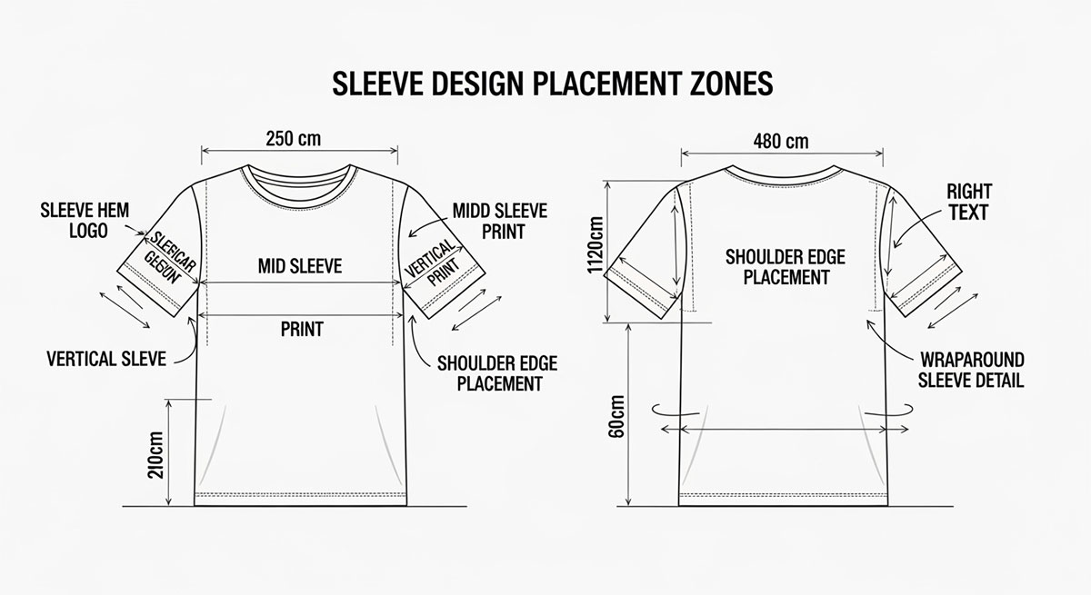
Sleeves might seem small, but they’re actually a secret spot for creativity. A well-designed sleeve can make a shirt stand out. It can grab attention, tell a story, and give the shirt character. Understanding how sleeves move, how fabric stretches, and how sizes differ helps you design smarter, not guess.
Text on sleeves is more than decoration; it adds motion, personality, and subtle messaging. The way it is oriented, vertical or horizontal, changes how it’s read and how it interacts with the wearer’s body.
Vertical Sleeve Text: Adding text to sleeves is more than just decoration. It can show personality, create 3D, and even send a subtle message. How the text is placed, vertical or horizontal, changes how it looks and how people notice it.
Advanced Considerations for Vertical Text: Letter spacing should be tight enough to read as a single element but not so tight as to become cramped. Longer text may need to be scaled down so it doesn’t wrap or distort when the arm bends. Body curves, such as the bicep, can slightly warp vertical letters, so testing on fitted mockups is essential to ensure readability and balance.
Horizontal Sleeve Text: Horizontal text creates a relaxed, casual vibe. It is easiest to read when the arm is at rest, so placement matters. Upper bicep placement works well for traditional or sports-inspired designs. Lower forearm placement is ideal for streetwear or playful statements.
Advanced Considerations for Horizontal Text: Avoid placing text too close to the shoulder seam or cuff, which can make reading awkward. Fabric stretch also matters. Thin or fitted sleeves may distort horizontal text when worn, so testing across sizes and fits is crucial.
Printing Methods: Screen printing works well for simple, bold text. DTG allows finer details and gradient effects. Heat transfer can be used for small or complex text, but alignment is critical.
Done correctly, sleeve text adds personality and movement. It can make a T-shirt feel intentional and complete, turning small areas into meaningful design opportunities. Vertical or horizontal orientation should be chosen thoughtfully, with placement, scale, and body movement in mind.
Sleeves are a subtle but powerful place for small graphics. Logos, icons, or small brand accents work here because they add detail without stealing attention from the front or back design. This placement creates interest when the wearer moves; the eye notices the arm in motion, making these graphics feel dynamic.
Why This Placement Works: Sleeve graphics let a brand or message exist quietly. They do not dominate the shirt, but they reward observers who take a closer look. Small details like this can make a sweater feel thoughtful and polished.
Core Logic: Placement depends on the sleeve’s natural lines. The upper arm, near the shoulder seam, is visible at natural eye level and works well for logos meant to be noticed without shouting. The lower arm, near the cuff or forearm, is more playful. Streetwear often uses this area for novelty icons or repeated motifs.
Scale is critical. Sleeves are narrow and curved. A logo that is too wide will warp when the shirt is worn. Designers must adjust the size to make it look intentional and proportional.
Advanced Considerations: Long sleeves can host multiple small icons along the arm to create rhythm and continuity. Fitted sleeves may need smaller graphics to prevent stretching. Oversized sleeves allow slightly larger logos, but designers must avoid crowding.
Printing Methods: Screen printing works best for flat, simple icons that maintain precise edges. DTG is ideal for detailed graphics or logos that follow curves. Heat transfer can also work, but it needs careful alignment to avoid shifting.
Done well, sleeve logos and icons turn small areas into meaningful parts of the shirt. They enhance movement, provide subtle branding, and give the garment a thoughtful, professional feel. These small accents can make the difference between a plain shirt and one that feels intentional and complete.
Double-sleeve designs use both sleeves to make a shirt feel complete. Think of it like giving the shirt rhythm and balance. The sleeves work together without stealing attention from the central front or back graphics.
Why Designers Use It: Adding design to both sleeves makes a shirt feel connected. It can show off a brand, tell a little story, or make the shirt more fun to look at. The effect is subtle but powerful. The front or back stays the star, while the sleeves quietly support it.
Core Logic: Both sleeves should match visually but never fight for attention. Designers often use mirrored text, repeated icons, or light graphic bands around the arms. Symmetrical designs feel neat and structured; great for casual or sportswear. Asymmetrical design ideas are more relaxed and edgy, perfect for streetwear or bold styles.
Advanced Considerations: Handedness matters. If a design is mirrored, it should make sense on both arms when someone wears the shirt. Keep spacing consistent from the shoulders to the cuffs so it looks intentional.
Movement changes everything. Sleeves bend, twist, and stretch. A design that looks perfect flat might look weird when arms move. Always test designs on real shirts or mannequins.
Common Mistakes: Uneven sizes or bad alignment can ruin the harmony. Ignoring the arm’s natural curve can make mirrored designs look warped or sloppy.
When done right, double-sleeve designs add a professional touch. They guide the eye, create flow, and make the shirt feel polished. Simple sleeves suddenly become a smart, intentional part of the whole garment.
Using sleeve designs with front graphics is a clever way to tell a bigger story. Instead of just two separate prints, the shirt feels like one connected piece. It makes even a simple T-shirt look thoughtful.
Why This Works: The sleeve can carry the story from the chest to the arm. It gives the design a sense of movement. When someone looks at it, their eyes naturally travel from the front to the sleeve. It makes the whole design feel complete, like it belongs together.
Core Logic: The sleeve should add to the front, not fight with it. This can be done with matching colors, small icons, patterns, or subtle themes. The front stays the main focus. The sleeve is just the sidekick.
Advanced Considerations: Sleeves move. When the wearer raises or bends their arms, the design shifts. The connection to the front should still feel intentional during movement.
Scale matters. Small front graphics pair with subtle sleeve details. Larger front designs call for proportionally larger sleeve accents to maintain balance.
Use negative space wisely. Layered or complex combos can become visually crowded if the shirt isn’t carefully balanced.
Printing Considerations: DTG is ideal for front-to-sleeve combos because it allows precise placement and alignment. Screen printing works too, but may need careful registration and separate platens for sleeves.
Common Mistakes: Making the sleeve compete with the front draws attention away from the main graphic. Misalignment or poorly scaled elements break the visual flow and make the design feel amateur.
When used thoughtfully, matching front and sleeve designs creates cohesion and gives the shirt a professional, intentional feel. It’s a way to elevate a simple T-shirt into something more dynamic and engaging.
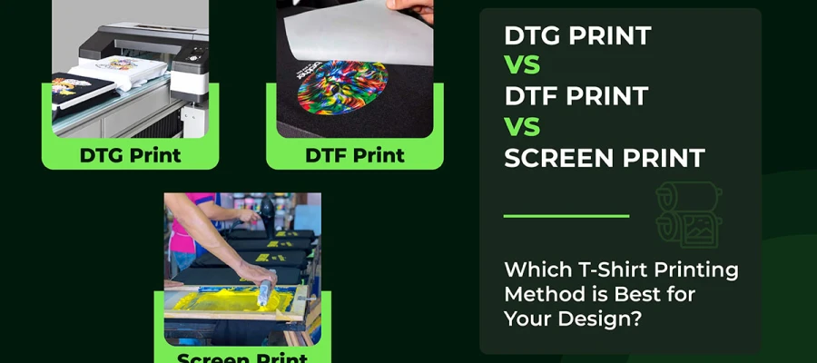
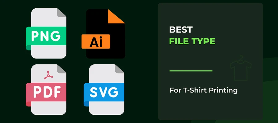
See the 8 types of t-shirt printing methods.
Putting a design on a shirt is just the first step. The real challenge is making sure it looks right on a person. Testing your design helps you see if it sits in the best spot. It shows you if it feels balanced, natural, and easy to look at.
The steps below will guide you in checking, adjusting, and improving every placement before you print.
Mockups are like practice runs for your design. Seeing a flat image on a screen is not the same as seeing it on a real shirt. Mockups let you imagine how the design works with the shirt’s shape, folds, and seams. This way, you don’t waste time or money printing something that looks off.
Shirts are three-dimensional and move with the wearer. A design that looks fine on a screen might feel too small, too high, or off-center once it’s worn. Mockups give you the chance to see problems early and make adjustments. They also help you check readability, color contrast, and balance across different fabrics and shirt colors.
Use high-quality mockups. Choose ones where you can move, scale, or rotate your design. Test it on different shirt sizes, styles, and colors. Look closely at how the design sits near collars, shoulder seams, and hems. If possible, add natural folds or movement to see how the design flows in real life.
Don’t test your design on only one size or color. Don’t ignore folds or curves of the body. And don’t rely on flat mockups for complicated designs; they can be misleading.
Using mockups properly gives your design balance and makes it easy to read. It helps you catch mistakes before printing. When done right, your shirt looks polished, professional, and just right. Mockups turn guesswork into clarity, making your design hit harder.
Looking at a digital preview of your design is helpful, but it only tells part of the story. The real test happens when your design hits the fabric. That’s where sample transfers come in. They let you see how the shirt’s material, fit, and printing method affect your design’s placement, size, and alignment.
This step is important because some problems don’t show up on a screen.
Shirts don’t stay still like a computer screen. They stretch, hang, and move with the body. A design might look perfect on your monitor, but on a real shirt, it can shift, stretch, or even look off-center. Printing a sample shows these issues early. That way, you can fix them before spending a lot of time and money on the full batch.
Start by printing one or two sample shirts. Use the same printing method you plan for the final run: screen printing, DTG, or heat transfer. Mark important spots like collars, seams, and hems. These marks help keep your design in the right place on all sizes.
Try the shirt on or move it around. Lift your arms, stretch, or bend. Watch how the design reacts. Does it stretch? Shift? Bend oddly? Adjust as needed. This small step can make a huge difference.
Don’t rely only on digital mockups. Don’t forget how the shirt moves or stretches. And don’t assume a design works on one shirt type for every size and fit.
Using sample transfers makes sure your design looks great in real life. It helps you check alignment, size, and spacing. Most importantly, it catches distortions before they become a problem. This step turns a good idea into a professional, polished shirt that looks balanced on anyone who wears it.
Even the best designers need someone else to look at their work. No matter how sure you are, it’s easy to miss small problems. A design might look perfect on your screen, but it can act differently on real fabric. That’s why feedback is so important.
Your design might seem flawless while you’re working on it. But once it’s printed, colors can change, lines can stretch, and shapes can look off on different shirt sizes. Asking for feedback early can save you time, money, and a lot of headaches.
It also helps you spot tiny issues that are easy to overlook. Things like crooked spacing, crowded details, or text that’s hard to read when someone moves can all be fixed before printing. Catching these early makes your design stronger.
Start with mockups or sample prints. Show them to friends, colleagues, or people who match your audience. Ask clear questions like:
Check the design on different shirt sizes and types. A design that works on a medium might look weird on an XL or a kid’s shirt.
Don’t ignore helpful feedback just because it looks fine to you. Don’t test on only one shirt type or size. And don’t rely only on computer previews; real fabric can be very different.
Getting thoughtful feedback makes your design feel intentional, easy to read, and perfect on all sizes. This is what turns a good T-shirt into a professional, polished one.
These FAQs answer common questions designers and beginners face. Placement is more than numbers. The right spot makes a T-shirt feel intentional, while a poor spot makes it look random.
Most people put it on the upper-left side. Keep it 2–3 inches below the collar. Line it up with the shoulder seam.
For adults, 3–4 inches below the collar works best. For kids, a little higher. It also depends on the shirt style.
Start about 3 inches below the collar. Let it cover the upper to mid-back. Leave some space near the bottom hem.
Yes. Bigger or smaller shirts need small adjustments. It keeps the design balanced and easy to read.
Use mockups and standard t-shirt graphic placement measurements. Make sample prints. Mark key points and test different sizes.
Small logos: 2.5–5 inches wide. Centered graphics: 6–8 inches. You can adjust for shirt type and audience.
Upper-left chest for logos. Center chest for main graphics. It looks balanced and is easy to read.
Measure from the collar and seams. Use mockups. Check optical centering. Test multiple sizes.
Yes, if you do it on purpose. Make the front design dominant. Use sleeves or the back as support. Keep everything balanced.
A t-shirt design guide is not just a final step. It can decide whether people love a shirt or leave it in their closet. Where the design sits on the shirt really matters. Good placement helps people see the design clearly. It also makes the shirt feel comfortable when worn.
When the design is placed well, the shirt looks neat and well thought out. It does not feel messy or rushed. This is important for any kind of shirt. It could be for a brand, a school event, or something you want to sell. Smart placement makes people trust the design and take it seriously.
If you want your latest t-shirt design ideas to stand out, start trying new placements. Test different spots on the shirt. Watch what grabs attention first. Pay attention to how the shirt feels on the body. Even small moves can change the whole look.
For expert tips and ready-made mockups, check out our blog article. It can help you improve your t-shirt designs and move to the next level.
Best of luck on your creative journey!