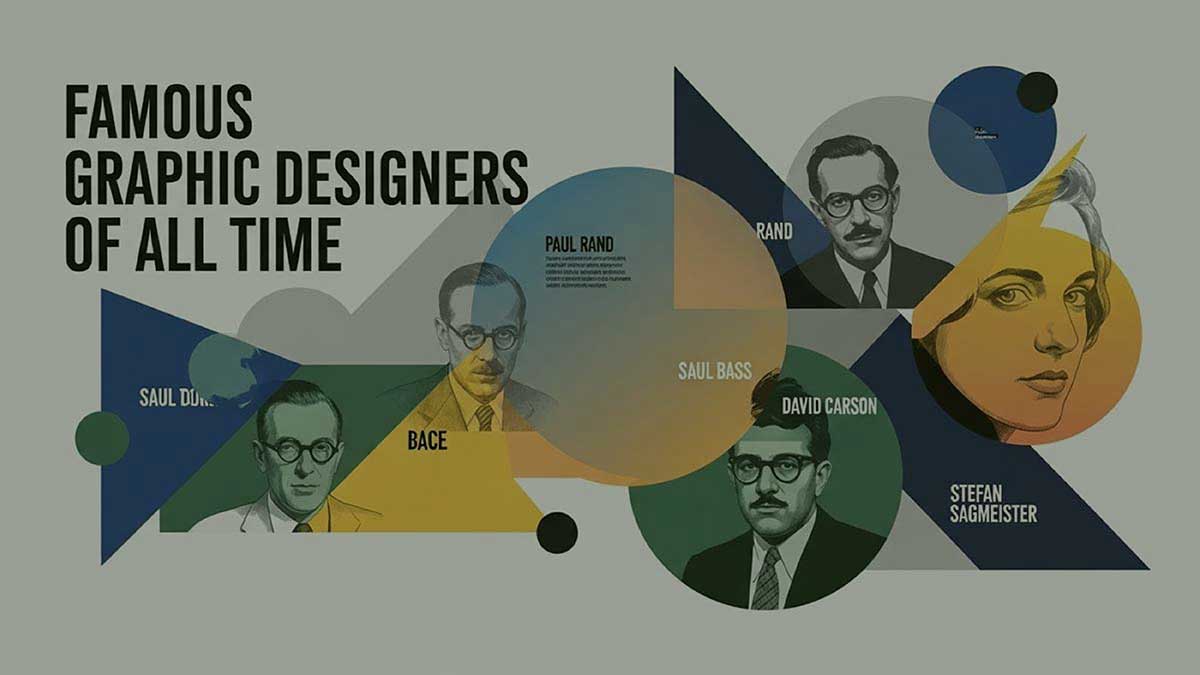
The most famous graphic designers have changed the dynamic of modern designs. From Stephen Sagmeister to Paul Rand, every designer has evolved the graphic design standard little by little. They’re the innovators of visual branding, typography, advertising, and digital media design today.
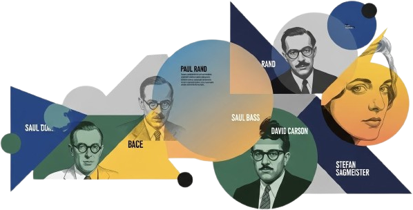
So, who are these legendary graphic designers of all time? How did they change the way we see the world? You’re about to find them out. The people designed custom logos, posters, apps, and visual styles that people still recognize.
Companies with thoughtful designs get up to 32% more attention and customer loyalty. That’s how powerful good design can be. When you read about the creators behind these visuals, you’ll learn their ideas and strategies that make modern design work.
So, let’s meet the 25 most famous graphic designers and their most iconic designs below!
The history of graphic design didn’t evolve overnight. It grew gradually and steadily by the creators who saw the world differently. These graphic designers broke the rules and tried new ideas. They played with letters, shapes, and layouts in ways no one had seen before.
Because of these creative design masters, the designs we see today are full of personality. Their design became the base that modern creators still build on. And their ideas keep inspiring people all over the world.
Here’s a list of the 25 most famous graphic designers and the most iconic works that made them famous.
Paul Rand was born Peretz Rosenbaum in Brooklyn in 1914 and lived until 1996. He is the most influential graphic designer in history. Paul Rand changed the way companies think about design. He mixed ideas from European art movements like Bauhaus, Cubism, Constructivism, and Swiss Style with practical American thinking.
Paul Rand believed design should be simple but powerful. It should look good and clearly show what the brand identity is for. Paul Rand thought that using universal, abstract visuals could help companies grow.
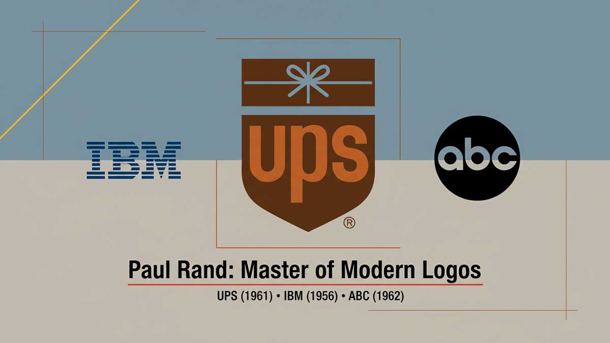
One of his most famous designs was for IBM. Paul Rand's designs there showed that smart, well-thought-out design could be a key part of business strategy. Because of this, many people call him the “father of graphic design.” His influence spread to New York, London, and Toronto during the mid-century modernist movement.
Paul Rand designed the UPS shield logo in 1961. IBM had its famous 8-bar wordmark from 1956 to 1972. ABC created its round logo in 1962. These custom logos are still around today, almost the same as they were back then. It made Paul Rand famous.
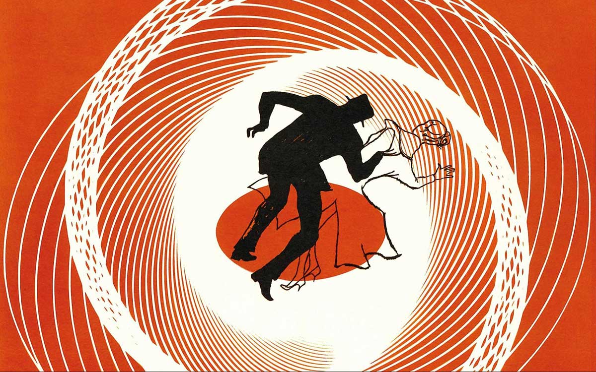
Saul Bass (1920–1996) is considered the best graphic designer of all time. He changed the way people think about graphic design. Saul Bass made movie title sequences more than just names on a screen; they became little stories themselves. Born in Brooklyn, Bass loved using bold shapes and symbols. His designs were simple but powerful.
Saul Bass worked with famous movie directors such as Alfred Hitchcock, Otto Preminger, and Martin Scorsese. Together, they made some of the most memorable visuals in movies. But Saul Bass didn’t just work in film. He also created logos for big companies like AT&T, United Airlines, and Minolta. These logos are still famous today.
Saul Bass believed that simple designs with smart ideas could last forever. His style, inspired by the Bauhaus movement, still influences designers. Even now, people look at his work and feel inspired.
Saul Bass was a true pioneer in movies. He invented the first animated opening titles for films. Saul Bass also made some of the most famous movie posters for Vertigo, Psycho, and The Man with the Golden Arm, and designed AT&T and United Airlines’ logos.
Milton Glaser was one of the many graphic design legends who was born in the Bronx in 1929. He changed American graphic design. His work mixed fine art with commercial design, making both more exciting.
In 1954, Milton Glaser co-founded Push Pin Studios, a famous design studio. There, he brought back styles like Art Nouveau and Art Deco, but made them modern and fresh. Milton Glaser's designs were smart and easy to understand.
In 2009, President Barack Obama gave Milton Glaser the National Medal of Arts. Milton Glaser was the first graphic designer to ever get it. His design inspired designers all over the world, from New York to London, Toronto to Vancouver. He set the standard of graphic design today.
Milton Glaser died on his 91st birthday in 2020. He left behind a huge, lasting impact on art and design.
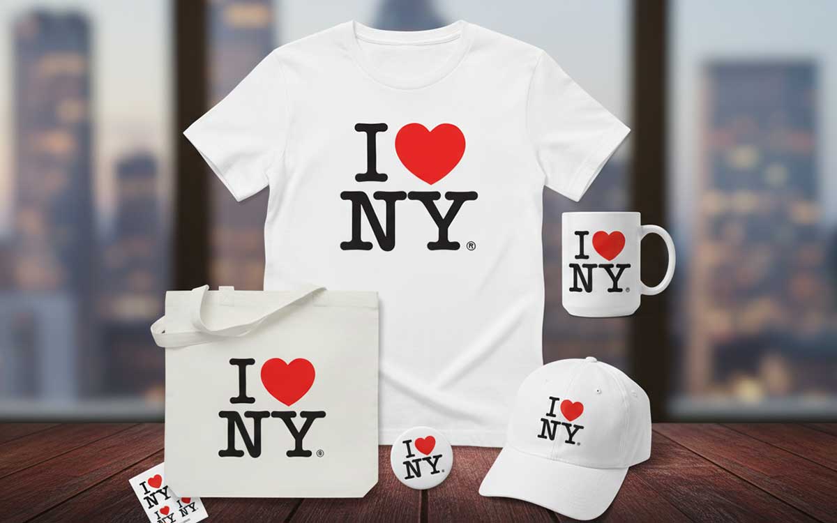
Milton Glaser is famous for some well-known designs. One is the I ❤ NY logo from 1977, which became a cultural heartbeat, appearing everywhere from billboards to t-shirt designs around the world.
Milton Glaser also created the legendary 1967 psychedelic Bob Dylan poster, featuring the musician’s silhouette filled with vibrant, swirling rainbow hair. That design became a counterculture icon, widely reproduced on walls, album collections, and yes, countless t-shirts worn by fans who wanted to carry a piece of that era with them.
Chip Kidd is one of the most famous book cover designers in America. He changed the way people see and connect with books. Born in Pennsylvania, Kidd started working at the publisher Alfred A. Knopf in 1986. Since then, he has designed thousands of book covers.
Chip Kidd’s style is simple and smart. He uses bold letters and clever pictures that make each cover feel like its own little story. People don’t just see his covers; they remember them.
Chip Kidd has won many awards, including five Eisner Awards, the AIGA Medal in 2014, and the American National Design Award in 2007. He has designed covers for famous writers like Cormac McCarthy, Haruki Murakami, and Michael Crichton.
Today, Chip Kidd is the Vice President and Art Director at Knopf. He still helps with book cover design that grabs attention and tells stories for readers.
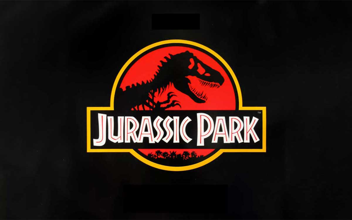
Chip Kidd is famous all over the world for designing the T. rex skeleton logo for Jurassic Park in 1990. His design became the face of the franchise. You could see it in all the movies and on toys, clothes, and other merchandise. Everyone instantly recognizes it.

Jessica Walsh is one of the Iconic graphic design artists and an art director from New York. She is known for making colorful designs that make people feel something.
Jessica Walsh went to the Rhode Island School of Design (RISD) and finished in 2008. Just a few years later, at 25, she became a partner at a big design studio called Sagmeister & Walsh. That made her one of the youngest partners ever.
In 2019, Jessica Walsh started her own company called & Walsh in Brooklyn. Her team helps big brands like Levi’s, Adobe, and The Jewish Museum with their design and ideas.
Jessica Walsh has won lots of awards, like Forbes’ 30 Under 30 and the 2024 D&AD President’s Award. Jessica Walsh is respected in design communities in New York, London, and Toronto.
Jessica Walsh is famous for a project called 40 Days of Dating that went viral online. In 2024, she started something new called Type of Feeling. It’s a small business that makes special typography. This typography is designed to show emotions, so the letters themselves can feel a certain way.
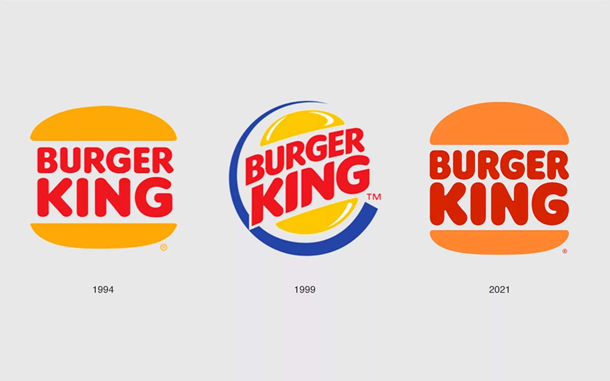
Debbie Millman is a famous designer who has worked with Burger King, Häagen-Dazs, and Tropicana brands. For twenty years, she led the design team at Sterling Brands and helped shape how these companies look and feel.
In 2005, Debbie Millman started a podcast called Design Matters. It talks about design, creativity, and ideas. The podcast became very popular. People all over the world listen to it, and it even won a big design award.
Debbie Millman has also shaped design education. She co-created the first-ever graduate program in branding at New York’s School of Visual Arts. Debbie Millman has been a leader in AIGA, a major design organization, and many magazines call her one of the most influential designers today.
In 2024, Harvard Business School made her an Executive Fellow, showing that Debbie Millman is not just a designer but also a thinker who shapes how people see design.
In 1999, Debbie Millman helped give Burger King a whole new style. She also worked on Star Wars merchandise, making it exciting for fans. On top of that, Debbie Millman hosts a podcast called Design Matters. It has won awards and made people see design in a totally new way.
David Carson changed the world of graphic design in the 1990s. David Carson didn’t follow the usual rules. Instead, he played with letters, shapes, and layouts in wild, creative ways. People called him the “Godfather of grunge typography.”
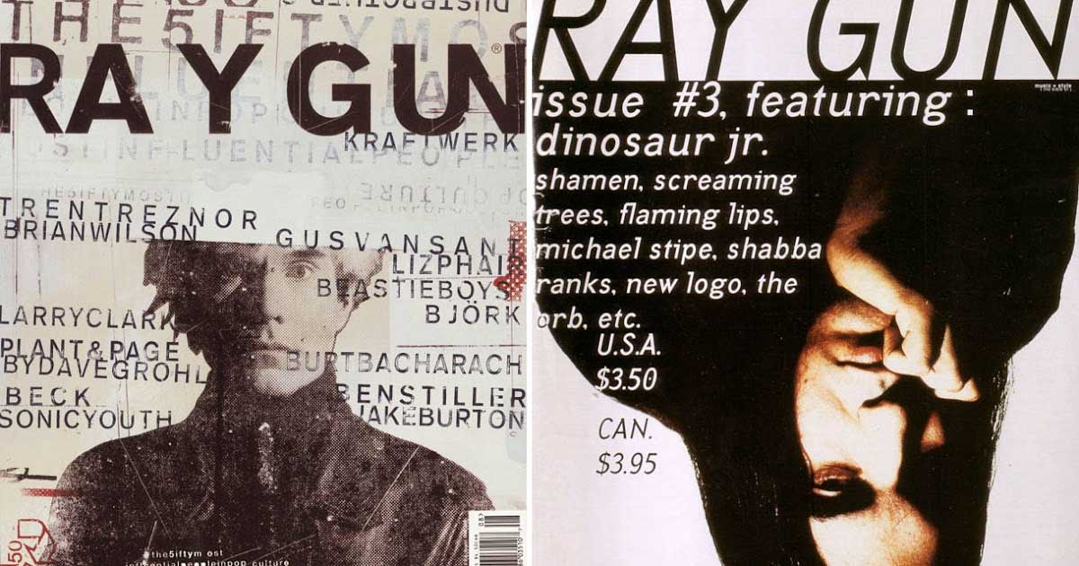
David Carson taught himself design and worked as art director for Transworld Skateboarding, Beach Culture, and the famous Ray Gun magazines. His pages looked messy or broken, with letters that were stretched or twisted. At first, some people thought his designs were hard to read. But those designs made people feel something.
David Carson didn’t just design for magazines. Big brands like Nike, Pepsi, Levi’s, and Ray-Ban hired him, too. Even today, he works on high-end projects, like designing for The Macallan whisky. His ideas still inspire designers all over the world.
David Carson is famous for making wild and messy cover designs for Ray Gun magazine. He liked to break all the normal rules of layout.
One of his most famous moves was a 1994 interview with Bryan Ferry. He printed the whole thing in Zapf Dingbats, a font made of symbols instead of letters. It was his bold way of saying, “I don’t follow the rules of design.”
Paula Scher was born in 1948. She is one of the most famous graphic designers in the world. She changed the way big companies and cultural institutions look with their logos and designs.
In 1991, Paula Scher became the first woman to be a top partner at Pentagram, a big design company. She started using letters and fonts in bold, creative ways to make brands stand out. Her style is loud and full of energy. Paula Scher mixes ideas from Russian Constructivism and Art Deco, which makes her work different from plain, boring corporate designs.
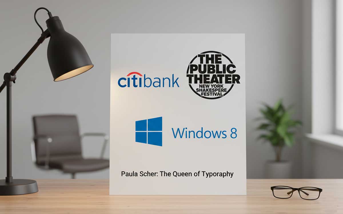
Paula Scher also uniquely paints maps. Some of her paintings are in MoMA, a famous art museum. She has designed logos and visual systems for big names like Citibank and The Public Theater.
Paula Scher has won more than 300 awards for her work. Some of the biggest are the AIGA Medal in 2001 and the National Design Award in 2013. Even today, she keeps changing how words and letters tell stories in New York City and beyond.
Paula Scher is one of the popular graphic designers today for her work with letters. In 1994, she gave the Public Theater a look that everyone remembers. In 2002, Paula Scher redesigned the Citibank logo. And in 2012, she worked on Windows 8. Scher doesn’t just make logos; she turns them into pieces of culture.
April Greiman mixed the clean style of Swiss design with the creative style of West Coast art. She did this by experimenting with computers in ways no one had tried before.
In 1976, April Greiman moved from New York to Los Angeles. There, she became known as a designer who wasn’t afraid to use new technology, even when others were skeptical. In 1984, April Greiman started using a Macintosh computer early on, which was unusual at the time.
Greiman created her own style called “hybrid imagery.” She combined letters, photos, videos, and digital effects to make designs that felt alive and full of movement. Her work at CalArts and her company, Made In Space, taught young designers to see computers not just as tools, but as partners in creating art.
Today, April Greiman is a full professor at USC Roski School of Art and Design. Her influence can be seen in big art shows, including MoMA in 2025 and LACMA in 2024–2025. She continues to inspire new generations of artists to explore design in bold, creative ways.
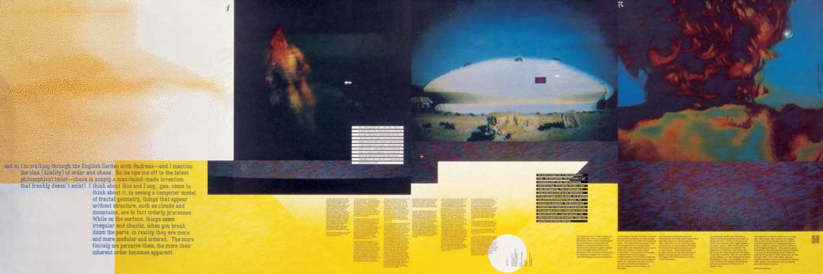
April Greiman is famous for her creative work in the 1980s. One of her pieces, Does It Make Sense? (1986), is a fold-out poster for Design Quarterly. It mixes digital images in new and surprising ways. Another work, Pacific Wave (1987), shows her bold digital style and clever use of letters. Both works helped change how people thought about design.
Shepard Fairey is an American street artist, designer, and activist. He became famous for his OBEY Giant campaign, which changed the way people see urban art. Fairey was born in Charleston, South Carolina, in 1970. In 1992, he graduated from the Rhode Island School of Design.
Fairey’s art mixes old Soviet propaganda style with modern messages about society. He talks about power, fairness, and taking care of the environment. The Institute of Contemporary Art in Boston calls him one of the most important street artists of our time.
His work is shown in big museums like The Smithsonian, MoMA, and the Victoria and Albert Museum. In 2024, his exhibitions in Milan and Los Angeles show that he still uses art to fight for causes he believes in.
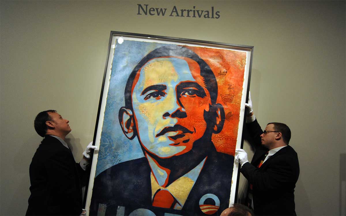
Shepard Fairey became famous all over the world for his 2008 Barack Obama "Hope" poster. The New Yorker even called it “the most powerful American political picture since Uncle Sam Wants You.”
Before that, in 1989, Shepard Fairey started the Andre the Giant Has a Posse sticker campaign, which later became known as OBEY Giant. Both designs spread everywhere and got people talking.
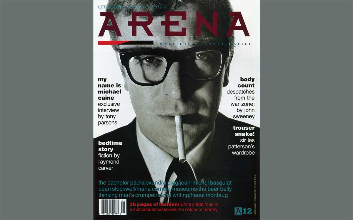
Neville Brody is an English graphic designer and art director. He also makes typefaces, which are the styles of letters you see in magazines and online. In the 1980s, Neville Brody changed the way magazines looked. One of his big projects was The Face magazine, which he worked on from 1981 to 1986.
Born in 1957, Neville Brody liked to break the rules of design. Neville Brody tried new ways of arranging text and images instead of following the usual grids. He also created experimental fonts that looked different and exciting. His style mixes Art Deco shapes with ideas from other cultures, making his work feel fresh and unique.
Neville Brody became famous as one of the first designers to explore digital typography. In 2011, he received the Royal Designer for Industry award, which is the highest honor a designer can get in the UK. In 2014, Brody started his own company, Brody Associates. Since then, he has worked with Supreme, Christian Dior, BBC, and Samsung brands.
Neville Brody is famous for changing the way magazines look. He worked on The Face and Arena. Brody also created cool, well-known fonts, like Industria in 1984. Later, in 1991, he worked on FUSE magazine. This project was an experimental and mixed design with technology. It started a new way of using digital type in creative ways.
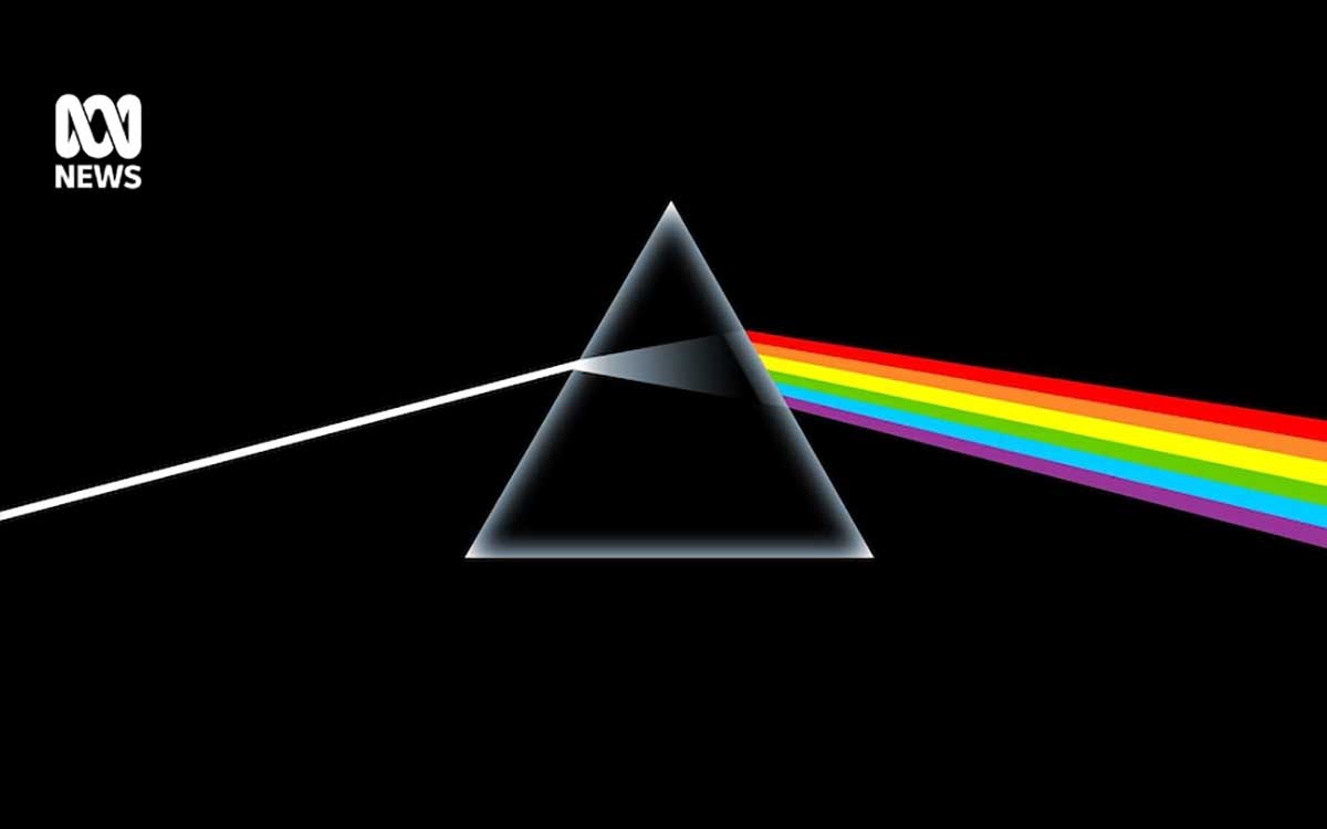
Storm Thorgerson (1944–2013) was a British artist who changed the way album covers looked. In 1968, he started a design studio called Hipgnosis with his friend Aubrey Powell. Unlike many artists today, Storm Thorgerson didn’t use computers. Instead, he built real sets and strange scenes to make his ideas come to life.
Thorgerson loved the painter René Magritte and often put ordinary objects in unusual places. This made people stop and think. He made people ask, “What is really happening here?”
Storm worked with Pink Floyd for over 40 years, creating some of the most famous album covers in music history. Storm Thorgerson also designed for Led Zeppelin, Muse, The Mars Volta, and Biffy Clyro bands.
Later, Storm Thorgerson ran his own studio, StormStudios, where he made even more complex and mind-bending images. His work was so clever that it looked like Photoshop before Photoshop even existed.
Even today, his style influences new designers. Prog Magazine even created the Storm Thorgerson Grand Design Award to celebrate his lasting impact on music and art.
Storm Thorgerson is best known for designing the cover of Pink Floyd’s album The Dark Side of the Moon in 1973. It shows a simple prism with light shining through it. Many people think it’s one of the greatest album covers ever made.

Jonathan Barnbrook is a British designer and filmmaker. He is famous for making bold and unusual designs that often have a political message. He was born in 1966 in Luton, UK. He studied art at Saint Martin's School of Art and the Royal College of Art, finishing in 1990.
Jonathan Barnbrook works in many areas, mixing activism with commercial design. Since 1997, he has made creative and experimental fonts through his own company, VirusFonts.
Jonathan Barnbrook is also well-known for working with David Bowie from 2002 to 2016. Together, they made famous album covers like Heathen, Reality, The Next Day, and the Grammy-winning ★ (Blackstar).
One of his fonts, called Mason, became so important that the Museum of Modern Art in New York bought it in 2010. Today, his work influences both art and design all over the world, from London to New York.
Jonathan Barnbrook is famous for designing the album cover for David Bowie. That cover won big awards. In 2016, it got a Grammy for Best Recording Package. It also won the Beazley Graphic Design of the Year.
Peter Saville was born in Manchester in 1955. He changed the look of music in the late 1970s and 1980s. He co-founded Factory Records, a famous record label.
Saville didn’t make typical rock album covers. Instead, he used simple shapes, clean letters, and ideas from old paintings. Peter Saville mixed modern design with art history in a way that felt smart and fresh.
His work wasn’t just for music. Peter Saville also worked in fashion. He helped redesign Burberry and worked with big names like Calvin Klein, Christian Dior, and Stella McCartney.
People recognized his talent. Peter Saville became a Royal Designer for Industry and won the London Design Medal in 2013. In 2020, he got a CBE, one of Britain’s top honors. Today, he is seen as one of the most famous graphic designers in the UK.
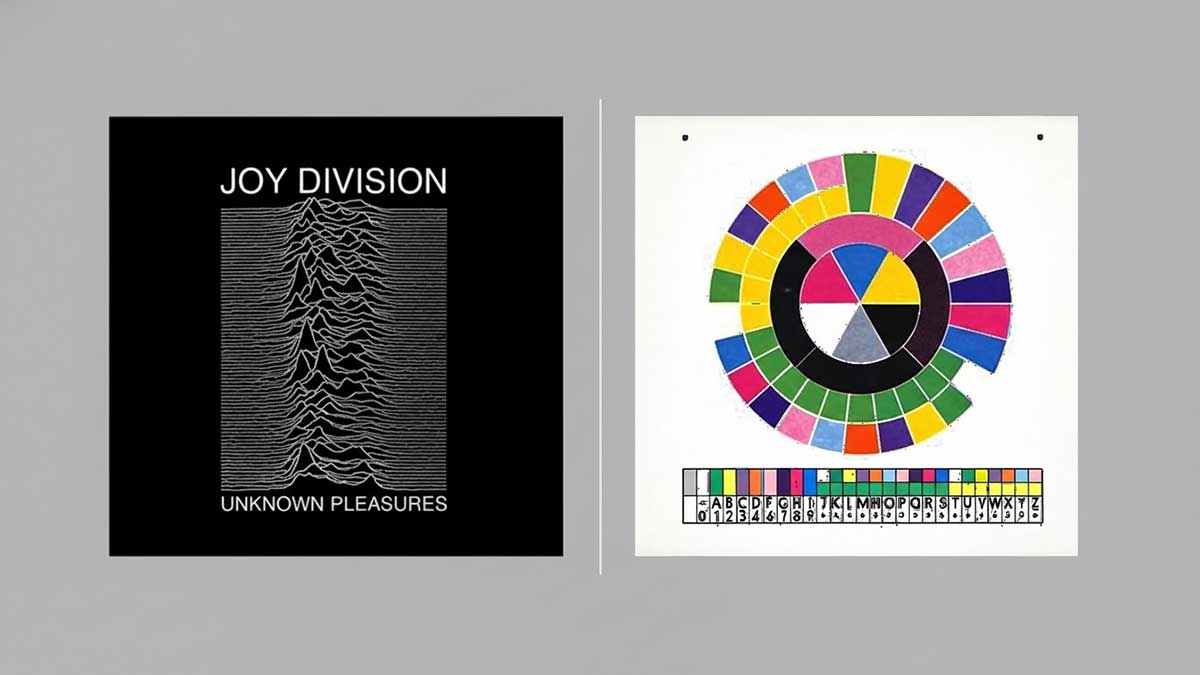
Peter Saville is famous for his work with the bands Joy Division and New Order. He designed the cover for Joy Division’s album Unknown Pleasures in 1979. It shows a cool pattern of pulsar radio waves.
Later, in 1983, Peter Saville designed New Order’s single Blue Monday. Its cover was unique. It looked like a floppy disk and used color codes that were like a secret code. His designs became iconic and shaped the style of the 1980s.

Alan Fletcher (1931–2006) was a famous British graphic designer. He co-founded a design company called Pentagram in 1972. Alan Fletcher changed the way companies showed themselves to the world, using clever, simple, and smart designs.
People often call him “The Father of British Graphic Design.” He took the old rules of modern design and made them fun, clear, and thoughtful. Alan Fletcher was born in Nairobi and studied art in London and at Yale University in the US.
In 1962, Fletcher started his own design studio, Fletcher/Forbes/Gill. He worked with big clients like Pirelli, Cunard, Penguin Books, and Olivetti. His work became famous not just in the UK, but also in the US and Canada.
Fletcher loved telling stories through design. He used letters, colors, and shapes to explain big ideas in simple, eye-catching ways. His designs were smart, elegant, and always left a strong impression.
Alan Fletcher is famous for designing some really well-known logos. In 1989, Fletcher created the logo for the Victoria and Albert Museum, also called the V&A. Back in 1965, he designed the Reuters logo, which has 84 little dots. He also made the identity for the Institute of Directors, known as the "IoD."
Abram Games (1914–1996) was a famous British graphic designer. He believed in “maximum meaning, minimum means,” which meant saying a lot with very little. This idea changed how posters were made in the 20th century.
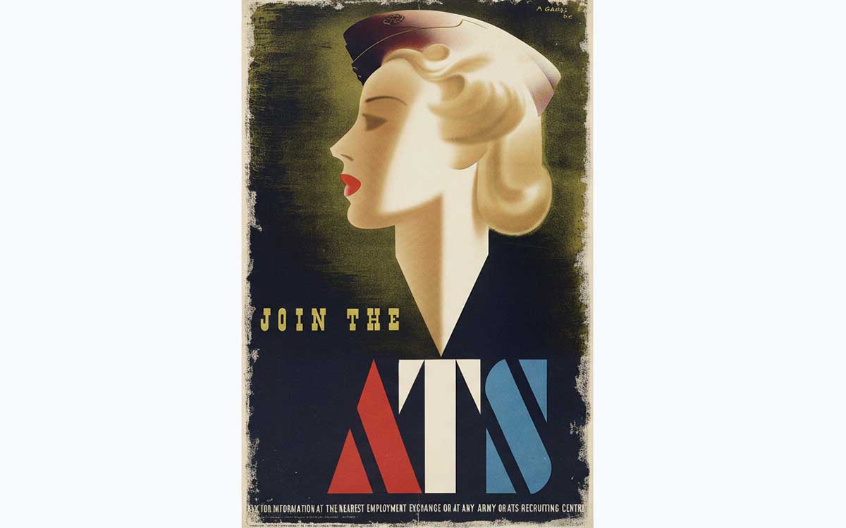
Games was born in Whitechapel, London. During World War II, he became Britain’s Official War Poster Artist. Abram Games made over 100 powerful posters that encouraged people to support the war. These posters became some of the most memorable images of the time.
His style was bold and simple. He used strong symbols, clear letters, and expert airbrushing to make his work stand out. Because of his talent, Abram Games received big honors like the OBE, RDI, and the D&AD President’s Award in 1991.
Games are also designed for London Transport, Guinness, the BBC, and the United Nations. Even today, his ideas still inspire graphic designers all over the world.
Abram Games is famous for a few iconic designs. One is the "Blonde Bombshell" recruitment poster for the ATS in 1941. Abram Games also made the very first animated logo for BBC TV in 1953. And he designed the emblem for the Festival of Britain in 1951. All of these show his style: simple designs that make a big impact.
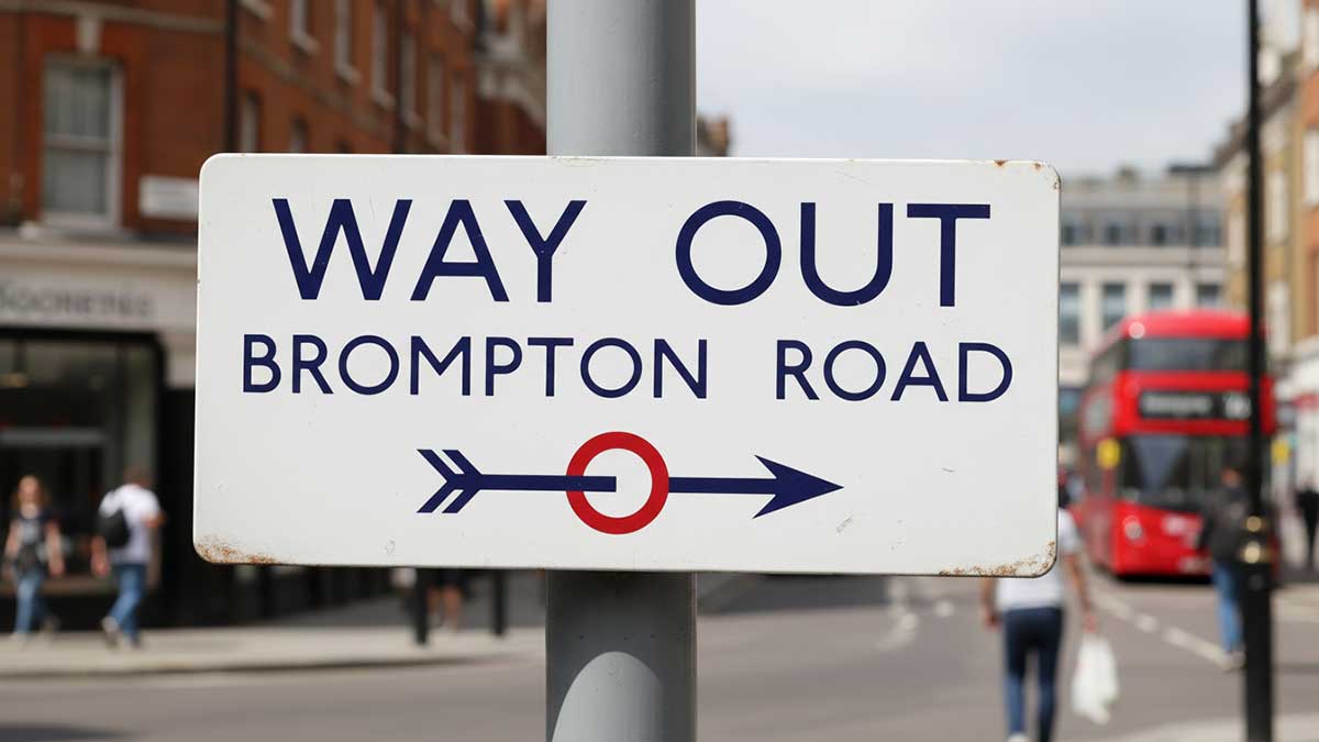
Margaret Calvert is a famous British designer who changed the way people see road signs. She worked with Jock Kinneir in the 1960s to create the UK’s modern road signs.
Margaret was born in South Africa but moved to Britain. She had a talent for making complicated information easy to understand. Together with Jock, she designed all of Britain’s road signs—a huge and important project.
Some of her signs are very well known. The ‘School Children Crossing’ sign was based on a picture of her as a child. The ‘Farm Animals’ sign shows a cow called Patience from her family’s farm in Warwickshire. People still recognize these signs everywhere in the UK.
In 2016, Margaret Calvert was given an OBE for her work on typography and road safety. In 2024, she received the TDC Medal, one of the top awards in design. Today, she is remembered as one of the most important designers in history.
Margaret Calvert is famous for helping design the road signs we see all over the UK. She also created special fonts called the Transport and Rail Alphabet. On top of that, Calvert invented pictures and symbols that help people understand things quickly. These simple designs have made roads and public places much safer for everyone.
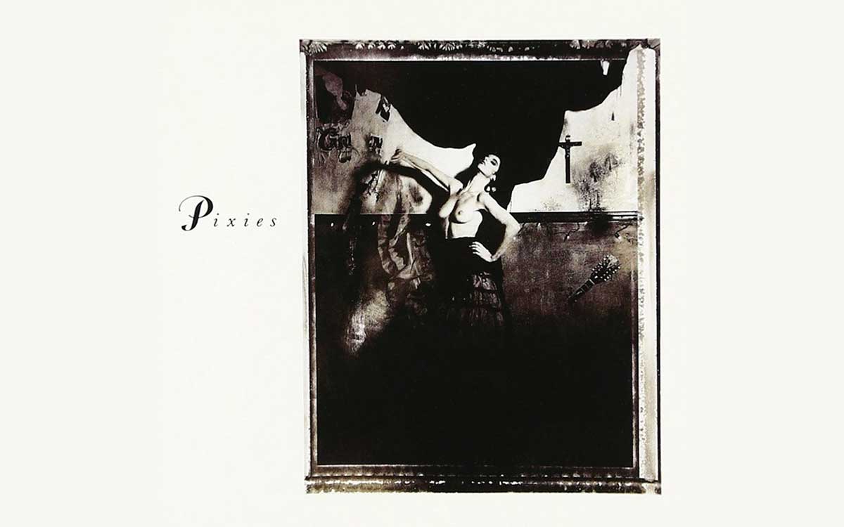
Vaughan Oliver (1957–2019) changed the way music looked. He worked as the art director for 4AD Records, a label known for alternative rock. There, he created unique styles for some of the most famous bands in that scene.
Oliver ran studios called 23 Envelope and v23. In them, he mixed strange, dreamlike images with experimental fonts and eerie photos. His album covers were like little worlds you could get lost in.
In 2013, Vaughan Oliver joined the prestigious Alliance Graphique Internationale (AGI), a group of the world’s top designers. He worked closely with photographers like Simon Larbalestier and Nigel Grierson. Together, they made a dark, dreamy style that influenced independent music.
Vaughan Oliver is famous for making album covers that people remember. He designed the artwork for Pixies’ Surfer Rosa and Doolittle. Oliver also made the cover for The Breeders’ Pod and all of the Cocteau Twins’ albums. His work helped give the record label 4AD a unique, dreamy, and surreal look.
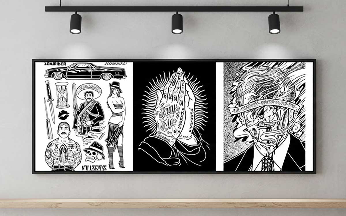
Mike Giant, whose real name is Mike LeSage, was born in 1971 in upstate New York. He became a key figure in San Francisco’s underground art scene in the mid-1990s. People around the world know him for his super clean black-and-white designs.
Giant studied architecture at the University of New Mexico. In 1993, he moved to San Francisco and joined Think Skateboards. He spent about ten years there, developing his own unique style. His art mixes graffiti, tattoos, illustration, and skateboard designs in a way that feels totally his own.
In 2003, Mike Giant co-founded a streetwear brand called REBEL8 with Josh D. They made fashion with a bold, rebellious style inspired by underground culture.
Mike’s art is also shaped by Buddhist meditation. He uses it while he draws, turning his work into a kind of mindfulness practice. Through his art, he shares ideas about life and philosophy in a visual way.
Mike Giant is famous for his amazing pen-and-ink drawings. He doesn’t use colors or shading; just black and white. His art is full of strong, bold letters and cool tattoo-style designs. Giant also makes detailed skateboard graphics for Think Skateboards and designs clothes for REBEL8 streetwear. His work is sharp, eye-catching, and full of energy.
Aries Moross (they used to go by Kate Moross) is a creative designer from London. They don’t identify as just male or female. They make cool illustrations, graphics, and designs that really stand out.
In 2012, Moross started their own studio called Studio Moross. Since then, they’ve worked with big music stars like Kylie Minogue, Disclosure, Sam Smith, and the Spice Girls. They’ve also made eye-catching designs for huge brands like Nike, MTV, and Netflix.
Aries has done lots of other exciting projects, too. They helped with nationwide ads for Cadbury’s, created clothes for Topshop, and directed visuals for music festivals like Parklife and Glitterbox.
Their style is wild, colorful, and a bit psychedelic. Because of their work, Moross has won awards and recognition, including the ADC Young Guns Award in 2012 and a UKMVA Award in 2014.
Kate Moross uses bright, almost trippy colors that catch your eye. The letters look like they were drawn by hand. Shapes and patterns are mixed in with the letters. Everything feels full and busy, but exciting. These designs are made for music campaigns and entertainment brands. Moross gives each brand a loud, unforgettable look.
Massimo Vignelli (1931–2014) was a designer from Italy. He believed in keeping things simple. Vignelli once said, "If you can design one thing, you can design everything."
Vignelli worked on many kinds of design. This included logos, signs, furniture, and buildings. His work was so important that he won big awards. In 1983, he got the AIGA Gold Medal. He also won the Compasso d’Oro twice, in 1964 and 1998. Massimo Vignelli showed that simple, clean design can be powerful and lasting.
Early in his career, Vignelli worked with famous Italian designers like Achille Castiglioni and with Venini glassworks. In 1957 and 1958, he taught at Chicago’s New Bauhaus. Later, in 1965, Massimo Vignelli helped start Unimark International, the first design company with offices all over the world. As design director, he created corporate logos and identities that defined the look of an era.
Vignelli won many awards for his work. In 1982, he entered the Art Directors Club Hall of Fame. In 1985, he received the first Presidential Design Award. His work still inspires designers today.
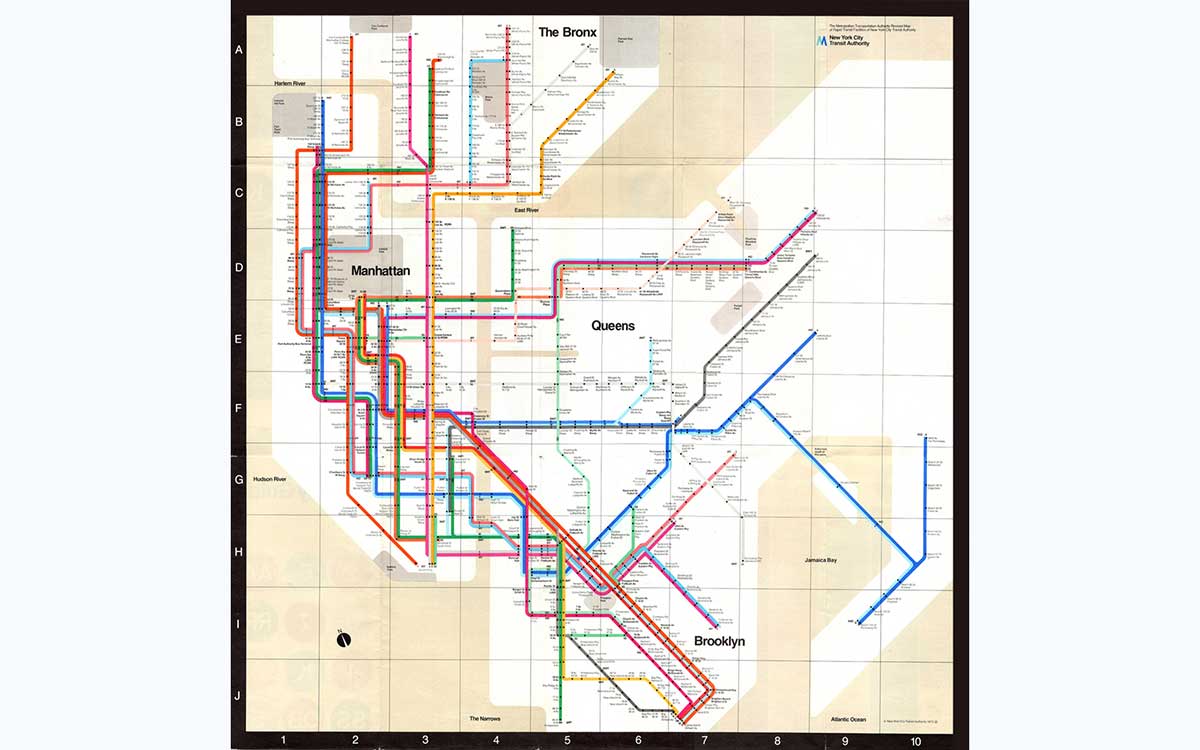
Massimo Vignelli is famous for his 1972 New York City Subway map. It used only straight lines at 45° and 90° angles. Some people didn’t like it, and it was replaced in 1979. But it was so good that it inspired a new MTA map in 2025.
He also designed the American Airlines "AA" logo in 1967 and Bloomingdale’s famous brown bag in 1973. He made stackable Heller dinnerware in 1964, which even won the Compasso d’Oro award.
Tibor Kalman (1949–1999) used design to make people think and talk about important issues. He was born in Budapest, Hungary. When Kalman was seven, he and his family fled the country because of the Soviet invasion. That experience as a refugee made him care deeply about fairness and justice.
Kalman didn’t go to design school. Instead, he taught himself by reading books at Barnes & Noble. In 1979, Tibor Kalman started his own design company called M&Co. His studio didn’t follow the usual corporate rules. He wanted design to be bold, honest, and meaningful.
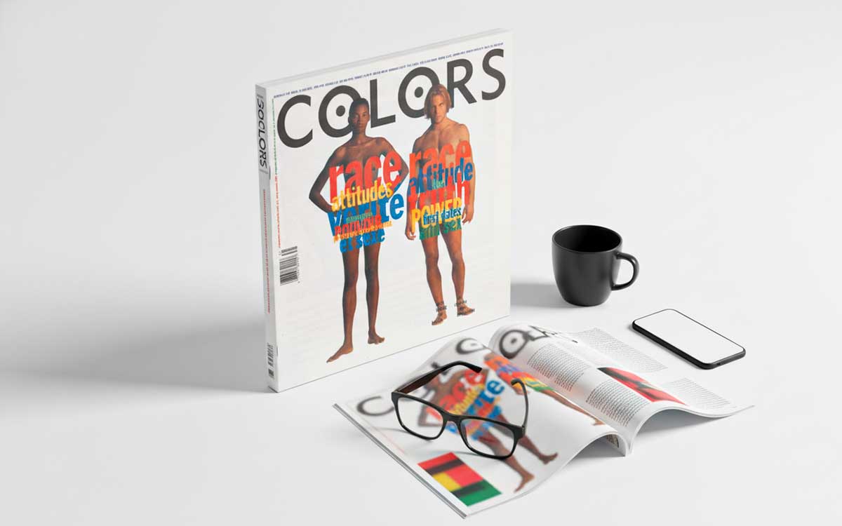
From 1991 to 1995, Tibor Kalman was the editor-in-chief of Colors magazine. There, he pushed for designs that were socially aware and challenged people to think differently. People called him “the bad boy of graphic design” because he wasn’t afraid to shake things up.
Tibor Kalman believed design should serve society, not just sell products. His work inspired designers all over the world to use their skills for social change. Even after he died, his ideas live on. In 1999, Kalman was awarded the AIGA medal, a top honor in design. Today, designers still look up to him as someone who proved that design can make a real difference in the world.
Tibor Kalman’s most famous work is Colors magazine. It was sponsored by Benetton and became very popular because it showed the world in a new way. The magazine explored different cultures and mixed races. One issue, called Issue 4, was about race. It was very controversial. It had pictures of Queen Elizabeth II and Pope John Paul II as people of different races. This shocked a lot of people and started big debates around the world.
Louise Fili is a famous American designer. She’s best known for making restaurants and food brands look beautiful. Fili also designed nearly 2,000 book covers while working at Pantheon Books from 1978 to 1989. Her style often mixes old-fashioned elegance with modern, clean designs. She has won big awards for her work, like the AIGA Medal in 2014 and the Type Directors Club Medal in 2015.
Louise started her career working for a famous designer named Herb Lubalin. After that, she became the art director at Pantheon Books, where she showed that great design doesn’t need to be loud or flashy; it can be smart and stylish. In 1989, Louise Fili opened her own studio in New York City. Since then, she has created memorable designs for restaurants like Via Carota, with an Italian-inspired look, and Sarabeth’s, giving their packaging design a fresh, modern feel.
Her work is inspired by her Italian roots and her love of European design, especially Art Deco and Stile Liberty styles. Many museums, like the Library of Congress and the Cooper Hewitt Museum, keep her designs in their collections. She has been honored with spots in the Art Directors Club Hall of Fame and has been nominated for the James Beard Awards three times.
Louise has also written more than twenty books about design from around the world. In 2025, she designed the poster for the Library of Congress National Book Festival. Her work mixes vintage charm with modern touches, and it continues to inspire people who want designs that feel authentic in today’s digital world.
Louise Fili became famous for her work on restaurants and food packaging. She worked with Tate's Bake Shop, Bella Cucina, Jean-Georges Vongerichten, and Via Carota.
Fili is known for her hand-drawn logos and custom fonts. Some of her fonts, like Montecatini Pro, Marseille, and Portofino, are widely recognized.
Armin Hofmann (1920–2020) was a famous Swiss graphic designer and teacher. He created the Swiss Style, a type of design known for being clean, simple, and easy to read. He used grids, simple shapes, and plain fonts in his work. Hofmann also wrote an important book called Graphic Design Manual in 1965.
Armin Hofmann was born on June 29, 1920, in Winterthur, Switzerland. Armin Hofmann studied art in Zurich and worked as a lithographer, making prints. In 1947, he started teaching at the Basel School of Design. Armin Hofmann stayed there for 40 years, shaping how young designers thought about their work.
Hofmann believed that design should be clear and functional, not just decorative. Armin Hofmann used grids, careful layouts, and clean fonts to make designs that were both elegant and easy to understand. His teaching style encouraged students to experiment. Armin Hofmann wanted them to learn by playing with points, lines, shapes, and how things fit together.
In 1972, Armin Hofmann began teaching at Yale University in the U.S. Hofmann helped introduce Swiss design ideas to American students. His book, Graphic Design Manual, became a key guide for designers everywhere.
Armin Hofmann was known for his simple, clean style. He often used grids to organize his work. His posters had bold letters and clear shapes. Armin Hofmann taught the Swiss Style, which focuses on being clear, balanced, and careful with shapes, colors, and space.
Stefan Sagmeister is a famous graphic designer from Austria. He is known for bold, unusual designs that make people stop and think. He has created eye-catching album covers and experimented with type in ways most designers never try.
Sagmeister has won two Grammy Awards and a big design prize called the AIGA Medal in 2013. Stefan also takes a special break every seven years—he shuts down his studio for a whole year to refresh his ideas and get creative again. He co-founded the design studio Sagmeister & Walsh in New York, which ran from 2012 to 2019. Some of his works have even been shown in museums, exploring ideas like happiness, beauty, and how design can affect people.
Stefan was born in Austria in 1962. He studied art and design in Vienna and New York. In 1993, he started his own studio, Sagmeister Inc., and quickly became famous in the music world for his daring designs. He doesn’t just make things look good—he tries to make people feel something and think deeply through his work.
His style has influenced design communities in London, New York, and Toronto. He encourages other designers to take risks and try new things. Stefan has won many awards, including the National Design Award in 2005 and Austria’s Golden Medal of Honor in 2013. His museums have included MoMA and the Guggenheim. By taking long breaks to explore life and creativity, Stefan Sagmeister shows that great work comes from inspiration, not just constant hustle.
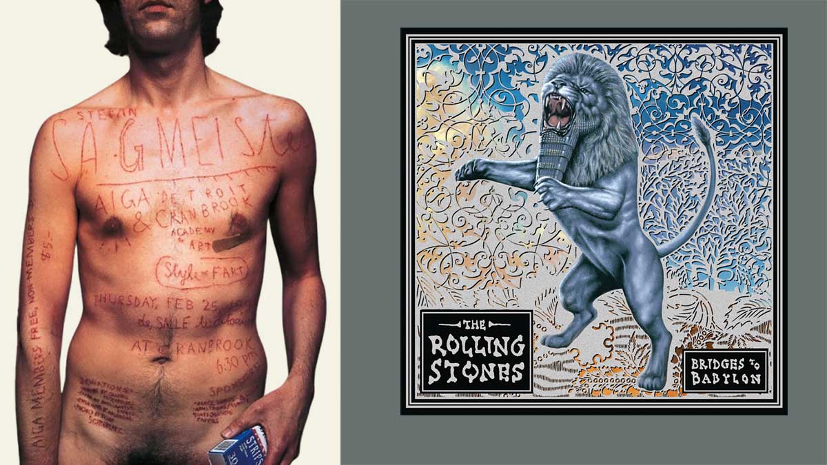
Stefan Sagmeister is famous for a poster he made in 1999 for AIGA Detroit. For it, he carved words into his own skin. It was shocking, but it showed how design can be painful and intense.
He also designed album covers that won a Grammy, like for The Rolling Stones’ Bridges to Babylon in 1997, as well as for Lou Reed and Talking Heads.
Most famous graphic designers leave fingerprints on the imaginations of young creatives who study their work like it’s a secret map. When newcomers see how a legend bends color, type, or negative space into something unforgettable, it encourages them to try their own wild ideas.
The influence goes deeper than style. Many iconic designers built careers by questioning the rules, pushing past trends, or blending disciplines in ways that didn’t make sense until suddenly they did. Their paths remind young artists that great work rarely comes from playing it safe. Instead, it grows out of curiosity, experimentation, and the courage to develop a voice that feels unmistakably their own.
Below, we break down three powerful steps these industry leaders and graphic designers continue to inspire.
Learning about famous designers can help new creatives. It gives you a clear picture of how design has changed over time. When you know the history of design, you also learn how past ideas and styles were made.
Studying history shows you how one trend leads to another. You can see how styles and ideas changed as society changed. In the UK, the US, and Canada, most graphic designers, around 90%, work freelance. Knowing the stories of these graphic design industry leaders is worthwhile if you want to succeed in such a competitive field.
These stories show that being a great designer isn’t just about learning the tools. It’s about sticking with it after rejection, keeping up with new technology, and staying true to your creative ideas even when the market is tough. For young designers, these lessons give inspiration and practical advice.
The stories of famous designers show lessons that go beyond just learning skills. Most famous graphic designers teach us that being creative often means breaking the rules. For example, Saul Bass looked at things others ignored, and Jonathan Barnbrook tried bold and unusual ideas.
For young designers, changing jobs a lot is normal; 54% do so within two years. Even legends faced unstable times in their careers.
Having a mentor helps. People with mentors are five times more likely to get promoted. Following the mindset of great designers can help anyone grow in their design career.
Famous designers create styles that last for generations. These styles still influence trends today, even in 2025. Right now, designs using AI, bold minimalism, and busy, colorful illustrations are popular. These trends can be traced back to early modern and postmodern designers who changed the rules of design.
When young designers study these icons, they see how past ideas shape today’s work. For example, the current trend of AI-powered personalized design builds on the clear, organized thinking of Swiss Design and the practical, “function-first” ideas of the Bauhaus school.
The global graphic design market is huge. It was worth $52.32 billion in 2024, and it keeps growing because each generation takes old ideas and reimagines them with new technology.
Now, design drives business and growth. Young creatives who understand the history of design can lead the way instead of just copying graphic design trends. They can turn old lessons into fresh ideas that shape the future of how we see and experience visuals.
If you want to learn about top graphic designers or need fresh creative insight, the following offers direct and reliable information. This FAQ gives clear answers to common questions about their careers, design styles, and influence on the industry.
Many experts point to Paul Rand as the most influential graphic designer of all time. He shaped modern visual communication with iconic logos for IBM, UPS, ABC, and more. Rand’s minimal, idea-driven approach continues to define what “good design” means across the industry.
Legendary designers usually share strong visual problem-solving skills. They know typography well. They understand color theory. They also have a natural sense for clear communication.
On top of that, they stay curious. They practice consistently. And they can adapt to new tools and trends without losing their own creative voice.
Design icons grow from earlier movements like Bauhaus, Swiss Design, Pop Art, and Postmodernism. These eras brought in grid systems, bold minimalism, expressive typography, and experimental layouts. Today’s top designers take these ideas and reshape them for modern audiences and digital platforms.
Yes. The digital age makes it more possible than ever.
We now have global visibility, easy-to-use tools, and chances to work across many fields.
Designers who push new ideas in UX, motion graphics, branding, or new tech like AR and VR can still leave a lasting mark just like the legends before them.
You can find legendary designers’ work in design museums, online archives, and industry sites. Check places like AIGA, the Adobe Creative Cloud blogs, and Cooper Hewitt’s digital collection.
You can also look at academic resources on design history for deeper insight. Many designers share their ideas through books, talks, and case studies that explain how they think and create.
When you look at the most famous graphic designers, you start to see how much they changed the way our world looks. Their ideas were fresh and bold. They worked with fonts, logos, posters, and later even digital tools. They created the visual styles that shape how we communicate today.
Each designer had their own way of seeing the world. They broke rules and showed that design isn’t just decoration. It can shape culture. It can help people understand ideas. It can even change the way we see ourselves.
Their work inspires modern graphic designers now. It reminds us that new ideas come from being curious, being brave, and being willing to try something different. As design keeps changing, the breakthroughs these designers made give us something solid to build on.
When we understand what they did, we can make graphic designs that matter, and they have the power to change things.
If you’re already stuck in a design project, feel free to contact us for any consultation.