Why do some modern landscaping logos look professional right away, while others don’t so much? It’s because they send a clear message immediately. They share care, skill, and trust at first glance through clean lines, simple natural shapes, balanced text, and calm, confident colors.
Your logo is often the first thing people notice. Homeowners, property managers, and business clients see it before they read reviews or visit your website. Without saying a word, your logo shows how seriously you take your work.
A modern landscaping logo design feels planned and thoughtful. It feels calm and reliable. It does not shout or try too hard to impress. Instead, it quietly reassures people and helps them feel comfortable choosing your business.
The best landscaping logo design ideas share a clear style. They stay simple and avoid clutter. They are easy to use on trucks, uniforms, signs, and digital platforms. They look good at any size and in any setting.
Designers use leaves, trees, and geometric shapes with care. These elements are not added just for decoration. Every shape, color, and letter has a purpose. This matches professional landscaping, where balance, precision, and attention to detail matter.
In this article, you will get some modern landscaping logos from established landscaping, lawn care, and landscape design brands. You will see what works, why it works, and how design choices affect trust.

A modern landscaping logo looks fresh right away. It demonstrates care and balance, and how a space can come alive when someone works on it carefully. You can see a mix of nature and design in the shapes.
It’s also notable how a simple line or curve can evoke calm gardens or neat outdoor spaces.
Now, let’s explore 15 modern landscaping logos that do this exceptionally well. Each one shows how minimalism, nature-inspired elements, and strong branding can come together to create logos that look professional, memorable, and perfect for landscaping companies.
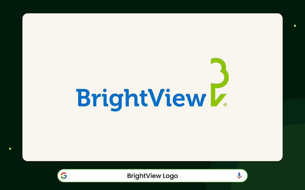
The BrightView logo feels like stepping into a well-planned garden. The blue and green colors remind you of the sky, the earth, and water. The letters are neat and easy to read. It makes the logo feel stable and trustworthy. It fits a company that provides landscaping and outdoor care services.
BrightView started in 2014. It was made when The Brickman Group and ValleyCrest Companies joined together. Both companies had extensive experience, with over a hundred years combined.
The logo looks modern and signals the company knows its stuff. It feels confident without being flashy, mixing experience with fresh ideas.
Next to the name, there is a small green symbol. It resembles a leaf and the letter B. The leaf makes you think of soil and roots. The icon is simple and easy to remember. It also shows what the company cares about: helping people notice and care for nature.
The main idea is this: a logo should be simple, clear, and calm. It should look good, regardless of its size. BrightView is a good example of this. Because the design is clean and thoughtful, people automatically trust the brand.
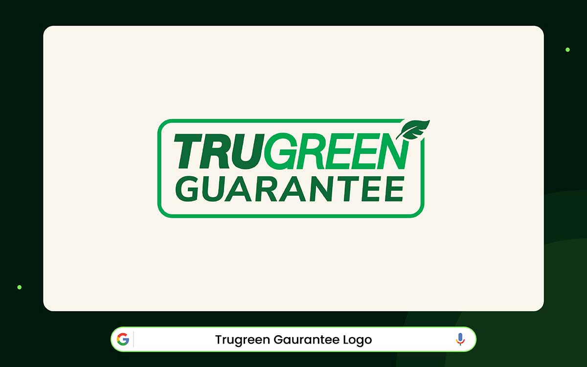
The TruGreen logo is made to feel alive and happy, like nature itself. The bright green color looks like sunlight on fresh grass after it rains. The letters are strong and steady, like a reliable helper.
The small leaf over the “N” makes the logo feel friendly and fun. Together, the colors and shapes show that TruGreen is clean, reliable, and full of energy.
TruGreen began in Michigan in 1973. By the next year, their work was already making a difference. Grass that had looked dull and weak began to grow healthy and green. The company used both science and care to help lawns thrive. The bold letters in the logo show that TruGreen can be trusted.
The little leaf in the logo also tells a story. It shows that TruGreen cares about nature and growth. The letters and the leaf together create a professional yet nature-inspired logo design.
The logo is simple but strong. There’s nothing extra or flashy. Its design is quiet but powerful, proving that good design doesn’t need to shout. Tiny details, such as the green color and thick lettering, make it feel cheerful and trustworthy.
Over time, people come to prefer it. Just like the lawns TruGreen cares for, the logo grows on you.
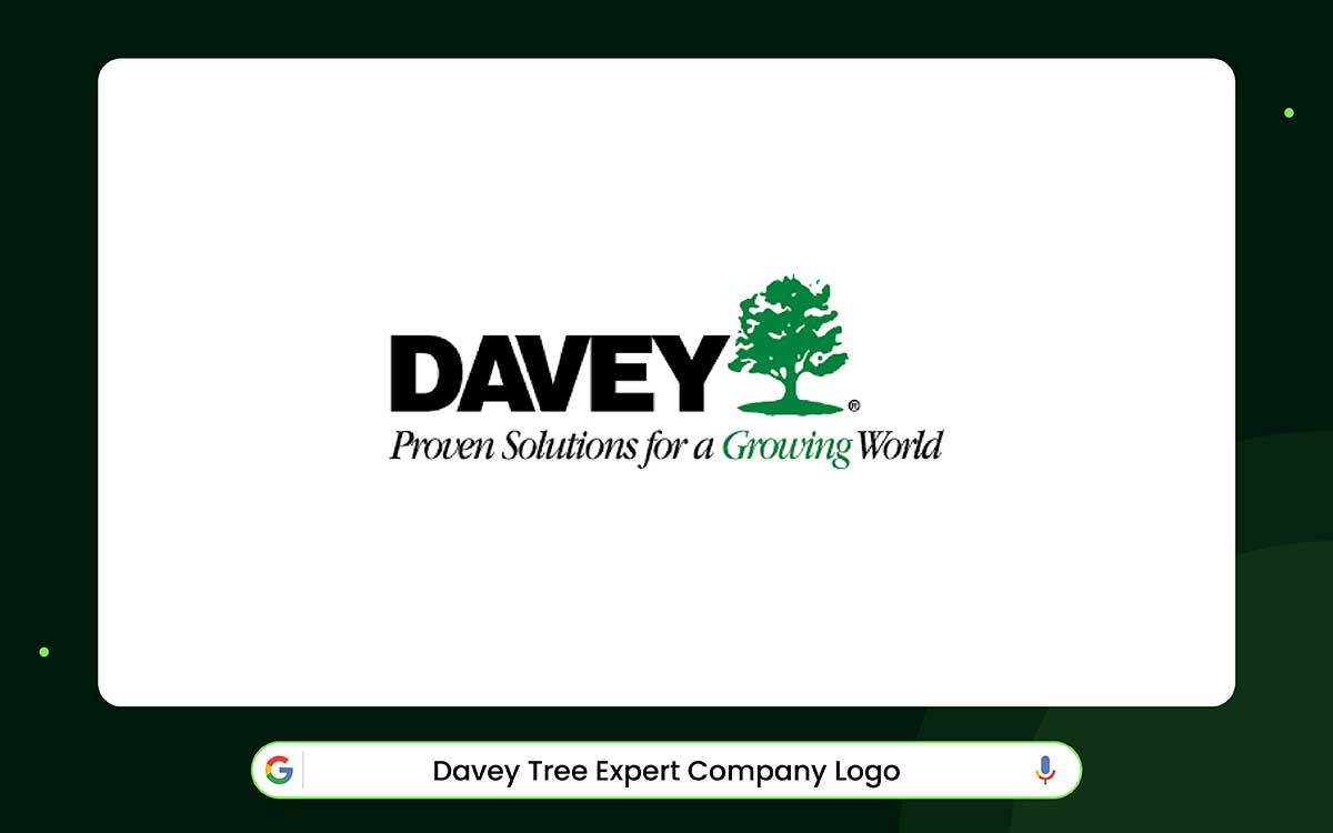
Davey Tree’s logo appears to be from a long time ago. The big green tree in the logo shows the company’s quiet strength and pride. The strong letters under the tree make it look solid and professional. It feels like the company has been around for many years.
The company started in 1880. John Davey, called the Father of Tree Surgery, founded it. He became famous for caring for trees through scientific methods. The company’s long history is shown in the logo. It feels experienced and well-rooted. The logo doesn’t follow modern design trends. Its simple look shows real skill and knowledge that has grown over many years.
The green color in the logo also tells a story. Dark green stands for growth and care. The fir tree shows protection and strength because it is connected to nature. This calm, natural green makes the logo feel honest and real.
The main idea is simple: minimalist landscaping logos based on strong values never go out of style. It only becomes more meaningful over time. Davey Tree’s history is still impressive today. Even though the logo is old, it can inspire new landscaping businesses and their designs.
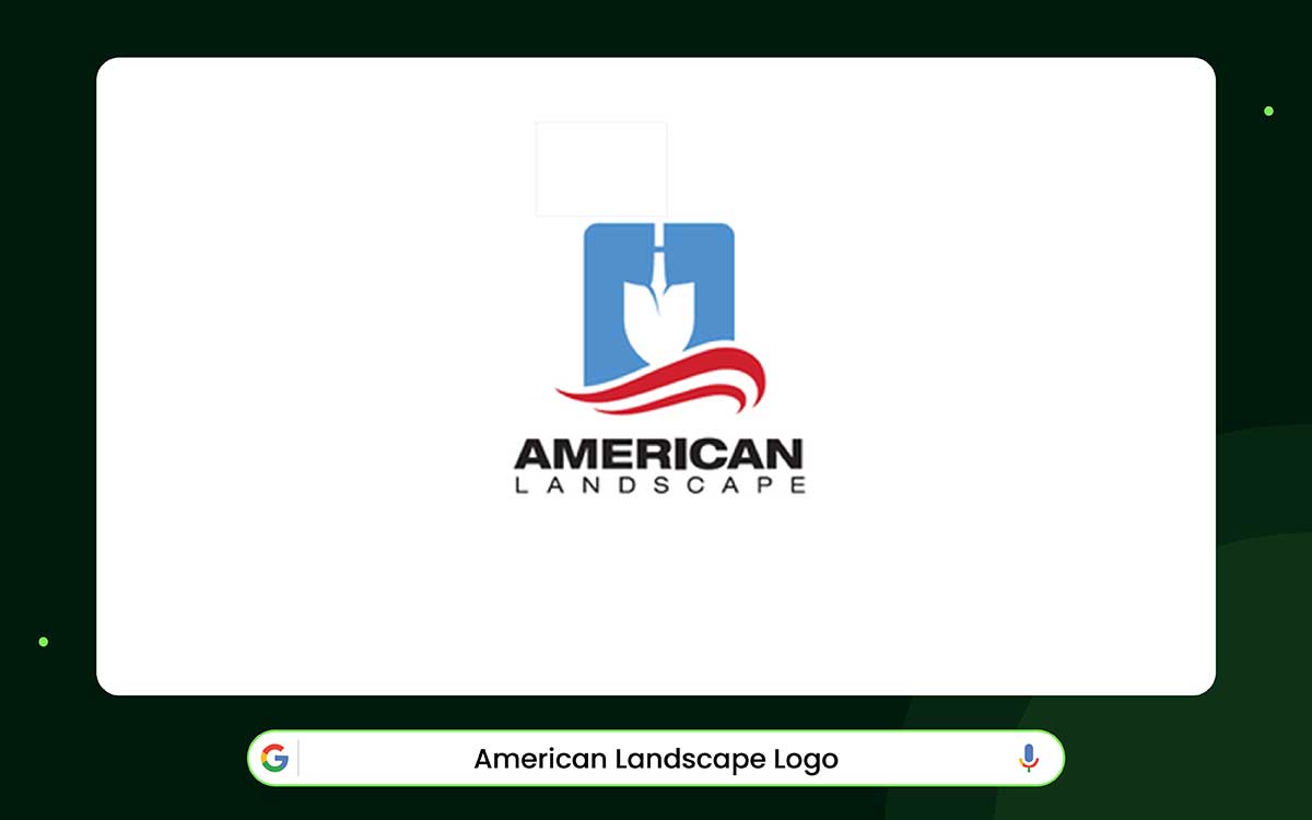
The American Landscape logo tells a lot about the company. It shows the company’s history and values. When people see it, they feel trust, experience, and professionalism. The design uses simple symbols to introduce the brand to everyone.
The logo has a shovel inside a blue shield shape. This transforms a standard tool into a symbol of hard work, skill, and responsibility. The white space around it makes the logo look clean and professional. There is also a red wave under the shovel. It evokes the American flag and reflects pride in the country and a strong work ethic.
The words “Since 1973” indicate the company has been operating for 45 years. This makes people feel it is reliable. The logo matches the company’s story. It started small but bold, and now it is a top landscaping company trusted with big projects.
Even as the company has grown, it continues to focus on quality, honesty, and customer satisfaction. The logo conveys this stability through its clean, confident design. The bold letters convey power, and the space between them conveys balance and openness. The red, white, and blue colors are professional, not just decoration.
In short, the logo is a good example of how design can show a company’s story and values. It creates a look that feels real, trustworthy, and lasting.
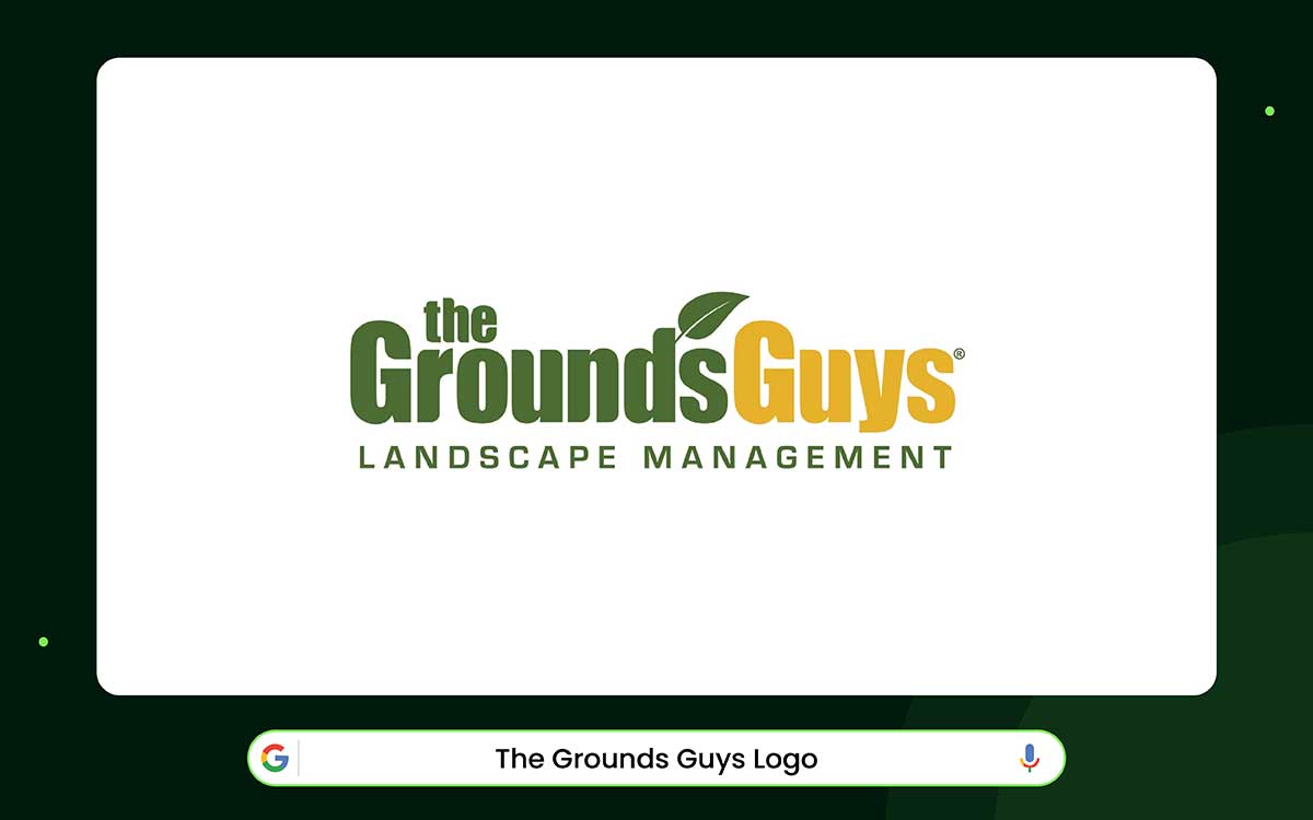
The Grounds Guys logo is a real example of professional landscaping branding. Bright yellow and deep green sit side by side. The colors feel alive, like nature mixed with happiness. The logo feels welcoming, like a neighbor waving from their yard. This aligns with the company's story. Ten brothers started it as a small family business. Over time, it grew into a big national lawn care company.
The colors do more than just look nice. Green evokes growth and the outdoors. Yellow feels warm, happy, and helpful. Together, the colors convey that the company is professional and cares about people. Even the little leaf above the name adds life. It makes every job they do feel fresh and well done.
The letters are big and simple. They demonstrate the company's reliability. The logo works on trucks, shirts, or business cards. Its shape is balanced and neat, showing order and care. The happy colors make it feel human and friendly. It fits a team that works with landscaping.
The clever thing is that the logo shows the company’s values without words. Respect, honesty, and care for customers are reflected in the colors and shapes. It’s more than a logo. It’s a symbol that shows a company can be professional and still feel warm and personal.
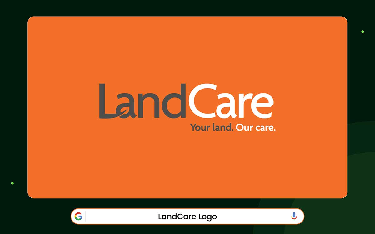
LandCare’s logo stands out with a strong mix of grey and orange. Grey feels solid. Orange feels lively. Together, they show the company is both strong and energetic. A small leaf sits in the “L,” quietly reminding us that everything starts with the land. The design is simple, modern, and complements their landscaping.
Orange is unusual for landscaping, but it works here. It catches the eye and balances the calm grey. The colors show a brand that is confident, capable, and open to change. The logo feels fresh and young, yet still trustworthy.
The tiny leaf is more than decoration. It represents care, nurturing the land, and staying close to nature. The logo feels calm but alive. It suggests that growth and protection of nature can go hand in hand. It’s a symbol of balance; human creativity working with nature.
The simple style works anywhere, from city offices to open fields. Its clear design reflects the company’s goal: keeping landscapes healthy while caring for people and the environment. As the name says, it stands for teamwork, connection, and purpose. The logo is a modern sign of lasting growth.
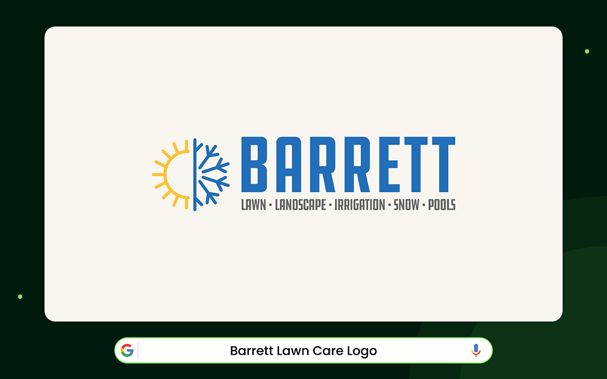
The Barrett Lawn Care logo is a great example of smart branding. You can tell what the company does just by looking at it. The main icon is a circle split in two. Each half shows a different season.
The yellow sun stands for summer. It represents growth, lawns, landscaping, and pools. The blue snowflake stands for winter. It shows snow control. A line separates them, marking the change in seasons. It shows that Barrett works year-round, regardless of the weather.
The logo also tells the company’s story. Barrett Lawn Care started in 1998. Initially, it had only one employee and one truck. Over time, it grew into a trusted local company. Now it serves homes and businesses across the Twin Cities. Their goal has always been to manage every season with a single reliable team. The logo shares that promise right away.
Even the letters and colors add meaning. “BARRETT” is bold and strong, showing the company is built to last. Blue stands for trust and professionalism. Yellow adds energy and makes the logo stand out. The grey tagline lists the services without distracting from the name.
The main lesson from this logo is clarity. It’s easy to read and understand. It shows that a strong landscaping logo solves customer problems. It quickly communicates reliability, coverage, and consistency.
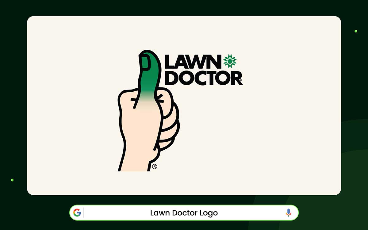
The Lawn Doctor logo feels friendly and capable. The green thumb shows care, growth, and skill right away. The bold letters look strong and reliable. The small icon feels welcoming. Together, the logo is both personal and professional.
The story behind it makes it even stronger. In the 1960s, two friends, Bob Magda and Tony Giordano, started Lawn Doctor. They saw people struggling with their lawns and wanted to help. Their small idea grew into a big business with hundreds of locations. The green thumb came from their wish to help. It became a symbol people could trust.
Most of the logo is green, which makes sense. Green stands for life, nature, and new growth. The clean design looks good everywhere, including trucks, flyers, and more. It’s easy to recognize, no matter where you see it. The logo matches the service’s message: care made simple.
What makes the Lawn Doctor logo last is its story. It combines creativity, friendliness, and trust in a simple image. When a logo comes from a real purpose, it’s more than just a picture.
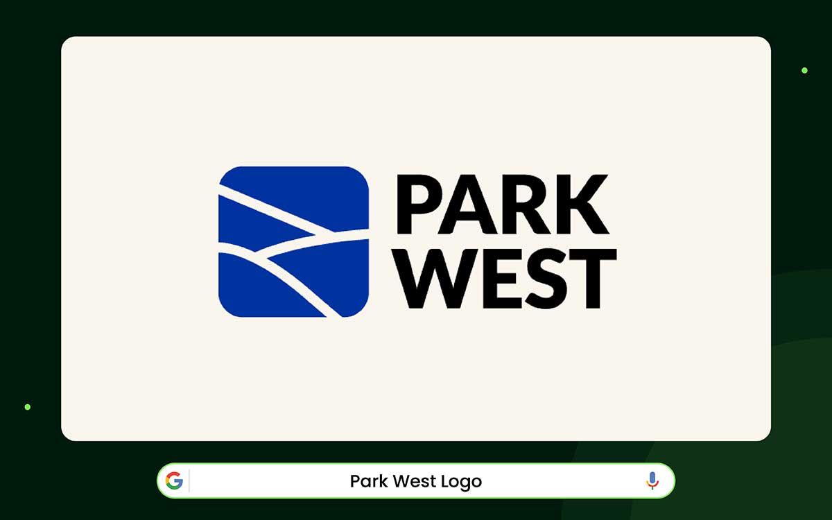
The Park West logo shows trust and optimism. Its clean letters and strong shape give a professional feel. The blue color makes it feel warm. The design fits well with other modern landscaping logos. It feels steady but also forward-moving.
Park West began over forty years ago in California. They became known for a wide range of landscape work. The logo’s simple design matches this focus on quality and great service. Nothing feels forced or trendy. Every line and space shows reliability and a commitment to long-term partnerships.
The blue color represents growth, renewal, and life; the same life they bring to every garden and yard. With clear, strong letters, the logo feels professional and human. It is serious but also warm.
For designers and business owners, Park West shows that simple designs can carry real emotion. Choose colors and shapes that reflect your true values. A logo built on honesty and care can last for decades, just like the company behind it.
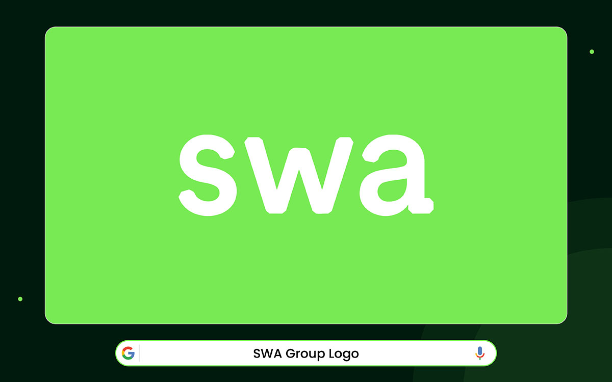
The SWA Group logo marks a clear step toward modern, process-driven branding. It does not use literal symbols. Instead, it focuses on systems, connections, and forward thinking. The circular pattern of dots works like a network.
Each dot represents a node: people, ideas, studios, or services. They are all linked, moving toward the SWA name. The open circle suggests progress, flexibility, and collaboration, not a fixed endpoint.
This idea reflects who SWA is as a company. For over fifty years, SWA has been a collective of independent, employee-owned studios. They work together across the globe.
Their projects connect people, ecosystems, and places. The logo mirrors this structure. The varying dot sizes indicate scale, showing that SWA handles both small local projects and large, complex global work.
The colors and typography support a digital, professional feel. Layered blues convey trust, intelligence, and stability. Lime-green accents bring in innovation, sustainability, and fresh thinking. Grey text, instead of black, keeps the brand soft and modern. The bold “SWA” shows authority. The lowercase “swa” conveys a friendly, digital-first tone.
The main lesson from the design is the principle of purposeful abstraction. SWA’s logo proves that a complex, global, collaborative brand should show systems and movement, not literal objects.
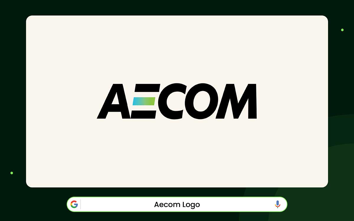
The AECOM logo looks strong and balanced. It uses simple shapes. The letters are wide and slightly slanted. This makes them appear to be moving. The letter “E” is missing a small line, resulting in a small gap. This gap can look like an open path or a ray of light. It adds a small sense of life and freedom to the logo.
AECOM started in 1990. At first, its logo was colorful. But in 1991, the company changed it. The “E” went from blue and green to solid black. Black made the logo look confident and bold. It also gave it a lasting, serious feel.
Using only black and white keeps the logo simple. It shows what the company does: building, planning, and growing. The strong letters also show the company’s reliability and stability.
This logo proves that a simple design can work very well. Every line has meaning. A minimal look can say more than a complicated one. No matter where it appears, the AECOM logo stands for trust, strength, and professionalism in a changing world.
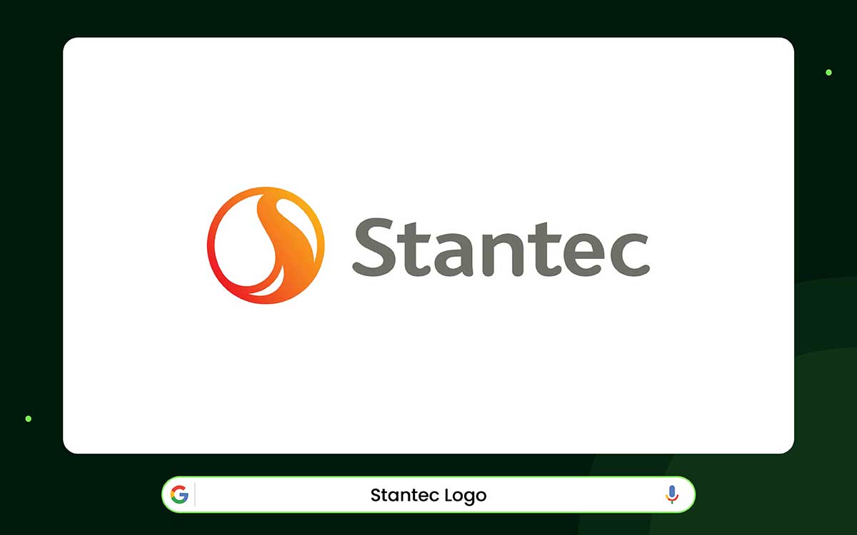
What does winter warmth feel like? You feel it as soon as you see the Stantec logo. The logo is round and looks like an “S.” Its curves are soft, but the center is strong. This makes it seem alive, moving, and connecting, like water flowing or people coming together. It matches Stantec’s goal of designing for communities.
The logo's colors tell the company’s story. In 2016, bright orange showed energy. By 2019, the logo turned dark gray. This made it calmer and more serious. Gray shows balance and stability. It is strong and works in any situation.
Stantec began in 1954 with one engineer in Edmonton. Today, it has over 30,000 employees worldwide. The logo had to show everything the company does: architecture, infrastructure, and landscaping.
The Stantec logo is simple but warm. It proves a brand does not need to be flashy to be strong. It only needs to be honest, solid, and welcoming. This simple, friendly design makes it a perfect modern logo for a company that works with landscapes and communities.

The Gothic Landscape logo highlights boldness and creativity. The bright blue "G" is the first thing people notice. It sits at the center of a dark diamond, making it even more striking.
The company’s name is in all caps. A short tagline explains what the company does. It doesn’t crowd the design. Everything feels balanced and simple.
Blue stands for trust and professionalism. The diamond shape gives structure and focus. The large "G" is easy to spot on cars, uniforms, and signs. The simple letters show confidence. Every part of the logo feels planned and meaningful.
The company’s family story adds warmth. Gothic began in a small garage in 1968. Now it operates in four states. Throughout, the company has remained true to its family values. This story matches the logo’s sense of stability and trust. It also adds a personal touch that people can connect with.
The main lesson is that shapes and colors matter. One strong symbol, clear letters, and smart design make a brand recognizable and meaningful. This logo demonstrates that a modern garden brand can be professional, friendly, and full of personality simultaneously.
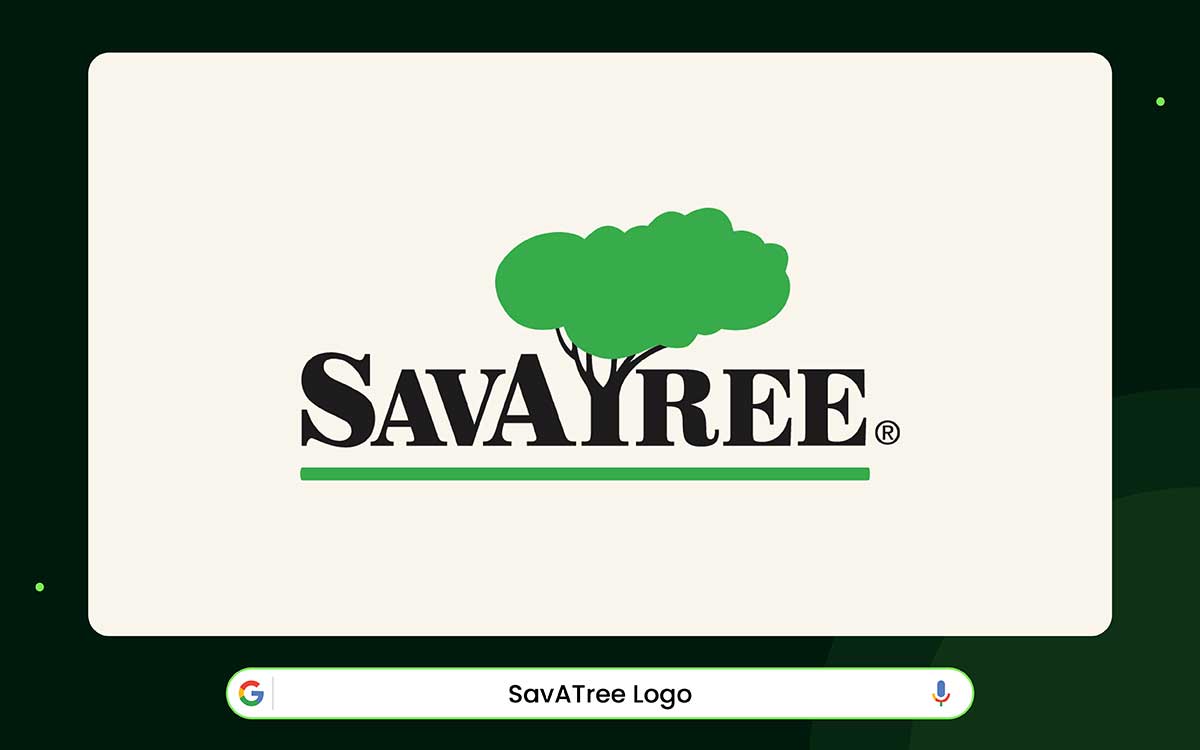
A strong logo can show a brand’s identity in seconds. The SavATree logo does this very well. At the top, there is a large green tree. It represents growth and care. Below, bold black letters show clarity and professionalism. A short tagline conveys the services without cluttering the design. This keeps the logo simple but informative.
The green color suggests life and health. Uppercase letters make the logo strong but still friendly. This makes it easy to remember. Every part of the logo shows skill and trust. It does not require additional decoration to be clear and meaningful.
The logo makes more sense when you know the company’s story. SavATree began in 1978 to protect trees from gypsy moths. Today, it offers services like pruning and deer control in 40 states. This history aligns with the logo, demonstrating care and expertise. It also creates an emotional connection with people.
From this, we can learn an important lesson: A simple symbol with clear letters builds trust. Small details, such as color and shape, evoke emotion. SavATree is eco-friendly and honest, making it easy for people to feel naturally connected to the brand.
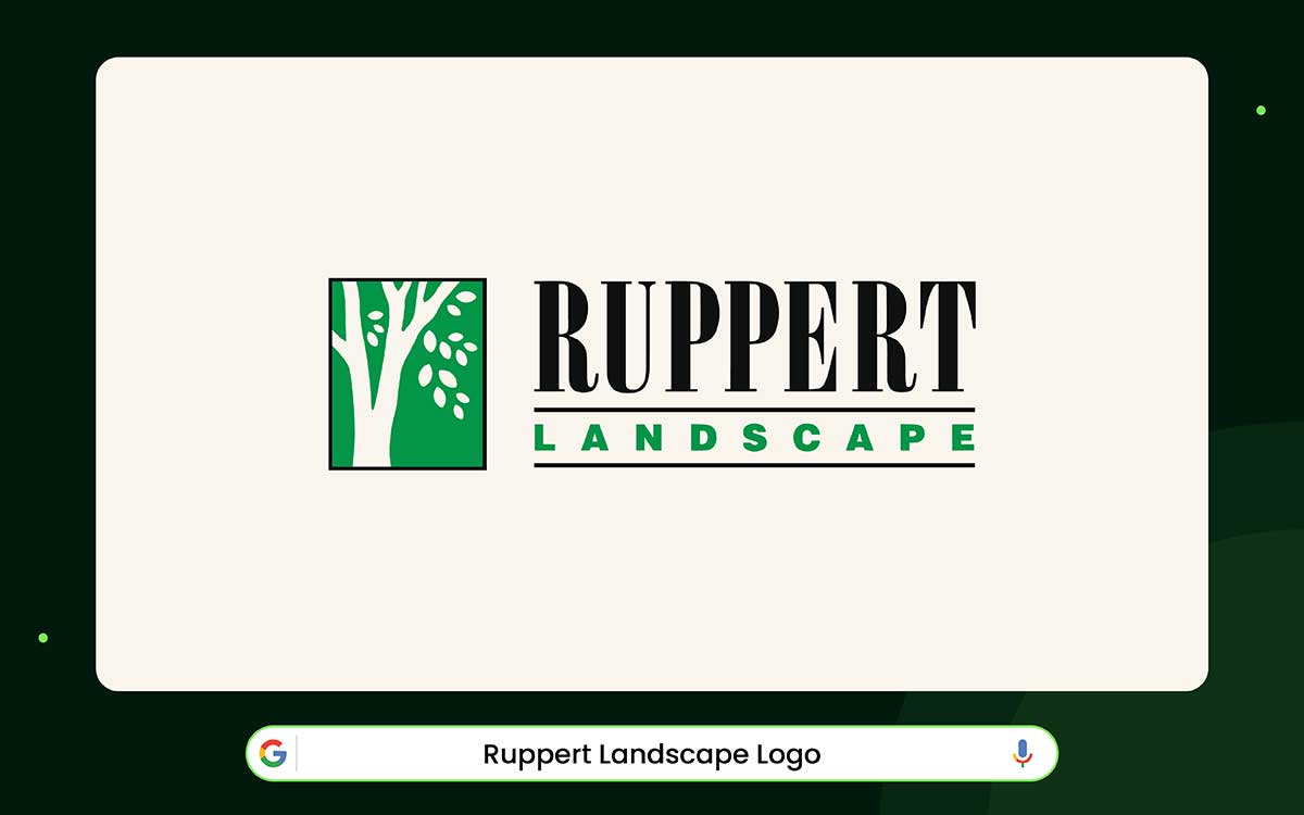
When a logo shows growth and trust, you notice it right away. The Ruppert Landscape logo does this perfectly. The green letters show life and growth. The black letters show strength and trust. The font is clean and easy to read, too.
A simple design like this is easy to remember. It works well on signs, trucks, or online. This style fits modern landscaping logos perfectly.
The story behind it makes it even stronger. Craig Ruppert began mowing lawns from a small garage in the 1970s. The company grew to more than 2,500 employees across multiple states. The logo reflects care, skill, and reliability.
The colors and shapes match the story. Green means life. Bold letters mean trust. The spacing and simple design convey a careful, precise brand. The logo feels warm and friendly while remaining professional.
Keep designs clear and meaningful. Simple shapes and letters can show skill and care. Ruppert’s logo proves that a small, simple design can feel strong and human.
Designing a modern landscaping logo starts with knowing the brand.
First, you need to understand what the company believes in. You also need to know what kind of work it does. This part matters a lot.
Once you understand that, the logo should reflect it immediately. Anyone who sees the logo should get the idea in seconds.
Now, let’s look at how to design a modern landscaping brand logo, one step at a time.
Start by thinking about the company and what it really means. Does it focus on careful planning, consistency, and strong skills? Or is it more about being creative, flexible, and working well with nature? Every choice in your logo should show these main ideas.
Symbols such as leaves, trees, or grass can represent growth and life. Round shapes feel friendly and easy to approach. Straight or geometric lines show control and precision. Bold lettering can make the logo feel strong, while gentle curves can make it feel welcoming. Every part of the design should have a reason. Don’t add anything just for the sake of it.
Colors are also very important. Green is the natural choice for landscaping. Bright green conveys energy and life, while dark green conveys stability and trust.
Brown and other earth tones suggest reliability. Small colors like yellow or blue can show happiness and trust. When you combine shapes, lines, and colors carefully, your logo can clearly tell your brand’s story.
Next, consider the audience. Who will see your logo every day, and how will they perceive it? Different viewers notice different things: homeowners are drawn to friendliness and clarity, businesses focus on structure and professionalism, and sustainability-minded clients respond to natural, simple forms.
Where your logo appears also affects perception. Across trucks, uniforms, signs, websites, and social media, every size affects how details are interpreted. Tiny design elements can get lost, and even small spacing or proportion errors can make the logo feel sloppy.
Think carefully about the message your logo sends. A clean, organized design communicates that your company takes its work seriously. A cluttered or overly busy logo can signal the opposite. In professional landscaping branding, clarity and focus are essential, not optional.
Standing out in landscaping can be hard. Many logos use the same things, like leaves, grass, or swooshes. A good logo needs to be different, but not too flashy. Bold shapes, smart use of space, and little unique details make your logo easy to remember.
Simplicity is very important. Too many details make a logo hard to read. This is a problem with trucks, uniforms, signs, or online. Try your logo in black and white or in a single color. Make sure it still looks strong and clear.
Think about the future. Design trends change all the time. Minimalism might be popular now, but something else could be popular later. Your logo should still be recognizable years from now. You can make minor changes, but the core idea should remain the same. A logo is a big part of your brand and grows with your company.
Every shape, color, and letter counts. Keep your design simple, easy to read, and meaningful. When your logo shows what your company is about, it works. People notice it, understand your brand, and trust your work.
We’ve reviewed a number of modern landscaping logos, and it’s amazing how much a small design can say about a company. Just one shape, curve, or color can reveal a lot about a landscaping business. That’s the quiet power of a good logo.
A modern landscaping logo shows how you work, how you think about space, and how much you care about nature. It also affects how clients feel about you. Even before they meet you, your logo can signal that you are professional, reliable, and detail-oriented.
Think about your own landscaping business. What style fits your brand best? Do you want something sharp and modern, or soft and natural? Select a design that clearly reflects who you are. Notice which shapes and colors stick in your mind.
If you’re ready to create a memorable landscaping logo, professional logo design services from Graphic Design Eye can help. Our logo designers build strong brand identities, create unique concepts, and make sure every logo works across print, web, and social media. And with pricing that starts at just $50, getting a creative logo design is easier than ever.
Keep making outdoor spaces that feel alive, one small detail at a time. Your logo is more than just a picture. It’s the first step in telling your brand’s story. It’s the foundation of your visual identity and one of the most important tools for growing your landscaping business.