No wait, layout design is considered the most important part of website and application developments. If the layout isn’t good-looking, it will fail to interact with users and can’t help you get the desired results. You may be familiar with the words user interface (UI) and user experience (UX).
Creative layout design for websites and mobile apps helps to ensure users' seamless visual experience you are on the brink of building an online appearance with a website or mobile app, you need to know the basics of layout design and so on.
The article will instruct what you should consider making a better visual appearance in this regard. So, let’s dive into the discussion,
What comes to your mind first when you see the word layout? Maybe it is a well-recognized web page or mobile app interface. Whatever the layout defines the structure is made up of visual elements. It is designed for specific websites and mobile applications in a way that engages users and encourages them to spend more time with it. Layout design is the process of designing a unique and effective layout using texts, visual elements, color, shape, texture, etc.
However, designing a creative outstanding layout isn’t rocket science. All you need is a creative mind and skills to operate design software. If you do not have the skills to design the layout on your own, you can outsource website design and app development services to get the job done.
First, let’s get the basics of layout design to understand why it is so crucial in web design and development. If you are not one of them, it will help you to create the best layout design for your needs. Here are the basics of layout design you should know,
Grid is one of the most essential basics of graphic design, web & application design. It is considered the backbone of the layout as it determines how you want to design the structure. The layout design starts with formatting grids to understand where the visual elements will be placed in the layout. There are different kinds of layout grids such as,
Manuscript grids
Column grids
Hierarchical grids
Modular grids
Horizontal grids
Baseline grids
Margin defines the left, right, top, and bottom edges of the layout and the vacant spaces around a text box. Margins are sophisticated because of their values. It should be input carefully to create the right visual experience. Margin is a part of the grid.
Gutter is used to creating extra space between margins and columns. It helps to ensure that the contents located side by side in the layout have enough space to avoid distraction. Gutter widths depend on the screen size or breakpoints and it has a fixed value for different breakpoint ranges.
Vertical Rhythm is a visual expression of typography on the web page and app’s user interface (UI). If the value is not applied properly, the visual typography of the layout will be unpleasant. Vertical rhythm plays an important role as it is used to set the line height for paragraphs, body text, and titles.
Layout design is all about digging out the best creative visual structure for specific applications. The process is done with the industry's best layout design practices which involve principles of creative layout design. Whatever the layout, it should adhere to the layout design principles. If not, it will fail to interact with users and bring the desired success. Here are five principles of layout design that will help you get a little more into layout design.
A layout includes several elements such as image, typography, table, space, texture, and so on. The hierarchy shows the aa structure of elements included on the page based on their importance. The visual hierarchy for layout can be recognized in many ways such as color, contrast, proximity, size, whitespace, texture, style, etc. For instance, one can create a layout hierarchy through the size of the elements.
In website, software, and mobile applications layout, each element has its particular viewport, breakpoint, and pixel density. Balance is one of the principles of layout design which helps to deliver a visually stabilized and comfortable layout to visitors and customers.
The alignment shows the visual composition of elements which is mainly used to create visual harmony in the layout. It is also used to create connections between elements in a layout. There are right alignment, left alignment, center, justified and vertical alignments that should be prioritized to get about it.
Proximity provides an invisible direction to entice visitors with the best first impression. Generally, it is used to connect elements to make a sense that the elements are connected in visual layout design. So, visitors can easily understand the context or flow of the layout and get what they are looking for quickly. So, users can follow the connection and easily get the necessary information from the website.
The layout is an important topic for visual artists in print design media, advertising design, and visual branding design. Whatever the design is, it should have a successful layout that can leverage ROI and show the highest results. Graphics designers need to consider grid, margin, whitespace, color, and hierarchy and ensure the best possible layout for the target audiences. It involves audience research, understanding audience behavior and psychology, color theory, typography, and other graphic design skills as well.
For print design, online and offline visual designs should need to structure the design layout at first. For more info, you can get a look at the below different types of layouts for graphic designers.
Multi Panel Layout
Silhouette Layout
Big-Type Layout
Mondrian Layout
Circus Layout
Alphabet-Inspired Layout
Copy Heavy Layout
Frame Layout
Rebus Layout
Picture Window Layout
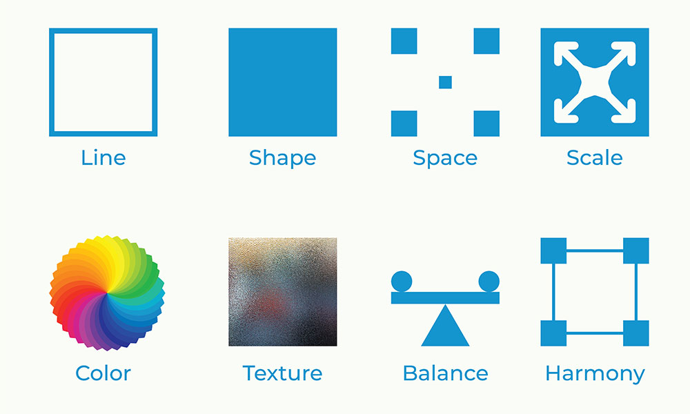
Elements are what make the layout design feel lively and communicative. If you think about a content body, elements are headings, subheadings, paragraphs, images or graphs, space, typography, etc.
Similarly, the web page and application UI layout consist of elements that give meaning to the structure. For instance, currently, apps and web pages are presented as smart and psychologically balanced to users. Graphic designers ensure that the elements are used in the right way. They decide on color combination, hierarchy, and alignment of elements, and organize to compose the best layout structure. Here are the main elements of layout design,
Line
Color
Shape
Space
Texture
Typography
Scale (Size)
Dominance and Emphasis
Balance
Harmony
In geometrical terms, a line is a connector between two endpoints. The line is an essential element in layout design that is used to navigate, instruct, and create boundaries inside the layout. Lines can be usually vertical, horizontal, or diagonal which helps to play with visitors’ attention by directing them to important sections of the layout/page. For instance, you can use lines to boldly feature product collections on your website to grab people’s attention on them.
The importance of color in graphic design, layout design, and all kinds of the visual design can’t be overstated. Color adds value to the design and makes it meaningful and attractive. Choosing the right color for the layout user interface is a prerequisite for successful design. According to the present layout material design practices, you should decide on primary and secondary colors, variants of primary and secondary colors, and additional color palettes for UI background, typography, iconography, border, header, and footer color, etc.
Pro designers use color theory and combine primary, secondary, and tertiary colors to decide the best color format for the layout design.
The shape is one of the basic visual elements used in digital arts and designs. Shapes can be two or three directional and most of them come with geometric definitions. A professional graphic designer can create the best value designs just by using 2D or 3D shapes. Even when they lack a meaningful concept for a design, they can do it by combining some basic shapes and making a beautiful layout. Besides, geometrical shapes, you can also use,
Organic shapes – shapes that you capture somewhere naturally established
Abstract shapes – unlike geometrical and organic shapes
Typography is distinct, there aren’t any design elements but put the main context in the layout design. Without text and typography, a design is nothing but a visual layout consisting of colors and blocks, and images. Typography is important because it captures the viewer's attention for a long time and provides them with the information they need. You must choose the right typography, font size, and font color based on the layout and utilize the other typography attributes to maintain vertical rhythm in the layout.
Image is the universal layout element that is used to imply emotions, clarification, and add more interesting objects to convince the audience. The image comes as necessary everywhere. To make the layout outstanding, you need to use graphics, images, illustrations, GIFs, and so on. They include more details about specific topics in the layout for the visitors. However, today’s smart website and app layouts include short videos and YouTube video snippets where necessary.
Creative and responsive layout design is one of the top priorities for web developers and online activists. Today most websites and applications come with a responsive layout. Responsive layout means that the layout is capable of adjusting with any screen size no matter it is smartphone or web. A creative layout tells users about your uniqueness and professionalism while a responsive layout ensures that it can perform well in the competition.
Therefore, it is highly important to build a creative layout for websites and mobile applications which can boost your online presence. Here are some facts that you can consider to get the importance of creative layout design.
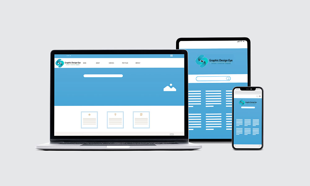
Responsive layout is indispensable in today's web and apps industry. Whatever you implement to start online activities, you need to ensure a responsive design for it. Responsive websites and applications are designed to make one adaptive layout for all different platforms. Because you can’t build different layouts for different device platforms and screen sizes. So, you need to consider a responsive layout when designing the layout for any digital medium.
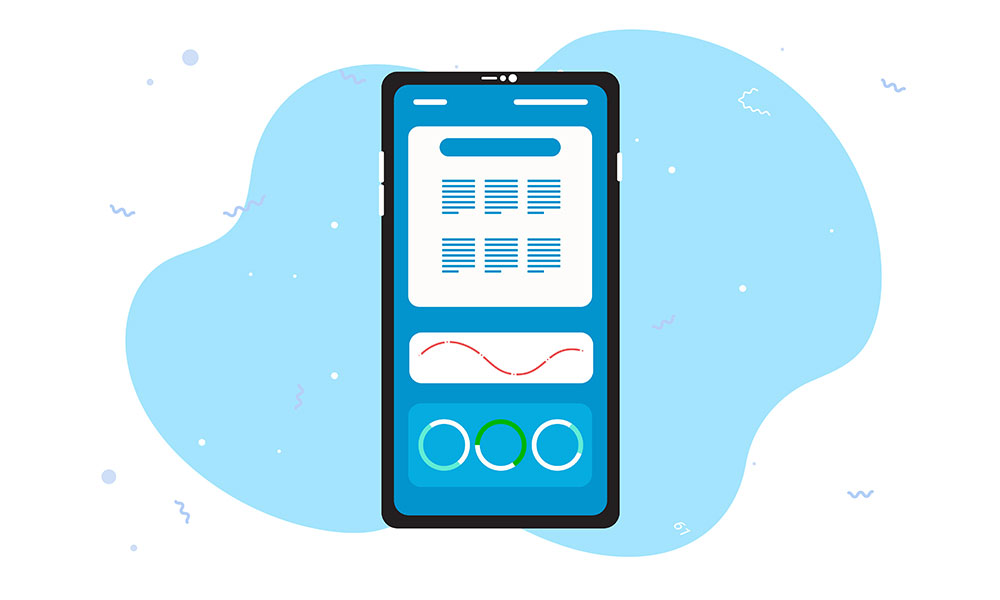
When you design a responsive layout, it means that the layout works well not only for the web but also for mobile screens. This is very important and all website and application owners pay a lot of attention to making their websites mobile-friendly. It is because more than half of the internet users access through smartphones. So, you need to consider mobile-friendliness to make your website available to mobile phone users.
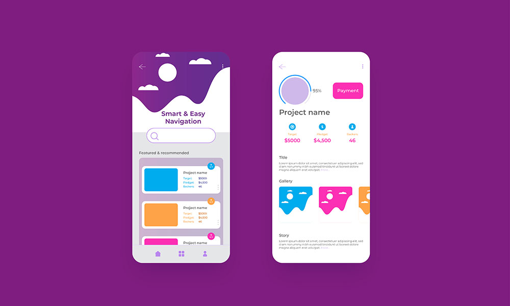
Good layout design makes flowing navigation that helps users to quickly navigate from page to page in the application. A website or an application includes a lot of pages such as sign-in pages, landing pages, blogs, category pages, etc. If users can’t shift from one page to another easily, they will be annoyed and leave the web page or remove the application. A professionally designed layout is always composed of flexible navigation and the highest user comfortability. Therefore, you should do the job with professionals who can fabricate the best layout for your needs.
Creative and responsive user interface design is highly responsive to provide a seamless user experience. User experience regulates how users will interact and how long they will be engaged with it. User experience or UX should be user-centric. You need to dive deeper into monitoring user activity, find bugs, errors, and improvements and upgrade the system over time.
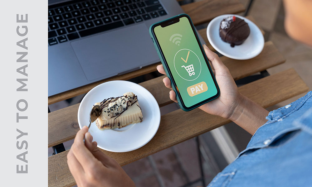
After completing the development of a website or mobile application, it needs regular maintenance, proper management, and improvements. The clean minimalist design helps to compose and manage the application without any hassle. On the other hand, if the design includes unplanned elements, it will hamper the user experience and further monetization.
Well-designed websites and applications can emphasize brand identity and brand recognition. Online competition is now overwhelming and it is so difficult to keep consistency in online business and eCommerce solutions.
There is a huge competition and so you have to develop an effective strategy to make your brand familiar to the audience. In this regard, having a website or application with user-centric UI/UX can help a lot to establish brand recognition.
Search engine optimization (SEO) helps websites in many ways. For instance, it helps the website to rank higher in search engine result pages and get more traffic, leads, and revenue. SEO is the industry-leading practice for websites and is followed by everyone related to the industry.
However, it is proven that a good layout design can boost website performance and SEO scores. If the website has a user-friendly design, it will show a positive sign to the browser bot and improve search engine ranking.
We have come through the basics and principles of creative layout design for digital platforms. What we get from the discussion is that layout design isn’t any simple job. It requires schematic research, analysis, testing, prototyping, and maintenance to establish a great layout design for a website or mobile application. To do that, you need to get some experts who can understand your needs and accomplish the job in that way.
Besides, if you know the industry's best practices, you can recognize whether you are doing it in the right way or not. For your convenience, here we have mentioned some of them,
Grid comes first in layout design which is used to create a visual hierarchy for the design. Grid involves margins and gutter to create a balanced layout with a perfect composition of all the layout elements. In the grid structure, you need to decide where to show texts, images, and other elements. Grid includes blocks for specific elements in the layout. So, it can be easily understood while further working on the layout management.
We have shown that there are different types of grid layouts to consider. Among them, the column grid is the most frequently used layout by designers. The column grid includes columns vertically to create the structure of the layout. The number of total columns was based on requirements but mostly it used 12 columns to make a column grid layout.
However, you can consider other forms of the grid that seem perfect for your desired layout.
Employing a brand color palette and reflex it on layout color combination is an effective way to make brand recognition. Having a unique brand color palette provides an advantage in that the brand can use the specific color in all approaches. As a result, it will make a good sense of visual branding which helps people to recognize your brand with the brand color combination.
The rule of thirds is a very common rule for gridding layout perfectly. It is applied if you can’t help yourself create a balanced structure for the layout, you can use the rule of thirds instead. The rule of thirds is established with 3x3 grids where the complete layout is divided into 9 stacks. This is effective because the 3x3 grid can cover the layout design properly.
To apply the rule in your design, you need to divide the layout into three rows and columns. You can use the rule to design beautiful landing pages, icon designs, banner designs, poster designs, and website layout designs also.
White space is an important part of all kinds of visual design. Whatever the design is, it includes visual elements along with white spaces and typography. You shouldn’t only care for the element’s placement in the layout, rather you should also count the white space and utilize this to enhance the visibility of the design.
When structuring the layout, you should carefully decide the size of the gutters which creates visual empty spaces between columns. Utilizing white space helps to grab the audience's attention and influence them emotionally.
When you have designed the layout, it’s time to place visual elements and give it a reason to grab the audience's attention. No matter what the layout design illustrates, it must look simple and minimalist. Complex designs aren’t always accepted and recognized by the viewers.
There are visual designs that come with a good color combination and design but the context is complex to understand within 3 seconds between the first impression. People won’t pay attention to these kinds of designs.
They receive impressions but can’t make it a successful campaign although. On the other hand, simplistic design can do it by conveying the information and winning the audience's heart at the first impression. This is why it is necessary to keep layout design and graphic design simple and effective.
Image optimization becomes crucial in website management. Optimized image refers to the image being perfect in size and format. Images need to be optimized for minimal loading issues. Unoptimized images take more than 3 seconds to load which is bad for websites.
Visitors don’t have enough time to wait for image loading, they like to leave and visit another website instead. If you want to keep users engaged, you should use optimized images in your website and application.
Finally, think and do everything from the users’ point of view. These are the rules for creating a successful design. Since digital platforms like websites and applications are being created for consumers and users, therefore the design should be established as user-centric.
If you think from the users’ perspective, you can easily understand what can make them happy and what can distract them from using the application. And then you can design the corresponding layout and receive the highest engagement from users.