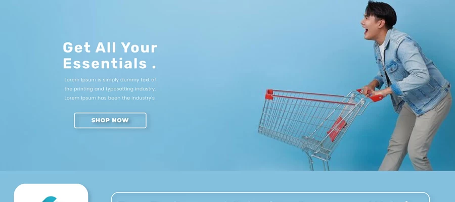
Here you will find landing page tips and tricks to promote products online. If you want to promote your products online, landing pages are a must. As targeted entrance points, they let you highlight your product's unique selling qualities and immediately affect your sales funnel by influencing the visitor's choice to purchase.
Nowadays, the demand for landing pages to promote products is increasing daily. As the world is becoming digital, promoting products online has become a must-take landing page for increasing client rates. From an experienced product owner to a small business owner, everyone needs a landing page design guideline about how they should promote their product online.
This article will provide landing page tips and tricks, how to attract customers, and how to manage them. Shall we begin?
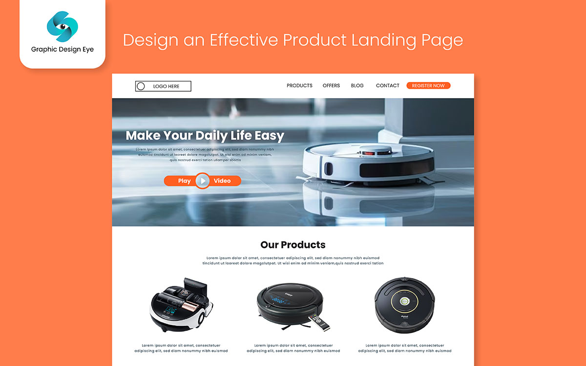
Having attractive visuals and text on a product landing page isn't enough to promote the product. Details of products, photos, and a purchasing procedure are all part of the well-organized framework. Each of these components is important to the success of a landing page campaign promoting a product. Here, we'll go over some landing page tips for organizing product details, stressing advantages over features, and making content more engaging with interactive elements.
Highlighting product features without showing the actual benefit to the user is a common mistake while designing a landing page. While features promots a product's functionality, benefits explain why that functionality is important to customers. To connect with potential customers on an emotional level and show them how a product may enhance their lives, value-driven copy is essential on product landing pages.
If a smartwatch promises "24-hour heart rate monitoring," the user may rest easy knowing that their health data are constantly being tracked. As opposed to "Our smartwatch monitors your heart rate," pointing out, "Stay in tune with your health 24/7, giving you the power to stay active and stress-free." You can turn curiosity into real interest by highlighting the benefit of the product will have on the user's life.
Also adding features is essential, but they should support the overall benefit narrative of the promoting product. So always try to mention features when they help clarify the unique value.
Landing pages should be aesthetically pleasing and user-friendly to attract online shoppers. You can highlight important features and benefits with bullet points, and short paragraphs are great for expressing emotional value or telling a short tale. Also, it may help to increase the landing page's engagement and effectiveness. Another way to promote your product by telling a story by utilizing user cases. This will help to connect with your audience on an emotional level and promote the product with a positive response.
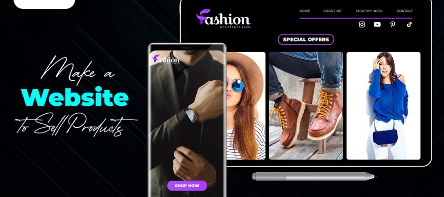
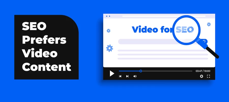
Making a video or images of your product is a great way to highlight its features, benefits, and value offer. With helping to promote the product online it will also make an effect on conversion rates and user engagement.
Seeing a product, especially on the product landing site, is usually more beneficial than hearing about it– the old adage goes. It is worth noting that the addition of interactive features such as product images will finally boost engagement among visitors. A video makes it easier to show complex products in simple and easy-to-comprehend visuals due to the fact that it reduces lagging and increases the likelihood of a viewer making a purchasing decision.
Visual content lets visitors stay longer on the page, and this is directly proportional to increased conversions in most cases. Videos can show the features of a product and have a transformational effect; customers can now see themselves using the product.
For example, a very short video of 30 seconds showing a kitchen appliance that does the work faster and trouble-free is more convincing than a long explanation in writing.
Calls to Action (CTAs) on landing pages determine whether visitors take the next step. Effective CTAs involve careful word choice and appeal. Here are ways to write conversion-boosting CTAs.
A call to action's conversion rate is highly sensitive to the verbs you use. Strong, action-oriented verbs like "Get," "Start," "Join," "Claim," and "Discover" are effective because they generate a feeling of empowerment and urgency. Using expressions like "Submit" or "Click Here" are common now, so try using these verbs to express words with value:
It is important to use precise, easy-to-understand language that aligns with the visitor's objectives. Using phrases like "Find Your Dream Home" or "Boost Your Skills Today" in a call-to-action (CTA) increases engagement since it speaks directly to the needs or goals of the target audience.
An important factor that impacts a landing page is the CTA placement. Whether the call to action should be placed above or below of the page is a debatable subject in conversion optimization. So, placing an initial CTA above the fold for users ready to commit quickly, and another one further down for those who need more conviction, covers both types of audiences.
Using A/B Testing you can compare two landing pages to see which one is better and where you can make improvements. Here are a few points that can be tested with A/B testing. Here are three key elements that can be part of testing:
After getting the A/B result, it is necessary to analyze and find a solution for your landing page betterment. Find out patterns in the data, like engagement rate that reveal user behavior and preferences. Also, check the click-through rates, time spent on the page, and bounce rates. Make the changes and find which one works better for your product promotion.
It is important to note that landing page and image optimization for mobile improves conversions- with mobile traffic still on the rise. This is mainly because mobile devices become more popular. A very compelling offer can become fruitless if the mobile experience is poorly presented. Such an experience is not afforded by mobile optimization where the layout conforms to any screen. Being able to present the user in small screens and ensure that there is a clear route to conversion onsite requires attention to detail on the needs of the text contents, resizing images to appropriate sizes and eliminating unnecessary advertising.
Testimonials from previous customers are an effective type of social proof that can significantly impact a visitor's decision-making.
Aim for a minimum of three high-quality testimonials when determining the optimal number of testimonials. Having too few might not be persuasive, but having too many can be intimidating.
Also, investing additional time and energy into creating powerful and trustworthy video testimonials is worth it. There is also the option of using text-based testimonials that include a photo and name.
Building trust with your landing page visitors is crucial for encouraging conversions. A simple way to do this is by using trust badges and certifications. These visual cues reassure potential customers of your credibility. Let’s know why these certificates are important:
Industry certifications and affiliations to boost credibility. Let’s know why these are important:
By using trust badges and certifications, you provide your visitors with multiple layers of validation, ensuring their confidence in your brand's legitimacy and trustworthiness.
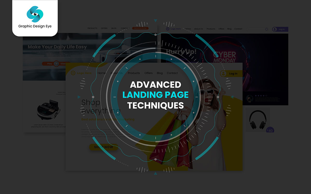
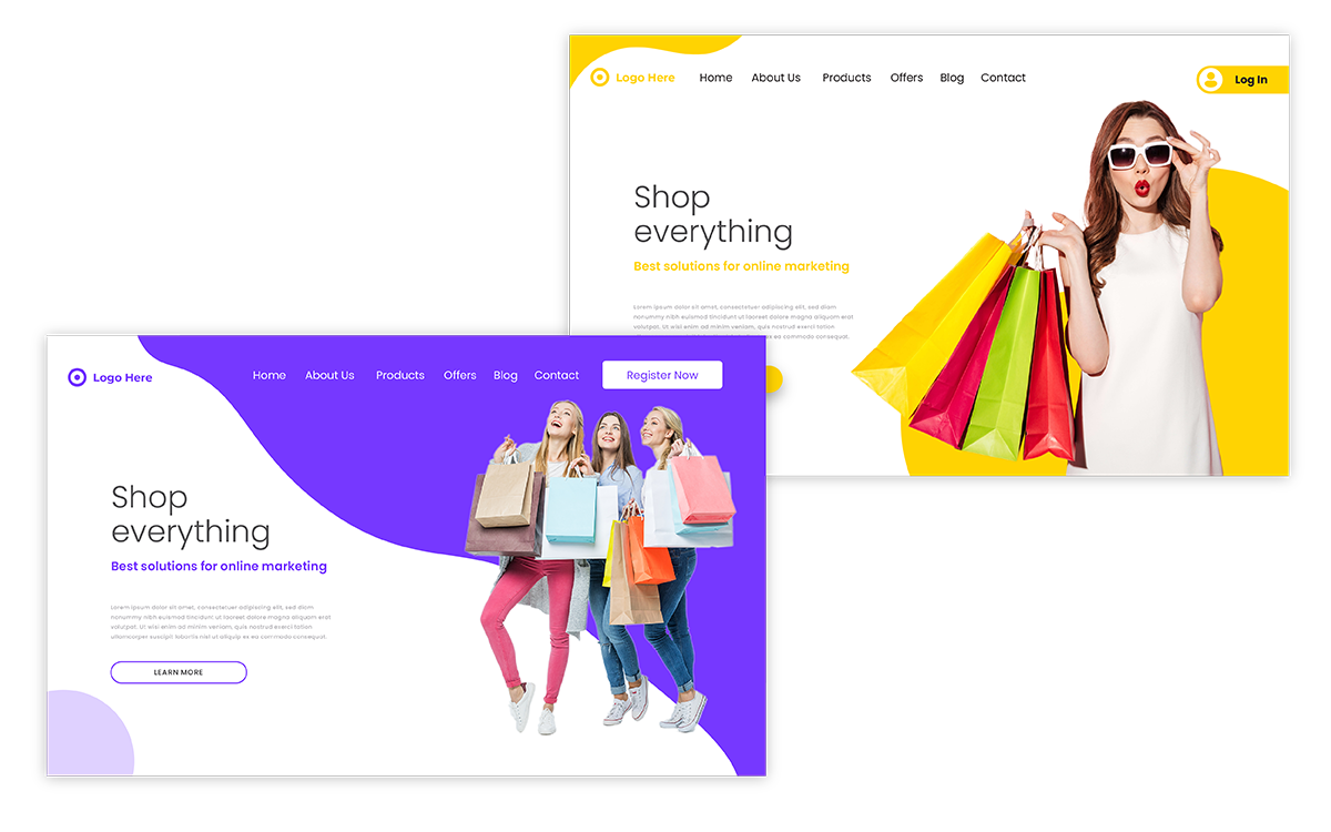
Two options for making a product promote successful are personalization and an advanced landing page. Personalizing user experience can increase engagement and product buying possibility. And a advanced landing page will provide them smooth user experience so they will come back again and again.
Personalization is at the heart of evolving basic landing pages; it assists in transforming them into more action-generating tools. When using effective landing pages, a single layout is applied, and this does not often give the best results as visitors are not the same.
A proper understanding of this principle is that people often visit e-commerce sites with intentions to buy, and therefore, highly trained landing pages have higher conversion rates. Each user is different; therefore, content that is probably the most effective will have to be fashioned for each individual site web visitor. You can also improve their attention and increase conversions by almost every aspect of the content, e.g., location, behavior, and even referred source.
As a case, a visitor from New York would probably want to see some deals or events happening yesterday. As explained previously, some people may have some interactions with the company or its website to help them understand what and how to persuade customers. Finally, it helps to remember what’s out that brought them in: a Facebook ad, a search, a freebie, etc.
To personalize content effectively, using customer data is crucial. Here are a few ways you can leverage this data:
| Customer Data Type | Personalization Opportunity |
|---|---|
| Demographic Data | Change content based on age, gender, or location (e.g., show products popular with specific demographics). |
| Behavioral Data | Display items or offers based on previous browsing or purchase history. |
| Device Type | Adapt the landing page based on whether the user is on a mobile, tablet, or desktop device (e.g., mobile-friendly design). |
| Stage in Sales Funnel | Adjust the messaging for new visitors versus returning ones (e.g., for new users, show an introduction, while for returning users, focus on conversion). |
Retargeting is an effective way to turn landing page visitors into customers, as it involves advertising to users who have used your services or products on a given occasion. Since these are potential return users, chances are they will be familiar with your products and services and will be persuaded to take some action. In order to maximize the benefits of retargeting, you have to classify your visitors depending on their actions, create irresistible marketing propositions, and make sure that your ads are in harmony with the content on the landing pages. Also, regarding retargeting campaign planning, you should take into account that users may become saturated with your brand if they see ads too often while you still strive for it to be on their minds.
When people click on ads or links, the first page they view is called a landing page. Converting site visitors into paying customers begins at this point. So here's why optimizing a landing page matters:
The goal of conversion rate optimization (CRO) is to increase the number of website visitors. Converting visitors into buyers is the goal of an optimized landing page, which directly impacts the CRO rate. Making adjustments to your page's appearance, messaging, or good use of the call-to-action (CTA) button all are part of increasing the page capacity which can satisfy the customer's demand.
Landing page visitors won't feel confused if the UX is smooth. Reducing bounce rates, keeping people engaged, and using an easy navigation system and simply designed landing page will increase the chances of making a sale. A well-designed landing page promotes your products online more presentably. Which create an impact on revenue because customers decide to stay for a long time.
Creating a high-converting landing page is indeed a blend of art and science. Below are some essential landing page FAQs to guide you in designing a landing page that performs well.
When it comes to online product promotion, there are two separate yet related pages that make up a website's structure: the homepage and the landing page. You can tell them the difference and see why landing pages are so important for promoting products in this way:
| Element | Landing Page | Homepage |
|---|---|---|
| Primary Goal | Conversion-focused CTA | General navigation |
| Content-Length | Short, targeted | Broad, detailed |
| Navigation Links | Minimal or none | Full site navigation |
These ensure that your landing page delivers the most impact, leading to higher conversion rates for your products.
A landing page should generally have a few CTAs (Calls-to-Action), usually between 1 to 3. This takes care of putting off too much information on the users while inviting them to take a certain action, like signing up, buying or subscribing. If you have more than three CTAs, it is likely to create chaos and lead the landing page away from its main intention.
Yes, you can display multiple products on your landing page, but you must be careful of some matters. Think about if your products have a similar theme, category, or benefit. Here are some landing page tips on how to promote multiple products online using a landing page:
Use A clear CTA: Make your CTA related to all listed products. For example, "Shop the Collection" would work for a cosmetics line.
Product Highlights: Showcase each product's advantages. This might be bullet points, brief descriptions, or high-quality edited images.
Product Display: Pick a format that showcases your products. Scrolling, grid, or list. Consider aesthetics and usability.
By following these landing page tips, you can effectively promote multiple products in a cohesive manner, improving user experience and driving sales.
The target length for a landing page depends on the audience, product, and campaign objectives. When promoting a product on the web, it is usually worth trying to avoid giving too much information or too little, just enough to get the visitors interested in taking a certain action and not leave them without an urge to do something.
Usually, this is about 500 to 1500 words depending on the nature of the product or the service offered.
Influence consumers on the benefits of your product, create engaging content, and position information on top. Making use of bulleted lists and subheadings makes it an easy task for the users to read the article and also it reduces the boredom with the content.
Finally, we hope that this article is a complete guide to landing page tips and tricks. With a primary focus on online product promotion, build your landing page perfectly. This article discusses the definition and significance of landing pages, offers advice on essential elements for achieving high conversion rates, and highlights the function of graphic design in producing impactful landing sites.
Our goal is to provide you with the skills and know-how required to develop effective landing pages that promote online products and increase conversions.
This is our take on of the best tips and tricks. Please feel free to write us if you think we missed any important information or if you have any inquiries about the landing page design or would need more guidance. We can always be of assistance!
Give a check into our website regularly for more fascinating and educational topics. I wish you the best as you improve your landing pages for conversion!