TL;DR
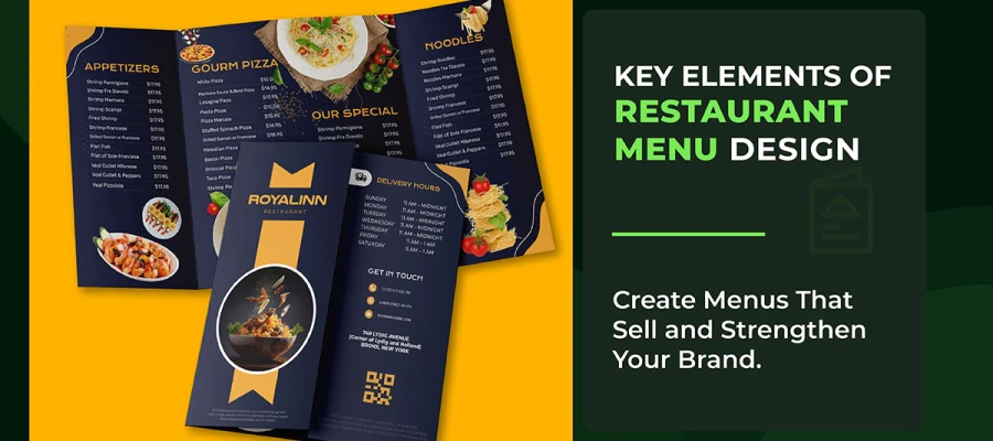
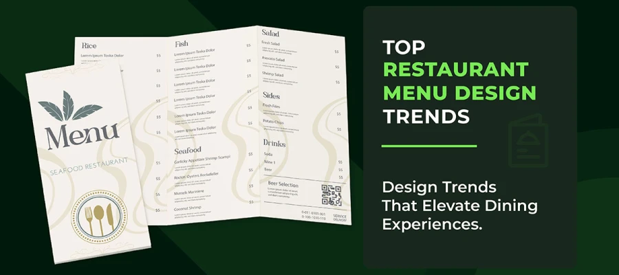
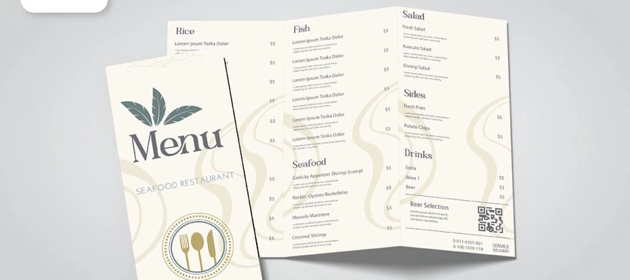
The key elements of digital menu design are visual hierarchy, readable typography, consistent branding, high-quality imagery, logical categorization, etc. These make it simple for guests to choose, reduce confusion, and make food look more tempting. A well-designed digital menu can increase orders, improve customer experience, and make your restaurant look professional.
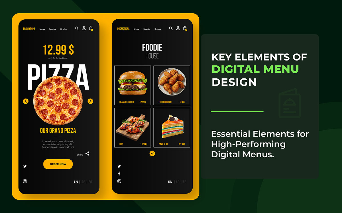
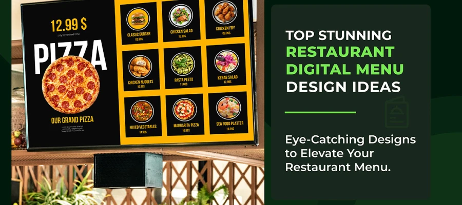
Walk into almost any restaurant today and you will encounter a digital menu. It might be a glowing wall-mounted screen above the counter or a tablet passed across the bar. It could also be a QR code on the tablecloth, a self-service kiosk in the lobby, or an online ordering page on a guest’s smartphone.
Digital menus have graduated from novelty to operational standard and for compelling reasons. They update instantly, cost less to maintain over time, and create far richer guest experiences than a laminated card ever could.
But there is a problem that too many restaurants overlook.
A poorly designed digital menu does not simply fail to impress, it actively damages your business. Cluttered layouts increase decision fatigue, pushing guests to order the first familiar item they recognize rather than the high-margin dish you want them to choose.
Also, typography that is too small frustrates older guests and guests with visual impairments. Inconsistent branding erodes the trust you have spent years building. And a menu that loads slowly or crashes on a smartphone sends diners directly to a competitor.
To tackle these challenges effectively, this guide covers the seven key elements of a digital menu that every restaurant and food business should implement. Each element is explained with the reasoning behind it and practical steps you can apply immediately.
You are redesigning an existing digital menu or building your first one, these principles form the foundation of a menu that does not just list your offerings, it sells them.
Now it’s time to make your digital menu work harder for your restaurant.
Let’s dive in!

Understanding the key elements of digital menu design at a glance helps restaurants, cafés, and food businesses create menus that are not only visually appealing but also intuitive, conversion-driven, and brand-consistent. At present, you're building from scratch or refreshing an outdated layout, these core principles will guide every smart design decision you make.
Before diving into the details, here is a quick overview of the 7 key elements and their direct impact on your restaurant’s bottom line. Use this table as a reference point as you work through the full guide; every row maps to a dedicated section below.
| Design Element | Primary Business Impact |
|---|---|
| Visual Hierarchy | Steers attention to high-margin and signature items |
| Typography & Readability | Ensures every guest can read your menu effortlessly |
| Color & Branding | Builds trust and reinforces brand identity across touchpoints |
| High-Quality Imagery | Increases individual item sales by up to 30% |
| Menu Categorization | Reduces cognitive load and improves order completion rates |
| Real-Time Flexibility | Eliminates errors and enables dynamic revenue management |
| Accessibility & Inclusivity | Serves every guest and satisfies legal compliance requirements |
Visual hierarchy tells the story of your menu. Among all the key elements of digital menu design, visual hierarchy is the one that directly controls attention and sales. It guides the guest’s eye from the most important items to the least, in the order you choose, not by chance. It is the foundational principle of effective digital menu design. And it is the one that most restaurants either get wrong or ignore entirely.
When every item on a screen carries equal visual weight, nothing stands out. Guests look around randomly. They take longer than needed and often choose the cheapest or most familiar dish instead of the one you want to sell. A strong visual hierarchy is one of the most effective strategies for driving traffic toward your highest-margin plates and seasonal specials.
Use size, contrast, and positioning as your primary instruments. Larger elements attract the eye first. High-contrast text and images register before low-contrast ones. Items placed in the top-center or upper-left of a screen receive the most attention, a pattern confirmed by eye-tracking research.
The golden triangle principle, borrowed from print menu psychology but fully applicable to digital screens, shows that viewers' eyes land on the center first, drift to the upper-right, then move to the upper-left. Place your hero items and most profitable dishes in these three zones.
White space is one of the most underused tools in digital menu design. Generous padding around a featured item does not waste space; it gives the dish room to breathe, reduces visual clutter, and measurably speeds up the decision-making process.
Best Practice: Build a three-tier hierarchy, hero item (largest, most prominent) → category header (medium weight) → individual item (standard size). Maintain strict consistency within each tier across every screen.
Typography encompasses the selection and arrangement of type: fonts, sizes, weights, spacing, and contrast. In the context of digital menu design, it has one non-negotiable purpose, making your text both visually appealing and effortlessly legible on every device your guests use.
Your menu could describe the most extraordinary dishes in the world. But if guests have to squint at the item descriptions or hunt for the price, the experience deteriorates instantly. Typography is the invisible backbone of a readable digital menu. And also, this is one of the most common graphic design mistakes that can lead to lost sales. Because guests never consciously notice good typography, but they feel its absence immediately.
The six rules below cover every typographic decision you will face when designing or auditing a digital menu, from font choice and sizing to contrast compliance and line spacing. Each one directly affects how quickly and comfortably a guest can read your menu, so treat them as minimum standards rather than optional refinements.
Color serves two roles simultaneously in digital menu design. It is a functional tool that directs attention and conveys meaning, and a brand asset that builds recognition and trust. Branding consistency means your digital menu feels like a natural extension of your physical restaurant and your marketing materials, not a separate, disconnected product.
Why Color & Branding Consistency Matters
Inconsistent branding creates cognitive dissonance. Guests who recognize your brand from your physical space, your social media, or your packaging arrive at your digital menu expecting a coherent experience. When the color palette, typography, or visual language diverges from what they associate with your brand, trust erodes, subtly but measurably.
How to Apply Color Strategy to Your Digital Menu
This section will guide you on how to use color effectively. It will help improve your digital menu’s appeal and support more sales. The approach is based on advanced color theory for graphic designers.
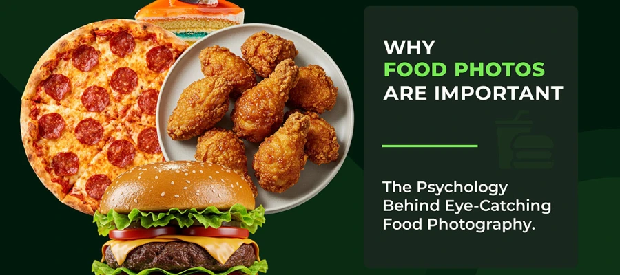
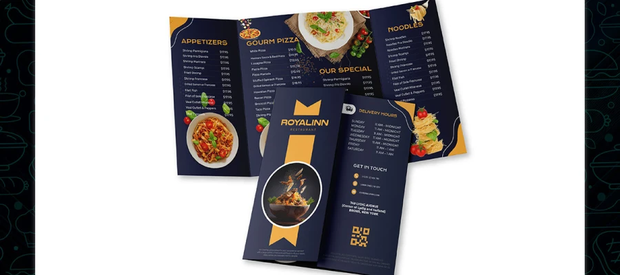
Images in digital menu design encompass every visual asset beyond typography: food photographs, icons, illustrated backgrounds, and short video loops. High-quality imagery performs a function that no amount of well-written copy can fully replicate, it shows guests what they are about to order, builds appetite before the food arrives, and anchors the emotional experience of your brand.
The evidence is unambiguous: menus featuring food photography outperform text-only menus in both order rates and average transaction value. Industry data consistently shows that high-quality images increase individual item sales by up to 30%. A guest reading 'seared duck breast with cherry jus' forms a vague mental impression; a guest who sees a well-composed photograph of that dish experiences something far closer to tasting it. The decision to order is made before the price is even considered.
Knowing that photography drives sales is only half the equation, execution is what separates menus that convert from those that disappoint. The checklist below covers both the creative and the technical side of image use, from commissioning your shoot to optimizing file formats for fast mobile load times (look at our image optimization guide for a deeper dive into WebP and compression best practices).
Menu categorization is how you organize and group your items so guests can navigate quickly and intuitively. Good categorization reduces cognitive load, the mental effort required to process and compare options. Poor categorization causes confusion, frustration, and abandoned orders.
Consumer psychology research has firmly established the paradox of choice: more options do not empower guests to make better decisions; they overwhelm them. Digital menus, unlike their printed counterparts, can theoretically hold unlimited items. Restraint is therefore both a design decision and a business decision. The goal is not to list everything you have ever served. It is to present the right items in the right order for the right guest at the right moment.
Translating the paradox of choice into practice means making deliberate structural decisions at every layer of your menu, from how many categories you offer to how individual items are labelled and filtered. The six steps below are ordered by impact; apply them in sequence, and you will see measurable improvements in completion rates and guest satisfaction.
Design Mobile-First: The majority of QR menu views occur on smartphones. Design for vertical scrolling, generous tap targets, and one-handed usability before adapting for larger screens.
Real-time update capability is the ability to change pricing, item availability, descriptions, and entire menu sections instantly, without reprinting, redesigning, or waiting for a third-party supplier. It is the single most operationally significant advantage that digital menus hold over print, and it is an advantage that most restaurants significantly underutilize.
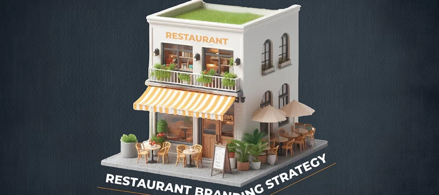
A print menu is a static document. The moment it leaves the press, it begins to diverge from operational reality. Every price adjustment, every seasonal change, every item the kitchen has run out of, becomes a silent contradiction between what the menu promises and what the guest will actually receive. These contradictions erode trust and can damage your restaurant branding strategy, compounding into negative reviews and declining repeat visits.
A digital menu is a live system. Used with intention, it becomes a dynamic tool for revenue management, waste reduction, and real-time guest communication.
Making your digital menu truly live requires connecting it to the systems already running your restaurant. The five steps below show exactly how to do that, starting with POS and inventory integration, the single change that delivers the biggest immediate return, and moving through scheduling, dynamic pricing, and seasonal updates.
It is one of the most iconic key elements of digital menu design. Well, accessibility means designing your digital menu so that every guest, regardless of visual impairment, motor limitation, language background, or age can navigate and use it without friction. Inclusivity extends this principle further to encompass dietary identity, cultural context, and economic diversity.
Accessibility in digital menu design is simultaneously a legal obligation and a business opportunity. Approximately one in five people lives with some form of disability. In many jurisdictions, digital menus that serve the public are subject to accessibility legislation: the UK's Equality Act 2010, the EU's European Accessibility Act (in force from 2025 for digital services), and the US Americans with Disabilities Act as applied by federal courts to websites and digital kiosks. Compliance is not optional. But beyond legal compliance, accessible design simply means serving more guests effectively.
Meeting accessibility standards is not a single action, it is a layered set of decisions that span code structure, visual design, language, and labelling. The six-point checklist below works through each layer in order, from foundational WCAG 2.1 AA compliance through to real-user testing, because automated tools alone will not catch every gap that a real guest will encounter.
The following digital menu design FAQ section addresses the most common questions restaurant owners, operators, and designers ask when working on digital menu design. These answers are structured to align with common search queries and support featured snippet eligibility.
A good digital menu design combines clear visual hierarchy, legible typography (minimum 16px for body text), consistent brand colors, real food photography optimized for fast loading, intuitive category structure with 6–10 items per section, live POS integration for real-time availability updates, and WCAG 2.1 AA accessibility compliance. Each element works together: weaken one and the others become less effective.
Digital menus update instantly; pricing, availability, descriptions, and entire sections can change in seconds without reprinting. They support interactive features such as search, dietary filters, and upsell prompts. They can display food photography and video. They integrate with POS and inventory systems to automatically remove unavailable items. And they can display different menus at different times of day automatically. Print menus offer tactile quality and independence from power and connectivity, but cannot match the operational flexibility or interactive capability of a well-built digital alternative.
Use a minimum of 16px for body text, item descriptions, and prices, and 20px or larger for item names on web and QR-based menus. For large-format digital signage viewed from one metre or more, apply the rule of 1 point of font size per 30cm of viewing distance.
Consumer psychology research consistently supports limiting each category to 6–10 items. Beyond 10 items, the cognitive load of comparison increases sharply, leading to longer decision times and a higher rate of guests choosing the cheapest or most familiar option rather than exploring the menu. If your current categories exceed this range, consider splitting one large category into two more specific ones rather than removing items entirely.
Yes. In most markets, digital menus that serve the public are subject to accessibility legislation. In the UK, the Equality Act 2010 requires reasonable adjustments for disabled people. In the EU, the European Accessibility Act applies to digital services from 2025. In the US, the ADA has been applied to websites and digital kiosks by federal courts. Beyond legal obligation, approximately 20% of the global population lives with a disability of some kind. Accessible digital menu design is good business as well as good practice.
For web-based and QR menus, WebP is the recommended format. It delivers significantly smaller file sizes than JPEG or PNG at equivalent visual quality, which improves load times on mobile connections. If you need a fallback for older browsers, provide JPEG as an alternative using the HTML picture element.
A restaurant should update its digital menu on a consistent basis. At minimum, a digital menu should reflect live inventory, and items should be marked unavailable the moment they sell out. Beyond that, descriptions and pricing should be updated any time they change in the kitchen or pricing strategy. Seasonal menus should update the day the kitchen transitions. A well-configured digital menu platform connected to your POS system can automate the majority of these updates, eliminating manual intervention and the risk of menu-to-kitchen discrepancies.
Yes, and the impact is measurable. High-quality food photography increases individual item sales by up to 30%. Strategic visual hierarchy draws attention to high-margin items. Upsell prompts and 'Most Popular' or 'Chef's Choice' badges, when deployed with restraint, increase attachment rates for add-ons and premium options.
You’ve now got a solid grip on the key elements of digital menu design for 2026. Effective digital menu design is not a single decision made at launch and forgotten.
Visual hierarchy guides attention to your most valuable items. Clear typography in graphic design keeps everything easy to read. Strong restaurant branding makes your identity consistent. Quality images spark appetite instantly. Smart structure simplifies choices. Real-time updates keep your menu dynamic. And accessibility ensures every guest can use it comfortably.
Get all seven right, and your digital menu stops being a passive register of items. It becomes one of the most effective sales, branding, and operational tools your restaurant owns.
And if you want to stay ahead, subscribe to our creative brief. This can give you fresh ideas every week.
Well, at the end of the day, the tool itself is not magic. The magic is how you use it. When design elements meet the right thinking, your menu becomes persuasive.
So ready to upgrade your restaurant’s digital menu? See how we can build a tool that moves your orders forward and magically increases your profit. Contact Graphic Design Eye LLC for custom menu design service.
We do not just design menus. We build digital experiences. These are shaped around your brand and your customers. We use no templates and take no shortcuts. Every section and every interaction is created from the ground up.
We use data-backed design decisions. We place your high-margin items exactly where users naturally focus. This is not guesswork. It is intentional. We also make sure everything your guest sees connects with your kitchen operations.
Do not settle for a basic link. Think bigger. Your digital menu can be a quiet salesperson. It works 24 hours a day!