Famous restaurant logos can inspire you to create a great logo for your own food brand. Each one shows the heart of the restaurant. It makes customers feel hungry, welcome, and ready to come back again.
Think of any restaurant logo. Which logo pops into your head? It’s obviously McDonald’s (Or Los Pollos Hermanos, if you’re a BB fan). Now, think of the essence that sticks in your head.
Take McDonald’s golden arches, for example. They don’t just shine. They promise fast service and that “oh, I know this place” feeling. Olive Garden’s smooth, fancy writing does more than show the name. It makes you think of family dinners, laughing, and warm nights. Even tiny things can mean something. And those small details create memories that stick for a long time.
Here’s the thing about recognition. When someone thinks about getting food, the logo is what jumps into their mind. Menus change. Interiors get updated. Workers come and go. But a strong logo concept stays the same. That’s the bond. That’s loyalty.
In this post, we’ll show you 25 of the most famous restaurant logos ever made and explain why they stand out. Use these examples to get inspired for your next logo design project.
Alright, let’s jump in and explore some modern restaurant logo ideas!
Your restaurant’s logo gives people a hint of what the place feels like before they even try the food. When you look at a logo, it can show flavor, culture, and care all at the same time.
Here, we’ve gathered the top 25 famous restaurant logos that changed how people see food brands. Each one sends its own message about trust, creativity, and style.
Let’s take a look at how these restaurant logo ideas make food feel memorable!
The Golden Steer Restaurant Logo has a warm, old-style look. It’s easy to understand at a glance. The long, flowing script feels friendly, almost like a hand-painted sign from an old steakhouse. The curved letters add a soft sense of motion, which makes the logo feel human and inviting. It quietly shows that the restaurant cares about its food and about the people who walk through its doors.
The gold color gives the place an old, classic feel. It makes people think of spots that have been around for a long time. Even if someone doesn't know much about Golden Steer, the color alone hints that it has a long history. The warm shade also fits a restaurant that serves rich, cozy food. It makes people feel welcome and comfortable before they even step inside.
Its steer inside the circle gives a clear message. It shows exactly what the restaurant is about without needing extra details. The shape is simple and clean, so it does not feel old or crowded. It also brings a hint of Western ranch culture, where strength and honesty were important. The circle makes it feel like a proud seal of tradition.
The logo works well because it feels historic but still easy to read today. The script adds emotion, and the simple shapes make it practical. Designers may notice how the open space helps the letters breathe. Business owners might appreciate how clear it stays on signs, menus, and packages. It proves that strong restaurant logos tell an honest story instead of chasing trends.
Antoine’s logo uses serif letters that look a little old-fashioned, which fits a restaurant with a long history in New Orleans. Each letter looks strong but still soft, like friendly service from the past. The letters have wide, open space between them, so the name is easy to read. This slow, calm look matches a place that’s been around for a long time.
The deep green color has meaning too. Green often reminds people of old traditions and family places that have been around for a long time. This shade feels classic, like the painted doors or old menus you might see in a restaurant from years ago. It gives a timeless feeling without trying to look fancy. It mixes culture and calmness in a way that fits a historic restaurant.
The little accent mark above the name gives it some style. It makes people think of the French roots in New Orleans food. That tiny mark keeps the logo from looking boring. It’s like a small signature that shows personality but still keeps the design simple and neat.
The whole logo is simple, and that’s why people trust it. Lots of popular restaurants use this kind of clean design because it stays good for many years. It helps people feel the restaurant’s history without needing extra details. Designers like the neat spacing. Business owners like that the logo looks good on signs, menus, and photos. A simple design lasts as the restaurant grows and time goes on.
The logo connects the restaurant to the area around it. The simple pictures of nature and the rough, old-style letters make it feel calm and peaceful. If the restaurant is near famous spots, the logo makes it feel like a place you want to visit. Designers know that using local images in a simple way helps people remember the place and know what to expect.
Feelings come from natural shapes and textures. Curved hills or flowing water make people feel calm and relaxed. They also make people want to stay longer. Colors from nature and wooden details give a warm, real feeling. Marketers can use these things to attract visitors. They also show that the restaurant fits well with its surroundings.
The design works at any size. A simplified icon keeps detail when small and looks strong on large signs. Balanced space between image and text keeps it stable on menus, merchandise, and online. Designers learn to reduce scenes to their essential forms for clarity.
If your restaurant is inspired by a certain place, pick one thing that shows its story. Designers should use simple icons that work everywhere, on menus, signs, or posters. The main idea is to show where your restaurant comes from and make new visitors feel welcoming.
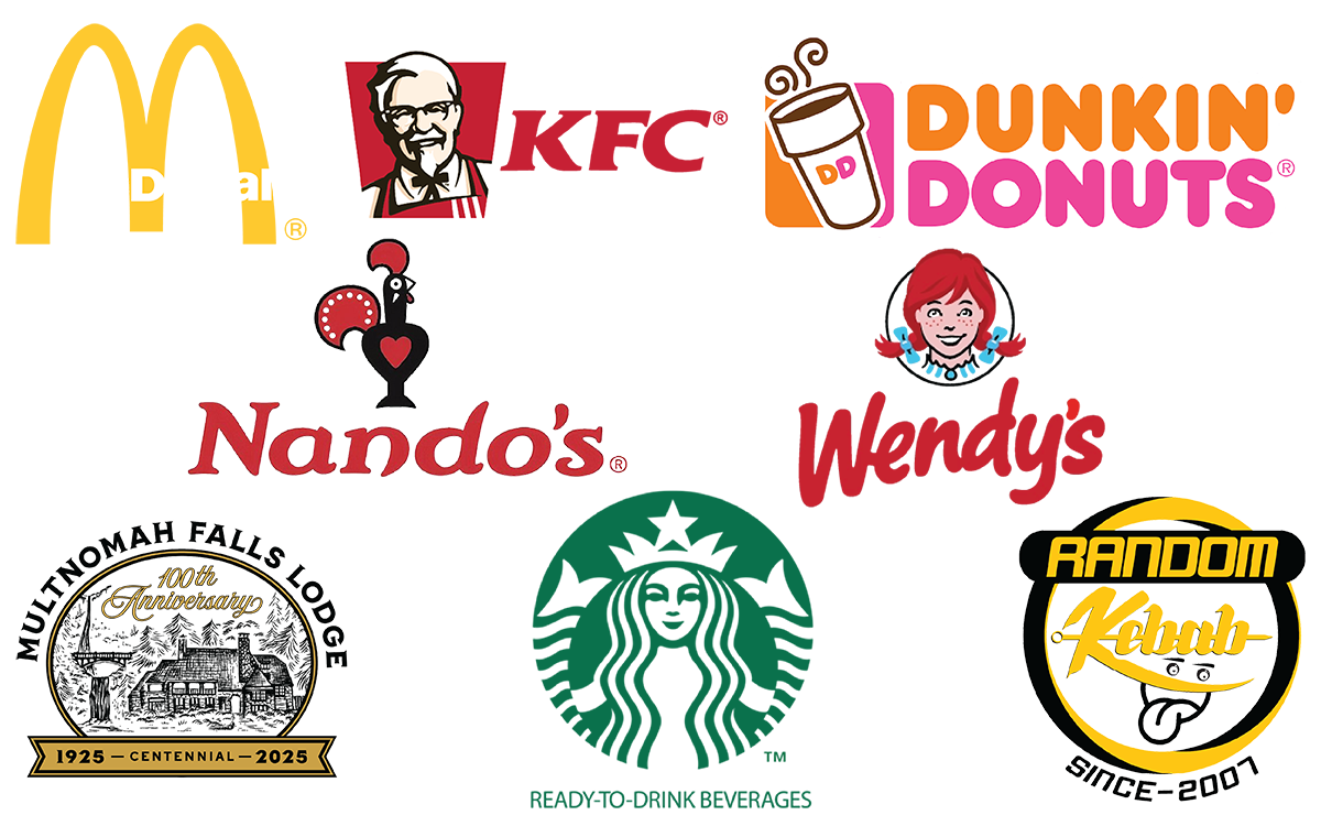
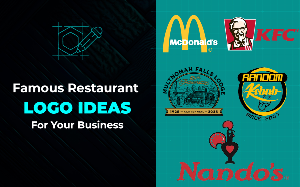
The McDonald’s logo shows how a simple shape can be recognized anywhere. The golden arches are more than just an “M.” They promise quick service, tasty food, and happy vibes. The round curves make the logo feel friendly. The bright yellow color adds warmth and cheer. It feels like the logo is saying, “Welcome in!” wherever you see it.
Color can make you feel things. Red makes you hungry and excited. Yellow feels happy and friendly. When you put them together, they send a clear message. Even before you read the name, you know it’s about food and energy.
The design is simple, but it is strong. The arches look good on signs, cups, or screens. They stay easy to see, no matter the size.
McDonald’s shows an important lesson. A good logo should be simple, easy to remember, and make people feel something. This one logo has become known all over the world. It makes people think of comfort, happiness, and feeling like they belong.
The Random Kebab logo shows the energy and warmth of kebabs. Bold lines and rich colors hint at smoke and fire. Flowing shapes capture the rhythm of the grill. The design feels alive and connects instantly to the lively eating experience.
Color affects mood and appetite. Yellow, black, and white remind us of sizzling meat and fire. Warm colors make the food feel real even before the first bite.
Hand-drawn shapes and curved letters give a personal touch. Circular layouts guide the eye, like spinning grills and turning skewers. Every element comes together, showing the lively, flavorful spirit of the food.
The lesson is simple. A fast food logo should feel as lively as the food it stands for. Random Kebab shows this well. Its logo holds energy, warmth, and movement all in one. It makes the brand feel welcoming right away.
The KFC logo shows history, personality, and trust in one image. Colonel Sanders’ face stands for care, tradition, and the brand’s friendly side. His calm smile and simple lines give warmth and connection. The logo tells a story people recognize immediately.
Color gives the design power. Red sparks hunger and excitement. White brings balance and clarity. Black adds structure and focus. Together, they make the logo bold, friendly, and easy to remember.
The design has changed over time, but its spirit remains. Each update keeps the familiar look. At the same time, it works better on food packages, uniforms, and signs. This blend of old and new keeps the brand fresh and reliable.
Personality builds trust. The KFC logo shows how a human touch can make a brand feel real. A good logo does more than show what a place sells. It shows who the brand is.
You know the Starbucks logo, right? It’s easy to recognize. And that’s not an accident.
The logo has a story. It also has some smart designs. The twin-tailed siren comes from old sea myths. She connects to Seattle’s past as a busy port city.
The siren invites people to enjoy coffee in an almost magical way. She’s not just for decoration. She makes the brand feel warm and mysterious. Kind of like the first smell of fresh coffee.
The green color was added in 1987 when Howard Schultz redesigned the brand. It represents growth, calm, and trust. It also fits Starbucks’ idea of being a welcoming place to pause. The round shape gives a sense of community. It reminds customers that they are part of something shared.
Over time, the coffee logo got simpler. Now, it shows only the siren. This made it easier to use on cups, packaging, and screens. The logo keeps its identity clear. It works anywhere without losing its feeling.
Designers and brand thinkers can learn a lot from Starbucks. A symbol can show feelings without words. It happens when story and shape work together. Every detail counts. Famous restaurant logos share the brand’s promise before anyone even reads the name.
Subway’s logo has clever shapes in its letters. The S and Y have arrows. They show movement and direction. Maybe they do more than look nice. They hint at Subway’s promise of fresh, made-to-order meals.
The colors yellow and green aren’t random. Yellow feels energetic and friendly. Green stands for freshness and health. Together, they show that Subway is a healthy fast-food choice. Even small tweaks to color and shape over the years kept the logo easy to read.
Subway began as Pete’s Super Submarines in 1965. As the business grew, the name and logo changed too. But the redesigns kept the original meaning. Keeping the arrows and colors helped Subway be recognized in over 44,000 locations worldwide.
Looking at it now, Subway shows that simple design can be powerful. Colors and arrows make a logo instantly recognizable. Small design choices can make a brand memorable. They shape how people see quality and trust, without a single word.
Pizza Hut’s logo tells both a visual and emotional story. The red roof looks like the roofs of its restaurants. It also suggests comfort and shared meals. Red even makes people feel hungry. It helps the brand stand out on signs, boxes, and menus.
The letters match the roof and often look playful. This adds a sense of fun and friendliness. Over time, small touches of green, yellow, and white were added. They show freshness and connect to Italian food tradition. The red roof stayed the same, keeping the logo easy to recognize.
Pizza Hut started in 1958. Two college students opened it with just $600. The pizza logo helped the brand stay consistent as it grew. Smart design choices built loyalty through ads, movies like Wayne’s World, and sports partnerships. Every update kept the logo modern but familiar.
A creative logo can show both ideas and feelings. Shape, color, and style tell a story of trust, warmth, and happiness. A good logo does more than look nice. It draws people in and helps the brand stay remembered for years.
Wendy’s logo is easy to spot. It shows a cheerful red-haired girl with freckles. The design feels warm and friendly. Her smile, playful pigtails, and bright eyes make customers feel welcome, even before they enter. This creates an emotional bond that goes beyond just hamburgers.
The typeface matches her portrait well. The wordmark is casual and handwritten, with wide strokes. It feels down-to-earth and approachable. Almost like a friendly note inviting you to enjoy a meal. The red color sparks appetite and energy, while the subtle blue in her outfit adds trust and calm.
The logo has changed since 1969, but Wendy’s face has always stayed at the center. Early versions had detailed frames and phrases like “Old Fashioned Hamburgers.” Today, the focus is on her expression. It makes the brand easy to recognize worldwide. Small updates over time keep the emotional impact without losing familiarity.
For designers, here’s the takeaway. Use images that show your brand, and pair them with friendly fonts. Wendy’s shows that a humanized icon and the right colors can make a fast food logo inviting and memorable.
Let’s see Burger King’s logo. It has a simple but clever idea: the brand name inside a hamburger bun. This immediately shows people what the business sells flame-grilled burgers. The rounded shapes suggest comfort and satisfaction.
Look at the bold letters. They make the logo easy to read from far away. This is very important for roadside signs and quick-service recognition.
The colors are chosen carefully too. Red and yellow boost appetite and excitement. The cream color in the 2021 redesign softens the look and gives a retro, friendly feel. Earlier versions used a diagonal tilt to show energy and motion without complex graphics.
The Burger King logo has changed over time. From crowns and mascots in the past to a clean bun-focused design today. Each update, from the 1950s Insta-Burger King text to the 2021 redesign, kept the brand identity while making it modern. This shows that a logo can evolve but still stay recognizable.
So, the clarity and connection to the product is what matters here. Framing your name with a symbolic shape shows people what your brand is at a glance. Combining a product reference with appetizing colors creates an instant visual and emotional connection.
Taco Bell’s logo shows a stylized bell. But it’s more than just a bell sound. It also signals flavor, fun, and energy. The bell has sharp, bold shapes. They suggest movement. The bright purple and pink colors give a youthful, modern feel.
The typeface matters too. In the 70s and 80s, Taco Bell used sharp serif fonts. Today, it’s clean, blocky sans-serif. The letters stay easy to read while keeping the bell as the focus. This mix of fun and trust appeals to many people.
Taco Bell has changed its logo a lot since 1962. Early designs had colorful blocks inspired by Mexican folk art. Later, it switched to simple monochrome wordmarks. In 1985, the bell appeared. Each version matched its time but always kept a clear symbol tied to the food.
For restaurant owners and designers, there’s a lesson here. A unique shape, bold colors, and clear letters help a brand stand out. When a symbol shows both the product and personality, it can connect with customers for generations.
Dunkin’s orange and pink are bright and cheerful. The colors feel full of energy. They grab your attention. Imagine this: the logo gives the same feeling as your first sip of morning coffee. It is warm, lively, and moving. The mix of candy-pink and bold orange is part of American mornings. It feels like a visual caffeine kick, telling you everything is in good hands.
Now, the typeface ties it all together. Dunkin’s bold, rounded letters feel friendly and solid. The soft edges make it casual and human. The thick strokes show strength and reliability. The wordmark alone is strong enough to carry the brand. You don’t need a cup or a donut. Saying “Dunkin” in those colors is enough.
The logo’s look didn’t happen overnight. It took decades to refine. Dunkin was founded in 1950 by William Rosenberg in Quincy, Massachusetts. Early logos were brown and handwritten. Pink appeared in the 1960s, and orange joined in the 1970s. Each update made it cleaner while keeping the happy, lively tone. In 2019, “Donuts” was dropped, leaving just “Dunkin.” This wasn’t a rebrand. It reflected growth while keeping the familiar feeling.
Dunkin shows how color can shape a brand’s personality. Pink signals fun and friendliness. Orange gives energy and warmth. The typeface adds trust and consistency. Together, they make a simple, joyful, and unstoppable design.
The Cheesecake Factory’s logo feels rich and luxurious. The deep brown color and elegant serif letters match the desserts’ richness. It doesn’t whisper, it makes a statement. From the first glance, you sense indulgence. The heavy, curved letters look like they belong on a gilded menu or velvet curtain. They fit the restaurant’s lavish interiors and huge menu perfectly.
The typography sets the mood. Every curve and pointed serif shows care and precision. This mirrors how the brand crafts its cheesecakes and ornate dishes. The golden and dark brown tones add warmth, almost like a candlelit room.
This look has been part of the brand since the start. The Cheesecake Factory began in the 1950s as a small family bakery in Detroit. By 1978, it became a restaurant in Beverly Hills. Even back then, the logo suggested grandeur. Over time, it modernized, but the ornate feel stayed. Whether gold, burgundy, or chocolate brown, the logo always reads as luxurious and indulgent.
Elegance doesn’t have to be simple. The Cheesecake Factory uses bold letters, wide spacing, and warm colors. The logo reflects the food’s promise. It feels like dessert before the plate even arrives.
Olive Garden’s logo feels like an invitation to dinner. Look at the flowing script, soft green colors, and natural images. They speak of warmth, family, and Italian comfort. The cursive moves like a handwritten note from someone you care about. It feels personal and heartfelt. Each curve is charming, mixing elegance with familiarity, just like Italian hospitality.
The current design from 2014 is simple, but it still hints at nature. The olive branch next to the name isn’t just decoration. It symbolizes peace and abundance. The lighter green shows freshness and friendliness. The straight font below, “Italian Kitchen,” keeps things clear. This design balances tradition with a modern touch.
This feeling didn’t happen overnight. Olive Garden started in 1982 under General Mills. Early logos used earthy browns and greens. By the 1990s, the colors became bolder, and a grapevine was added, nodding to winemaking and family dinners. Every redesign reflects the culture of its time while keeping warmth alive.
Olive Garden shows that feelings matter more than style. You can change colors or fonts, but the core feeling must stay. The script and olive branch remind diners that eating here isn’t just about food. It’s about belonging. The famous logo tells a story: soft, rich, and familiar.
P.F. Chang’s logo is simple but strong. It uses a bold font inspired by traditional Asian calligraphy. The design avoids clutter and lets the name stand out. The warm brown color adds comfort and richness. The logo feels grounded, much like the hearty Asian-American dishes the restaurant serves.
Now, look at the horse symbol. It’s subtle but adds energy and movement. It suggests both vitality and elegance. In Chinese culture, horses symbolize strength, progress, and endurance. It fits the restaurant’s promise of consistent, high-quality dining.
Think about the style. The logo’s retro-Asian look reflects the restaurant’s interiors, with woodwork and murals inspired by traditional Asian design. P.F. Chang’s was founded by Paul Fleming and Philip Chiang in 1993. The logo helped create a clear identity early on. It appealed to fans of Asian cuisine and casual diners looking for sophistication in a welcoming space.
There’s a lesson here for designers and owners. Minimal graphics and careful typography show authenticity and style. The color choice and subtle cultural touches prove that small details can shape how diners feel and what they expect.
Ruth’s Chris Steak House uses sleek serif letters. They give a sense of confidence and authority. The sharp, clean lines show professionalism and high quality. This fits the restaurant’s reputation for fine steaks.
Here’s the interesting part. The name has a story. Ruth Fertel, a determined single mother, bought Chris Steak House in 1965. After a fire destroyed the original restaurant, she added her name. This personal history gives the logo a quiet authenticity diners can feel.
The font plays a key role. Its strong, classic style supports the brand promise. The simple design avoids gimmicks. It lets the name itself carry authority. This builds trust quickly.
The lesson is clear. Less can be more. A clean wordmark shows quality, legacy, and professionalism better than complex graphics.
Panera Bread’s logo tells a story at first glance. You can see a woman holding a loaf of bread. It reflects the “Mother Bread” tradition, where a piece of dough from one batch starts the next. The symbol shows care, warmth, and continuity. It fits Panera’s promise of fresh, wholesome bakery products.
The typography adds to the story. The smooth, hand-lettered script feels friendly and approachable. The brown and beige colors remind diners of baked goods and cozy bakery spaces. Together, the icon and text create a feeling of comfort, freshness, and home.
Panera has refined its logo over decades, from the original 1987 version to today. Yet the warmth and identity stayed the same. The logo has become a visual anchor, linking every location to the same comforting promise.
For designers and strategists, the lesson is clear. Combining meaningful symbols with friendly typography is more than decoration. It makes a brand recognizable, relatable, and memorable.
The Nando’s logo feels alive even before you see the food. The red and black rooster stands tall. Its bold strokes make it confident. A small heart sits in the middle and catches your eye right away. The logo isn’t perfect or too clean. That makes it feel real, almost handmade. The rough brush lines give it character, like a piece of street art by a local artist.
This design has a story. It was inspired by the Barcelos rooster from Portugal. The rooster is a symbol of faith and good luck. When Nando’s opened its first restaurant in South Africa in 1987, it carried this symbol across continents. In 2016, the Sunshinegun team worked with local artists to refresh the logo. Every shape and curve now feels full of life, color, and meaning.
The red wasn’t chosen by chance. Color expert Manie Pietersen matched it to the shade of peri-peri chili. It gives the logo a spicy, exciting feel. Even the letters have a story. Artist Mark Salimu hand-painted them. He drew inspiration from signs and murals in small Southern African towns. It gives the brand a warm, cultural look that feels close to the people.
When you see Nando’s logo, you see more than a restaurant. You see pride, community, and flavor. It shows how a simple design can carry culture, history, and emotion, while staying modern and easy to recognize.
The Tim Hortons logo feels like a cup of coffee on a cold morning. The red, handwritten script flows gently, giving it a friendly, welcoming look. It almost seems hand-written, adding a personal touch. Its simple, natural style makes it easy to remember.
It all began in 1964 when hockey player Tim Horton opened his first store in Hamilton, Ontario. Early logos were detailed, with banners and extra shapes. As the brand grew across Canada, the logo became simpler. By 2018, it showed only the name in clean red letters, looking confident and timeless.
The rounded letters make the logo feel friendly and warm. The red color adds energy but still feels cozy. Together, they show that Tim Hortons is not just coffee. It’s comfort, routine, and community.
When you see a Tim Hortons sign, it doesn’t shout or demand attention. It feels calm and familiar. That’s what makes it special. The logo speaks softly but leaves a lasting impression.
The Jollibee logo, a smiling bee, brings happiness at first glance. Its round face, big grin, and tiny chef’s hat feel friendly and fun. The colors work together like laughter. They are bright, familiar, and impossible to ignore. Simple as it is, the logo sticks in your mind. It shows that joy, when drawn simply and honestly, can be as memorable as taste.
The story started in 1975 with a small ice cream shop in Quezon City. Later, it became a restaurant serving Filipino-style fast food. The founder, Tony Tan, wanted a mascot that showed joy and teamwork. So he picked a bee.
The first designs were simple. Later updates in 1996 and 2011 made the bee smoother and brighter, but it kept its charm.
What makes this logo work is its balance. The bee’s tilted head feels welcoming. Red shows excitement, white brings freshness, and yellow adds warmth. The rounded font matches the happy mascot, making the design friendly for families and kids.
The Cracker Barrel logo feels warm and old-fashioned in a good way. The old man sitting by the barrel makes it gentle and kind. The yellow and brown colors remind you of wooden furniture, cozy lights, and home-cooked meals. It doesn’t try to look new or flashy. It feels honest and welcoming.
The first Cracker Barrel opened in Tennessee in 1969. The founder wanted a mix of a country store and a restaurant. The logo grew from that idea. By the 1970s, the man and barrel became the main image. Even in the 2025 update, the design stayed simple. They only cleaned it up for modern screens but kept its heart the same.
The colors tell their own story. Yellow adds warmth and friendliness. Brown feels strong and trustworthy. The letters look handmade, giving them a vintage charm. Everything comes together to remind people of old times, kindness, and comfort.
Cracker Barrel’s logo lasts because it’s full of feeling. It doesn’t need fancy tricks. When people see it, they think of good food, wooden rocking chairs, and happy memories. That’s why it still feels right after all these years.
Look at Chipotle’s logo. It shows how one symbol can tell a whole story. A circular badge holds a curved chili pepper. It feels natural and grounded. Red and brown dominate the colors. They bring warmth, spice, and the feeling of soil. The palette adds depth and energy. It hints that simple ingredients can create strong experiences.
Chipotle opened in 1993 in Denver. Steve Ells started it with $85,000 from his father. It began as a small burrito shop but supported a fine-dining dream. Over time, it grew into a national chain. In 2009, the logo was redesigned. That’s when the chili pepper icon we see today appeared. The symbol stands for boldness, authenticity, and real flavor. It’s now one of the famous restaurant logos.
The logo’s rectangular layout feels balanced and confident. Clean typography by Sequence is modern but warm. Strong letters sit next to the pepper’s curves. Together, they create harmony across packaging, signs, and screens. Every detail was chosen to make the logo timeless.
Chipotle’s design shows that symbols must have meaning. One memorable icon can build a strong brand and recognition. It’s a clear example for anyone studying creative restaurant logos.
The Shake Shack logo doesn’t shout. It welcomes you. The bright green burger outline feels cheerful and modern. It’s like a friendly nod from a park stand. The clean lines and simple letters speak of freshness, openness, and fun. They show the brand’s goal: to serve good food in a relaxed way. The burger logo is a strong example of modern restaurant branding.
Shake Shack began in 2001 as a small hot dog cart in Madison Square Park. The burger logo captured that casual, park-side feel. Designers avoided heavy icons or dark colors. Green was chosen to signal freshness and nature. It also reflects sustainability, a core value of the brand. The simple burger sketch became the heart of the identity. People recognize it instantly, even without words.
The logo’s strength comes from restraint. Careful spacing and balance create calm and rhythm. The burger outline is tidy yet full of character. The letters sit naturally beside it. Clean and upright, they harmonize with the image. This balance lets the logo work on glowing signs and digital screens alike.
Shake Shack’s logo proves a point. Strong design doesn’t need to be loud or complex. It needs to fit. The brand turned one small sketch into a friendly identity that feels fresh everywhere. For designers and owners, it shows that a minimal logo works best when its meaning is clear.
The Blaze Pizza logo fits its build-your-own concept. The thin letters and small flame in the middle are simple but lively. Bright orange adds warmth and energy. It reminds people of the open-flame ovens in each restaurant. The round flame shows motion and creativity. It connects directly to the hands-on dining experience.
Blaze Pizza started with Rick and Elise Wetzel. They wanted fast, custom pizza, like Chipotle’s model. With LeBron James as a partner, the brand grew quickly. The logo shows both innovation and friendliness. Its clean, modern look matches the casual, lively feel of the restaurants.
The font and layout support the message. Slim letters and even spacing suggest care, speed, and balance. The flame stands out but keeps the name clear, whether on menus or apps. The design reflects the brand’s quick three-minute baking process.
The main lesson is simple. A creative logo can capture the full customer experience. One strong symbol, like a flame, can carry meaning, emotion, and memory. The clean shape and warm color make Blaze Pizza’s logo easy to recognize and hard to forget.
Famous restaurant logos show food brands how a simple image can change the way people feel about food. These logos prove that design is more than decoration. Design can hint at how the food will taste. It can set the mood of the place. It can even build trust in the brand. By studying these logos, food companies see how powerful a small symbol can be. Here’s how they do it:
In the end, famous restaurant logos inspire food brands. They show that design can shape taste, feelings, and memories. These logos prove that a simple mark can tell a whole story. They also remind food brands that a logo should do more than look nice. It should make people feel the brand.
A restaurant logo should capture the feeling of the place. It’s not just about a nice font or icon. It should show the taste, mood, and personality of the restaurant.
Famous restaurant logos, whether from casual spots or fancy ones, have one thing in common. They make a strong first impression. People see them and remember them. This helps the restaurant stand out and become well-known.
Now, you will learn how to design a restaurant logo that fits its identity and stays memorable in a busy market.
Before you start drawing, take a look around. Check out logos from famous restaurants, both nearby and far away. Notice what makes them memorable. It could be a color, a font, or a symbol. Don’t copy them; learn. Ask yourself: what feeling does this logo give? How quickly can someone recognize it? It’ll help you understand what works in restaurant logo design.
Next, figure out your main message. A logo should show it in seconds. For example, if your place feels homey, the logo should feel warm. If it’s fine dining, it should feel classy.
Choose one clear idea either joy, freshness, tradition, or excitement. This idea will guide every design choice.
Now, pick a logo style that matches your message.
Wordmarks focus on your restaurant’s name. They work well if your name is unique or catchy. Keep the fonts simple so people can remember them. This is where typography really matters in restaurant logos.
Symbols are great if your idea can be shown visually, like a flame or a cup. People instantly get the type of food you serve. This is common in icon-based restaurant logos.
Combination logos mix text and symbols. They are flexible. Use the symbol for small spaces and the full logo for big signs.
Badge or emblem styles give a traditional feel. They are perfect for family-owned or rustic places. These logos show trust and heritage, often seen in classic or vintage designs.
Color isn’t just decoration. People respond to it emotionally. Red adds energy and makes food exciting. Yellow feels happy. Green feels fresh. Black or gold feels elegant. Sounds about right, doesn’t it? Keep it simple. Two or three colors are usually enough. Try them everywhere. If it still looks good, you’ve got a strong visual identity for your restaurant.
Symbols are memory shortcuts. A small, clear image can say a lot. A pizza flame shows energy. A steaming cup shows warmth. Keep details simple. Add a creative twist, like a hidden shape or clever element. That sticks in people’s minds and makes your brand memorable. It’s smart for restaurant branding.
A famous food brand logo has to look good everywhere. For example- on signs, boxes, websites, and tiny social icons. Straight up, design in vector format. Test different sizes. If it’s clear when small, that's a big fact. Also check it in black and white. Strong restaurant logos keep their identity without color, which is key in logo color psychology in restaurants.
A great logo feels personal. Can relate? It doesn’t just tell people where to eat, it gives a small taste of what your restaurant stands for. When people can imagine the food, mood, and memory just by looking at it, that’s when it becomes part of restaurant branding strategy.
Pro Tip:
A famous restaurant logo is built with thinking, not luck. Understand your brand, pick the right style, limit colors, and design with purpose. Test it everywhere before finalizing. When it tells your story clearly, people will recognize it, trust it, remember it, and even talk about it. That’s how restaurant logos attract customers in the long run.
We’ve reached the final part! Now it’s your turn to get inspired by the 25 famous restaurant logos we shared to create your own ideas. Pretty wild, right?
Hopefully, these logos sparked some creative thoughts. They show what makes a restaurant logo stand out instantly.
Logos are the heart of a restaurant’s brand. They give instant recognition and leave a lasting impression. These examples clearly show what works in the food and dining world. They can guide you to create a logo that truly fits your restaurant.
But this is just the beginning. These famous logos show what styles, colors, and symbols make a brand unforgettable. It hits differently when you imagine it for your own restaurant logo design. The vibe is real.
Get ready to see your restaurant’s story come alive in a logo. Make it memorable, meaningful, and iconic. Legendary, honestly. Big respect if you pull it off.