The most famous photography logos inspire photographers to choose the kind of logo that represents their style and creative identity. These iconic photography brand logos are recognized worldwide, ranging from meaningful symbols and modern typography.
Research has shown that a strong logo, which can boost brand recognition by over 40%, is essential for photography studios making their mark in the competitive marketplace. For this reason, such household names as Pro Photo Studio, Ever After Photographers, Lindsay Adler, Society of Photographers, continue to refine their logo design ideas for improved and greater impact.
A logo is far more than a mere symbol; it is a reflection of the identity of your brand and the creative spirit. Get ready to dive into a world of the top 20 famous photography logos that define creative vision, innovation, and lasting visual appeal.
Let’s explore and be inspired!
Photography logos are more than just visual identifiers. Through a thoughtful blend of symbols, typography, and minimal design, each logo has a unique story.
In this list of 20 creative photography logo ideas, we'll look at how a well-designed logo can be a photography brand’s identity and creative inspiration. Now, we dive into these captivating and inspiring photography logo examples!
One of the most famous photography logos is Pro Photo Studio. It is distinguished by its elegant and polished appearance, famous throughout the world for its commercial and product photography. The logo represents modern visual art by combining trust and originality.
The simple black and white design carries a lot of information, with a classic appearance that draws attention right away.
The logo of Pro Photo Studio is a mix between originality and professionalism, with its simple design makes a lasting impression on clients. The brand's identity is defined by the quality, knowledge, and innovation that the logo communicates.
The Pro Photo Studio logo represents the art of seeing beauty in every detail. It is a mark of sophistication and skill, showing that a simple yet thoughtful design can make a brand iconic in the photography world.
Ever After Photographers is a well-known photography brand that dedicates itself to documenting weddings, engagements, and love stories with passion and innovation. The Ever After Photographers logo encapsulates this professional and romantic style through a clean, elegant design that unites contemporary typography with a timeless feel.
Its symbol is usually a simple, refined wordmark, sometimes enriched with subtle iconography in the form of rings, hearts, or abstract shapes signifying love, commitment, and storytelling. Its simplicity maintains focus on the design of the brand while conveying trust and professionalism to consumers.
What makes the Ever After Photographers logo unique is its ability to express emotion without being obfuscatory or sloppy. The clean lines and symmetrical layout exude reliability and refined sensibility, an expression of the firm's dedication to retelling each love story with honesty and elegance.
In brief, the Ever After Photographers logo is more than a design, it's an emblem of romance, art, and timeless storytelling. It perfectly encapsulates a brand dedicated to creating traditions-ed memories for couples all over the world.
Lindsay Adler is a world-renowned fashion photographer who is recognized for her high-fashion, edgy photography and innovative vision. This professional creativity is exquisitely reflected in the Lindsay Adler logo through its contemporary, streamlined look and refined typography. It conveys sophistication, professionalism, and an aura of refined creativity, matching the innovation and boldness of her photography.
The logotype is a clean sans-serif wordmark that is elegant and simple, with the emphasis on the photographer's name. The simplicity highlights professionalism while maintaining a modern, fashion-forward aesthetic in line with Lindsay's iconic brand identity.
What is notable in the Lindsay Adler logo is the way it succeeds in projecting both authority and artistry. The simplicity and clean lines talk of elegance and precision, the signature of her photography style and teaching. It also provides flexibility so that the logo can be used in websites, social media graphics, and publications without loss of effect.
In brief, the Lindsay Adler logo is an image of creative genius, innovative fearlessness, and ageless style. It is a brand that continues to motivate photographers worldwide while maintaining a distinctive, high-fashion allure.
Ansel Adams is perhaps the most legendary name in photographic history. The logo itself carries a timeless design. It is famous for its breathtaking black-and-white landscapes, the Ansel Adams logo evokes a feeling of depth, strength, and simplicity that defines his photographic style.
The logo has a simple, classic serif typography. The simplicity embodies sophistication and professionalism as the plain look reminds him of his control of light and dark. The absence of complex details lets the power of his name and legacy do the talking.
The depth of emotions makes the Ansel Adams logo truly remarkable. It speaks of a deep passion for nature, accuracy in art, and following the passion for beauty and simplicity. Like his photographs, the logo speaks of serenity, courage, and honesty at once.
Indeed, the Ansel Adams logo is a witness to magnificent art photography. It is not just a design; it is an exercise of vision, restraint, and lasting style, a symbol that inspires generations of photographers around the globe.
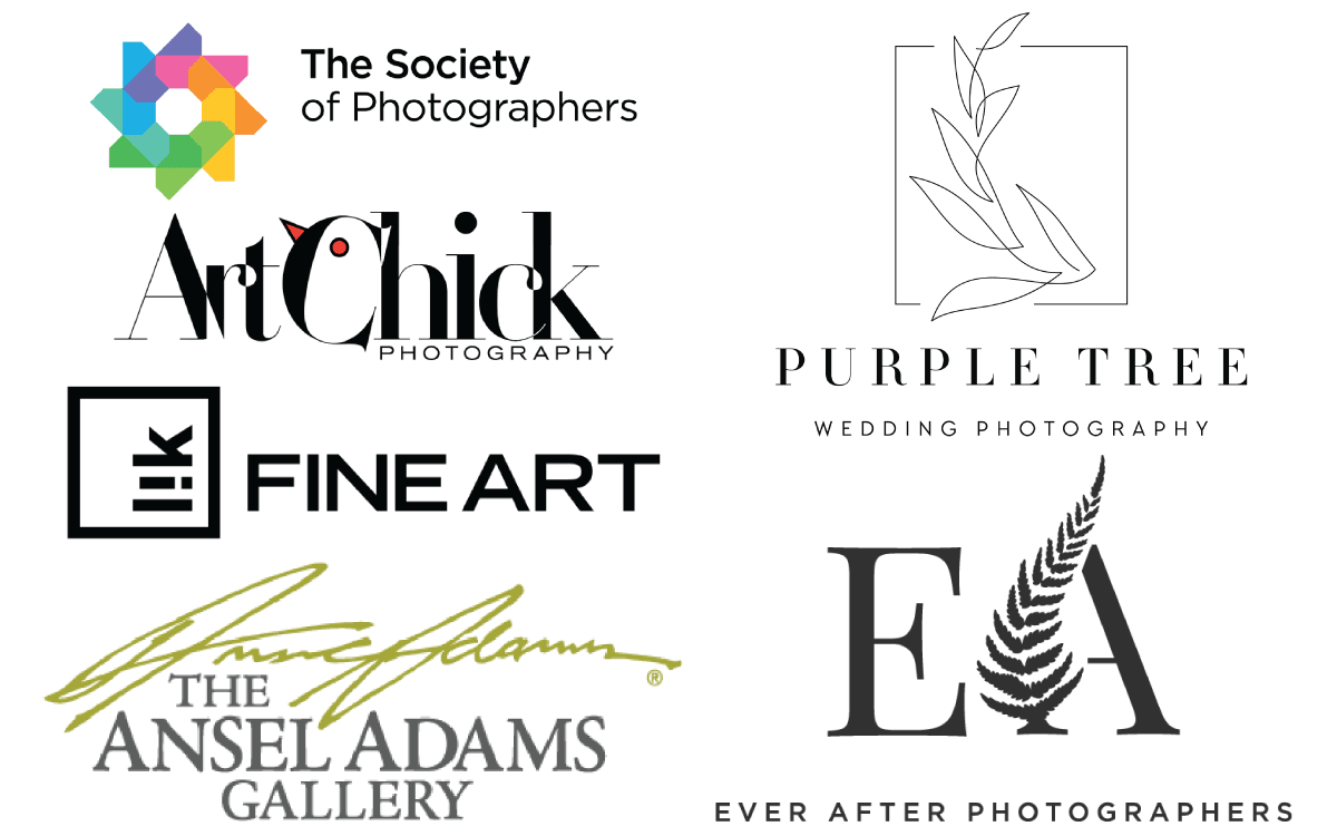
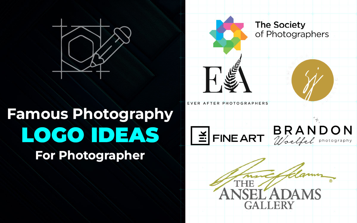
The Society of Photographers is an elite professional body that recognizes excellence and creativity in photography. The Society of Photographers logo embodies such a reputation for professionalism and artistry in its pristine, timeless, and authoritative appearance. With a modern serif font and emblematic icon, the logo exudes credibility, professionalism, and forever classy aspects, all of which mirror the body itself.
The design of the logo is simple but powerful. Monochromatic or subdued color is utilized to present it subtly and formally, suitable for the international community of professionals. The crest-like or circular emblem that is normally appended with the brand icon is indicative of unity and acknowledgment, the badge of distinction for photographers who are adept in their profession.
What is so remarkable about the Society of Photographers logo is that it both communicates tradition and modernism. It merges traditional professionalism with contemporary style, a reflection of the manner in which the organization incorporates traditional photography conventions with emerging creative photography logo design trends and styles.
In brief, the Society of Photographers logo is not just any design, it's a badge of honor. It is an emblem of credibility, excellence, and creativity in picture form, reflecting the passion and proficiency of photographers all over the world with pride.
Localgrapher is among the globe's leading travel photography networks, connecting travelers with professional photographers in over 1000 cities. Localgrapher's logo is an ideal reflection of this worldwide but personal nature, chic, friendly, and professional. It combines a chic sans-serif typeface with a subtly photographic signifier, finding a balance between imagination and professionalism.
The design adopts the utilization of soft, inviting hues that convey warmth and confidence, fundamental values for a brand centered on documenting human connections. Its circular camera icon discreetly illustrates wholeness and the idea of encapsulating life from every angle. The sparse typography maintains readability and global recognition, and the circular letter forms render it cordial and inviting.
What is so special about the Localgrapher logo is that it conveys visually the intention of the company: making every trip unforgettable with breathtaking, professional photographs. It embraces adventure, connection, and storytelling in a straightforward yet powerful design.
Indeed, the Localgrapher logo is a symbol of creativity and connection. It represents not just a company, but a community of photographers dedicated to making travel moments remembered as timeless memories with their lenses.
Samantha Josette Photography is a well-known name in elopement and intimate wedding photography, acclaimed for capturing the real and emotional moments with an artistic flair. The logo of Samantha Josette Photography abides by this philosophy through its sleek and understated approach, often resulting in a clean sharp serif typeface that exudes sophistication and timelessness.
The logo's simplicity maintains focus on the creativity and passion Samantha invests in her work. The clean lines and symmetrical design of the logo reflect the brand's goal to create images that are both pleasing to the eye and highly personal. The restrained color use in the logo conveys warmth, which is in keeping with the warm and welcoming atmosphere Samantha provides for her clients.
What is impressive about the Samantha Josette Photography logo is that it achieves conveying professionalism and approachability. It is a striking image of an enterprise that prioritizes connection, authenticity, and the beauty of life's most valuable moments.
In essence, the logo of Samantha Josette Photography is more than a design; it is symbolic of a photographer dedicated to telling stories through the lens of the camera, capturing love in its purest form, and making memories that transcend time.
Little Wolf Collective is one of the creative photography brands whose logo reflects perfect art combined with feeling. The logo shows integrity and teamwork.
The wolf icon in the logo represents strength and freedom. Its design shows the team spirit and imagination that define the group. The simplicity of the icon makes it even more functional.
The Little Wolf Collective has emotional appeal and marks it as one of the best things about it. The wolf represents unity, intuition, and vision, qualities that remind us of the photographers' shared passion for art and camaraderie. Its simple color scheme and symmetrical form make it timeless, modern, and elegantly low-key.
Actually, the Little Wolf Collective logo is more than just a picture. It is an entire combination of creativity, collaboration, and beauty. In its simplicity and symbolism, the logo perfectly captures the spirit of modern photography.
Jennifer See Studios is a world-famous photography brand. It is a combination of feeling with elegance. The logo reveals the brand's belief in shooting from the heart. It is refined, intimate, and very recognizable.
The handwritten style of the logo gives it a warm, personal feel, reflecting the simplicity of Jennifer's photography, but the elegant lettering gives it an added elegance. The minimalist design gives an artistic message of the brand.
What's wonderful about the Jennifer See Studios logo is its emotional depth. With a warm and cursive text, like a signature, the logo reminds us that each photograph has its own story through the lens of the photographer. It has both professionalism and personality.
Actually, the Jennifer See Studios logo personifies the essence of art and emotion. With a simple but poignant design, it is an iconic symbol of creativity, passion, and storytelling in the art of photography.
Ranjith Studios is a popular household name in photography, known for fusing the freshness of ideas with the depth of culture. The logo is an expression of this ultimate synergy, the personification of innovation, feeling, and storytelling through the lenses.
The Ranjith Studios logo employs bold, modern typography that is eye-catching. Its simplicity in lines and symmetry gives it a businesslike but approachable look. The limited use of color and white space lends it depth that makes the logo instantly recognizable and memorable across all media.
What is unique about the Ranjith Studios logo is the passion it carries. It is a reflection of creative confidence, passion, and commitment, the essence of the photography brand. Every single detail appears to be deliberate, designed to invite both trust and awe.
Actually, Ranjith Studios' logo is not just a graphic symbol. It conveys the creative essence, storytelling, and excellence of the brand itself. Through its purity of modernity and timelessness, it remains a shining one of the most famous photography logos in the business.
PhotoEllieB is a name for modern photography, renowned for capturing the most beautiful moments in life with a lens of timelessness and authenticity. Its logo is true to that spirit, with a classy handwritten-style font that is intimate, warm, and timeless. It lands the audience right into the creative and emotional tone of the brand at once.
The flowing, smooth script of the logo creates a feeling of proximity, and the white color introduces purity and simplicity. It is the elegance and restraint in design that make the logo possess a modern sensibility without losing its emotional resonance. The logo represents the storytelling and human connection focus of the brand, two key elements in Ellie B's photography style.
Without a doubt, the PhotoEllieB logo is a symbol of love for design. Its hand-written beauty is a powerful reminder that each photo comes with a human story, shot with love and care. It's the ultimate blend of creativity, emotion, and sincerity, which makes it one of the most memorable photography logos in the creative space today.
Tiffany Singh Photography is a much-respected brand in the lifestyle and wedding photography industry, renowned for their capacity to capture moments that are saturated with emotion, light, and timeless elegance. The Tiffany Singh Photography logo wonderfully captures this elegant style with its plain, uppercase lettering that is bold and sophisticated. The black and white minimalism gives it a touch of luxury without being ostentatious, striking an instant presence with quiet confidence.
What's special about this logo is that it can impart trust and sophistication without resorting to complex symbols. The sleek, modern wordmark is reflective of Tiffany's photography approach, genuine, intimate, and full of life. It communicates with customers who value the professionalism draped in warmth and sophistication.
This is a visual decision that reflects Tiffany's brand personality and story, where every photo is intimate but professionally executed.
The Tiffany Singh portrait photography logo whispers softly of luxury and emotional depth, reminding the viewer that honesty in art doesn't need repetition, only intent and vision. It's a badge of artistic consistency and confidence and a guarantee of Tiffany's passion for ageless storytelling.
Brandon Woelfel is arguably the most iconic name in modern portrait and creative photography, with a following for his otherworldly lighting, neon hues, and playful color palettes. The Brandon Woelfel logo embodies this iconic aesthetic perfectly, simple, and enviably modern. It's best described through a simple wordmark that keeps the focus on his name, symbolizing the personal brand that he's built by way of visual storytelling.
The logo itself is most often displayed in a clean sans-serif font, one that honors simplicity and sophistication. Its spareness allows his vibrant, photo-rich photography to do the talking, but it still radiates a sense of artistic confidence. The design choice reflects Brandon's ability to take ordinary moments and turn them into bright, stunning works of art, where light, color, and emotion communicate more loudly than language.
The Brandon Woelfel logo stands out because it's not so fancy but is very identifiable at first glance. It resonates with the calming accuracy of his edit aesthetic and the affectionate feel of his portraits. In every aspect, the logo is consistent with his brand aesthetic, modern, emotive, and real.
Beyond a shadow of doubt, the Brandon Woelfel logo is that of a creative genius whose work inspires millions of photographers worldwide. It's proof that sometimes simplicity carries the most light.
Peter Lik is a world-famous fine art photographer who is renowned for his breathtaking landscape photography evoking the power and serenity of nature in perfect harmony. The Peter Lik logo embodies the same atmosphere of timeless design, simple, strong, and unmistakably refined. It is often a clean wordmark with contemporary lettering that suggests strength and artistic precision.
The logo design's simplicity allows the user to maintain their focus on Lik's stunning photos, vast deserts, glowing canyons, and dreamlike skies. Its bold typography exudes confidence and strength, echoing Peter Lik's design in front of the lens and his reputation as one of the world's best landscape photographers. Every aspect of the logo seems deliberate, similar to the careful composition of his photographs.
It's what makes the Peter Lik logo exceptional - its refined simplicity. It communicates greatness, drive, and timeless beauty without any symbols or intricate artwork. It possesses the edgy lines and corners of a contemporary feel but maintains the character of traditional artistry.
Fundamentally, the Peter Lik logo is a mark of mastery in visual form, potent in its simplicity and enduring in its impact, similar to the awe-inspiring landscapes that pervade his working life.
Precision Studios is an active studio that specializes in apparel, product, and fashion photography, and its logo perfectly captures this creative accuracy. The Precision Studios logo is a minimalist black-and-white design, combining a modern camera icon with a bold, clean lettering.
The streamlined look and smooth lines symbolize professionalism, concentration, and workmanship, the same thing the studio offers on every shoot. The simplicity of the design exudes professionalism and the monochromatic color scheme offers timeless sophistication, which makes it easily identifiable on print and digital media.
What is striking about the Precision Studios logo is how well it blends creativity and sophistication. The subtle camera imagery conveys the personality of the brand without overwhelming the design, and the typography gives it a sleek and confident look.
In essence, this logo is not just a symbol, it's an embodiment of a studio that translates fashion into visual art form. The Precision Studios logo itself demonstrates precision, style, and perfection passion found in the art of professional clothes photography.
Citywide Studio Photography is a well-respected photography firm with a professional approach to portrait, event, and commercial photography. This professionalism is reflected in the Citywide Studio Photography logo in its clean, modern appearance and bold typography, creating an instantly recognizable and authoritative brand image.
The logo typically utilizes a straightforward wordmark with even symmetrical spacing and lines, radiating clarity and sophistication. Its simplicity allows it to be versatile across all media, from studio signage to the internet and social media, without sacrificing sentiments of trust and professionalism.
What sets the Citywide Studio Photography logo apart is the way it can express reliability and quality. How simple and clean the design is shows that the brand is all about taking clear, and refined photographs, and how bold and strong the typography depicts confidence and professionalism.
Essentially, the Citywide Studio Photography logo is a graphical representation of precision, professionalism, and creative excellence. It is a robust mark that is unique and should, therefore, instill confidence in clients about the studio's commitment to providing high-standard photography services.
California Center for Digital Arts is a top institution that vows to create photographers of all levels through full learning and hands-on experience. Its logo embodies this mission with its dynamic and modern design, with its iconic camera lens symbol that stands for the art and science of photography. The bold, uppercase letters convey professionalism and minimalism, demonstrating the center's commitment to excellence in digital arts learning.
The color palette of the logo, mainly black and orange, evokes a sense of creativity and energy suitable for the lively learning environment in the center. The circular lens symbol, apart from representing the focus of the photography, also expresses a sense of community and openness and urges individuals to explore and cultivate their photographic abilities.
What is unique about the CCDA logo is its ability to merge art with technicality. It is a pictorial depiction of the center's dedication to developing an artistic community where students can hone their art, from entry-level to sophisticated techniques.
Fundamentally, the California Center for Digital Arts logo is a beaming star for prospective photographers, symbolizing a place where enthusiasm meets artistry, and where every picture captured is an inch closer to mastery.
Purple Tree Photography is a well-known name in wedding and lifestyle photography, particularly in the regard of depicting intimate and artistic moments with elegance and compassion. The logo of Purple Tree Photography holds true to this identity, as there is a stylized tree monogram with soft, flowing lines symbolizing growth, life, and inspiration.
The logo often employs purple tones, which evokes a sense of elegance and creative flair. Its clean and balanced form has it fitting perfectly into any website, social media site, or print medium, conveying the brand's focus on heart-to-heart storytelling.
What sets the Purple Tree Photography logo apart is the emotional resonance it creates. The tree symbolizes relationship, growth, and natural beauty of life, all of which are core values of the brand. Combined with clean typography, the logo creates an excellent balance between creativity and professionalism.
Evidently, Purple Tree Photography's logo is a timeless icon of creativity, authenticity, and refinement, encapsulating the essence of the brand and making a lasting impression on anyone who lays eyes on it.
MMG Artists is a globally recognized creative agency that represents some of the world's top photographers, models, and visual artists. The global prestige of MMG Artists is reflected in its logo by its contemporary, minimal, and streamlined design that speaks professionalism, unity, and artistic excellence. The clean lines and bold typography of the logo express strength and sophistication, the very same qualities that define MMG's leadership in the photography industry.
The simplicity of the logo gives it timelessness, such that the focus stays on the multitalented individual it symbolizes. The strong, uppercase font tells of power and confidence, symbolizing the agency's work in uniting artistry and commerce. The logo one-color scheme further contributes to its elegance, while the uniform spacing gives it a contemporary, editorial feel that is known to luxury fashion and high-end photography brands.
Most notable about the MMG Artists logo is how effortlessly versatile it is. Whether on digital media covers, or promotions for events, the logo performs just as well without undermining its identity. It speaks to the brand's commitment to creativity, professionalism, and global reach.
Actually, the MMG Artists logo is more than just a visual representation, it's a badge of artistry and ambition converging. Its very streamlined simplicity captures the essence of a brand that continues to push the limits of creative excellence beyond borders.
Artchick Photography is a creative studio that honors individuality, emotion, and artistic expression, and its logo perfectly encapsulates that essence. The logo of Artchick Photography showcases a contemporary yet whimsical design, merging stylish typography with subtle artistic touches that embody the essence of creativity and genuineness.
The logo’s sleek yet expressive arrangement represents confidence and uniqueness. Its gentle curves and elegant font suggest warmth and friendliness, while still upholding a professional look that reflects the studio’s dedication to visual storytelling.
The Artchick Photography logo is quite exceptional since it combines passion and art. The brand's photography approach, which combines unscripted situations with a dash of artistic flair, is reflected in the design's personal yet polished feel.
Essentially, the Artchick Photography logo reflects passion, vision, and personality more than it does merely serving as a business symbol. Through the lens of creativity and heart, it symbolizes a studio that transforms genuine feelings into eternal art.
The famous photography logos give people a recall and place in their minds for their connection to your photographic being and trust. It takes more than just designing a famous camera brand logo. This involves designing a visual identity that conveys your narrative, your enthusiasm, and the viewpoints you are sharing.
Here is how to design your own photography logo that stands out:
Before designing your logo, start by thinking about your photographic style, whether you are a wedding, nature, or commercial photographer. You will want your logo to communicate the type of photography you do and reflect your creative personality.
For example, if you’re a wedding photographer, research your competitors’ logos to understand how they use fonts and elements to appeal to couples. Understanding your style and audience helps you create a logo that truly brands your photography business.
All iconic photography brand logos have what I call a story, and that story includes a personal and custom design that many people won't know about. You could use your initials, a logo symbol, or even a fun little graphic that fits your unique style of photography, such as a mountain, flower, or camera lens!
Typography provides a necessary tone/word setting to your design. A serif font will tell the audience that you are traditional or trustworthy, a sans-serif font will indicate you have a stylized understanding and are more modern in your perception, or a handwritten font or hand script will tell the audience you are a local artist/community photographer or have a personal approach to styling your art. Don't add too much detail or elements to your logo.
Color plays a powerful role in emotion and shaping how people perceive your photography brand. For instance, black and white tones often represent sophistication, elegance, and professionalism, while bright colors convey energy, creativity.
When choosing your logo color palette, make sure the combinations look appealing both digitally and in print. Also, ensure your logo remains clear and recognizable even when used as a watermark on your images. The right color combination can enhance your brand’s identity.
The popular photography logos of many well-known brands are simple in design. Consider Pro Photo Studio, Ever After Photographers, Lindsay Adler, or The Society of Photographers, their logo designs are clean, simple, and timeless. Just think about exploding shapes based on positive and negative space that people can easily remember.
Finally, we’ve reached the end of our list of the top 20 creative photography logo ideas! I firmly believe that the popular photography logo designs will help you understand the importance of thoughtfulness. And that it will inspire you to create something memorable for your own photography business.
There’s no doubt that a logo is the heart of your photography business. It gives your brand instant recognition and sets the tone for your professional identity.
But now, it’s your time to be ready to bring your logo ideas to life and start drafting your concepts. Once you have a clear vision, reach out to top graphic design agencies that can transform your ideas into a customized iconic logo. Top-tier agency designers will carefully consider your style, audience, and goals to design a logo that truly reflects your photography business.
If you’re ready to decide to hire an agency, check out our custom logo design services to create your own iconic photography logo.
Get ready to shine with a photography logo that captures your brand’s essence, just like the famous photography logos we’ve explored today.
Let your creativity lead, and let your logo tell your story!