Famous hotel logos can ignite your imagination and inspire you to design an iconic logo for your own brand. From iconic symbols to elegant typography, these hotel logos tell stories of hospitality that make travelers feel welcomed, pampered, and inspired the moment they arrive.

Studies show that a logo can increase guest recall and boost booking rates by over 30%. That’s why top brands keep upgrading their logos. Among the hotel logos of top brands, Hilton, Ritz-Carlton, Radisson, and Taj Hotels are the most popular.
A logo can change the entire vibe of your brand and make it memorable to your audience. So, today is your lucky day because here we’ll show you the top 20 famous hotel logo design ideas that reflect luxury, comfort, and hospitality. Let’s dive in and explore the stories behind these iconic designs!
The hotel logos of world-famous hotels don’t just represent their names. But to make them memorable, their hotel logos play a big role. So, now we’ll see the inner psychology of each of the logos and see how they help people memorize.
A well-designed logo carries hidden psychology, using shapes, colors, and design elements to leave a lasting impression on guests. Let’s see 20 famous hotel logos one by one and see what makes them different!
The Claremont Hotel logo blends timeless elegance with refined hospitality. Its classic serif typography is the secret thing. This logo celebrates over 110 years of luxury across some of the most prestigious locations.
The logo represents several renowned destinations, including the historic Berkeley Hills resort and the coastal retreat in Maine. The Berkeley property, which opened in 1915, underwent a major rebrand in March 2025. It dropped its old name, “Claremont Club & Spa, A Fairmont Hotel,” for a simpler one: “Claremont Resort & Club.” This change marks a new chapter, yet it still honors the Tudor Revival style and its century-old legacy.
The logo’s elegant serif letters and clean design appeal to travelers from the UK, the US, and Canada. It brings to mind the golden age of resorts and the charm of early luxury escapes. For North American guests, it’s a reminder of the original Claremont.
The Davenport Hotel logo is a symbol of over 110 years of luxury and hospitality. With its elegant serif font and classy details, the logo represents Spokane's top luxury hotel since 1914.
The logo carries the legacy of one of America's longest-standing hotel brands, founded by Louis Davenport in Spokane, Washington. When the hotel opened in 1914, it was America's first fully air-conditioned building, with central vacuum systems and accordion ballroom doors. The logo reflects this bold spirit, attracting luxury travelers from the UK, the US, and Canada.
In 2002, Walt and Karen Worthy restored the Davenport with a multi-million-dollar investment. Since then, the brand expanded to five properties, each carrying the signature logo. In 2025, The Louie, A Davenport Hotel, joined the family, proving that the brand keeps evolving while staying true to Louis Davenport’s original vision.
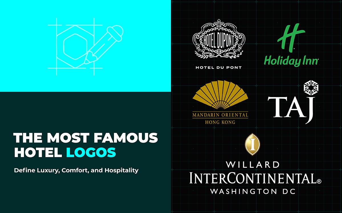
The Hotel Du Pont logo combines a classic trefoil with sleek serif lettering, showcasing the hotel’s Gilded Age roots in Wilmington, Delaware. In 2021, the logo was updated with a bold new vision, "History Unscripted." This new design highlights both the hotel's timeless appeal and modern luxury.
The updated logo blends the past with contemporary elegance. It represents Delaware's top destination, a recognition from Conde Nast Traveler. Created by Pierre S. du Pont in 1913, the logo was refreshed in 2021 by Philadelphia’s WFGD Studio. The trefoil symbol stayed, but the typography was updated, with a refined color palette to appeal to luxury travelers from the US, UK, and Canada.
Built between 1911 and 1913, this Italian Renaissance gem has hosted U.S. presidents and numerous celebrities. The logo reflects the hotel’s cultural importance in the Brandywine Valley, connecting with North American guests seeking a true luxury experience. The "History Unscripted" philosophy ties the hotel's modern excellence to Wilmington’s industrial past.
The Willard InterContinental Hotel’s logo blends American tradition with international elegance. It prominently features the InterContinental “I” symbol, a golden oval that has evolved since 1946, when it was part of Pan American Airways. Today, it’s a sleek, 3D gold design with a warm brown border, reflecting the hotel’s prestige in Washington D.C.'s political world.
The font for “WILLARD INTERCONTINENTAL” is classic and timeless, honoring the hotel’s 200-year history. Every U.S. president since Franklin Pierce has stayed here. The soft gold, brown, and white colors of the logo convey luxury and trust. They perfectly suit the high-profile guests the hotel attracts. From diplomats in London to business leaders in Toronto, the logo speaks to those seeking prestige and access. It’s a striking design that highlights the hotel’s blend of historic charm and modern luxury for travelers from the UK, US, and Canada.
The La Quinta Inns & Suites logo is a great example of color psychology. The bold yellow sunburst gives off warmth, energy, and enthusiasm. It instantly makes people feel happy and positive. This bright icon grabs attention and makes the brand easily recognizable in over 925 locations worldwide.
When Wyndham bought La Quinta for $1.95 billion in 2018, they renamed it "La Quinta by Wyndham." They kept the same friendly design. The mix of yellow and green appeals to budget-conscious travelers. Whether in Toronto, Manchester, or the US, it balances affordable luxury with reliability. This color scheme builds trust, helping the brand stand out in the crowded markets.
The Hilton Hotels & Resorts logo is a symbol of hospitality that has stood the test of time. It features a stylized “H” and has welcomed over 220 million guests in 2024 alone. Created by the famous Saul Bass in the mid-1900s, the logo combines lowercase letters with a curved arc and two intersecting triangles, forming the iconic “Hilton symbol.”
The logo represents a brand worth $15.1 billion. Hilton has over 8,400 properties in 140 countries and territories. From the historic Park Lane in London to the busy streets of Toronto and the bright lights of New York's Times Square, Hilton is everywhere.
No matter where it is, the logo remains instantly recognizable, while also fitting into local cultures and architectural styles.
The famous hotel logos' lowercase letters feel warm and inviting. The Hilton symbol adds a classic and sophisticated touch. This design connects with Hilton’s 203 million loyal members, building trust and a consistent image that appeals to people.
The Marriott Bonvoy hotel logo combines modern elegance with a welcoming feel. Its "M" symbol hints at mountain peaks and open doors, which are the signs of adventure and hospitality. The navy blue and gold colors represent Marriott’s global presence, with over 9,400 hotels in 144 countries.
The logo reflects Marriott's $68 billion market value and its commitment to quality. A 2013 redesign refined the typography and sharpened the logo’s geometric precision, keeping it fresh while respecting its 1927 origins. Whether in London, Toronto, or Times Square, the logo adapts to local styles while maintaining its global recognition.
The logo’s abstract “M” is easy to recognize. The deep navy blue shows reliability and trust. This color choice strengthens Marriott’s reputation as a global leader in hospitality.
The Ritz-Carlton logo is a sign of luxury and elegance. With a lion beneath a royal crown, it has been a mark of prestige since the time of César Ritz. In 2015, the logo got an update, keeping its noble history while appealing to today's travelers.
The design combines the British crown with the lion. The gold color adds a sense of richness. The bold typography beneath the crest makes the brand memorable. This famous hotel logo represents The Ritz-Carlton's commitment to exceptional service, reflecting their $2,000 empowerment rule and the “Ladies and Gentlemen serving Ladies and Gentlemen” philosophy.
The lion and crown remind us of power and royalty. This classic symbol builds trust and makes the Ritz-Carlton feel exclusive. It reminds us of their imperialism and thus remains so popular.
The Four Seasons logo design features a tree with four branches, each representing a season. This elegant design reflects the brand’s promise of exceptional service throughout the year.
Founded in 1960, Four Seasons has grown into a global leader in hospitality with 130 properties worldwide. The tree symbol represents growth, renewal, and a strong connection to nature. The clean typography and earthy colors further emphasize the brand’s commitment to sustainable luxury.
The tree's changing seasons remind us of consistency and natural beauty. This makes it very appealing to eco-conscious travelers. The design connects with our emotions, creating positive feelings. At the same time, it highlights the brand's dedication to excellent service throughout the year.
Hyatt's arch logo is a symbol of connection. It reflects the brand's commitment to bringing guests closer to unforgettable experiences. The simple curve, replacing the "A’s" crossbar, acts as a bridge. It connects the past with the future, tradition with innovation, and most importantly, guests with transformative travel moments.
This minimalist arch is a refined version of Hyatt's original four-petal flower logo, now in a sophisticated blue.
The hotel logo’s sleek simplicity aligns with logo design trends in modern luxury hospitality. We see it in Hyatt’s new Park Hyatt London River Thames, expanding locations in Toronto, and luxury destinations across North America. It also echoes Hyatt’s 2024 "Be More Here" campaign. It perfectly aligns with their record 34 wins at the 2024 Travel + Leisure World’s Best Awards.
The arch represents welcome, stability, and journey. These are the core hotel logo ideas of hospitality. The simple, clean typography makes the Hyatt brand instantly recognizable across its growing collection of five-star hotels.
InterContinental’s golden logo means luxury. The three-dimensional oval with a bold white "I" at its center catches the eye instantly. Since its debut in 1946, when Pan American Airways launched it as a luxury brand, the logo has evolved.
It started as a blue rectangle with a golden emblem, then transformed into a sleek design that now reflects the brand’s focus on "Cultivated Elegance."
In 2023, its updated version arrived. This update led the brand to earn the title of the World’s Leading Business Hotel Brand for 2024. The brand has become dominant in London, Toronto, and cities across North America.
The golden oval screams luxury. The bold "I" in the center suggests personalized service, which is perfect for business travelers. Its 3D shape gives it a strong look. And the neutral colors make it adaptable in any culture.
The Sheraton hotel logo is a symbol of lasting hospitality. Its bold "S" is at the center of a clean, geometric design. In 2019, Marriott updated this 82-year-old logo. They replaced the old laurel wreath with a modern circle.
The new logo represents "the world and the energy of gathering." It keeps the original logo's strong recognition but reflects Sheraton’s focus on community. From London’s luxury hotels to Toronto’s business hubs, and New York’s lively spots, the Sheraton "S" is easily recognized across North America.
The famous hotel logo is easy to recognize. The circle symbolizes global connection. The classic "S" keeps the brand’s 87-year legacy of luxury alive. It mixes timeless tradition with a modern touch.
Holiday Inn’s logo gives off a welcoming feel with its fresh green color and modern design. The green color stands for relaxation, balance, and safety. It promises comfort, no matter if you're in Manchester, Toronto, or New York.
After a $1 billion makeover and the launch of the H4 Design strategy, the logo now reflects the brand’s shift to modern, full-service hospitality. This update has helped Holiday Inn remain the #1 trusted brand in U.S. travel and hospitality for four years straight. Both business and leisure travelers know they can always count on Holiday Inn for a comfortable stay.
The logo works because it’s tied to a trusted brand. The green color feels warm and inviting. It makes guests feel comfortable. The design is simple but refined. It strikes the right balance between being friendly and professional. All these make Holiday Inn easy to recognize anywhere, attracting all kinds of travelers.
Mandarin Oriental's fan logo is a well-known symbol in hospitality. It was created by the famous Pentagram design house in the mid-1980s. The 11-bladed fan is inspired by oriental culture. It represents the joining of two historic hotels: The Mandarin in Hong Kong and The Oriental in Bangkok.
In 2025, Mandarin Oriental updated its brand for the first time in 40 years. They modernized the fan but kept its cultural roots. The new design introduces Celadon Green, alongside the classic black, white, and gold. Each of the brand’s 43 hotels features its own fan artwork. The designs reflect local culture, blending global luxury with local heritage in an authentic way.
The fan combines tradition with modern style. It stands as a cultural symbol and a luxury item. Its simple, geometric design looks great on digital screens. At the same time, local versions of the fan create emotional connections with guests in London, New York, and Singapore.
Accor's logo is a great example of modern simplicity. The gold monogram blends the letter "A" with the Bernache Goose. This goose has represented unity, travel, and progress since 1983. The logo was redesigned in 2019, replacing the old script with clean lines. It works well on digital screens and building signs.
With over 5,600 hotels in more than 110 countries, Accor's logo unites a variety of brands. From the affordable Ibis to the luxury Raffles, the design is flexible. The gold color adds elegance, whether in London, Toronto, or New York. The logo perfectly balances corporate professionalism and the warmth of hospitality.
Accor’s hotel logo gold color shows luxury and prestige. The clean design makes it easy to recognize. Whether on a mobile app or a building, it stands out worldwide. Simple, but strong.
The famous hotel logo blends tradition with luxury. It combines the rising sun and an iconic dome, representing Indian hospitality and royal heritage. Founded in 1903 by Jamsetji Tata, the logo tells a century-long story of excellence and pride.
The golden sun in the logo symbolizes energy, power, and creativity. It places India as a leader in hospitality. The dome recalls the grandeur of the Taj Mahal, a symbol of timeless elegance.
This elegant design has helped Taj Hotels become a famous hotel brand in 2025. It earned an impressive Brand Strength Index (BSI) score of 92.2 out of 100. The shimmering gold logo appears everywhere, giving the brand a premium look that attracts luxury travelers.
The logo blends Indian tradition with a hint of global luxury. The sun and dome instantly connect with viewers. The golden color adds a sense of prestige. It keeps Taj at the top as the world’s leading name in hospitality.
The Shangri-La Hotel logo stands for luxury and Asian heritage. It’s instantly recognizable. The signature “S” mark, updated in 2021 for the brand’s 50th anniversary, is inspired by a Chinese seal. It captures the beauty of Asian architecture, with images of mountains reflected in calm waters.
The new golden color feels warm and symbolizes hope, fresh beginnings, and unforgettable moments. The typography blends the brand's 50-year legacy with a modern touch. From luxury in London to boutique hotels in North America and Asia, the logo represents Shangri-La’s commitment to authentic Asian hospitality and culture.
The golden "S" catches the eye right away. Its design honors Asian heritage. The sunrise image evokes warmth and hope, reflecting the brand’s spirit of luxury and true Asian hospitality.
Radisson Hotels' new look blends modern style with warm hospitality. Their 2025 logo harks back to the brand’s American roots, inspired by the original hotel signage created by Edna Dickerson 115 years ago.
The new design stands out while still feeling inviting. It’s just what Radisson needs to connect with travelers in key cities like Toronto, London, and New York. This logo reflects the brand's focus on "purposeful innovation" and cements its position as a leader in the hotel industry today.
With its clean lines and bold, all-caps font, the logo is easy to recognize. It perfectly captures Radisson's mission of providing genuine hotel experiences with classic warmth with modern expectations.
The famous logo perfectly balances tradition and modernity. It nods to the original signage, bringing a sense of nostalgia. At the same time, it features modern typography. In the competitive high-end markets of North America, a personal touch makes the brand stand out.
Westin Hotels & Resorts' logo perfectly reflects wellness. It's simple, clean, and calming, just like the experience they offer. The elegant typography adds sophistication and peace, aligning with their "For a Better You" philosophy.
In 2016, Westin updated its look with brighter photos and a more refined style. But it stayed true to its wellness focus. The logo subtly represents Westin's Six Pillars of Well-Being: Sleep Well, Eat Well, Move Well, Feel Well, Work Well, and Play Well. The balanced typography gives a sense of peace, reflecting Westin's promise to help guests find harmony and renewal.
The logo is simple and easy to recognize. Its clean lines and balanced shape capture the essence of wellness. The typography is calm and inviting. It gives off a soothing feeling. This minimalist design appeals to those who value peace and comfort. It’s ideal for luxury travelers looking for experiences that nurture body and mind.
Best Western knows how to keep it simple. Their logo says it all. It’s a sleek blue circle with bold white “BW” letters in Century Bold Condensed. The design is instantly recognizable and stands out across North America and Europe.
The famous hotel logo is perfectly balanced, with clean lines that feel organized and right. It’s like each hotel promises comfort and careful management. The blue color represents trust and professionalism. The hand-drawn lettering adds a personal touch.
Best Western stands for reliable, comfortable stays. Whether you’re traveling for work or leisure, the brand speaks to budget-conscious travelers in the UK, the US, and Canada.
The design is simple and clear, making the brand easy to recognize. The blue circle represents trust and stability. The "BW" abbreviation makes the brand memorable. It’s a smart choice for a midscale hotel chain that wants to stand out for its value.
Creating famous hotel logos involves understanding guests, balancing simplicity and luxury, choosing the right font and color combination, and getting the experts' help. Let’s see how these help:
To create a hotel logo that connects with guests, you need to understand who your guests are. Research shows that American travelers are the largest group visiting Britain.
The best hotel logos speak to the guests they attract. Business travelers prefer logos that show sophistication and efficiency. Leisure guests want something cozy that offers a memorable experience. Luxury travelers are drawn to authenticity and a local connection.
To design a logo that resonates, research your guests' preferences. Use surveys, competitor reviews, and feedback from booking platforms. Also, consider cultural differences in North America to choose visual elements that will appeal to your target market.
Designing Iconic hotel logos is about balancing luxury and simplicity. In 2025, minimalist elegance is the trend. It focuses on refined typography and smart use of space, rather than heavy decoration.
Take The Ritz-Carlton’s logo, for instance. It pairs an elegant wordmark with subtle serif fonts, proving luxury can shine through simplicity. Boutique hotels often choose clean, geometric shapes with rich color schemes. A visual hierarchy that feels exclusive but not cluttered is the key to success.
When creating your logo, consider how it will look everywhere, from websites to business cards to building signs. The famous hotel logos are versatile. Consistency is crucial for strong brand recognition as well. It ensures your logo always feels sophisticated.
Research shows that blue, red, and green are the top picks in award-winning hotel designs. Each color triggers a unique emotion. Blue builds trust, while deep reds bring luxury and warmth.
Typography is just as important. The logo design fonts you choose say a lot about your brand. Studies show elegant fonts can boost perceived quality by 13% and reliability by 9%. Serif fonts like Trajan hint at classic luxury. On the other hand, sleek sans-serif fonts like Proxima Nova give a modern touch.
Regional tastes matter too. In North America, bold, easy-to-read fonts are preferred, especially online. However, they still need to feel refined for the hospitality industry.
Partnering with top logo design agencies can elevate your hotel brand. Research shows that professionally designed brands are more memorable and lead to higher bookings compared to DIY designs.
Graphic Design Eye experts bring valuable logo design industry knowledge. They take care of everything, from providing a scalable hotel logo design service to maintaining consistency across your brand. The benefits of working with them include strategic brand positioning, clear guidelines, and ongoing design support.
When choosing an agency, focus on one with a solid hospitality portfolio. Ensure they understand your target markets (US, UK, Canada) and are familiar with both luxury and boutique hotels. While it might cost more initially, investing in professional design surely pays off. Strong brand recognition and customer loyalty can deliver returns 3 to 5 times greater.
Finally, we’ve end of our journey! A logo design is the heart of a hotel brand. They tell people who they are, what they stand for, and the unforgettable moments they offer.
A logo does more than identify a brand. Creative logo design builds trust, sparks memories, and keeps guests coming back. Before booking a room, a logo starts to work its magic. A logo boosts the hotel’s reputation, makes people feel confident, and gives them a sense of belonging.
To make a logo stand out in a crowded market, learning from the best examples is key. And now that you’ve just learned the famous hotel logos in the world, you can take inspiration to create your own. Whether you design a hotel logo yourself or share your thoughts with a professional graphic designer, have them design a perfect logo for your hotel business.
Good luck creating a creative hotel logo that tells your brand’s story!