Ever wonder why some gyms stick in your mind while others fade away? A lot of it comes down to their logos. Famous gym logos convey energy, trust, and the gym's core values at a glance.

A logo is usually the first thing people notice. It sets the vibe, motivates people, and makes a gym easy to recognize. Elements such as bold text, shapes, clever symbols, and smart color choices all matter. Every detail helps people feel connected to the gym.
When you understand why these best logo design ideas work, you can see how design affects feelings, builds trust, and makes a gym stand out. Colors, shapes, and fonts tell a story without words. They give each gym its own personality.
In this article, you’ll get the world’s most famous gym logos to inspire the perfect identity for your fitness brand. You’ll learn what makes them memorable and get tips on creating a gym brand that people trust, recognize, and remember.
Keep reading!
It’s not surprising that minimalist gym logo ideas feel strong, confident, and long-lasting. The best gym logos show that good design does not need to be complex. Some designs are clean and simple. Others use smart lettering, shapes, weights, or symbols. These details help show motion and energy.
When you first see these logos, they send a clear message. They stand for strength, drive, confidence, and hard work. A well-made gym logo can quickly do a few important things:
Through careful research, we selected 20 of the most famous gym logos worldwide. Each of them has shaped the fitness industry in some way. They have also pushed many brands to rethink how they look and present themselves.
Next, you’ll have a closer look at famous fitness brand logos. You’ll learn why they work so well. You’ll also see how smart logo design builds strong and lasting fitness brands.
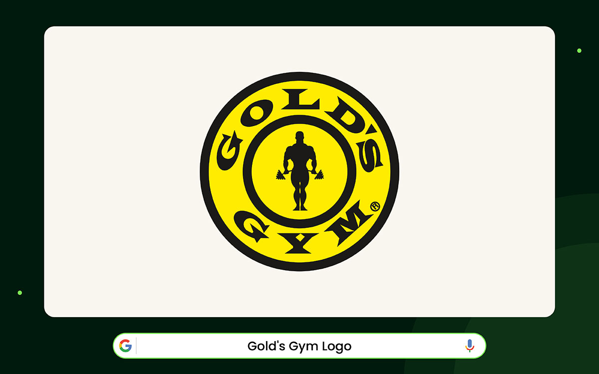
The moment you see the Gold’s Gym logo, it makes you think of strength. The bright yellow circle catches your eye right away. It’s like a light bulb turns on in your mind. Inside the circle, there is a black silhouette of a bodybuilder. He looks tall, strong, and steady. He shows not just muscles, but also goals and determination.
This logo is recognized worldwide. It stands for fitness and hard work, something anyone can understand. The black silhouette is simple but powerful. The dumbbells on each side balance the design and give it direction. The logo's bold style mirrors the training culture it represents, which began in Venice Beach in 1965.
The gold ring around the figure keeps the logo complete. Round shapes often mean unity and history. That fits a brand that has lasted almost 60 years. The circle feels like a badge of focus and progress. This makes the logo easy to remember, even if you only see it for a moment.
The logo designers also used lettering to strengthen the logo. “GOLDS” is written along the top curve of the circle, and “GYM” curves along the bottom. Together, they frame the bodybuilder like a medal.
The bold letters make the logo feel tough. The mix of yellow, black, circles, and strong shapes shows power and discipline. It is a bright, bold logo with a single hero at its center and has lasted for decades.
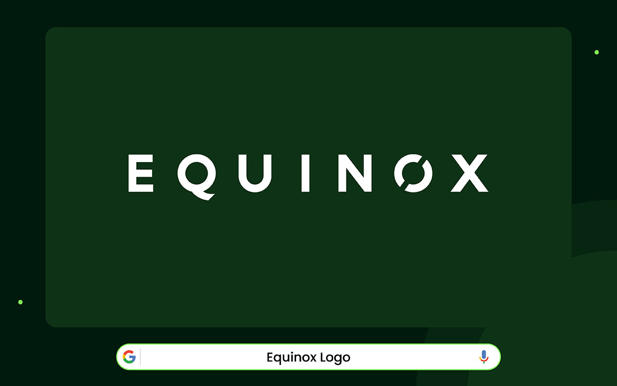
The Equinox logo is easy to recognize. It looks bold yet simple. The letters are all capital and use a clean, geometric font. This makes the logo feel confident and strong. The letters are thick enough to show stability, but not so heavy that they feel awkward. Each letter appears carefully crafted to convey quality at first glance.
The letter ‘Q’ has a short tail that points inward. It’s a small detail, but it makes the logo unique. People notice it, even if they don’t realize why. This little change keeps the logo from looking plain or boring. It also gives the design a sense of motion, as if it’s alive.
The letter ‘O’ has a clever design too. There’s a tiny gap in the circle, so it’s not fully closed. This makes the logo feel energetic and moving. It also hints at the idea of balance, which fits the word “Equinox.” The gap can remind you of the sun and moon, or the moment when day and night are equal.
The colors are also simple: black and white. Black shows power and sophistication. White keeps the letters clean and easy to read. Together, they make the logo feel luxurious and timeless. The design proves that even a small change in a letter can make a logo feel iconic and special.
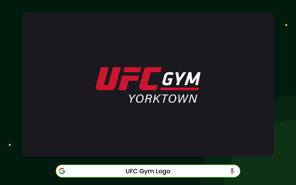
The UFC Gym logo is one of the best gym logo designs in the world. The black color conveys a serious, strong impression and gives a sense of power and focus. It also makes the logo look sharp on any background. The word “UFC” conveys speed and energy.
Thick lines and sharp edges give it a strong feel. The letters lean forward slightly, making them appear to move. The angles look aggressive, which fits mixed martial arts. This style also matches the main UFC brand. That way, the gym shares a strong identity.
The word “GYM” sits under “UFC” in a simpler style. It balances the logo and clearly conveys its identity. A straight line under the words acts like a base. It makes the logo feel steady and grounded. The logo works because it mixes energy with structure.
UFC Gym has more than 150 locations in many countries, and the logo is easy to read everywhere. It shows how contrast, angles, and size can tell a strong brand story. It also demonstrates that a gym logo can be powerful and connected to a larger brand, while remaining simple and useful for everyday training.
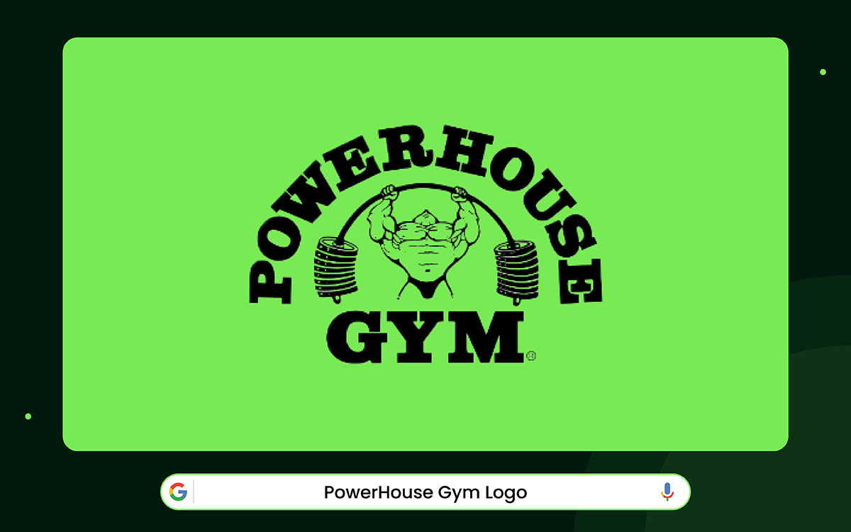
The Powerhouse Gym logo feels like a trip back to old-school bodybuilding. In the middle, a strong athlete lifts a heavy barbell. The picture uses thick black lines and bold shapes. This makes the logo look rough, strong, and classic. It evokes 1970s gym posters.
The word POWERHOUSE curves at the top. It makes the design look balanced and complete. The curved word appears as a banner positioned prominently over the picture. The word "GYM" appears below in thick block letters.
These letters feel strong and steady. They serve as a base that supports the entire logo. The mix of fancy letters on top and simple letters on the bottom adds charm. It quietly honors the past while still feeling modern.
Powerhouse Gym was founded in 1974, and the logo remains very close to the original. The brand has expanded into many countries, but the logo has changed little. It helps people trust the name. The logo shows how strong drawings, solid letters, and classic design can make something feel timeless and personal.
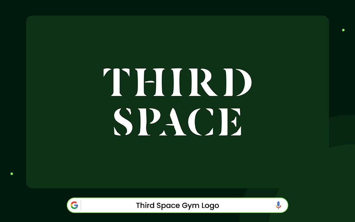
At first glance, the Third Space logo appears calm. But when you gaze deep, it feels strong. The letters have thick and thin parts. This makes the logo look fancy, like many luxury brands.
Fashion brands used the same style in the early 1900s. People still see it as confident because our eyes notice the difference in thickness.
The logo is stacked in two lines. This makes it feel steady and balanced. The letters are close together. That gives the words a smooth rhythm.
The tight spacing makes the logo appear as one solid shape rather than two separate words. Many high-end gyms do this to show discipline and order. The letters are white on a dark background. This makes them stand out.
White often means purity and clarity in design. It fits here because Third Space wants its gym to feel calm and focused. The brand started in London as a gym where exercise is more than just exercise.
Overall, the logo is simple and clean. It doesn’t try to be flashy. It stands on its own and lets the letters do the work. Designers can learn from it. Good spacing, stacking, and contrast can make a brand look confident. When the type of logo feels strong, the brand feels strong too.
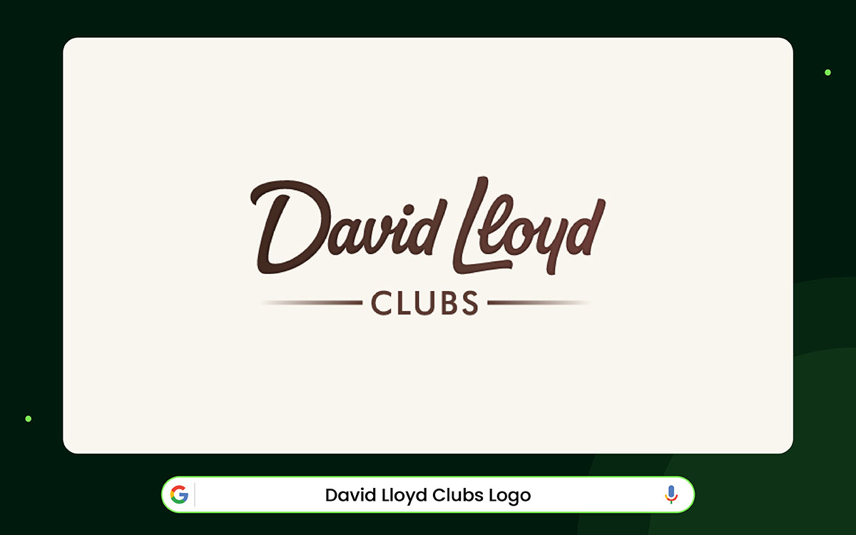
The David Lloyd Clubs logo tells a friendly story at a glance. The letters appear handwritten. It feels like someone wrote a personal note just for you. This matches the brand’s history.
David Lloyd Clubs have been family-focused since 1982. The handwriting style connects the past and present in a smooth, natural way.
Under the handwriting, the smaller word “clubs” appears. It uses a simple, clean font. The mix of flowing handwriting and clear, straight letters keeps the logo balanced. It shows the brand cares about people while remaining professional. Designers often use this mix when something needs to feel both high-quality and friendly.
Two thin lines go under the word “clubs.” They hold the logo together and provide stability. The lines help your eyes rest after following the curves of the letters. This balance also shows how the brand works. David Lloyd Clubs have grown across Europe with careful planning and strong buildings.
The logo's dark color feels strong yet not heavy. It keeps the handwritten part soft while making the whole mark feel solid. The logo is a great example of using fonts to show personality. Handwriting can feel fun and playful, but when combined with clean, straight letters, it also conveys trust and care.

Anytime Fitness has a logo composed of two elements: a simple name and a small image. The picture is a stick figure running. It demonstrates movement and action immediately.
The figure’s pose also hints that the gym is open all day, every day. Even though it’s small, it quickly makes the brand feel accessible and friendly. The name “Anytime Fitness” is written in bold, rounded letters. The word “ANYTIME” is bigger than “FITNESS.” It shows that the gyms are always open.
All the letters are capitalized, which makes them strong and easy to read. The words are stacked neatly, giving the logo a steady, balanced look.
The logo uses white shapes on a purple background. This makes everything stand out and look clean. Purple appears friendly but remains energetic. Together, the running figure and the name form a single design. They demonstrate that the brand is reliable, welcoming, and open at all times.
The logo works because it is simple and easy to understand. It proves that even a stick figure can tell a story when the letters match it well.
Designers can learn from this that energy, friendliness, and clarity are more important than fancy pictures. Anytime Fitness shows that movement and accessibility can be clear in a simple design.
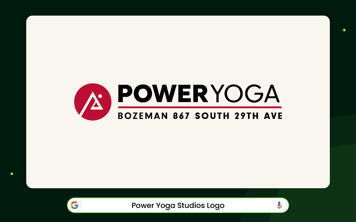
The Power Yoga Studios logo shows a new way of thinking about yoga. It doesn’t focus on the spiritual side.
Instead, it presents yoga as a sport that needs strength and discipline. The logo uses a bold, red circle. It makes it strong and noticeable.
The logo looks like a triangle or a mountain. It shows peak performance, success, and inner strength.
If you look closely, it also resembles a person in a yoga pose. This connects physical strength with mindfulness. The triangle and circle also link to sacred geometry, which symbolizes balance, movement, and wholeness.
The letters in the logo also convey a message. The word POWER is heavy and bold. It shows strength and energy. The word YOGA is lighter and softer. This adds balance and control. Together, the words reflect the studio’s idea: yoga is tough, but it also needs focus and breathing.
In short, the logo shows that yoga can be both exercise and personal growth. It proves that fitness branding can be strong without losing meaning.
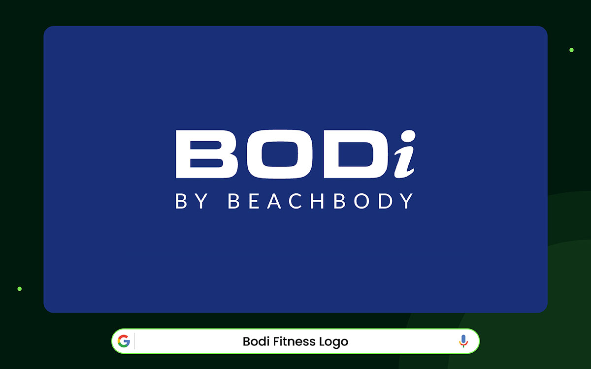
Look at the logo closely. Most of the letters are big. Only the “i” at the end is small. Large lettering makes the logo look strong. The font is simple and geometric. It looks modern and clean.
The letters are thick. Thick letters show power and stability. This is perfect for a fitness brand. It signals to people that the brand is serious and trustworthy.
The small “i” is slightly tilted. It leans forward. This makes the logo appear to move. The dot on the “i” is tiny but important. It keeps the letter separate, but still part of the word.
These little details make the logo interesting. They add energy without making it look messy.
The logo is white. White is simple and clean. You can read it easily from far away. This makes it suitable for apps, gym equipment, or clothing. The simple design also makes it easy to remember.
Overall, the BODi logo is simple but meaningful. It shows strength, energy, and progress. Small details, like the tilted “i,” make it special. Big letters and little touches can tell a whole brand story.
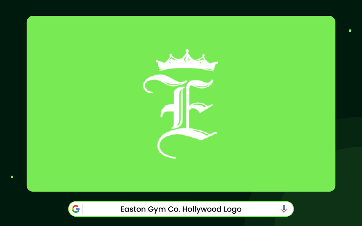
Easton Gym looks different from other gyms. The first thing you notice is the big “E.” It is in an old-fashioned style called Old English. The letter has sharp edges and fancy lines. This makes the logo feel classic and strong. It also makes the gym seem experienced and high-quality.
On top of the “E” is a crown. Crowns show power and importance. The crown fits the letter perfectly. It doesn’t feel extra or out of place. It makes the logo look special. The crown indicates that Easton Gym is among the best.
This makes it easy to see. The details are clear and sharp. It looks clean and professional. The logo also feels balanced and steady. This helps the gym seem trustworthy.
Overall, the Easton Gym logo proves that old styles and careful design work well together. The letters, crown, and colors all match. The logo shows trust, power, and quality without saying a word.

Then there’s 6 Degree Fitness. The logo looks active and strong. In the middle, there is a diamond shape.
Around the diamond are rings. The diamond has sharp corners. This makes it look strong and steady.
The rings appear to be moving. This shows growth and progress. It is like a fitness journey. Each step is part of a bigger process. The number “6” is big and bold. People notice it fast. The rings around it show a complete system.
This communicates to people that the gym offers a comprehensive fitness experience. The shapes overlap, making a 3D effect. The logo feels alive and moving.
The color is deep blue. Blue shows trust, calm, and professionalism. The letters are thick and in uppercase. They are close together. It makes the text strong and solid.
Overall, the 6 Degree Fitness logo mixes energy and strength. The shapes, colors, and letters work together. The logo is clear, active, and professional. It shows that a simple design can tell a strong story.

The Planet Fitness logo makes the gym look friendly. In the middle, there is a thumbs-up. This hand is saying, “You’re welcome here” and “No judging.” The hand looks a little hand-drawn. That makes it feel warm and casual, not stiff or formal.
Planet Fitness started in 1992 in Dover, New Hampshire. At first, it was like any other gym. However, the owners noticed that many people avoided gyms. Many felt judged or thought it would cost too much. So the gym changed. It became cheap and friendly for everyone. Now, the logo shows this story without words.
The hand is bright yellow, and the background is purple. The letters are white. Yellow makes the hand pop. Purple feels calm and steady. White makes the text easy to read. Together, the colors make the logo clear and friendly.
There is a circle around the hand and words. The circle looks like a gear. It shows order and moving forward. The words are in two lines. The letters are round and bold. They are lowercase, which makes them softer. The design works well on signs, clothes, and phone apps.
This logo teaches something cool. A simple picture, colors, and words can tell a story. The thumbs-up, the colors, and the circle all say, “Everyone belongs here” in a clear way.
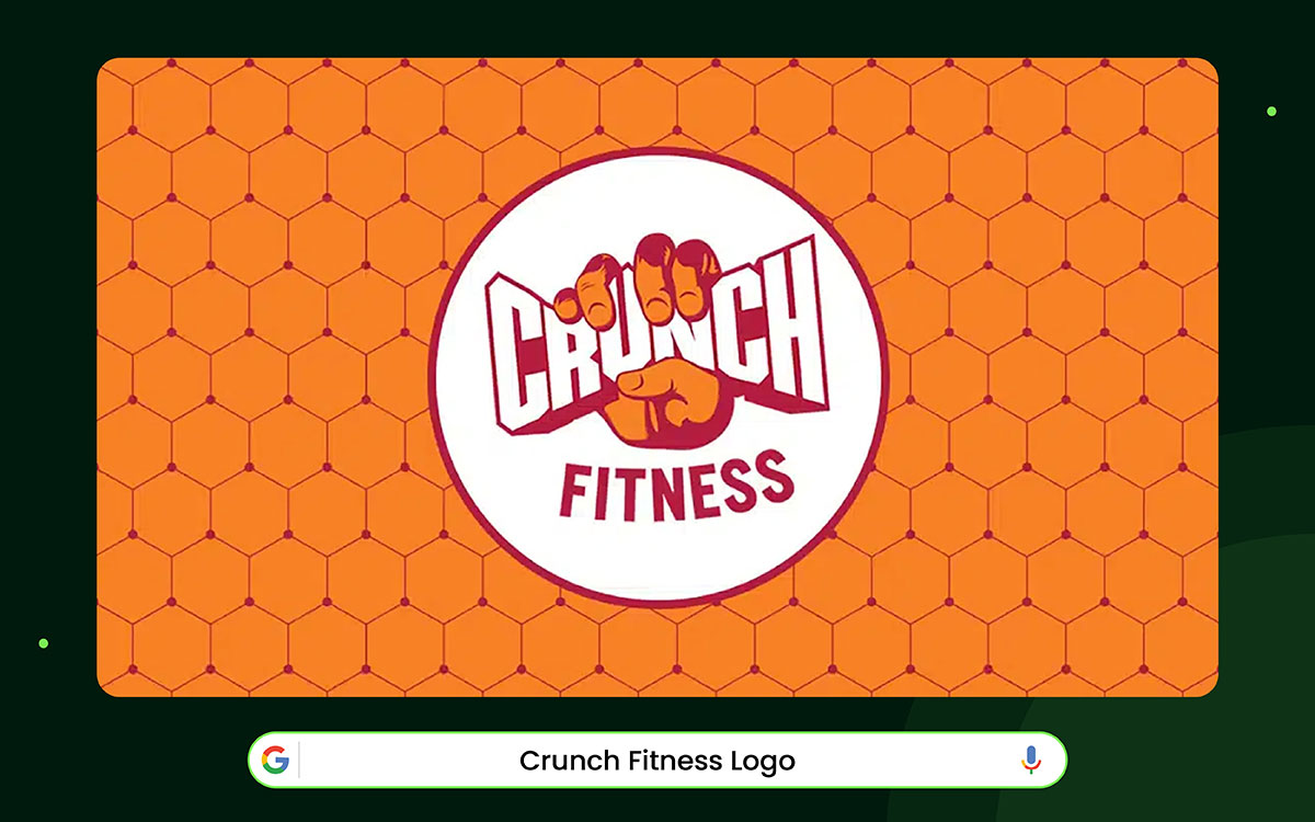
The Crunch Fitness logo catches your eye fast. It depicts a fist holding the gym's name. The hand looks strong and full of effort. It shows that workouts will be tough but also rewarding. The style looks like a comic book. This makes it engaging yet serious.
Crunch started in 1989 in a small basement in Greenwich Village, New York. People came who wanted hard workouts but also wanted to have fun. The logo tells this story. The hand and the letters together show action and power. They are connected, so the logo feels like a single cohesive idea.
The letters are bold and square. They look solid. A small 3D logo makes them feel real and strong. The fist and letters together send a clear message.
The colors also matter. White letters stand out against the dark hand and red border. Red grabs attention and shows strength and determination.
The mix of the image, letters, and colors makes the logo easy to understand. Designers can see how symbols and text can clearly tell a brand’s story.
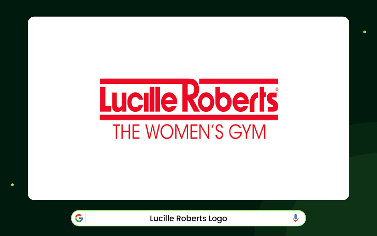
The Lucille Roberts logo looks strong but also caring. The main letters are bold, but their edges are soft. This makes the brand feel powerful without being harsh. Thick lines above and below the words keep everything steady and balanced.
The smaller tagline says, “THE WOMEN’S GYM.” Its letters are thinner and more widely spaced. This makes it feel lighter and matches the big letters well. Together, the main name and tagline show confidence and clarity. The design is modern and professional yet friendly.
Lucille Roberts opened her first gym in 1969 near Macy’s in New York. She wanted a safe and supportive place just for women. The logo reflects this idea. The bold letters show strength. The tagline shows care and order.
The colors are bright red and pink. They grab attention and feel excited. They make the brand look lively and welcoming.
These colors are very different from dark, serious gym colors. They fit women who want help and encouragement while working out.
The logo balances two concepts. The big letters show power. The soft edges and spacing make it gentle. The lines above and below add stability. The bright colors make it stand out.
Lucille Roberts shows that colors, fonts, and design can send a clear message while connecting with the right people.

Indigo Fitness logo feels calm and organized. Thin lines create a shape that appears steady and deliberate. Everything fits neatly, and the design has a soft, modern feel. Today, many new fitness brands try to make this kind of calm, clear look.
Indigo Fitness started in 1996 in the UK. The company grew by using smart concepts and careful planning. As a result, the logo’s clean style aligns with the brand’s practice of continually improving gyms and equipment.
The hexagon symbol is made of thin lines that meet at sharp points. This creates a gentle pattern that appears technical yet friendly. The shape can evoke natural elements, such as honeycombs or crystals. These natural shapes suggest balance, teamwork, and smart design. The lines also guide the eye around the shape, creating a subtle sense of movement.
Next to the symbol, the brand name uses simple capital letters. All the letters are the same thickness and flow in a straight line. “Indigo” stands out a bit more, so people can remember it easily. “Fitness” is softer, making the whole name read smoothly.
The white letters are easy to see from far away. This makes the logo work well on walls, machines, and screens. Designers also appreciate that the logo remains clear even when very small.
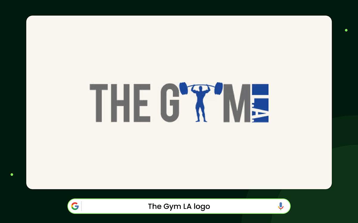
The Gym logo looks strong right away. The letters are thick and heavy. They feel solid, like something built to last. The blocky shapes stand tall, giving anyone a clear first impression of power and strength.
The Gym L.A. began with rigorous workouts and intense training. Over time, it became famous for old-school discipline. That history quietly lives in the heavy letters of the logo.
Within the logo, one letter is replaced by a small human figure. The person is lifting a bar above their head. This small detail tells a story of hard work. The bright blue color makes the figure stand out and draws your eyes to the center. It shows the gym is all about real people getting stronger.
Grey letters arouse steel weights and gym equipment. The blue figure also resembles a pull-up bar. It shows the kind of workouts the gym offers without needing extra words.
The whole logo works well on shirts, walls, signs, and screens. It still looks good even when it’s small. Gym owners see this as a symbol of stability.
Designers like it because it mixes letters and symbols in a simple, smart way. The logo proves that one strong idea can explain more than a long description ever could.
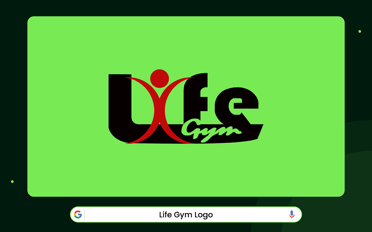
The Life Gym logo shows power and energy. It stands for life, health, and becoming a better version of yourself.
In the center of the logo, a red human figure extends arms and legs, resembling the Vitruvian Man. This figure symbolizes movement, energy, and life.
The letter “i” in the word “Life” is replaced with this human figure. This shows that the person is the heart of the brand. The figure overlaps with the letters, making the design appear to move rather than stand still.
The word “Gym” is written in a slanted, handwritten style. This makes it feel friendly, active, and community-focused. The long tail of the “f” in “Life” connects with the script, making the design feel whole.
Colors in the logo add more meaning. Red is full of energy and shows passion and life. Black makes the logo look clean, sharp, and professional, but also a little tough. White is used for contrast and to keep it simple.
Overall, the logo is more than just a picture. It shows the gym’s energy, people, and the power of change. It tells the story of movement, strength, and transformation.
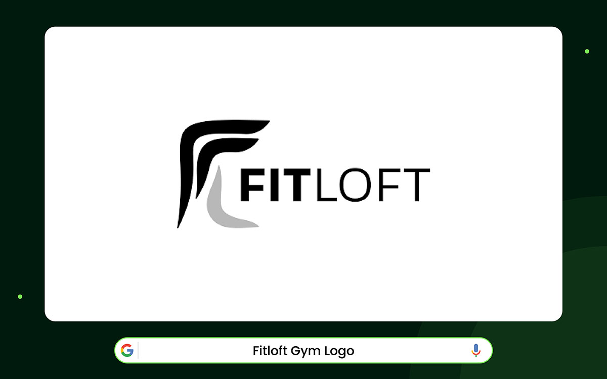
The FITLOFT logo is a great example of modern gym branding. It is simple, sleek, and energetic. Instead of using bright colors or obvious gym symbols, it uses shapes and movement to make a statement.
The abstract shape on the left looks like the letter “F.” But it can also look like a moving body or a flexed muscle. The upward, wing-like strokes give a feeling of lifting, growing, and reaching higher.
Black shows power, focus, and discipline. White keeps the design clean and confident. A single grey line adds depth, making the shape feel like it has layers, almost like muscles moving. This simple style makes the logo feel classic rather than merely trendy.
The letters in the logo match the icon's energy. “FIT” is bold and strong, showing that fitness is the main focus. “LOFT” is lighter, giving the name space and a calm lifestyle vibe. Everything is neat and lined up, which makes it look professional.
The main lesson from the FITLOFT logo is about keeping things refined. It proves that fancy gyms don’t need loud designs. Clear shapes and simplicity can show strength, ambition, and change just as well.
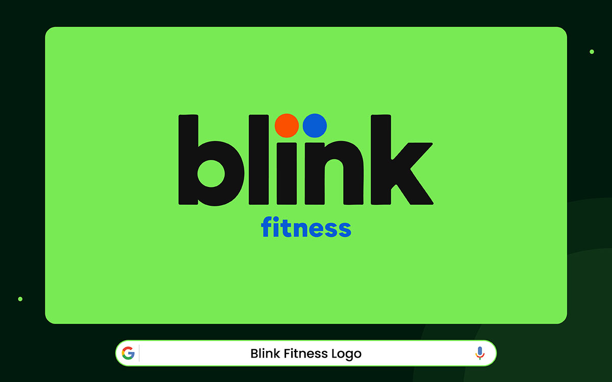
Blink Fitness features a bright, lively design that energizes you immediately. The logo is simple but bold. Its smooth curves catch your eye fast. It looks modern, active, and dynamic. This sense of movement aligns with the gym’s goal: making fitness simple and fun.
The story behind Blink matches its look. The gym wants people to feel good even before they start working out. The logo’s round, smooth shapes show this concept. It looks cheerful and balanced.
Beginners feel welcome, and experienced gym-goers still feel confident. The letters in the logo are steady and easy to read. They mix stability with a sense of motion. Nothing looks too heavy or too fancy.
This logo works because it shows joy in moving your body. Its clean, bright look makes people feel comfortable. Designers see it as a lesson in balance. Gym owners recognize that a happy, welcoming brand can attract more people.
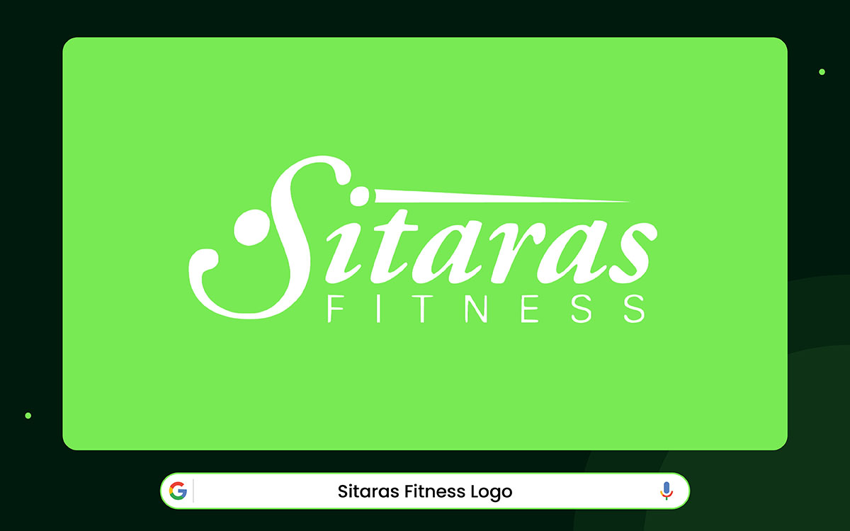
Look at the logo. The top line flows like someone’s careful signature. It feels personal, like a promise signed with steady hands. Each small curve shows skill and experience.
When you know the brand, the design makes sense. Sitaras is a top-level training system. It is built with a strong structure and science. The fancy script matches that idea. It shows care, focus, and expert guidance. The block letters below keep the logo solid and clear.
The smooth top line and the steady lower text work together like a gentle rhythm. The bright white color makes the logo shine clean and polished. Every shape is in the right place. You can almost feel the discipline just by looking at it.
This logo works because it talks like a good trainer. Calm. Confident. In control. It gives trust without being loud. For designers, it shows how softness can still feel strong. For gym owners, it teaches that simple, careful choices can make a brand feel premium.
A logo must perform three important jobs simultaneously.
First, it should connect with your gym's visitors. Second, it should align with the gym's style and energy. Third, it should still look good in years to come.
If even one of these things is wrong, the logo won’t feel right.
Let’s break down how to make a gym logo that hits all three.
First, think about who comes to your gym. Are they beginners just starting out? Or are athletes pushing themselves hard? Maybe they are busy people trying to stay healthy.
Knowing who your gym is for is important. Your logo is like a first hello; it should instantly say, “This place is for you.”
Next, think about what your members care about most. Some want results fast. Some like feeling part of a community. Others just want a place where they feel welcome. A good logo can convey all this without words.
To understand better, watch your members. Identify what excites them and what keeps them coming back. Also, check out other gyms. Don’t copy them; just see how they do things.
Put your gym into a few simple words. Words such as friendly, strong, or focused can guide your logo design. This way, your logo really shows your gym’s personality.
Your gym must have its own vibe, and your logo should show that. Is it tough and intense, calm and friendly, or somewhere in the middle? The way your logo looks can give people that feeling right away.
Shapes matter a lot. Sharp, angular shapes convey strength and boldness. Curved shapes feel soft and welcoming. Colors also send messages. Dark reds and blacks convey a sense of seriousness and power. Blues and greens feel calm and trustworthy.
The letters you use are important, too. Thick, heavy letters show strength and reliability. Simple, clean letters convey a sense of calm and professionalism.
A good way to start is to spend time in your gym. Walk around and notice how it makes you feel. Then, translate those feelings into design ideas.
Draw some sketches and ask a few people which ones match the gym’s vibe. When it works, the shapes, colors, and letters all tell the same story your gym does every day.
A logo might look cool now, but will it still work in five years? Styles and trends change frequently. Your logo should grow with your gym, not look old and out of date. Simple designs last longer. Logos that are too busy can feel old fast.
Think about where your logo will appear. Will it be on walls, social media, clothes, or gym gear? It needs to look good everywhere. Pick fonts and colors that can work in different places.
Focus on ideas that never go out of style, like community, progress, strength, and health. These are things everyone can connect with.
A good logo isn’t just a picture. It shows who your gym is. When new members see it, they should instantly feel your gym’s values. That’s the real power of a logo done right.
Those were 20 famous gym logos. Each one shows how design can tell a story. Some use a simple shape, a bold font, or the right colors to show strength, energy, and focus.
A gym logo shows what your gym is about. It tells people what they can get from it. It also shows how your brand makes them feel. A good logo is easy to remember. It builds trust in your gym and signals its strength.
Making a logo can feel tricky. That’s when a professional designer can help. They know how to turn your gym’s purpose into a design. A great design can inspire people and stay in their minds.
If you’re ready for a gym logo that truly reflects your fitness brand, Graphic Design Eye offers custom gym logo design services that are modern, creative, and recognizable.
Let’s shape a fitness brand people won’t forget. Share your requirement, and we’ll create a creative logo that works everywhere, from signage to social media.
Reach out to us now!